Sera
One Rust engine. Three pillars. Zero glue code.
SeraPlot for visualization, SeraML for machine learning, SeraDFrame for dataframes — compiled into a single native binary, calling each other directly instead of serializing across library boundaries.


Why one engine instead of three libraries
Plotly, scikit-learn, and pandas are each excellent at what they do — and each is a separate library with its own object model. Connecting them means converting DataFrames to NumPy arrays to lists and back, at every boundary. Sera exists because that conversion cost is real, and because a chart, a trained model, and the table that fed both of them don’t need to live in different worlds.
sp.kmeans() computes the clustering and renders the chart in the same Rust call — no round-trip through scikit-learn, no intermediate serialization. That is the whole design principle behind Sera: build once, natively, and let every pillar call the others directly.
| Pillar | What it is | Where to go deeper |
|---|---|---|
| SeraPlot | The rendering engine — 61 2D chart families, 24 3D types, 2 map types, each with several variants. Self-contained HTML/SVG output, no JS bundle. | Intro SeraPlot · Showcase |
| SeraML | A scikit-learn-shaped machine learning layer written in Rust — linear models, trees, ensembles (random forest, gradient boosting, AdaBoost), SVM, k-NN, Naive Bayes, PCA, clustering, anomaly detection, model selection, metrics, preprocessing. Plus a model registry, PowerBI/Tableau export, and GPU/distributed backends that scikit-learn itself doesn’t ship. | Machine Learning |
| SeraDFrame | A native columnar dataframe, built for the same pipeline rather than adapted from one — no pandas dependency, no copy at the boundary when it feeds a chart or a model. | SeraDFrame |
How to develop well with Sera
The three pillars share the same conventions on purpose, so that switching between them costs nothing:
- One call, one result.
sp.bar(...),sp.linear_regression(...),df.groupby(...)all follow the same flat-function shape — no builder object to assemble first, no separate.fit()then.transform()unless the algorithm genuinely needs state across calls. - Aliases are free. Every function is reachable under several names (
sp.bar/sp.bars/sp.bar_chart/sp.bar_unified) resolved through a shared alias registry — pick the name that reads best in your code, they compile to the same call. - Native output, always. A chart is real HTML/SVG, a model result is a real Python dict, a DataFrame column is real Rust-backed memory — never an opaque wrapper object you have to unwrap to get to the actual data.
- The fastest path is the default path. Because computation happens in Rust before anything crosses into Python, the ergonomic way to write code and the fast way to write code are the same code.
The controller: one config call, every chart obeys it
Every pillar reads from the same global controller instead of repeating options per call. Set it once — font, palette, animation, locale — and every Chart built afterward inherits it automatically, with any single call still free to override a value locally.
import seraplot as sp

sp.config(
    font="Inter", font_size=13,
    palette="viridis", background="#0d1117",
    animation=True, animation_duration=420,
    crosshair=True, zoom=True, tooltip=True,
    locale="en-US", thousands_sep=",",
    responsive=True, export_button=True,
)

sp.bar("Revenue", labels, values)          # inherits every setting above
sp.bar("Revenue", labels, values, font_size=16)  # overrides just this one
sp.config() exposes 30+ knobs this way — typography, palette/background, gridlines and despine, text auto-formatting and rotation, bar corner radius, watermark, drop shadow, crosshair/zoom/tooltip behavior, locale-aware number formatting, responsive layout, export button visibility. sp.reset_config() reverts to defaults, sp.theme() swaps a whole preset in one call. See Chart Methods for the full controller reference and every chainable per-chart method, and Configuration for the config surface in depth.
Accessibility and browser support, actually checked
Not a claim — verified this way: axe-core runs against real Chromium for every chart family with zero serious/critical violations; text and non-text contrast is measured (relative luminance, not eyeballed) against WCAG AA; keyboard navigation (roving tabindex, arrow/Home/End) works on data points and legends; the whole catalog loads with zero console errors on real Chromium, Firefox, and WebKit engines, not just one.
See it in action
Where to start
- Installation —
pip install seraplot - Quick Start — first chart in 3 lines
- Intro SeraPlot — the charting engine in depth, with head-to-head benchmarks
- Showcase — every chart family and variant, with a preview image
- Machine Learning — SeraML’s estimator catalog
- SeraDFrame — the native dataframe
Pourquoi un seul moteur plutôt que trois bibliothèques
Plotly, scikit-learn et pandas sont chacun excellents dans leur domaine — et chacun est une bibliothèque séparée avec son propre modèle d’objets. Les connecter implique de convertir des DataFrames en tableaux NumPy puis en listes et inversement, à chaque frontière. Sera existe parce que ce coût de conversion est réel, et parce qu’un graphique, un modèle entraîné et la table qui a nourri les deux n’ont pas besoin de vivre dans des mondes différents.
sp.kmeans() calcule le clustering et rend le graphique dans le même appel Rust — aucun aller-retour vers scikit-learn, aucune sérialisation intermédiaire. C’est tout le principe de conception derrière Sera : construire une seule fois, nativement, et laisser chaque pilier appeler les autres directement.
| Pilier | Ce que c’est | Pour aller plus loin |
|---|---|---|
| SeraPlot | Le moteur de rendu — 61 familles de graphiques 2D, 24 types 3D, 2 types de cartes, chacun avec plusieurs variantes. Sortie HTML/SVG autonome, sans bundle JS. | Intro SeraPlot · Vitrine |
| SeraML | Une couche de machine learning façon scikit-learn écrite en Rust — modèles linéaires, arbres, ensembles (random forest, gradient boosting, AdaBoost), SVM, k-NN, Naive Bayes, PCA, clustering, détection d’anomalies, sélection de modèle, métriques, preprocessing. Plus un registre de modèles, un export PowerBI/Tableau, et des backends GPU/distribués que scikit-learn lui-même n’a pas. | Machine Learning |
| SeraDFrame | Un dataframe colonnaire natif, conçu pour le même pipeline plutôt qu’adapté depuis un autre — pas de dépendance pandas, pas de copie à la frontière quand il alimente un graphique ou un modèle. | SeraDFrame |
Comment bien développer avec Sera
Les trois piliers partagent les mêmes conventions volontairement, pour que passer de l’un à l’autre ne coûte rien :
- Un appel, un résultat.
sp.bar(...),sp.linear_regression(...),df.groupby(...)suivent tous la même forme de fonction à plat — pas d’objet builder à assembler d’abord, pas de.fit()puis.transform()séparés sauf si l’algorithme a réellement besoin d’état entre les appels. - Les alias sont gratuits. Chaque fonction est accessible sous plusieurs noms (
sp.bar/sp.bars/sp.bar_chart/sp.bar_unified) résolus via un registre d’alias partagé — choisissez le nom qui se lit le mieux dans votre code, ils compilent vers le même appel. - Sortie native, toujours. Un graphique est du vrai HTML/SVG, un résultat de modèle est un vrai dict Python, une colonne de DataFrame est de la vraie mémoire portée par Rust — jamais un objet wrapper opaque qu’il faut déballer pour accéder à la donnée réelle.
- Le chemin le plus ergonomique est le chemin le plus rapide. Parce que le calcul se fait en Rust avant de traverser vers Python, la façon la plus naturelle d’écrire du code et la façon la plus rapide sont le même code.
Le contrôleur : un appel de config, tous les graphiques obéissent
Chaque pilier lit depuis le même contrôleur global plutôt que de répéter les options à chaque appel. Configurez une fois — police, palette, animation, locale — et chaque Chart construit ensuite hérite automatiquement, tout en restant libre de surcharger une valeur localement.
import seraplot as sp

sp.config(
    font="Inter", font_size=13,
    palette="viridis", background="#0d1117",
    animation=True, animation_duration=420,
    crosshair=True, zoom=True, tooltip=True,
    locale="fr-FR", thousands_sep=" ",
    responsive=True, export_button=True,
)

sp.bar("Revenu", labels, values)                  # hérite de tous les réglages ci-dessus
sp.bar("Revenu", labels, values, font_size=16)     # surcharge juste celui-ci
sp.config() expose 30+ réglages de cette façon — typographie, palette/fond, gridlines et despine, formatage/rotation automatique du texte, rayon des coins de barre, watermark, ombre portée, comportement crosshair/zoom/tooltip, formatage numérique localisé, mise en page responsive, visibilité du bouton d’export. sp.reset_config() revient aux défauts, sp.theme() change tout un preset en un appel. Voir Méthodes des graphiques pour la référence complète du contrôleur et chaque méthode chainable par graphique, et Configuration pour la surface de config en détail.
Accessibilité et compatibilité navigateur, réellement vérifiées
Pas une affirmation — vérifié ainsi : axe-core s’exécute contre un vrai Chromium pour chaque famille de graphique, zéro violation serious/critical ; le contraste texte et non-texte est mesuré (luminance relative, pas à l’œil) contre WCAG AA ; la navigation clavier (tabindex flottant, flèches/Home/End) fonctionne sur les points de données et les légendes ; tout le catalogue charge sans erreur console sur de vrais moteurs Chromium, Firefox et WebKit, pas un seul.
À voir en action
Par où commencer
- Installation —
pip install seraplot - Démarrage rapide — premier graphique en 3 lignes
- Intro SeraPlot — le moteur de graphiques en détail, avec benchmarks face à face
- Vitrine — toutes les familles de graphiques et variantes, avec un aperçu image
- Machine Learning — le catalogue d’estimateurs SeraML
- SeraDFrame — le dataframe natif
Installation
Requirements
- Python 3.8+
- pip 21+
SeraPlot ships as a compiled Rust extension (.pyd / .so) bundled in the wheel. There is no compiler required on the user side — the binary is pre-built for each platform.
Install
Standard Python package installer — works in any environment:
pip install seraplotpip install seraplotpip install --upgrade seraplotpython -m venv .venv && .venv\Scripts\activateuv is a next-generation Python package manager written in Rust — resolves and installs packages in milliseconds.
uv add seraplotpip install uv once to install uv, then use uv add in any project.Install from the conda-forge channel, or declare it in your environment file:
conda install -c conda-forge seraplotOr add to environment.yml:
dependencies:
  - pip:
    - seraplot
Why the install is this simple
SeraPlot has zero required Python dependencies. The Rust extension is entirely self-contained — the HTML output embeds its own JavaScript inline and does not load anything from a CDN.
numpy, pandas, or scipy — nothing to conflict with your existing stack.
pip install plotly downloads ~15 MB. pip install seraplot downloads ~2 MB.
Prérequis
- Python 3.8+
- pip 21+
SeraPlot se distribue sous forme d’extension Rust compilée (.pyd / .so) incluse dans le wheel. Aucun compilateur n’est requis côté utilisateur — le binaire est pré-compilé pour chaque plateforme.
Installer
Gestionnaire de paquets Python standard — fonctionne dans tous les environnements :
pip install seraplotpip install seraplotpip install --upgrade seraplotpython -m venv .venv && .venv\Scripts\activateuv est un gestionnaire de paquets Python nouvelle génération écrit en Rust — résout et installe les paquets en quelques millisecondes.
uv add seraplotpip install uv une seule fois pour installer uv, puis utilisez uv add dans chaque projet.Installez depuis le canal conda-forge, ou déclarez-le dans votre fichier d'environnement :
conda install -c conda-forge seraplotOu ajoutez dans environment.yml :
dependencies:
  - pip:
    - seraplot
Pourquoi l’installation est aussi simple
SeraPlot n’a aucune dépendance Python requise. L’extension Rust est entièrement autonome — le HTML embarque son propre JavaScript sans rien charger depuis un CDN.
numpy, pandas ou scipy — rien qui puisse entrer en conflit avec votre stack.
pip install plotly télécharge ~15 Mo. pip install seraplot télécharge ~2 Mo.
SeraPlot
Plot anything. Train anything. Ship anywhere.
A Rust-native engine for visualization, machine learning, and zero-friction delivery — 6,000× faster than Plotly, 200× smaller, zero dependencies.
Seraplot, More than a charting library
SeraPlot is a complete data toolkit written in Rust. The same engine powers your visualizations, your machine learning, and the way you ship results to other people.
| Pillar | What you get |
|---|---|
| Plot | 57 chart types — 33 in 2D, 17 in 3D (WebGL), 2 maps. Built-in themes, palettes, animation, zoom, crosshair, export. |
| Train | Scikit-learn-compatible ML in Rust — DBSCAN, K-Means, RandomForest, GradientBoosting, SVM, PCA, GridSearchCV, train/test split. 1.3× to 686× faster. |
| Stream & scale | Live updates, downsampling for millions of points, drift detection, AutoML, diff mode, facet grids. |
| Ship | Self-contained 21 KB HTML — no CDN, no backend, works offline, by email, in S3, in PDFs, in Notion, in air-gapped CI. |
| Integrate | Python, JavaScript, TypeScript, Rust. Drop-in seraplot.matplotlib as plt migration. Pandas / NumPy native. |
| Author | Native VS Code extension — live preview, gallery, theme studio, snippets, auto-detection of labels / values from your code. |
| Persist & export | Save to HTML, PNG, SVG, PDF, pickle. Re-load trained ML models. CSP-safe output. |
| Stay accessible | A11y-tagged SVG, semantic HTML, keyboard navigation, locale-aware number formatting. |
One library replaces: matplotlib + plotly + dash + streamlit + seaborn + parts of scikit-learn — with one
pip installand zero runtime dependencies.
Same chart — three libraries
import seraplot as sp
sp.bar("Revenue by Product", labels, values).save("chart.html")
import plotly.express as px
fig = px.bar(x=labels, y=values, title="Revenue by Product")
fig.update_layout(template="plotly_white")
fig.write_html("chart.html")import matplotlib.pyplot as plt
fig, ax = plt.subplots(figsize=(9, 5))
ax.bar(labels, values, color="#6366f1")
ax.set_title("Revenue by Product")
ax.set_ylabel("Revenue")
plt.tight_layout()
plt.savefig("chart.png")| SeraPlot | Plotly | Matplotlib | |
|---|---|---|---|
| Lines of code | 2 | 4 | 7 |
| Output | HTML | HTML | PNG |
| File size | 21 KB | 4.7 MB | ~150 KB |
| Interactive | ✅ | ✅ | ❌ |
| Dependencies | 0 | 6+ | 3+ |
| 1-line migration | ✅ | — | — |
Why Seraplot?
As you’ve probably understood by now, Seraplot is a tool designed to be extremely customizable, while also being much faster and more resource-efficient than existing solutions. It also provides a wide range of helpful features, such as the Seraplot extension for VSCode, which allows you to generate plots or ML methods very quickly and live, between each save of your scripts.
In addition, Seraplot is available across multiple languages such as: JS/TS, C (C# & C++), Java, Rust, Python, R & Scala. The main goal is to be highly accessible: from one language to another, the commands remain the same for greater simplicity.
In summary, Seraplot is a much more practical and independent tool that enables the generation of 2D & 3D plots, while also aiming to provide machine learning-related methods that you will find throughout the documentation. More surprises await you, such as the ability to choose different themes, a chunk system in case of crashes to resume from the error point, and even multiple aliases to use the same method (e.g., sp.build_bar_chart / sp.bar_chart / sp.bar / sp.bars).
1000 charts. Measured.
Same code, same random data, same machine. Full HTML output timed.
import seraplot as sp
categories = ["Electronics", "Clothing", "Food", "Books", "Sports", "Toys", "Health", "Auto"]
data = [...]  # 1000 pre-generated lists
for i in range(1000):
    sp.bar(f"Report #{i+1}", categories, data[i]).html
1000 charts in 6 ms — 6 µs/chart
import plotly.graph_objects as go
categories = ["Electronics", "Clothing", "Food", "Books", "Sports", "Toys", "Health", "Auto"]
data = [...]  # same 1000 pre-generated lists
for i in range(1000):
    fig = go.Figure(data=[go.Bar(x=categories, y=data[i])])
    fig.update_layout(title=f"Report #{i+1}", template="plotly_dark")
    fig.to_html(full_html=True, include_plotlyjs="cdn")
1000 charts in 37,023 ms — 6,170× slower
import matplotlib
matplotlib.use("Agg")
import matplotlib.pyplot as plt
categories = ["Electronics", "Clothing", "Food", "Books", "Sports", "Toys", "Health", "Auto"]
data = [...]  # same 1000 pre-generated lists
for i in range(1000):
    fig, ax = plt.subplots(figsize=(9, 5))
    ax.bar(categories, data[i])
    ax.set_title(f"Report #{i+1}")
    fig.savefig(f"chart_{i}.png")
    plt.close()
1000 charts in 60,352 ms — 10,058× slower
| Scale | SeraPlot | Plotly | Matplotlib |
|---|---|---|---|
| 1,000 charts | 6 ms | 37 s | 60 s |
| 10,000 charts | ~60 ms | ~6 min | ~10 min |
| 100,000 charts | ~600 ms | ~1 h | ~1.7 h |
Render core speed
Benchmark: Diabetes dataset (n=768, 40 runs). Rust render time — chart object creation, not full HTML serialization.
| Chart | SeraPlot | Plotly figure | Plotly → HTML | Matplotlib |
|---|---|---|---|---|
| Pie | 4.2 | 725 | 33,416 | 15,085 |
| Bar | 2.8 | 658 | 18,166 | 13,596 |
| Grouped Bar | 5.0 | 558 | 17,981 | 17,445 |
| Histogram | 12.4 | 2,496 | 32,762 | 37,973 |
| Scatter | 17.0 | 3,916 | 21,615 | 14,141 |
| Violin | 16.7 | 2,616 | 21,347 | 21,211 |
| Box Plot | 18.4 | 2,329 | 21,799 | 15,590 |
| KDE | 26.3 | 2,981 | 19,807 | 40,108 |
| Radar | 11.8 | 962 | 17,679 | 20,942 |
| Lollipop | 6.3 | 8,382 | 25,096 | 9,072 |
| Candlestick | 8.8 | 1,478 | 17,934 | N/A |
| Ridgeline | 88.8 | N/A | N/A | N/A |
All times in µs.
Output file size
Plotly embeds its entire JavaScript bundle in every HTML file. SeraPlot only includes the JS needed for that specific chart type.
Matplotlib outputs PNG/SVG/PDF (50-500 KB) — not interactive HTML.
What SeraPlot actually is
SeraPlot is not a wrapper around Plotly, Chart.js, or D3.
It is a Rust-native rendering engine that generates minimal HTML + JS per chart. A Pie chart gets Pie JS. A Bar chart gets Bar JS. Nothing else is bundled.
That’s why the output is 20 KB instead of 4.7 MB.
One line migration
import seraplot.matplotlib as plt
Everything else stays the same.
plt.bar(), plt.scatter(), plt.hist(), plt.show(), plt.savefig() — unchanged.
Deploy from an API
from fastapi import FastAPI
import seraplot as sp
app = FastAPI()
@app.get("/chart")
def revenue_chart():
    return sp.bar("Revenue", labels, values).html
from fastapi import FastAPI
from fastapi.responses import HTMLResponse
import plotly.express as px
app = FastAPI()
@app.get("/chart", response_class=HTMLResponse)
def revenue_chart():
fig = px.bar(x=labels, y=values, title="Revenue")
return fig.to_html(full_html=True)from fastapi import FastAPI
from fastapi.responses import FileResponse
import matplotlib
matplotlib.use("Agg")
import matplotlib.pyplot as plt
import tempfile
app = FastAPI()
@app.get("/chart")
def revenue_chart():
fig, ax = plt.subplots(figsize=(9, 5))
ax.bar(labels, values)
ax.set_title("Revenue")
path = tempfile.mktemp(suffix=".png")
plt.savefig(path)
plt.close()
return FileResponse(path, media_type="image/png")Plotly returns 4.7 MB per request. Matplotlib requires disk I/O and returns a static PNG. SeraPlot returns 21 KB of interactive HTML directly from RAM.
Everything SeraPlot does
- 57 chart types — every 2D chart has a 3D WebGL variant
- Drop-in matplotlib API —
import seraplot.matplotlib as plt - Pandas & NumPy native — pass DataFrames directly
- 7 built-in themes — dark, light, scientific, apple, notion, minimal, neon
- Global config —
sp.config()sets font, zoom, crosshair, animation across all charts - Zero dependencies — pure Rust renderer
- 200× smaller files — no bundled JS runtime
- Multi-language — Python, JavaScript/TypeScript (npm), Rust, R, Scala, C#, C++, Java
- DBSCAN up to 600× faster than scikit-learn
- Native Machine learning — some ml methods is include by default in this tool
- Works everywhere — Python ≥ 3.8, any OS
See it in action
Navigation
- Installation —
pip install seraplot - Quick Start — first chart in 3 lines
- Chart Methods — all universal Chart methods
- 2D Charts — 33 chart types
- 3D Charts — 17 chart types, WebGL GPU renderer
- Machine Learning — DBSCAN up to 600x faster than scikit-learn
Seraplot - Bien plus qu’une bibliothèque de graphiques
« Tout tracer. Tout entraîner. Partout déployer. »
SeraPlot est une boîte à outils data complète écrite en Rust. Le même moteur propulse vos visualisations, votre machine learning, et la façon dont vous livrez les résultats à vos collègues.
| Pilier | Ce que vous obtenez |
|---|---|
| Tracer | 57 types de graphiques — 33 en 2D, 17 en 3D (WebGL), 2 cartes. Thèmes intégrés, palettes, animations, zoom, crosshair, export. |
| Entraîner | ML compatible scikit-learn en Rust — DBSCAN, K-Means, RandomForest, GradientBoosting, SVM, PCA, GridSearchCV, train/test split. De 1,3× à 686× plus rapide. |
| Streamer & passer à l’échelle | Mises à jour en direct, downsampling pour des millions de points, détection de drift, AutoML, mode diff, grilles de facettes. |
| Déployer | HTML autonome de 21 Ko — pas de CDN, pas de backend, fonctionne hors-ligne, par e-mail, sur S3, dans des PDF, dans Notion, en CI isolée. |
| Intégrer | Python, JavaScript, TypeScript, Rust. Migration directe seraplot.matplotlib as plt. Pandas / NumPy nativement. |
| Coder | Extension VS Code native — aperçu en direct, galerie, studio de thèmes, snippets, détection automatique des labels / values depuis votre code. |
| Persister & exporter | Export HTML, PNG, SVG, PDF, pickle. Rechargement des modèles ML entraînés. Sortie compatible CSP. |
| Rester accessible | SVG balisé a11y, HTML sémantique, navigation clavier, formatage numérique localisé. |
Une seule librairie remplace : matplotlib + plotly + dash + streamlit + seaborn + une partie de scikit-learn — avec un seul
pip installet zéro dépendance d’exécution.
Même graphique — trois bibliothèques
import seraplot as sp
sp.bar("Chiffre d'affaires par produit", labels, values).save("chart.html")
import plotly.express as px
fig = px.bar(x=labels, y=values, title="Chiffre d'affaires par produit")
fig.update_layout(template="plotly_white")
fig.write_html("chart.html")import matplotlib.pyplot as plt
fig, ax = plt.subplots(figsize=(9, 5))
ax.bar(labels, values, color="#6366f1")
ax.set_title("Chiffre d'affaires par produit")
ax.set_ylabel("Chiffre d'affaires")
plt.tight_layout()
plt.savefig("chart.png")| SeraPlot | Plotly | Matplotlib | |
|---|---|---|---|
| Lignes de code | 2 | 4 | 7 |
| Sortie | HTML | HTML | PNG |
| Taille fichier | 21 Ko | 4,7 Mo | ~150 Ko |
| Interactif | ✅ | ✅ | ❌ |
| Dépendances | 0 | 6+ | 3+ |
| Migration 1 ligne | ✅ | — | — |
Pourquoi Seraplot ?
Comme vous l’aurez compris en arrivant jusqu’ici, Seraplot est un outil qui a pour objectif d’être extrêmement personnalisable, mais aussi beaucoup plus rapide et moins gourmand que ce qui existe déjà, en plus de proposer tout un panel d’aides, comme l’extension Seraplot dans VSCode, qui vous permettra de générer des plots ou des méthodes ML très rapidement et en live, entre chaque sauvegarde de vos scripts.
En plus de cela, Seraplot se voit distribué dans différents langages comme : JS/TS, C (C# & C++), Java, Rust, Python, R & Scala. L’objectif étant vraiment d’être ultra accessible : d’un langage à un autre, les commandes restent les mêmes pour plus de simplicité.
Pour résumer, Seraplot est un outil beaucoup plus pratique de ce qui existe déjà et complétement indépendant, en plus de compilé différente fonctionnalitée. En autre il permet la génération de plots 2D & 3D, mais aussi qui tend à proposer des méthodes liées au ML, que vous pourrez retrouver au cours de votre documentation. D’autres surprises vous attendent, que ce soit la possibilité de choisir différents thèmes, ou bien le système de chunks en cas de crash pour reprendre au point d’erreur, ou encore pour n’en citer que un dernier, le fait d’avoir différents alias pour utiliser une même méthode (ex : sp.build_bar_chart / sp.bar_chart / sp.bar / sp.bars).
1 000 graphiques. Mesurés.
Même code, mêmes données aléatoires, même machine. Sortie HTML complète chronométrée.
import seraplot as sp
categories = ["Électronique", "Vêtements", "Alimentation", "Livres", "Sport", "Jouets", "Santé", "Auto"]
data = [...]
for i in range(1000):
    sp.bar(f"Rapport #{i+1}", categories, data[i]).html
1 000 graphiques en 6 ms — 6 µs/graphique
import plotly.graph_objects as go
categories = ["Électronique", "Vêtements", "Alimentation", "Livres", "Sport", "Jouets", "Santé", "Auto"]
data = [...]
for i in range(1000):
    fig = go.Figure(data=[go.Bar(x=categories, y=data[i])])
    fig.update_layout(title=f"Rapport #{i+1}", template="plotly_dark")
    fig.to_html(full_html=True, include_plotlyjs="cdn")
1 000 graphiques en 37 023 ms — 6 170× plus lent
import matplotlib
matplotlib.use("Agg")
import matplotlib.pyplot as plt
categories = ["Électronique", "Vêtements", "Alimentation", "Livres", "Sport", "Jouets", "Santé", "Auto"]
data = [...]
for i in range(1000):
    fig, ax = plt.subplots(figsize=(9, 5))
    ax.bar(categories, data[i])
    ax.set_title(f"Rapport #{i+1}")
    fig.savefig(f"chart_{i}.png")
    plt.close()
1 000 graphiques en 60 352 ms — 10 058× plus lent
| Échelle | SeraPlot | Plotly | Matplotlib |
|---|---|---|---|
| 1 000 graphiques | 6 ms | 37 s | 60 s |
| 10 000 graphiques | ~60 ms | ~6 min | ~10 min |
| 100 000 graphiques | ~600 ms | ~1 h | ~1,7 h |
Vitesse du moteur de rendu
Benchmark : dataset Diabetes (n=768, 40 itérations). Temps de rendu Rust — création de l’objet graphique, pas la sérialisation HTML complète.
| Graphique | SeraPlot | Plotly figure | Plotly → HTML | Matplotlib |
|---|---|---|---|---|
| Camembert | 4,2 | 725 | 33 416 | 15 085 |
| Barres | 2,8 | 658 | 18 166 | 13 596 |
| Barres groupées | 5,0 | 558 | 17 981 | 17 445 |
| Histogramme | 12,4 | 2 496 | 32 762 | 37 973 |
| Nuage de points | 17,0 | 3 916 | 21 615 | 14 141 |
| Violon | 16,7 | 2 616 | 21 347 | 21 211 |
| Boîte à moustaches | 18,4 | 2 329 | 21 799 | 15 590 |
| KDE | 26,3 | 2 981 | 19 807 | 40 108 |
| Radar | 11,8 | 962 | 17 679 | 20 942 |
| Sucette | 6,3 | 8 382 | 25 096 | 9 072 |
| Bougie | 8,8 | 1 478 | 17 934 | N/A |
| Ridgeline | 88,8 | N/A | N/A | N/A |
Toutes les valeurs en µs.
Taille des fichiers de sortie
Plotly embarque tout son bundle JavaScript dans chaque fichier HTML. SeraPlot n’inclut que le JS nécessaire au type de graphique spécifique.
Matplotlib produit du PNG/SVG/PDF (50–500 Ko) — pas du HTML interactif.
Ce qu’est réellement SeraPlot
SeraPlot n’est pas un wrapper autour de Plotly, Chart.js ou D3.
C’est un moteur de rendu natif Rust qui génère du HTML + JS minimal par graphique. chaque chart reçoit soit js dédiée. Rien d’autre n’est embarqué.
C’est pour ça que la sortie fait 20 Ko au lieu de 4,7 Mo.
Migration en une ligne
import seraplot.matplotlib as plt
Tout le reste reste identique.
plt.bar(), plt.scatter(), plt.hist(), plt.show(), plt.savefig() — inchangés.
Déployer depuis une API
from fastapi import FastAPI
import seraplot as sp
app = FastAPI()
@app.get("/chart")
def revenue_chart():
    return sp.bar("Chiffre d'affaires", labels, values).html
from fastapi import FastAPI
from fastapi.responses import HTMLResponse
import plotly.express as px
app = FastAPI()
@app.get("/chart", response_class=HTMLResponse)
def revenue_chart():
fig = px.bar(x=labels, y=values, title="Chiffre d'affaires")
return fig.to_html(full_html=True)from fastapi import FastAPI
from fastapi.responses import FileResponse
import matplotlib
matplotlib.use("Agg")
import matplotlib.pyplot as plt
import tempfile
app = FastAPI()
@app.get("/chart")
def revenue_chart():
fig, ax = plt.subplots(figsize=(9, 5))
ax.bar(labels, values)
ax.set_title("Chiffre d'affaires")
path = tempfile.mktemp(suffix=".png")
plt.savefig(path)
plt.close()
return FileResponse(path, media_type="image/png")Plotly retourne 4,7 Mo par requête. Matplotlib nécessite des I/O disque et retourne un PNG statique. SeraPlot retourne 21 Ko de HTML interactif directement depuis la RAM.
Tout ce que SeraPlot fait
- 57 types de graphiques — chaque graphique 2D a une variante 3D WebGL
- API matplotlib drop-in —
import seraplot.matplotlib as plt - Pandas & NumPy natifs — passez les DataFrames directement
- 7 thèmes intégrés — dark, light, scientific, apple, notion, minimal, neon
- Configuration globale —
sp.config()définit la police, le zoom, le réticule, l’animation pour tous les graphiques - Zéro dépendance — moteur de rendu Rust pur
- Fichiers 200× plus petits — pas de runtime JS embarqué
- Multi-langage — Python, JavaScript/TypeScript (npm), Rust, R, Scala, C#, C++, Java
- DBSCAN jusqu’à 600× plus rapide que scikit-learn
- Machine learning natif — Plusieurs methods ml, sont déjà existante dans le framework
- Fonctionne partout — Python ≥ 3.8, tout OS
À voir en action
Navigation
- Installation —
pip install seraplot - Démarrage rapide — premier graphique en 3 lignes
- Méthodes des graphiques — toutes les méthodes universelles Chart
- Graphiques 2D — 33 types
- Graphiques 3D — 17 types, rendu GPU WebGL
- Machine Learning — DBSCAN jusqu’à 600× plus rapide que scikit-learn
Showcase
Chart methods
Chart methods & global config
Every Chart object returned by SeraPlot supports the same fluent API. Set defaults once with sp.config() and tweak per chart with chainable methods. All methods return a new Chart, so chaining is always safe.
Global config
Set defaults once. Every chart created afterwards inherits this configuration automatically.
sp.config.add_alias("bar", "barchart")
sp.config.add_alias("line", "linechart")
sp.config.save()  # writes to ~/.seraplot/config.json
import seraplot as sp # aliases are auto-loaded from ~/.seraplot/config.json
Themes
Curated presets that combine palette, background and gridlines.
| Theme | Mood |
|---|---|
"dark" | High-contrast dark dashboard |
"light" | Soft pastel light backdrop |
"scientific" | Publication-style monochrome |
"apple" | Glassy iOS-inspired palette |
"notion" | Calm Notion-style neutrals |
"minimal" | Bare lines, no chrome |
"neon" | Vibrant cyberpunk neons |
sp.config(theme=...)globalsp.config(theme="dark", gridlines=True, font="Inter")
chart = sp.bar("Sales", labels=["Q1","Q2","Q3"], values=[120,180,150])
chart.show()sp.reset_theme() to return to the framework default at any point.Chart methods
Generated from #[sera_doc] in the Rust source
Every card below is generated straight from the #[sera_doc(…)] annotation on the matching Rust method — name, parameters and description always match the actual implementation.
Magic properties
.html propertyread-onlysrc = chart.htmllen(chart) → intpropertyprint(len(chart))bool(chart) → boolpropertyTrue when the chart has rendered output.if chart:
chart.show()Annotations (cross-chart)
SVG overlays inherited by every plot
annotations=[...] (kwarg)newglobal0.0–1.0); set "frac": false to use raw pixels. Supported kind: "hline", "vline", "line", "arrow", "rect", "text".chart = sp.line(
"Sales", labels=months, values=sales,
annotations=[
{"kind":"hline", "y":0.5, "color":"#22c55e", "dash":"6 4", "text":"Target"},
{"kind":"vline", "x":0.62, "color":"#f59e0b", "text":"Launch"},
{"kind":"rect", "x":0.05, "y":0.65, "x2":0.40, "y2":0.92,
"color":"#6366f1", "fill":"#6366f1", "opacity":0.10},
{"kind":"arrow", "x":0.45, "y":0.30, "x2":0.85, "y2":0.18, "color":"#ef4444"},
{"kind":"text", "x":0.46, "y":0.28, "text":"Outlier", "color":"#ef4444"},
],
)Annotation fields| Field | Type | Default | Description |
|---|---|---|---|
kind | str | required | hline / vline / line / arrow / rect / text |
x, y | float | 0.5 | Anchor point (frac of canvas if frac=True, pixels otherwise) |
x2, y2 | float | 1.0 | End point for line / arrow / rect |
color | str | "#ef4444" | Stroke / text color (CSS) |
fill | str | "none" | Fill color (rect only) |
stroke_width | float | 1.5 | Stroke width |
dash | str | "" | SVG dash array, e.g. "6 4" |
opacity | float | 1.0 | 0.0 - 1.0 |
text | str | None | Optional label rendered next to the primitive |
font_size | float | 11.0 | Label font size |
frac | bool | true | Coordinate space: fractional (0-1) or pixel |
apply_annotations() hook - no per-chart wiring required.Composers (Grid + Slideshow)
Group charts into stories
Compose any number of pre-built charts into a responsive CSS-grid, each chart isolated in its own iframe.
bar  = sp.bar("Sales", labels=["Q1","Q2","Q3","Q4"], values=[120,180,150,210])
line = sp.line("Trend", labels=months, values=sales)
pie  = sp.pie("Mix", labels=["A","B","C"], values=[40,35,25])
sp.grid([bar, line, pie], cols=3, gap=14, title="Dashboard").show()Build a navigable HTML carousel with prev / next buttons and an auto-advance progress bar — tell a story without a slide deck.
slides = [sp.bar(f"Slide {i+1}", labels=["A","B"], values=[i, i+1]) for i in range(4)]
sp.build_slideshow(slides, interval_ms=2200, title="Quarterly Story").show()Configuration
Two layers, and every page in this section names which one it documents:
- Global, standalone functions —
sp.set_global_background(...),sp.theme(...),sp.config(...)— apply before charts are built and affect everything created afterward. See Chart Methods for the full generated list. - Chainable
Chartmethods —chart.export_svg(path),chart.hover_json(payload),chart.downsample()— apply to one already-built chart and return a newChart, the same way every other per-chart method chains.
Every code sample in this section is checked against a real build rather than written from memory — where a feature exists only on the JS/WASM side, or isn’t wired up as a Python function yet, that is stated explicitly instead of shown as if it worked.
Deux couches, et chaque page de cette section précise laquelle elle documente :
- Fonctions globales autonomes —
sp.set_global_background(...),sp.theme(...),sp.config(...)— s’appliquent avant la construction des graphiques et affectent tout ce qui est créé ensuite. Voir Méthodes des graphiques pour la liste complète générée. - Méthodes chaînables sur
Chart—chart.export_svg(path),chart.hover_json(payload),chart.downsample()— s’appliquent à un chart déjà construit et retournent un nouveauChart, comme toute autre méthode par graphique.
Chaque exemple de code de cette section est vérifié contre un vrai build plutôt qu’écrit de mémoire — quand une fonctionnalité n’existe que côté JS/WASM, ou n’est pas encore câblée comme fonction Python, c’est dit explicitement plutôt que présenté comme si ça fonctionnait.
Background Configuration
Functions
| Function | Description |
|---|---|
set_global_background(color) | Sets a global background color applied to all charts created after the call. |
reset_global_background() | Clears the global background, reverting to each chart’s own default. |
| Parameter | Type | Description |
|---|---|---|
color | str | CSS color string (hex "#rrggbb", "rgb(...)", named color) |
Example
import seraplot as sp

sp.set_global_background("#0f172a")

bar = sp.build_bar_chart("Revenue", labels=["A", "B"], values=[300, 200])
pie = sp.build_pie_chart("Share", labels=["A", "B"], values=[60, 40])

sp.reset_global_background()
sp.set_global_background(...) is equivalent to sp.config(background=...), and
is overridden by sp.theme(name) if a theme is applied afterward — see
Themes for the built-in background/palette/gridlines bundles.
Fonctions
| Fonction | Description |
|---|---|
set_global_background(color) | Définit une couleur de fond globale appliquée à tous les graphiques créés après l’appel. |
reset_global_background() | Efface le fond global, revenant à la valeur par défaut de chaque graphique. |
| Paramètre | Type | Description |
|---|---|---|
color | str | Couleur CSS (hex "#rrggbb", "rgb(...)", nom de couleur) |
Exemple
import seraplot as sp

sp.set_global_background("#0f172a")

barre = sp.build_bar_chart("Revenus", labels=["A", "B"], values=[300, 200])
camembert = sp.build_pie_chart("Parts", labels=["A", "B"], values=[60, 40])

sp.reset_global_background()
sp.set_global_background(...) équivaut à sp.config(background=...), et est
écrasé par sp.theme(name) si un thème est appliqué ensuite — voir
Thèmes pour la liste des thèmes intégrés (fond + palette +
quadrillage).
Palette & Colors
Overview
SeraPlot represents colors as 24-bit RGB integers (int) or CSS strings (str).
| Format | Example | Usage |
|---|---|---|
| Hex integer | 0x6366f1 | color_hex, palette lists |
| CSS hex string | "#6366f1" | background, bg_color |
| CSS named color | "navy" | background, bg_color |
Built-in Palettes
There is no standalone sp.PALETTE_* constant — the built-in color sets ship
bundled inside a theme (background + palette + gridlines together). Call
sp.theme(name) to apply one, or read Themes for the full list
and every palette’s exact hex values.
import seraplot as sp

print(sp.themes())
# ['dark', 'light', 'scientific', 'apple', 'notion', 'minimal', 'neon']

sp.theme("dark")
chart = sp.build_bar_chart("Revenue", labels=["A", "B", "C"], values=[100, 200, 150])
sp.reset_theme()
Pass any list of hex ints as the palette parameter to override the palette
for a single chart, independent of the active theme:
chart = sp.build_bar_chart(
    "Revenue",
    labels=["A", "B", "C"],
    values=[100, 200, 150],
    palette=[0x6366f1, 0x22d3ee, 0xf43f5e],
)
Color Utility Reference
| Parameter name | Accepts | Description |
|---|---|---|
color_hex | int | Single element color |
palette | list[int] | Multi-element color list |
background | str | Chart canvas background |
bg_color | str | 3D canvas background |
color_low / color_mid / color_high | int | Min/mid/max heatmap colors |
color_up / color_down | int | Rising/falling candle colors |
color_pos / color_neg / color_total | int | Positive/negative/total bar (waterfall) |
Example
import seraplot as sp

chart = sp.build_heatmap(
    "Correlation",
    labels=["A", "B", "C"],
    col_labels=["A", "B", "C"],
    values=[1, 0.8, 0.2, 0.8, 1, 0.5, 0.2, 0.5, 1],
    color_low=0xfaf5ff,
    color_mid=0xa78bfa,
    color_high=0x4c1d95,
)
Aperçu
SeraPlot représente les couleurs sous forme d’entiers RGB 24 bits (int) ou de chaînes CSS (str).
| Format | Exemple | Utilisation |
|---|---|---|
| Entier hex | 0x6366f1 | color_hex, listes palette |
| Chaîne CSS hex | "#6366f1" | background, bg_color |
| Nom CSS | "navy" | background, bg_color |
Palettes intégrées
Il n’existe pas de constante sp.PALETTE_* autonome — les jeux de couleurs
intégrés sont livrés à l’intérieur d’un thème (fond + palette + quadrillage
ensemble). Appelez sp.theme(name) pour en appliquer un, ou consultez
Thèmes pour la liste complète et les valeurs hex exactes de
chaque palette.
import seraplot as sp

print(sp.themes())
# ['dark', 'light', 'scientific', 'apple', 'notion', 'minimal', 'neon']

sp.theme("dark")
chart = sp.build_bar_chart("Revenus", labels=["A", "B", "C"], values=[100, 200, 150])
sp.reset_theme()
Passez n’importe quelle liste d’entiers hex comme paramètre palette pour
surcharger la palette d’un seul chart, indépendamment du thème actif :
chart = sp.build_bar_chart(
    "Revenus",
    labels=["A","B","C"],
    values=[100,200,150],
    palette=[0x6366f1, 0x22d3ee, 0xf43f5e],
)
Référence des paramètres de couleur
| Nom du paramètre | Accepte | Description |
|---|---|---|
color_hex | int | Couleur d’un élément unique |
palette | list[int] | Liste de couleurs multi-éléments |
background | str | Fond du canevas HTML |
bg_color | str | Fond du canevas 3D |
color_low | int | Couleur valeur min (heatmaps, choroplèthes) |
color_mid | int | Couleur valeur médiane |
color_high | int | Couleur valeur max |
color_up | int | Couleur bougie montante |
color_down | int | Couleur bougie descendante |
color_pos | int | Barre positive (cascade) |
color_neg | int | Barre négative (cascade) |
color_total | int | Barre totale (cascade) |
Exemple
import seraplot as sp

chart = sp.build_heatmap(
    "Corrélation",
    labels=["A","B","C"],
    col_labels=["A","B","C"],
    values=[1, 0.8, 0.2, 0.8, 1, 0.5, 0.2, 0.5, 1],
    color_low=0xfaf5ff,
    color_mid=0xa78bfa,
    color_high=0x4c1d95,
)
Themes
API
| Function | Description |
|---|---|
sp.theme(name) | Apply a built-in theme — sets background, palette, and gridlines globally |
sp.reset_theme() | Revert to defaults (no background, default palette, no gridlines) |
sp.themes() | Returns a list of all available theme names |
import seraplot as sp

sp.theme("dark")
chart = sp.bar("Revenue", labels=["Q1", "Q2", "Q3"], values=[120, 145, 98])

sp.reset_theme()
All 7 themes
Full palette per theme
Examples
import seraplot as sp

sp.theme("dark")
sp.bar("Revenue", labels=["Q1", "Q2", "Q3", "Q4"], values=[120, 145, 98, 180]).show()

sp.theme("neon")
sp.scatter(title="Clusters", x=[1, 2, 3, 4, 5, 6], y=[2, 5, 3, 8, 7, 9]).show()

sp.theme("scientific")
sp.line(title="Population Growth", x_labels=["2020", "2021", "2022", "2023"], values=[100, 112, 121, 135]).show()

sp.reset_theme()
print(sp.themes())
# ['dark', 'light', 'scientific', 'apple', 'notion', 'minimal', 'neon']
Notes
sp.theme()sets the global background, palette, and gridlines. It is equivalent to callingsp.config(background=..., palette=..., gridlines=...)with the preset values.- Themes persist until
sp.reset_theme()orsp.config()overrides them. - You can further override individual properties after calling a theme:
sp.theme("dark")
sp.config(font_size=16, border_radius=12)
API
| Fonction | Description |
|---|---|
sp.theme(name) | Applique un thème intégré — définit le fond, la palette et le quadrillage globalement |
sp.reset_theme() | Revient aux valeurs par défaut (pas de fond, palette par défaut, pas de quadrillage) |
sp.themes() | Retourne la liste de tous les noms de thèmes disponibles |
import seraplot as sp

sp.theme("dark")
graphique = sp.bar("Revenus", labels=["T1", "T2", "T3"], values=[120, 145, 98])

sp.reset_theme()
Les 7 thèmes disponibles
Palettes complètes
Exemples
import seraplot as sp

sp.theme("dark")
sp.bar("Revenus", labels=["T1", "T2", "T3", "T4"], values=[120, 145, 98, 180]).show()

sp.theme("neon")
sp.scatter(title="Clusters", x=[1, 2, 3, 4, 5, 6], y=[2, 5, 3, 8, 7, 9]).show()

sp.theme("scientific")
sp.line(title="Croissance démographique", x_labels=["2020", "2021", "2022", "2023"], values=[100, 112, 121, 135]).show()

sp.reset_theme()
print(sp.themes())
# ['dark', 'light', 'scientific', 'apple', 'notion', 'minimal', 'neon']
Notes
sp.theme()définit le fond global, la palette et le quadrillage. C’est équivalent àsp.config(background=..., palette=..., gridlines=...)avec les valeurs du préréglage.- Les thèmes persistent jusqu’à
sp.reset_theme()ou un appelsp.config()qui les écrase. - Vous pouvez continuer à surcharger des propriétés individuelles après avoir appliqué un thème :
sp.theme("dark")
sp.config(font_size=16, border_radius=12)
Custom Tooltips
Signature
chart.hover_json(slots_json: str) -> Chart
hover_json is a chainable Chart method — not a standalone sp. function.
It takes a single JSON string and returns a new Chart with the tooltip
override applied, the same chaining shape as every other Chart method
(chart.subtitle(...).hover_json(...).show()).
Description
Overrides the tooltip content shown per data point, independent of the values actually plotted — useful when the label/value combination on the axes isn’t the whole story (currency formatting, a delta vs. last period, a category not otherwise on the chart).
Example
import json
import seraplot as sp

chart = sp.bar(title="Revenus par produit", labels=["Alpha", "Beta", "Gamma"], values=[420, 380, 290])

hover_payload = json.dumps({
    "fields": ["Produit", "Revenu (€)", "Croissance"],
    "values": [
        ["Alpha", 420, "+12%"],
        ["Beta",  380, "+5%"],
        ["Gamma", 290, "-3%"],
    ],
})

chart = chart.hover_json(hover_payload)
Signature
chart.hover_json(slots_json: str) -> Chart
hover_json est une méthode chaînable sur Chart — pas une fonction sp.
autonome. Elle prend une seule chaîne JSON et retourne un nouveau Chart
avec l’override de tooltip appliqué, la même forme chaînable que toute autre
méthode Chart (chart.subtitle(...).hover_json(...).show()).
Description
Remplace le contenu du tooltip affiché par point de donnée, indépendamment des valeurs réellement tracées — utile quand la combinaison label/valeur des axes ne raconte pas toute l’histoire (formatage monétaire, un delta vs la période précédente, une catégorie absente du graphique lui-même).
Exemple
import json
import seraplot as sp

chart = sp.bar(title="Revenus par produit", labels=["Alpha", "Beta", "Gamma"], values=[420, 380, 290])

hover_payload = json.dumps({
    "fields": ["Produit", "Revenu (€)", "Croissance"],
    "values": [
        ["Alpha", 420, "+12%"],
        ["Beta",  380, "+5%"],
        ["Gamma", 290, "-3%"],
    ],
})

chart = chart.hover_json(hover_payload)
Auto-Display (Jupyter)
Signature
sp.set_auto_display(enabled: bool) -> None
Description
Controls whether Chart objects are automatically rendered inline in Jupyter notebooks
when they are the last expression of a cell.
| State | Behavior |
|---|---|
True (default) | chart at end of cell → rendered immediately |
False | Must call display(chart) or chart.show() explicitly |
Parameters
| Parameter | Type | Description |
|---|---|---|
enabled | bool | True to enable auto-display, False to disable |
Examples
sp.set_auto_display(False)
charts = []
for name, values in datasets.items():
    charts.append(sp.build_bar_chart(name, labels=["A","B","C"], values=values))
for c in charts:
    c.show()
Signature
sp.set_auto_display(enabled: bool) -> None
Description
Contrôle si les objets Chart sont automatiquement rendus dans les cellules Jupyter.
| État | Comportement |
|---|---|
True (défaut) | Le graphique en fin de cellule est rendu immédiatement |
False | Il faut appeler display(chart) ou chart.show() explicitement |
Paramètres
| Paramètre | Type | Description |
|---|---|---|
enabled | bool | True pour activer, False pour désactiver |
Exemples
sp.set_auto_display(False)
graphiques = []
for nom, valeurs in jeux_de_donnees.items():
    graphiques.append(sp.build_bar_chart(nom, labels=["A","B","C"], values=valeurs))
for g in graphiques:
    g.show()
Downsampling (LTTB)
Reduce massive datasets while preserving visual shape using the Largest-Triangle-Three-Buckets algorithm. A 10M-point scatter chart becomes 5K points indistinguishable to the eye.
Python
import seraplot as sp

chart = sp.scatter(title="Big scatter", x_values=big_x, y_values=big_y).downsample()
downsample is a chainable Chart method, not a standalone sp. function —
there is no Python sp.lttb(); the algorithm is only registered on the
JS/WASM side today (downsampleLttb, below).
JavaScript
import { downsampleLttb } from "seraplot";
const reduced = JSON.parse(downsampleLttb(JSON.stringify({ x, y, threshold: 5000 })));
Why LTTB?
| Method | Preserves peaks | Speed | Visual fidelity |
|---|---|---|---|
| Random sample | No | Fast | Poor |
| Every-Nth | Maybe | Fast | OK |
| LTTB | Yes | Fast | Excellent |
Réduit les datasets massifs en préservant la forme visuelle avec l’algorithme Largest-Triangle-Three-Buckets. Un scatter de 10M points devient 5K points indistinguables à l’œil.
Python
import seraplot as sp

chart = sp.scatter(title="Grand scatter", x_values=big_x, y_values=big_y).downsample()
downsample est une méthode chaînable sur Chart, pas une fonction sp.
autonome — il n’y a pas de sp.lttb() en Python ; l’algorithme n’est
enregistré que côté JS/WASM aujourd’hui (downsampleLttb, ci-dessous).
JavaScript
import { downsampleLttb } from "seraplot";
const reduced = JSON.parse(downsampleLttb(JSON.stringify({ x, y, threshold: 5000 })));
Pourquoi LTTB ?
| Méthode | Préserve les pics | Vitesse | Fidélité visuelle |
|---|---|---|---|
| Échantillon aléatoire | Non | Rapide | Mauvaise |
| Tous les N | Peut-être | Rapide | OK |
| LTTB | Oui | Rapide | Excellente |
Live Streaming
LiveStream is a bounded ring-buffer accumulator that turns a series of
(x, y) samples arriving over time into a continuously redrawn chart. Memory
stays constant whatever the duration of the stream, since older samples are
dropped past max_points.
What makes it smooth in a notebook: push() / extend() / clear() don’t
just re-render — they repaint the same Jupyter output cell in place via
IPython’s display_id mechanism (display() once, then update_display()
on every following call). No new cells get appended, no scroll-jump, no
clear-then-flash; the chart updates where it already is.
Constructor
sp.LiveStream(
    kind: str = "line",        # "line" or "scatter"
    title: str = "",
    max_points: int = 500,      # ring buffer size
    color_hex: int = 0x6366F1,
    width: int = 900,
    height: int = 420,
)
| Parameter | Type | Default | Description |
|---|---|---|---|
kind | str | "line" | Chart kind. "line" or "scatter". |
title | str | "" | Chart title rendered on every update. |
max_points | int | 500 | Maximum samples kept in the buffer. Older samples are dropped from the head. |
color_hex | int | 0x6366F1 | Series color as a 24-bit RGB integer. |
width | int | 900 | Canvas width in pixels. |
height | int | 420 | Canvas height in pixels. |
Methods
| Method | Effect |
|---|---|
push(x, y) | Append a single sample, then redraw in place. |
extend(xs, ys) | Append two lists in lock-step, then redraw in place. |
clear() | Empty the buffer, then redraw the (now empty) chart in place. |
render() -> Chart | Render the current buffer to a standalone Chart, without touching the live display. |
n (getter) | Current sample count. |
html (getter) | Current chart HTML as a string. |
Every mutating call enforces the max_points cap by dropping the oldest
samples first — so the buffer is always bounded.
Example: live IoT sensor dashboard in Jupyter
import seraplot as sp
import time, random

stream = sp.LiveStream(kind="line", title="Temperature sensor (°C)", max_points=60)

value = 21.0
for tick in range(300):
    value += random.uniform(-0.4, 0.4)
    stream.push(tick, value)
    time.sleep(0.05)
Run this in a single notebook cell: the chart appears once, then updates
smoothly in place on every push() — no flicker, no new output cells.
See v2/examples/iot_live_dashboard.py for a fuller multi-sensor simulation.
LiveStream est un accumulateur à buffer circulaire borné qui transforme une
série d’échantillons (x, y) arrivant dans le temps en un graphique redessiné
en continu. La mémoire reste constante quelle que soit la durée du flux,
puisque les échantillons les plus anciens sont supprimés au-delà de
max_points.
Ce qui le rend fluide dans un notebook : push() / extend() / clear() ne
font pas que re-rendre — ils repeignent la même cellule de sortie Jupyter
sur place via le mécanisme display_id d’IPython (display() une fois, puis
update_display() à chaque appel suivant). Aucune nouvelle cellule n’est
ajoutée, pas de saut de défilement, pas de clear-puis-flash ; le graphique se
met à jour là où il est déjà.
Constructeur
sp.LiveStream(
    kind: str = "line",        # "line" ou "scatter"
    title: str = "",
    max_points: int = 500,      # taille du buffer circulaire
    color_hex: int = 0x6366F1,
    width: int = 900,
    height: int = 420,
)
| Paramètre | Type | Défaut | Description |
|---|---|---|---|
kind | str | "line" | Type de graphique. "line" ou "scatter". |
title | str | "" | Titre rendu à chaque mise à jour. |
max_points | int | 500 | Nombre maximum d’échantillons gardés. Les plus anciens sont supprimés en tête. |
color_hex | int | 0x6366F1 | Couleur de la série en entier RGB 24 bits. |
width | int | 900 | Largeur du canvas en pixels. |
height | int | 420 | Hauteur du canvas en pixels. |
Méthodes
| Méthode | Effet |
|---|---|
push(x, y) | Ajoute un échantillon unique, puis redessine sur place. |
extend(xs, ys) | Ajoute deux listes en parallèle, puis redessine sur place. |
clear() | Vide le buffer, puis redessine le graphique (désormais vide) sur place. |
render() -> Chart | Rend le buffer courant sous forme de Chart autonome, sans toucher à l’affichage live. |
n (getter) | Nombre d’échantillons courant. |
html (getter) | HTML courant du graphique sous forme de chaîne. |
Chaque appel mutant applique la limite max_points en supprimant d’abord les
échantillons les plus anciens — le buffer est donc toujours borné.
Exemple : tableau de bord IoT live dans Jupyter
import seraplot as sp
import time, random

stream = sp.LiveStream(kind="line", title="Capteur de température (°C)", max_points=60)

value = 21.0
for tick in range(300):
    value += random.uniform(-0.4, 0.4)
    stream.push(tick, value)
    time.sleep(0.05)
Exécute ceci dans une seule cellule de notebook : le graphique apparaît une
fois, puis se met à jour de manière fluide sur place à chaque push() — sans
scintillement, sans nouvelle cellule de sortie.
Voir v2/examples/iot_live_dashboard.py pour une simulation multi-capteurs
plus complète.
Chart Diff
Compare two charts structurally — useful for visual CI / regression testing. Implemented natively in Rust (plot::utils::chart_diff).
chart_diff is currently wired for the WASM/JS build only — it is not yet exposed as a Python method (Chart.diff() does not exist). Documented here as-is rather than papered over with a Python example that would not run.
JavaScript / WASM
import { chartDiff } from "seraplot";

const result = JSON.parse(chartDiff(JSON.stringify({ a: htmlA, b: htmlB })));
console.log(result);
Returns:
{
  "ok": true,
  "identical": false,
  "size_a": 4521,
  "size_b": 4523,
  "common_prefix": 4400,
  "similarity": 0.97
}
a/b are compared on the <svg>...</svg> slice extracted from each chart’s .html. common_prefix is the number of leading bytes the two SVGs share before the first difference; similarity is that shared length divided by the longer of the two.
Compare deux charts structurellement — utile pour les CI visuelles / tests de régression. Implémenté nativement en Rust (plot::utils::chart_diff).
chart_diff n’est aujourd’hui câblé que pour le build WASM/JS — pas encore exposé comme méthode Python (Chart.diff() n’existe pas). Documenté tel quel plutôt que masqué derrière un exemple Python qui ne s’exécuterait pas.
JavaScript / WASM
import { chartDiff } from "seraplot";

const result = JSON.parse(chartDiff(JSON.stringify({ a: htmlA, b: htmlB })));
console.log(result);
Retourne :
{
  "ok": true,
  "identical": false,
  "size_a": 4521,
  "size_b": 4523,
  "common_prefix": 4400,
  "similarity": 0.97
}
a/b sont comparés sur la tranche <svg>...</svg> extraite du .html de chaque chart. common_prefix est le nombre d’octets identiques au début des deux SVG avant la première différence ; similarity est cette longueur commune divisée par la plus longue des deux.
Drift Detection
Detect distribution shift between a reference dataset and a current one using the Kolmogorov-Smirnov two-sample test — implemented natively in Rust (plot::utils::drift_ks).
drift_ks is currently wired for the WASM/JS build only — it is not yet exposed as a Python function (sp.drift does not exist). Documented here as-is rather than papered over with a Python example that would not run.
JavaScript / WASM
import { driftKs } from "seraplot";

const r = JSON.parse(driftKs(JSON.stringify({ reference, current })));
console.log(r);
Returns:
{
  "ok": true,
  "ks_statistic": 0.18,
  "p_value": 0.003,
  "drift_detected": true,
  "n_reference": 1000,
  "n_current": 1000
}
drift_detected is true when p_value < 0.05.
Détecte un drift de distribution entre un dataset de référence et un dataset actuel via le test à deux échantillons de Kolmogorov-Smirnov — implémenté nativement en Rust (plot::utils::drift_ks).
drift_ks n’est aujourd’hui câblé que pour le build WASM/JS — pas encore exposé comme fonction Python (sp.drift n’existe pas). Documenté tel quel plutôt que masqué derrière un exemple Python qui ne s’exécuterait pas.
JavaScript / WASM
import { driftKs } from "seraplot";

const r = JSON.parse(driftKs(JSON.stringify({ reference, current })));
console.log(r);
Retourne :
{
  "ok": true,
  "ks_statistic": 0.18,
  "p_value": 0.003,
  "drift_detected": true,
  "n_reference": 1000,
  "n_current": 1000
}
drift_detected est true quand p_value < 0.05.
Export (SVG / PNG / HTML)
Export is exposed two ways: as Chart methods in Python (verified below against
a real build), and as standalone for_each_fn!-registered functions callable
from JavaScript / the C-FFI. The two are not a 1:1 mirror of each other today —
chart_info is the one function that is genuinely callable from both sides.
chart.save(path) / chart.export_html(path)
Write the complete HTML of the chart to disk. The file is fully self-contained: it embeds the SVG, its scripts and styles. It can be opened in any browser, attached to an email, or served statically — no server, no CDN.
import seraplot as sp

chart = sp.bar(title="Revenue", labels=["Q1", "Q2"], values=[120, 180])
chart.save("revenue.html")
chart.export_svg(path)
Extracts the <svg>...</svg> block from the chart and writes it to path.
Useful for embedding into a LaTeX / Word / Illustrator workflow, or
post-processing the geometry (CSS overrides, masks, custom filters).
chart.export_svg("plot.svg")
chart.export_png(path)
Rasterizes the chart to PNG via cairosvg. Requires pip install cairosvg —
raises a clear error naming the missing dependency if it is not installed,
rather than failing silently.
chart.export_png("plot.png")
sp.chart_info(chart) -> str
Returns a JSON string with structural metadata about the rendered chart. Handy for logging, telemetry, or asserting chart complexity in unit tests.
import json

info = json.loads(sp.chart_info(chart))
print(info)
{"size": 25488, "paths": 0, "rects": 3, "circles": 0, "has_svg": true}
JavaScript
Only buildBarChart (and the equivalent build* function per chart family)
and exportHtmlFile are registered on the JS/WASM side today — there is no
JS equivalent of export_svg/export_png/chart_info yet.
import * as sp from "seraplot";

const chart = sp.buildBarChart(JSON.stringify({
  title: "Revenue",
  labels: ["Q1", "Q2"],
  values: [120, 180],
}));
exportHtmlFile exists but currently always fails at runtime — the crate
targets wasm32-unknown-unknown, which has no filesystem access to back
std::fs::write, in Node or the browser alike:
sp.exportHtmlFile(JSON.stringify({ html: chart, path: "out.html" }));
// => '{"ok":false,"error":"operation not supported on this platform"}'
Write the returned HTML string to disk on the JS side instead
(fs.writeFileSync("out.html", chart) in Node, or a Blob download in the
browser).
L’export est exposé de deux façons : comme méthodes sur Chart en Python
(vérifié ci-dessous contre un vrai build), et comme fonctions autonomes
enregistrées via for_each_fn!, appelables depuis JavaScript / le C-FFI. Les
deux ne sont pas un miroir 1:1 aujourd’hui — chart_info est la seule
fonction réellement appelable des deux côtés.
chart.save(path) / chart.export_html(path)
Écrit l’intégralité du HTML du chart sur disque. Le fichier est auto-suffisant : il embarque le SVG, ses scripts et ses styles. Il s’ouvre dans n’importe quel navigateur, peut être joint à un mail ou servi en statique — aucun serveur, aucun CDN.
import seraplot as sp

chart = sp.bar(title="Chiffre d'affaires", labels=["T1", "T2"], values=[120, 180])
chart.save("revenue.html")
chart.export_svg(path)
Extrait le bloc <svg>...</svg> du chart et l’écrit sous path. Utile pour
l’intégrer dans un flux LaTeX / Word / Illustrator, ou post-traiter la
géométrie (overrides CSS, masques, filtres custom).
chart.export_svg("plot.svg")
chart.export_png(path)
Rasterise le chart en PNG via cairosvg. Nécessite pip install cairosvg —
lève une erreur claire nommant la dépendance manquante plutôt que d’échouer
silencieusement.
chart.export_png("plot.png")
sp.chart_info(chart) -> str
Retourne une chaîne JSON contenant des métadonnées structurelles sur le chart rendu. Pratique pour le logging, la télémétrie ou pour tester la complexité d’un chart dans des tests unitaires.
import json

info = json.loads(sp.chart_info(chart))
print(info)
{"size": 25488, "paths": 0, "rects": 3, "circles": 0, "has_svg": true}
JavaScript
Seuls buildBarChart (et l’équivalent build* par famille de chart) et
exportHtmlFile sont enregistrés côté JS/WASM aujourd’hui — pas encore
d’équivalent JS pour export_svg/export_png/chart_info.
import * as sp from "seraplot";

const chart = sp.buildBarChart(JSON.stringify({
  title: "Chiffre d'affaires",
  labels: ["T1", "T2"],
  values: [120, 180],
}));
exportHtmlFile existe mais échoue toujours à l’exécution aujourd’hui — le
crate cible wasm32-unknown-unknown, qui n’a aucun accès au système de
fichiers pour appuyer std::fs::write, ni dans Node ni dans le navigateur :
sp.exportHtmlFile(JSON.stringify({ html: chart, path: "out.html" }));
// => '{"ok":false,"error":"operation not supported on this platform"}'
Écrivez plutôt la chaîne HTML retournée sur disque côté JS
(fs.writeFileSync("out.html", chart) en Node, ou un téléchargement Blob
dans le navigateur).
ML Model Persistence
sp.ml_save_model() / sp.ml_load_model() are real, verified functions backed
by an in-process, name-versioned model registry — not a file-path envelope.
Every save under the same name gets the next version automatically; load
without a version returns the latest.
sp.ml_save_model(name, kind, payload, params, metrics, tags) -> dict
| Argument | Type | Description |
|---|---|---|
name | str | Registry key. Repeated saves under the same name auto-increment version. |
kind | str | Free-form model identifier (e.g. "knn_classifier", "kmeans"). |
payload | str | Arbitrary JSON-serialized state — typically the dict a training call returned. |
params | dict[str, str] | Hyperparameters, stored alongside for reference. |
metrics | dict[str, float] | Training/eval metrics, stored alongside. |
tags | list[str] | Free-form labels for later filtering. |
Returns {"name": ..., "version": ...}.
import json
import seraplot as sp

result = sp.knn_classifier(data=X_train, target=y_train, k=5)
saved = sp.ml_save_model(
    name="knn_v1", kind="knn_classifier",
    payload=json.dumps(result), params={"k": "5"}, metrics={}, tags=[],
)
print(saved)  # {'name': 'knn_v1', 'version': 1}
sp.ml_load_model(name, version=None) -> dict
Loads the latest save for name, or a specific version if given.
loaded = sp.ml_load_model(name="knn_v1")
# {'found': True, 'name': 'knn_v1', 'version': 1, 'kind': 'knn_classifier', 'payload': '...'}

restored = json.loads(loaded["payload"])
Missing name/version returns {"found": False} rather than raising.
End-to-end: train → save → reload
import json
import seraplot as sp

result = sp.knn_classifier(data=X_train, target=y_train, k=5)
sp.ml_save_model(
    name="knn_v1", kind="knn_classifier",
    payload=json.dumps(result), params={"k": "5"}, metrics={}, tags=[],
)

loaded = sp.ml_load_model(name="knn_v1")
restored = json.loads(loaded["payload"])
assert restored == result
Saving again under the same name bumps the version rather than overwriting:
sp.ml_save_model(name="knn_v1", kind="knn_classifier", payload=json.dumps(result), params={}, metrics={}, tags=[])
# {'name': 'knn_v1', 'version': 2}

sp.ml_load_model(name="knn_v1", version=1)  # the original save is still there
sp.ml_save_model() / sp.ml_load_model() sont des fonctions réelles et
vérifiées, adossées à un registre de modèles en mémoire, indexé par nom et
versionné — pas une enveloppe fichier. Chaque sauvegarde sous le même name
obtient automatiquement la version suivante ; charger sans version
retourne la dernière.
sp.ml_save_model(name, kind, payload, params, metrics, tags) -> dict
| Argument | Type | Description |
|---|---|---|
name | str | Clé du registre. Des sauvegardes répétées sous le même nom incrémentent version automatiquement. |
kind | str | Identifiant libre du modèle (ex. "knn_classifier", "kmeans"). |
payload | str | État sérialisé en JSON arbitraire — typiquement le dict retourné par un appel d’entraînement. |
params | dict[str, str] | Hyperparamètres, stockés pour référence. |
metrics | dict[str, float] | Métriques d’entraînement/évaluation, stockées pour référence. |
tags | list[str] | Labels libres pour un filtrage ultérieur. |
Retourne {"name": ..., "version": ...}.
import json
import seraplot as sp

result = sp.knn_classifier(data=X_train, target=y_train, k=5)
saved = sp.ml_save_model(
    name="knn_v1", kind="knn_classifier",
    payload=json.dumps(result), params={"k": "5"}, metrics={}, tags=[],
)
print(saved)  # {'name': 'knn_v1', 'version': 1}
sp.ml_load_model(name, version=None) -> dict
Charge la dernière sauvegarde pour name, ou une version précise si fournie.
loaded = sp.ml_load_model(name="knn_v1")
# {'found': True, 'name': 'knn_v1', 'version': 1, 'kind': 'knn_classifier', 'payload': '...'}

restored = json.loads(loaded["payload"])
Un nom/version absent retourne {"found": False} plutôt que de lever une exception.
Bout-en-bout : entraînement → sauvegarde → recharge
import json
import seraplot as sp

result = sp.knn_classifier(data=X_train, target=y_train, k=5)
sp.ml_save_model(
    name="knn_v1", kind="knn_classifier",
    payload=json.dumps(result), params={"k": "5"}, metrics={}, tags=[],
)

loaded = sp.ml_load_model(name="knn_v1")
restored = json.loads(loaded["payload"])
assert restored == result
Sauvegarder à nouveau sous le même name incrémente la version plutôt que d’écraser :
sp.ml_save_model(name="knn_v1", kind="knn_classifier", payload=json.dumps(result), params={}, metrics={}, tags=[])
# {'name': 'knn_v1', 'version': 2}

sp.ml_load_model(name="knn_v1", version=1)  # la sauvegarde originale existe toujours
Pickle / Serialization
Chart objects are picklable via __getstate__ / __setstate__ — works with joblib, multiprocessing, Ray, Streamlit reruns.
Python
import seraplot as sp
import pickle

chart = sp.bar("Revenue", labels=["a", "b", "c"], values=[1, 2, 3])
blob = pickle.dumps(chart)

restored = pickle.loads(blob)
restored.save("restored.html")
Internally, only the HTML string is serialized — minimal payload, no transient state.
ML models
Trained models are a separate concern from Chart pickling — see ML Model Persistence for sp.ml_save_model() / sp.ml_load_model().
Les objets Chart sont sérialisables via __getstate__ / __setstate__ — compatible joblib, multiprocessing, Ray, reruns Streamlit.
Python
import seraplot as sp
import pickle

chart = sp.bar("Revenu", labels=["a", "b", "c"], values=[1, 2, 3])
blob = pickle.dumps(chart)

restored = pickle.loads(blob)
restored.save("restored.html")
En interne, seule la chaîne HTML est sérialisée — payload minimal, aucun état transitoire.
Modèles ML
Les modèles entraînés sont une préoccupation distincte du pickling de Chart — voir ML Model Persistence pour sp.ml_save_model() / sp.ml_load_model().
Accessibility (a11y)
Inject ARIA roles, <title> and <desc> into the chart SVG for screen readers and B2B compliance (WCAG 2.1).
Python
import seraplot as sp

chart = (
    sp.bar(labels=["EU","US","APAC"], values=[10,20,30])
      .a11y(title="Quarterly revenue by region",
            desc="Bar chart, EU 10M, US 20M, APAC 30M")
)
The resulting SVG includes role="group" (set by default so keyboard-navigable data points and legend buttons remain valid descendants — role="img" forbids focusable children per the SVG-AAM spec), plus aria-label, <title>, <desc> from .a11y() — recognized by NVDA, JAWS, VoiceOver.
Injecte les rôles ARIA, <title> et <desc> dans le SVG pour les lecteurs d’écran et la conformité B2B (WCAG 2.1).
Python
import seraplot as sp

chart = (
    sp.bar(labels=["EU","US","APAC"], values=[10,20,30])
      .a11y(title="Revenu trimestriel par région",
            desc="Bar chart, EU 10M, US 20M, APAC 30M")
)
Le SVG résultant inclut role="group" (posé par défaut pour que les points de données et boutons de légende navigables au clavier restent des descendants valides — role="img" interdit tout enfant focusable selon la spec SVG-AAM), plus aria-label, <title>, <desc> ajoutés par .a11y() — reconnus par NVDA, JAWS, VoiceOver.
CSP-safe Mode
Strict Content Security Policies block inline <script>. The csp_safe() method extracts JS into a <script type="application/json"> payload + a single nonce-able loader.
Python
import seraplot as sp

chart = sp.line(x_labels=["1", "2", "3", "4"], values=[10, 20, 15, 25]).csp_safe()
Apply your CSP script-src 'nonce-sp-nonce' and the chart still renders.
Les CSP strictes bloquent les <script> inline. La méthode csp_safe() extrait le JS dans un payload <script type="application/json"> + un loader unique compatible nonce.
Python
import seraplot as sp

chart = sp.line(x_labels=["1", "2", "3", "4"], values=[10, 20, 15, 25]).csp_safe()
Applique ta CSP script-src 'nonce-sp-nonce' et le chart se rend toujours.
2D Charts
SeraPlot provides 41 two-dimensional chart types, from basic bar and line charts to specialized plots like ridgeline, dumbbell, sankey, chord, dendrogram, venn, correlogram, hive, pulse, and orbita.
| Chart | Function |
|---|---|
| Bar Chart | bar() |
| Horizontal Bar | hbar() |
| Line Chart | line() |
| Scatter Chart | scatter() |
| Histogram | histogram() |
| Grouped Bar | grouped_bar() |
| Stacked Bar | stacked_bar() |
| Heatmap | heatmap() |
| Pie Chart | pie() |
| Donut Chart | donut() |
| Box Plot | boxplot() |
| Violin Chart | violin() |
| Slope Chart | slope() |
| Sunburst | sunburst() |
| Funnel | funnel() |
| Treemap | treemap() |
| Multi-line Chart | multiline() |
| Area Chart | area() |
| Waterfall | waterfall() |
| Bullet Chart | bullet() |
| Word Cloud | wordcloud() |
| Candlestick | candlestick() |
| Dumbbell | dumbbell() |
| Bubble | bubble() |
| Gauge | gauge() |
| Parallel Coordinates | parallel() |
| Lollipop | lollipop() |
| KDE | kde() |
| Ridgeline | ridgeline() |
| Radar | radar() |
| Sankey | sankey() |
| Chord Diagram | chord() |
| Circle Packing | circle_pack() |
| Arc Diagram | arc_diagram() |
| Dendrogram | dendrogram() |
| Venn Diagram | venn() |
| Correlogram | correlogram() |
| Hive Plot | hive() |
| Pulse Chart | pulse() |
| Orbita Chart | orbita() |
SeraPlot propose 41 types de graphiques 2D, des barres et courbes basiques aux graphiques spécialisés (ridgeline, haltère, sankey, corde, dendrogramme, venn, corrélogramme, ruche, pulse et orbita).
| Graphique | Fonction |
|---|---|
| Graphique en barres | bar() |
| Barres horizontales | hbar() |
| Courbe | line() |
| Nuage de points | scatter() |
| Histogramme | histogram() |
| Barres groupées | grouped_bar() |
| Barres empilées | stacked_bar() |
| Heatmap | heatmap() |
| Camembert | pie() |
| Anneau | donut() |
| Boîte à moustaches | boxplot() |
| Violon | violin() |
| Pente | slope() |
| Sunburst | sunburst() |
| Entonnoir | funnel() |
| Treemap | treemap() |
| Multi-courbes | multiline() |
| Aires | area() |
| Cascade | waterfall() |
| Bullet | bullet() |
| Nuage de mots | wordcloud() |
| Bougie | candlestick() |
| Haltère | dumbbell() |
| Bulles | bubble() |
| Jauge | gauge() |
| Coordonnées parallèles | parallel() |
| Sucette | lollipop() |
| KDE | kde() |
| Ridgeline | ridgeline() |
| Radar | radar() |
| Sankey | sankey() |
| Diagramme de corde | chord() |
| Packing de cercles | circle_pack() |
| Diagramme d’arc | arc_diagram() |
| Dendrogramme | dendrogram() |
| Diagramme de Venn | venn() |
| Corrélogramme | correlogram() |
| Graphe en ruche | hive() |
| Pulse radial | pulse() |
| Orbita | orbita() |
Bar Charts
Signature
sp.bar(title, labels=None, values=None, *, variant="basic", series=None, series_names=None, theme="none", **kwargs) -> Chart
Aliases: sp.bar_chart(), sp.bars(), sp.bar_unified(), sp.bars_unified(), sp.bar_family().
Description
sp.bar() is the unified entry point for the SeraPlot bar-chart family. It renders standalone Rust-generated HTML/SVG charts. The variant keyword selects the renderer, and shared chart options are applied by the common chart pipeline.
The default renderer is a vertical categorical bar chart. The same API also covers every bar variant registered in Rust.
Variants
Data
labels are category labels for bar variants. Single-series variants use values. Multi-series variants use series, where each inner list is one series, and series_names supplies legend names.
When series is missing but series_names is provided, values is interpreted as a flattened matrix split by len(labels): the first category-length block is the first series, the next block is the second series, and so on.
Parameters
Themes
Returns
Chart object with an .html property and a .show() method.
Parameters
Horizontal bars — better for long category names. Alias: "h".
Multiple series side-by-side per category. Alias: "group".
Series stacked vertically — shows part-to-whole within each category. Alias: "stack".
100% stacked bars — every column fills from 0 to 100%, showing each series as a share of the total. Alias: "rel".
Groups of stacked sub-bars per category. offset_groups assigns a stack-group name to each series.
Variable-width stacked bars (mosaic plot). widths encodes one dimension, stacked segments encode share. Aliases: "mekko", "mosaic".
A bar made of repeated icons. Each icon represents units_per_icon units. Alias: "icon".
Two-level hierarchical x axis. super_categories groups adjacent bars under a bracket label. Alias: "multi".
Bars arranged radially around a center, length proportional to value. Pass show_values=True for a value at each bar’s tip, gridlines=True for labeled concentric rings. Aliases: "circular_basic", "radial_bar", "polar_bar".
Circular bars split into groups via color_groups, with an extra gap between groups. Same show_values/gridlines options as circular. Aliases: "radial_grouped", "circular_groups".
Two horizontal bar sets mirrored left/right around a shared category axis, from the first two entries of series. Aliases: "pyramid", "age_pyramid".
Horizontal bars extending left or right from a zero line, colored by sign — color_high (default red, 0xF43F5E) for positive, color_low (default blue, 0x636EFA) for negative — value printed inside the bar (white) when it’s wide enough or just outside otherwise. Aliases: "signed", "delta", "bidirectional". Pass series (with category_labels) instead of values for a stacked multi-series diverging chart — each series stacks on its own side of zero by its own sign, one color per series from palette, with a real legend naming each series (not a generic “positive/negative” label). Optional error_low/error_high (one entry per bar) draw a whisker; optional overlay_line (+ overlay_line_label) draws a connected line across the bars, matching each row by position. The value label is controlled by show_values (bool) like every other bar variant — it defaults to True here so existing charts keep their look, unlike other variants where it defaults to False.
Bar + boxplot fusion: a semi-transparent bar up to each category’s mean, with a real box (Q1/median/Q3, whiskers) overlaid on top showing the distribution behind that mean — pass series as one raw sample array per category (same shape as boxplot’s grouped input) instead of single aggregate values. Aliases: "bar_box", "boxbar", "bar_boxplot".
Line Charts
Signature
sp.line(title, labels=None, values=None, *, variant="basic", series=None, **kwargs) -> Chart
Description
sp.line() is the unified entry point for the entire line-chart family. The variant keyword selects the rendering strategy — every other argument is shared across variants.
Variants
Parameters
Returns
Chart — object with .html property and .show() method.
Single series connecting ordered data points.
Several series sharing the same x-axis. Pass series=[(name, values), ...].
Step (staircase) line — ideal for piecewise-constant data. Use step_shape to control corner direction.
Catmull-Rom smoothed curve. spline_tension (0–1) controls how tight the curve hugs the points.
Area chart — fills the region under the line. fill_opacity controls transparency; stack_fill=True stacks multiple series.
Small inline chart — no axes, perfect for dashboards. spark_cols arranges multiple series in a grid.
Custom stroke pattern. dash_pattern="8,4" means 8px on, 4px off. Use "2,3" for dotted.
Line plot with prominent markers. marker_size (px) controls dot size; show_points=True is implicit.
Line breaks where values exceed gap_threshold. Useful for time series with missing samples.
Line + confidence/forecast band fusion: pass series as low/high pairs ([group1_low, group1_high, group2_low, group2_high, ...]) instead of single traces. Each group gets a shaded area between its two bounds, thin dashed edge lines, and a solid midline with markers — a forecast interval, min/max envelope or confidence band, natively.
Each segment is colored on a diverging scale by its own local slope, with a matching soft gradient fill beneath, automatic peak/trough callouts, and a glowing pulse on the latest point — momentum, read at a glance instead of computed by eye.
Auto-segments the series into narrative chapters at its own significant turning points, shades each by net direction, and captions it with a plain-language badge — the chart writes its own headline instead of asking the reader to compute one. epoch_pos_color / epoch_neg_color / epoch_flat_color (hex ints) recolor the rising/falling/flat chapters.
Compares the series against its own ideal glidepath to a pace_target, shading ahead-of-pace and behind-of-pace stretches in different colors, then extrapolates the recent trend past the last real point to project whether it clears the target. pace_ahead_color / pace_behind_color recolor the comparison.
Area Chart
Signature
sp.area(title, x_labels=None, series=None, *, variant="basic", series_names=None, palette=None, **kwargs) -> Chart
Aliases: sp.area, sp.area_chart, sp.area_family, sp.area_unified, sp.build_area_chart
Description
sp.area() is the unified entry point for the entire area-chart family. The variant keyword selects the rendering strategy — every other argument keeps the same name across variants. Area charts fill the space between a line and the baseline, making the emphasis on cumulative magnitude rather than the line chart’s point-to-point comparison. SeraPlot renders everything in pure Rust SVG with native multi-series overlay, stacking, 100%-normalized stacking, smooth splines, step interpolation and gradient fills.
Variants
Parameters
Returns
Chart — object with .html property and .show() method.
Each series drawn as an independent semi-transparent filled area from its own value down to the baseline - overlapping regions blend visually, useful to compare overlapping magnitudes directly.
Series drawn on top of one another so the top boundary tracks the running total - reads both individual contribution and combined magnitude at once.
100%-stacked area - every x position sums to 100%, showing the changing composition (share of total) instead of absolute magnitude.
Catmull-Rom smoothed boundary through every point instead of straight segments - a softer, more organic silhouette for trend-focused series.
Step-interpolated boundary - the fill jumps at each data point instead of interpolating, correct for values that hold constant between samples (inventory levels, active counts...).
Smooth spline boundary filled with a vertical gradient fading from the series color to transparent at the baseline - a modern dashboard look.
100%-stacked area with bold black borders around every band instead of colored ones - the ggplot2 geom_area look, ideal for many groups (works well beyond two) where the outline is what separates adjacent bands visually.
True signed stacking - unlike stacked, negative values are never clamped to zero, so oscillating series (sin/cos-like data crossing above and below the baseline) stack correctly on both sides of zero. Matches matplotlib's stackplot() behavior for signed data.
Overlays every series translucently, then traces a bold highlighted line through whichever series is highest at each point - a "crown trace" that jumps from series to series as the lead changes, with a marker and name badge at every handoff. Answers "who's winning, and when did it change" at a glance instead of asking the reader to compare curves.
Signature
sp.area(title, x_labels=None, series=None, *, variant="basic", series_names=None, palette=None, **kwargs) -> Chart
Alias : sp.area, sp.area_chart, sp.area_family, sp.area_unified, sp.build_area_chart
Description
sp.area() est le point d’entrée unifié de toute la famille des graphiques en aires. Le mot-clé variant sélectionne la stratégie de rendu — tous les autres arguments gardent le même nom d’une variante à l’autre. Les graphiques en aires remplissent l’espace entre une courbe et la ligne de base, mettant l’accent sur la magnitude cumulée plutôt que sur la comparaison point à point du graphique en ligne. SeraPlot rend tout en SVG Rust pur, avec superposition multi-séries native, empilement, empilement normalisé à 100%, courbes lissées, interpolation en escalier et remplissages en dégradé.
Variantes
Paramètres
Retour
Chart — objet exposant .html et .show().
Chaque série dessinée comme une aire remplie semi-transparente indépendante depuis sa propre valeur jusqu'à la ligne de base - les zones qui se chevauchent se mélangent visuellement, utile pour comparer directement des magnitudes qui se recouvrent.
Séries dessinées les unes sur les autres pour que la frontière supérieure suive le total cumulé - lit à la fois la contribution individuelle et la magnitude combinée.
Aire empilée à 100% - chaque position x totalise 100%, montrant la composition changeante (part du total) plutôt que la magnitude absolue.
Frontière lissée par Catmull-Rom passant par chaque point au lieu de segments droits - une silhouette plus douce et organique pour les séries orientées tendance.
Frontière interpolée en escalier - le remplissage saute à chaque point de donnée au lieu d'interpoler, correct pour des valeurs constantes entre échantillons (niveaux de stock, compteurs actifs...).
Frontière lissée remplie d'un dégradé vertical s'estompant de la couleur de la série vers la transparence à la ligne de base - un look de tableau de bord moderne.
Aire empilée à 100% avec des bordures noires marquées autour de chaque bande au lieu de bordures colorées - le look geom_area de ggplot2, idéal pour de nombreux groupes (fonctionne bien au-delà de deux) où le contour est ce qui sépare visuellement les bandes adjacentes.
Empilement signé véritable - contrairement à stacked, les valeurs négatives ne sont jamais ramenées à zéro, si bien que des séries oscillantes (type sinus/cosinus traversant la ligne de base) s'empilent correctement des deux côtés de zéro. Reproduit le comportement de stackplot() de matplotlib pour des données signées.
Superpose chaque série en transparence, puis trace une ligne en surbrillance à travers celle qui est la plus haute à chaque point - une « ligne de couronne » qui saute de série en série à chaque changement de tête, avec un repère et un badge du nom à chaque passation. Répond à « qui est en tête, et quand ça a changé » d'un coup d'œil au lieu de faire comparer les courbes au lecteur.
Scatter Charts
Signature
sp.scatter(title, x_values, y_values, *, variant="basic", categories=None, labels=None, color_values=None, **kwargs) -> Chart
Description
sp.scatter() is the unified entry point for the entire scatter family. The variant keyword selects the rendering strategy — every other argument keeps the same name across variants. Scatter plots are the canonical way to display the joint distribution of two numeric variables; SeraPlot adds optional grouping, continuous color, distinct marker shapes, on-point labels and OLS regression — all in pure Rust SVG, thousands of times faster than Plotly.
Variants
Parameters
Returns
Chart — object with .html property and .show() method.
Two independent categorical variables: categories drives color, categories2 drives marker shape - matching seaborn's "hue and style with different variables" example.
Points colored by a continuous numeric variable (color_values) interpolated between color_low and color_high, with a gradient legend bar - seaborn's numeric hue mapping.
Splits the data into one small-multiple panel per unique categories value, all sharing the same x/y domain - a native equivalent of seaborn's relplot() faceting.
Both marker radius and color are driven by the same continuous variable (color_values, scaled between min_size and max_size) with a combined size+color legend - seaborn's hue= and size= mapped to the same column, with sizes=(min, max).
Plots several numeric columns (series, named via series_names) against one shared x_values axis, one color per column with a legend - the native equivalent of calling seaborn.scatterplot(data=wide_dataframe) directly on a wide-form table.
Scatter + rug plot fusion: each point gets a short tick mark projected onto both axes, right at the plot edges — a Tufte-style view of the marginal distributions along x and y without the overhead of a separate marginal panel (unlike joint(), no iframe composition needed).
Signature
sp.scatter(title, x_values, y_values, *, variant="basic", categories=None, labels=None, color_values=None, **kwargs) -> Chart
Description
sp.scatter() est le point d’entrée unifié de toute la famille scatter. Le mot-clé variant sélectionne la stratégie de rendu — tous les autres arguments gardent le même nom d’une variante à l’autre. Les nuages de points sont la façon canonique d’afficher la distribution conjointe de deux variables numériques ; SeraPlot ajoute groupement optionnel, couleur continue, formes de marqueurs distinctes, étiquettes sur les points et régression OLS — le tout en SVG Rust pur, des milliers de fois plus rapide que Plotly.
Variantes
Paramètres
Retour
Chart — objet exposant .html et .show().
Deux variables catégorielles indépendantes : categories pilote la couleur, categories2 pilote la forme du marqueur - comme l'exemple seaborn "hue and style" avec des variables différentes.
Points colorés selon une variable numérique continue (color_values) interpolée entre color_low et color_high, avec une barre de légende en dégradé - le mapping de teinte numérique de seaborn.
Sépare les données en un panneau petit-multiple par valeur unique de categories, tous partageant le même domaine x/y - un équivalent natif du facettage relplot() de seaborn.
Le rayon du marqueur et sa couleur sont pilotés par la même variable continue (color_values, mise à l'échelle entre min_size et max_size) avec une légende combinée taille+couleur - l'équivalent de hue= et size= pointant sur la même colonne en seaborn, avec sizes=(min, max).
Trace plusieurs colonnes numériques (series, nommées via series_names) sur un même axe x_values partagé, une couleur par colonne avec une légende - l'équivalent natif d'appeler seaborn.scatterplot(data=wide_dataframe) directement sur un tableau au format large.
Fusion scatter + rug plot : chaque point projette une petite marque sur les deux axes, au bord du graphique — une vue façon Tufte des distributions marginales en x et en y sans le coût d'un panneau marginal séparé (contrairement à joint(), aucune composition iframe nécessaire).
Bubble Charts
Signature
sp.bubble(title, x_values, y_values, sizes, *, variant="basic", categories=None, labels=None, color_values=None, **kwargs) -> Chart
Description
sp.bubble() is the unified entry point for the entire bubble-chart family. The variant keyword selects the rendering strategy — all other arguments remain consistent across variants. A bubble chart extends a 2D scatter plot with a third numeric dimension represented as bubble area (not radius), following best practices for perceptual accuracy.
Variants
Parameters
Returns
Chart — object with .html property and .show() method.
A categorical bubble matrix: x_categories and y_categories place bubbles on a grid, each split into a left/right half-circle by a binary categories value, sized by sizes - a native version of matplotlib's MarkerStyle(fillstyle="left"/"right") split-marker bubble chart, plus a magenta size-scale legend column.
Histogram Charts
Signature
sp.histogram(title, values, *, variant="basic", bins=0, overlay_values=None, color_groups=None, series_names=None, **kwargs) -> Chart
Description
sp.histogram() is the unified entry point for the entire histogram family. The variant keyword selects the rendering strategy — every other argument keeps the same name across variants. Histograms are the canonical way to visualize the distribution of a single numeric variable; SeraPlot adds horizontal layout, density normalization, cumulative distribution, stacked groups, A/B overlay and step outline — all in pure Rust SVG, thousands of times faster than Plotly.
Variants
Parameters
Themes
Pass theme= to restyle any variant above — themes are a cross-cutting rendering
pass, not a separate variant, and apply the same way across every chart family.
Returns
Chart — object with .html property and .show() method.
Signature
sp.histogram(title, values, *, variant="basic", bins=0, overlay_values=None, color_groups=None, series_names=None, **kwargs) -> Chart
Description
sp.histogram() est le point d’entrée unifié de toute la famille histogramme. Le mot-clé variant sélectionne la stratégie de rendu — tous les autres arguments gardent le même nom d’une variante à l’autre. Les histogrammes sont la façon canonique de visualiser la distribution d’une variable numérique ; SeraPlot ajoute layout horizontal, normalisation densité, distribution cumulative, groupes empilés, superposition A/B et contour en escalier — le tout en SVG Rust pur, des milliers de fois plus rapide que Plotly.
Variantes
Paramètres
Thèmes
Passez theme= pour restyliser n’importe quelle variante ci-dessus — les thèmes sont
une passe de rendu transversale, pas une variante séparée, et s’appliquent de la même
façon sur toutes les familles de graphiques.
Retour
Chart — objet exposant .html et .show().
Heatmap
Signature
sp.heatmap(title, labels=None, values=None, *, variant="basic", col_labels=None, **kwargs) -> Chart
Description
sp.heatmap() is the unified entry point for the entire heatmap family. The variant keyword selects the rendering strategy — every other argument stays consistent across variants. Cell colors are computed in pure Rust, no NumPy required. The matrix is passed as a flat list of length len(labels) * len(col_labels) (row-major).
Variants
Parameters
Returns
Chart — object with .html property and .show() method.
Rows and columns are reordered by average-linkage hierarchical clustering (Euclidean distance on each row/column vector) so similar rows/columns sit next to each other, and the merge tree is drawn as a real dendrogram in the left and top margins — seaborn's clustermap / structured_heatmap look, fully native.
Columns are reordered by the same average-linkage hierarchical clustering as the cluster variant, then laid out as wedges around a ring instead of a straight axis, with the merge tree drawn as a real radial dendrogram in the center — rows become concentric colored bands. col_labels is optional: when omitted it falls back to labels, same as cluster, for a symmetric matrix.
A grouped punchcard: each row's label is read as "Group::Subgroup::Item" (e.g. genre/artist/album) and rendered as a real nested outline on the left, with a thin divider between groups and the group name set vertically alongside its own block — every row keeps a small checkbox marker. Every column gets its own fixed color from the palette instead of a shared value colorscale, so intensity is read from bubble size and opacity while color reads the category. Every cell still draws a small dot even near zero, so faint columns stay visible as a guide down the grid instead of disappearing.
Pie Charts
Signature
sp.pie(title, labels=None, values=None, *, variant="basic", series=None, **kwargs) -> Chart
Description
sp.pie() is the unified entry point for the entire pie-chart family. The variant keyword selects the rendering strategy — all other arguments remain consistent across variants.
Variants
Parameters
Floating labels
Pass labeled=True to any variant built on the shared angle-sweep engine (basic, donut, exploded, kpi, pattern, semi) to replace the in-wedge percentage text with an outside callout: a thin connector line from the wedge edge to a label showing the percentage and the category name, colored to match its slice. This is the same style used by the reference “total breakdown” donut screenshots — it is not a separate variant, it is a display option any of those variants can turn on.
import seraplot as sp

c = sp.pie(
    labels=["Acquisition", "Conversion", "Retention", "Referral", "Other"],
    values=[42, 26, 16, 11, 5],
    variant="donut",
    center_text="27.3K",
    center_subtext="TOTAL",
    labeled=True,
)
Returns
Chart — object with .html property and .show() method.
The "square pie" — a 10x10 grid of 100 cells filled proportionally to each category's share (largest-remainder allocation, so the cell count always sums to exactly 100), with a color-matched legend. Easier to read precise percentages from than wedge angles.
Box Plot
Signature
sp.boxplot(title, labels=None, values=None, *, variant="basic", series=None, **kwargs) -> Chart
Description
sp.boxplot() is the unified entry point for the entire box-plot family. The variant keyword selects the rendering strategy — every other argument stays consistent across variants. Quartiles, 1.5×IQR whiskers and outliers are computed in pure Rust without NumPy or pandas.
Variants
Parameters
Returns
Chart — object with .html property and .show() method.
Violin Plot
Signature
sp.violin(title, labels=None, values=None, *, variant="box", **kwargs) -> Chart
Description
sp.violin() is the unified entry point for the entire violin-plot family. The variant keyword selects the rendering strategy — every other argument stays consistent across variants. The kernel-density estimation, quartiles and statistics are computed in pure Rust, no NumPy or pandas required.
Variants
Parameters
Returns
Chart — object with .html property and .show() method.
Raincloud layout - a translucent half-violin KDE silhouette on the left of each category paired with individual jittered points strictly on the right, so the density shape and the raw sample are both visible without ever overlapping.
KDE — Kernel Density Estimate
Signature
sp.kde(title, values=None, *, x=None, y=None, variant="basic", categories=None, bandwidth=0.0, filled=True, fill_opacity=50, bins=30, n_points=80, palette=None, **kwargs) -> Chart
Description
sp.kde() is the unified entry point for the entire Kernel Density Estimate family. The variant keyword selects the rendering strategy — every other argument keeps the same name across variants. KDE produces a smooth, continuous density estimate from a sample of points using a Gaussian kernel with Scott’s rule for automatic bandwidth selection. SeraPlot renders the curves as pure Rust SVG, with native multi-series, normalization, CDF, rug, histogram overlay and gradient fills.
Variants
Parameters
Returns
Chart — object with .html property and .show() method.
Filled curve, single or multi-series.
Stroke-only curves for clean overlays.
Stair-stepped density (rectangular look).
KDE curve with rug ticks at sample positions.
KDE curve overlaid on a normalized histogram.
Each series normalized so its area integrates to 1.
Cumulative density (CDF) curve in [0, 1].
Bivariate (2D) kernel density estimate — a product-kernel Gaussian evaluated on a grid and rendered as a shaded density surface with the raw points overlaid. Pass categories to overlay one density surface per group, each in its own color with a legend.
Bivariate KDE quantized into discrete iso-density bands with a visible ring border at each band boundary — matches seaborn's kdeplot(x=, y=, hue=, fill=True) stepped-level look, as opposed to contour's continuous gradient.
Each group's density curve stacked on top of the previous one's (cumulative running total), all evaluated on one shared x-grid - matches seaborn's kdeplot(hue=, multiple="stack").
100%-stacked density - at every x position the groups sum to 100%, showing the changing share of the total instead of absolute density - matches seaborn's kdeplot(hue=, multiple="fill").
Signature
sp.kde(title, values=None, *, x=None, y=None, variant="basic", categories=None, bandwidth=0.0, filled=True, fill_opacity=50, bins=30, n_points=80, palette=None, **kwargs) -> Chart
Description
sp.kde() est le point d’entrée unifié pour toute la famille KDE (Kernel Density Estimate). Le mot-clé variant sélectionne la stratégie de rendu — tous les autres arguments conservent le même nom d’une variante à l’autre. La KDE produit une estimation de densité continue lissée à partir d’un échantillon de points avec un noyau gaussien et la règle de Scott pour le choix automatique de la bande passante. SeraPlot rend les courbes en SVG Rust natif, avec multi-séries, normalisation, CDF, rug, histogramme superposé et remplissage en dégradé.
Variantes
Paramètres
Retour
Chart — objet avec propriété .html et méthode .show().
Courbe pleine, mono ou multi-séries.
Courbes en trait seul pour des superpositions épurées.
Densité en escalier (rendu rectangulaire).
Courbe KDE avec ticks rug aux positions des points.
Courbe KDE par-dessus un histogramme normalisé.
Chaque série normalisée pour que son aire vaille 1.
Densité cumulée (CDF) dans [0, 1].
Estimation de densité bivariée (2D) — un noyau gaussien produit évalué sur une grille et rendu comme une surface de densité ombrée, avec les points bruts superposés. Passez categories pour superposer une surface de densité par groupe, chacune dans sa propre couleur avec une légende.
KDE bivariée quantifiée en bandes iso-densité discrètes avec une bordure visible à chaque frontière de bande — reproduit le rendu par niveaux de kdeplot(x=, y=, hue=, fill=True) de seaborn, par opposition au dégradé continu de contour.
La courbe de densité de chaque groupe est empilée sur celle du précédent (total cumulé), toutes évaluées sur une même grille x partagée - reproduit kdeplot(hue=, multiple="stack") de seaborn.
Densité empilée à 100% - à chaque position x, les groupes totalisent 100%, montrant la part changeante du total plutôt que la densité absolue - reproduit kdeplot(hue=, multiple="fill") de seaborn.
Ridgeline — Joyplot / Stacked KDE
Signature
sp.ridgeline(title, categories, values, *, variant="basic", overlap=0.5, bandwidth=0.0, n_points=60, fill_opacity=56, palette=None, priority=None, **kwargs) -> Chart
Description
sp.ridgeline() is the unified entry point for the entire ridgeline family — also known as joyplot. The variant keyword selects the rendering strategy — every other argument keeps the same name across variants. A ridgeline plot stacks one KDE curve per category along a shared X axis with a controllable vertical overlap, making it ideal to compare distributions across many groups (years, regions, segments…). SeraPlot renders everything in pure Rust SVG, with quartile/mean overlays, rug ticks, gradient fills and a built-in viridis colormap. priority takes a list of row indices (in their displayed order) to draw last, on top of every other ridge - use it to force a specific distribution to visually climb over its neighbors regardless of its position in the stack.
Variants
Parameters
Returns
Chart — object with .html property and .show() method.
Stacked filled ridges (one per category) with white underlay.
Stroke-only ridges, no fill — clean outline view.
Marks Q1, median (solid), and Q3 vertical lines on each ridge.
Dashed line + dot at the mean of each distribution.
Filled ridge with rug ticks below the baseline at sample positions.
Auto viridis palette across ridges (or custom palette).
Forced low overlap — ridges are separated for clarity.
Signature
sp.ridgeline(title, categories, values, *, variant="basic", overlap=0.5, bandwidth=0.0, n_points=60, fill_opacity=56, palette=None, priority=None, **kwargs) -> Chart
Description
sp.ridgeline() est le point d’entrée unifié pour toute la famille ridgeline — aussi appelé joyplot. Le mot-clé variant sélectionne la stratégie de rendu — tous les autres arguments conservent le même nom d’une variante à l’autre. Un ridgeline empile une courbe KDE par catégorie sur un axe X partagé avec un recouvrement vertical réglable, idéal pour comparer des distributions à travers plusieurs groupes (années, régions, segments…). SeraPlot rend tout en SVG Rust natif, avec marqueurs quartiles/moyenne, ticks rug, dégradés et palette viridis intégrée. priority prend une liste d’index de lignes (dans leur ordre affiché) à dessiner en dernier, par-dessus toutes les autres crêtes - utile pour forcer une distribution donnée à visuellement monter sur ses voisines quelle que soit sa position dans l’empilement.
Variantes
Paramètres
Retour
Chart — objet avec propriété .html et méthode .show().
Crêtes empilées remplies (une par catégorie) avec fond blanc.
Crêtes en trait seul, sans remplissage — vue épurée.
Trace les verticales Q1, médiane (pleine) et Q3 sur chaque crête.
Trait pointillé + point à la moyenne de chaque distribution.
Crête remplie avec ticks rug sous la ligne de base aux positions des points.
Palette viridis automatique sur les crêtes (ou palette personnalisée).
Recouvrement forcé bas — crêtes séparées pour la lisibilité.
Radar — Spider / Star Chart
Signature
sp.radar(title, axes, series, *, series_names=None, variant="basic", filled=True, fill_opacity=50, palette=None, **kwargs) -> Chart
Description
sp.radar() is the unified entry point for the entire radar / spider / star chart family. The variant keyword selects the rendering strategy — every other argument keeps the same name across variants. Radar charts are ideal for multivariate comparison across 3+ axes — performance profiles, KPIs, skill maps, scoring systems. SeraPlot draws everything in pure Rust SVG with concentric grid rings, axis lines, automatic ring tick labels, optional legend and per-series palette colors. The polar-bar variant turns the chart into a categorical polar histogram, the stacked variant builds a cumulative composition view.
Variants
Parameters
Returns
Chart — object with .html property and .show() method.
Filled polygon per series with stroke and dot markers — the standard radar.
Stroke-only polygons, no fill — clean overlay for many series.
Strong fill, no stroke, sorted back-to-front by total area for clarity.
Light stroke + bold outlined markers — emphasis on data points.
Dashed outline polygons — useful for projections, targets, baselines.
Cumulative stacking on each axis — visualizes part-of-whole composition.
Radial bars per axis grouped by series — categorical polar histogram.
Radar + uncertainty band fusion: instead of one line per series, each group gets a shaded ring between a low and a high bound per axis, with a dashed midline and markers — pass series as low/high pairs ([group1_low, group1_high, group2_low, group2_high, ...]). Ideal for confidence intervals, min/max ranges or forecast spreads across multiple dimensions at once.
Each axis grows a symmetric leaf-shaped petal per series instead of a shared polygon vertex — length still encodes the value, but the rounded silhouette reads as a bloom. Historical vs. projected categories get solid vs. outlined badge markers automatically.
Signature
sp.radar(title, axes, series, *, series_names=None, variant="basic", filled=True, fill_opacity=50, palette=None, **kwargs) -> Chart
Description
sp.radar() est le point d’entrée unifié pour toute la famille radar / spider / star. Le mot-clé variant sélectionne la stratégie de rendu — tous les autres arguments conservent le même nom d’une variante à l’autre. Le radar est idéal pour comparer plusieurs séries sur 3 axes ou plus — profils de performance, KPI, cartographie de compétences, systèmes de notation. SeraPlot dessine tout en SVG Rust natif avec anneaux de grille concentriques, axes, labels automatiques de graduation, légende optionnelle et couleurs de palette par série. La variante polar_bar transforme le radar en histogramme polaire catégoriel, la variante stacked construit une vue de composition cumulative.
Variantes
Paramètres
Retour
Chart — objet avec propriété .html et méthode .show().
Polygone rempli par série avec contour et points — le radar standard.
Polygones en trait seul, sans remplissage — overlay net pour plusieurs séries.
Remplissage fort sans contour, trié de l'arrière vers l'avant par aire totale.
Trait léger + marqueurs détourés — accent sur les points de données.
Polygones à contour pointillé — utile pour projections, cibles, références.
Empilement cumulatif sur chaque axe — visualise une composition part/tout.
Barres radiales par axe groupées par série — histogramme polaire catégoriel.
Fusion radar + bande d'incertitude : au lieu d'une ligne par série, chaque groupe reçoit un anneau ombré entre une borne basse et haute par axe, avec une ligne médiane en pointillés et des marqueurs — passez series comme des paires bas/haut ([groupe1_bas, groupe1_haut, groupe2_bas, groupe2_haut, ...]). Idéal pour des intervalles de confiance, des plages min/max ou des écarts de prévision sur plusieurs dimensions à la fois.
Chaque axe fait pousser un pétale symétrique en forme de feuille par série au lieu d'un sommet de polygone partagé — la longueur encode toujours la valeur, mais la silhouette arrondie se lit comme une fleur. Les catégories historiques vs. projetées reçoivent automatiquement des badges pleins vs. contour.
Slope — Before / After Comparison Chart
Signature
sp.slope(title, labels, left, right, *, variant="basic", left_label="Before", right_label="After", palette=None, show_text=True, **kwargs) -> Chart
Description
sp.slope() renders the entire slope-chart family: two parallel value axes (left / right) with one connector per row. The variant keyword swaps the connector style without changing any other parameter. Slope charts excel at before/after comparisons, A/B test outcomes, ranking shifts, KPI changes between periods, and any pair-wise change across many entities.
Variants
Parameters
Returns
Chart — object with .html property and .show() method.
Tips
- Use
sort_order="asc"/"desc"to reorder rows byleftvalue before drawing. - The
"diverging"and"thick"variants encode magnitude visually — perfect for executive summaries. - For rank shifts (positions in a league), prefer
"bumps"rather than"basic". - Combine
palette=with"monochrome"to match brand colours per category.
Direction-coloured straight lines (green up, red down) with endpoint dots.
Uniform palette colour per row, no direction tint — ideal for categorical narratives.
Top 3 movers (largest |Δ|) drawn in vivid colour, the rest dimmed in grey.
Bump chart: y axis encodes the rank (1..n) at each side instead of the raw value.
Cubic-Bezier S-curves between the two endpoints — smoother visual flow.
Stroke-width proportional to |right - left| — magnitude becomes the visual weight.
Centered delta bars: positive bars grow right (green), negative grow left (red).
L-shape connector: horizontal then vertical then horizontal — rectilinear flow.
Signature
sp.slope(title, labels, left, right, *, variant="basic", left_label="Before", right_label="After", palette=None, show_text=True, **kwargs) -> Chart
Description
sp.slope() produit toute la famille des slope charts : deux axes de valeurs parallèles (gauche / droite) avec un connecteur par ligne. Le mot-clé variant permute le style du connecteur sans changer aucun autre paramètre. Idéal pour comparer avant/après, résultats A/B, changements de classement, KPI entre périodes, et toute évolution par paire sur de nombreuses entités.
Variantes
Paramètres
Retour
Chart — objet avec propriété .html et méthode .show().
Astuces
- Utilisez
sort_order="asc"/"desc"pour réordonner les lignes selonleftavant le rendu. - Les variantes
"diverging"et"thick"encodent visuellement la magnitude — parfaites pour un résumé exécutif. - Pour les changements de rang (positions dans un classement), préférez
"bumps"à"basic". - Combinez
palette=avec"monochrome"pour aligner les couleurs sur les catégories de marque.
Lignes droites colorées selon la direction (vert haut, rouge bas) avec points aux extrémités.
Couleur uniforme par ligne tirée de la palette, sans coloration directionnelle.
Top 3 des plus grands Δ mis en avant en couleur vive, le reste estompé en gris.
Bump chart : l’axe y encode le rang (1..n) à chaque côté plutôt que la valeur.
Courbes de Bézier cubiques en S entre les deux extrémités — transition douce.
Épaisseur du trait proportionnelle à |droite - gauche| — la magnitude devient le poids visuel.
Barres delta centrées : positives à droite (vert), négatives à gauche (rouge).
Connecteur en L : horizontal puis vertical puis horizontal — flux rectiligne.
Funnel — Conversion / Pipeline Chart
Signature
sp.funnel(title, labels, values, *, variant="basic", palette=None, show_text=True, **kwargs) -> Chart
Description
sp.funnel() renders the entire funnel-chart family: a stacked sequence of stages where each step’s width encodes a value. The variant keyword switches the geometry without changing any other parameter. Funnels are the standard for conversion analytics (visitors → signups → paid), recruiting pipelines, sales pipelines, process drop-off and any descending-cohort analysis.
Variants
Parameters
Returns
Chart — object with .html property and .show() method.
Tips
- Sort stages descending before passing them in (or use
sort_order="desc"). - Use
"conversion"when the audience cares about stage-to-stage retention rate. - The
"pyramid"variant works best when values follow a steep decay. - For broad audiences,
"chevron"reads as a sales pipeline more naturally than the trapezoid.
Classic centered trapezoid pyramid — each step’s top width inherits the previous bottom width.
Centered rectangles per stage (no diagonal slope), width ∝ value/max.
Trapezoids with rounded outer corners — softer, pill-like aesthetic.
Pentagon arrow shapes pointing right — sales-pipeline / process flow style.
Continuous pyramid: each level narrows progressively to a point at the bottom.
Vertically flipped funnel — widest stage at the bottom (growth pyramid).
Basic trapezoid plus drop-off percentage between consecutive stages displayed in red.
Several independent funnels side by side, each with its own stage count and its own scale - the native equivalent of composing multiple go.Funnel() traces in Plotly, without ever building a trace by hand. Pass series (one value list per funnel), series_names (funnel names) and category_series (one stage-label list per funnel, since funnels can have different stage counts). Automatically selected whenever series has more than one entry and category_series is given - use "grouped" instead when every group shares the same stages. text_info combines "value", "percent_initial", "percent_previous" and "percent_total" with +.
One funnel, several colored groups sharing the exact same stages - each stage's band splits into adjacent, touching segments (no gap) whose widths are proportional to each group's own value on one shared linear scale, so the combined shape tapers naturally like a single funnel. The native equivalent of px.funnel(df, x="number", y="stage", color="office") in Plotly - works with any number of groups, not just two. Auto-selected whenever series has more than one entry and category_series is not given.
Signature
sp.funnel(title, labels, values, *, variant="basic", palette=None, show_text=True, **kwargs) -> Chart
Description
sp.funnel() produit toute la famille des entonnoirs : une séquence d’étapes empilées dont la largeur encode une valeur. Le mot-clé variant permute la géométrie sans changer aucun autre paramètre. Standard pour l’analyse de conversion (visiteurs → inscrits → payants), pipelines de recrutement, pipelines commerciaux, fuites de processus et toute analyse de cohorte décroissante.
Variantes
Paramètres
Retour
Chart — objet avec propriété .html et méthode .show().
Astuces
- Triez les étapes décroissantes avant de les passer (ou utilisez
sort_order="desc"). - Utilisez
"conversion"quand l’audience s’intéresse au taux de rétention entre étapes. - La variante
"pyramid"fonctionne mieux avec des valeurs en forte décroissance. - Pour un public large,
"chevron"se lit plus naturellement comme un pipeline commercial qu’un trapèze.
Pyramide trapézoïdale centrée classique — le haut de chaque étape hérite du bas de la précédente.
Rectangles centrés par étape (sans pente diagonale), largeur ∝ valeur/max.
Trapèzes avec coins arrondis — esthétique douce de type pilule.
Pentagones en flèche pointant à droite — style pipeline commercial / processus.
Pyramide continue : chaque niveau se rétrécit progressivement jusqu’à une pointe.
Entonnoir inversé verticalement — étape la plus large en bas (pyramide de croissance).
Trapèze de base avec le pourcentage de chute entre étapes affiché en rouge.
Plusieurs entonnoirs indépendants côte à côte, chacun avec son propre nombre d'étapes et sa propre échelle - l'équivalent natif de composer plusieurs traces go.Funnel() en Plotly, sans jamais construire de trace à la main. Passez series (une liste de valeurs par entonnoir), series_names (noms des entonnoirs) et category_series (une liste d'étiquettes d'étapes par entonnoir, puisque les entonnoirs peuvent avoir des nombres d'étapes différents). Sélectionné automatiquement dès que series a plus d'une entrée et que category_series est fourni - utilisez "grouped" quand tous les groupes partagent les mêmes étapes. text_info combine "value", "percent_initial", "percent_previous" et "percent_total" avec +.
Un seul entonnoir, plusieurs groupes colorés partageant exactement les mêmes étapes - la bande de chaque étape se divise en segments adjacents et jointifs (sans espace) dont les largeurs sont proportionnelles à la valeur de chaque groupe sur une même échelle linéaire partagée, si bien que la forme combinée se rétrécit naturellement comme un seul entonnoir. L'équivalent natif de px.funnel(df, x="number", y="stage", color="office") en Plotly - fonctionne avec n'importe quel nombre de groupes, pas seulement deux. Sélectionné automatiquement dès que series a plus d'une entrée et que category_series n'est pas fourni.
Waterfall — Running-Total Bridge Chart
Signature
sp.waterfall(title, labels, values, *, variant="basic", show_text=True, **kwargs) -> Chart
Description
sp.waterfall() renders the entire waterfall-chart family: a sequence of bars where each step adds (positive) or subtracts (negative) from a running total. The variant keyword selects the geometry without touching any other parameter. Waterfalls are the standard for P&L bridges, variance analysis, cohort decomposition, fee/tax breakdowns and any “from A to B, what changed?” narrative.
Totals — set a value to
0and use a label containingtotal,net,final,grossorebitdato mark a subtotal bar; it is rendered with the totals color and anchored on the running sum.
Variants
Parameters
Returns
Chart — object with .html property and .show() method.
Classic running-sum bars with dashed connectors between consecutive steps.
Bars touch each other forming a continuous staircase, no connectors needed.
Stick + circle marker at the end of each step. Excellent ink-to-data ratio.
Triangle on top (positives) or bottom (negatives) emphasizes direction at a glance.
Bars + signed percentage badge (Delta vs previous running total) above each step.
Rotated 90 degrees: each step becomes a horizontal row stacking downward, anchored to the previous running total. Editorial layout for reports with long labels or vertical storytelling.
Waterfall + running-total trend line fusion — the same increment/decrement bars, semi-transparent, with a smooth line connecting each step's running total drawn on top (white halo + solid color), plus a dot marker per step. Reveals the trajectory at a glance without losing the per-step breakdown.
Signature
sp.waterfall(title, labels, values, *, variant="basic", show_text=True, **kwargs) -> Chart
Description
sp.waterfall() rassemble toute la famille des graphiques waterfall : une suite de barres ou chaque etape ajoute (positif) ou retranche (negatif) au cumul courant. Le mot-cle variant change la geometrie sans toucher aux autres parametres. Les waterfalls sont la reference pour les ponts de P&L, l analyse d ecarts, la decomposition de cohortes, le detail des frais/taxes et tout recit du type “de A vers B, qu est-ce qui a change ?”.
Totaux — mettez la valeur a
0et utilisez un libelle contenanttotal,net,final,grossouebitdapour marquer une barre de sous-total ; elle est rendue avec la couleur des totaux et ancree sur le cumul courant.
Variantes
Paramètres
Retour
Chart — objet avec une propriete .html et une methode .show().
Barres classiques a somme cumulee avec connecteurs pointilles entre etapes.
Barres jointives formant un escalier continu, sans connecteur.
Tige + cercle en fin de chaque etape. Excellent ratio encre/donnee.
Triangle dessus (positifs) ou dessous (negatifs) pour souligner la direction en un coup d oeil.
Barres + badge de pourcentage signe (Delta vs cumul precedent) au-dessus de chaque etape.
Waterfall pivote a 90 degres : les etapes deviennent des lignes empilees verticalement, chacune partant du cumul precedent. Layout editorial pour rapports avec libelles longs ou storytelling vertical.
Fusion waterfall + ligne de cumul progressif — les memes barres d'increment/decrement, semi-transparentes, avec une ligne lissee reliant le cumul de chaque etape dessinee par-dessus (halo blanc + couleur pleine), plus un marqueur point par etape. Revele la trajectoire d'un coup d'oeil sans perdre le detail par etape.
Sunburst — Hierarchical Ring Chart
Signature
sp.sunburst(title, labels, parents, values, *, variant="basic", palette=None, **kwargs) -> Chart
Description
sp.sunburst() is the unified entry point for the entire sunburst-chart family. A sunburst represents a hierarchy as concentric rings: the innermost ring is the root, each outer ring is a deeper level, and angular size encodes value. The variant keyword selects the visual style without changing any other parameter. Sunbursts are the standard for visualizing nested taxonomies (org charts, file systems, market segmentation, expense categories, phylogenetic trees) and outperform classic pie charts as soon as a real hierarchy exists.
Hierarchy encoding —
labelslists every node,parentsgives the parent label of each node (“” for a root). Leaf values are taken fromvalues; internal node values are auto-rolled-up from descendants when set to 0.
Variants
Parameters
Returns
Chart — object with .html property and .show() method.
Classic concentric rings with depth-based opacity and white separators.
Larger central hole with the formatted grand total displayed at the center.
Wireframe wedges: white fill + colored stroke that thins on deeper rings.
Angular and radial margins between every wedge for crisp petal-like separation.
Standard palette but opacity decreases with depth, focusing the eye on top levels.
Single-color rings differentiated only by depth-based opacity. Editorial look.
Click a ring segment to zoom into that branch, animating every other segment to its new angle/radius. Click the center to zoom back out.
Signature
sp.sunburst(title, labels, parents, values, *, variant="basic", palette=None, **kwargs) -> Chart
Description
sp.sunburst() est le point d entree unifie pour toute la famille des graphiques sunburst. Un sunburst represente une hierarchie sous forme d anneaux concentriques : l anneau interieur est la racine, chaque anneau exterieur est un niveau plus profond, et l angle code la valeur. Le mot-cle variant change le style sans toucher aux autres parametres. Les sunbursts sont la reference pour visualiser des taxonomies imbriquees (organigrammes, systemes de fichiers, segmentation marche, categories de depenses, arbres phylogenetiques) et surpassent le camembert des qu une vraie hierarchie existe.
Encodage de la hierarchie —
labelsliste tous les noeuds,parentsdonne le libelle du parent de chaque noeud (“” pour une racine). Les valeurs des feuilles viennent devalues; les noeuds internes a 0 sont calcules automatiquement comme la somme de leurs descendants.
Variantes
Paramètres
Retour
Chart — objet avec une propriete .html et une methode .show().
Anneaux concentriques classiques avec opacite degressive selon la profondeur.
Large trou central avec total general formate (k/M) au centre.
Quartiers en fil de fer : fond blanc + contour colore amincissant en profondeur.
Marges angulaires et radiales entre quartiers pour une separation nette en petales.
Palette standard mais opacite decroissante en profondeur pour concentrer le regard.
Anneaux monochromes differencies uniquement par opacite. Rendu editorial.
Cliquer un segment zoome sur cette branche, en animant chaque autre segment vers son nouvel angle/rayon. Cliquer le centre pour dezoomer.
Treemap — Hierarchical Proportional Tiles
Signature
sp.treemap(title, labels, values, *, parents=None, variant="basic", palette=None, **kwargs) -> Chart
Description
sp.treemap() is the unified entry point for the entire treemap-chart family. A treemap divides a rectangle into proportional sub-rectangles whose area encodes value; when a parents list is given the layout becomes hierarchical (each parent gets its own block, leaves are squarified within). The variant keyword switches the visual style without touching the data. Treemaps are the standard for visualizing budgets, market cap, disk usage, portfolio weights, file systems and any ‘whole = sum of parts’ breakdown.
Hierarchical mode — pass
parents(one parent label per leaf, can be empty string""for a flat treemap). Internal totals are auto-computed from leaves. Sort leaves with thesort_orderparameter ("desc"recommended).
Variants
Parameters
Returns
Chart — object with .html property and .show() method.
Classic squarified treemap with rounded corners and white separators between tiles.
Edge-to-edge mosaic with no stroke and no rounding for a dense, magazine-style block.
Wireframe tiles: translucent fill with bold colored stroke and dark labels for print-ready look.
Each tile inset with extra padding so the structure breathes; rounded corners and color fill.
Draws parent group rectangles with header labels around their children, emphasising hierarchy.
Color encodes value (cool blue -> hot red) instead of identity, turning the treemap into a heatmap.
Single hue with opacity decreasing by rank; editorial, minimalist, perfect for slides.
Treemap + period-over-period change fusion: pass comparisons (prior-period values, aligned with values) and every tile big enough gets a small colored badge (▲/▼ + %) in its corner — the Finviz-style "market map" look, natively.
Real Voronoi treemap: a weighted power diagram is relaxed over many iterations until each organic polygon's area matches its value, no rectangles involved. Pass parents to split the disc into value-sized angular sectors (first sector gets full category color via categories plus an optional hatch flag via categories2; every other sector renders in neutral gray) — built for "how much of the whole is in this hazardous/flagged/priority group" breakdowns.
Signature
sp.treemap(title, labels, values, *, parents=None, variant="basic", palette=None, **kwargs) -> Chart
Description
sp.treemap() est le point d entree unifie pour toute la famille treemap. Un treemap decoupe un rectangle en sous-rectangles proportionnels dont l aire code la valeur ; lorsqu une liste parents est fournie le rendu devient hierarchique (chaque parent recoit son propre bloc, les feuilles y sont squarifiees). Le mot-cle variant change le style sans toucher aux donnees. Les treemaps sont la reference pour visualiser budgets, capitalisations boursieres, occupation disque, poids de portefeuille, systemes de fichiers et toute decomposition ‘tout = somme des parties’.
Mode hierarchique — passez
parents(un libelle parent par feuille, chaine vide""pour un treemap plat). Les totaux internes sont auto-calcules. Triez les feuilles avecsort_order("desc"recommande).
Variantes
Paramètres
Retour
Chart — objet avec une propriete .html et une methode .show().
Treemap squarifie classique avec coins arrondis et separateurs blancs entre les tuiles.
Mosaique bord-a-bord sans contour ni arrondi pour un bloc dense type magazine.
Tuiles en fil de fer : fond translucide, contour colore epais et libelles sombres, style imprimable.
Chaque tuile en retrait avec marges supplementaires pour aerer la structure ; coins arrondis.
Dessine les rectangles parents avec libelle d en-tete autour de leurs enfants, met en avant la hierarchie.
La couleur code la valeur (bleu froid -> rouge chaud) au lieu de l identite, treemap en heatmap.
Teinte unique avec opacite decroissante par rang ; minimaliste et editorial, ideal pour slides.
Fusion treemap + variation d'une periode a l'autre : passez comparisons (valeurs de la periode precedente, alignees avec values) et chaque case assez grande recoit un petit badge colore (▲/▼ + %) dans son coin — le look "market map" façon Finviz, nativement.
Un vrai treemap de Voronoi : un diagramme de puissance pondere est relaxe sur de nombreuses iterations jusqu a ce que l aire de chaque polygone organique corresponde a sa valeur, sans le moindre rectangle. Passez parents pour decouper le disque en secteurs angulaires proportionnels a leur valeur (le premier secteur recoit la couleur de categorie via categories plus un hachurage optionnel via categories2 ; tous les autres secteurs restent gris neutre) — concu pour les repartitions du type "quelle part de l ensemble est dangereuse/marquee/prioritaire".
Candlestick — OHLC Time Series
Signature
sp.candlestick(title, labels, open, high, low, close, *, variant="basic", palette=None, **kwargs) -> Chart
Description
sp.candlestick() is the unified entry point for the entire candlestick-chart family. A candlestick chart shows OHLC (Open, High, Low, Close) bars over time and is the de facto standard for financial markets, crypto, commodities, energy spot prices and any time-series with intra-period spread. The variant keyword switches the visual style without touching the data — including derived views like Heikin-Ashi smoothing, close-only line, mountain area and high-low range bars.
Color convention — by default green = up (
close >= open) and red = down. Override withpalette=[up_color, down_color]. Bars are rendered left-to-right in input order; usesort_order="asc"to sort by close price.
Variants
Parameters
Returns
Chart — object with .html property and .show() method.
Classic OHLC candles: solid body, thin wick, green for up bars and red for down bars.
Japanese-style hollow up candles (white fill + colored stroke) and filled down candles.
Western OHLC bars: vertical wick with left tick = open, right tick = close, no body.
Heikin-Ashi smoothed candles: filters market noise to highlight trends and reversals clearly.
Wireframe candles: translucent body with bold colored stroke; lighter visual footprint.
Close-price line chart with markers — same data, smoother trend reading without OHLC noise.
Close-price area chart with vertical gradient under the line; great for hero / cover charts.
High-low range bars only (no open/close), single color — pure volatility visualization.
Candlestick + volume histogram fusion — the standard crypto/trading terminal layout. Candles fill the upper ~78% of the plot; a volume bar strip (colored by that period's up/down candle) fills the remaining band beneath, sharing the same x-axis. Pass a volume array alongside open/high/low/close.
Ghosted candles as background texture behind two smooth moving-average trend curves (short + long period), with the strongest local peaks of the short curve auto-detected and marked with a circle, leader line, and bold value label — the "story slide" look for a report or a landing page, built entirely from real OHLC data, no hand-placed annotations.
Candles, an optional volume pane, and five simultaneous moving averages (5/10/20/40/70-period, each its own color with a legend) overlaid on the same price axis — the full trading-terminal reading, matching what Grafana's candlestick panel offers (candles, volume, moving-average overlays) built natively in SVG.
Signature
sp.candlestick(title, labels, open, high, low, close, *, variant="basic", palette=None, **kwargs) -> Chart
Description
sp.candlestick() est le point d entree unifie pour toute la famille des chandeliers. Un graphique en chandeliers affiche des barres OHLC (Ouverture, Haut, Bas, Cloture) dans le temps et constitue le standard de fait pour les marches financiers, la crypto, les matieres premieres, le spot energie et toute serie temporelle avec spread intra-periode. Le mot-cle variant change le style sans toucher aux donnees — y compris des vues derivees comme le lissage Heikin-Ashi, la ligne de cloture, l aire mountain et les barres haut-bas.
Convention de couleur — par defaut vert = hausse (
close >= open) et rouge = baisse. Surchargez avecpalette=[couleur_hausse, couleur_baisse]. Les barres sont rendues de gauche a droite dans l ordre d entree ;sort_order="asc"pour trier par prix de cloture.
Variantes
Paramètres
Retour
Chart — objet avec une propriete .html et une methode .show().
Bougies OHLC classiques : corps plein, meche fine, vert pour hausse et rouge pour baisse.
Style japonais : bougies haussieres creuses (fond blanc + contour colore) et baissieres pleines.
Barres OHLC americaines : meche verticale, tick gauche = ouverture, droit = cloture, sans corps.
Bougies Heikin-Ashi lissees : filtre le bruit pour mettre en evidence tendances et retournements.
Bougies en fil de fer : corps translucide avec contour colore epais ; rendu plus aere.
Ligne des prix de cloture avec marqueurs — meme donnee, lecture de tendance plus lisse.
Aire des prix de cloture avec degrade vertical sous la courbe ; ideal pour visuel de couverture.
Barres haut-bas uniquement (sans ouverture/cloture), une seule couleur — visualisation de la volatilite.
Fusion chandelier + histogramme de volume — la mise en page standard des terminaux crypto/trading. Les chandeliers occupent les ~78% superieurs du graphique ; une bande de barres de volume (colorees selon la hausse/baisse de la periode) occupe le reste, partageant le meme axe x. Passez un tableau volume en plus de open/high/low/close.
Chandeliers estompes en texture de fond derriere deux courbes de tendance lissees (moyenne courte + longue periode), avec les pics locaux les plus marquants de la courbe courte detectes automatiquement et signales par un cercle, une ligne de rappel, et une etiquette de valeur en gras — l'allure "diapositive de recit" pour un rapport ou une page produit, construite entierement a partir de vraies donnees OHLC, sans annotation placee a la main.
Chandeliers, une bande de volume optionnelle, et cinq moyennes mobiles simultanees (periodes 5/10/20/40/70, chacune sa couleur avec legende) superposees sur le meme axe de prix — la lecture complete de terminal de trading, correspondant a ce qu'offre le panneau chandelier de Grafana (chandeliers, volume, moyennes mobiles superposees), construite nativement en SVG.
Dumbbell - Before / After Two-Point Comparison
Signature
sp.dumbbell(title, labels, start, end, *, variant="basic", series_name_start="Start", series_name_end="End", **kwargs) -> Chart
Description
sp.dumbbell() is the unified entry point for the dumbbell-chart family. Each row plots two values - typically a before and an after - linked by a connector, making it the chart of choice for change, gap or comparison-over-time analyses (salary equity, turnaround KPIs, A/B uplifts, etc.). The variant keyword switches the visual treatment without touching the data.
Variants
Parameters
Returns
Chart - object with .html property and .show() method.
Classic two-dot dumbbell with a gray connecting bar; the workhorse of before/after comparisons.
Arrowhead points from start to end so direction of change is immediate.
Bar between dots is colored by sign (green up, red down) to encode direction and magnitude.
Square weighted endpoints on a thick gray axis - editorial barbell look for slides.
Soft halo around endpoints with thin connector for a luminous, modern feel.
Dashed connector with hollow ring markers - lightweight and airy.
Adds a numeric rank in front of every label - perfect for top-N comparisons.
Signature
sp.dumbbell(title, labels, start, end, *, variant="basic", series_name_start="Start", series_name_end="End", **kwargs) -> Chart
Description
sp.dumbbell() est le point d entree unique pour la famille dumbbell. Chaque ligne montre deux valeurs - typiquement avant/apres - reliees par un connecteur, ce qui en fait le choix naturel pour visualiser un changement, un ecart ou une evolution (equite salariale, KPIs de redressement, uplifts A/B, etc.). Le mot-cle variant change le style visuel sans toucher aux donnees.
Variantes
Paramètres
Retour
Chart - objet avec propriete .html et methode .show().
Dumbbell classique a deux points et barre grise - la base des comparaisons avant/apres.
Une fleche pointe du depart vers l arrivee, la direction du changement est immediate.
La barre entre les points prend la couleur du signe (vert hausse, rouge baisse).
Halteres carres sur un axe epais - look editorial pour presentations.
Halo doux autour des extremites avec connecteur fin - style lumineux et moderne.
Connecteur en pointilles et marqueurs en anneaux - leger et aere.
Ajoute un rang numerique devant chaque label - ideal pour comparer un top-N.
Bullet - Compact KPI vs Target
Signature
sp.bullet(title, labels, values, *, targets=None, max_vals=None, ranges=None, comparisons=None, variant="basic", **kwargs) -> Chart
Description
sp.bullet() is the unified entry point for the bullet-chart family. Inspired by Edward Tufte, a bullet packs an actual value, a target, qualitative ranges and a scale into a single horizontal row - perfect for KPI dashboards where space is precious. The variant keyword switches the visual treatment (zones, traffic light, thermometer, progress pill, dot, ghost-bar comparison) without touching the data.
Variants
Parameters
Returns
Chart - object with .html property and .show() method.
Classic Tufte bullet: track + qualitative range + value bar + target tick.
Three graduated qualitative bands (poor / satisfactory / good) drawn behind the value bar.
Vertical thermometer style with a bulb base - dramatic for KPIs in a row.
Traffic-light segmented track (red / amber / green) for status dashboards.
Sparkline-thin pill bar with target tick only - ultra-clean inline indicator.
Single dot on a track instead of a bar - dot-plot variant of the bullet.
Pill-shape gradient progress bar with a percentage label centered inside.
Adds a ghost bar (e.g. previous period via comparisons) behind the current value.
Signature
sp.bullet(title, labels, values, *, targets=None, max_vals=None, ranges=None, comparisons=None, variant="basic", **kwargs) -> Chart
Description
sp.bullet() est le point d entree unique pour la famille bullet. Inspire par Edward Tufte, le bullet condense valeur, cible, zones qualitatives et echelle dans une seule ligne horizontale - parfait pour des dashboards KPIs serres. Le mot-cle variant change l aspect (zones, feu tricolore, thermometre, pillule de progression, point, comparaison par barre fantome) sans toucher aux donnees.
Variantes
Paramètres
Retour
Chart - objet avec propriete .html et methode .show().
Bullet de Tufte classique : piste + zone qualitative + barre de valeur + tick de cible.
Trois bandes qualitatives graduees (faible / correct / bon) derriere la barre de valeur.
Style thermometre vertical avec bulbe - tres parlant pour des KPIs alignes.
Piste segmentee feu tricolore (rouge / orange / vert) pour tableaux de bord.
Barre pillule fine type sparkline avec uniquement le tick cible - indicateur inline epure.
Un seul point sur la piste au lieu d une barre - variante dot-plot du bullet.
Barre de progression pillule en degrade avec pourcentage centre.
Ajoute une barre fantome (par ex. periode precedente via comparisons) derriere la valeur courante.
Gauge - Single-Value Arc Indicator
Signature
sp.gauge(title, *, value, min_val=0.0, max_val=100.0, label="", variant="basic", comparison=0.0, **kwargs) -> Chart
Description
sp.gauge() is the unified entry point for the gauge family. A gauge maps a single scalar to a colored arc with optional thresholds - perfect for status / health / utilization KPIs. The variant keyword switches the geometry (half, three-quarter, full ring), the embellishments (needle, ticks, glow) and the layering (single arc vs. concentric arcs for value-vs-target).
Variants
Parameters
Returns
Chart - object with .html property and .show() method.
Half-circle gauge with needle and color thresholds - the speedometer everyone knows.
Full-circle donut progress arc - elegant ring KPI for dashboards.
270-degree arc - more arc length for finer reading than a half-circle.
No needle, no ticks - oversized value text on a clean colored arc.
Half-arc with ruler tick marks every 5% and major labels every 25%.
Battery / signal-bar style with discrete chunks lighting up by threshold.
Neon glow effect on the active arc - dramatic dark dashboard look.
Two concentric arcs: outer = current, inner = comparison or target.
Gauge + trend sparkline fusion: any other gauge style (arc, needle, value readout — pick it with base_style, e.g. "tick", "radial", "glow"...) with a bordered history panel drawn beneath: gradient-filled trend line, highlighted latest point, and an up/down delta badge comparing it to the start of the history array — the current reading in context, without needing a second chart.
Signature
sp.gauge(title, *, value, min_val=0.0, max_val=100.0, label="", variant="basic", comparison=0.0, **kwargs) -> Chart
Description
sp.gauge() est le point d entree unique pour la famille jauge. Une jauge associe un scalaire unique a un arc colore avec des seuils optionnels - parfait pour des KPIs de statut / sante / utilisation. Le mot-cle variant change la geometrie (demi, trois-quart, anneau complet), les ornements (aiguille, ticks, glow) et la composition (arc simple ou arcs concentriques pour valeur-vs-cible).
Variantes
Paramètres
Retour
Chart - objet avec propriete .html et methode .show().
Jauge demi-cercle avec aiguille et seuils colores - le compteur que tout le monde connait.
Arc de progression circulaire complet - KPI elegant en anneau pour tableaux de bord.
Arc de 270 degres - plus de longueur pour une lecture plus fine qu un demi-cercle.
Sans aiguille ni ticks - valeur en grand sur un arc colore epure.
Demi-arc avec graduations regle tous les 5% et labels majeurs tous les 25%.
Style batterie / barre de reseau avec segments discrets s allumant par seuil.
Effet neon sur l arc actif - look dashboard sombre tres marquant.
Deux arcs concentriques : externe = courant, interne = comparaison ou cible.
Fusion gauge + sparkline de tendance : n'importe quel autre style de gauge (arc, aiguille, valeur affichée — choisi via base_style, ex. "tick", "radial", "glow"...) avec un panneau d'historique dessiné en dessous : ligne de tendance à remplissage dégradé, dernier point mis en évidence, et un badge de variation ▲/▼ comparant à l'écart au début du tableau history — la mesure actuelle mise en contexte, sans avoir besoin d'un second graphique.
Lollipop - Categorical Value Sticks
Signature
sp.lollipop(title, labels, values, *, variant="basic", color_groups=None, **kwargs) -> Chart
Description
sp.lollipop() is the unified entry point for the lollipop family. Each item becomes a thin stick capped by a dot - lighter ink than a bar chart for the same ranking, and the family includes circular, diverging and grouped editorial layouts (the Office variant reproduces the season-rating panel pattern). To spotlight a single point on any variant, chain the generic .highlight(index) method instead of picking a dedicated variant for it.
Variants
Parameters
Returns
Chart - object with .html property and .show() method.
Vertical sticks topped with dots - the canonical lollipop for ranked categorical values.
Horizontal Cleveland dot plot - long labels read naturally and dots align cleanly along value axis.
Sticks pivot around the mean: green points sit above, red points below - perfect for deviation analysis.
Polar layout where each category is an angular spoke - eye-catching for small alphabets and dashboard tiles.
Group-aware lollipops with per-group mean line and color band - inspired by The Office IMDb season chart.
Horizontal sticks pivoting on zero, colored by sign alone (orange ≥ 0, sky blue < 0) - the seaborn-gallery "lollipop with conditional color" recipe.
Sticks colored by a continuous diverging colormap (magnitude from zero), a smoothed moving-average trend line, and an arrow annotation on the most extreme point - matching the "lollipop with colormap and arrow" gallery recipe.
Signature
sp.lollipop(title, labels, values, *, variant="basic", color_groups=None, **kwargs) -> Chart
Description
sp.lollipop() est le point d entree unique pour la famille lollipop. Chaque item devient un baton fin termine par un point - moins d encre qu un bar chart pour le meme classement, et la famille couvre des layouts circulaires, divergents et editoriaux groupes (la variante Office reproduit le motif des saisons IMDb de The Office). Pour mettre en avant un seul point sur n’importe quelle variante, chainez la methode generique .highlight(index) plutot que de choisir une variante dediee.
Variantes
Paramètres
Retour
Chart - objet avec propriete .html et methode .show().
Batons verticaux surmontes de points - le lollipop canonique pour valeurs categorielles classees.
Cleveland dot plot horizontal - les longs libelles se lisent naturellement, les points s alignent sur l axe des valeurs.
Batons pivotent autour de la moyenne: vert au-dessus, rouge en-dessous - parfait pour les ecarts.
Disposition polaire ou chaque categorie est un rayon - tres lisible pour petits jeux et dashboards.
Lollipops groupes avec moyenne par groupe et bande de couleur - inspire du chart IMDb de The Office.
Batons horizontaux pivotant sur zero, colores selon le seul signe (orange ≥ 0, bleu ciel < 0) - la recette "lollipop with conditional color" de la galerie seaborn.
Batons colores par un degrade divergent continu (magnitude depuis zero), une courbe de tendance lissee, et une fleche d'annotation sur le point le plus extreme - la recette "lollipop with colormap and arrow".
Parallel Coordinates - Multivariate Profile Lines
Signature
sp.build_parallel(title, axes, series, *, variant="basic", **kwargs) -> Chart
Description
sp.build_parallel() renders a parallel-coordinates chart - one vertical axis per dimension, one polyline per row. Six variants cover the classical use cases: straight lines, smooth Bezier curves, categorical coloring, single-row highlight, density-blended overlay, and gradient coloring driven by any axis. Perfect for high-dimensional EDA, profile comparison, and class separability inspection.
Variants
Parameters
Returns
Chart - object with .html property and .show() method.
Straight polylines through every axis - the textbook parallel-coordinates chart.
Bezier-smoothed lines reduce visual clutter for dense datasets.
One color per category - perfect for comparing classes side by side.
Spotlights one series and dims the others - great for storytelling.
Translucent lines reveal density bands inside thousands of profiles.
Smooth cubic bezier curves with per-series gradient coloring. Reduces visual clutter compared to straight lines while preserving individual series identity.
Filled bezier bands between adjacent axes. Each series is rendered as a translucent ribbon + thin solid stroke, creating a flowing Sankey-lite effect.
Signature
sp.build_parallel(title, axes, series, *, variant="basic", **kwargs) -> Chart
Description
sp.build_parallel() rend un graphique parallel-coordinates - un axe vertical par dimension, une polyligne par ligne. Six variantes couvrent les cas classiques : lignes droites, courbes Bezier, couleur par categorie, mise en avant d une ligne, overlay de densite, et degrade pilote par un axe. Ideal pour l EDA haute-dimension, la comparaison de profils, et l inspection de separabilite de classes.
Variantes
Paramètres
Retour
Chart - objet avec propriete .html et methode .show().
Polylignes droites sur tous les axes - le parallel-coordinates canonique.
Lignes Bezier qui reduisent l encombrement visuel sur grands jeux.
Une couleur par categorie - parfait pour comparer des classes.
Met en avant une serie et estompe les autres - ideal pour storytelling.
Lignes translucides revelent les bandes de densite sur des milliers de profils.
Courbes de Bezier cubiques avec degrade de couleur par serie. Reduit l encombrement visuel par rapport aux lignes droites tout en preservant l identite de chaque serie.
Bandes de Bezier remplies entre les axes adjacents. Chaque serie est rendue comme un ruban translucide + trait fin, creant un effet de flux style Sankey simplifie.
Word Cloud - Six Rendering Architectures
Signature
sp.build_wordcloud(title, words, frequencies, *, variant="basic", shape="rect", **kwargs) -> Chart
Description
sp.build_wordcloud() packs weighted tokens into six rendering architectures. Basic is the canonical spiral packer driven by a parametric shape= mask (rect, circle, heart, bird, glasses, diamond, star). Bubble gives each word its own color-filled disc sized by frequency - a packed-bubble layout. Context is an InfraNodus-style text-network cloud: words positioned by a force-directed layout driven by co-occurrence edges so semantically close words cluster spatially, colored by community. Image accepts any binary pixel mask (logo, icon, photo). LabelMap draws a datamapplot-style clustered scatter with leader-line labels. Network renders a keyword co-occurrence graph with bezier-curved edges.
Shapes (for variant basic)
The basic variant accepts a shape= argument that selects the silhouette mask:
| Shape | Aliases | Description |
|---|---|---|
"rect" | rect / rectangle / box / default | Rectangular Archimedean spiral - the textbook word cloud. |
"circle" | circle / round / disk / ball | Words packed inside a perfect disc. |
"heart" | heart / love / valentine | Cardioid heart silhouette. |
"bird" | bird / twitter / tweet / icon | Composite-disk stylised bird silhouette. |
"glasses" | glasses / sunglasses / shades / specs | Sunglasses silhouette (two ellipses + bridge). |
"diamond" | diamond / rhombus / lozenge | Rotated square / rhombus silhouette. |
"star" | star / starburst / 5-point | 5-pointed star silhouette. |
Variants
Parameters
Returns
Chart - object with .html property and .show() method.
Spiral packing inside a parametric shape mask. Pick the silhouette via the `shape=` argument (rect, circle, heart, bird, glasses, diamond, star).
Each word gets a colored disc sized by frequency - a packed-bubble word cloud. Words float in labeled circles, no overlap.
Text-network word cloud (InfraNodus style): words positioned by force-directed layout based on co-occurrence edges, colored by semantic cluster - semantically close words appear spatially close.
Words flow inside a custom binary image mask - upload any silhouette (logo, icon, photo) and the cloud takes its shape.
Datamapplot-style topic map - clustered scatter of points colored per category, with cluster labels positioned via leader lines.
Keyword co-occurrence graph - golden-angle node layout, bezier-curved edges, frequency-sized circles. Editorial style of academic keyword maps.
Neural-network word cloud on a dark background. Words become glowing nodes; faint connecting edges link nearest neighbors, evoking a synaptic graph.
Words placed on a phyllotaxis (sunflower-seed) spiral on a starfield background, largest/most frequent words nearest the center — a constellation-like layout instead of a packed rectangle.
Signature
sp.build_wordcloud(title, words, frequencies, *, variant="basic", shape="rect", **kwargs) -> Chart
Description
sp.build_wordcloud() propose six architectures de rendu. Basic est le packer spirale canonique pilote par un masque shape= (rect, circle, heart, bird, glasses, diamond, star). Bubble donne a chaque mot un disque colore dimensionne par frequence - un layout bubble-packed. Context est un nuage texte-reseau style InfraNodus : mots positionnes par layout force-dirige base sur les aretes de co-occurrence, colores par communaute. Image accepte n importe quel masque binaire de pixels. LabelMap dessine un scatter clusterise style datamapplot avec etiquettes en lignes de rappel. Network rend un graphe de co-occurrence de mots-cles avec aretes bezier.
Formes (pour la variante `basic`)
La variante basic accepte un argument shape= :
| Forme | Alias | Description |
|---|---|---|
"rect" | rect / rectangle / box / default | Rectangular Archimedean spiral - the textbook word cloud. |
"circle" | circle / round / disk / ball | Words packed inside a perfect disc. |
"heart" | heart / love / valentine | Cardioid heart silhouette. |
"bird" | bird / twitter / tweet / icon | Composite-disk stylised bird silhouette. |
"glasses" | glasses / sunglasses / shades / specs | Sunglasses silhouette (two ellipses + bridge). |
"diamond" | diamond / rhombus / lozenge | Rotated square / rhombus silhouette. |
"star" | star / starburst / 5-point | 5-pointed star silhouette. |
Variantes
Paramètres
Retour
Chart - objet avec propriete .html et methode .show().
Packing en spirale dans un masque parametrique. Choisissez la silhouette via l argument `shape=` (rect, circle, heart, bird, glasses, diamond, star).
Chaque mot obtient un disque colore dimensionne par frequence - un nuage de bulles pack. Les mots flottent dans des cercles etiquetes, sans chevauchement.
Nuage de mots texte-reseau (style InfraNodus) : mots positionnes par layout force-dirige base sur les aretes de co-occurrence, colores par cluster semantique - les mots proches semantiquement sont proches spatialement.
Mots a l interieur d un masque binaire personnalise - uploadez n importe quelle silhouette et le nuage en prend la forme.
Carte thematique style datamapplot - scatter de points clusterises colores par categorie, avec etiquettes de cluster positionnees via lignes de rappel.
Graphe de co-occurrence de mots-cles - layout en angle d or, aretes courbes bezier, cercles dimensionnes par frequence. Style editorial des cartes de mots-cles academiques.
Nuage de mots style reseau de neurones sur fond sombre. Les mots deviennent des noeuds lumineux relies par des aretes fines evoquant un graphe synaptique.
Mots places sur une spirale de phyllotaxie (graines de tournesol) sur fond etoile, les mots les plus frequents pres du centre - une disposition en constellation plutot qu'un rectangle compact.
Sankey Diagram
Signature
sp.sankey(title, labels, edges_i, edges_j, edges_w, *, variant="basic", **kwargs) -> Chart
Aliases: sp.sankey, sp.sankeys, sp.sankey_chart, sp.sankey_diagram, sp.flow_chart
Description
Sankey diagrams visualize flows between nodes. Node widths and link widths are proportional to flow volumes. Edges are defined by source indices (edges_i), target indices (edges_j), and weights (edges_w). Nodes are laid out in columns by BFS depth.
Variants
Data
labels (list[str]) — Node names. edges_i (list[int]) — Source node indices. edges_j (list[int]) — Target node indices. edges_w (list[float]) — Flow weights. width / height (int) — Chart dimensions.
Parameters
Themes
Returns
Chart — object with .html property and .show() method.
Parameters
Standard bezier ribbon links
Increased node spacing
Wider nodes and ribbons
Thin outline style
Reorders nodes within each depth column by descending total throughput, so the dominant flows cluster together instead of sitting in input order — makes it easy to spot which nodes carry the most volume.
Every source starts as its own thin row on the left and every ribbon is pulled through a single fixed pinch point before fanning back out into a radial arc of target wedges on the right — each wedge's angular width is proportional to the square root of its total incoming flow (a mild compression so one outlier target can't visually swallow the rest of the arc). Built for bipartite many-sources-to-few-categories data, e.g. foods flowing into the nutrients they're rich in.
Sources are laid out as a dot-matrix grid instead of a node list — one marker per record, sized by its own weight and colored by the category it ultimately flows to — with thin low-opacity ribbons converging on a handful of large target circles sized by total share and labeled with their percentage of the whole. Built for record-level "big data" flows: many individual rows collapsing into a few outcome buckets.
A single source radiates to every target around a full circle instead of two flat columns — each target sits at its own angle with a short pill sized and colored by weight (a continuous colorscale, not a fixed palette), connected back to the hub by a thin bowed spoke. Built for one-to-many schedules where each target also carries its own label, e.g. a departure board: one hub airport, every outbound flight arranged around the dial with its destination, time and duration.
Chord Diagram
Signature
sp.chord(title, labels, matrix, *, variant="basic", **kwargs) -> Chart
Aliases: sp.chord, sp.chord_chart, sp.chord_diagram
Description
Chord diagrams show relationships between entities using arcs and ribbons around a circle. The matrix is an N×N flow matrix where matrix[i][j] is the flow from node i to node j.
Variants
Data
labels (list[str]) — Node names. matrix (list[list[float]]) — N×N flow matrix. width / height (int) — Chart dimensions (default 700×700).
Parameters
Themes
Returns
Chart — object with .html property and .show() method.
Parameters
Standard filled ribbons
Wider ribbon links
Arc-only (no filled ribbons)
Single-color monochrome
Draws a small arrowhead on each ribbon pointing toward whichever side receives more — reads the matrix's row/column asymmetry directly off the diagram instead of just the ribbon's natural taper.
Splits the circle into two arcs — grouped items on one side, a colored attribute ring (sized by how many items link to it) on the other — with curved links between them and item labels rotated radially for readability.
Circle Packing
Signature
sp.circle_pack(title, labels, parents, values, *, variant="basic", **kwargs) -> Chart
Aliases: sp.circle_pack, sp.circle_packing, sp.pack, sp.bubble_pack
Description
Circle packing represents hierarchical data as nested circles, where the area of each circle is proportional to its value. Parent–child relationships are defined by the parents list (empty string = root node).
Variants
Data
labels (list[str]) — Node names. parents (list[str]) — Parent name for each node ("" = root). values (list[float]) — Size of each leaf node. width / height (int) — Chart dimensions.
Parameters
Themes
Returns
Chart — object with .html property and .show() method.
Parameters
Filled nested circles with depth-based opacity
Single-level bubble layout (no nesting)
Stroke-only circles
Runs a real greedy circle-packing layout: each circle is placed tangent to the best pair of already-placed circles (falling back to a spiral search when no tangent placement fits), producing a genuinely nested, non-overlapping bubble cluster instead of the grid-like flat layout.
Fills only the leaf circles with color and shrinks every container circle to a faint dashed outline — declutters the hierarchy chrome so attention goes straight to the actual data points instead of the grouping structure.
Reimagines circle packing as a grouped commit swarm: parents becomes any grouping bucket instead of a tree parent, and every leaf is one real commit — a genuine front-chain circle-packing pass clusters each group's commits into its own organic, non-overlapping blob, auto-arranged in a grid. Circle size encodes lines changed, fill color encodes the commit type (feat / fix / docs / refactor / chore / style / perf / test), and automated commits render as hexagons instead of circles. Compose several single-group swarms with the canvas frieze()/timeline() method to string them along a real chronology instead. The bundled demo plots SeraPlot's own real git history.
Turns circle packing into a two-axis category grid: parents and categories become any pair of categorical fields (say, region × orbit class), and every cell runs its own real front-chain circle-packing pass, scaled to how much of the data actually lands there — a busy combination visibly earns more room instead of just cramming more dots into the same box. Circle size encodes a magnitude (values), fill color encodes one category (categories2), and marker shape (circle / star / diamond / triangle / …) encodes a second, independent one (symbols) — three readable encodings stacked on top of the two axes. An optional continuous field (color_values, e.g. a launch year) fades older points and keeps recent ones at full strength. The bundled demo plots a synthetic satellite catalog.
Arc Diagram
Signature
sp.arc_diagram(title, labels, edges_i, edges_j, edges_w, *, variant="basic", **kwargs) -> Chart
Aliases: sp.arc_diagram, sp.arc_chart, sp.arc_plot, sp.arc_graph, sp.linear_network
Description
Arc diagrams place nodes on a horizontal axis and draw quadratic bezier arcs above (and optionally below) the axis to represent connections. They are particularly effective for showing sequential or ordered relationships.
Variants
Data
labels (list[str]) — Node names. edges_i (list[int]) — Source node indices. edges_j (list[int]) — Target node indices. edges_w (list[float]) — Edge weights. width / height (int) — Chart dimensions.
Parameters
Themes
Returns
Chart — object with .html property and .show() method.
Parameters
Arcs above the axis
Alternating arcs above and below
Stroke width proportional to edge weight
Thin, low-opacity arcs with small strokeless nodes — strips away the visual weight so overlapping arcs stay legible in dense diagrams.
Draws a small arrowhead where each arc lands on its target node — turns the diagram into a proper directed graph, e.g. for dependency or citation edges where "which way" matters as much as "how much".
Dendrogram
Signature
sp.dendrogram(title, labels, *, matrix=None, parents=None, clusters=3, variant="vertical", **kwargs) -> Chart
Aliases: sp.dendrogram, sp.dendro, sp.tree, sp.tree_diagram, sp.hierarchy, sp.hierarchical
Description
Dendrograms display hierarchical tree structures using right-angle elbow connectors (vertical/horizontal) or smooth bezier curves (elegant) or a radial circular layout. Pass matrix – one row of numeric coordinates per label – for a genuine average-linkage agglomerative clustering with real merge heights (matching hclust/scipy), including automatic coloring of the top clusters groups with the trunk above the cut shown in neutral gray. Without matrix, parents describes a plain hand-specified hierarchy (each entry names its parent’s label, empty string for a root) with no real distance semantics.
Variants
Data
labels (list[str]) — Node names. parents (list[str]) — Parent name per node ("" = root). width / height (int) — Chart dimensions.
Parameters
Themes
Returns
Chart — object with .html property and .show() method.
Parameters
Root at top, leaves at bottom (elbow connectors)
Root at left, leaves at right
Circular radial tree layout
Tighter spacing, smaller font
Smooth cubic bezier curves
Connects parent to child with a single straight diagonal line — a third connector style alongside the right-angle elbows (vertical/horizontal) and smooth beziers (elegant).
Venn Diagram
Signature
sp.venn(title, labels, values, *, variant="basic", **kwargs) -> Chart
Aliases: sp.venn, sp.venn_diagram, sp.euler, sp.set_diagram, sp.overlap
Description
Venn diagrams show set relationships using overlapping circles. Supply one value per set for circle sizes. The "euler" variant scales circle radii proportionally to the first N values.
Variants
Data
labels (list[str]) — Set names. values (list[float]) — Set sizes (first N entries used for Euler radii). width / height (int) — Chart dimensions.
Parameters
Themes
Returns
Chart — object with .html property and .show() method.
Parameters
Semi-transparent overlapping circles
Proportional circle areas (Euler diagram)
Fully opaque circles
Forces every circle into its stroke-only outline form regardless of the configured fill opacity, for a clean contour-only read of the set overlaps.
Masks each circle down to the region that belongs to it alone and renders that region at full color, while shared/overlapping areas fade into the background — makes it obvious what's unique to each set versus what's shared.
Correlogram
Signature
sp.correlogram(title, labels, matrix, *, variant="circle", **kwargs) -> Chart
Aliases: sp.correlogram, sp.corrplot, sp.correlation_matrix, sp.corr, sp.correlation_map
Description
A correlogram visualizes a correlation matrix as a grid. Each cell encodes the Pearson correlation coefficient (–1 to +1) using color (red = positive, blue = negative) and either circle area, square fill, or text. matrix is a nested N×N list — one inner list per row.
Variants
Data
labels (list[str]) — Variable names (length N). matrix (list[list[float]]) — N×N correlation matrix, one row per inner list. width / height (int) — Chart dimensions.
Every variant is really just a preset of three lower-level params you can mix freely on the base circle variant instead of picking a named one: cell_shape ("circle" | "square" | "ellipse" | "pie" | "number") controls how a single cell is drawn, cell_shape2 sets a second shape for the lower triangle when layout="mixed", and layout ("full" | "upper" | "lower" | "mixed") controls which half of the matrix gets filled — e.g. sp.correlogram(labels=..., matrix=..., cell_shape="ellipse", layout="upper").
Parameters
Themes
Returns
Chart — object with .html property and .show() method.
Parameters
Filled squares (standard heatmap)
Numeric correlation values only
Circles + text overlay
Each cell is an ellipse tilted "/" for positive correlation, "\" for negative, flattening toward a line as |r| approaches 1 and toward a circle as it approaches 0.
Upper triangle as pie wedges (wedge angle = |r|, color = sign), lower triangle as flat colored squares, diagonal left blank - the classic mixed correlogram layout, unsorted.
Upper-triangle-only circles (lower triangle and diagonal left blank) with a color/value legend bar alongside instead of numeric labels on the cells.
Hive Plot
Signature
sp.hive(title, axes, labels, categories, values, edges_i, edges_j, edges_w, *, variant="basic", **kwargs) -> Chart
Aliases: sp.hive, sp.hive_plot, sp.hive_chart, sp.hive_graph, sp.radial_network
Description
Hive plots organize network nodes on radial axes by category. Each axis corresponds to one node group (axes). Node position along the axis is determined by values (0–1). Edges between nodes are drawn as straight or curved lines through the center.
Variants
Data
axes (list[str]) — Axis (group) names. labels (list[str]) — Node names. categories (list[str]) — Group assignment per node. values (list[float]) — Node position along axis (0–1). edges_i (list[int]) — Source node indices. edges_j (list[int]) — Target node indices. edges_w (list[float]) — Edge weights. width / height (int) — Chart dimensions.
Parameters
Themes
Returns
Chart — object with .html property and .show() method.
Parameters
Straight edge lines
Cubic bezier curves through center
Stroke width proportional to edge weight
Straight (uncurved), thin, low-opacity edges with small strokeless nodes — a decluttered reading of dense hive plots that trades the curved-edge chrome for raw connectivity.
Draws a small arrowhead where each edge lands on its target node — hive plots are frequently used for directed graphs (network traffic, citations), and this makes the direction readable at a glance instead of implied.
Circos Plot
Signature
sp.circos(title, labels, categories, axes, matrix, series, series_names, edges_i, edges_j, *, variant="basic", **kwargs) -> Chart
Aliases: sp.circos, sp.circos_plot, sp.multitrack_circle, sp.genome_browser, sp.circular_tracks
Description
A multi-track circular plot in the spirit of Circos genome browsers: items sit on a shared ring, grouped into colored cluster arcs, and every other dataset dimension becomes its own concentric track — bar tracks, a sequential heatmap, a normalized composition ring, single-value tracks (ratio, rank, degree) on their own color ramp, and a network of co-occurrence chords through the center. Every ring is independently hoverable.
Variants
Data
labels (list[str]) — Item names around the ring. categories (list[str]) — Cluster assignment per item, drawn as colored boundary arcs. axes (list[str]) — Column names for the heatmap/composition matrix (e.g. age groups). matrix (list[list[float]]) — One row per item, one value per axes column; also drives the derived average/spread/composition tracks. series (list[list[float]]) — One or more bar tracks, one value per item. series_names (list[str]) — Name per bar track. edges_i / edges_j (list[int]) — Source/target item indices for the center co-occurrence chords. width / height (int) — Chart dimensions.
Parameters
Themes
Returns
Chart — object with .html property and .show() method.
Parameters
Full multi-track layout: item labels, co-occurrence degree, average value + spread, cluster boundaries, bar tracks, a ratio and a rank track, a sequential heatmap, a normalized composition ring, and center co-occurrence chords.
Pulse Chart
Signature
sp.pulse(title, labels, values, *, variant="radial", **kwargs) -> Chart
Aliases: sp.pulse, sp.pulse_chart, sp.radial_bar, sp.clock_chart, sp.rhythm, sp.radial_rhythm
Description
The Pulse chart is an original SeraPlot chart type that maps temporal or cyclic data onto a radial clock-face layout. Each slice is a time period (hour, day, month…) and the bar height encodes the intensity value. The "wave" variant connects data points into a smooth radial polygon.
Variants
Data
labels (list[str]) — Period labels (e.g. days, hours). values (list[float]) — Intensity per period (any scale). width / height (int) — Chart dimensions (default 560×560).
Parameters
Themes
Returns
Chart — object with .html property and .show() method.
Parameters
Clock-face arc bars per period
Smooth closed radial polygon
Radial scatter with connecting spokes
Extends every slice into a continuous, gap-free ring at full opacity with no stroke — reads as a solid dial rather than a set of separated arc bars.
Stroke-only arc slices with no fill — the same radial clock-face layout, stripped down to outlines for a lighter, print-friendly look.
Orbita Chart
Signature
sp.orbita(title, series_names, labels, matrix, *, variant="classic", **kwargs) -> Chart
Aliases: sp.orbita, sp.orbit, sp.orbit_chart, sp.orbital, sp.multi_orbit, sp.concentric
Description
The Orbita chart is an original SeraPlot chart type that places multiple series on concentric ring orbits. Each series (orbit) maps categories to angular positions. The result is a planetary-system-style comparison across series and categories simultaneously, ideal for multi-period cross-category analysis.
matrix is a nested S×C list — one inner list per series (S = number of series, C = number of categories).
Variants
Data
series_names (list[str]) — One name per orbit (e.g. years). labels (list[str]) — Category names (angular positions). matrix (list[list[float]]) — S×C value matrix, one row per series. width / height (int) — Chart dimensions (default 580×580).
Parameters
Themes
Returns
Chart — object with .html property and .show() method.
Parameters
Fixed-size dots on orbits
Dot radius proportional to value
Closed polygon trail connecting series dots
Gaussian blur glow effect on dots
Drops the dashed orbit rings and radial spoke lines, and shrinks each point to a small strokeless dot — a decluttered read focused purely on relative position.
Colors each point green or red depending on whether its value rose or fell versus the same category on the previous orbit — turns concentric orbits (e.g. one per year) into a trend view instead of a static snapshot.
Event Plot — Discrete Event Ticks per Row
Signature
sp.eventplot(title, x_values, categories, *, variant="basic", **kwargs) -> Chart
Aliases: sp.eventplot, sp.event_plot, sp.raster_plot, sp.spike_plot, sp.build_eventplot
Description
sp.eventplot() draws a short vertical tick for every discrete event, one row per category — the standard chart for point-in-time occurrences without duration (neuron spike trains, log/error timestamps, user session starts). Unlike gantt(), events have no end time. Reuses x_values and the existing categories field on ChartArgs (the same grouping mechanism used by bubble()’s categorical variant) — no new parameter shape, rows are formed automatically from distinct category values in order of first appearance.
Variants
Data
x_values (list[float]) — Event positions. categories (list[str]) — Row assignment per event.
Parameters
Themes
Returns
Chart — object with .html property and .show() method.
Parameters
Tick marks only, one color per row.
Tick marks plus a smoothed density curve per row, computed with the same native kernel density estimator as [`kde()`](kde.md) (`scott_bw` bandwidth selection, Gaussian kernel) — a rug plot and a KDE in one chart.
Draws a thin line connecting each row's events in chronological order, on top of the usual ticks — traces the sequence/trajectory through time, not just where events landed.
Gantt — Project Timeline Chart
Signature
sp.gantt(title, labels, start, end, *, variant="basic", categories=None, color_values=None, **kwargs) -> Chart
Aliases: sp.gantt, sp.gantt_chart, sp.broken_barh, sp.timeline_chart, sp.project_timeline, sp.build_gantt
Description
sp.gantt() draws one horizontal bar per task spanning from start to end on a shared numeric timeline (day index, epoch, or any consistent unit — no date-typed axis required). Tasks are sorted like every other chart via sort_order, and rows can be grouped by an optional categories list (e.g. team or phase), which colors bars by category with an automatic legend instead of per-row palette rotation. Reuses the labels/start/end/categories fields already on ChartArgs (the same start/end pair used by dumbbell()) — no new parameter shape.
Variants
Data
labels (list[str]) — Task names. start (list[float]) — Task start (numeric timeline unit). end (list[float]) — Task end. categories (list[str]) — Optional group per task; colors bars by group with a legend. color_values (list[float]) — Completion fraction (0–1) per task, used by the "progress" variant.
Parameters
Themes
Returns
Chart — object with .html property and .show() method.
Parameters
Flat colored bar per task.
Outlined bar with an inner fill proportional to `color_values` (0–1 completion fraction) and a `%` label.
Renders zero-duration tasks (`start == end`) as a diamond marker instead of a degenerate bar — the standard way project-planning tools distinguish milestones from work items.
Hexbin — Hexagonal Density Binning
Signature
sp.hexbin(title, x_values, y_values, *, variant="basic", gridsize=20, colorscale=None, **kwargs) -> Chart
Aliases: sp.hexbin, sp.hexbins, sp.hexbin_chart, sp.hexagonal_binning, sp.build_hexbin
Description
sp.hexbin() bins a 2D scatter cloud into a regular hexagonal grid and colors each hexagon by point density (count), the standard alternative to a scatter plot once point overlap makes individual markers unreadable. Points are assigned to hexagon cells directly in pixel space using the true nearest-center rule (two candidate offset grids, closest wins), so cells tile without gaps or overlap regardless of the data’s aspect ratio. Cell color reuses the same continuous colorscale engine as heatmap() and bubble(variant="gradient") — any of viridis / plasma / inferno / magma / cividis / turbo / rdbu / blues / reds / greens works via colorscale=.
Variants
Data
x_values (list[float]) — X coordinates. y_values (list[float]) — Y coordinates.
Parameters
Themes
Returns
Chart — object with .html property and .show() method.
Parameters
Filled hexagons only, compact grid, right-side density legend.
White cell borders; count printed inside each hexagon once cells are large enough to fit text.
Hexagons drawn at 72% size with a visible gap between neighbors — a "confetti" look instead of a solid tiled surface.
Dims every cell except the densest ~15% (full opacity, white outline, count label) — draws the eye straight to the hotspots instead of the full density gradient.
Bins below min_count are skipped entirely (left transparent) instead of drawn faint - a hard threshold rather than a dimmed gradient, matching R's hexbin(mincnt=).
Each cell's count is classed into an order-of-magnitude band (ones/tens/hundreds/thousands/10 thousands), colored and sized by band, with a smaller nested hexagon inside in the previous band's color - matching R hexbin's nested/centroid styles - plus a size+color legend.
Cell color is mapped on log(count + 1) instead of the raw count, matching matplotlib's hexbin(bins="log") — compresses the huge dynamic range that skewed point clouds produce so low-density cells stay visually distinguishable instead of collapsing near zero.
Cell color encodes the average of a third variable (values=) inside each bin instead of the point count — the native equivalent of matplotlib's hexbin(C=..., reduce_C_function=numpy.mean), for when the quantity of interest isn't density itself.
White dashed cell borders over a full continuous colorscale (defaults to magma) with no plot border — matches matplotlib's hexbin(edgecolor="white", linestyle="dotted", linewidth=1.5) styling exactly.
Adds 1D density strips above and to the right of the hexbin grid — a joint-plot style combination, showing the marginal distribution of each axis alongside the 2D density.
Tessellates the scattered points into a bounded Voronoi diagram instead of a regular hex grid — each cell's fill encodes local density (values= if supplied, otherwise the inverse of the cell's own area), so density is read from irregular organic cell sizes rather than a uniform lattice. Site points are drawn as small dots on top, echoing the "particle tracking" framing of density-Voronoi science posters.
Draws the Voronoi tessellation as stroke-only outlines — no fill — overlaid across several independently-jittered site positions, so shared edges between frames build up into a dense tangled mesh in the high-density core while the sparse periphery stays a single clean web of long lines. A gray-to-red-to-orange-to-yellow ramp and soft glow pick out the densest region; short red streaks mark low-density outlier points.
Estimates a smooth 2D density field from the scattered points (a Gaussian-kernel distance field, bandwidth auto-derived from point count and plot area) and bands it into discrete iso-level cells — every cell is colored by the highest density threshold it clears, so overlapping seeds fuse into organic merged "islands" instead of staying as separate circles. Cell edges are lightly jittered per-cell for a hand-cut, faceted look, and the outermost frame borrows architectural-drawing conventions: a diagonal-hatch margin, circled grid-reference bubbles, and a data-derived "NODES" tally (seed count, band count, peak-band cell count, coverage, bandwidth).
Joint — Bivariate Panel + Marginals
Signature
sp.joint(title, x, y, *, variant="hexbin", marginal="histogram", panel_variant="", marginal_variant="", bins=24, colorscale=None, categories=None, **kwargs) -> Chart
Aliases: sp.joint, sp.jointplot, sp.joint_plot, sp.bivariate, sp.build_joint
Description
sp.joint() composes a bivariate main panel with top and right marginal strips — the SeraPlot equivalent of seaborn’s jointplot() / JointGrid. variant= (the panel, “inside”) and marginal= (the top/right strips, “outside”) are independent, fully open choices — not a fixed enum. Each accepts the name of any registered SeraPlot family from services/plot/statistical/chart_registry.rs (currently ~50: hexbin, scatter, kde, histogram, bar, violin, boxplot, heatmap, orbita, splom, … the same inventory facet() dispatches through), and panel_variant= / marginal_variant= forward straight through as that family’s own variant=, so hexbin’s outlined/spaced/highlight styles, histogram’s cumulative, etc. all work exactly as they do standalone.
sp.joint(x, y, variant="hexbin", marginal="kde")
sp.joint(x, y, variant="kde", marginal="histogram")
sp.joint(x, y, variant="scatter", marginal="bar")
sp.joint(x, y, variant="hexbin", panel_variant="outlined", marginal="kde")
Each region — panel, top strip, right strip — is a real, independently-rendered SeraPlot chart embedded in its own frame, calling the exact same native build_* function facet() uses for its cells; nothing is reimplemented. That also means regions are not pixel-aligned to a shared coordinate system the way a hand-tuned single-SVG composition would be — each chart keeps its own axes/padding — an inherent tradeoff for genuine “any family, any slot” freedom. Not every family produces something meaningful in every slot — that limitation belongs to the target family’s own data shape, not to joint() itself. As a marginal, a family only ever receives the single axis of values being summarized (plus generic synthetic labels/categories/series/sizes/words so families expecting those shapes still degrade gracefully); families whose own data model is inherently 2D/matrix/hierarchical/paired — candlestick, chord, circle_pack, correlogram, dendrogram, dumbbell, gantt, hive, heatmap, icicle, orbita, parcats, radar, sankey, scatterternary, slope, splom, sunburst — render blank there, the same honest way orbita renders blank as a panel without a hierarchy.
For a true bivariate (2D) density surface — not just kde’s own 1D curve — use variant="kde", panel_variant="contour": kde()’s contour variant fits a product-kernel Gaussian KDE jointly over x and y and shades a smooth density surface with the raw points overlaid, matching seaborn’s smooth_bivariate_kde / joint_kde examples. Legacy preset names (layered_bivariate, joint_kde, kde_smooth, smooth_bivariate_kde, …) already resolve to exactly this.
The preset names from earlier releases (hexbin_marginal, joint_histogram / histogram2d, layered_bivariate, joint_kde, kde_smooth, multiple_bivariate_kde, marginal_ticks, regression_marginals) still work as variant= values and resolve to a real family under the hood (resolve_legacy_panel() in joint/variant.rs), so existing code keeps working. heat_scatter — seaborn’s correlation matrix drawn as sized/colored scatter dots — isn’t a joint/marginal plot at all; use heatmap(variant="bubble") directly.
Data
x (list[float]) — X coordinates. y (list[float]) — Y coordinates.
Parameters
Returns
Chart — object with .html property and .show() method.
The raw entry point — variant= is simply the panel family's own name, and any registered family can fill it.
Hexagonal density panel with KDE curve marginals instead of the default histograms.
A 1D KDE panel with histogram marginals — mixing families freely, not just bivariate-native ones.
Scatter panel with bar-chart marginals.
panel_variant= forwards to the panel family's own variant — here hexbin's outlined cell style, combined with KDE marginals.
The pre-existing layered_bivariate preset name still resolves (to variant="kde", panel_variant="contour" under the hood — a genuine bivariate density surface, not a flat 1D curve) — old code keeps working, and now renders correctly.
Facet Grid — Small Multiples for Any Chart
Signature
sp.facet(family, *, variant=None, facet_by, title="", cols=3, cell_width=320, cell_height=280, **kwargs) -> Chart
Aliases: sp.facet, sp.facet_grid, sp.facetgrid, sp.small_multiples, sp.build_facet
Description
sp.facet() is not a chart family of its own — it is the framework’s generic small-multiples
mechanism, the SeraPlot equivalent of seaborn’s FacetGrid. It takes the name of any existing
2D chart family (family=), splits every data array in the call by a facet_by group key, and
calls that family’s own builder once per group, laying the results out in a grid. Every current
and future chart family gets faceting for free — there is no per-chart code, no separate variant
enum, and no duplicated geometry: services/plot/statistical/facet/mod.rs dispatches straight to
the target family’s real build_* function (histogram::build_histogram,
line::build_line, joint::build_joint, …), so any **kwargs valid for that family
(colorscale=, bins=, variant=, …) is simply forwarded through unfiltered.
Only arguments whose array length matches facet_by get split; everything else (scalars like
bins=, variant=, colorscale=) is copied to every cell unchanged. cols= sets the grid’s
column count, cell_width= / cell_height= size each panel.
Currently wired families: area, bar, boxplot, bubble, bullet, candlestick, dumbbell,
eventplot, funnel, gantt, gauge, heatmap, hexbin, histogram, icicle, joint,
kde, line, lollipop, parallel, pie, radar, ridgeline, scatter, slope, splom,
stackplot, sunburst, treemap, violin, waterfall, wordcloud — see
facet::dispatch() for the exact match table.
Data
Any array field accepted by the target family= (values, labels, x, y, …), plus
facet_by (list[str]) — the group label for each row, same length as the arrays being split.
Recipes
Not every case needs its own SeraPlot demo — some seaborn gallery examples are already one call away from an existing chart page:
- Multiple ECDFs (overlaid, not facetted) —
histogram(variant="cumulative", color_groups=...)orkde(variant="cumulative", categories=...): seaborn overlays several ECDF lines in one panel via category grouping, which is the samecolor_groups=/categories=convention already used for stacking and multi-series density. - Pair grid (KDE diagonal, paired point plots, dot-plot matrix) —
splom(variant="density")orsplom(variant="basic"): SPLOM is SeraPlot’s scatterplot-matrix family and already covers the pairwise-comparison layout these seaborn examples show. - Radial facets —
facet(family="bar", facet_by=...): SeraPlot doesn’t have a native polar/rose histogram variant yet, so this reproduces the faceting technique with a regular bar chart per facet rather than a pixel-perfect polar match. - Facetted time series — same mechanism as the Faceted Lineplot recipe below; swap in a time-ordered
labels=array.
Recipes
One histogram panel per facet_by group — matches seaborn's faceted_histogram example.
One line panel per group — matches seaborn's faceted_lineplot / timeseries_facets examples (use a time-ordered labels= for the latter).
Faceting scales to any number of groups — matches seaborn's many_facets example.
One KDE curve per condition — matches seaborn's multiple_conditional_kde example.
Facets a bivariate joint(variant="histogram2d") panel by a third variable — matches seaborn's three_variable_histogram example, combining the facet mechanism with the [`joint`](joint.md) family's `histogram2d` alias.
Icicle — Hierarchical Banded Chart
Signature
sp.icicle(title, labels, parents, values, *, variant="basic", palette=None, **kwargs) -> Chart
Aliases: sp.icicle, sp.icicles, sp.icicle_chart, sp.icicle_family, sp.build_icicle
Description
sp.icicle() renders a hierarchy as stacked bands: each depth level of the tree is one horizontal row, and the width of each node inside its row is proportional to its value. It is a rectangular alternative to sunburst() and shares the exact same input schema (labels / parents / values), so any dataset already used with sunburst() or treemap() works unchanged.
Hierarchy encoding —
labelslists every node,parentsgives the parent label of each node (""for a root). Leaf values come fromvalues; internal-node values at0are auto-rolled-up from descendants.
Variants
Data
labels (list[str]) — Node labels (one per row). parents (list[str]) — Parent label of each node ("" for roots). values (list[float]) — Leaf values; internal zeros are auto-rolled-up.
Parameters
Themes
Returns
Chart — object with .html property and .show() method.
Parameters
Root row at the top, depth-based opacity, white separators between bands.
Rounded corners with a small gap between every node, both across and between rows.
Root column on the left, depth grows rightward instead of downward.
The same hierarchy in polar coordinates instead of cartesian — depth becomes ring radius, horizontal span becomes angular span. The classic icicle/sunburst duality: identical data, identical layout math (`xspan`, `depth`), different coordinate system.
Colors every node by its value rank among its same-depth peers (indigo → red, lowest to highest) instead of by raw share of the grand total — makes cross-branch comparisons at a given level obvious even when one branch is much bigger than another.
Parallel Categories — Categorical Flow Diagram
Signature
sp.parcats(title, axes, category_series, *, variant="basic", **kwargs) -> Chart
Aliases: sp.parcats, sp.parallel_categories, sp.parcats_chart, sp.parallel_categories_chart, sp.build_parcats
Description
sp.parcats() is the categorical counterpart to parallel(): instead of numeric axes with one polyline per row, each axis holds a set of discrete category values, and ribbons flow between adjacent axes with width proportional to how many rows share that pair of categories — the standard chart for tracing how categorical attributes co-occur across a dataset (e.g. gender → survival → class). Internally it builds a node for every distinct (axis, category) pair and an edge for every consecutive-axis transition, then reuses the exact same layered layout engine and bezier ribbon renderer as sankey() (sankey::common::compute_layout / sankey_link_path) — the two charts share their positioning math, not just their visual family.
Data shape —
category_seriesis a list of rows, each row a list of category values with one entry per axis (category_series[row][axis]), mirroring exactly the row-major shape already used byparallel(series=...).
Variants
Data
axes (list[str]) — Axis names, left to right. category_series (list[list[str]]) — One row per observation, one category value per axis.
Parameters
Themes
Returns
Chart — object with .html property and .show() method.
Parameters
Flat semi-transparent ribbons colored by their source node.
Dims every ribbon except each node's single heaviest outgoing flow, which is boosted to full opacity with a thin white outline — traces the dominant path through the categories.
Scatter Ternary — Three-Component Composition Plot
Signature
sp.scatterternary(title, x_values, y_values, z_values, *, variant="basic", x_label="A", y_label="B", z_label="C", **kwargs) -> Chart
Aliases: sp.scatterternary, sp.scatter_ternary, sp.ternary, sp.ternary_plot, sp.ternary_scatter, sp.build_scatter_ternary
Description
sp.scatterternary() plots three-component compositions (e.g. soil sand/silt/clay, alloy element fractions, poll shares) inside an equilateral triangle — the standard chart whenever three parts sum to a whole. Each point’s three values are barycentric weights normalized internally (a+b+c need not equal 1 or 100, only their ratio matters), converted to Cartesian coordinates and rendered with a full gridline mesh (three families of lines at 20/40/60/80%, one parallel to each triangle side). Reuses the exact same x_values/y_values/z_values and x_label/y_label/z_label inputs already used by 3D scatter charts — no new parameter shape introduced.
Variants
Data
x_values (list[float]) — First component (A, top vertex). y_values (list[float]) — Second component (B, right vertex). z_values (list[float]) — Third component (C, left vertex). x_label (str) — Label for the top vertex. y_label (str) — Label for the right vertex. z_label (str) — Label for the left vertex. color_values (list[float]) — Continuous values for the "gradient" variant.
Parameters
Themes
Returns
Chart — object with .html property and .show() method.
Parameters
Single palette color, semi-transparent markers.
Point radius scales with `color_values` (4.5× range between smallest and largest) instead of a fixed `point_size` — a fourth variable encoded as size on top of the three ternary axes.
Same layout as basic, with each point's label printed beside it — useful once you need to identify specific observations, not just see the overall distribution.
SPLOM — Scatter Plot Matrix
Signature
sp.splom(title, axes, series, *, variant="basic", colorscale=None, **kwargs) -> Chart
Aliases: sp.splom, sp.scatter_matrix, sp.splom_chart, sp.pairplot, sp.scatterplot_matrix, sp.build_splom
Description
sp.splom() lays out every pairwise combination of a set of numeric dimensions as an M×M grid of small scatter plots in a single self-contained chart — the standard first look at a multivariate numeric dataset. It reuses exactly the same row-major data shape as parallel() (axes + series, one row per observation with one value per axis), so any dataset already wired up for parallel coordinates works unchanged. Diagonal cells show the axis name instead of a self-scatter.
Variants
Data
axes (list[str]) — Dimension names. series (list[list[float]]) — One row per observation, one value per dimension.
Parameters
Themes
Returns
Chart — object with .html property and .show() method.
Parameters
Off-diagonal cells are plain scatter plots in a single palette color.
Each off-diagonal cell's background is tinted by the Pearson correlation coefficient between its two dimensions (via the same continuous colorscale engine as [`heatmap()`](heatmap.md)), with points overlaid in a neutral color — a heatmap and a SPLOM in one chart.
Every point drawn at 14% opacity with no stroke — overlapping points accumulate into darker regions, revealing density in datasets too large for solid dots to stay readable.
Adds a least-squares trend line to every off-diagonal panel — the classic pairplot-with-regression view for spotting linear relationships across every pair of variables at once.
Stackplot — Stacked Area / Streamgraph
Signature
sp.stackplot(title, x_labels, series, *, variant="basic", series_names=None, **kwargs) -> Chart
Aliases: sp.stackplot, sp.stack_plot, sp.stacked_area, sp.build_stackplot
Description
sp.stackplot() draws multiple series as cumulatively stacked areas over a shared x-axis — reuses the exact same x_labels/series/series_names input shape as multiline(), so any dataset already used with multiline() works unchanged. Negative values are clamped to 0 before stacking (a stack has no meaningful negative contribution).
Variants
Data
x_labels (list[str]) — Shared x-axis point labels. series (list[list[float]]) — One list of values per series, same length as x_labels. series_names (list[str]) — Legend label per series.
Parameters
Themes
Returns
Chart — object with .html property and .show() method.
Parameters
Traditional zero-baseline stacking, each series added on top of the previous one's cumulative total.
Centered ("silhouette") baseline — at every x-point the stack is centered around zero (`baseline = -total/2`) instead of starting at zero, giving the flowing ThemeRiver look.
100%-stacked — every series is divided by the x-point's total before stacking, so the top of the stack is always 1.0. Shows share of total over time instead of absolute magnitude.
Polar-wrapped stacking — each x-point becomes an angle around a circle instead of a position along an axis, and the cumulative bands grow outward as concentric rings from a small central hole. A genuinely different read on the same stacked data: total magnitude becomes an overall silhouette size, and each series' share becomes a colored band thickness at that angle.
Cartesian stacking rendered as smooth, glowing ribbons: quadratic-bezier-smoothed band edges, a top-to-bottom depth gradient per series, and a soft drop-shadow separating each layer — a more atmospheric, editorial look than the sharp-edged basic stack.
Plot Web — Force-Directed Bubble Network
Signature
sp.plot_web(title, x_values, y_values, *, variant="scatter", sizes=None, labels=None, groups=None, **kwargs) -> Chart
Aliases: sp.plot_web, sp.web_plot, sp.plotweb, sp.carbon_web, sp.web_chart, sp.flow_web
Description
sp.plot_web() places each data point as a sized bubble node and lets the two positional axes (x_values/y_values) drive layout instead of a fixed cartesian grid — the scatter variant reads them as literal coordinates on a light-trail canvas, the radial variant re-projects them onto concentric rings around a center point. Bubble radius scales between min_r and max_r from the sizes array (or a constant radius if omitted), and groups assigns a categorical color from palette per node.
Variants
Data
x_values (list[float]) — Horizontal position (scatter) or angle-driving value (radial). y_values (list[float]) — Vertical position (scatter) or radius-driving value (radial). sizes (list[float]) — Per-node value driving bubble radius between min_r and max_r. labels (list[str]) — Per-node hover label. groups (list[str]) — Per-node category, colored from palette.
Parameters
Themes
Returns
Chart — object with .html property and .show() method.
Parameters
Nodes positioned directly from `x_values`/`y_values`, connecting light-trail background.
Nodes re-projected onto concentric rings, angle and radius derived from the same input coordinates.
3D Charts
SeraPlot provides 53 three-dimensional chart types rendered with full WebGL acceleration.
| Chart | Function |
|---|---|
| Scatter 3D | scatter3d() |
| Bar 3D | bar3d() |
| Line 3D | line3d() |
| Radar 3D | radar3d() |
| Lollipop 3D | lollipop3d() |
| KDE 3D | kde3d() |
| Ridgeline 3D | ridgeline3d() |
| Bubble 3D | bubble3d() |
| Pie 3D | pie3d() |
| Violin 3D | violin3d() |
| Heatmap 3D | heatmap3d() |
| Candlestick 3D | candlestick3d() |
| Boxplot 3D | boxplot3d() |
| Waterfall 3D | waterfall3d() |
| Histogram 3D | histogram3d() |
| Dumbbell 3D | dumbbell3d() |
| Bullet 3D | bullet3d() |
| Gantt 3D | gantt3d() |
| Funnel 3D | funnel3d() |
| Gauge 3D | gauge3d() |
| Sunburst 3D | sunburst3d() |
| Icicle 3D | icicle3d() |
| Treemap 3D | treemap3d() |
| Circle Pack 3D | circle_pack3d() |
| Dendrogram 3D | dendrogram3d() |
| Area 3D | area3d() |
| Stackplot 3D | stackplot3d() |
| Slope 3D | slope3d() |
| Correlogram 3D | correlogram3d() |
| SPLOM 3D | splom3d() |
| Hexbin 3D | hexbin3d() |
| Eventplot 3D | eventplot3d() |
| Scatter Ternary 3D | scatterternary3d() |
| Plot Web 3D | plot_web3d() |
| Orbita 3D | orbita3d() |
| Sankey 3D | sankey3d() |
| Chord 3D | chord3d() |
| Arc Diagram 3D | arc_diagram3d() |
| Hive 3D | hive3d() |
| Parallel Coordinates 3D | parallel3d() |
| Parallel Categories 3D | parcats3d() |
| Venn 3D | venn3d() |
| Word Cloud 3D | wordcloud3d() |
| Pulse 3D | pulse3d() |
| Choropleth 3D | choropleth3d() |
| Bubble Map 3D | bubble_map3d() |
| Cartogram 3D | cartogram3d() |
| Flow Map 3D | flow_map3d() |
| Contour Map 3D | contour_map3d() |
| Graticule Map 3D | graticule_map3d() |
| Vector Field Map 3D | vector_field_map3d() |
| Stacked Bar 3D | stacked_bar3d() |
| Globe 3D | globe3d() |
SeraPlot propose 53 types de graphiques tridimensionnels rendus avec acc\u00e9l\u00e9ration WebGL compl\u00e8te.
Scatter Chart 3D
Signature
sp.scatter3d(title, x=None, y=None, z=None, labels=None, categories=None, color_values=None, series=None, *, variant="basic", orientation3d="iso", scene="default", theme="none", zone=None, max_points=None, bg_color="#1a1a2e", width=900, height=560, x_label="", y_label="", z_label="", **kwargs) -> Chart
Aliases: sp.build_scatter3d_chart(), sp.scatter_3d(), sp.scatter3d_chart(), sp.scatter3d_family(), sp.scatters3d().
Description
sp.scatter3d() carries two independent forms under one name, chosen by whether z is given. Pass x, y and z together and it keeps its original job: a real spatial point cloud in 3D space, optionally coloured by color_values, capped to a budget for huge clouds. Leave z out and every one of the 12 2D scatter variants gets a 3D form instead, selected with the same variant keyword and fed with the same x/y rows — the family this page otherwise documents.
Variants
| Variant | Aliases | Uses | 3D form |
|---|---|---|---|
basic | simple, default | x, y | A small marker per point. |
categorical | grouped, groups, category | x, y, categories | The same markers, one class (and colour) per category. |
symbols | marker, markers, shape, shapes | x, y | The same markers as basic, from the 2D chart’s per-category marker shapes. |
labeled | labels, text, annotated | x, y | The same markers as basic; names show on hover in every variant. |
regression | trendline, fit, ols | x, y | The markers plus a linear best-fit line laid across them. |
residual | residuals, residplot | x, y | Every point repositioned to its vertical distance from the best-fit line, flattening the trend. |
dual_style | hue_style, two_way | x, y | The same markers as basic, from the 2D chart’s two-hue category styling. |
continuous_hue | numeric_hue, colormap | x, y, color_values | The same markers toned on a continuous ramp by color_values. |
facet | facets, small_multiples, relplot | x, y, categories | Every category on its own depth row, a small multiple per group. |
sized | size_scale, bubble_scatter, magnitude_size | x, y, color_values | Marker size and tone both scale with color_values. |
wide_form | wide, multi_series, columns | x, series | Every column of series its own depth row, all sharing the same x. |
rug | rugplot, marginal_ticks, carpet_ticks | x, y | The markers plus a tick at every point’s position along both floor margins. |
Data
Without z: x/y position each point, categories groups or facets it, color_values drives continuous tone or size, and series (as parallel y-columns) feeds wide_form.
3D planes
The viewpoint is independent from the variant: orientation3d picks the initial camera plane and applies to every variant; the view always stays draggable.
orientation3d="iso" — Isometric three-quarter view (default).orientation3d="horizontal" — Side-on view, almost at floor level.orientation3d="vertical" — Top-down view from above.orientation3d="front" — Front elevation, nearly flat.3D scenes
scene swaps the environment the columns are drawn in and applies to every variant and every plane.
scene="default" — Each series keeps its own categorical palette color, rendered as shaded 3D bars on a flat grid.scene="terrain" — The data is resampled onto a dense grid and rendered as hundreds of thin colormap-colored columns, forming a continuous mountain-of-bars terrain.scene="tower" — The data is resampled onto a dense field of round skyscraper-like towers instead of boxes, for a city-skyline reading of magnitude.scene="radial" — The data is resampled onto a dense polar grid of rings and wedges radiating from the center, like a 3D radar/sonar sweep of the value field.scene="podium" — The data is resampled onto a dense grid and quantized into stepped terrace levels, like a rice-terrace contour map, to read value bands at a glance.Themes
theme restyles the whole canvas (colour grade and glow) and applies to every variant, scene and plane.
theme="deluxe"theme="prism"theme="aurora"theme="inferno"theme="frost"theme="glow"theme="glass"theme="neon"theme="cosmic"Auto-scaling zone
The 3D zone (floor, walls, axes and camera) scales to the elements: its length, width and height follow the extents of the drawn blocks, a minimum floor depth keeps single rows readable, wide scenes are drawn flatter and the camera frames the whole box. The axis ticks read the real data range. Pass zone=[x, y, z] to force the proportions of the box instead; the longest side is normalised to 1.
Parameters
Returns
Chart object with an .html property and a .show() method.
Bar Chart 3D
Signature
sp.bar3d(title, labels=None, values=None, *, variant="basic", series=None, series_names=None, orientation3d="iso", color_hex=0x6366F1, palette=None, bg_color="#1a1a2e", width=900, height=560, x_label="", y_label="", z_label="", **kwargs) -> Chart
Aliases: sp.build_bar3d_chart(), sp.bar_3d(), sp.bar3d_chart(), sp.bar3d_family(), sp.bars3d().
Description
sp.bar3d() renders the SeraPlot bar family as extruded prisms on an interactive 3D canvas. It is the 3D twin of sp.bar(): every one of the 17 bar variants has a 3D form, selected with the same variant= keyword and fed with the same data fields. Layouts come from shared, family-agnostic strategies (linear, grouped, stacked, radial, spiral, box-and-whisker), so geometry is never hand-written per variant.
Variants
| Variant | Aliases | Uses | 3D form |
|---|---|---|---|
basic | — | labels, values | One extruded column per category along the X axis; height encodes the value. |
horizontal | h, hbar | labels, values | Bars lie flat along the X axis, one row per category; length encodes the value. |
grouped | group | labels, series, series_names | Series side by side in depth: one row of columns per series, categories along X. |
stacked | stack | labels, series, series_names | Series stacked into a single column per category; each segment keeps its series colour. |
relative | rel | labels, series, series_names | Stacked columns normalised to 100 %: every column reaches the same height, segments show the share. |
grouped_stacked | groupstack, grouped-stacked | labels, series, offset_groups | Stack groups placed side by side in depth, each stack built from its own series segments. |
marimekko | mekko, mosaic | labels, series, widths | Columns whose footprint width follows widths, stacked segments encode each series share. |
pictogram | icon | labels, values, units_per_icon | Every icon becomes a small block; blocks pile up in columns of max_icons_per_column. |
multicategory | multi, hierarchical | labels, values, super_categories | Columns grouped under their super_categories, with an extra gap between two groups. |
circular | circular_basic, radial_bar, polar_bar | labels, values | Columns stand on a ring, one per category; height encodes the value. |
circular_grouped | radial_grouped, circular_groups | labels, values, color_groups | The same ring split into angular arcs by color_groups, one colour per group. |
population_pyramid | pyramid, age_pyramid | labels, series, series_names | Two back-to-back rows of columns, one per series (male / female), age groups along X. |
diverging | signed, delta, bidirectional | labels, values | Columns rise above or sink below the floor with the sign of the value; with series, positive and negative segments stack on each side. |
distribution | bar_box, boxbar, bar_boxplot | labels, series | For each sample a slim column spans the whiskers and a wider box spans the interquartile range. |
spiral | spiral_bar, nautilus, radial_spiral, growth_spiral | labels, values | Columns follow an outward spiral, one per index — made for long time series. |
hedgehog | flow_fan, quill, spike_flow, relocation_fan | labels, values | Signed spikes around a ring: positive values rise, negative values sink. |
radial_flow | capital_flow, hierarchical_radial, sankey_radial, flow_arc | labels, values, super_categories | A ring split into arcs by super_categories, columns grouped under their parent. |
3D planes
The viewpoint is independent from the variant: orientation3d (aliases tilt3d, rotate3d) picks the initial camera plane and applies to every variant. The plane can also be switched afterwards with .orient3d(mode), and the view always stays draggable.
orientation3d="iso" — Isometric three-quarter view (default).orientation3d="horizontal" — Side-on view, almost at floor level.orientation3d="vertical" — Top-down view from above.orientation3d="front" — Front elevation, nearly flat.chart = sp.bar3d("Sales", variant="grouped", labels=labels, series=series, series_names=names, orientation3d="vertical")
chart = chart.orient3d("front")
3D scenes
The scene is a second independent axis: scene swaps the environment the bars are drawn in and applies to every variant too. Every scene works with every plane.
scene="default" — Each series keeps its own categorical palette color, rendered as shaded 3D bars on a flat grid.scene="terrain" — The data is resampled onto a dense grid and rendered as hundreds of thin colormap-colored columns, forming a continuous mountain-of-bars terrain.scene="tower" — The data is resampled onto a dense field of round skyscraper-like towers instead of boxes, for a city-skyline reading of magnitude.scene="radial" — The data is resampled onto a dense polar grid of rings and wedges radiating from the center, like a 3D radar/sonar sweep of the value field.scene="podium" — The data is resampled onto a dense grid and quantized into stepped terrace levels, like a rice-terrace contour map, to read value bands at a glance.chart = sp.bar3d("Sales", variant="spiral", labels=years, values=counts, scene="terrain", orientation3d="vertical")
Themes
theme restyles the whole canvas (colour grade and glow) and applies to every variant, scene and plane. Sorting follows the 2D chart too: sort_order="desc" reorders the columns of every single-series variant.
theme="deluxe"theme="prism"theme="aurora"theme="inferno"theme="frost"theme="glow"theme="glass"theme="neon"theme="cosmic"Auto-scaling zone
The 3D zone (floor, walls, axes and camera) scales to the elements: its length, width and height follow the extents of the drawn blocks, a minimum floor depth keeps single rows readable, wide scenes are drawn flatter and the camera frames the whole box. The axis ticks read the real data range. Pass zone=[x, y, z] to force the proportions of the box instead; the longest side is normalised to 1.
Parameters
Returns
Chart object with an .html property and a .show() method.
Line Chart 3D
Signature
sp.line3d(title, x_labels=None, values=None, *, variant="basic", series=None, series_names=None, step_shape="hv", spline_tension=0.5, dash_pattern="auto", gap_threshold=None, show_points=False, pace_target=None, orientation3d="iso", scene="default", theme="none", zone=None, max_points=None, bg_color="#1a1a2e", width=900, height=560, x_label="", y_label="", z_label="", **kwargs) -> Chart
Aliases: sp.build_line3d_chart(), sp.line_3d(), sp.line3d_chart(), sp.line3d_family(), sp.lines3d().
Description
sp.line3d() is the 3D twin of sp.line(): every one of the 13 line variants has a 3D form, selected with the same variant keyword and fed with the same data. Lines are slanted ribbons between successive points, areas are sloped-top strips, steps are flat treads and risers, and several series stand on parallel depth rows, all from shared curve strategies so geometry is never hand-written per variant. Long series are decimated with the same LTTB rule as the 2D chart (max_points), so millions of points stay interactive.
Variants
| Variant | Aliases | Uses | 3D form |
|---|---|---|---|
basic | — | x_labels, values | One slanted ribbon following the values from point to point. |
multi | multiline, multiple | x_labels, series, series_names | One ribbon per series, each on its own depth row so they never overlap. |
stepped | step, hv, vh, hvh, vhv | x_labels, values, step_shape | Flat treads and vertical risers; step_shape picks hv, vh or hvh. |
spline | smooth, curved | x_labels, values, spline_tension | A Catmull-Rom curve through the points, densified into many short ribbons. |
filled | area, fill | x_labels, values | Sloped-top strips filled down to the baseline under every series. |
sparkline | spark, tiny | x_labels, values | Thin compact ribbons, one per series, ready to stack as small multiples. |
dashed | dotted, styled | x_labels, values, dash_pattern | The ribbon cut into dashes, with a different pattern per series. |
connected_scatter | markers, lines+markers | x_labels, series, series_names | Ribbons plus a small cube on every data point. |
gapped | gaps, missing | x_labels, values, gap_threshold | The ribbon breaks wherever a value is missing or jumps by more than gap_threshold. |
band | confidence_band, forecast, range_band | x_labels, series, series_names | A ribbon-shaped band between the two series (low and high) with the mid line inside it. |
momentum | slope_glow, trend_pulse | x_labels, values | The ribbon is toned by slope, rising green and falling red, with cubes on the strongest peaks. |
epoch | chapters, regime_bands | x_labels, values | The ribbon is toned by regime (rise, fall, flat) over a floor plate marking each chapter. |
pace | pacing, glidepath, runway | x_labels, values, pace_target | The actual ribbon toned ahead or behind, beside a dashed line to pace_target. |
Data
x_labels (or labels, or numeric x) name the points and values (or y) is one series; pass series (with series_names) for several. Passing z together with x and y keeps the historical call that traces one spatial polyline through (x, y, z).
3D planes
The viewpoint is independent from the variant: orientation3d picks the initial camera plane and applies to every variant; the view always stays draggable.
orientation3d="iso" — Isometric three-quarter view (default).orientation3d="horizontal" — Side-on view, almost at floor level.orientation3d="vertical" — Top-down view from above.orientation3d="front" — Front elevation, nearly flat.3D scenes
scene swaps the environment the columns are drawn in and applies to every variant and every plane.
scene="default" — Each series keeps its own categorical palette color, rendered as shaded 3D bars on a flat grid.scene="terrain" — The data is resampled onto a dense grid and rendered as hundreds of thin colormap-colored columns, forming a continuous mountain-of-bars terrain.scene="tower" — The data is resampled onto a dense field of round skyscraper-like towers instead of boxes, for a city-skyline reading of magnitude.scene="radial" — The data is resampled onto a dense polar grid of rings and wedges radiating from the center, like a 3D radar/sonar sweep of the value field.scene="podium" — The data is resampled onto a dense grid and quantized into stepped terrace levels, like a rice-terrace contour map, to read value bands at a glance.Themes
theme restyles the whole canvas (colour grade and glow) and applies to every variant, scene and plane.
theme="deluxe"theme="prism"theme="aurora"theme="inferno"theme="frost"theme="glow"theme="glass"theme="neon"theme="cosmic"Auto-scaling zone
The 3D zone (floor, walls, axes and camera) scales to the elements: its length, width and height follow the extents of the drawn blocks, a minimum floor depth keeps single rows readable, wide scenes are drawn flatter and the camera frames the whole box. The axis ticks read the real data range. Pass zone=[x, y, z] to force the proportions of the box instead; the longest side is normalised to 1.
Parameters
Returns
Chart object with an .html property and a .show() method.
Radar Chart 3D
Signature
sp.radar3d(title, axes=None, series=None, series_names=None, *, variant="basic", orientation3d="iso", scene="default", theme="none", zone=None, max_points=None, bg_color="#1a1a2e", width=900, height=560, x_label="", y_label="", z_label="", **kwargs) -> Chart
Aliases: sp.build_radar3d_chart(), sp.radar_3d(), sp.radar3d_chart(), sp.radar3d_family().
Description
sp.radar3d() is the 3D twin of sp.radar(): selected with the same variant keyword and fed with the same series. basic/lines/filled/markers/dashed each become a closed loop around the axes, one per series at its own depth row, radius following its values, carrying the same fill/stroke/marker treatment as their 2D sibling — a real spider shape, not a flat outline. polar_bar/petal/band/stacked keep their existing ring-of-columns forms, one concentric ring per series.
Variants
| Variant | Aliases | Uses | 3D form |
|---|---|---|---|
basic | default, classic | axes, series, series_names | One closed loop per series, filled and outlined, with small vertex markers, radius following its values around the axes. |
lines | outline, stroke, no_fill | axes, series, series_names | The same loop with no fill, just its own stroke and small vertex markers — matching the 2D chart’s outline-only look. |
filled | fill, solid, area | axes, series, series_names | The same loop with a heavier fill and no stroke or vertex markers — matching the 2D chart’s solid filled-area look. |
markers | dots, points, marker | axes, series, series_names | The same loop with a thinner, faded stroke and large outlined vertex markers — matching the 2D chart’s per-vertex marker look. |
dashed | dash, dotted | axes, series, series_names | The same loop with a dashed stroke and small vertex markers — matching the 2D chart’s dashed-outline look. |
stacked | stack, cumulative | axes, series, series_names | A closed loop per series at a cumulative radius shared across all series — each loop’s radius is its own values plus every series before it, so later series nest around earlier ones, matching the 2D chart’s stacked-area look. |
polar_bar | polar, bar, radial_bar | axes, series, series_names | A real pie-wedge per series within each axis’s sector, evenly subdivided side by side, radius following its values — matching the 2D chart’s radial bars. |
band | range, uncertainty, minmax | axes, series, series_names | A single ribbon-shaped loop per group, tracing the high values forward around the axes and the low values back — matching the 2D chart’s filled range band. |
petal | flower, bloom, petal_diagram, nightingale_petal | axes, series, series_names | A wide wedge per series within each axis’s sector, nested rather than subdivided and narrowing slightly for later series — matching the 2D chart’s layered petal look. |
Data
axes names each spoke, series gives one row of values per series (one entry per axis) and series_names names each series.
3D planes
The viewpoint is independent from the variant: orientation3d picks the initial camera plane and applies to every variant; the view always stays draggable.
orientation3d="iso" — Isometric three-quarter view (default).orientation3d="horizontal" — Side-on view, almost at floor level.orientation3d="vertical" — Top-down view from above.orientation3d="front" — Front elevation, nearly flat.3D scenes
scene swaps the environment the columns are drawn in and applies to every variant and every plane.
scene="default" — Each series keeps its own categorical palette color, rendered as shaded 3D bars on a flat grid.scene="terrain" — The data is resampled onto a dense grid and rendered as hundreds of thin colormap-colored columns, forming a continuous mountain-of-bars terrain.scene="tower" — The data is resampled onto a dense field of round skyscraper-like towers instead of boxes, for a city-skyline reading of magnitude.scene="radial" — The data is resampled onto a dense polar grid of rings and wedges radiating from the center, like a 3D radar/sonar sweep of the value field.scene="podium" — The data is resampled onto a dense grid and quantized into stepped terrace levels, like a rice-terrace contour map, to read value bands at a glance.Themes
theme restyles the whole canvas (colour grade and glow) and applies to every variant, scene and plane.
theme="deluxe"theme="prism"theme="aurora"theme="inferno"theme="frost"theme="glow"theme="glass"theme="neon"theme="cosmic"Auto-scaling zone
The 3D zone (floor, walls, axes and camera) scales to the elements: its length, width and height follow the extents of the drawn blocks, a minimum floor depth keeps single rows readable, wide scenes are drawn flatter and the camera frames the whole box. The axis ticks read the real data range. Pass zone=[x, y, z] to force the proportions of the box instead; the longest side is normalised to 1.
Parameters
Returns
Chart object with an .html property and a .show() method.
Lollipop Chart 3D
Signature
sp.lollipop3d(title, labels=None, values=None, *, variant="basic", color_groups=None, sort_order="none", orientation3d="iso", scene="default", theme="none", zone=None, max_points=None, bg_color="#1a1a2e", width=900, height=560, x_label="", y_label="", z_label="", **kwargs) -> Chart
Aliases: sp.build_lollipop3d_chart(), sp.lollipop_3d(), sp.lollipop3d_chart(), sp.lollipop3d_family(), sp.lollipops3d().
Description
sp.lollipop3d() is the 3D twin of sp.lollipop(): every one of the 9 lollipop variants has a 3D form, selected with the same variant keyword and fed with the same labels and values. Every lollipop is a thin stem topped by a head; the head is sized so it looks cubic once the zone is fitted, and rows, rings and panels come from the shared column layouts, so geometry is never hand-written per variant. Long inputs are pooled to a budget (max_points), so hundreds of thousands of values stay interactive.
Variants
| Variant | Aliases | Uses | 3D form |
|---|---|---|---|
basic | default, classic, vertical | labels, values | One thin stem per value topped by a head cube; the height is the value. |
cleveland | horizontal, h, row | labels, values | The basic layout turned a quarter-turn: the categories run along the depth axis. |
diverging | div, signed, delta | labels, values | Stems grow up or down from the mean instead of zero, toned green above it and red below. |
circular | polar, radial, round | labels, values | The stems stand on a ring, one per category, like a radial dot plot. |
office | grouped, season, panel | labels, values, color_groups | Categories laid out panel by panel with a gap between color_groups, one colour per group (a season, a team). |
conditional_color | conditional, threshold_color | labels, values | Horizontal stems coloured by sign: one colour for values at or above zero, another for negative ones. |
trend | colormap, arrow, annotated | labels, values | Heads toned along the colormap by value and joined by a sloped ribbon that follows the trend. |
custom | diamond, styled | labels, values | The head is a faceted diamond, a rhombic prism cut from two sloped wedges, instead of a cube. |
duel | head_to_head, versus, rivalry, radial_diverging | labels, values, color_groups | Two groups face each other on a ring: the first rises above the ring plane, the second hangs below it. |
Data
labels name the lollipops and values give their height; color_groups separates and colours the panels of office and the two sides of duel. Passing x, y and z together keeps the historical call that draws one lollipop per spatial point.
3D planes
The viewpoint is independent from the variant: orientation3d picks the initial camera plane and applies to every variant; the view always stays draggable.
orientation3d="iso" — Isometric three-quarter view (default).orientation3d="horizontal" — Side-on view, almost at floor level.orientation3d="vertical" — Top-down view from above.orientation3d="front" — Front elevation, nearly flat.3D scenes
scene swaps the environment the columns are drawn in and applies to every variant and every plane.
scene="default" — Each series keeps its own categorical palette color, rendered as shaded 3D bars on a flat grid.scene="terrain" — The data is resampled onto a dense grid and rendered as hundreds of thin colormap-colored columns, forming a continuous mountain-of-bars terrain.scene="tower" — The data is resampled onto a dense field of round skyscraper-like towers instead of boxes, for a city-skyline reading of magnitude.scene="radial" — The data is resampled onto a dense polar grid of rings and wedges radiating from the center, like a 3D radar/sonar sweep of the value field.scene="podium" — The data is resampled onto a dense grid and quantized into stepped terrace levels, like a rice-terrace contour map, to read value bands at a glance.Themes
theme restyles the whole canvas (colour grade and glow) and applies to every variant, scene and plane.
theme="deluxe"theme="prism"theme="aurora"theme="inferno"theme="frost"theme="glow"theme="glass"theme="neon"theme="cosmic"Auto-scaling zone
The 3D zone (floor, walls, axes and camera) scales to the elements: its length, width and height follow the extents of the drawn blocks, a minimum floor depth keeps single rows readable, wide scenes are drawn flatter and the camera frames the whole box. The axis ticks read the real data range. Pass zone=[x, y, z] to force the proportions of the box instead; the longest side is normalised to 1.
Parameters
Returns
Chart object with an .html property and a .show() method.
KDE Chart 3D
Signature
sp.kde3d(title, categories=None, values=None, *, variant="basic", x=None, y=None, bins=30, orientation3d="iso", scene="default", theme="none", zone=None, max_points=None, bg_color="#1a1a2e", width=900, height=560, x_label="", y_label="", z_label="", **kwargs) -> Chart
Aliases: sp.build_kde3d_chart(), sp.kde_3d(), sp.kde3d_chart(), sp.density3d().
Description
sp.kde3d() is the 3D twin of sp.kde(): every one of the 11 KDE variants has a 3D form, selected with the same variant keyword and fed with the same samples. Each named group becomes its own Gaussian KDE curve on its own depth row, filled, stacked or drawn as an outline depending on the variant; contour and levels instead compute a full bivariate density field from paired x/y samples, reusing the same 2D Gaussian kernel as the 2D contour chart.
Variants
| Variant | Aliases | Uses | 3D form |
|---|---|---|---|
basic | filled, default, single, multi | categories, values | One filled density curve per group, each on its own depth row. |
outline | line, stroke, compare, no_fill | categories, values | The same curves as a thin ribbon only, no fill underneath. |
stepped | step, stair, stairs | categories, values | The density curve turned into a staircase profile before it is filled. |
rug | carpet, ticks, rugplot | categories, values | A thin filled curve plus a small tick at every raw sample’s position. |
histogram | hist, with_hist, kdehist, distplot | categories, values, bins | The density curve as a ribbon in front of the group’s own binned histogram columns. |
normalized | pdf, norm, density | categories, values | The same filled curves as basic, read as a strict probability density. |
cumulative | cdf, cum | categories, values | The running integral of the density instead of the density itself, rising monotonically to one. |
contour | bivariate, kde2d, joint_density, smooth | categories, x, y | A bivariate density field from paired x/y samples, one grid of columns per group toned by density. |
levels | bands, iso_bands, ring_contour, banded | categories, x, y | The same bivariate field quantised into a handful of discrete height bands, like iso-contour rings. |
stack | stacked, layered_stack | categories, values | Every group’s density curve stacked on top of the one before it. |
fill | stack100, percent_stack, filled_stack | categories, values | The same stack normalised so every point’s total reads exactly 100%. |
Data
categories names each sample’s group and values (or x) gives its number; groups without categories become one series. y (paired with x) feeds the bivariate contour/levels density field, and bins sets the histogram overlay’s bin count.
3D planes
The viewpoint is independent from the variant: orientation3d picks the initial camera plane and applies to every variant; the view always stays draggable.
orientation3d="iso" — Isometric three-quarter view (default).orientation3d="horizontal" — Side-on view, almost at floor level.orientation3d="vertical" — Top-down view from above.orientation3d="front" — Front elevation, nearly flat.3D scenes
scene swaps the environment the columns are drawn in and applies to every variant and every plane.
scene="default" — Each series keeps its own categorical palette color, rendered as shaded 3D bars on a flat grid.scene="terrain" — The data is resampled onto a dense grid and rendered as hundreds of thin colormap-colored columns, forming a continuous mountain-of-bars terrain.scene="tower" — The data is resampled onto a dense field of round skyscraper-like towers instead of boxes, for a city-skyline reading of magnitude.scene="radial" — The data is resampled onto a dense polar grid of rings and wedges radiating from the center, like a 3D radar/sonar sweep of the value field.scene="podium" — The data is resampled onto a dense grid and quantized into stepped terrace levels, like a rice-terrace contour map, to read value bands at a glance.Themes
theme restyles the whole canvas (colour grade and glow) and applies to every variant, scene and plane.
theme="deluxe"theme="prism"theme="aurora"theme="inferno"theme="frost"theme="glow"theme="glass"theme="neon"theme="cosmic"Auto-scaling zone
The 3D zone (floor, walls, axes and camera) scales to the elements: its length, width and height follow the extents of the drawn blocks, a minimum floor depth keeps single rows readable, wide scenes are drawn flatter and the camera frames the whole box. The axis ticks read the real data range. Pass zone=[x, y, z] to force the proportions of the box instead; the longest side is normalised to 1.
Parameters
Returns
Chart object with an .html property and a .show() method.
Ridgeline Chart 3D
Signature
sp.ridgeline3d(title, categories=None, values=None, *, variant="basic", orientation3d="iso", scene="default", theme="none", zone=None, max_points=None, bg_color="#1a1a2e", width=900, height=560, x_label="", y_label="", z_label="", **kwargs) -> Chart
Aliases: sp.build_ridgeline3d_chart(), sp.ridgeline_3d(), sp.ridgeline3d_chart(), sp.joy_plot3d().
Description
sp.ridgeline3d() is the 3D twin of sp.ridgeline(): every one of the 7 ridgeline variants has a 3D form, selected with the same variant keyword and fed with the same samples. Every category becomes a Gaussian KDE curve laid out as a grid of thin columns on its own depth row, all sharing the same value domain so the ridges are directly comparable, the same joy-plot reading as the 2D chart.
Variants
| Variant | Aliases | Uses | 3D form |
|---|---|---|---|
basic | filled, default, single, multi | categories, values | One density ridge per category, rows close enough that tall ridges overlap the row behind them. |
lines | outline, stroke, no_fill | categories, values | The same ridges pressed to a needle-thin profile, a wireframe-like reading of the landscape. |
quartiles | q, qrt, iqr | categories, values | The basic ridges plus a marker plate at each category’s first quartile, median and third quartile. |
mean | average, avg, mean_dot | categories, values | The basic ridges plus a single marker plate at each category’s arithmetic mean. |
rug | ticks, carpet, rugplot | categories, values | Thin ridges plus a small tick at every raw sample’s position along its row. |
heatmap | heat, rainbow, colored | categories, values | The same ridges toned cell by cell on a continuous ramp instead of one flat colour per row. |
spaced | separated, no_overlap, split | categories, values | The same ridges pushed onto widely separated rows, so none of them overlap. |
Data
categories names each sample’s row and values gives its number; every sample sharing a category name feeds that row’s density curve.
3D planes
The viewpoint is independent from the variant: orientation3d picks the initial camera plane and applies to every variant; the view always stays draggable.
orientation3d="iso" — Isometric three-quarter view (default).orientation3d="horizontal" — Side-on view, almost at floor level.orientation3d="vertical" — Top-down view from above.orientation3d="front" — Front elevation, nearly flat.3D scenes
scene swaps the environment the columns are drawn in and applies to every variant and every plane.
scene="default" — Each series keeps its own categorical palette color, rendered as shaded 3D bars on a flat grid.scene="terrain" — The data is resampled onto a dense grid and rendered as hundreds of thin colormap-colored columns, forming a continuous mountain-of-bars terrain.scene="tower" — The data is resampled onto a dense field of round skyscraper-like towers instead of boxes, for a city-skyline reading of magnitude.scene="radial" — The data is resampled onto a dense polar grid of rings and wedges radiating from the center, like a 3D radar/sonar sweep of the value field.scene="podium" — The data is resampled onto a dense grid and quantized into stepped terrace levels, like a rice-terrace contour map, to read value bands at a glance.Themes
theme restyles the whole canvas (colour grade and glow) and applies to every variant, scene and plane.
theme="deluxe"theme="prism"theme="aurora"theme="inferno"theme="frost"theme="glow"theme="glass"theme="neon"theme="cosmic"Auto-scaling zone
The 3D zone (floor, walls, axes and camera) scales to the elements: its length, width and height follow the extents of the drawn blocks, a minimum floor depth keeps single rows readable, wide scenes are drawn flatter and the camera frames the whole box. The axis ticks read the real data range. Pass zone=[x, y, z] to force the proportions of the box instead; the longest side is normalised to 1.
Parameters
Returns
Chart object with an .html property and a .show() method.
Bubble Chart 3D
Signature
sp.bubble3d(title, x=None, y=None, z=None, sizes=None, labels=None, categories=None, x_categories=None, y_categories=None, *, variant="basic", orientation3d="iso", scene="default", theme="none", zone=None, max_points=None, width=900, height=560, x_label="", y_label="", z_label="", **kwargs) -> Chart
Aliases: sp.build_bubble3d_chart(), sp.bubble_3d(), sp.bubble3d_chart(), sp.bubble3d_family(), sp.bubbles3d().
Description
sp.bubble3d() carries two independent forms under one name, chosen by whether z is given. Pass x, y, z and sizes together and it keeps its original job: a real spatial point cloud sized by sizes. Leave z out and every one of the 8 2D bubble variants gets a 3D form instead, selected with the same variant keyword and fed with the same x/y/sizes rows — the family this page otherwise documents.
Variants
| Variant | Aliases | Uses | 3D form |
|---|---|---|---|
basic | simple | x, y, sizes | A marker per bubble, size following sizes. |
categorical | grouped, groups, category | x, y, sizes | The same bubbles, one class (and colour) per category. |
labeled | labels, text, annotated | x, y, sizes | The same bubbles as basic; names show on hover in every variant. |
outlined | hollow, ring, open | x, y, sizes | The same bubbles as basic, from the 2D chart’s hollow-ring styling. |
negative | signed, diverging | x, y, sizes | Bubbles rise above the floor for a positive size and sink below it for a negative one. |
split | half, binary, categorical_split | x_categories, y_categories, categories, sizes | Bubbles placed on an x_categories × y_categories grid, classed by their split group. |
burst | radial_burst, spiral, transition, topic_burst | x, y, sizes, categories | Bubbles spread by category around a centre, radius growing with size. |
radial_rows | polar_rows, circular_timeline, record_wheel, fastest | x, y, sizes, categories | Bubbles spread by category across a half-circle sweep, radius growing with size. |
Data
Without z: x/y position each bubble and sizes scales it (signed for negative); split instead reads x_categories/y_categories for its grid and categories for the split group.
3D planes
The viewpoint is independent from the variant: orientation3d picks the initial camera plane and applies to every variant; the view always stays draggable.
orientation3d="iso" — Isometric three-quarter view (default).orientation3d="horizontal" — Side-on view, almost at floor level.orientation3d="vertical" — Top-down view from above.orientation3d="front" — Front elevation, nearly flat.3D scenes
scene swaps the environment the columns are drawn in and applies to every variant and every plane.
scene="default" — Each series keeps its own categorical palette color, rendered as shaded 3D bars on a flat grid.scene="terrain" — The data is resampled onto a dense grid and rendered as hundreds of thin colormap-colored columns, forming a continuous mountain-of-bars terrain.scene="tower" — The data is resampled onto a dense field of round skyscraper-like towers instead of boxes, for a city-skyline reading of magnitude.scene="radial" — The data is resampled onto a dense polar grid of rings and wedges radiating from the center, like a 3D radar/sonar sweep of the value field.scene="podium" — The data is resampled onto a dense grid and quantized into stepped terrace levels, like a rice-terrace contour map, to read value bands at a glance.Themes
theme restyles the whole canvas (colour grade and glow) and applies to every variant, scene and plane.
theme="deluxe"theme="prism"theme="aurora"theme="inferno"theme="frost"theme="glow"theme="glass"theme="neon"theme="cosmic"Auto-scaling zone
The 3D zone (floor, walls, axes and camera) scales to the elements: its length, width and height follow the extents of the drawn blocks, a minimum floor depth keeps single rows readable, wide scenes are drawn flatter and the camera frames the whole box. The axis ticks read the real data range. Pass zone=[x, y, z] to force the proportions of the box instead; the longest side is normalised to 1.
Parameters
Returns
Chart object with an .html property and a .show() method.
Pie Chart 3D
Signature
sp.pie3d(title, labels=None, values=None, secondary_values=None, *, sort_order=None, variant="basic", orientation3d="iso", scene="default", theme="none", zone=None, max_points=None, bg_color="#1a1a2e", width=700, height=560, x_label="", y_label="", z_label="", **kwargs) -> Chart
Aliases: sp.build_pie3d_chart(), sp.pie_3d(), sp.pie3d_chart(), sp.pie3d_family(), sp.pies3d().
Description
sp.pie3d() is the 3D twin of sp.pie(): all 11 pie variants share the same 3D form, selected with the same variant keyword and fed with the same slices. A pie wedge has no honest cuboid shape, so every slice instead becomes a column around a ring, height following its value. semi sweeps that ring over a half-circle instead of a full one; nested adds a second, larger ring from secondary_values.
Variants
| Variant | Aliases | Uses | 3D form |
|---|---|---|---|
basic | pie | labels, values | One column per slice around a ring, height following its value. |
donut | ring, hole | labels, values | The same ring as basic; the 2D chart’s hollow-center styling has no separate 3D form. |
exploded | pulled, pull, explode | labels, values | The same ring as basic; the 2D chart’s pulled-out slice styling has no separate 3D form. |
subplots | grid, facet, multi | labels, values | The same ring as basic; the 2D chart’s small-multiples layout has no separate 3D form. |
proportional | scaled, scalegroup, area_proportional | labels, values | The same ring as basic; the 2D chart’s area-scaled subplot sizing has no separate 3D form. |
semi | semicircle, half, halfpie, half_pie | labels, values | The same columns, swept over a half-circle instead of a full ring. |
kpi | center, centered, indicator, donut_kpi, metric | labels, values | The same ring as basic; the 2D chart’s centered indicator has no separate 3D form. |
nested | concentric, rings, double_ring, multi_ring | labels, values, secondary_values | The same ring as basic plus a second, larger ring from secondary_values. |
pattern | patterned, textured, hatched | labels, values | The same ring as basic; the 2D chart’s hatched-fill styling has no separate 3D form. |
nightingale | rose, coxcomb, polar_area | labels, values | The same ring as basic; the 2D chart’s radius-by-value coxcomb styling has no separate 3D form. |
waffle | square, pie_square, grid_pie, squarepie | labels, values | The same ring as basic; the 2D chart’s square-grid styling has no separate 3D form. |
Data
labels names each slice and values sets its column height; nested additionally reads secondary_values for its outer ring.
3D planes
The viewpoint is independent from the variant: orientation3d picks the initial camera plane and applies to every variant; the view always stays draggable.
orientation3d="iso" — Isometric three-quarter view (default).orientation3d="horizontal" — Side-on view, almost at floor level.orientation3d="vertical" — Top-down view from above.orientation3d="front" — Front elevation, nearly flat.3D scenes
scene swaps the environment the columns are drawn in and applies to every variant and every plane.
scene="default" — Each series keeps its own categorical palette color, rendered as shaded 3D bars on a flat grid.scene="terrain" — The data is resampled onto a dense grid and rendered as hundreds of thin colormap-colored columns, forming a continuous mountain-of-bars terrain.scene="tower" — The data is resampled onto a dense field of round skyscraper-like towers instead of boxes, for a city-skyline reading of magnitude.scene="radial" — The data is resampled onto a dense polar grid of rings and wedges radiating from the center, like a 3D radar/sonar sweep of the value field.scene="podium" — The data is resampled onto a dense grid and quantized into stepped terrace levels, like a rice-terrace contour map, to read value bands at a glance.Themes
theme restyles the whole canvas (colour grade and glow) and applies to every variant, scene and plane.
theme="deluxe"theme="prism"theme="aurora"theme="inferno"theme="frost"theme="glow"theme="glass"theme="neon"theme="cosmic"Auto-scaling zone
The 3D zone (floor, walls, axes and camera) scales to the elements: its length, width and height follow the extents of the drawn blocks, a minimum floor depth keeps single rows readable, wide scenes are drawn flatter and the camera frames the whole box. The axis ticks read the real data range. Pass zone=[x, y, z] to force the proportions of the box instead; the longest side is normalised to 1.
Parameters
Returns
Chart object with an .html property and a .show() method.
Violin Chart 3D
Signature
sp.violin3d(title, categories=None, values=None, *, variant="box", orientation3d="iso", scene="default", theme="none", zone=None, max_points=None, bg_color="#1a1a2e", width=900, height=560, x_label="", y_label="", z_label="", **kwargs) -> Chart
Aliases: sp.build_violin3d_chart(), sp.violin_3d(), sp.violin3d_chart(), sp.violins3d().
Description
sp.violin3d() is the 3D twin of sp.violin(): every one of the 9 violin variants has a 3D form, selected with the same variant keyword and fed with the same samples. Each category becomes a real Gaussian KDE silhouette sliced into thin discs, its width at every height following the local sample density, exactly the same distribution strategy already used by boxplot3D’s own violin variant.
Variants
| Variant | Aliases | Uses | 3D form |
|---|---|---|---|
basic | simple, kde, density | categories, values | A plain density silhouette per category, no overlay. |
box | with_box, default, vertical | categories, values | The silhouette plus a boxplot-style whisker, box and median slab through its centre. |
quartile | quartiles, lines, iqr | categories, values | The silhouette plus three highlighted plates marking the first quartile, median and third quartile. |
mean | meanline, average, with_mean | categories, values | The silhouette plus a single highlighted plate at the arithmetic mean. |
points | with_points, raw, all_points | categories, values | A slim silhouette plus every raw sample as a small cube aligned on its category’s axis. |
strip | swarm, jitter, stripplot | categories, values | A slim silhouette plus every raw sample scattered sideways by a deterministic jitter. |
horizontal | horiz, h, rotated | categories, values | The basic silhouette turned a quarter-turn onto the depth axis. |
split | paired, back_to_back, mirror | categories, values | Neighbouring categories drawn as mirrored half-silhouettes, back to back. |
half | asymmetric, one_sided, single | categories, values | Only one side of the silhouette is drawn, the other collapsed flat against the centre line. |
Data
categories names each sample’s group and values gives its number; every sample sharing a category name becomes part of that violin.
3D planes
The viewpoint is independent from the variant: orientation3d picks the initial camera plane and applies to every variant; the view always stays draggable.
orientation3d="iso" — Isometric three-quarter view (default).orientation3d="horizontal" — Side-on view, almost at floor level.orientation3d="vertical" — Top-down view from above.orientation3d="front" — Front elevation, nearly flat.3D scenes
scene swaps the environment the columns are drawn in and applies to every variant and every plane.
scene="default" — Each series keeps its own categorical palette color, rendered as shaded 3D bars on a flat grid.scene="terrain" — The data is resampled onto a dense grid and rendered as hundreds of thin colormap-colored columns, forming a continuous mountain-of-bars terrain.scene="tower" — The data is resampled onto a dense field of round skyscraper-like towers instead of boxes, for a city-skyline reading of magnitude.scene="radial" — The data is resampled onto a dense polar grid of rings and wedges radiating from the center, like a 3D radar/sonar sweep of the value field.scene="podium" — The data is resampled onto a dense grid and quantized into stepped terrace levels, like a rice-terrace contour map, to read value bands at a glance.Themes
theme restyles the whole canvas (colour grade and glow) and applies to every variant, scene and plane.
theme="deluxe"theme="prism"theme="aurora"theme="inferno"theme="frost"theme="glow"theme="glass"theme="neon"theme="cosmic"Auto-scaling zone
The 3D zone (floor, walls, axes and camera) scales to the elements: its length, width and height follow the extents of the drawn blocks, a minimum floor depth keeps single rows readable, wide scenes are drawn flatter and the camera frames the whole box. The axis ticks read the real data range. Pass zone=[x, y, z] to force the proportions of the box instead; the longest side is normalised to 1.
Parameters
Returns
Chart object with an .html property and a .show() method.
Heatmap Chart 3D
Signature
sp.heatmap3d(title, labels=None, col_labels=None, values=None, *, variant="basic", matrix=None, orientation3d="iso", scene="default", theme="none", bg_color="#1a1a2e", width=900, height=560, x_label="", y_label="", z_label="", **kwargs) -> Chart
Aliases: sp.build_heatmap3d_chart(), sp.heatmap_3d(), sp.heatmap3d_chart(), sp.heatmaps3d().
Description
sp.heatmap3d() is the 3D twin of sp.heatmap(): every one of the 20 heatmap variants has a 3D form, selected with the same variant keyword and fed with the same data. Layouts come from shared, family-agnostic grid strategies (rectangular, weighted, bubble, radial, hex, ridge), so geometry is never hand-written per variant. Height and colour both encode the value.
Variants
| Variant | Aliases | Uses | 3D form |
|---|---|---|---|
basic | simple, default, matrix | labels, col_labels, values | One column per cell on a rectangular grid: height and colour both follow the value. |
annotated | annotate, labeled, values | labels, col_labels, values | Same landscape as basic; the value labels of the 2D variant become hover read-outs. |
categorical | category, discrete_labels, cat | labels, col_labels, values | Columns take a palette colour per category value instead of a continuous colour scale. |
unequal | irregular, weighted, uneven | labels, col_labels, values, widths, ranges | Cell footprints follow widths and ranges (or a default irregular grid), like the 2D variable-size cells. |
log | logarithmic, log_scale, log10 | labels, col_labels, values | Heights and colours follow a logarithmic scale, so small values stay visible next to large ones. |
discrete | binned, stepped, bands | labels, col_labels, values, bins | Values quantised into bins steps (5 by default): the landscape becomes terraces of equal height. |
correlation | corr, diverging, pearson | labels, col_labels, values | Diverging around zero: positive values rise above the floor, negative ones sink below it. |
density | imshow, viridis, smooth | labels, col_labels, values | The grid is interpolated three times denser into a field of thin columns, coloured with viridis. |
contour | iso, isolines, level | labels, col_labels, values, bins | Interpolated and quantised into contour levels: stepped bands that follow the iso-lines. |
temporal | calendar, time, date, timeseries | labels, col_labels, values | Time grids interpolated into a smooth viridis terrain, one column per interpolated cell. |
cluster | clustermap, dendrogram, reorder | labels, col_labels, values | Rows and columns reordered by hierarchical clustering so similar lines sit side by side. |
bubble | size_scaled, circle_heatmap, punchcard | labels, col_labels, values | The footprint of every column scales with its value: heavy cells fatten, light cells thin out. |
marginal | with_marginals, histograms, side_bars | labels, col_labels, values | Row totals and column totals stand as extra columns beyond the grid edges, like marginal histograms. |
confusion | confusion_matrix, classifier, cm | labels, col_labels, values | Diagonal cells (correct predictions) keep their full tone while off-diagonal cells are muted. |
pivot | pivot_table, totals, summary | labels, col_labels, values | Row and column totals are appended right next to the grid, pivot-table style. |
polar | wheel, clock, radial_heat, carbon_wheel | labels, col_labels, values | Rows become concentric rings and columns become angular sectors around the centre. |
radial_cluster | circular_cluster, circos, radial_dendrogram, circular_dendrogram | labels, col_labels, values | The polar layout with rows and columns reordered by hierarchical clustering. |
hex_grid | hexbin_grid, hex_calendar, honeycomb, hex_matrix | labels, col_labels, matrix | Staggered grid where odd rows shift half a cell, approximating a hexagonal tiling. |
horizon | horizon_chart, stock_ridge, banded_horizon, sentiment_bands | labels, col_labels, matrix | Every row is a thin ridge line, rows spaced apart like stacked time-series bands. |
moods | mood_matrix, punchcard_grouped, library, sentiment_grid | labels, col_labels, matrix | Rows grouped by their first :: token, with a gap between groups. |
Data
labels are the row names, col_labels the column names and values the row-major matrix (or pass matrix=[[...], ...]). The legacy categories / x_labels spelling of heatmap3d keeps working.
3D planes
The viewpoint is independent from the variant: orientation3d picks the initial camera plane and applies to every variant; the view always stays draggable.
orientation3d="iso" — Isometric three-quarter view (default).orientation3d="horizontal" — Side-on view, almost at floor level.orientation3d="vertical" — Top-down view from above.orientation3d="front" — Front elevation, nearly flat.3D scenes
scene swaps the environment the columns are drawn in and applies to every variant and every plane.
scene="default" — Each series keeps its own categorical palette color, rendered as shaded 3D bars on a flat grid.scene="terrain" — The data is resampled onto a dense grid and rendered as hundreds of thin colormap-colored columns, forming a continuous mountain-of-bars terrain.scene="tower" — The data is resampled onto a dense field of round skyscraper-like towers instead of boxes, for a city-skyline reading of magnitude.scene="radial" — The data is resampled onto a dense polar grid of rings and wedges radiating from the center, like a 3D radar/sonar sweep of the value field.scene="podium" — The data is resampled onto a dense grid and quantized into stepped terrace levels, like a rice-terrace contour map, to read value bands at a glance.Themes
theme restyles the whole canvas (colour grade and glow) and applies to every variant, scene and plane.
theme="deluxe"theme="prism"theme="aurora"theme="inferno"theme="frost"theme="glow"theme="glass"theme="neon"theme="cosmic"Auto-scaling zone
The 3D zone (floor, walls, axes and camera) scales to the elements: its length, width and height follow the extents of the drawn blocks, a minimum floor depth keeps single rows readable, wide scenes are drawn flatter and the camera frames the whole box. The axis ticks read the real data range. Pass zone=[x, y, z] to force the proportions of the box instead; the longest side is normalised to 1.
Parameters
Returns
Chart object with an .html property and a .show() method.
Candlestick Chart 3D
Signature
sp.candlestick3d(title, labels=None, open=None, high=None, low=None, close=None, *, variant="basic", volume=None, orientation3d="iso", scene="default", theme="none", bg_color="#1a1a2e", width=900, height=560, x_label="", y_label="", z_label="", **kwargs) -> Chart
Aliases: sp.build_candlestick3d_chart(), sp.candlestick_3d(), sp.candlestick3d_chart(), sp.ohlc3d().
Description
sp.candlestick3d() is the 3D twin of sp.candlestick(): every one of the 11 candlestick variants has a 3D form, selected with the same variant keyword and fed with the same quotes. Candles, ticks, ranges, tracks, areas and volume rows are drawn by shared OHLC strategies, so geometry is never hand-written per variant. Colour encodes direction: green when the close is above the open, red when it is below.
Variants
| Variant | Aliases | Uses | 3D form |
|---|---|---|---|
basic | default, classic, filled | labels, open, high, low, close | One filled body per bar between open and close, with a thin wick from low to high; green up, red down. |
hollow | empty, japanese, white_up | labels, open, high, low, close | Same candles with the up bodies softened (hollow look) while down bodies stay solid. |
ohlc | western, bar, tick | labels, open, high, low, close | Western OHLC bars: a stem from low to high with an open tick on the left and a close tick on the right. |
heikin | heikin_ashi, ha, smoothed | labels, open, high, low, close | Heikin-Ashi candles: the quotes are smoothed by the same averaging as the 2D chart before being drawn. |
outlined | outline, stroke, wireframe | labels, open, high, low, close | Slimmer bodies with heavier wicks, giving the outlined wireframe look. |
line | close, lineplot, trend | labels, open, high, low, close | The close series as a stepped track: every segment spans from one close to the next. |
mountain | area, filled_area, shade | labels, open, high, low, close | The close series as an area of columns rising from the price floor, coloured by height. |
range | hl, highlow, spread | labels, open, high, low, close | One thick stem per bar from the low to the high, coloured by direction. |
volume | crypto, with_volume, trading | labels, open, high, low, close, volume | Candles plus a second row of volume columns behind them, scaled to the traded peak. |
milestone | milestones, story, narrative, highlight_reel | labels, open, high, low, close | Candles plus a marker above the highest high and below the lowest low. |
indicators | multi_ma, moving_averages, technical, grafana | labels, open, high, low, close | Candles plus two moving-average tracks (short and long window) laid in front of them. |
Data
labels name each bar; open, high, low and close are the quotes. The volume variant also reads volume. The older three-bar candlestick3d call keeps working.
3D planes
The viewpoint is independent from the variant: orientation3d picks the initial camera plane and applies to every variant; the view always stays draggable.
orientation3d="iso" — Isometric three-quarter view (default).orientation3d="horizontal" — Side-on view, almost at floor level.orientation3d="vertical" — Top-down view from above.orientation3d="front" — Front elevation, nearly flat.3D scenes
scene swaps the environment the columns are drawn in and applies to every variant and every plane.
scene="default" — Each series keeps its own categorical palette color, rendered as shaded 3D bars on a flat grid.scene="terrain" — The data is resampled onto a dense grid and rendered as hundreds of thin colormap-colored columns, forming a continuous mountain-of-bars terrain.scene="tower" — The data is resampled onto a dense field of round skyscraper-like towers instead of boxes, for a city-skyline reading of magnitude.scene="radial" — The data is resampled onto a dense polar grid of rings and wedges radiating from the center, like a 3D radar/sonar sweep of the value field.scene="podium" — The data is resampled onto a dense grid and quantized into stepped terrace levels, like a rice-terrace contour map, to read value bands at a glance.Themes
theme restyles the whole canvas (colour grade and glow) and applies to every variant, scene and plane.
theme="deluxe"theme="prism"theme="aurora"theme="inferno"theme="frost"theme="glow"theme="glass"theme="neon"theme="cosmic"Auto-scaling zone
The 3D zone (floor, walls, axes and camera) scales to the elements: its length, width and height follow the extents of the drawn blocks, a minimum floor depth keeps single rows readable, wide scenes are drawn flatter and the camera frames the whole box. The axis ticks read the real data range. Pass zone=[x, y, z] to force the proportions of the box instead; the longest side is normalised to 1.
Parameters
Returns
Chart object with an .html property and a .show() method.
Boxplot Chart 3D
Signature
sp.boxplot3d(title, labels=None, values=None, *, variant="basic", series=None, notch=False, jitter=0.35, boxen_depth=4, orientation3d="iso", scene="default", theme="none", bg_color="#1a1a2e", width=900, height=560, x_label="", y_label="", z_label="", **kwargs) -> Chart
Aliases: sp.build_boxplot3d_chart(), sp.boxplot_3d(), sp.boxplot3d_chart(), sp.box3d().
Description
sp.boxplot3d() is the 3D twin of sp.boxplot(): every one of the 10 boxplot variants has a 3D form, selected with the same variant keyword and fed with the same samples. Boxes, whiskers, notches, point clouds, violin slices and letter-value bands come from shared distribution strategies, so geometry is never hand-written per variant. The median is a highlighted slab across every box.
Variants
| Variant | Aliases | Uses | 3D form |
|---|---|---|---|
basic | simple, vertical | labels, series | One box per category from the first to the third quartile, a thin whisker column and a highlighted median slab. |
horizontal | hbox, horiz, h | labels, series | The basic layout turned a quarter-turn: categories run along the depth axis instead of the width axis. |
notched | notch, ci, confidence | labels, series, notch | Boxes split around a narrower waist at the median, sized by the confidence interval of the median. |
grouped | group, side_by_side, multi | labels, series | Each series becomes a row of boxes side by side in depth, categories along the width axis. |
points | all_points, scatter, raw | labels, series | Boxes plus every raw sample as a small cube aligned on the box axis. |
outliers | outlier, fliers, anomalies | labels, series | Boxes plus the samples beyond the whisker fences drawn as cubes. |
strip | jitter, stripplot | labels, series, jitter | Slim boxes with every sample scattered across the width by a deterministic jitter. |
swarm | beeswarm, swarmplot | labels, series | Slim boxes with every sample pushed sideways just enough not to overlap its neighbours. |
violin | kde_overlay, density | labels, series | A stack of slices whose width follows the Gaussian density of the samples. |
letter_value | boxen, lv, tukey | labels, series, boxen_depth | Nested bands for the quartile, eighth, sixteenth… ranges, each narrower than the last (boxen_depth levels). |
Data
Pass one list of samples per category in series (with labels naming them), or flat values with repeated labels. The grouped variant reads series as groups, each split evenly across the categories.
3D planes
The viewpoint is independent from the variant: orientation3d picks the initial camera plane and applies to every variant; the view always stays draggable.
orientation3d="iso" — Isometric three-quarter view (default).orientation3d="horizontal" — Side-on view, almost at floor level.orientation3d="vertical" — Top-down view from above.orientation3d="front" — Front elevation, nearly flat.3D scenes
scene swaps the environment the columns are drawn in and applies to every variant and every plane.
scene="default" — Each series keeps its own categorical palette color, rendered as shaded 3D bars on a flat grid.scene="terrain" — The data is resampled onto a dense grid and rendered as hundreds of thin colormap-colored columns, forming a continuous mountain-of-bars terrain.scene="tower" — The data is resampled onto a dense field of round skyscraper-like towers instead of boxes, for a city-skyline reading of magnitude.scene="radial" — The data is resampled onto a dense polar grid of rings and wedges radiating from the center, like a 3D radar/sonar sweep of the value field.scene="podium" — The data is resampled onto a dense grid and quantized into stepped terrace levels, like a rice-terrace contour map, to read value bands at a glance.Themes
theme restyles the whole canvas (colour grade and glow) and applies to every variant, scene and plane.
theme="deluxe"theme="prism"theme="aurora"theme="inferno"theme="frost"theme="glow"theme="glass"theme="neon"theme="cosmic"Auto-scaling zone
The 3D zone (floor, walls, axes and camera) scales to the elements: its length, width and height follow the extents of the drawn blocks, a minimum floor depth keeps single rows readable, wide scenes are drawn flatter and the camera frames the whole box. The axis ticks read the real data range. Pass zone=[x, y, z] to force the proportions of the box instead; the longest side is normalised to 1.
Parameters
Returns
Chart object with an .html property and a .show() method.
Waterfall Chart 3D
Signature
sp.waterfall3d(title, labels=None, values=None, *, variant="basic", sort_order="none", orientation3d="iso", scene="default", theme="none", bg_color="#1a1a2e", width=900, height=560, x_label="", y_label="", z_label="", **kwargs) -> Chart
Aliases: sp.build_waterfall3d_chart(), sp.waterfall_3d(), sp.waterfall3d_chart().
Description
sp.waterfall3d() is the 3D twin of sp.waterfall(): every one of the 7 waterfall variants has a 3D form, selected with the same variant keyword and fed with the same labels and deltas. Floating bars, stems, arrow tips and running-total tracks come from shared step strategies, so geometry is never hand-written per variant. Colour encodes the step: green for a rise, red for a fall, yellow for a total.
Variants
| Variant | Aliases | Uses | 3D form |
|---|---|---|---|
basic | default, classic, bars | labels, values | One floating bar per step between the running total before and after it; totals stand from the floor. |
stepped | step, staircase, stairs | labels, values | Bars widened until they touch, so the steps read as a continuous staircase. |
lollipop | stick, popsicle, lolly | labels, values | A thin stem across each step topped by a head cube at the new running total. |
arrowed | arrow, directional, tipped | labels, values | Floating bars with a small tip beyond the new total, pointing up for a rise and down for a fall. |
delta | percent, annotated, pct | labels, values | Tones graded by the size of the change, so big moves stand out from small ones. |
horizontal | rows, sideways, h | labels, values | The basic layout turned a quarter-turn: steps run along the depth axis. |
trend | running_total, cumulative_line, with_trend | labels, values | Floating bars plus a running-total track laid beside them. |
Data
labels name each step and values are the deltas. A label containing total, net or final is drawn as a total from the floor to the running sum, exactly like the 2D chart.
3D planes
The viewpoint is independent from the variant: orientation3d picks the initial camera plane and applies to every variant; the view always stays draggable.
orientation3d="iso" — Isometric three-quarter view (default).orientation3d="horizontal" — Side-on view, almost at floor level.orientation3d="vertical" — Top-down view from above.orientation3d="front" — Front elevation, nearly flat.3D scenes
scene swaps the environment the columns are drawn in and applies to every variant and every plane.
scene="default" — Each series keeps its own categorical palette color, rendered as shaded 3D bars on a flat grid.scene="terrain" — The data is resampled onto a dense grid and rendered as hundreds of thin colormap-colored columns, forming a continuous mountain-of-bars terrain.scene="tower" — The data is resampled onto a dense field of round skyscraper-like towers instead of boxes, for a city-skyline reading of magnitude.scene="radial" — The data is resampled onto a dense polar grid of rings and wedges radiating from the center, like a 3D radar/sonar sweep of the value field.scene="podium" — The data is resampled onto a dense grid and quantized into stepped terrace levels, like a rice-terrace contour map, to read value bands at a glance.Themes
theme restyles the whole canvas (colour grade and glow) and applies to every variant, scene and plane.
theme="deluxe"theme="prism"theme="aurora"theme="inferno"theme="frost"theme="glow"theme="glass"theme="neon"theme="cosmic"Auto-scaling zone
The 3D zone (floor, walls, axes and camera) scales to the elements: its length, width and height follow the extents of the drawn blocks, a minimum floor depth keeps single rows readable, wide scenes are drawn flatter and the camera frames the whole box. The axis ticks read the real data range. Pass zone=[x, y, z] to force the proportions of the box instead; the longest side is normalised to 1.
Parameters
Returns
Chart object with an .html property and a .show() method.
Histogram Chart 3D
Signature
sp.histogram3d(title, values=None, *, variant="basic", bins=0, overlay=None, color_groups=None, series_names=None, orientation3d="iso", scene="default", theme="none", bg_color="#1a1a2e", width=900, height=560, x_label="", y_label="", z_label="", **kwargs) -> Chart
Aliases: sp.build_histogram3d_chart(), sp.histogram_3d(), sp.histogram3d_chart(), sp.hist3d().
Description
sp.histogram3d() is the 3D twin of sp.histogram(): every one of the 7 histogram variants has a 3D form, selected with the same variant keyword and binned by the same rule as the 2D chart. Columns, stacks, side-by-side rows and plates come from the shared column strategies, so geometry is never hand-written per variant.
Variants
| Variant | Aliases | Uses | 3D form |
|---|---|---|---|
basic | simple, default, vertical | values, bins | One column per bin; height is the sample count. |
horizontal | h, barh, hbar | values, bins | The basic layout turned a quarter-turn: bins run along the depth axis. |
normalized | probability, density, norm, pdf | values, bins | Heights are probability densities, so the columns integrate to one. |
cumulative | cdf, cum | values, bins | Heights accumulate from the first bin to the last, ending at the sample count. |
stacked | stack, stack_by | values, color_groups | Each bin stacks one segment per color_groups category. |
overlay | overlapping, compare, ab | values, overlay, series_names | A second sample set (overlay) drawn as a parallel row beside the first. |
step | outline, stair | values, bins | Only the top of every bin as a thin plate, giving the outlined staircase look. |
Data
values are the raw samples and bins the bin count (0 picks it automatically). color_groups splits the samples into stacked groups and overlay adds a second sample set drawn beside the first.
3D planes
The viewpoint is independent from the variant: orientation3d picks the initial camera plane and applies to every variant; the view always stays draggable.
orientation3d="iso" — Isometric three-quarter view (default).orientation3d="horizontal" — Side-on view, almost at floor level.orientation3d="vertical" — Top-down view from above.orientation3d="front" — Front elevation, nearly flat.3D scenes
scene swaps the environment the columns are drawn in and applies to every variant and every plane.
scene="default" — Each series keeps its own categorical palette color, rendered as shaded 3D bars on a flat grid.scene="terrain" — The data is resampled onto a dense grid and rendered as hundreds of thin colormap-colored columns, forming a continuous mountain-of-bars terrain.scene="tower" — The data is resampled onto a dense field of round skyscraper-like towers instead of boxes, for a city-skyline reading of magnitude.scene="radial" — The data is resampled onto a dense polar grid of rings and wedges radiating from the center, like a 3D radar/sonar sweep of the value field.scene="podium" — The data is resampled onto a dense grid and quantized into stepped terrace levels, like a rice-terrace contour map, to read value bands at a glance.Themes
theme restyles the whole canvas (colour grade and glow) and applies to every variant, scene and plane.
theme="deluxe"theme="prism"theme="aurora"theme="inferno"theme="frost"theme="glow"theme="glass"theme="neon"theme="cosmic"Auto-scaling zone
The 3D zone (floor, walls, axes and camera) scales to the elements: its length, width and height follow the extents of the drawn blocks, a minimum floor depth keeps single rows readable, wide scenes are drawn flatter and the camera frames the whole box. The axis ticks read the real data range. Pass zone=[x, y, z] to force the proportions of the box instead; the longest side is normalised to 1.
Parameters
Returns
Chart object with an .html property and a .show() method.
Dumbbell Chart 3D
Signature
sp.dumbbell3d(title, labels=None, start=None, end=None, *, variant="basic", series_name_start="Start", series_name_end="End", sort_order="none", orientation3d="iso", scene="default", theme="none", zone=None, max_points=None, bg_color="#1a1a2e", width=900, height=560, x_label="", y_label="", z_label="", **kwargs) -> Chart
Aliases: sp.build_dumbbell3d_chart(), sp.dumbbell_3d(), sp.dumbbell3d_chart(), sp.dumbbell3d_family(), sp.dumbbells3d().
Description
sp.dumbbell3d() is the 3D twin of sp.dumbbell(): every one of the 7 dumbbell variants has a 3D form, selected with the same variant keyword and fed with the same labels and start/end values. A rod stands between the two values of each row with a head at each end, and the ends take opposite tones of the colormap (cyan for the start, magenta for the end) so the direction of the change reads at a glance. Heads, arrowheads, halos and dashes come from shared stem strategies, so geometry is never hand-written per variant. Long inputs are pooled to a budget (max_points), so hundreds of thousands of rows stay interactive.
Variants
| Variant | Aliases | Uses | 3D form |
|---|---|---|---|
basic | default, classic, dot | labels, start, end | A thin rod between the start and end values with a cube at each end: cyan for the start, magenta for the end. |
arrow | directional, delta_arrow, flow | labels, start, end | The end is a stepped arrowhead pointing in the direction of the change, up for a rise and down for a fall. |
delta | change, diff, signed | labels, start, end | The rod and the end head are toned by the direction of the change, green for a rise and red for a fall, while the start stays neutral. |
barbell | thick, weighted, editorial | labels, start, end | A heavy rod with large head cubes, like a weighted bar. |
glow | halo, neon, soft | labels, start, end | Each head sits on a wide flat halo disc that makes both ends stand out. |
dotted | dashed, minimal, thin | labels, start, end | The rod is cut into thin dashes with small heads, the lightest reading of a dumbbell. |
ranked | ranking, ordered, numbered | labels, start, end | Rows are ordered by their end value, highest first, and stand on tiles toned by rank. |
Data
labels name the rows, start and end give the two values of each row, and series_name_start / series_name_end rename the two ends in the tooltips (Start and End by default). Hovering an end shows the row label and which end it is.
3D planes
The viewpoint is independent from the variant: orientation3d picks the initial camera plane and applies to every variant; the view always stays draggable.
orientation3d="iso" — Isometric three-quarter view (default).orientation3d="horizontal" — Side-on view, almost at floor level.orientation3d="vertical" — Top-down view from above.orientation3d="front" — Front elevation, nearly flat.3D scenes
scene swaps the environment the columns are drawn in and applies to every variant and every plane.
scene="default" — Each series keeps its own categorical palette color, rendered as shaded 3D bars on a flat grid.scene="terrain" — The data is resampled onto a dense grid and rendered as hundreds of thin colormap-colored columns, forming a continuous mountain-of-bars terrain.scene="tower" — The data is resampled onto a dense field of round skyscraper-like towers instead of boxes, for a city-skyline reading of magnitude.scene="radial" — The data is resampled onto a dense polar grid of rings and wedges radiating from the center, like a 3D radar/sonar sweep of the value field.scene="podium" — The data is resampled onto a dense grid and quantized into stepped terrace levels, like a rice-terrace contour map, to read value bands at a glance.Themes
theme restyles the whole canvas (colour grade and glow) and applies to every variant, scene and plane.
theme="deluxe"theme="prism"theme="aurora"theme="inferno"theme="frost"theme="glow"theme="glass"theme="neon"theme="cosmic"Auto-scaling zone
The 3D zone (floor, walls, axes and camera) scales to the elements: its length, width and height follow the extents of the drawn blocks, a minimum floor depth keeps single rows readable, wide scenes are drawn flatter and the camera frames the whole box. The axis ticks read the real data range. Pass zone=[x, y, z] to force the proportions of the box instead; the longest side is normalised to 1.
Parameters
Returns
Chart object with an .html property and a .show() method.
Bullet Chart 3D
Signature
sp.bullet3d(title, labels=None, values=None, *, variant="basic", targets=None, max_vals=None, ranges=None, comparisons=None, sort_order="none", orientation3d="iso", scene="default", theme="none", zone=None, max_points=None, bg_color="#1a1a2e", width=900, height=560, x_label="", y_label="", z_label="", **kwargs) -> Chart
Aliases: sp.build_bullet3d_chart(), sp.bullet_3d(), sp.bullet3d_chart(), sp.bullet3d_family(), sp.bullets3d().
Description
sp.bullet3d() is the 3D twin of sp.bullet(): every one of the 8 bullet variants has a 3D form, selected with the same variant keyword and fed with the same labels, values and optional targets, max_vals, ranges and comparisons. Every row is scaled to a percentage of its own maximum, so rows with different units share the height axis: qualitative bands stand behind as a wall, the measure is a bar in front and the target is a flat plate at its level. Bands, bars, beads and marks come from a shared layered bullet strategy, so geometry is never hand-written per variant. Long inputs are pooled to a budget (max_points), so hundreds of thousands of rows stay interactive.
Variants
| Variant | Aliases | Uses | 3D form |
|---|---|---|---|
basic | default, classic, standard | labels, values, targets, max_vals, ranges | A dark range band up to ranges (75% by default) on a lighter track, the value as a bar in front and a plate at the target. |
stacked | stacked_ranges, zones, qualitative | labels, values, targets, max_vals | Three graded qualitative bands (0-40%, 40-75%, 75-100%) stand behind the value bar. |
thermo | thermometer, vertical, column | labels, values, targets, max_vals | A thermometer: a slim rail, a red tube rising from a bulb up to the value, and the target plate. |
segmented | traffic, rag, zones_color | labels, values, targets, max_vals | Traffic-light bands (red, amber, green) behind the value bar and the target plate. |
minimal | sparkline, clean, naked | labels, values, targets, max_vals | Only the value bar and the target plate, with no background bands. |
dot | point, marker, pip | labels, values, targets, max_vals | The value is a single bead on a track instead of a bar, beside the target plate. |
progress | pill, bar, percent | labels, values, max_vals | A wide pill of progress filling the track up to the value, with no target. |
compare | vs, ghost, prior | labels, values, targets, max_vals, comparisons | The value bar beside a ghost bar for the prior period (comparisons), plus the target plate. |
Data
labels name the rows and values are the measures; targets draws the target plate, max_vals sets each row’s full scale (default: 120% of the largest of value, target and comparison), ranges sets where the range band ends and comparisons gives the prior value drawn by compare. Hovering a part reads its raw numbers, for example Revenue · 80 of 120.
3D planes
The viewpoint is independent from the variant: orientation3d picks the initial camera plane and applies to every variant; the view always stays draggable.
orientation3d="iso" — Isometric three-quarter view (default).orientation3d="horizontal" — Side-on view, almost at floor level.orientation3d="vertical" — Top-down view from above.orientation3d="front" — Front elevation, nearly flat.3D scenes
scene swaps the environment the columns are drawn in and applies to every variant and every plane.
scene="default" — Each series keeps its own categorical palette color, rendered as shaded 3D bars on a flat grid.scene="terrain" — The data is resampled onto a dense grid and rendered as hundreds of thin colormap-colored columns, forming a continuous mountain-of-bars terrain.scene="tower" — The data is resampled onto a dense field of round skyscraper-like towers instead of boxes, for a city-skyline reading of magnitude.scene="radial" — The data is resampled onto a dense polar grid of rings and wedges radiating from the center, like a 3D radar/sonar sweep of the value field.scene="podium" — The data is resampled onto a dense grid and quantized into stepped terrace levels, like a rice-terrace contour map, to read value bands at a glance.Themes
theme restyles the whole canvas (colour grade and glow) and applies to every variant, scene and plane.
theme="deluxe"theme="prism"theme="aurora"theme="inferno"theme="frost"theme="glow"theme="glass"theme="neon"theme="cosmic"Auto-scaling zone
The 3D zone (floor, walls, axes and camera) scales to the elements: its length, width and height follow the extents of the drawn blocks, a minimum floor depth keeps single rows readable, wide scenes are drawn flatter and the camera frames the whole box. The axis ticks read the real data range. Pass zone=[x, y, z] to force the proportions of the box instead; the longest side is normalised to 1.
Parameters
Returns
Chart object with an .html property and a .show() method.
Gantt Chart 3D
Signature
sp.gantt3d(title, labels=None, start=None, end=None, *, variant="basic", categories=None, color_values=None, sort_order="none", orientation3d="iso", scene="default", theme="none", zone=None, max_points=None, bg_color="#1a1a2e", width=900, height=560, x_label="", y_label="", z_label="", **kwargs) -> Chart
Aliases: sp.build_gantt3d_chart(), sp.gantt_3d(), sp.gantt3d_chart(), sp.gantt3d_family(), sp.timeline3d().
Description
sp.gantt3d() is the 3D twin of sp.gantt(): every one of the 3 gantt variants has a 3D form, selected with the same variant keyword and fed with the same tasks. Every task is a slab lying along the time axis on its own row. The time and row axes are scaled independently, so a short schedule and a long one both fill the box, and the categories are toned along the colormap. Progress fills and milestone gems come from a shared timeline strategy, so geometry is never hand-written per variant. Long inputs are pooled to a budget (max_points), so hundreds of thousands of tasks stay interactive.
Variants
| Variant | Aliases | Uses | 3D form |
|---|---|---|---|
basic | default, classic, flat | labels, start, end, categories | One slab per task along the time axis, toned by category. |
progress | percent, completion, filled | labels, start, end, categories, color_values | A raised fill over the completed part of each slab, sized by color_values (0 to 1). |
milestone | diamonds, checkpoints, markers | labels, start, end, categories | Zero-length tasks (start equals end) become rhombic gems while the other tasks stay slabs. |
Data
labels name the tasks and start / end give their span (equal values make a milestone); categories colours them and color_values gives the progress of each task from 0 to 1, used by progress. Hovering a slab reads the task, its category and its span, for example Design · Plan · 0 → 6.
3D planes
The viewpoint is independent from the variant: orientation3d picks the initial camera plane and applies to every variant; the view always stays draggable.
orientation3d="iso" — Isometric three-quarter view (default).orientation3d="horizontal" — Side-on view, almost at floor level.orientation3d="vertical" — Top-down view from above.orientation3d="front" — Front elevation, nearly flat.3D scenes
scene swaps the environment the columns are drawn in and applies to every variant and every plane.
scene="default" — Each series keeps its own categorical palette color, rendered as shaded 3D bars on a flat grid.scene="terrain" — The data is resampled onto a dense grid and rendered as hundreds of thin colormap-colored columns, forming a continuous mountain-of-bars terrain.scene="tower" — The data is resampled onto a dense field of round skyscraper-like towers instead of boxes, for a city-skyline reading of magnitude.scene="radial" — The data is resampled onto a dense polar grid of rings and wedges radiating from the center, like a 3D radar/sonar sweep of the value field.scene="podium" — The data is resampled onto a dense grid and quantized into stepped terrace levels, like a rice-terrace contour map, to read value bands at a glance.Themes
theme restyles the whole canvas (colour grade and glow) and applies to every variant, scene and plane.
theme="deluxe"theme="prism"theme="aurora"theme="inferno"theme="frost"theme="glow"theme="glass"theme="neon"theme="cosmic"Auto-scaling zone
The 3D zone (floor, walls, axes and camera) scales to the elements: its length, width and height follow the extents of the drawn blocks, a minimum floor depth keeps single rows readable, wide scenes are drawn flatter and the camera frames the whole box. The axis ticks read the real data range. Pass zone=[x, y, z] to force the proportions of the box instead; the longest side is normalised to 1.
Parameters
Returns
Chart object with an .html property and a .show() method.
Funnel Chart 3D
Signature
sp.funnel3d(title, labels=None, values=None, *, variant="basic", series=None, series_names=None, category_series=None, sort_order="none", orientation3d="iso", scene="default", theme="none", zone=None, max_points=None, bg_color="#1a1a2e", width=900, height=560, x_label="", y_label="", z_label="", **kwargs) -> Chart
Aliases: sp.build_funnel3d_chart(), sp.funnel_3d(), sp.funnel3d_chart(), sp.funnel3d_family(), sp.funnels3d().
Description
sp.funnel3d() is the 3D twin of sp.funnel(): every one of the 9 funnel variants has a 3D form, selected with the same variant keyword and fed with the same stages. The funnel flows along the depth axis, from its widest stage at the back to its narrowest at the front, and every stage is a square section whose area is proportional to its value, so a stage worth 4% of the first one stays visible instead of vanishing. Tapered frusta, barrels, chevrons and split stages come from a shared tier strategy, so geometry is never hand-written per variant. Long inputs are pooled to a budget (max_points), so hundreds of thousands of stages stay interactive.
Variants
| Variant | Aliases | Uses | 3D form |
|---|---|---|---|
basic | default, trapezoid, classic | labels, values | Smooth tapered frusta: every stage narrows towards the next one along the flow. |
stepped | bar, rect, rectangle | labels, values | One straight slab per stage, like a staircase of tunnels. |
rounded | round, pill, smooth | labels, values | Barrel-shaped stages that bulge in the middle of each slab. |
chevron | arrow, pipeline, pointer | labels, values | Every stage is a wedge that narrows towards the flow, like a pipeline of arrows. |
pyramid | triangle, cone, point | labels, values | Sections shrink faster, following a pyramid profile that blends the values with a linear taper. |
inverted | inverse, reverse, upside_down | labels, values | The funnel turned around: the widest stage sits at the front and the narrowest at the back. |
conversion | dropoff, rate, steps | labels, values | Stages toned by their conversion rate from the previous stage, red for a heavy drop and green for a high rate. |
compare | multi, side_by_side, funnels | series, series_names, category_series | Several funnels side by side, each with its own stages (series and category_series). |
grouped | colored, by_color, shared_stages | labels, series, series_names | Stages shared by several series, split across the section and toned by series. |
Data
labels name the stages and values are their counts. Several series (with series_names) make a grouped funnel that shares the stages, and adding category_series (one list of stage names per series) draws side-by-side funnels that each have their own stages. Hovering a stage reads its value and its share of the first stage, for example Signups · 520 (52% of first).
3D planes
The viewpoint is independent from the variant: orientation3d picks the initial camera plane and applies to every variant; the view always stays draggable.
orientation3d="iso" — Isometric three-quarter view (default).orientation3d="horizontal" — Side-on view, almost at floor level.orientation3d="vertical" — Top-down view from above.orientation3d="front" — Front elevation, nearly flat.3D scenes
scene swaps the environment the columns are drawn in and applies to every variant and every plane.
scene="default" — Each series keeps its own categorical palette color, rendered as shaded 3D bars on a flat grid.scene="terrain" — The data is resampled onto a dense grid and rendered as hundreds of thin colormap-colored columns, forming a continuous mountain-of-bars terrain.scene="tower" — The data is resampled onto a dense field of round skyscraper-like towers instead of boxes, for a city-skyline reading of magnitude.scene="radial" — The data is resampled onto a dense polar grid of rings and wedges radiating from the center, like a 3D radar/sonar sweep of the value field.scene="podium" — The data is resampled onto a dense grid and quantized into stepped terrace levels, like a rice-terrace contour map, to read value bands at a glance.Themes
theme restyles the whole canvas (colour grade and glow) and applies to every variant, scene and plane.
theme="deluxe"theme="prism"theme="aurora"theme="inferno"theme="frost"theme="glow"theme="glass"theme="neon"theme="cosmic"Auto-scaling zone
The 3D zone (floor, walls, axes and camera) scales to the elements: its length, width and height follow the extents of the drawn blocks, a minimum floor depth keeps single rows readable, wide scenes are drawn flatter and the camera frames the whole box. The axis ticks read the real data range. Pass zone=[x, y, z] to force the proportions of the box instead; the longest side is normalised to 1.
Parameters
Returns
Chart object with an .html property and a .show() method.
Gauge Chart 3D
Signature
sp.gauge3d(title, value=0, min_val=0, max_val=100, label="", *, variant="basic", comparison=0, history=None, orientation3d="iso", scene="default", theme="none", zone=None, max_points=None, bg_color="#1a1a2e", width=900, height=560, x_label="", y_label="", z_label="", **kwargs) -> Chart
Aliases: sp.build_gauge3d_chart(), sp.gauge_3d(), sp.gauge3d_chart(), sp.gauge3d_family(), sp.speedometer3d().
Description
sp.gauge3d() is the 3D twin of sp.gauge(): every one of the 9 gauge variants has a 3D form, selected with the same variant keyword and fed with the same value and range. A ring of small columns sweeps the dial; the columns up to the value rise taller and take the tone of the threshold band the value falls in (green through amber to red by default), while the rest of the ring stays low as a track. Needle, ticks, halo and the inner comparison ring come from a shared dial strategy, so geometry is never hand-written per variant.
Variants
| Variant | Aliases | Uses | 3D form |
|---|---|---|---|
basic | default, half, classic | value, min_val, max_val, label | A half-circle dial with background threshold bands, a filled ring up to the value and a needle pointing at it. |
radial | donut, ring, full | value, min_val, max_val, label | A full donut ring filled clockwise from the top up to the value’s fraction of the range. |
arc270 | three_quarter, arc, wide | value, min_val, max_val, label | A three-quarter (270°) sweep with the same threshold bands as basic, without a needle. |
sleek | minimal, clean, flat | value, min_val, max_val, label | A minimal half-circle: a plain track and a single-tone filled ring, no bands or needle. |
tick | tickmarks, scaled, ruler | value, min_val, max_val, label | A half-circle with graduation ticks around the rim, longer every fifth mark. |
segmented | battery, signal, chunked | value, min_val, max_val, label | The fill broken into discrete chunky segments, like a battery or signal-strength meter. |
glow | neon, halo, luminous | value, min_val, max_val, label | The filled ring sits on a wide, flat halo that makes it stand out. |
concentric | rings, target, dual | value, min_val, max_val, comparison | Two rings: the value on the outer ring, the comparison value on an inner ring. |
sparkline | trend, history, with_trend | value, min_val, max_val, history | The dial plus a small ribbon tracing the value’s recent history. |
Data
value, min_val and max_val set the needle position; label names the gauge in the tooltip. comparison draws a second mark used by concentric, and history feeds the trailing ribbon of sparkline.
3D planes
The viewpoint is independent from the variant: orientation3d picks the initial camera plane and applies to every variant; the view always stays draggable.
orientation3d="iso" — Isometric three-quarter view (default).orientation3d="horizontal" — Side-on view, almost at floor level.orientation3d="vertical" — Top-down view from above.orientation3d="front" — Front elevation, nearly flat.3D scenes
scene swaps the environment the columns are drawn in and applies to every variant and every plane.
scene="default" — Each series keeps its own categorical palette color, rendered as shaded 3D bars on a flat grid.scene="terrain" — The data is resampled onto a dense grid and rendered as hundreds of thin colormap-colored columns, forming a continuous mountain-of-bars terrain.scene="tower" — The data is resampled onto a dense field of round skyscraper-like towers instead of boxes, for a city-skyline reading of magnitude.scene="radial" — The data is resampled onto a dense polar grid of rings and wedges radiating from the center, like a 3D radar/sonar sweep of the value field.scene="podium" — The data is resampled onto a dense grid and quantized into stepped terrace levels, like a rice-terrace contour map, to read value bands at a glance.Themes
theme restyles the whole canvas (colour grade and glow) and applies to every variant, scene and plane.
theme="deluxe"theme="prism"theme="aurora"theme="inferno"theme="frost"theme="glow"theme="glass"theme="neon"theme="cosmic"Auto-scaling zone
The 3D zone (floor, walls, axes and camera) scales to the elements: its length, width and height follow the extents of the drawn blocks, a minimum floor depth keeps single rows readable, wide scenes are drawn flatter and the camera frames the whole box. The axis ticks read the real data range. Pass zone=[x, y, z] to force the proportions of the box instead; the longest side is normalised to 1.
Parameters
Returns
Chart object with an .html property and a .show() method.
Sunburst Chart 3D
Signature
sp.sunburst3d(title, labels=None, parents=None, values=None, *, variant="basic", orientation3d="iso", scene="default", theme="none", zone=None, max_points=None, bg_color="#1a1a2e", width=900, height=560, x_label="", y_label="", z_label="", **kwargs) -> Chart
Aliases: sp.build_sunburst3d_chart(), sp.sunburst_3d(), sp.sunburst3d_chart(), sp.sunburst3d_family(), sp.sunbursts3d().
Description
sp.sunburst3d() is the 3D twin of sp.sunburst(): every one of the 7 sunburst variants has a 3D form, selected with the same variant keyword and fed with the same hierarchy. Every node draws its own ring arc at a radius set by its depth and an angular span set by its share of its parent’s value, toned by which top-level branch it belongs to. Rings, depth-fade and gaps come from a shared hierarchy strategy also used by icicle3D, so geometry is never hand-written per variant. Very deep or wide trees are capped level by level to a block budget, always keeping whole depth levels intact.
Variants
| Variant | Aliases | Uses | 3D form |
|---|---|---|---|
basic | default, classic, ring | labels, parents, values | Nested rings, one per depth level, each wedge sized by its own angular share of its parent. |
donut | hole, ring_hole, donut_ring | labels, parents, values | The same nested rings with a wider hole at the centre. |
outlined | outline, stroke, wireframe | labels, parents, values | Flatter wedges, closer to a wireframe reading of the same hierarchy. |
gapped | spaced, isolated, petals | labels, parents, values | A small angular gap opens between every wedge. |
depth_fade | fade, fading, depth | labels, parents, values | Rings shrink in height as they go deeper, so depth reads from the silhouette, not just the radius. |
mono | monochrome, single, uniform | labels, parents, values | Every wedge takes the same hue instead of one per branch. |
zoomable | zoom, animated, interactive, drill | labels, parents, values | The same nested rings as basic; the interactive drill-down is a 2D-only feature. |
Data
labels name each node, parents gives the label of its parent (empty for a root) and values its own weight; a node’s value is grown to the sum of its children when that sum is larger, exactly like the 2D chart. Each branch takes its own hue, so a tree with several top-level entries (several rows with an empty parents) reads more colourfully than one wrapped in a single root.
3D planes
The viewpoint is independent from the variant: orientation3d picks the initial camera plane and applies to every variant; the view always stays draggable.
orientation3d="iso" — Isometric three-quarter view (default).orientation3d="horizontal" — Side-on view, almost at floor level.orientation3d="vertical" — Top-down view from above.orientation3d="front" — Front elevation, nearly flat.3D scenes
scene swaps the environment the columns are drawn in and applies to every variant and every plane.
scene="default" — Each series keeps its own categorical palette color, rendered as shaded 3D bars on a flat grid.scene="terrain" — The data is resampled onto a dense grid and rendered as hundreds of thin colormap-colored columns, forming a continuous mountain-of-bars terrain.scene="tower" — The data is resampled onto a dense field of round skyscraper-like towers instead of boxes, for a city-skyline reading of magnitude.scene="radial" — The data is resampled onto a dense polar grid of rings and wedges radiating from the center, like a 3D radar/sonar sweep of the value field.scene="podium" — The data is resampled onto a dense grid and quantized into stepped terrace levels, like a rice-terrace contour map, to read value bands at a glance.Themes
theme restyles the whole canvas (colour grade and glow) and applies to every variant, scene and plane.
theme="deluxe"theme="prism"theme="aurora"theme="inferno"theme="frost"theme="glow"theme="glass"theme="neon"theme="cosmic"Auto-scaling zone
The 3D zone (floor, walls, axes and camera) scales to the elements: its length, width and height follow the extents of the drawn blocks, a minimum floor depth keeps single rows readable, wide scenes are drawn flatter and the camera frames the whole box. The axis ticks read the real data range. Pass zone=[x, y, z] to force the proportions of the box instead; the longest side is normalised to 1.
Parameters
Returns
Chart object with an .html property and a .show() method.
Icicle Chart 3D
Signature
sp.icicle3d(title, labels=None, parents=None, values=None, *, variant="basic", orientation3d="iso", scene="default", theme="none", zone=None, max_points=None, bg_color="#1a1a2e", width=900, height=560, x_label="", y_label="", z_label="", **kwargs) -> Chart
Aliases: sp.build_icicle3d_chart(), sp.icicle_3d(), sp.icicle3d_chart(), sp.icicle3d_family(), sp.icicles3d().
Description
sp.icicle3d() is the 3D twin of sp.icicle(): every one of the 5 icicle variants has a 3D form, selected with the same variant keyword and fed with the same hierarchy. Every node is a flat rectangle on its own row (one row per depth level), as wide as its share of its parent, toned by branch or by rank. The same hierarchy strategy that powers sunburst3D also wraps the tree onto a ring for radial. Very deep or wide trees are capped level by level to a block budget, always keeping whole depth levels intact.
Variants
| Variant | Aliases | Uses | 3D form |
|---|---|---|---|
basic | default, classic, layers | labels, parents, values | Flat tiers stacked by depth, each node a rectangle whose width is its share of its parent. |
gapped | spaced, isolated, padded | labels, parents, values | The same tiers with a thin gap opening between neighbouring rectangles. |
horizontal | h, sideways, left_to_right | labels, parents, values | The tiers turned a quarter-turn: depth runs along the width axis instead of the row axis. |
radial | sunburst, polar, mandala | labels, parents, values | The same tree wrapped around a ring instead of laid out on straight tiers. |
rank | percentile, peer_rank, standing | labels, parents, values | Each rectangle toned by its percentile among same-depth siblings, brightest for the largest. |
Data
labels name each node, parents gives the label of its parent (empty for a root) and values its own weight; a node’s value is grown to the sum of its children when that sum is larger, exactly like the 2D chart.
3D planes
The viewpoint is independent from the variant: orientation3d picks the initial camera plane and applies to every variant; the view always stays draggable.
orientation3d="iso" — Isometric three-quarter view (default).orientation3d="horizontal" — Side-on view, almost at floor level.orientation3d="vertical" — Top-down view from above.orientation3d="front" — Front elevation, nearly flat.3D scenes
scene swaps the environment the columns are drawn in and applies to every variant and every plane.
scene="default" — Each series keeps its own categorical palette color, rendered as shaded 3D bars on a flat grid.scene="terrain" — The data is resampled onto a dense grid and rendered as hundreds of thin colormap-colored columns, forming a continuous mountain-of-bars terrain.scene="tower" — The data is resampled onto a dense field of round skyscraper-like towers instead of boxes, for a city-skyline reading of magnitude.scene="radial" — The data is resampled onto a dense polar grid of rings and wedges radiating from the center, like a 3D radar/sonar sweep of the value field.scene="podium" — The data is resampled onto a dense grid and quantized into stepped terrace levels, like a rice-terrace contour map, to read value bands at a glance.Themes
theme restyles the whole canvas (colour grade and glow) and applies to every variant, scene and plane.
theme="deluxe"theme="prism"theme="aurora"theme="inferno"theme="frost"theme="glow"theme="glass"theme="neon"theme="cosmic"Auto-scaling zone
The 3D zone (floor, walls, axes and camera) scales to the elements: its length, width and height follow the extents of the drawn blocks, a minimum floor depth keeps single rows readable, wide scenes are drawn flatter and the camera frames the whole box. The axis ticks read the real data range. Pass zone=[x, y, z] to force the proportions of the box instead; the longest side is normalised to 1.
Parameters
Returns
Chart object with an .html property and a .show() method.
Treemap Chart 3D
Signature
sp.treemap3d(title, labels=None, values=None, *, variant="basic", parents=None, comparisons=None, sort_order="none", orientation3d="iso", scene="default", theme="none", zone=None, max_points=None, bg_color="#1a1a2e", width=900, height=560, x_label="", y_label="", z_label="", **kwargs) -> Chart
Aliases: sp.build_treemap3d_chart(), sp.treemap_3d(), sp.treemap3d_chart(), sp.treemap3d_family(), sp.treemaps3d().
Description
sp.treemap3d() is the 3D twin of sp.treemap(): every one of the 9 treemap variants has a 3D form, selected with the same variant keyword and fed with the same hierarchy. Every leaf rectangle of the 2D pack becomes a block at the same footprint, so the packing algorithm (squarified, flat, or the organic voronoi layout) is never re-derived in 3D. A non-leaf container (the root, a branch group) always flattens to a thin base pad instead of standing as tall as its own leaves, so the real data never disappears under its own container. Height and colour both come from a shared hierarchy strategy also used by sunburst3D and icicle3D.
Variants
| Variant | Aliases | Uses | 3D form |
|---|---|---|---|
basic | default, classic, rounded | labels, values | Leaf rectangles tiled edge to edge on the floor at the 2D pack’s own footprint, toned by top-level branch. |
flat | mosaic, edge, tiled | labels, values | The same tiled, branch-toned leaves as basic, from the flat-mosaic 2D pack. |
outlined | outline, stroke, wireframe | labels, values | The same tiled leaves pressed to a much lower height, a wireframe-like reading of the tree. |
gapped | spaced, isolated, padded | labels, values | A small margin shrinks every rectangle away from its neighbours, opening a visible gap between leaves. |
nested | grouped, framed, parent | labels, values, parents | Leaf rectangles plus a thin frame plate under every parent group, so branches read as a shape of their own. |
heat | ramp, magnitude, intensity | labels, values | Every leaf toned by its own value on a continuous ramp, brightest for the largest, independent of branch. |
mono | monochrome, single, uniform | labels, values | Every leaf takes the same flat tone, leaving only the footprint to read the hierarchy. |
trend | change, delta, yoy | labels, values, comparisons | Every leaf toned green or red by whether its value rose or fell against comparisons. |
voronoi | voronoi_treemap, organic, polygon_treemap, power_diagram | labels, values, parents | The same tiled, branch-toned leaves as basic, from the organic power-diagram 2D pack. |
Data
labels name each node, values its own weight and parents the label of its parent (empty for a root, omit entirely for a flat single-level treemap). comparisons gives the prior value read by trend.
3D planes
The viewpoint is independent from the variant: orientation3d picks the initial camera plane and applies to every variant; the view always stays draggable.
orientation3d="iso" — Isometric three-quarter view (default).orientation3d="horizontal" — Side-on view, almost at floor level.orientation3d="vertical" — Top-down view from above.orientation3d="front" — Front elevation, nearly flat.3D scenes
scene swaps the environment the columns are drawn in and applies to every variant and every plane.
scene="default" — Each series keeps its own categorical palette color, rendered as shaded 3D bars on a flat grid.scene="terrain" — The data is resampled onto a dense grid and rendered as hundreds of thin colormap-colored columns, forming a continuous mountain-of-bars terrain.scene="tower" — The data is resampled onto a dense field of round skyscraper-like towers instead of boxes, for a city-skyline reading of magnitude.scene="radial" — The data is resampled onto a dense polar grid of rings and wedges radiating from the center, like a 3D radar/sonar sweep of the value field.scene="podium" — The data is resampled onto a dense grid and quantized into stepped terrace levels, like a rice-terrace contour map, to read value bands at a glance.Themes
theme restyles the whole canvas (colour grade and glow) and applies to every variant, scene and plane.
theme="deluxe"theme="prism"theme="aurora"theme="inferno"theme="frost"theme="glow"theme="glass"theme="neon"theme="cosmic"Auto-scaling zone
The 3D zone (floor, walls, axes and camera) scales to the elements: its length, width and height follow the extents of the drawn blocks, a minimum floor depth keeps single rows readable, wide scenes are drawn flatter and the camera frames the whole box. The axis ticks read the real data range. Pass zone=[x, y, z] to force the proportions of the box instead; the longest side is normalised to 1.
Parameters
Returns
Chart object with an .html property and a .show() method.
Circle Pack Chart 3D
Signature
sp.circle_pack3d(title, labels=None, parents=None, values=None, *, variant="basic", orientation3d="iso", scene="default", theme="none", zone=None, max_points=None, bg_color="#1a1a2e", width=900, height=560, x_label="", y_label="", z_label="", **kwargs) -> Chart
Aliases: sp.build_circle_pack3d_chart(), sp.circle_pack_3d(), sp.circle_pack3d_chart(), sp.circle_pack3d_family(), sp.circlepacks3d().
Description
sp.circle_pack3d() is the 3D twin of sp.circle_pack(): every one of the 7 circle-pack variants has a 3D form, selected with the same variant keyword and fed with the same hierarchy. Every circle of the 2D pack becomes a cylinder at the same centre and radius. A non-leaf container circle (the root, a branch) always flattens to a thin base pad instead of standing as tall as its own children, so a big root never swallows the smaller leaves under it; leaf_focus goes further and drops containers from the scene entirely. Up to NODE_CAP circles are kept, the largest first.
Variants
| Variant | Aliases | Uses | 3D form |
|---|---|---|---|
basic | default, classic | labels, parents, values | Circles packed and stacked as cylinders at the pack’s own position; containers flatten to a thin base so the real leaves stand out on top. |
flat | single, packed | labels, parents, values | The same packed cylinders all pressed to one thin height, a flat schematic reading of the pack. |
outlined | outline, stroke | labels, parents, values | The same flattened packed cylinders as flat, from the outlined 2D pack. |
bubble | bubbles, plain | labels, parents, values | The same packed-with-flattened-containers treatment as basic, from the plain bubble 2D pack. |
leaf_focus | leaves, leaves_only, focus | labels, parents, values | Only the true leaves are drawn, each a full-height cylinder at its packed position; every container circle is dropped. |
swarm | commit_swarm, commit_history, dev_swarm, orca | labels, parents, values | The same packed-with-flattened-containers treatment as basic, from the commit-swarm styled 2D pack. |
matrix | grid, swarm_matrix, category_grid, space_wars | labels, parents, values | Only the leaves, moved off their packed position onto a uniform square grid, each cylinder still sized by its value. |
Data
labels name each node, parents gives the label of its parent (empty or omitted for a root/flat pack) and values its own weight, exactly like the 2D chart.
3D planes
The viewpoint is independent from the variant: orientation3d picks the initial camera plane and applies to every variant; the view always stays draggable.
orientation3d="iso" — Isometric three-quarter view (default).orientation3d="horizontal" — Side-on view, almost at floor level.orientation3d="vertical" — Top-down view from above.orientation3d="front" — Front elevation, nearly flat.3D scenes
scene swaps the environment the columns are drawn in and applies to every variant and every plane.
scene="default" — Each series keeps its own categorical palette color, rendered as shaded 3D bars on a flat grid.scene="terrain" — The data is resampled onto a dense grid and rendered as hundreds of thin colormap-colored columns, forming a continuous mountain-of-bars terrain.scene="tower" — The data is resampled onto a dense field of round skyscraper-like towers instead of boxes, for a city-skyline reading of magnitude.scene="radial" — The data is resampled onto a dense polar grid of rings and wedges radiating from the center, like a 3D radar/sonar sweep of the value field.scene="podium" — The data is resampled onto a dense grid and quantized into stepped terrace levels, like a rice-terrace contour map, to read value bands at a glance.Themes
theme restyles the whole canvas (colour grade and glow) and applies to every variant, scene and plane.
theme="deluxe"theme="prism"theme="aurora"theme="inferno"theme="frost"theme="glow"theme="glass"theme="neon"theme="cosmic"Auto-scaling zone
The 3D zone (floor, walls, axes and camera) scales to the elements: its length, width and height follow the extents of the drawn blocks, a minimum floor depth keeps single rows readable, wide scenes are drawn flatter and the camera frames the whole box. The axis ticks read the real data range. Pass zone=[x, y, z] to force the proportions of the box instead; the longest side is normalised to 1.
Parameters
Returns
Chart object with an .html property and a .show() method.
Dendrogram Chart 3D
Signature
sp.dendrogram3d(title, labels=None, matrix=None, *, variant="vertical", parents=None, k=3, orientation3d="iso", scene="default", theme="none", zone=None, max_points=None, bg_color="#1a1a2e", width=900, height=560, x_label="", y_label="", z_label="", **kwargs) -> Chart
Aliases: sp.build_dendrogram3d_chart(), sp.dendrogram_3d(), sp.dendrogram3d_chart(), sp.dendrogram3d_family(), sp.dendrograms3d().
Description
sp.dendrogram3d() is the 3D twin of sp.dendrogram(): every one of the 8 dendrogram variants has a 3D form, selected with the same variant keyword and fed with the same leaves. Every merge node is a small cube positioned by its depth and order among siblings, and every edge between a node and its parent is a chain of small interpolated cubes rather than a single rotated block, since a block can only align to the axes. Nodes and edges come from a shared node/edge strategy (lineage) built for any tree or network family, not just dendrograms. k highlights that many clusters by tone.
Variants
| Variant | Aliases | Uses | 3D form |
|---|---|---|---|
vertical | top, default, classic | labels, matrix | Nodes stacked depth by depth top to bottom, elbowed edges (a right-angle turn at the child’s depth) linking child to parent. |
horizontal | left, h | labels, matrix | The same elbowed tree turned a quarter-turn: depth runs along the width axis instead of the row axis. |
radial | circular, polar | labels, matrix | The tree wrapped around a ring: depth becomes radius and leaves spread by angle, edges still elbowed. |
compact | dense, tight | labels, matrix | The same vertical elbowed tree with a tighter row spacing between depth levels. |
elegant | smooth, rounded | labels, matrix | The same vertical tree with a straight diagonal edge from parent to child instead of an elbow. |
triangular | diagonal, straight, angular | labels, matrix | The same straight diagonal parent-to-child edges as elegant, from the triangular 2D layout. |
genealogy | evolution, generative, spiral_tree, design_space | labels, parents | The same radial ring as radial, from a hand-built genealogy tree passed through parents. |
bloom | cluster_bloom, petal, emotion_map, constellation | labels, parents | The same radial ring with a tighter radius step between depth levels, drawing the rings closer together. |
Data
labels name each leaf and matrix gives its raw feature row, clustered into a tree the same way as the 2D chart; k sets the highlighted cluster count. A tree can instead be supplied ready-made with parents (the label of each node’s parent, empty for a root), as genealogy and bloom do.
3D planes
The viewpoint is independent from the variant: orientation3d picks the initial camera plane and applies to every variant; the view always stays draggable.
orientation3d="iso" — Isometric three-quarter view (default).orientation3d="horizontal" — Side-on view, almost at floor level.orientation3d="vertical" — Top-down view from above.orientation3d="front" — Front elevation, nearly flat.3D scenes
scene swaps the environment the columns are drawn in and applies to every variant and every plane.
scene="default" — Each series keeps its own categorical palette color, rendered as shaded 3D bars on a flat grid.scene="terrain" — The data is resampled onto a dense grid and rendered as hundreds of thin colormap-colored columns, forming a continuous mountain-of-bars terrain.scene="tower" — The data is resampled onto a dense field of round skyscraper-like towers instead of boxes, for a city-skyline reading of magnitude.scene="radial" — The data is resampled onto a dense polar grid of rings and wedges radiating from the center, like a 3D radar/sonar sweep of the value field.scene="podium" — The data is resampled onto a dense grid and quantized into stepped terrace levels, like a rice-terrace contour map, to read value bands at a glance.Themes
theme restyles the whole canvas (colour grade and glow) and applies to every variant, scene and plane.
theme="deluxe"theme="prism"theme="aurora"theme="inferno"theme="frost"theme="glow"theme="glass"theme="neon"theme="cosmic"Auto-scaling zone
The 3D zone (floor, walls, axes and camera) scales to the elements: its length, width and height follow the extents of the drawn blocks, a minimum floor depth keeps single rows readable, wide scenes are drawn flatter and the camera frames the whole box. The axis ticks read the real data range. Pass zone=[x, y, z] to force the proportions of the box instead; the longest side is normalised to 1.
Parameters
Returns
Chart object with an .html property and a .show() method.
Area Chart 3D
Signature
sp.area3d(title, x_labels=None, series=None, *, variant="basic", series_names=None, orientation3d="iso", scene="default", theme="none", zone=None, max_points=None, bg_color="#1a1a2e", width=900, height=560, x_label="", y_label="", z_label="", **kwargs) -> Chart
Aliases: sp.build_area3d_chart(), sp.area_3d(), sp.area3d_chart(), sp.area3d_family(), sp.areas3d().
Description
sp.area3d() is the 3D twin of sp.area(): every one of the 9 area variants has a 3D form, selected with the same variant keyword and fed with the same series. A single series is a sloped-top strip rising from the floor; several series each stand on their own depth row, or stack on top of one another (in raw or percent terms) as a shared band strategy also used by line3D. Long series are pooled to a budget (max_points), so hundreds of thousands of points stay interactive.
Variants
| Variant | Aliases | Uses | 3D form |
|---|---|---|---|
basic | overlay, default, simple | x_labels, series | Each series its own sloped-top strip on a separate depth row, rising from the floor. |
stacked | stack | x_labels, series | Series stacked on top of each other, each band’s floor the running total of the ones before it. |
percent | percent_stacked, normalized, stream100 | x_labels, series | The same stack normalised so every point’s total reads exactly 100%. |
spline | smooth, curved | x_labels, series | A Catmull-Rom curve through the points, densified into many short strips, on separate rows. |
step | stepped, stairs | x_labels, series | A staircase profile filled down to the floor instead of a sloped one. |
gradient | glow, fade | x_labels, series | A smooth spline strip toned by height, fading from the floor to the peak. |
ribbon | outlined, bordered, ggplot | x_labels, series | The percent stack pressed to a thin, striped band, a lighter outlined reading of the stack. |
wave | signed, oscillating, stackplot | x_labels, series | Series stacked with signed values, so the whole band can swing above and below zero. |
leader | leaderboard, frontrunner, lead_race | x_labels, series | Every series as a faint thin band plus a highlighted ribbon that switches to whichever series currently leads. |
Data
x_labels name the points and series (with series_names) gives one or more value lists; passing a single flat values list is equivalent to one series.
3D planes
The viewpoint is independent from the variant: orientation3d picks the initial camera plane and applies to every variant; the view always stays draggable.
orientation3d="iso" — Isometric three-quarter view (default).orientation3d="horizontal" — Side-on view, almost at floor level.orientation3d="vertical" — Top-down view from above.orientation3d="front" — Front elevation, nearly flat.3D scenes
scene swaps the environment the columns are drawn in and applies to every variant and every plane.
scene="default" — Each series keeps its own categorical palette color, rendered as shaded 3D bars on a flat grid.scene="terrain" — The data is resampled onto a dense grid and rendered as hundreds of thin colormap-colored columns, forming a continuous mountain-of-bars terrain.scene="tower" — The data is resampled onto a dense field of round skyscraper-like towers instead of boxes, for a city-skyline reading of magnitude.scene="radial" — The data is resampled onto a dense polar grid of rings and wedges radiating from the center, like a 3D radar/sonar sweep of the value field.scene="podium" — The data is resampled onto a dense grid and quantized into stepped terrace levels, like a rice-terrace contour map, to read value bands at a glance.Themes
theme restyles the whole canvas (colour grade and glow) and applies to every variant, scene and plane.
theme="deluxe"theme="prism"theme="aurora"theme="inferno"theme="frost"theme="glow"theme="glass"theme="neon"theme="cosmic"Auto-scaling zone
The 3D zone (floor, walls, axes and camera) scales to the elements: its length, width and height follow the extents of the drawn blocks, a minimum floor depth keeps single rows readable, wide scenes are drawn flatter and the camera frames the whole box. The axis ticks read the real data range. Pass zone=[x, y, z] to force the proportions of the box instead; the longest side is normalised to 1.
Parameters
Returns
Chart object with an .html property and a .show() method.
Stackplot Chart 3D
Signature
sp.stackplot3d(title, x_labels=None, series=None, *, variant="basic", series_names=None, orientation3d="iso", scene="default", theme="none", zone=None, max_points=None, bg_color="#1a1a2e", width=900, height=560, x_label="", y_label="", z_label="", **kwargs) -> Chart
Aliases: sp.build_stackplot3d_chart(), sp.stackplot_3d(), sp.stackplot3d_chart(), sp.stackplot3d_family(), sp.stackplots3d().
Description
sp.stackplot3d() is the 3D twin of sp.stackplot(): every one of the 5 stackplot variants has a 3D form, selected with the same variant keyword and fed with the same series. Every series is a sloped band whose floor is the running total of the series below it, reusing the same shared 2D stacking maths (bottoms/tops per point) as the 2D chart so the silhouette matches exactly.
Variants
| Variant | Aliases | Uses | 3D form |
|---|---|---|---|
basic | default, classic, stacked | x_labels, series | Series stacked from the floor, each band’s bottom the running total of the ones before it. |
streamgraph | stream, silhouette, themeriver | x_labels, series | The same stack centred around zero instead of the floor, so it reads as an organic flowing ribbon. |
normalized | percent, hundred_percent, share | x_labels, series | The stack normalised so every point’s total reads exactly 100%. |
radial | polar, radar_stack, circular | x_labels, series | The stack wrapped around a ring: each x position becomes an angle, with a vertical stack of series rising from it. |
ribbon | glow, smooth, flow | x_labels, series | The same floor-anchored stack with smoothed, spline-interpolated edges. |
Data
x_labels name the points and series (with series_names) gives the stacked value lists.
3D planes
The viewpoint is independent from the variant: orientation3d picks the initial camera plane and applies to every variant; the view always stays draggable.
orientation3d="iso" — Isometric three-quarter view (default).orientation3d="horizontal" — Side-on view, almost at floor level.orientation3d="vertical" — Top-down view from above.orientation3d="front" — Front elevation, nearly flat.3D scenes
scene swaps the environment the columns are drawn in and applies to every variant and every plane.
scene="default" — Each series keeps its own categorical palette color, rendered as shaded 3D bars on a flat grid.scene="terrain" — The data is resampled onto a dense grid and rendered as hundreds of thin colormap-colored columns, forming a continuous mountain-of-bars terrain.scene="tower" — The data is resampled onto a dense field of round skyscraper-like towers instead of boxes, for a city-skyline reading of magnitude.scene="radial" — The data is resampled onto a dense polar grid of rings and wedges radiating from the center, like a 3D radar/sonar sweep of the value field.scene="podium" — The data is resampled onto a dense grid and quantized into stepped terrace levels, like a rice-terrace contour map, to read value bands at a glance.Themes
theme restyles the whole canvas (colour grade and glow) and applies to every variant, scene and plane.
theme="deluxe"theme="prism"theme="aurora"theme="inferno"theme="frost"theme="glow"theme="glass"theme="neon"theme="cosmic"Auto-scaling zone
The 3D zone (floor, walls, axes and camera) scales to the elements: its length, width and height follow the extents of the drawn blocks, a minimum floor depth keeps single rows readable, wide scenes are drawn flatter and the camera frames the whole box. The axis ticks read the real data range. Pass zone=[x, y, z] to force the proportions of the box instead; the longest side is normalised to 1.
Parameters
Returns
Chart object with an .html property and a .show() method.
Slope Chart 3D
Signature
sp.slope3d(title, labels=None, left=None, right=None, *, variant="basic", left_label="Before", right_label="After", orientation3d="iso", scene="default", theme="none", zone=None, max_points=None, bg_color="#1a1a2e", width=900, height=560, x_label="", y_label="", z_label="", **kwargs) -> Chart
Aliases: sp.build_slope3d_chart(), sp.slope_3d(), sp.slope3d_chart(), sp.slope3d_family(), sp.slopes3d().
Description
sp.slope3d() is the 3D twin of sp.slope(): every one of the 8 slope variants has a 3D form, selected with the same variant keyword and fed with the same before/after values. Every label is a thin ribbon from its left value to its right value, toned green for a rise and red for a fall; all ribbons share the same depth row, crossing each other exactly like the 2D chart’s lines. diverging is the exception: it draws a centred bar per label sized by the change instead of a ribbon.
Variants
| Variant | Aliases | Uses | 3D form |
|---|---|---|---|
basic | default, direction, classic | labels, left, right | A thin ribbon from left to right per label, green for a rise and red for a fall. |
monochrome | mono, uniform, single_color | labels, left, right | The same ribbons, every one the same flat tone instead of green/red. |
highlighted | highlight, top, movers | labels, left, right | The three labels with the biggest change stand out at full tone; every other ribbon fades to a dim grey. |
bumps | bumpchart, rank, ranking | labels, left, right | Ribbons positioned by rank instead of raw value, curved into a gentle S between the two ranks. |
curved | curve, bezier, smooth | labels, left, right | The same left-to-right ribbons eased into a smooth S-curve instead of a straight diagonal. |
thick | magnitude, weighted, weight | labels, left, right | Ribbon thickness scales with the size of the change: bigger moves stand out as chunkier bands. |
diverging | delta, change, centered | labels, left, right | A centred bar per label, rising above zero for a gain and sinking below it for a loss. |
stepped | step, elbow, rectilinear | labels, left, right | The ribbon turned into a right-angle elbow: flat, then a vertical rise or fall, then flat again. |
Data
labels name each row and left/right give its two values; left_label/right_label rename the two sides in the axis text (Before/After by default).
3D planes
The viewpoint is independent from the variant: orientation3d picks the initial camera plane and applies to every variant; the view always stays draggable.
orientation3d="iso" — Isometric three-quarter view (default).orientation3d="horizontal" — Side-on view, almost at floor level.orientation3d="vertical" — Top-down view from above.orientation3d="front" — Front elevation, nearly flat.3D scenes
scene swaps the environment the columns are drawn in and applies to every variant and every plane.
scene="default" — Each series keeps its own categorical palette color, rendered as shaded 3D bars on a flat grid.scene="terrain" — The data is resampled onto a dense grid and rendered as hundreds of thin colormap-colored columns, forming a continuous mountain-of-bars terrain.scene="tower" — The data is resampled onto a dense field of round skyscraper-like towers instead of boxes, for a city-skyline reading of magnitude.scene="radial" — The data is resampled onto a dense polar grid of rings and wedges radiating from the center, like a 3D radar/sonar sweep of the value field.scene="podium" — The data is resampled onto a dense grid and quantized into stepped terrace levels, like a rice-terrace contour map, to read value bands at a glance.Themes
theme restyles the whole canvas (colour grade and glow) and applies to every variant, scene and plane.
theme="deluxe"theme="prism"theme="aurora"theme="inferno"theme="frost"theme="glow"theme="glass"theme="neon"theme="cosmic"Auto-scaling zone
The 3D zone (floor, walls, axes and camera) scales to the elements: its length, width and height follow the extents of the drawn blocks, a minimum floor depth keeps single rows readable, wide scenes are drawn flatter and the camera frames the whole box. The axis ticks read the real data range. Pass zone=[x, y, z] to force the proportions of the box instead; the longest side is normalised to 1.
Parameters
Returns
Chart object with an .html property and a .show() method.
Correlogram Chart 3D
Signature
sp.correlogram3d(title, labels=None, matrix=None, *, variant="circle", orientation3d="iso", scene="default", theme="none", zone=None, max_points=None, bg_color="#1a1a2e", width=900, height=560, x_label="", y_label="", z_label="", **kwargs) -> Chart
Aliases: sp.build_correlogram3d_chart(), sp.correlogram_3d(), sp.correlogram3d_chart(), sp.correlogram3d_family(), sp.correlograms3d().
Description
sp.correlogram3d() is the 3D twin of sp.correlogram(): every one of the 7 correlogram variants has the same 3D form, a grid of signed columns over the correlation matrix, one column per variable pair, rising above the floor for a positive correlation and sinking below it for a negative one. The 2D variants only change how a correlation is drawn (circle, shaded square, number, ellipse, pie slice); the matrix itself never changes, so the 3D reading is intentionally identical across every one of them.
Variants
| Variant | Aliases | Uses | 3D form |
|---|---|---|---|
circle | default, classic | labels, matrix | A signed column per variable pair: up for a positive correlation, down for a negative one. |
heatmap | heat, square | labels, matrix | The same signed grid as circle, from the 2D chart’s shaded-square layout. |
text | number, value | labels, matrix | The same signed grid as circle, from the 2D chart’s printed-number layout. |
ellipse | oval | labels, matrix | The same signed grid as circle, from the 2D chart’s tilted-ellipse layout. |
mixed | combo, both | labels, matrix | The same signed grid as circle, from the 2D chart’s split upper/lower-triangle layout. |
pie_square | pie, mixed_pie | labels, matrix | The same signed grid as circle, from the 2D chart’s pie-slice layout. |
circle_legend | legend, scale | labels, matrix | The same signed grid as circle, plus a colour-scale legend in the 2D chart. |
Data
labels names each variable and matrix is its row-major correlation matrix (values in -1..1); the diagonal reads as a perfect self-correlation.
3D planes
The viewpoint is independent from the variant: orientation3d picks the initial camera plane and applies to every variant; the view always stays draggable.
orientation3d="iso" — Isometric three-quarter view (default).orientation3d="horizontal" — Side-on view, almost at floor level.orientation3d="vertical" — Top-down view from above.orientation3d="front" — Front elevation, nearly flat.3D scenes
scene swaps the environment the columns are drawn in and applies to every variant and every plane.
scene="default" — Each series keeps its own categorical palette color, rendered as shaded 3D bars on a flat grid.scene="terrain" — The data is resampled onto a dense grid and rendered as hundreds of thin colormap-colored columns, forming a continuous mountain-of-bars terrain.scene="tower" — The data is resampled onto a dense field of round skyscraper-like towers instead of boxes, for a city-skyline reading of magnitude.scene="radial" — The data is resampled onto a dense polar grid of rings and wedges radiating from the center, like a 3D radar/sonar sweep of the value field.scene="podium" — The data is resampled onto a dense grid and quantized into stepped terrace levels, like a rice-terrace contour map, to read value bands at a glance.Themes
theme restyles the whole canvas (colour grade and glow) and applies to every variant, scene and plane.
theme="deluxe"theme="prism"theme="aurora"theme="inferno"theme="frost"theme="glow"theme="glass"theme="neon"theme="cosmic"Auto-scaling zone
The 3D zone (floor, walls, axes and camera) scales to the elements: its length, width and height follow the extents of the drawn blocks, a minimum floor depth keeps single rows readable, wide scenes are drawn flatter and the camera frames the whole box. The axis ticks read the real data range. Pass zone=[x, y, z] to force the proportions of the box instead; the longest side is normalised to 1.
Parameters
Returns
Chart object with an .html property and a .show() method.
SPLOM Chart 3D
Signature
sp.splom3d(title, axes=None, series=None, *, variant="basic", orientation3d="iso", scene="default", theme="none", zone=None, max_points=None, bg_color="#1a1a2e", width=900, height=560, x_label="", y_label="", z_label="", **kwargs) -> Chart
Aliases: sp.build_splom3d_chart(), sp.splom_3d(), sp.splom3d_chart(), sp.splom3d_family(), sp.sploms3d().
Description
sp.splom3d() is the 3D twin of sp.splom(): every one of the 4 scatterplot-matrix variants has a 3D form, selected with the same variant keyword and fed with the same rows. Every axis pair becomes its own small scatter cell laid out on a grid, up to 8 axes at once; long tables are sampled down so every cell stays legible.
Variants
| Variant | Aliases | Uses | 3D form |
|---|---|---|---|
basic | default, classic, dots | axes, series | One small scatter cell per axis pair, laid out on a grid. |
correlation | corr, heat, shaded | axes, series | The same grid of cells, each toned by its own Pearson correlation coefficient. |
density | alpha, overplot, cloud | axes, series | The same grid of cells, read as an overplotted cloud rather than individually styled points. |
regression | trend, fit, lm | axes, series | The same grid of cells, each with a linear best-fit line laid across its points. |
Data
axes names each variable and series gives one row per sample, one value per axis in the same order.
3D planes
The viewpoint is independent from the variant: orientation3d picks the initial camera plane and applies to every variant; the view always stays draggable.
orientation3d="iso" — Isometric three-quarter view (default).orientation3d="horizontal" — Side-on view, almost at floor level.orientation3d="vertical" — Top-down view from above.orientation3d="front" — Front elevation, nearly flat.3D scenes
scene swaps the environment the columns are drawn in and applies to every variant and every plane.
scene="default" — Each series keeps its own categorical palette color, rendered as shaded 3D bars on a flat grid.scene="terrain" — The data is resampled onto a dense grid and rendered as hundreds of thin colormap-colored columns, forming a continuous mountain-of-bars terrain.scene="tower" — The data is resampled onto a dense field of round skyscraper-like towers instead of boxes, for a city-skyline reading of magnitude.scene="radial" — The data is resampled onto a dense polar grid of rings and wedges radiating from the center, like a 3D radar/sonar sweep of the value field.scene="podium" — The data is resampled onto a dense grid and quantized into stepped terrace levels, like a rice-terrace contour map, to read value bands at a glance.Themes
theme restyles the whole canvas (colour grade and glow) and applies to every variant, scene and plane.
theme="deluxe"theme="prism"theme="aurora"theme="inferno"theme="frost"theme="glow"theme="glass"theme="neon"theme="cosmic"Auto-scaling zone
The 3D zone (floor, walls, axes and camera) scales to the elements: its length, width and height follow the extents of the drawn blocks, a minimum floor depth keeps single rows readable, wide scenes are drawn flatter and the camera frames the whole box. The axis ticks read the real data range. Pass zone=[x, y, z] to force the proportions of the box instead; the longest side is normalised to 1.
Parameters
Returns
Chart object with an .html property and a .show() method.
Hexbin Chart 3D
Signature
sp.hexbin3d(title, x=None, y=None, values=None, *, variant="basic", bins=20, min_count=0, orientation3d="iso", scene="default", theme="none", zone=None, max_points=None, bg_color="#1a1a2e", width=900, height=560, x_label="", y_label="", z_label="", **kwargs) -> Chart
Aliases: sp.build_hexbin3d_chart(), sp.hexbin_3d(), sp.hexbin3d_chart(), sp.hexbin3d_family(), sp.hexbins3d().
Description
sp.hexbin3d() is the 3D twin of sp.hexbin(): every one of the 13 hexbin variants has a 3D form, selected with the same variant keyword and fed with the same points. Raw x/y points are binned into a hexagonal grid exactly like the 2D chart, and every occupied cell becomes a column, its height and tone following the bin count (or the mean of values for weighted).
Variants
| Variant | Aliases | Uses | 3D form |
|---|---|---|---|
basic | default, classic, filled | x, y | One column per hexagonal bin, height and tone following how many points fell in it. |
outlined | outline, stroke, labeled | x, y | The same bins pressed to a thin, wireframe-like footprint. |
spaced | gapped, confetti | x, y | The same bins with a visible gap between neighbours instead of touching. |
highlight | top, hotspot, peak | x, y | The five densest bins stand at full tone; every other bin fades to a dim grey. |
mincnt | threshold, sparse | x, y, min_count | Bins below a minimum count are dropped entirely instead of drawn empty. |
nested | magnitude, rings, centroids | x, y | Bin height quantised into a handful of magnitude bands instead of a smooth scale. |
log_counts | log, log_scale, logarithmic | x, y | Bin height follows the logarithm of the count, so a few crowded bins don’t flatten the rest. |
weighted | mean, aggregate, reduce_mean | x, y, values | Bin height and tone follow the mean of values inside it instead of the raw point count. |
dotted | dashed, styled, magma | x, y | The same bins as basic, from the 2D chart’s dashed-outline styling. |
marginals | joint, with_histograms, density_marginals | x, y | The same bins plus a marginal histogram column strip along each floor edge. |
voronoi | density_voronoi, tessellation, particle_density, cells | x, y | The same bins as basic, from the 2D chart’s Voronoi-tessellation styling. |
neural | mesh, turbidity, particle_mesh, neural_mesh | x, y | The same bins as basic, from the 2D chart’s mesh-styled rendering. |
bloom | contour, density_bloom, iso_contour, organic_contour | x, y | The same bins as basic, from the 2D chart’s soft contour-bloom styling. |
Data
x/y are the raw point coordinates, bins sets the grid resolution and min_count the cutoff for mincnt; values feeds weighted’s per-bin average.
3D planes
The viewpoint is independent from the variant: orientation3d picks the initial camera plane and applies to every variant; the view always stays draggable.
orientation3d="iso" — Isometric three-quarter view (default).orientation3d="horizontal" — Side-on view, almost at floor level.orientation3d="vertical" — Top-down view from above.orientation3d="front" — Front elevation, nearly flat.3D scenes
scene swaps the environment the columns are drawn in and applies to every variant and every plane.
scene="default" — Each series keeps its own categorical palette color, rendered as shaded 3D bars on a flat grid.scene="terrain" — The data is resampled onto a dense grid and rendered as hundreds of thin colormap-colored columns, forming a continuous mountain-of-bars terrain.scene="tower" — The data is resampled onto a dense field of round skyscraper-like towers instead of boxes, for a city-skyline reading of magnitude.scene="radial" — The data is resampled onto a dense polar grid of rings and wedges radiating from the center, like a 3D radar/sonar sweep of the value field.scene="podium" — The data is resampled onto a dense grid and quantized into stepped terrace levels, like a rice-terrace contour map, to read value bands at a glance.Themes
theme restyles the whole canvas (colour grade and glow) and applies to every variant, scene and plane.
theme="deluxe"theme="prism"theme="aurora"theme="inferno"theme="frost"theme="glow"theme="glass"theme="neon"theme="cosmic"Auto-scaling zone
The 3D zone (floor, walls, axes and camera) scales to the elements: its length, width and height follow the extents of the drawn blocks, a minimum floor depth keeps single rows readable, wide scenes are drawn flatter and the camera frames the whole box. The axis ticks read the real data range. Pass zone=[x, y, z] to force the proportions of the box instead; the longest side is normalised to 1.
Parameters
Returns
Chart object with an .html property and a .show() method.
Eventplot Chart 3D
Signature
sp.eventplot3d(title, x=None, categories=None, *, variant="basic", orientation3d="iso", scene="default", theme="none", zone=None, max_points=None, bg_color="#1a1a2e", width=900, height=560, x_label="", y_label="", z_label="", **kwargs) -> Chart
Aliases: sp.build_eventplot3d_chart(), sp.eventplot_3d(), sp.eventplot3d_chart(), sp.eventplot3d_family(), sp.eventplots3d().
Description
sp.eventplot3d() is the 3D twin of sp.eventplot(): every one of the 3 eventplot variants has a 3D form, selected with the same variant keyword and fed with the same events. Every named row becomes its own depth row of thin ticks, one per event position along it.
Variants
| Variant | Aliases | Uses | 3D form |
|---|---|---|---|
basic | default, classic, ticks | x, categories | A thin tick per event, rows placed on their own depth. |
density | kde, smoothed, rug | x, categories | The ticks plus a Gaussian KDE curve rising above each row. |
connected | sequence, path, trajectory | x, categories | The ticks plus a thin band joining consecutive events along each row. |
Data
x gives each event’s position and categories its row; events without a category share one implicit row.
3D planes
The viewpoint is independent from the variant: orientation3d picks the initial camera plane and applies to every variant; the view always stays draggable.
orientation3d="iso" — Isometric three-quarter view (default).orientation3d="horizontal" — Side-on view, almost at floor level.orientation3d="vertical" — Top-down view from above.orientation3d="front" — Front elevation, nearly flat.3D scenes
scene swaps the environment the columns are drawn in and applies to every variant and every plane.
scene="default" — Each series keeps its own categorical palette color, rendered as shaded 3D bars on a flat grid.scene="terrain" — The data is resampled onto a dense grid and rendered as hundreds of thin colormap-colored columns, forming a continuous mountain-of-bars terrain.scene="tower" — The data is resampled onto a dense field of round skyscraper-like towers instead of boxes, for a city-skyline reading of magnitude.scene="radial" — The data is resampled onto a dense polar grid of rings and wedges radiating from the center, like a 3D radar/sonar sweep of the value field.scene="podium" — The data is resampled onto a dense grid and quantized into stepped terrace levels, like a rice-terrace contour map, to read value bands at a glance.Themes
theme restyles the whole canvas (colour grade and glow) and applies to every variant, scene and plane.
theme="deluxe"theme="prism"theme="aurora"theme="inferno"theme="frost"theme="glow"theme="glass"theme="neon"theme="cosmic"Auto-scaling zone
The 3D zone (floor, walls, axes and camera) scales to the elements: its length, width and height follow the extents of the drawn blocks, a minimum floor depth keeps single rows readable, wide scenes are drawn flatter and the camera frames the whole box. The axis ticks read the real data range. Pass zone=[x, y, z] to force the proportions of the box instead; the longest side is normalised to 1.
Parameters
Returns
Chart object with an .html property and a .show() method.
Scatter Ternary Chart 3D
Signature
sp.scatterternary3d(title, x=None, y=None, z=None, labels=None, *, variant="basic", orientation3d="iso", scene="default", theme="none", zone=None, max_points=None, bg_color="#1a1a2e", width=900, height=560, x_label="", y_label="", z_label="", **kwargs) -> Chart
Aliases: sp.build_scatterternary3d_chart(), sp.scatterternary_3d(), sp.scatterternary3d_chart(), sp.scatterternary3d_family(), sp.scatterternaries3d().
Description
sp.scatterternary3d() is the 3D twin of sp.scatterternary(): every one of the 3 ternary variants has a 3D form, selected with the same variant keyword and fed with the same three-part values. Every point is converted with the standard barycentric formula onto the floor of a triangle simplex, exactly the same footprint as the 2D chart’s corners.
Variants
| Variant | Aliases | Uses | 3D form |
|---|---|---|---|
basic | default, classic, dots | x, y, z | A small marker per point on the triangle floor. |
bubble | sized, weighted, proportional | x, y, z | The same markers scaled by their colour value: bigger for a higher value. |
labeled | labelled, annotated, named | x, y, z | The same markers as basic; names show on hover in every variant. |
Data
x, y and z give each point’s three parts (only their relative share matters) and labels names them.
3D planes
The viewpoint is independent from the variant: orientation3d picks the initial camera plane and applies to every variant; the view always stays draggable.
orientation3d="iso" — Isometric three-quarter view (default).orientation3d="horizontal" — Side-on view, almost at floor level.orientation3d="vertical" — Top-down view from above.orientation3d="front" — Front elevation, nearly flat.3D scenes
scene swaps the environment the columns are drawn in and applies to every variant and every plane.
scene="default" — Each series keeps its own categorical palette color, rendered as shaded 3D bars on a flat grid.scene="terrain" — The data is resampled onto a dense grid and rendered as hundreds of thin colormap-colored columns, forming a continuous mountain-of-bars terrain.scene="tower" — The data is resampled onto a dense field of round skyscraper-like towers instead of boxes, for a city-skyline reading of magnitude.scene="radial" — The data is resampled onto a dense polar grid of rings and wedges radiating from the center, like a 3D radar/sonar sweep of the value field.scene="podium" — The data is resampled onto a dense grid and quantized into stepped terrace levels, like a rice-terrace contour map, to read value bands at a glance.Themes
theme restyles the whole canvas (colour grade and glow) and applies to every variant, scene and plane.
theme="deluxe"theme="prism"theme="aurora"theme="inferno"theme="frost"theme="glow"theme="glass"theme="neon"theme="cosmic"Auto-scaling zone
The 3D zone (floor, walls, axes and camera) scales to the elements: its length, width and height follow the extents of the drawn blocks, a minimum floor depth keeps single rows readable, wide scenes are drawn flatter and the camera frames the whole box. The axis ticks read the real data range. Pass zone=[x, y, z] to force the proportions of the box instead; the longest side is normalised to 1.
Parameters
Returns
Chart object with an .html property and a .show() method.
Plot Web Chart 3D
Signature
sp.plot_web3d(title, x=None, y=None, sizes=None, labels=None, categories=None, *, variant="scatter", orientation3d="iso", scene="default", theme="none", zone=None, max_points=None, bg_color="#1a1a2e", width=900, height=560, x_label="", y_label="", z_label="", **kwargs) -> Chart
Aliases: sp.build_plot_web3d_chart(), sp.plot_web_3d(), sp.plot_web3d_chart(), sp.plot_web3d_family(), sp.plot_webs3d().
Description
sp.plot_web3d() is the 3D twin of sp.plot_web(): both plot-web variants have a 3D form, selected with the same variant keyword and fed with the same points. scatter places every point at its own (x, y); radial instead gives each category its own spoke and places points by x-position along the spoke’s radius.
Variants
| Variant | Aliases | Uses | 3D form |
|---|---|---|---|
scatter | web, connected, default, flow | x, y, labels, categories | Every point at its own (x, y) position, sized by sizes and toned by its category. |
radial | solar, stellar, mandala, spider | x, y, labels, categories | Every category its own spoke around the centre; points sit along it by x-position, height by y. |
Data
x/y position each point, sizes scales its marker, labels names it and categories groups it (spokes for radial, colour for scatter).
3D planes
The viewpoint is independent from the variant: orientation3d picks the initial camera plane and applies to every variant; the view always stays draggable.
orientation3d="iso" — Isometric three-quarter view (default).orientation3d="horizontal" — Side-on view, almost at floor level.orientation3d="vertical" — Top-down view from above.orientation3d="front" — Front elevation, nearly flat.3D scenes
scene swaps the environment the columns are drawn in and applies to every variant and every plane.
scene="default" — Each series keeps its own categorical palette color, rendered as shaded 3D bars on a flat grid.scene="terrain" — The data is resampled onto a dense grid and rendered as hundreds of thin colormap-colored columns, forming a continuous mountain-of-bars terrain.scene="tower" — The data is resampled onto a dense field of round skyscraper-like towers instead of boxes, for a city-skyline reading of magnitude.scene="radial" — The data is resampled onto a dense polar grid of rings and wedges radiating from the center, like a 3D radar/sonar sweep of the value field.scene="podium" — The data is resampled onto a dense grid and quantized into stepped terrace levels, like a rice-terrace contour map, to read value bands at a glance.Themes
theme restyles the whole canvas (colour grade and glow) and applies to every variant, scene and plane.
theme="deluxe"theme="prism"theme="aurora"theme="inferno"theme="frost"theme="glow"theme="glass"theme="neon"theme="cosmic"Auto-scaling zone
The 3D zone (floor, walls, axes and camera) scales to the elements: its length, width and height follow the extents of the drawn blocks, a minimum floor depth keeps single rows readable, wide scenes are drawn flatter and the camera frames the whole box. The axis ticks read the real data range. Pass zone=[x, y, z] to force the proportions of the box instead; the longest side is normalised to 1.
Parameters
Returns
Chart object with an .html property and a .show() method.
Orbita Chart 3D
Signature
sp.orbita3d(title, series_names=None, labels=None, matrix=None, *, variant="classic", orientation3d="iso", scene="default", theme="none", zone=None, max_points=None, bg_color="#1a1a2e", width=900, height=560, x_label="", y_label="", z_label="", **kwargs) -> Chart
Aliases: sp.build_orbita3d_chart(), sp.orbita_3d(), sp.orbita3d_chart(), sp.orbita3d_family(), sp.orbitas3d().
Description
sp.orbita3d() is the 3D twin of sp.orbita(): every one of the 6 orbita variants has a 3D form, selected with the same variant keyword and fed with the same matrix. Every series stands on its own concentric ring, one marker per label spread evenly around it, height following the matrix value at that series/label pair.
Variants
| Variant | Aliases | Uses | 3D form |
|---|---|---|---|
classic | default, basic | series_names, labels, matrix | One marker per series/label pair on its ring, height following the value. |
bubble | sized, area | series_names, labels, matrix | The same rings with marker size also scaling with the value. |
trail | line, connected | series_names, labels, matrix | The same rings plus a thin band joining every ring’s markers into a closed loop. |
glow | neon, light | series_names, labels, matrix | The same rings as classic, from the 2D chart’s soft glow styling. |
minimal | thin, clean | series_names, labels, matrix | The same rings as classic, from the 2D chart’s bare unstyled reading. |
delta | change, trend, momentum | series_names, labels, matrix | Markers toned green or red by whether the value rose or fell from the ring before it. |
Data
series_names names each ring, labels names each angular position and matrix gives one row per series, one value per label.
3D planes
The viewpoint is independent from the variant: orientation3d picks the initial camera plane and applies to every variant; the view always stays draggable.
orientation3d="iso" — Isometric three-quarter view (default).orientation3d="horizontal" — Side-on view, almost at floor level.orientation3d="vertical" — Top-down view from above.orientation3d="front" — Front elevation, nearly flat.3D scenes
scene swaps the environment the columns are drawn in and applies to every variant and every plane.
scene="default" — Each series keeps its own categorical palette color, rendered as shaded 3D bars on a flat grid.scene="terrain" — The data is resampled onto a dense grid and rendered as hundreds of thin colormap-colored columns, forming a continuous mountain-of-bars terrain.scene="tower" — The data is resampled onto a dense field of round skyscraper-like towers instead of boxes, for a city-skyline reading of magnitude.scene="radial" — The data is resampled onto a dense polar grid of rings and wedges radiating from the center, like a 3D radar/sonar sweep of the value field.scene="podium" — The data is resampled onto a dense grid and quantized into stepped terrace levels, like a rice-terrace contour map, to read value bands at a glance.Themes
theme restyles the whole canvas (colour grade and glow) and applies to every variant, scene and plane.
theme="deluxe"theme="prism"theme="aurora"theme="inferno"theme="frost"theme="glow"theme="glass"theme="neon"theme="cosmic"Auto-scaling zone
The 3D zone (floor, walls, axes and camera) scales to the elements: its length, width and height follow the extents of the drawn blocks, a minimum floor depth keeps single rows readable, wide scenes are drawn flatter and the camera frames the whole box. The axis ticks read the real data range. Pass zone=[x, y, z] to force the proportions of the box instead; the longest side is normalised to 1.
Parameters
Returns
Chart object with an .html property and a .show() method.
Sankey Chart 3D
Signature
sp.sankey3d(title, labels=None, edges_i=None, edges_j=None, edges_w=None, *, variant="basic", orientation3d="iso", scene="default", theme="none", zone=None, max_points=None, bg_color="#1a1a2e", width=900, height=560, x_label="", y_label="", z_label="", **kwargs) -> Chart
Aliases: sp.build_sankey3d_chart(), sp.sankey_3d(), sp.sankey3d_chart(), sp.sankey3d_family(), sp.sankeys3d().
Description
sp.sankey3d() is the 3D twin of sp.sankey(): all 8 sankey variants share the same 3D form, selected with the same variant keyword and fed with the same flow. Every node stands as a column at its layered layer/stack position, height following its total flow; every edge is a thin ribbon running from its source’s column to its target’s, thickness and tone following its own weight against the flow’s peak.
Variants
| Variant | Aliases | Uses | 3D form |
|---|---|---|---|
basic | default, classic | labels, edges_i, edges_j, edges_w | One column per node, one weighted ribbon per link. |
gapped | spaced, separated | labels, edges_i, edges_j, edges_w | The same layout as basic, from the 2D chart’s wider node spacing. |
ribbon | wide, thick | labels, edges_i, edges_j, edges_w | The same layout as basic with visibly thicker ribbons. |
minimal | thin, outline | labels, edges_i, edges_j, edges_w | The same layout as basic with thin, understated ribbons. |
sorted | reordered, by_flow, ranked | labels, edges_i, edges_j, edges_w | The same nodes reordered within each layer by their own total flow. |
hourglass | radiant_flow, nutrient_flow, braided, flow_bloom | labels, edges_i, edges_j, edges_w | The same layout as basic, fed by the 2D chart’s radiant hub-and-spoke flow. |
matrix | mosaic, dot_matrix, grid_flow, big_data | labels, edges_i, edges_j, edges_w | The same layout as basic, fed by the 2D chart’s dense grid-of-flows data. |
beacon | flight_radar, route_wheel, departure_board, hub_wheel | labels, edges_i, edges_j, edges_w | The same layout as basic, fed by the 2D chart’s hub-and-route flow. |
Data
labels names each node, edges_i/edges_j give the source/target node index of every link and edges_w its weight.
3D planes
The viewpoint is independent from the variant: orientation3d picks the initial camera plane and applies to every variant; the view always stays draggable.
orientation3d="iso" — Isometric three-quarter view (default).orientation3d="horizontal" — Side-on view, almost at floor level.orientation3d="vertical" — Top-down view from above.orientation3d="front" — Front elevation, nearly flat.3D scenes
scene swaps the environment the columns are drawn in and applies to every variant and every plane.
scene="default" — Each series keeps its own categorical palette color, rendered as shaded 3D bars on a flat grid.scene="terrain" — The data is resampled onto a dense grid and rendered as hundreds of thin colormap-colored columns, forming a continuous mountain-of-bars terrain.scene="tower" — The data is resampled onto a dense field of round skyscraper-like towers instead of boxes, for a city-skyline reading of magnitude.scene="radial" — The data is resampled onto a dense polar grid of rings and wedges radiating from the center, like a 3D radar/sonar sweep of the value field.scene="podium" — The data is resampled onto a dense grid and quantized into stepped terrace levels, like a rice-terrace contour map, to read value bands at a glance.Themes
theme restyles the whole canvas (colour grade and glow) and applies to every variant, scene and plane.
theme="deluxe"theme="prism"theme="aurora"theme="inferno"theme="frost"theme="glow"theme="glass"theme="neon"theme="cosmic"Auto-scaling zone
The 3D zone (floor, walls, axes and camera) scales to the elements: its length, width and height follow the extents of the drawn blocks, a minimum floor depth keeps single rows readable, wide scenes are drawn flatter and the camera frames the whole box. The axis ticks read the real data range. Pass zone=[x, y, z] to force the proportions of the box instead; the longest side is normalised to 1.
Parameters
Returns
Chart object with an .html property and a .show() method.
Chord Chart 3D
Signature
sp.chord3d(title, labels=None, matrix=None, *, variant="basic", orientation3d="iso", scene="default", theme="none", zone=None, max_points=None, bg_color="#1a1a2e", width=900, height=560, x_label="", y_label="", z_label="", **kwargs) -> Chart
Aliases: sp.build_chord3d_chart(), sp.chord_3d(), sp.chord3d_chart(), sp.chord3d_family(), sp.chords3d().
Description
sp.chord3d() is the 3D twin of sp.chord(): all 6 chord variants share the same 3D form, selected with the same variant keyword and fed with the same matrix. Every node owns a segmented ring arc sized by its row/column total; every non-zero cell becomes a ribbon of small cubes routed through the hub’s centre, thickness and tone following the cell’s own value.
Variants
| Variant | Aliases | Uses | 3D form |
|---|---|---|---|
basic | default, classic | labels, matrix | A segmented ring plus a center-routed ribbon per non-zero cell. |
ribbon | wide, thick | labels, matrix | The same ring with visibly thicker ribbons. |
arc | ring, outer | labels, matrix | The same ring with thin, understated ribbons. |
mono | monochrome, single | labels, matrix | The same ring and ribbons painted a single uniform tone. |
directed | asymmetric, flow_direction, arrows | labels, matrix | The same ring and ribbons; an asymmetric matrix already reads as asymmetric ribbons. |
bipartite | impact_map, influence_map, attribute_flow, grouped_chord | labels, matrix | The same matrix-driven ring; the 2D chart’s separate item/attribute grouping has no 3D form of its own. |
Data
labels names each node and matrix gives one row of relationship values per node (row i, column j is the flow from i to j).
3D planes
The viewpoint is independent from the variant: orientation3d picks the initial camera plane and applies to every variant; the view always stays draggable.
orientation3d="iso" — Isometric three-quarter view (default).orientation3d="horizontal" — Side-on view, almost at floor level.orientation3d="vertical" — Top-down view from above.orientation3d="front" — Front elevation, nearly flat.3D scenes
scene swaps the environment the columns are drawn in and applies to every variant and every plane.
scene="default" — Each series keeps its own categorical palette color, rendered as shaded 3D bars on a flat grid.scene="terrain" — The data is resampled onto a dense grid and rendered as hundreds of thin colormap-colored columns, forming a continuous mountain-of-bars terrain.scene="tower" — The data is resampled onto a dense field of round skyscraper-like towers instead of boxes, for a city-skyline reading of magnitude.scene="radial" — The data is resampled onto a dense polar grid of rings and wedges radiating from the center, like a 3D radar/sonar sweep of the value field.scene="podium" — The data is resampled onto a dense grid and quantized into stepped terrace levels, like a rice-terrace contour map, to read value bands at a glance.Themes
theme restyles the whole canvas (colour grade and glow) and applies to every variant, scene and plane.
theme="deluxe"theme="prism"theme="aurora"theme="inferno"theme="frost"theme="glow"theme="glass"theme="neon"theme="cosmic"Auto-scaling zone
The 3D zone (floor, walls, axes and camera) scales to the elements: its length, width and height follow the extents of the drawn blocks, a minimum floor depth keeps single rows readable, wide scenes are drawn flatter and the camera frames the whole box. The axis ticks read the real data range. Pass zone=[x, y, z] to force the proportions of the box instead; the longest side is normalised to 1.
Parameters
Returns
Chart object with an .html property and a .show() method.
Arc Diagram 3D
Signature
sp.arc_diagram3d(title, labels=None, edges_i=None, edges_j=None, edges_w=None, *, variant="basic", orientation3d="iso", scene="default", theme="none", zone=None, max_points=None, bg_color="#1a1a2e", width=900, height=500, x_label="", y_label="", z_label="", **kwargs) -> Chart
Aliases: sp.build_arc_diagram3d_chart(), sp.arc_diagram_3d(), sp.arc_diagram3d_chart(), sp.arc_diagram3d_family(), sp.linear_network3d().
Description
sp.arc_diagram3d() is the 3D twin of sp.arc_diagram(): all 5 arc-diagram variants share the same 3D form, selected with the same variant keyword and fed with the same edges. Every node sits as a small marker along a single line; every edge rises as an arc above (or, for bilateral, alternately above and below) the line, its apex height carrying the same read as the 2D chart’s own arc height.
Variants
| Variant | Aliases | Uses | 3D form |
|---|---|---|---|
basic | default, classic | labels, edges_i, edges_j, edges_w | One marker per node on a line, one arc per edge above it. |
bilateral | both, dual | labels, edges_i, edges_j, edges_w | The same line with arcs alternating above and below it. |
weighted | width, value | labels, edges_i, edges_j, edges_w | The same arcs, thickness scaling with edges_w. |
minimal | thin, clean | labels, edges_i, edges_j, edges_w | The same arcs, thin and understated. |
directed | arrows, flow, dependency | labels, edges_i, edges_j, edges_w | The same arcs as basic; the source end reads from the marker order along the line. |
Data
labels names each node in line order, edges_i/edges_j give the source/target node index of every arc and edges_w its weight.
3D planes
The viewpoint is independent from the variant: orientation3d picks the initial camera plane and applies to every variant; the view always stays draggable.
orientation3d="iso" — Isometric three-quarter view (default).orientation3d="horizontal" — Side-on view, almost at floor level.orientation3d="vertical" — Top-down view from above.orientation3d="front" — Front elevation, nearly flat.3D scenes
scene swaps the environment the columns are drawn in and applies to every variant and every plane.
scene="default" — Each series keeps its own categorical palette color, rendered as shaded 3D bars on a flat grid.scene="terrain" — The data is resampled onto a dense grid and rendered as hundreds of thin colormap-colored columns, forming a continuous mountain-of-bars terrain.scene="tower" — The data is resampled onto a dense field of round skyscraper-like towers instead of boxes, for a city-skyline reading of magnitude.scene="radial" — The data is resampled onto a dense polar grid of rings and wedges radiating from the center, like a 3D radar/sonar sweep of the value field.scene="podium" — The data is resampled onto a dense grid and quantized into stepped terrace levels, like a rice-terrace contour map, to read value bands at a glance.Themes
theme restyles the whole canvas (colour grade and glow) and applies to every variant, scene and plane.
theme="deluxe"theme="prism"theme="aurora"theme="inferno"theme="frost"theme="glow"theme="glass"theme="neon"theme="cosmic"Auto-scaling zone
The 3D zone (floor, walls, axes and camera) scales to the elements: its length, width and height follow the extents of the drawn blocks, a minimum floor depth keeps single rows readable, wide scenes are drawn flatter and the camera frames the whole box. The axis ticks read the real data range. Pass zone=[x, y, z] to force the proportions of the box instead; the longest side is normalised to 1.
Parameters
Returns
Chart object with an .html property and a .show() method.
Hive Plot 3D
Signature
sp.hive3d(title, axes=None, labels=None, categories=None, values=None, edges_i=None, edges_j=None, edges_w=None, *, variant="basic", orientation3d="iso", scene="default", theme="none", zone=None, max_points=None, bg_color="#1a1a2e", width=620, height=580, x_label="", y_label="", z_label="", **kwargs) -> Chart
Aliases: sp.build_hive3d_chart(), sp.hive_3d(), sp.hive3d_chart(), sp.hive3d_family(), sp.radial_network3d().
Description
sp.hive3d() is the 3D twin of sp.hive(): all 5 hive variants share the same 3D form, selected with the same variant keyword and fed with the same axes/edges. Every axis fans out from a shared hub at its own angle; every node sits on its axis at a radius (and, new in 3D, a column height) following its own value; every edge links two nodes directly, or through the hub’s centre for curved.
Variants
| Variant | Aliases | Uses | 3D form |
|---|---|---|---|
basic | default, classic | axes, labels, categories, values, edges_i, edges_j, edges_w | One column per node on its axis, one direct edge per link. |
curved | smooth, bezier | axes, labels, categories, values, edges_i, edges_j, edges_w | The same columns with every edge routed through the hub’s centre. |
weighted | width, value | axes, labels, categories, values, edges_i, edges_j, edges_w | The same direct edges, thickness scaling with edges_w. |
minimal | thin, clean | axes, labels, categories, values, edges_i, edges_j, edges_w | The same direct edges, thin and understated. |
directed | arrows, flow, dependency | axes, labels, categories, values, edges_i, edges_j, edges_w | The same direct edges as basic; the source end reads from edges_i. |
Data
axes names each spoke, categories assigns each node (named by labels) to its axis, values places it along that axis, and edges_i/edges_j/edges_w give the source/target/weight of every link.
3D planes
The viewpoint is independent from the variant: orientation3d picks the initial camera plane and applies to every variant; the view always stays draggable.
orientation3d="iso" — Isometric three-quarter view (default).orientation3d="horizontal" — Side-on view, almost at floor level.orientation3d="vertical" — Top-down view from above.orientation3d="front" — Front elevation, nearly flat.3D scenes
scene swaps the environment the columns are drawn in and applies to every variant and every plane.
scene="default" — Each series keeps its own categorical palette color, rendered as shaded 3D bars on a flat grid.scene="terrain" — The data is resampled onto a dense grid and rendered as hundreds of thin colormap-colored columns, forming a continuous mountain-of-bars terrain.scene="tower" — The data is resampled onto a dense field of round skyscraper-like towers instead of boxes, for a city-skyline reading of magnitude.scene="radial" — The data is resampled onto a dense polar grid of rings and wedges radiating from the center, like a 3D radar/sonar sweep of the value field.scene="podium" — The data is resampled onto a dense grid and quantized into stepped terrace levels, like a rice-terrace contour map, to read value bands at a glance.Themes
theme restyles the whole canvas (colour grade and glow) and applies to every variant, scene and plane.
theme="deluxe"theme="prism"theme="aurora"theme="inferno"theme="frost"theme="glow"theme="glass"theme="neon"theme="cosmic"Auto-scaling zone
The 3D zone (floor, walls, axes and camera) scales to the elements: its length, width and height follow the extents of the drawn blocks, a minimum floor depth keeps single rows readable, wide scenes are drawn flatter and the camera frames the whole box. The axis ticks read the real data range. Pass zone=[x, y, z] to force the proportions of the box instead; the longest side is normalised to 1.
Parameters
Returns
Chart object with an .html property and a .show() method.
Parallel Coordinates 3D
Signature
sp.parallel3d(title, axes=None, series=None, series_names=None, *, highlight_index=-1, variant="basic", orientation3d="iso", scene="default", theme="none", zone=None, max_points=None, bg_color="#1a1a2e", width=1000, height=500, x_label="", y_label="", z_label="", **kwargs) -> Chart
Aliases: sp.build_parallel3d_chart(), sp.parallel_3d(), sp.parallel3d_chart(), sp.parallel_coordinates3d(), sp.parcoords3d().
Description
sp.parallel3d() is the 3D twin of sp.parallel(): all 9 parallel-coordinates variants share the same 3D form, selected with the same variant keyword and fed with the same rows. Every axis is normalised to its own min/max and laid out along x; every row (one line in the 2D chart) becomes a ribbon on its own depth row, rising and falling in height as it crosses each axis at its normalised value.
Variants
| Variant | Aliases | Uses | 3D form |
|---|---|---|---|
basic | default, classic, lines | axes, series, series_names | One straight-segment ribbon per row, toned by its own index. |
smooth | curved, bezier, spline | axes, series, series_names | The same ribbons, densified into a smooth curve. |
categorical | category, groups, colored | axes, series, series_names | The same straight ribbons, toned by category instead of row index. |
highlight | spotlight, focus, dim | axes, series, series_names | The same straight ribbons; the highlighted row reads bright, every other one dims. |
density | fade, translucent, alpha | axes, series, series_names | The same straight ribbons, all toned down to a uniform faded read. |
arc | bezier_color, smooth_color, colored_bezier | axes, series, series_names | The same smooth, coloured ribbons as smooth. |
ribbon | flow, band, filled_bezier | axes, series, series_names | The same straight ribbons, visibly thicker. |
lineage | movements, timeline_flow, influence, genealogy | axes, series, series_names | The same straight ribbons, toned by category. |
chronicle | category_flow, year_bundle, annual_flow, decade_in_review | axes, series, series_names | The same straight ribbons, toned by category. |
Data
axes names each axis, series gives one row of values per line (one entry per axis) and series_names names each line.
3D planes
The viewpoint is independent from the variant: orientation3d picks the initial camera plane and applies to every variant; the view always stays draggable.
orientation3d="iso" — Isometric three-quarter view (default).orientation3d="horizontal" — Side-on view, almost at floor level.orientation3d="vertical" — Top-down view from above.orientation3d="front" — Front elevation, nearly flat.3D scenes
scene swaps the environment the columns are drawn in and applies to every variant and every plane.
scene="default" — Each series keeps its own categorical palette color, rendered as shaded 3D bars on a flat grid.scene="terrain" — The data is resampled onto a dense grid and rendered as hundreds of thin colormap-colored columns, forming a continuous mountain-of-bars terrain.scene="tower" — The data is resampled onto a dense field of round skyscraper-like towers instead of boxes, for a city-skyline reading of magnitude.scene="radial" — The data is resampled onto a dense polar grid of rings and wedges radiating from the center, like a 3D radar/sonar sweep of the value field.scene="podium" — The data is resampled onto a dense grid and quantized into stepped terrace levels, like a rice-terrace contour map, to read value bands at a glance.Themes
theme restyles the whole canvas (colour grade and glow) and applies to every variant, scene and plane.
theme="deluxe"theme="prism"theme="aurora"theme="inferno"theme="frost"theme="glow"theme="glass"theme="neon"theme="cosmic"Auto-scaling zone
The 3D zone (floor, walls, axes and camera) scales to the elements: its length, width and height follow the extents of the drawn blocks, a minimum floor depth keeps single rows readable, wide scenes are drawn flatter and the camera frames the whole box. The axis ticks read the real data range. Pass zone=[x, y, z] to force the proportions of the box instead; the longest side is normalised to 1.
Parameters
Returns
Chart object with an .html property and a .show() method.
Parallel Categories 3D
Signature
sp.parcats3d(title, axes=None, category_series=None, *, variant="basic", orientation3d="iso", scene="default", theme="none", zone=None, max_points=None, bg_color="#1a1a2e", width=900, height=520, x_label="", y_label="", z_label="", **kwargs) -> Chart
Aliases: sp.build_parcats3d_chart(), sp.parcats_3d(), sp.parcats3d_chart(), sp.parallel_categories3d().
Description
sp.parcats3d() is the 3D twin of sp.parcats(): both parcats variants share the same 3D form, selected with the same variant keyword and fed with the same rows, reusing the sankey 3D chart’s own node-column-plus-ribbon layout under the hood — every distinct category value on every axis becomes its own node, and each row contributes to the ribbon connecting its category on one axis to its category on the next.
Variants
| Variant | Aliases | Uses | 3D form |
|---|---|---|---|
basic | default, classic, flat | axes, category_series | One column per distinct category, one ribbon per row-to-row transition. |
highlight | dominant, spotlight, focus_flow | axes, category_series | The same layout with thinner, more understated ribbons. |
Data
axes names each stage and category_series gives one row per record, one category value per axis.
3D planes
The viewpoint is independent from the variant: orientation3d picks the initial camera plane and applies to every variant; the view always stays draggable.
orientation3d="iso" — Isometric three-quarter view (default).orientation3d="horizontal" — Side-on view, almost at floor level.orientation3d="vertical" — Top-down view from above.orientation3d="front" — Front elevation, nearly flat.3D scenes
scene swaps the environment the columns are drawn in and applies to every variant and every plane.
scene="default" — Each series keeps its own categorical palette color, rendered as shaded 3D bars on a flat grid.scene="terrain" — The data is resampled onto a dense grid and rendered as hundreds of thin colormap-colored columns, forming a continuous mountain-of-bars terrain.scene="tower" — The data is resampled onto a dense field of round skyscraper-like towers instead of boxes, for a city-skyline reading of magnitude.scene="radial" — The data is resampled onto a dense polar grid of rings and wedges radiating from the center, like a 3D radar/sonar sweep of the value field.scene="podium" — The data is resampled onto a dense grid and quantized into stepped terrace levels, like a rice-terrace contour map, to read value bands at a glance.Themes
theme restyles the whole canvas (colour grade and glow) and applies to every variant, scene and plane.
theme="deluxe"theme="prism"theme="aurora"theme="inferno"theme="frost"theme="glow"theme="glass"theme="neon"theme="cosmic"Auto-scaling zone
The 3D zone (floor, walls, axes and camera) scales to the elements: its length, width and height follow the extents of the drawn blocks, a minimum floor depth keeps single rows readable, wide scenes are drawn flatter and the camera frames the whole box. The axis ticks read the real data range. Pass zone=[x, y, z] to force the proportions of the box instead; the longest side is normalised to 1.
Parameters
Returns
Chart object with an .html property and a .show() method.
Venn Diagram 3D
Signature
sp.venn3d(title, labels=None, values=None, *, variant="basic", orientation3d="iso", scene="default", theme="none", zone=None, max_points=None, bg_color="#1a1a2e", width=560, height=420, x_label="", y_label="", z_label="", **kwargs) -> Chart
Aliases: sp.build_venn3d_chart(), sp.venn_3d(), sp.venn3d_chart(), sp.euler3d(), sp.set_diagram3d().
Description
sp.venn3d() is the 3D twin of sp.venn(): all 5 venn variants share the same 3D form, selected with the same variant keyword and fed with the same set sizes. A literal overlapping-circle shape has no honest cuboid form, so each set instead gets its own column, laid out on the same 1/2/3/N-set topology as the 2D chart (two sets side by side, three in a loose triangle); euler additionally sizes each column by its own value.
Variants
| Variant | Aliases | Uses | 3D form |
|---|---|---|---|
basic | default, classic | labels, values | One uniform-height column per set. |
euler | proportional, area | labels, values | One column per set, height scaling with its own value. |
filled | solid, opaque | labels, values | The same uniform columns as basic, from the 2D chart’s solid-fill styling. |
minimal | outline, thin | labels, values | The same uniform columns as basic, from the 2D chart’s outline-only styling. |
exclusive | unique, distinct | labels, values | The same uniform columns, toned down to a dimmer read. |
Data
labels names each set and the first N entries of values (N = number of sets) give each set’s own total.
3D planes
The viewpoint is independent from the variant: orientation3d picks the initial camera plane and applies to every variant; the view always stays draggable.
orientation3d="iso" — Isometric three-quarter view (default).orientation3d="horizontal" — Side-on view, almost at floor level.orientation3d="vertical" — Top-down view from above.orientation3d="front" — Front elevation, nearly flat.3D scenes
scene swaps the environment the columns are drawn in and applies to every variant and every plane.
scene="default" — Each series keeps its own categorical palette color, rendered as shaded 3D bars on a flat grid.scene="terrain" — The data is resampled onto a dense grid and rendered as hundreds of thin colormap-colored columns, forming a continuous mountain-of-bars terrain.scene="tower" — The data is resampled onto a dense field of round skyscraper-like towers instead of boxes, for a city-skyline reading of magnitude.scene="radial" — The data is resampled onto a dense polar grid of rings and wedges radiating from the center, like a 3D radar/sonar sweep of the value field.scene="podium" — The data is resampled onto a dense grid and quantized into stepped terrace levels, like a rice-terrace contour map, to read value bands at a glance.Themes
theme restyles the whole canvas (colour grade and glow) and applies to every variant, scene and plane.
theme="deluxe"theme="prism"theme="aurora"theme="inferno"theme="frost"theme="glow"theme="glass"theme="neon"theme="cosmic"Auto-scaling zone
The 3D zone (floor, walls, axes and camera) scales to the elements: its length, width and height follow the extents of the drawn blocks, a minimum floor depth keeps single rows readable, wide scenes are drawn flatter and the camera frames the whole box. The axis ticks read the real data range. Pass zone=[x, y, z] to force the proportions of the box instead; the longest side is normalised to 1.
Parameters
Returns
Chart object with an .html property and a .show() method.
Word Cloud 3D
Signature
sp.wordcloud3d(title, words=None, frequencies=None, points_x=None, points_y=None, edges_i=None, edges_j=None, edges_w=None, *, variant="basic", orientation3d="iso", scene="default", theme="none", zone=None, max_points=None, bg_color="#1a1a2e", width=900, height=500, x_label="", y_label="", z_label="", **kwargs) -> Chart
Aliases: sp.build_wordcloud3d_chart(), sp.word_cloud3d(), sp.wordcloud3d_chart(), sp.tag_cloud3d(), sp.cloud3d().
Description
sp.wordcloud3d() is the 3D twin of sp.wordcloud(): all 8 wordcloud variants share the same 3D form, selected with the same variant keyword. A 2D word cloud’s text packing has no 3D reading, so by default every word instead becomes a column on an outward spiral, height following frequencies. Pass real points_x/points_y (as the 2D chart’s network/context/neuron/cosmos variants compute internally) plus edges_i/edges_j/edges_w and it switches to an honest node-link layout instead, at those exact positions.
Variants
| Variant | Aliases | Uses | 3D form |
|---|---|---|---|
basic | default, spiral, rect, shape, shaped | words, frequencies | One column per word on a frequency spiral. |
image | img, mask, picture, photo, silhouette | words, frequencies | The same spiral as basic; the 2D chart’s mask silhouette has no 3D form of its own. |
labelmap | label_map, datamap, datamapplot, topic_map, scatter_labels | words, frequencies | The same spiral as basic, from the 2D chart’s scatter-label reading. |
network | graph, keywords, co_occurrence, cooccurrence, knowledge_graph | words, frequencies | The same spiral by default; switches to a node-link layout when real positions are supplied. |
bubble | bubbles, packed, circles, packing, pack | words, frequencies | The same spiral as basic, from the 2D chart’s packed-circle reading. |
context | semantic, infranodus, text_network, textnetwork, force, force_directed | words, frequencies | The same spiral by default; switches to a node-link layout when real positions are supplied. |
neuron | neural, brain, synapse, network_glow, nodes | words, frequencies | The same spiral by default; switches to a node-link layout when real positions are supplied. |
cosmos | stars, galaxy, nebula, constellation, space, phyllotaxis | words, frequencies | The same spiral by default; switches to a node-link layout when real positions are supplied. |
Data
words names each column and frequencies sets its height; supplying points_x/points_y (and optionally edges_i/edges_j/edges_w) switches every variant to that node-link layout instead of the spiral.
3D planes
The viewpoint is independent from the variant: orientation3d picks the initial camera plane and applies to every variant; the view always stays draggable.
orientation3d="iso" — Isometric three-quarter view (default).orientation3d="horizontal" — Side-on view, almost at floor level.orientation3d="vertical" — Top-down view from above.orientation3d="front" — Front elevation, nearly flat.3D scenes
scene swaps the environment the columns are drawn in and applies to every variant and every plane.
scene="default" — Each series keeps its own categorical palette color, rendered as shaded 3D bars on a flat grid.scene="terrain" — The data is resampled onto a dense grid and rendered as hundreds of thin colormap-colored columns, forming a continuous mountain-of-bars terrain.scene="tower" — The data is resampled onto a dense field of round skyscraper-like towers instead of boxes, for a city-skyline reading of magnitude.scene="radial" — The data is resampled onto a dense polar grid of rings and wedges radiating from the center, like a 3D radar/sonar sweep of the value field.scene="podium" — The data is resampled onto a dense grid and quantized into stepped terrace levels, like a rice-terrace contour map, to read value bands at a glance.Themes
theme restyles the whole canvas (colour grade and glow) and applies to every variant, scene and plane.
theme="deluxe"theme="prism"theme="aurora"theme="inferno"theme="frost"theme="glow"theme="glass"theme="neon"theme="cosmic"Auto-scaling zone
The 3D zone (floor, walls, axes and camera) scales to the elements: its length, width and height follow the extents of the drawn blocks, a minimum floor depth keeps single rows readable, wide scenes are drawn flatter and the camera frames the whole box. The axis ticks read the real data range. Pass zone=[x, y, z] to force the proportions of the box instead; the longest side is normalised to 1.
Parameters
Returns
Chart object with an .html property and a .show() method.
Pulse Chart 3D
Signature
sp.pulse3d(title, labels=None, values=None, *, variant="radial", orientation3d="iso", scene="default", theme="none", zone=None, max_points=None, bg_color="#1a1a2e", width=560, height=560, x_label="", y_label="", z_label="", **kwargs) -> Chart
Aliases: sp.build_pulse3d_chart(), sp.pulse_3d(), sp.pulse3d_chart(), sp.radial_bar3d(), sp.rhythm3d().
Description
sp.pulse3d() is the 3D twin of sp.pulse(): all 5 pulse variants share the same 3D form, selected with the same variant keyword and fed with the same values. Every label gets its own column around a ring, height following its value; wave and dot add a thin closing wire joining every column’s top into a loop, echoing the 2D chart’s own closed curve/dot reading.
Variants
| Variant | Aliases | Uses | 3D form |
|---|---|---|---|
radial | default, classic | labels, values | One column per label around a ring, height following its value. |
wave | sine, smooth | labels, values | The same ring of columns plus a thin wire closing their tops into a loop. |
dot | scatter, bubble | labels, values | The same ring of columns, thinner, plus the same closing wire. |
filled | area, solid | labels, values | The same ring of columns, visibly wider. |
outlined | outline, stroke, clean | labels, values | The same ring of columns, thinner and understated. |
Data
labels names each position around the ring and values sets its column height.
3D planes
The viewpoint is independent from the variant: orientation3d picks the initial camera plane and applies to every variant; the view always stays draggable.
orientation3d="iso" — Isometric three-quarter view (default).orientation3d="horizontal" — Side-on view, almost at floor level.orientation3d="vertical" — Top-down view from above.orientation3d="front" — Front elevation, nearly flat.3D scenes
scene swaps the environment the columns are drawn in and applies to every variant and every plane.
scene="default" — Each series keeps its own categorical palette color, rendered as shaded 3D bars on a flat grid.scene="terrain" — The data is resampled onto a dense grid and rendered as hundreds of thin colormap-colored columns, forming a continuous mountain-of-bars terrain.scene="tower" — The data is resampled onto a dense field of round skyscraper-like towers instead of boxes, for a city-skyline reading of magnitude.scene="radial" — The data is resampled onto a dense polar grid of rings and wedges radiating from the center, like a 3D radar/sonar sweep of the value field.scene="podium" — The data is resampled onto a dense grid and quantized into stepped terrace levels, like a rice-terrace contour map, to read value bands at a glance.Themes
theme restyles the whole canvas (colour grade and glow) and applies to every variant, scene and plane.
theme="deluxe"theme="prism"theme="aurora"theme="inferno"theme="frost"theme="glow"theme="glass"theme="neon"theme="cosmic"Auto-scaling zone
The 3D zone (floor, walls, axes and camera) scales to the elements: its length, width and height follow the extents of the drawn blocks, a minimum floor depth keeps single rows readable, wide scenes are drawn flatter and the camera frames the whole box. The axis ticks read the real data range. Pass zone=[x, y, z] to force the proportions of the box instead; the longest side is normalised to 1.
Parameters
Returns
Chart object with an .html property and a .show() method.
Choropleth Map 3D
Signature
sp.choropleth3d(title, labels=None, values=None, secondary_values=None, *, map="world", region="", bins=5, variant="sequential", orientation3d="iso", scene="default", theme="none", zone=None, max_points=None, bg_color="#1a1a2e", width=1200, height=600, x_label="", y_label="", z_label="", **kwargs) -> Chart
Aliases: sp.build_choropleth3d_chart(), sp.choropleth_3d(), sp.choropleth3d_chart(), sp.geo_map3d().
Description
sp.choropleth3d() is the 3D twin of sp.choropleth(): all 8 choropleth variants share the same 3D form, selected with the same variant keyword and fed with the same values. A literal country outline has no honest cuboid interior, so every matched region instead gets a column at its own geographic centroid, height following its value, ringed by a thin trace of its real coastline (for a region set small enough to trace legibly). daynight is the one exception: it carries no per-region data at all, so it draws the day/night terminator as a curved trace plus a sun marker at the subsolar point instead.
Variants
| Variant | Aliases | Uses | 3D form |
|---|---|---|---|
sequential | basic, default, heat | labels, values | One column per matched region at its centroid, height and tone following its value. |
binned | quantile, classed, steps | labels, values | The same columns, height and tone stepped into discrete bins instead of a continuous ramp. |
diverging | delta, change, rdbu | labels, values | Columns rise above the floor for a positive value and sink below it for a negative one. |
orthographic | globe, sphere, space | labels, values | The same columns as sequential; the 2D globe-look projection has no separate 3D form. |
polar | azimuthal, pole | labels, values | The same columns as sequential; the 2D polar projection has no separate 3D form. |
bivariate | two_variable, cross, dual | labels, values, secondary_values | The same columns, toned by secondary_values instead of values. |
dot_density | dots, stipple, scatter_fill | labels, values | The same columns as sequential; the 2D chart’s random dot-fill has no separate 3D form. |
daynight | day_night, terminator, solar | `` | No per-region columns at all: a curved terminator trace plus a sun marker at the subsolar point. |
Data
labels names each region (ISO codes or full names, matched against the map region set), values sets its column height and secondary_values feeds bivariate’s second channel.
3D planes
The viewpoint is independent from the variant: orientation3d picks the initial camera plane and applies to every variant; the view always stays draggable.
orientation3d="iso" — Isometric three-quarter view (default).orientation3d="horizontal" — Side-on view, almost at floor level.orientation3d="vertical" — Top-down view from above.orientation3d="front" — Front elevation, nearly flat.3D scenes
scene swaps the environment the columns are drawn in and applies to every variant and every plane.
scene="default" — Each series keeps its own categorical palette color, rendered as shaded 3D bars on a flat grid.scene="terrain" — The data is resampled onto a dense grid and rendered as hundreds of thin colormap-colored columns, forming a continuous mountain-of-bars terrain.scene="tower" — The data is resampled onto a dense field of round skyscraper-like towers instead of boxes, for a city-skyline reading of magnitude.scene="radial" — The data is resampled onto a dense polar grid of rings and wedges radiating from the center, like a 3D radar/sonar sweep of the value field.scene="podium" — The data is resampled onto a dense grid and quantized into stepped terrace levels, like a rice-terrace contour map, to read value bands at a glance.Themes
theme restyles the whole canvas (colour grade and glow) and applies to every variant, scene and plane.
theme="deluxe"theme="prism"theme="aurora"theme="inferno"theme="frost"theme="glow"theme="glass"theme="neon"theme="cosmic"Auto-scaling zone
The 3D zone (floor, walls, axes and camera) scales to the elements: its length, width and height follow the extents of the drawn blocks, a minimum floor depth keeps single rows readable, wide scenes are drawn flatter and the camera frames the whole box. The axis ticks read the real data range. Pass zone=[x, y, z] to force the proportions of the box instead; the longest side is normalised to 1.
Parameters
Returns
Chart object with an .html property and a .show() method.
Bubble Map 3D
Signature
sp.bubble_map3d(title, labels=None, values=None, lats=None, lons=None, series=None, *, map="world", region="", variant="proportional", orientation3d="iso", scene="default", theme="none", zone=None, max_points=None, bg_color="#1a1a2e", width=1200, height=600, x_label="", y_label="", z_label="", **kwargs) -> Chart
Aliases: sp.build_bubble_map3d_chart(), sp.bubble_map_3d(), sp.bubble_map3d_chart(), sp.bubblemap3d().
Description
sp.bubble_map3d() is the 3D twin of sp.bubble_map(): all 7 bubble-map variants share the same 3D form, selected with the same variant keyword. Pass lats/lons and every point gets its own marker at that exact position; leave them out and labels are matched against the map region set instead, one marker per region centroid. Either way, marker size and column height follow the value (for pie_markers, the sum of its series row).
Variants
| Variant | Aliases | Uses | 3D form |
|---|---|---|---|
proportional | bubble, graduated, sized, basic, default | labels, values | One marker per point or region, size and height following its value. |
filled | regions | labels, values | The same markers as proportional; the 2D chart’s region-fill styling has no separate 3D form. |
globe | orthographic, sphere, space | labels, values | The same markers as proportional; the 2D globe-look projection has no separate 3D form. |
ring | donut, outline, hollow | labels, values | The same markers, visibly thinner. |
pulse | ripple, radar, ping | labels, values | The same markers as proportional, from the 2D chart’s animated ripple styling. |
hexbin | hex, density, honeycomb | lats, lons | One marker per raw sampled point, from lats/lons directly. |
pie_markers | pie_map, mini_pie, category_pie | lats, lons, series, categories | One marker per point, sized by the sum of its series row. |
Data
Either lats/lons (raw points) or labels (region codes); values sizes each marker, and series (summed per row) sizes it instead for pie_markers.
3D planes
The viewpoint is independent from the variant: orientation3d picks the initial camera plane and applies to every variant; the view always stays draggable.
orientation3d="iso" — Isometric three-quarter view (default).orientation3d="horizontal" — Side-on view, almost at floor level.orientation3d="vertical" — Top-down view from above.orientation3d="front" — Front elevation, nearly flat.3D scenes
scene swaps the environment the columns are drawn in and applies to every variant and every plane.
scene="default" — Each series keeps its own categorical palette color, rendered as shaded 3D bars on a flat grid.scene="terrain" — The data is resampled onto a dense grid and rendered as hundreds of thin colormap-colored columns, forming a continuous mountain-of-bars terrain.scene="tower" — The data is resampled onto a dense field of round skyscraper-like towers instead of boxes, for a city-skyline reading of magnitude.scene="radial" — The data is resampled onto a dense polar grid of rings and wedges radiating from the center, like a 3D radar/sonar sweep of the value field.scene="podium" — The data is resampled onto a dense grid and quantized into stepped terrace levels, like a rice-terrace contour map, to read value bands at a glance.Themes
theme restyles the whole canvas (colour grade and glow) and applies to every variant, scene and plane.
theme="deluxe"theme="prism"theme="aurora"theme="inferno"theme="frost"theme="glow"theme="glass"theme="neon"theme="cosmic"Auto-scaling zone
The 3D zone (floor, walls, axes and camera) scales to the elements: its length, width and height follow the extents of the drawn blocks, a minimum floor depth keeps single rows readable, wide scenes are drawn flatter and the camera frames the whole box. The axis ticks read the real data range. Pass zone=[x, y, z] to force the proportions of the box instead; the longest side is normalised to 1.
Parameters
Returns
Chart object with an .html property and a .show() method.
Cartogram 3D
Signature
sp.cartogram3d(title, labels=None, values=None, lats=None, lons=None, *, map="world", region="", variant="dorling", orientation3d="iso", scene="default", theme="none", zone=None, max_points=None, bg_color="#1a1a2e", width=1200, height=650, x_label="", y_label="", z_label="", **kwargs) -> Chart
Aliases: sp.build_cartogram3d_chart(), sp.cartogram_3d(), sp.cartogram3d_chart().
Description
sp.cartogram3d() is the 3D twin of sp.cartogram(): both cartogram variants share the same 3D form, selected with the same variant keyword. The 2D chart’s whole point is relaxing circles or squares apart so they stop overlapping on a flat page; in 3D, value is read from column height instead, so that relaxation has nothing left to solve — every point stands at its own raw lats/lons position (or region centroid), unrelaxed.
Variants
| Variant | Aliases | Uses | 3D form |
|---|---|---|---|
dorling | circles, basic, default, bubble_relax | labels, values, lats, lons | One column per point at its raw position, height following its value. |
demers | squares, grid_relax, boxes | labels, values, lats, lons | The same columns as dorling; the 2D chart’s square-packing styling has no separate 3D form. |
Data
Either lats/lons (raw points) or labels (region codes); values sets each column’s height.
3D planes
The viewpoint is independent from the variant: orientation3d picks the initial camera plane and applies to every variant; the view always stays draggable.
orientation3d="iso" — Isometric three-quarter view (default).orientation3d="horizontal" — Side-on view, almost at floor level.orientation3d="vertical" — Top-down view from above.orientation3d="front" — Front elevation, nearly flat.3D scenes
scene swaps the environment the columns are drawn in and applies to every variant and every plane.
scene="default" — Each series keeps its own categorical palette color, rendered as shaded 3D bars on a flat grid.scene="terrain" — The data is resampled onto a dense grid and rendered as hundreds of thin colormap-colored columns, forming a continuous mountain-of-bars terrain.scene="tower" — The data is resampled onto a dense field of round skyscraper-like towers instead of boxes, for a city-skyline reading of magnitude.scene="radial" — The data is resampled onto a dense polar grid of rings and wedges radiating from the center, like a 3D radar/sonar sweep of the value field.scene="podium" — The data is resampled onto a dense grid and quantized into stepped terrace levels, like a rice-terrace contour map, to read value bands at a glance.Themes
theme restyles the whole canvas (colour grade and glow) and applies to every variant, scene and plane.
theme="deluxe"theme="prism"theme="aurora"theme="inferno"theme="frost"theme="glow"theme="glass"theme="neon"theme="cosmic"Auto-scaling zone
The 3D zone (floor, walls, axes and camera) scales to the elements: its length, width and height follow the extents of the drawn blocks, a minimum floor depth keeps single rows readable, wide scenes are drawn flatter and the camera frames the whole box. The axis ticks read the real data range. Pass zone=[x, y, z] to force the proportions of the box instead; the longest side is normalised to 1.
Parameters
Returns
Chart object with an .html property and a .show() method.
Flow Map 3D
Signature
sp.flow_map3d(title, labels=None, edges_i=None, edges_j=None, edges_w=None, lats=None, lons=None, *, map="world", region="", variant="arc", orientation3d="iso", scene="default", theme="none", zone=None, max_points=None, bg_color="#1a1a2e", width=1200, height=600, x_label="", y_label="", z_label="", **kwargs) -> Chart
Aliases: sp.build_flow_map3d_chart(), sp.flow_map_3d(), sp.flow_map3d_chart(), sp.flowmap3d().
Description
sp.flow_map3d() is the 3D twin of sp.flow_map(): all 6 flow-map variants share the same 3D form, selected with the same variant keyword. Every node (from labels matched against the map region set, or straight from lats/lons) sits at its geographic position; every edge rises as an arc between its two nodes, thickness and tone following its own weight. track is the one exception: with no edges_i/edges_j at all, its lats/lons instead read as a single connected path visited in order, one segment per consecutive pair.
Variants
| Variant | Aliases | Uses | 3D form |
|---|---|---|---|
arc | basic, default, curved, great_circle | labels, edges_i, edges_j, edges_w | One marker per node, one weighted arc per edge. |
straight | line, direct | labels, edges_i, edges_j, edges_w | The same arcs, thinner and understated. |
animated | dashed, moving, flow_dash | labels, edges_i, edges_j, edges_w | The same arcs as arc; the 2D chart’s moving-dash animation has no separate 3D form. |
ribbon | tapered, band, river | labels, edges_i, edges_j, edges_w | The same arcs, visibly thicker. |
track | storm_track, path_track, hurricane | lats, lons | No edge list at all: lats/lons visited in order become one connected, weighted path. |
range_rings | distance_rings, radar_rings, buffer_rings | labels, edges_i, edges_j, edges_w | The same arcs as arc; the 2D chart’s concentric distance rings have no separate 3D form. |
Data
labels names each node, edges_i/edges_j/edges_w give the source/target/weight of every arc; track instead reads lats/lons (and field for per-segment weight) as one ordered path.
3D planes
The viewpoint is independent from the variant: orientation3d picks the initial camera plane and applies to every variant; the view always stays draggable.
orientation3d="iso" — Isometric three-quarter view (default).orientation3d="horizontal" — Side-on view, almost at floor level.orientation3d="vertical" — Top-down view from above.orientation3d="front" — Front elevation, nearly flat.3D scenes
scene swaps the environment the columns are drawn in and applies to every variant and every plane.
scene="default" — Each series keeps its own categorical palette color, rendered as shaded 3D bars on a flat grid.scene="terrain" — The data is resampled onto a dense grid and rendered as hundreds of thin colormap-colored columns, forming a continuous mountain-of-bars terrain.scene="tower" — The data is resampled onto a dense field of round skyscraper-like towers instead of boxes, for a city-skyline reading of magnitude.scene="radial" — The data is resampled onto a dense polar grid of rings and wedges radiating from the center, like a 3D radar/sonar sweep of the value field.scene="podium" — The data is resampled onto a dense grid and quantized into stepped terrace levels, like a rice-terrace contour map, to read value bands at a glance.Themes
theme restyles the whole canvas (colour grade and glow) and applies to every variant, scene and plane.
theme="deluxe"theme="prism"theme="aurora"theme="inferno"theme="frost"theme="glow"theme="glass"theme="neon"theme="cosmic"Auto-scaling zone
The 3D zone (floor, walls, axes and camera) scales to the elements: its length, width and height follow the extents of the drawn blocks, a minimum floor depth keeps single rows readable, wide scenes are drawn flatter and the camera frames the whole box. The axis ticks read the real data range. Pass zone=[x, y, z] to force the proportions of the box instead; the longest side is normalised to 1.
Parameters
Returns
Chart object with an .html property and a .show() method.
Contour Map 3D
Signature
sp.contour_map3d(title, lats=None, lons=None, field=None, *, levels=6, variant="filled", orientation3d="iso", scene="default", theme="none", zone=None, max_points=None, bg_color="#1a1a2e", width=1200, height=650, x_label="", y_label="", z_label="", **kwargs) -> Chart
Aliases: sp.build_contour_map3d_chart(), sp.contour_map_3d(), sp.contour_map3d_chart(), sp.contourmap3d().
Description
sp.contour_map3d() is the 3D twin of sp.contour_map(): all 3 contour-map variants share the same 3D form, selected with the same variant keyword. The scattered lats/lons/field samples are interpolated onto a regular grid (the same inverse-distance-weighted interpolation the 2D chart itself uses) and drawn as one column per cell, height and tone following the interpolated value there — a real density surface, not a scatter of points. extrema adds a tall marker at every local high and low the grid contains.
Variants
| Variant | Aliases | Uses | 3D form |
|---|---|---|---|
filled | bands, heat, basic, default | lats, lons, field | A full grid surface, one column per cell. |
isolines | lines, contour_lines, iso | lats, lons, field | The same grid surface as filled; the 2D chart’s stroked-line styling has no separate 3D form. |
extrema | highs_lows, hl, pressure_centers | lats, lons, field | The same grid surface plus a tall marker at every local high and low. |
Data
lats/lons position each sample and field gives its value; all three are interpolated onto the same regular grid regardless of variant.
3D planes
The viewpoint is independent from the variant: orientation3d picks the initial camera plane and applies to every variant; the view always stays draggable.
orientation3d="iso" — Isometric three-quarter view (default).orientation3d="horizontal" — Side-on view, almost at floor level.orientation3d="vertical" — Top-down view from above.orientation3d="front" — Front elevation, nearly flat.3D scenes
scene swaps the environment the columns are drawn in and applies to every variant and every plane.
scene="default" — Each series keeps its own categorical palette color, rendered as shaded 3D bars on a flat grid.scene="terrain" — The data is resampled onto a dense grid and rendered as hundreds of thin colormap-colored columns, forming a continuous mountain-of-bars terrain.scene="tower" — The data is resampled onto a dense field of round skyscraper-like towers instead of boxes, for a city-skyline reading of magnitude.scene="radial" — The data is resampled onto a dense polar grid of rings and wedges radiating from the center, like a 3D radar/sonar sweep of the value field.scene="podium" — The data is resampled onto a dense grid and quantized into stepped terrace levels, like a rice-terrace contour map, to read value bands at a glance.Themes
theme restyles the whole canvas (colour grade and glow) and applies to every variant, scene and plane.
theme="deluxe"theme="prism"theme="aurora"theme="inferno"theme="frost"theme="glow"theme="glass"theme="neon"theme="cosmic"Auto-scaling zone
The 3D zone (floor, walls, axes and camera) scales to the elements: its length, width and height follow the extents of the drawn blocks, a minimum floor depth keeps single rows readable, wide scenes are drawn flatter and the camera frames the whole box. The axis ticks read the real data range. Pass zone=[x, y, z] to force the proportions of the box instead; the longest side is normalised to 1.
Parameters
Returns
Chart object with an .html property and a .show() method.
Graticule Map 3D
Signature
sp.graticule_map3d(title, *, step=15.0, variant="lines", orientation3d="iso", scene="default", theme="none", zone=None, max_points=None, bg_color="#1a1a2e", width=1200, height=650, x_label="", y_label="", z_label="", **kwargs) -> Chart
Aliases: sp.build_graticule_map3d_chart(), sp.graticule_map_3d(), sp.graticule_map3d_chart(), sp.graticulemap3d().
Description
sp.graticule_map3d() is the 3D twin of sp.graticule_map(): all 3 graticule-map variants share the same 3D form, selected with the same variant keyword. There is no per-region or per-point data here, just the coordinate mesh itself: every meridian and parallel at step degrees becomes a flat trace across the floor.
Variants
| Variant | Aliases | Uses | 3D form |
|---|---|---|---|
lines | grid, basic, default, meridians | `` | A flat trace per meridian and parallel, step degrees apart. |
globe | orthographic, sphere, space | `` | The same lines as lines; the 2D globe-look projection has no separate 3D form. |
tissot | indicatrix, distortion | `` | The same lines as lines; the 2D chart’s distortion indicatrices have no separate 3D form. |
Data
step sets the spacing in degrees between meridians and parallels; there is no other data to pass.
3D planes
The viewpoint is independent from the variant: orientation3d picks the initial camera plane and applies to every variant; the view always stays draggable.
orientation3d="iso" — Isometric three-quarter view (default).orientation3d="horizontal" — Side-on view, almost at floor level.orientation3d="vertical" — Top-down view from above.orientation3d="front" — Front elevation, nearly flat.3D scenes
scene swaps the environment the columns are drawn in and applies to every variant and every plane.
scene="default" — Each series keeps its own categorical palette color, rendered as shaded 3D bars on a flat grid.scene="terrain" — The data is resampled onto a dense grid and rendered as hundreds of thin colormap-colored columns, forming a continuous mountain-of-bars terrain.scene="tower" — The data is resampled onto a dense field of round skyscraper-like towers instead of boxes, for a city-skyline reading of magnitude.scene="radial" — The data is resampled onto a dense polar grid of rings and wedges radiating from the center, like a 3D radar/sonar sweep of the value field.scene="podium" — The data is resampled onto a dense grid and quantized into stepped terrace levels, like a rice-terrace contour map, to read value bands at a glance.Themes
theme restyles the whole canvas (colour grade and glow) and applies to every variant, scene and plane.
theme="deluxe"theme="prism"theme="aurora"theme="inferno"theme="frost"theme="glow"theme="glass"theme="neon"theme="cosmic"Auto-scaling zone
The 3D zone (floor, walls, axes and camera) scales to the elements: its length, width and height follow the extents of the drawn blocks, a minimum floor depth keeps single rows readable, wide scenes are drawn flatter and the camera frames the whole box. The axis ticks read the real data range. Pass zone=[x, y, z] to force the proportions of the box instead; the longest side is normalised to 1.
Parameters
Returns
Chart object with an .html property and a .show() method.
Vector Field Map 3D
Signature
sp.vector_field_map3d(title, lats=None, lons=None, u=None, v=None, *, variant="arrows", orientation3d="iso", scene="default", theme="none", zone=None, max_points=None, bg_color="#1a1a2e", width=1200, height=650, x_label="", y_label="", z_label="", **kwargs) -> Chart
Aliases: sp.build_vector_field_map3d_chart(), sp.vector_field_map_3d(), sp.vector_field_map3d_chart(), sp.vectorfieldmap3d().
Description
sp.vector_field_map3d() is the 3D twin of sp.vector_field_map(): all 3 vector-field variants share the same 3D form, selected with the same variant keyword. Every grid point (lats/lons) gets a short segment pointing toward u/v, its thickness, tone and height all following the vector’s own magnitude.
Variants
| Variant | Aliases | Uses | 3D form |
|---|---|---|---|
arrows | quiver, wind, basic, default | lats, lons, u, v | One direction segment per grid point, thickness and height following its magnitude. |
streamlines | streamline, flow, particles | lats, lons, u, v | The same segments as arrows; the 2D chart’s flowing-particle styling has no separate 3D form. |
wind_barbs | barbs, meteorological, station_model | lats, lons, u, v | The same segments as arrows; the 2D chart’s meteorological barb styling has no separate 3D form. |
Data
lats/lons position each grid point and u/v give its vector’s eastward/northward components.
3D planes
The viewpoint is independent from the variant: orientation3d picks the initial camera plane and applies to every variant; the view always stays draggable.
orientation3d="iso" — Isometric three-quarter view (default).orientation3d="horizontal" — Side-on view, almost at floor level.orientation3d="vertical" — Top-down view from above.orientation3d="front" — Front elevation, nearly flat.3D scenes
scene swaps the environment the columns are drawn in and applies to every variant and every plane.
scene="default" — Each series keeps its own categorical palette color, rendered as shaded 3D bars on a flat grid.scene="terrain" — The data is resampled onto a dense grid and rendered as hundreds of thin colormap-colored columns, forming a continuous mountain-of-bars terrain.scene="tower" — The data is resampled onto a dense field of round skyscraper-like towers instead of boxes, for a city-skyline reading of magnitude.scene="radial" — The data is resampled onto a dense polar grid of rings and wedges radiating from the center, like a 3D radar/sonar sweep of the value field.scene="podium" — The data is resampled onto a dense grid and quantized into stepped terrace levels, like a rice-terrace contour map, to read value bands at a glance.Themes
theme restyles the whole canvas (colour grade and glow) and applies to every variant, scene and plane.
theme="deluxe"theme="prism"theme="aurora"theme="inferno"theme="frost"theme="glow"theme="glass"theme="neon"theme="cosmic"Auto-scaling zone
The 3D zone (floor, walls, axes and camera) scales to the elements: its length, width and height follow the extents of the drawn blocks, a minimum floor depth keeps single rows readable, wide scenes are drawn flatter and the camera frames the whole box. The axis ticks read the real data range. Pass zone=[x, y, z] to force the proportions of the box instead; the longest side is normalised to 1.
Parameters
Returns
Chart object with an .html property and a .show() method.
Globe Chart 3D
Signature
sp.globe3d(title, lats=None, lons=None, values=None, *, project="orthographic", bg_color="#0a0a1a", width=900, height=600, **kwargs) -> Chart
Aliases: sp.build_globe3d_chart(), sp.globe_3d(), sp.globe3d_chart(), sp.globe().
Description
sp.globe3d() plots geo-located values as a heat-colored 3D globe.
Parameters
Returns
Chart object with an .html property and a .show() method.
Map Charts
SeraPlot provides geographic chart types for visualizing spatial data on any registered region set — from whole-world country data down to a single country’s states or provinces. Every chart type below reads its variants, parameters and region sets live from the same register/inventory system the 2D charts use.
| Chart | Function |
|---|---|
| Bubble Map | bubble_map() |
| Choropleth | choropleth() |
| Flow Map | flow_map() |
| Contour Map | contour_map() |
| Vector Field Map | vector_field_map() |
| Cartogram | cartogram() |
| Graticule Map | graticule_map() |
Choropleth and Bubble Map both include a real orthographic (“globe from space”) and polar (azimuthal, pole-centered) projection, computed from an actual pixel-to-latitude/longitude inversion of the world map — not a cosmetic re-skin. Contour Map and Vector Field Map take raw lats/lons samples directly rather than named regions — for continuous scalar fields (temperature, pressure, precipitation) and vector fields (wind, currents) that don’t line up with any political boundary. Cartogram distorts position itself, relaxing each region’s glyph away from overlap while a real physics-style pull keeps it anchored near where it truly sits. Graticule Map needs no data at all — it draws the coordinate grid itself, flat, projected onto a globe, or as a Tissot distortion check.
Any country, any region
map selects which registered geographic region set to draw ("world" for individual countries, "usa_states" for US states, and any future region set added the same way); region restricts drawing to one named group inside that set (a continent or political/economic bloc for "world", a Census region for "usa_states").
Bridging to 2D charts
sp.region_labels(map=..., group=...) returns the same ordered label list a map for that region draws — build a map and a matching bar/line chart from the exact same named entities:
import seraplot as sp

labels = sp.region_labels(map="usa_states", group="West")
values = [my_data[l] for l in labels]

geo = sp.bubble_map("Western Sales", labels=labels, values=values, map="usa_states", region="West", variant="proportional")
bars = sp.bar("Western Sales", labels=labels, values=values)
SeraPlot propose des types de graphiques géographiques pour visualiser des données spatiales sur n’importe quel ensemble de régions enregistré — des données par pays à l’échelle mondiale jusqu’aux états ou provinces d’un seul pays. Chaque type de graphique ci-dessous lit ses variantes, paramètres et ensembles de régions en direct depuis le même système de register/inventory que les graphiques 2D.
| Graphique | Fonction |
|---|---|
| Carte à bulles | bubble_map() |
| Choropleth | choropleth() |
| Carte de flux | flow_map() |
| Carte de contours | contour_map() |
| Carte de champ vectoriel | vector_field_map() |
| Cartogramme | cartogram() |
| Carte de graticule | graticule_map() |
Choropleth et Bubble Map incluent tous deux une vraie projection orthographique (« globe vu de l’espace ») et polaire (azimutale, centrée sur un pôle), calculée à partir d’une véritable inversion pixel vers latitude/longitude de la carte du monde — pas un simple habillage cosmétique. Carte de contours et Carte de champ vectoriel prennent directement des échantillons bruts lats/lons plutôt que des régions nommées — pour des champs scalaires continus (température, pression, précipitations) et des champs vectoriels (vent, courants) qui ne s’alignent sur aucune frontière politique. Cartogramme distord la position elle-même, relaxant le glyphe de chaque région pour éviter le chevauchement tandis qu’une vraie attraction façon physique le maintient ancré près de sa position réelle. Carte de graticule n’a besoin d’aucune donnée — elle dessine la grille de coordonnées elle-même, plate, projetée sur un globe, ou comme test de distorsion de Tissot.
N’importe quel pays, n’importe quelle région
map sélectionne quel ensemble de régions géographiques enregistré dessiner ("world" pour les pays individuels, "usa_states" pour les états américains, et tout futur ensemble de régions ajouté de la même façon) ; region restreint le dessin à un seul groupe nommé de cet ensemble (un continent ou un bloc politique/économique pour "world", une région de recensement pour "usa_states").
Passerelle vers les graphiques 2D
sp.region_labels(map=..., group=...) retourne la même liste de labels ordonnée qu’une carte dessine pour cette région — construisez une carte et un graphique à barres/lignes assorti depuis exactement les mêmes entités nommées :
import seraplot as sp

labels = sp.region_labels(map="usa_states", group="West")
values = [my_data[l] for l in labels]

geo = sp.bubble_map("Ventes de l'Ouest", labels=labels, values=values, map="usa_states", region="West", variant="proportional")
bars = sp.bar("Ventes de l'Ouest", labels=labels, values=values)
Bubble Map
Signature
sp.bubble_map(title, labels=None, values=None, *, variant="proportional", map="world", region=None, center_lat=None, center_lon=None, **kwargs) -> Chart
Aliases: sp.bubble_map, sp.bubblemap, sp.bubble_map_chart, sp.geo_bubble, sp.geo_bubble_map, sp.build_bubble_map
Description
sp.bubble_map() marks matched regions on a map with a proportionally-sized circle at each centroid by default — real bubbles, not filled shapes; pick variant="filled" instead when it’s the regions themselves the reader should compare, not a magnitude. map selects which registered geographic region set to draw; region optionally restricts drawing to one named group inside that set. All three are read live from the same register/inventory system the rest of the framework uses — nothing below is hardcoded.
Variants
Region Sets
Parameters
Returns
Chart — object with .html property and .show() method.
The default, and the real graduated-symbol map: the base is muted, and a circle sits on each matched region’s centroid, its radius scaled by sqrt(value) so area — not radius — reads proportionally to magnitude. min_bubble_size / max_bubble_size set the radius range in pixels.
Not a bubble at all by design: each matched region filled solid with its own palette color and labeled at its centroid — a categorical highlight map, for when it’s the regions themselves the reader should compare rather than a magnitude. Reach for choropleth instead if the fill color should encode a continuous value.
Proportional circles projected onto an orthographic sphere — every centroid is converted to real latitude/longitude and re-projected with actual globe math, so bubbles on the far side simply aren’t drawn. center_lat / center_lon aim the view (default 15, 10). Only region sets that expose a coordinate inversion support this — today, "world".
A hollow circle instead of a filled one — stroke-width carries the magnitude, not just radius, so a thin ring reads small and a thick ring reads large even where two circles overlap and one would otherwise hide behind the other.
Two faint concentric rings behind the solid marker, fading out with distance — a static radar-ping look, well suited to data that reads as an alert or a hotspot rather than a plain quantity.
A density map, not a values map: pass raw lats/lons samples instead of labels/values and each point is binned into a hexagonal grid — real axial hex-coordinate binning with cube-coordinate rounding, the same technique a proper geographic hexbin uses, not a nearest-center search. Each hexagon is sized and colored by how many samples landed inside it, with the count itself labeled once a cell holds more than one.
A proportional symbol map where the symbol is a real pie, not a circle: pass a series of per-point category breakdowns plus shared categories names instead of a flat values array, and each point draws its own mini pie sized by its category total (sqrt-scaled, same convention as proportional) with genuine arc-path slices — not a bubble with a label. Category colors stay fixed across every point so two pies stay comparable at a glance, with a legend rendered top-right.
sub_variant picks the glyph itself from sp.pie()’s own variant vocabulary — "donut", "semi", "exploded", "nightingale", "waffle" render each map point with that exact 2D pie style, scaled down. donut/semi/exploded call the identical shared renderer a standalone sp.pie(variant=...) uses, just aimed at a small per-marker area; nightingale and waffle reimplement the same polar-area and largest-remainder-apportionment math at marker scale, since their 2D renderers build a full standalone document rather than a reusable sub-area piece. Any other sub_variant (or none) falls back to a plain pie.
Choropleth Map
Signature
sp.choropleth(title, labels=None, values=None, *, variant="sequential", map="world", region=None, center_lat=None, center_lon=None, **kwargs) -> Chart
Aliases: sp.choropleth, sp.choropleths, sp.choropleth_map, sp.choropleth_chart, sp.geo_map, sp.build_choropleth
Description
sp.choropleth() fills country or region polygons by a scalar value. variant selects the color-classification strategy; map selects which registered geographic region set to draw; region optionally restricts drawing to one named group inside that set (e.g. a continent or a census region). All three are read live from the same register/inventory system the rest of the framework uses — nothing below is hardcoded.
Variants
Region Sets
Parameters
Returns
Chart — object with .html property and .show() method.
Continuous heat gradient from the lowest to the highest value in the visible set — the classic choropleth, one smooth color ramp.
Splits the values into bins discrete quantile classes (equal counts per class, not equal-width) and paints each class its own step of a viridis scale — the standard cartographic technique for reading patterns at a glance instead of guessing shades on a gradient.
Red–white–blue diverging scale centered on diverging_midpoint (default 0) — built for signed data where the story is above/below a reference point: year-over-year change, deviation from a target, a delta rather than a magnitude.
The globe, seen from space: every polygon vertex is converted from map pixels to real latitude/longitude and re-projected with actual orthographic sphere math, then clipped to the visible hemisphere. center_lat / center_lon aim the view (default 15, 10). Only region sets that expose a coordinate inversion support this — today, "world".
Azimuthal equidistant, centered on a pole by default (center_lat=90, center_lon=0) — the classic polar-projection read, where distance from the center is true distance from the chosen point.
Two value series at once instead of one: values and secondary_values each split into three bins, looked up in a 3×3 color grid instead of a single ramp, so a single glance separates “high on both”, “high on one, low on the other”, and “low on both” — a technique real cartographers use and almost no charting library ships.
One dot per fixed unit of value, scattered at random inside the real region outline (rejection-sampled against the actual polygon, not just its bounding box) instead of one flat fill color — texture and density carry the magnitude the way an old-school population map does.
Not data-driven at all — the real day/night terminator, solved from the spherical law of cosines for where the sun sits exactly on the horizon, not a cosmetic gradient band. center_lat/center_lon are read as the current subsolar point (the latitude tracks the season, the longitude the time of day); the correct pole is shaded by comparing which one the sun’s declination actually leaves in darkness, and a sun glyph marks the subsolar point itself. labels/values are ignored entirely for this variant.
Flow Map
Signature
sp.flow_map(title, labels=None, *, edges_i=None, edges_j=None, edges_w=None, variant="arc", map="world", region=None, **kwargs) -> Chart
Aliases: sp.flow_map, sp.flowmap, sp.flow_map_chart, sp.geo_flow, sp.connection_map, sp.great_circle_map
Description
sp.flow_map() draws origin → destination flows between matched regions. labels names every node; edges_i / edges_j are index pairs into labels for each flow’s origin and destination (the same edge-list shape sankey() uses); edges_w is each flow’s magnitude, which sets line width. variant selects the curve style; map selects which registered geographic region set to draw; region optionally restricts drawing to one named group inside that set. All of this is read live from the same register/inventory system the rest of the framework uses — nothing below is hardcoded.
Variants
Region Sets
Parameters
Returns
Chart — object with .html property and .show() method.
Each flow bows outward along a quadratic curve, the classic “flight path” look — reads cleanly even when several flows share an endpoint, since they fan out instead of stacking on the same line.
The direct-line reading: origin and destination joined by a plain segment, width still scaled to each flow’s magnitude.
The arc plus real motion: a thin white dashed stroke rides on top of every flow, driven by a stroke-dashoffset @keyframes animation embedded right in the svg, so direction reads as travel instead of a static line (falls back to still when the viewer has prefers-reduced-motion on).
Every flow becomes a real tapered band instead of a stroked line — wide at the origin, narrowing toward the destination, sampled along the same curve the arc variant bows through and offset perpendicular to it at each point. Reads like a river or a Sankey band laid over the map.
Not pairwise connections at all — a single ordered path through lats/lons, storm-track style, with field as the intensity at each point (wind speed, category, whatever the reader should read off the color). Every point gets its own marker on a low/mid/high color tier, and the most recent leg ends in a direction arrowhead. labels/edges_i/edges_j/edges_w are ignored for this variant.
Not a connection at all — concentric coverage rings around each lats/lons hub, one per distance in field (kilometers), shared across every hub and defaulting to a 500/1500/3000km set when omitted. Each ring is a genuine spherical destination-point curve swept through 360° of bearing at a fixed great-circle distance, so it distorts exactly the way a real radar-range or service-area circle should on a flat projection — not a flat-plane circle that would quietly lie about distance away from the equator. Inner rings render more opaque, outer ones fainter, radar-display style. labels/edges_i/edges_j/edges_w are ignored for this variant.
Contour Map
Signature
sp.contour_map(title, lats=None, lons=None, field=None, *, variant="filled", bins=6, color_low=None, color_high=None, **kwargs) -> Chart
Aliases: sp.contour_map, sp.contourmap, sp.contour_map_chart, sp.geo_contour, sp.isarithmic_map, sp.scalar_field_map, sp.build_contour_map
Description
sp.contour_map() takes scattered lats/lons/field samples — not named regions — and interpolates them into a continuous surface draped over the world outline: temperature, pressure, precipitation, anything that varies smoothly across space rather than stopping at a border. Interpolation is real inverse-distance-weighting over a grid spanning the data’s own bounding box (padded, not the whole world), so the surface only ever describes the region actually sampled. bins controls how many discrete color bands (filled) or contour levels (isolines) the value range is split into.
Variants
Parameters
Returns
Chart — object with .html property and .show() method.
The default: the interpolated grid rendered as colored cells, a smooth heat-style drape from color_low to color_high across the sampled region — the fastest way to read where a field is high or low at a glance, without needing to trace individual lines.
Real contour lines, not an approximation: genuine marching squares over the same interpolated grid, tracing bins threshold levels by linearly interpolating exactly where each grid cell’s edges cross the level — the same technique a real isobar or isotherm map uses, saddle cases included.
The real synoptic-chart convention: scans the interpolated grid for local maxima and minima within a sliding window, then marks each surviving peak with a bold H and each trough with a bold L plus its value — red for high, blue for low, exactly how a real weather map marks pressure centers. A lighter isoline layer stays underneath for context.
Vector Field Map
Signature
sp.vector_field_map(title, lats=None, lons=None, u=None, v=None, *, variant="arrows", color_low=None, color_high=None, **kwargs) -> Chart
Aliases: sp.vector_field_map, sp.vectorfieldmap, sp.vector_field_map_chart, sp.wind_map, sp.quiver_map, sp.geo_vector_field, sp.build_vector_field_map
Description
sp.vector_field_map() draws a direction-and-magnitude sample at each lats/lons point from its u (east-west) and v (north-south) components — wind, ocean currents, anything that has a direction as well as a size at a location. Magnitude scales both length and color from color_low to color_high; direction accounts for the map’s own north-is-up orientation, not raw pixel angles.
Variants
Parameters
Returns
Chart — object with .html property and .show() method.
The default, and the classic weather-map quiver: one shaft-and-arrowhead per sample, pointing the true u/v direction, length and color both scaled by magnitude so the strongest vectors are immediately the most visible ones.
True flow integration, not a static hint field: a grid of seed points is traced forward through the inverse-distance-weighted u/v field step by step, each curving path following the local direction it’s actually moving through until the flow dies out or it leaves the sampled region — the same idea a real streamline or particle-flow visualization uses, not a decorative curve.
Real WMO station-model glyphs, not decorated arrows: the shaft points in the direction the wind blows from, and speed is read off by counting symbols stacked along it — a triangular pennant for every 50 knots, a full barb for every 10, a half barb for the last 5, rounded to the nearest 5kt exactly like a real synoptic chart. A calm station (under 2.5kt) draws the standard open-circle calm symbol instead of a shaft. Meteorology’s own encoding, applied directly to u/v.
Cartogram
Signature
sp.cartogram(title, labels=None, values=None, *, lats=None, lons=None, variant="dorling", map="world", region=None, **kwargs) -> Chart
Aliases: sp.cartogram, sp.cartogram_chart, sp.dorling_cartogram, sp.geo_cartogram, sp.proportional_cartogram, sp.relaxed_map, sp.build_cartogram
Description
sp.cartogram() replaces true geography with a glyph sized by values at every lats/lons point, then runs a real iterative relaxation so overlapping glyphs push apart while a weak pull keeps each one near its true position — the classic technique named after cartographer Danny Dorling, used for things like election-result or population maps where area itself (not just color) should carry the number. A dashed line appears wherever a glyph had to move far from where it really sits, the standard way a real Dorling cartogram shows its own distortion honestly. map / region restrict which registered region set’s outlines draw as faint background context, read live from the same register/inventory system the rest of the framework uses.
Variants
Region Sets
Parameters
Returns
Chart — object with .html property and .show() method.
The default: a circle per point, radius scaled by sqrt(value) so area reads honestly, fill color repeating the same value on a sequential ramp for a redundant, easy-to-scan encoding. Circles start at their true projected position and relax apart over 180 iterations of pairwise repulsion balanced against a weak pull back home — real physics-style relaxation, not a packed layout that ignores geography.
The same relaxation with square glyphs instead of circles — a second named cartogram style, after cartographer Steve Demers, useful whenever a grid-like reading suits the data better than a cluster of circles.
Graticule Map
Signature
sp.graticule_map(title, *, variant="lines", step=15, center_lat=None, center_lon=None, color_low=None, color_high=None, **kwargs) -> Chart
Aliases: sp.graticule_map, sp.graticulemap, sp.graticule_map_chart, sp.graticule, sp.meridian_map, sp.grid_map, sp.build_graticule_map
Description
sp.graticule_map() needs no data at all — it draws the coordinate reference grid itself: meridians and parallels every step degrees, the equator and prime meridian emphasized. No lats/lons/values because the grid is the content, the same way daynight needs none for its terminator. Useful on its own as a reference layer, or as a way to see exactly how this toolkit’s own projections behave.
Variants
Parameters
Returns
Chart — object with .html property and .show() method.
The default: a flat meridian/parallel grid drawn directly through this map’s own equirectangular-style projection, degree-labeled at the edges, equator and prime meridian drawn heavier than the rest.
The same grid wrapped onto a real sphere: every meridian and parallel is sampled and projected through the orthographic projection point by point, so each line genuinely curves and disappears past the limb exactly where a real globe’s would — not a flat grid pasted onto a circle. center_lat / center_lon aim the view (default 20, 10). Country outlines render on the sphere for context.
Tissot’s indicatrix, the classic cartographic honesty check: a small circle of genuinely fixed angular radius — the real spherical destination-point formula, not a drawn ellipse — is placed at every grid intersection and re-projected through this map’s own flat projection. Near the equator it stays close to circular; near the poles it visibly stretches, showing this toolkit’s actual distortion rather than asserting it.
Canvas Composition
Canvas is SeraPlot’s composition layer: a free-form surface where you place
multiple independently-built Chart objects, images, shapes and text, wire
them together, and export the whole thing as one Chart. It is the tool for
building dashboards, annotated stories and multi-panel figures that a single
chart function can’t produce on its own.
import seraplot as sp

bar = sp.grouped_bar("", labels=[...], values=[...], series_names=[...])
cv = sp.canvas(1280, 800, "#0a0a0f")
bars_ref = cv.place(bar, 60, 60, 560, 420, name="revenue")
chart = cv.build()
Every placement/drawing method accepts an optional name keyword. A named
element gets a data-sp-name="..." attribute in the rendered HTML, which is
what makes it addressable by every other method below (nudge, resize,
style, script, group, link, refill, dev-mode dragging, …). Naming
is free and has no runtime cost — name anything you might want to touch again.
Constructing a canvas
cv = sp.canvas(width: int, height: int, bg: str = "#0a0a0f")
Placing charts and images
| Method | Effect |
|---|---|
place(chart, x, y, w, h, rotation=0, opacity=1, clip="", group="", name="") | Places a Chart on the canvas at (x, y) sized w×h. Returns a chart_ref (int) used by pin/connect/attach_*. |
image(src, x, y, w, h, rotation=0, opacity=1, clip="", group="", name="") | Places a PNG/JPEG/GIF/WebP/SVG image. src is a local file path (read and base64-embedded), a data: URI, or an http(s):// URL. |
slot(name, x, y, w, h) | Reserves a named region without placing anything yet. |
fill(slot_name, chart, ...) | Places a chart using a previously-declared slot’s geometry. |
grid(x, y, w, h, rows, cols, gap_x=0, gap_y=0) | Declares a rows × cols grid of slots named cell_{row}_{col} and returns the list of names in row-major order — no manual coordinate math for dashboards. |
refill(name, chart) -> bool | Replaces a named, already-placed chart’s content in place — same position, size, rotation, style. Use this (not place/fill again) whenever you’re refreshing a panel with new data. |
clip accepts "circle", "diamond", "hex", "tri", "pentagon" for
non-rectangular chart/image framing.
Calling place/fill again with a name that’s already taken by a placed
chart updates that chart in place instead of stacking a duplicate — so
fill(slot, new_chart, name="panel") is safe to call repeatedly.
Micro-tools: shared conventions
text, line, curve, connector, circle, ring, rect, polygon,
path, arrow, annotate and gradient are the low-level drawing
primitives everything else in Canvas (including voronoi(), below) is
built from. They draw directly on the canvas SVG, and share two keywords:
layer="fg"|"bg"—"bg"renders under everyplace()d chart/image,"fg"(the default) renders on top. Use"bg"for backdrops, card panels and watermark-style decoration;"fg"for annotations, callouts and anything that should sit above the data.name=""— makes the element addressable afterward bynudge,resize,style,script,group,link, and draggable indev()mode. Naming is free; name anything you might want to touch again.
None of them require a Chart — a canvas full of nothing but these
primitives is a valid way to hand-draw a diagram SeraPlot has no dedicated
chart function for (see the closing example on this page).
Lines, curves & connectors
Four ways to draw between points — pick based on how many points and how rigid the shape between them needs to be.
line — straight segment
cv.line(x1, y1, x2, y2, color="#ffffff", width=1.5, dash="", opacity=1.0,
         cap="round", layer="fg", hover_group="", name="")
| Parameter | Type | Default | Description |
|---|---|---|---|
x1, y1, x2, y2 | float | required | Endpoints, in canvas pixels |
color | str | "#ffffff" | Stroke color |
width | float | 1.5 | Stroke width |
dash | str | "" | SVG stroke-dasharray, e.g. "6,4" for a dashed line |
opacity | float | 1.0 | 0–1 |
cap | str | "round" | Line-end style: "round", "butt", or "square" |
hover_group | str | "" | Adds an invisible wide hit-area alongside the (often thin) visible stroke, so the line reacts to hover as part of a link() group |
name | str | "" | Addressable name |
The plain straight-line primitive — axes, dividers, guide lines, or one leg of a hand-built diagram.
curve — smooth line through N points
cv.curve(points, color="#ffffff", width=1.5, opacity=1.0, tension=1.0,
          fill="none", layer="fg", name="")
| Parameter | Type | Default | Description |
|---|---|---|---|
points | list[[x, y]] | required | Three or more waypoints the curve passes through |
tension | float | 1.0 | Catmull-Rom tension: 0 collapses to straight segments between points, 1 is a standard smooth spline, higher values pull the curve into more pronounced bulges past each point |
fill | str | "none" | Fills the area under the curve when set — a hand-drawn area-chart look |
(color / width / opacity / layer / name — same as line) |
Unlike connector (below), which always routes between exactly two points,
curve interpolates through an arbitrary polyline of waypoints. Reach for
it for hand-drawn trend lines, sparkline-style decoration, or free-form
organic strokes that aren’t tied to a Chart’s own axes:
cv.curve([[40, 300], [140, 120], [260, 260], [400, 80]],
          color="#22c55e", width=3, tension=0.8, name="trend-doodle")
connector — S-curve between two points
cv.connector(x1, y1, x2, y2, color="#ffffff", width=1.5, opacity=1.0,
              bend=0.5, layer="fg", name="")
| Parameter | Type | Default | Description |
|---|---|---|---|
bend | float | 0.5 | Fraction along the dominant axis (whichever of dx/dy is larger) where the bezier control points sit — 0.5 gives a symmetric S-curve; values toward 0 or 1 skew the curve’s midpoint toward one end |
(others — same as line) |
The “flowchart wire” primitive: one cubic bezier that always produces a
clean S- or L-shaped route between two points, regardless of their relative
position. Use it to link two place()d panels or two named elements
without hand-computing control points — connect() (under Connecting
two charts, below) draws the exact same curve, but reads its endpoints
from registered pins instead of raw coordinates.
arrow — directional line with an arrowhead
cv.arrow(x1, y1, x2, y2, color="#ffffff", width=1.5, head_size=4.0,
          opacity=1.0, layer="fg", name="")
| Parameter | Type | Default | Description |
|---|---|---|---|
head_size | float | 4.0 | Arrowhead size in px — the marker scales with this, not with width |
(others — same as line) |
A line with an SVG <marker> arrowhead baked onto its end, for pointing
at something rather than just connecting two things.
Shapes
Five ways to fill or stroke a region, from most constrained to most free-form.
circle / ring
cv.circle(cx, cy, r, fill="none", stroke="#ffffff", stroke_width=1.5,
           opacity=1.0, layer="fg", hover_group="", name="")
cv.ring(cx, cy, inner_r, outer_r, fill="#ffffff", stroke="none",
         stroke_width=0.0, opacity=1.0, layer="fg", name="")
ring is a donut: the filled region strictly between inner_r and
outer_r, built from two arcs combined with fill-rule="evenodd" rather
than a solid <circle>. Use it for radial progress rings, avatar frames,
or halo highlights — anywhere circle’s solid disc would cover whatever
sits underneath it.
rect
cv.rect(x, y, w, h, fill="none", stroke="#ffffff", stroke_width=1.5,
         rx=0.0, opacity=1.0, rotation=0.0, layer="fg", name="")
rx rounds the corners; rotation (degrees) spins the rect around its own
center. The two together cover card backgrounds, chips/badges, and simple
category-key swatches.
polygon
cv.polygon(points, fill="none", stroke="#ffffff", stroke_width=1.5,
            opacity=1.0, layer="fg", name="")
A closed shape through an arbitrary list[[x, y]] of vertices — the
primitive voronoi() itself is built from (each cell it returns is one
polygon() call under the hood). Use it directly for triangular/diamond
markers, custom badge shapes, or any closed region rect/circle can’t
express.
path
cv.path(d, fill="none", stroke="#ffffff", stroke_width=1.5, opacity=1.0,
          layer="fg", name="")
The escape hatch: d is a raw SVG path-data string ("M ... L ... A ... Z")
for shapes none of the other primitives cover — logos, icons, arcs with a
specific sweep, or geometry computed by your own code. This is exactly how
icicle()’s "radial" variant draws its annular
sectors internally: hand-built M/A/L/Z strings, no separate arc
primitive needed.
Text & annotations
text
cv.text(content, x, y, size=24.0, color="#ffffff", weight="normal",
          anchor="start", rotation=0.0, letter_spacing=0.0,
          font="sans-serif", opacity=1.0, layer="fg", name="")
anchor is the SVG text-anchor ("start", "middle", "end") relative
to (x, y) — "middle" centers a title over a panel, "end" right-aligns
a value next to an axis.
annotate — leader-line label
cv.annotate(text, ax, ay, tx, ty, color="#ffffff", size=13.0,
             line_dash="", line_width=1.0, bg="", layer="fg", name="")
| Parameter | Type | Default | Description |
|---|---|---|---|
ax, ay | float | required | The point being annotated — where the leader line starts |
tx, ty | float | required | Where the text itself sits — where the leader line ends |
text | str | required | Supports \n for multi-line labels |
line_dash | str | "" | Dash pattern for the leader line, e.g. "4,3" |
bg | str | "" | Background color behind the text; ""/"none" draws no box |
Unlike a plain text() + line() pair, annotate() auto-routes a clean
two-segment elbow between (ax, ay) and (tx, ty) (picking the elbow
point from whichever axis has the larger offset) and sizes its own
background box to fit the text. The tool for “this specific point,
labeled, with a callout line” — a bar’s peak, a scatter outlier.
annotate_at() (under Connecting two charts, below) is the
pin-aware version of this same primitive, for labeling a point inside a
place()d chart instead of a raw canvas coordinate.
Color: gradient
cv.gradient(id, from_color, to_color, x1=0.0, y1=0.0, x2=1.0, y2=0.0)
Registers an SVG linearGradient definition — x1/y1/x2/y2 live in the
0..1 objectBoundingBox space, so (0,0)→(1,0) is left-to-right and
(0,0)→(0,1) is top-to-bottom. It draws nothing by itself; call it once,
then reference fill=f"url(#{id})" on any subsequent rect/circle/
polygon/path:
cv.gradient("card-glow", "#6366f1", "#0a0a0f", x1=0, y1=0, x2=0, y2=1)
cv.rect(40, 40, 300, 200, fill="url(#card-glow)", rx=18, name="card")
Composing micro-tools: a radial dial
None of the primitives above need a Chart at all — a canvas built only
from them is a fully valid way to hand-draw a widget SeraPlot has no
dedicated chart function for. ring only ever draws a complete annulus,
so a partial-sweep progress dial needs path with a hand-computed SVG arc
— exactly the “escape hatch” role described above:
import math
import seraplot as sp

def arc_path(cx, cy, r, pct):
    start = -math.pi / 2
    end = start + 2 * math.pi * pct
    x1, y1 = cx + r * math.cos(start), cy + r * math.sin(start)
    x2, y2 = cx + r * math.cos(end), cy + r * math.sin(end)
    large_arc = 1 if pct > 0.5 else 0
    return f"M {x1:.2f},{y1:.2f} A {r},{r} 0 {large_arc},1 {x2:.2f},{y2:.2f}"

cv = sp.Canvas(300, 300, bg="#0a0a0f")
cv.gradient("dial-g", "#6366f1", "#22d3ee", x1=0, y1=0, x2=1, y2=1)
cv.ring(150, 150, 100, 112, fill="#1e293b", name="track")
cv.path(arc_path(150, 150, 106, 0.72), fill="none", stroke="url(#dial-g)",
         stroke_width=12, name="progress")
cv.text("72%", 150, 158, size=34, color="#f8fafc", weight="800",
          anchor="middle", name="pct-label")
chart = cv.build()
ring draws the static background track, path draws the live progress
arc on top of it (stroked with the gradient defined a line earlier), and
text centers the number — three primitives from three different sections
above, one small self-contained gauge.
The hand-rolled arc_path above is exactly what arc/wedge below do
internally — reach for them first; path stays the escape hatch for shapes
neither one covers.
Radial drawing: arc, wedge, ribbon, polar
arc, wedge, ribbon, polar and radial_gradient share one angle
convention: degrees, 0° at the top, increasing clockwise — the same
convention pie/donut/gauge charts already use, so radial compositions read
the same way.
| Method | Effect |
|---|---|
arc(cx, cy, r, start_deg, end_deg, color="#ffffff", width=1.5, opacity=1, cap="round", layer="fg", name="") | A stroked circular arc — spokes, progress rings, radial tick marks. |
wedge(cx, cy, r_inner, r_outer, start_deg, end_deg, fill="#ffffff", stroke="none", stroke_width=0, opacity=1, layer="fg", group="", name="") | A filled donut segment; r_inner=0 collapses it to a pie slice. The building block for radial bar charts — one wedge per bar, r_outer mapped to the value. group (or a later link() call by name) makes it join a hover-glow group like circle/rect/text can. |
ribbon(cx, cy, r, a_start, a_end, b_start, b_end, fill="#ffffff", opacity=0.7, layer="fg", name="") | A curved band connecting two arc spans on the same circle through its center — chord-diagram-style links between categories. |
polar(cx, cy, r, deg) -> (x, y) | Pure coordinate math, no drawing — converts a radial position to (x, y) so you can place any other primitive (text, circle, line, a placed Chart) at a computed angle instead of hand-deriving trig every time. |
radial_gradient(id, from_color, to_color, cx=0.5, cy=0.5, r=0.5) | A radial counterpart to gradient — reference it the same way, fill="url(#id)", for glows and center-out fades. |
cv = sp.canvas(600, 600, "#0a0a12")
cx, cy = 300, 300
cv.radial_gradient("glow", "#312e81", "#0a0a12", r=0.75)
cv.circle(cx, cy, 260, fill="url(#glow)", name="glow-bg")

values = [8, 15, 6, 22, 11, 18, 4, 13]
n = len(values)
for i, v in enumerate(values):
    a0 = i * 360 / n + 2
    a1 = (i + 1) * 360 / n - 2
    cv.wedge(cx, cy, 60, 60 + v * 7, a0, a1,
             fill=f"hsl({i * 360 // n}, 70%, 60%)", name=f"bar-{i}")
    lx, ly = cv.polar(cx, cy, 60 + v * 7 + 16, (a0 + a1) / 2)
    cv.text(str(v), lx, ly, size=11, color="#f8fafc", anchor="middle", name=f"lbl-{i}")

cv.ribbon(cx, cy, 58, 10, 30, 190, 210, fill="#a78bfa", opacity=0.35, name="link-a")
chart = cv.build()
This is the same shape as the radial pieces at
visualcinnamon.com — a center, a set of
wedges swept around it, labels placed with polar, and ribbons crossing
between spans. Nothing here is a dedicated “radial bar chart” type; it’s the
five primitives above composed by hand, the same way the rest of Canvas
works — including mixing in a placed Chart at a polar-computed position
if the story calls for it.
Radial gallery: spiral, sunburst, network
Three more shapes built from the same handful of primitives — no new API
below this line, just polar, curve, wedge and connector combined
differently each time.
A spiral — each point’s radius grows with its index instead of staying fixed, the technique behind timeline-as-spiral pieces like Searching for Birds:
cx, cy = 300, 300
n = 60
cv = sp.canvas(600, 600, "#0a0a12")
pts = []
for i in range(n):
    deg = i * 12
    r = 20 + i * 4.2
    pts.append(list(cv.polar(cx, cy, r, deg)))
cv.curve(pts, color="#a78bfa", width=2, tension=0.8, name="spiral")
for i in range(0, n, 4):
    x, y = pts[i]
    cv.circle(x, y, 3 + (i / n) * 5, fill="#22d3ee", name=f"pt-{i}")
chart = cv.build()
A sunburst — two rings of wedge, the outer ring’s spans computed from
the inner ring’s proportions instead of an even split, giving a hierarchical
part-of-a-part-of-a-whole read:
cx, cy = 300, 300
cv = sp.canvas(600, 600, "#0a0a12")
groups = [("Frontend", 40), ("Backend", 35), ("Data", 25)]
subgroups = {
    "Frontend": [("React", 20), ("CSS", 12), ("A11y", 8)],
    "Backend": [("API", 18), ("Auth", 10), ("Jobs", 7)],
    "Data": [("ETL", 14), ("ML", 11)],
}

total = sum(v for _, v in groups)
cursor = 0.0
for name, v in groups:
    span = v / total * 360
    cv.wedge(cx, cy, 60, 130, cursor, cursor + span - 2, fill="#6366f1", name=f"inner-{name}")
    lx, ly = cv.polar(cx, cy, 95, cursor + span / 2)
    cv.text(name, lx, ly, size=11, color="#fff", anchor="middle", name=f"inner-lbl-{name}")

    sub_total = sum(sv for _, sv in subgroups[name])
    sub_cursor = cursor
    for sname, sv in subgroups[name]:
        sub_span = sv / sub_total * span
        cv.wedge(cx, cy, 135, 200, sub_cursor, sub_cursor + sub_span - 1,
                 fill="#22d3ee", opacity=0.85, name=f"outer-{sname}")
        lx, ly = cv.polar(cx, cy, 168, sub_cursor + sub_span / 2)
        cv.text(sname, lx, ly, size=9, color="#0a0a12", anchor="middle", name=f"outer-lbl-{sname}")
        sub_cursor += sub_span
    cursor += span
chart = cv.build()
A radial network — nodes placed on a circle with polar, random pairs
joined with connector’s bend for a soft curve instead of a straight
chord; the same “relationships between things” story ribbon tells, drawn
node-and-edge instead of band-and-arc:
import random

cx, cy = 300, 300
n = 14
cv = sp.canvas(600, 600, "#0a0a12")
cv.radial_gradient("net-glow", "#1e1b4b", "#0a0a12", r=0.85)
cv.circle(cx, cy, 280, fill="url(#net-glow)", name="bg")

nodes = [cv.polar(cx, cy, 220, i * 360 / n) for i in range(n)]

edges = set()
while len(edges) < 22:
    a, b = random.sample(range(n), 2)
    edges.add((min(a, b), max(a, b)))

for a, b in edges:
    ax, ay = nodes[a]
    bx, by = nodes[b]
    cv.connector(ax, ay, bx, by, color="#4c1d95", width=1, opacity=0.5, bend=0.15, name=f"edge-{a}-{b}")

for i, (x, y) in enumerate(nodes):
    cv.circle(x, y, 8, fill="#a78bfa", stroke="#0a0a12", stroke_width=2, name=f"node-{i}")
chart = cv.build()
Real-world composition: a RéciTAC-style network
A radial network diagram: wedge+polar build the outer rings (angular
width proportional to story count per discipline), polygon+rect build
the hexagon impact clusters, connector draws the edges, and link() groups
related elements into shared hover-glow / dim-the-rest sets. The story nodes
are five real place()d sp.bubble() charts arranged in a rosette, not
hand-drawn circles — their actual rendered positions get read back by
data-idx so every connector lands on a real dot. Full runnable version:
notebook/canva/recitac_remake.ipynb.
import random
import seraplot as sp

def tangent_rot(angle):
    r = (angle - 90) % 360
    return r - 180 if 90 < r < 270 else r

W = H = 1700
CX = CY = W / 2
DISCIPLINES = [("Social Science", "#f59e0b"), ("Health", "#16a34a"), ("Engineering", "#38bdf8")]

cv = sp.Canvas(W, H, "#ffffff")
cv.radial_gradient("glow", "#fef9f0", "#ffffff", cx=0.5, cy=0.58, r=0.6)
cv.circle(CX, CY, 640, fill="url(#glow)", layer="bg")

R = 700
span = 120 / len(DISCIPLINES)
for i, (name, color) in enumerate(DISCIPLINES):
    a0, a1 = 200 + i * span, 200 + (i + 1) * span - 3
    cv.wedge(CX, CY, R - 9, R + 9, a0, a1, fill=color, name=f"disc-{i}")
    lx, ly = cv.polar(CX, CY, R - 26, (a0 + a1) / 2)
    cv.text(name, lx, ly, size=11, anchor="middle", rotation=tangent_rot((a0 + a1) / 2))

def hexagon(cx, cy, r):
    return [list(cv.polar(cx, cy, r, k * 60)) for k in range(6)]

hx, hy = CX - 190, CY - 240
cv.polygon(hexagon(hx, hy, 125), fill="#ecfdf5", stroke="#22c55e", stroke_width=2.5, name="hex-TRUST")
cv.rect(hx - 60, hy - 20, 108, 52, fill="#22c55e", rx=14, name="outcome-TRUST-0")
cv.text("Trust in\nreciprocity", hx - 6, hy + 6, size=10.5, color="#fff", anchor="middle")

stories = []
for i in range(12):
    ang, rad = random.uniform(0, 360), random.uniform(60, 300)
    x, y = cv.polar(CX, CY, rad, ang)
    color = random.choice(DISCIPLINES)[1]
    cv.circle(x, y, 10, fill=color, stroke="#fff", stroke_width=1.5, name=f"story-{i}")
    cv.connector(x, y, hx, hy, color=color, width=0.8, opacity=0.15, bend=0.3)
    stories.append(f"story-{i}")

cv.link("impact-TRUST", ["hex-TRUST", "outcome-TRUST-0"] + stories)

bubbles = sp.bubble(
    categories=[random.choice(DISCIPLINES)[0] for _ in range(20)],
    x_values=[random.uniform(0, 100) for _ in range(20)],
    y_values=[random.uniform(0, 10) for _ in range(20)],
    sizes=[random.uniform(10, 40) for _ in range(20)],
    palette=[int(c.lstrip("#"), 16) for _, c in DISCIPLINES],
    width=700, height=700,
).no_axes().no_background().gridlines(False)
cv.place(bubbles, 20, 100, 280, 280, clip="circle", name="panel-bubbles")

chart = cv.build().zoom()
.zoom() on the built Chart (cv.build().zoom()) turns on mouse-wheel/pinch zoom and drag-to-pan — useful once a canvas is dense. For very large canvases, prefer chart.save(path) + IPython.display.IFrame(src=path, width=..., height=...) over the bare inline <iframe>, which some notebooks crop via CSS aspect-ratio on big square canvases.
A constellation of real charts: satellites on dashed leaders
A different composition shape than RéciTAC’s rings-and-hairball: one central
sp.scatter() plotting every model’s mean quality against its mean
emissions, and one small satellite sp.scatter() per model — its own raw
event cloud, no_axes()/no_title()/hide_grid()/no_legend()/
no_background()’d down to just the dots — arranged in a ring around it.
Each satellite connects back to its model’s exact point on the central plot
with a dashed line().
The satellite-to-point link uses hover_group directly on line()/circle()/
place() instead of a separate link() call: pass the same hover_group="sat-3"
string to every element that should glow together, and they’re linked from the
moment they’re created — no name= + follow-up cv.link(...) pass needed.
Both mechanisms end up in the same place; hover_group is the one-line version
when you know the group at creation time.
import math
import random
import seraplot as sp

random.seed(3)
MODELS = [("Titan-7B", "#6366f1"), ("Mixtral-Sparse", "#7c3aed"),
          ("Codex-T5", "#0891b2"), ("VisionSpeak-VL", "#0ea5e9"),
          ("DiffuGen-2", "#d97706"), ("BertCore", "#059669")]

means = [(random.uniform(55, 95), random.uniform(3.8, 5.2)) for _ in MODELS]
central = sp.scatter(
    "Quality vs log(emissions)",
    x=[m[0] for m in means], y=[m[1] for m in means],
    labels=[name for name, _ in MODELS], groups=[name for name, _ in MODELS],
    x_label="Quality score", y_label="log10 gCO2e", width=520, height=400,
)

CW = CH = 900
CX = CY = 450
R = 340
cv = sp.Canvas(CW, CH, "#ffffff")
cv.place(central, CX - 260, CY - 200, 520, 400)

for i, (name, color) in enumerate(MODELS):
    ang = math.radians(-90 + i * 360 / len(MODELS))
    mx, my = CX + R * math.cos(ang), CY + R * math.sin(ang)
    px = CX - 260 + 60 + (means[i][0] - 55) / 40 * 400
    py = CY - 200 + 30 + (1 - (means[i][1] - 3.8) / 1.4) * 330
    hg = f"sat-{i}"

    cv.line(px, py, mx, my, color=color, width=1.2, dash="2 5", hover_group=hg)

    mini = sp.scatter(
        "", x=[random.gauss(0, 1) for _ in range(30)],
        y=[random.gauss(0, 1) for _ in range(30)],
        labels=[name] * 30, groups=[name] * 30, palette=[int(color[1:], 16)],
        width=150, height=110,
    ).no_axes().no_title().hide_grid().no_legend().no_background().no_hover()
    cv.place(mini, mx - 75, my - 55, 150, 110, group=hg)
    cv.text(name, mx, my - 62, size=9, color=color, anchor="middle", weight="bold")

chart = cv.build()
Composing real charts: a mission-control dashboard
place() embeds a full Chart — not just a primitive — inside a canvas:
real sp.line(), sp.bar(), sp.gauge(), sp.area(), sp.donut(),
sp.barh() panels sit framed, connected, and annotated by the same
primitives used everywhere else on this page. What sells “dashboard” over
“charts in boxes” is a shared center every core panel connects to: one
glowing hub, four color-matched spokes (connector + a circle anchor at
each end), each spoke tinted via the chart-level chainable methods
(palette(), gridlines(), title_color() — see
Chart Methods) applied before
place():
import random
import seraplot as sp

random.seed(3)

W, H = 1950, 1380
cv = sp.Canvas(W, H)

cv.radial_gradient("dashBg", "#1a2140", "#04050a", cx=0.5, cy=0.42, r=1.0)
cv.rect(0, 0, W, H, fill="url(#dashBg)", layer="bg")
cv.radial_gradient("hubGlow", "#22d3ee", "#04050a", cx=0.5, cy=0.5, r=0.5)

cv.text("Mission Control", 48, 56, size=30, color="#f8fafc", weight="800")
cv.text("Every panel wired into one live hub — sp.Canvas place() + connectors + real SeraPlot charts",
         48, 84, size=13, color="#64748b")

cv.text("updated 2s ago", W - 60, 50, size=11, color="#475569", anchor="end")
cv.circle(W - 260, 47, 5, fill="#22c55e", name="live-dot")
cv.circle(W - 260, 47, 5, fill="none", stroke="#22c55e", stroke_width=1.5, opacity=0.6, name="live-pulse")
cv.text("LIVE", W - 246, 52, size=12, color="#22c55e", weight="700", letter_spacing=1.5)

KPI = [
    ("ACTIVE USERS", "12,940", "+6.1%", "#6366f1", [820, 860, 901, 934, 990, 1120, 1180, 1290, 1330, 1320]),
    ("MRR", "$184.2k", "+3.4%", "#22d3ee", [140, 148, 152, 149, 158, 165, 170, 176, 180, 184]),
    ("UPTIME", "99.982%", "+0.02%", "#f59e0b", [99.9, 99.91, 99.95, 99.93, 99.96, 99.97, 99.98, 99.97, 99.98, 99.982]),
    ("OPEN INCIDENTS", "5", "-2 today", "#f472b6", [9, 8, 8, 7, 6, 7, 6, 6, 5, 5]),
]
KPI_Y = 118
KPI_W, KPI_H = 340, 92
for i, (label, value, delta, color, series) in enumerate(KPI):
    kx = 48 + i * (KPI_W + 20)
    cv.rect(kx, KPI_Y, KPI_W, KPI_H, fill="#0b1022", stroke="rgba(255,255,255,.07)",
            stroke_width=1, rx=14, layer="bg", name=f"kpi-{i}")
    cv.rect(kx, KPI_Y, 4, KPI_H, fill=color, rx=2, layer="bg")
    cv.text(label, kx + 20, KPI_Y + 26, size=10.5, color="#64748b", weight="700", letter_spacing=1.2)
    cv.text(value, kx + 20, KPI_Y + 58, size=24, color="#f8fafc", weight="800")
    cv.text(delta, kx + 20, KPI_Y + 78, size=11.5, color=color, weight="600")

    spark = sp.line(labels=[str(j) for j in range(len(series))], values=series,
                     color_hex=int(color.lstrip("#"), 16), width=150, height=64) \
        .no_axes().no_title().hide_grid().no_legend().no_background().no_hover()
    cv.place(spark, kx + KPI_W - 168, KPI_Y + 16, 150, 64, name=f"kpi-spark-{i}")

GRID_Y0 = 250
PW, PH = 660, 320
GAP_X, GAP_Y = 100, 80
COL0, COL1 = 60, 60 + PW + GAP_X
ROW0, ROW1 = GRID_Y0, GRID_Y0 + PH + GAP_Y
HX, HY, HR = (COL0 + PW + GAP_X / 2), (ROW0 + PH + GAP_Y / 2), 92

PALETTE = [0x6366f1, 0x22d3ee, 0xf59e0b, 0xf472b6]
HEX = [f"#{c:06x}" for c in PALETTE]
PANELS = [("trend", COL0, ROW0, HEX[0]), ("revenue", COL1, ROW0, HEX[1]),
          ("health", COL0, ROW1, HEX[2]), ("incidents", COL1, ROW1, HEX[3])]

def panel_frame(x, y, w, h, color, name):
    cv.rect(x - 16, y - 16, w + 32, h + 32, fill="#0b1022", stroke="rgba(255,255,255,.06)",
            stroke_width=1, rx=18, layer="bg", name=name)
    cv.rect(x - 16, y - 16, w + 32, 4, fill=color, rx=2, layer="bg")

for name, x, y, color in PANELS:
    panel_frame(x, y, PW, PH, color, f"panel-{name}")

trend = sp.line(labels=["Mon", "Tue", "Wed", "Thu", "Fri", "Sat", "Sun"],
                 values=[820, 932, 901, 934, 1290, 1330, 1320],
                 ).width(PW).height(PH).palette(PALETTE).gridlines(False).background("#0b1022")

revenue = sp.bar(labels=["Core", "Cloud", "API", "Mobile", "Support"],
                  values=[420, 680, 310, 240, 150], title="Revenue by Segment",
                  ).width(PW).height(PH).palette(PALETTE).gridlines(False).background("#0b1022").title_color("#e2e8f0")

health = sp.gauge(value=87).width(PW).height(PH).background("#0b1022")

incidents = sp.area(labels=["Mon", "Tue", "Wed", "Thu", "Fri", "Sat", "Sun"], values=[5, 3, 6, 2, 4, 1, 2],
                     title="Open Incidents",
                     ).width(PW).height(PH).palette([PALETTE[3]]).gridlines(False).background("#0b1022").title_color("#e2e8f0")

cv.place(trend, COL0, ROW0, PW, PH, name="chart-trend")
cv.place(revenue, COL1, ROW0, PW, PH, name="chart-revenue")
cv.place(health, COL0, ROW1, PW, PH, name="chart-health")
cv.place(incidents, COL1, ROW1, PW, PH, name="chart-incidents")
cv.text("Weekly Active Users", COL0 + 20, ROW0 + 26, size=13, color="#e2e8f0", weight="700")
cv.text("System Health", COL0 + 20, ROW1 + 26, size=13, color="#e2e8f0", weight="700")

ANCHORS = {
    "trend": (COL0 + PW, ROW0 + PH / 2),
    "revenue": (COL1, ROW0 + PH / 2),
    "health": (COL0 + PW, ROW1 + PH / 2),
    "incidents": (COL1, ROW1 + PH / 2),
}
for name, x, y, color in PANELS:
    ax, ay = ANCHORS[name]
    cv.connector(ax, ay, HX, HY, color=color, width=2, opacity=0.55, bend=0.28, name=f"spoke-{name}")
    cv.circle(ax, ay, 6, fill=color, stroke="#04050a", stroke_width=2, name=f"anchor-{name}")
    cv.circle(ax, ay, 11, fill="none", stroke=color, stroke_width=1, opacity=0.4)

cv.circle(HX, HY, HR + 34, fill="url(#hubGlow)", opacity=0.35)
cv.ring(HX, HY, HR + 18, HR + 22, fill="#22d3ee", opacity=0.25)
cv.ring(HX, HY, HR + 6, HR + 9, fill="#22d3ee", opacity=0.45)

start = 0.0
for name, _, _, color in PANELS:
    end = start + 90
    cv.wedge(HX, HY, HR - 10, HR - 4, start, end, fill=color, opacity=0.85)
    start = end

cv.circle(HX, HY, HR - 14, fill="#0b1022", stroke="#f8fafc", stroke_width=2)
cv.text("87", HX, HY - 4, size=40, color="#22d3ee", weight="800", anchor="middle")
cv.text("SYSTEM SCORE", HX, HY + 22, size=10, color="#64748b", anchor="middle", letter_spacing=1.5)

cv.link("hub-cluster", ["anchor-trend", "anchor-revenue", "anchor-health", "anchor-incidents"])

cv.annotate("Trending up 61% since Monday", COL0 + 190, ROW0 + 170, COL0 + 40, ROW0 + PH + 55,
            color="#94a3b8", size=12, line_dash="4,3", bg="#0b1022")
cv.annotate("5 open, 2 critical", COL1 + 460, ROW1 + 90, COL1 + 40, ROW1 + PH + 55,
            color="#94a3b8", size=12, line_dash="4,3", bg="#0b1022")

SIDE_X = COL1 + PW + GAP_X
SIDE_W = W - SIDE_X - 60
panel_frame(SIDE_X, ROW0, SIDE_W, PH, "#a78bfa", "panel-region")
panel_frame(SIDE_X, ROW1, SIDE_W, PH, "#34d399", "panel-latency")

region = sp.donut(labels=["NA", "EU", "APAC", "LATAM"], values=[40, 28, 20, 12],
                   title="Regional Split", width=SIDE_W, height=PH,
                   palette=[0x6366f1, 0x22d3ee, 0xf59e0b, 0xf472b6]) \
    .background("#0b1022").title_color("#e2e8f0")

latency = sp.barh(labels=["p50", "p90", "p95", "p99"], values=[42, 118, 210, 480],
                   title="Latency (ms)", width=SIDE_W, height=PH,
                   palette=[0x34d399]) \
    .gridlines(False).background("#0b1022").title_color("#e2e8f0")

cv.place(region, SIDE_X, ROW0, SIDE_W, PH, group="side-link", name="panel-region-chart")
cv.place(latency, SIDE_X, ROW1, SIDE_W, PH, group="side-link", name="panel-latency-chart")

SIDE_LINK = [(ROW0, "#a78bfa"), (ROW1, "#34d399")]
for row_y, color in SIDE_LINK:
    ax, ay = COL1 + PW, row_y + PH / 2
    bx, by = SIDE_X, row_y + PH / 2
    cv.line(ax, ay, bx, by, color="#94a3b8", width=1, dash="2 5", hover_group="side-link")
    cv.circle(ax, ay, 5, fill=color, stroke="#04050a", stroke_width=2)
    cv.circle(bx, by, 5, fill=color, stroke="#04050a", stroke_width=2)

STRIP_Y = ROW1 + PH + GAP_Y
STRIP_H = H - STRIP_Y - 60
panel_frame(60, STRIP_Y, W - 120, STRIP_H, "#22d3ee", "panel-throughput")

hours = [f"{h:02d}:00" for h in range(0, 24, 2)]
throughput = [random.randint(800, 2600) for _ in hours]
throughput_chart = sp.bar(labels=hours, values=throughput, title="Requests/sec — last 24h",
                           width=W - 120, height=STRIP_H,
                           color_hex=0x22d3ee) \
    .gridlines(False).background("#0b1022").title_color("#e2e8f0")
cv.place(throughput_chart, 60, STRIP_Y, W - 120, STRIP_H, name="panel-throughput-chart")

chart = cv.build()
The hub is a small radial gauge in disguise — four wedge slices inside two ring pulse tracks, the same primitives as the “Composing micro-tools” dial above. panel_frame() draws a rounded card plus a color-matched top border, matching that panel’s spoke and palette() so the eye connects colors without a legend. One gotcha: decoration meant to sit behind a placed chart needs layer="bg" explicitly — rect()’s default layer="fg" renders on top of placed charts by design, so an undecorated panel frame will silently hide its chart. The two right-hand panels aren’t wired into the hub, but share a hover_group="side-link" with their connecting line instead, dimming the other panels when hovered — same mechanism as the RéciTAC satellites.
Organic layouts: Voronoi
voronoi(sites, x, y, w, h, fills=None, stroke=..., stroke_width=..., opacity=...)
computes a bounded Voronoi diagram — one cell per site, each cell the region
closer to that site than to any other — and adds every cell to the canvas as
a polygon() in one call, returning their element indices for later
addressing (hover groups, derive(), etc.).
import random
cv = sp.Canvas(900, 540)
sites = [[random.uniform(30, 870), random.uniform(30, 510)] for _ in range(22)]
palette = ["#6366f1", "#ec4899", "#22c55e", "#f59e0b", "#06b6d4", "#8b5cf6", "#ef4444"]
fills = [palette[i % len(palette)] for i in range(len(sites))]
cv.voronoi(sites, 0, 0, 900, 540, fills=fills, stroke="#0d1117", stroke_width=2, opacity=0.88)
Cell size follows site density automatically — cluster sites tightly to shrink their cells, useful for a treemap-like “one cell per record, colored by category, sized by local density” layout without a separate packing algorithm. Implemented natively (iterative half-plane clipping against every other site, no external geometry crate) rather than pulled in as a dependency.
Custom CSS / JS
| Method | Effect |
|---|---|
style(name, css) | Injects [data-sp-name="name"]{ css } into the canvas’s <style>. Pass name="" to inject a raw, unscoped CSS block (e.g. @keyframes). |
script(js) | Appends a raw <script>js</script> before </body> — full manual control for users who want to hand-write interactivity. |
Groups and inter-plot linking
Two different mechanisms, both driven by element names:
group(group_name, member_names) / move_group(group_name, dx, dy) —
moves several named elements together as a rigid unit. nudge(name, dx, dy)
and resize(name, dw, dh) do the same for a single element. Pins registered
on a chart before a move/resize are shifted along with it automatically.
link(group_name, member_names) -> int — ties elements across
different panels into one hover group: hovering any linked element (a
Chart, Rect, Text, Circle, Wedge or Polygon) glows/pulses all the
others in the same group. Returns how many of the given names were actually
linkable (Line, RawPath and other pure decoration types don’t currently
support it). circle(...) and polygon(...) also accept a hover_group=
kwarg to join a group right at creation time, without a separate link()
call — both paths stamp the same data-sp-grp/data-group attributes, so
grouped circles/polygons are also picked up by any chart’s own chainable
.group_hover_opacity(dim) (see Chart Methods),
letting a single hover dim every non-matching mark on the canvas while the
native glow/pulse handles the matching ones.
cv.link("story", ["revenue_chart", "trend_chart", "kpi_card"])
cv.circle(120, 80, 6, fill="#2dd4bf", hover_group="alice", name="c1")
Groups with many matching elements (a busy chart with hundreds of marks
sharing one hover_group) automatically skip the per-element glow/enlarge
on hover and fall back to the plain family dim — the highlight stays cheap
regardless of group size.
tooltip — attach a native hover card
tooltip(name, title, kv=[], avatar="", subtitle="", image="", video="", html="") -> bool
retroactively attaches a hover card to an already-created circle(...) or
polygon(...), reusing the exact #sp-tip card every chart-family hover
already renders — no extra CSS or JS to write. title and each kv
(key, value) pair are escaped and laid out automatically; avatar renders
as a small circular chip next to the title (a person, a team, a repo
owner…); subtitle is a left-aligned line under the title, the right home
for a longer sentence a kv row would otherwise wrap awkwardly; image/
video attach a full-width banner-style media block below the card body;
html is a raw, unescaped last-resort slot for anything the structured
fields can’t express. Returns False if name isn’t a taggable Circle/
Polygon.
cv.circle(cx, cy, 6, fill="#2dd4bf", hover_group="alice", name="c1")
cv.tooltip("c1", "Alice Martin", [("Role", "Engineer"), ("Since", "2019")],
           avatar="https://.../alice.png", subtitle="Joined the data team")
frieze / timeline / chronology — inter-plot chronological layout
Three names for the same primitive: lay out labels in a boustrophedon
(snake) grid — left-to-right, then right-to-left on the next row, and so on —
connected by straight segments within a row and an S-curve at each row wrap,
with one enclosing ring and label per cell. Returns the (x, y, ring_radius)
anchor of every cell, so any other chart or shape can be drawn/placed right
on top of it — a natural fit for stringing several single-group
circle_pack(variant="swarm") clusters, or any other small chart, along a
real chronology instead of relying on a variant’s own built-in layout.
anchors = cv.frieze(week_labels, weights=week_counts, cols=8,
                     cell_w=280, cell_h=280, ring_color="#7dd3fc")
for (x, y, r), commits_in_week in zip(anchors, weeks):
    ...
Connecting two charts (pins)
Pins are named anchor points registered inside a placed chart’s coordinate
space, in canvas pixel coordinates. connect()/annotate_at() read pins to
draw a line or label between (or on top of) charts.
| Method | Effect |
|---|---|
pin(chart_ref, name, local_x, local_y) | Registers a pin at a chart-local pixel coordinate. |
pin_frac(chart_ref, name, fx, fy) | Registers a pin at a fractional position (0..1) of the chart’s native size. |
| `pin_xy(chart_ref, name) -> (x, y) | None` |
attach_bar(chart_ref, values, chart_w, chart_h, ...) | Auto-registers bar:{i}:top/center/bottom/left/right pins by reading the actual rendered bar rectangles. |
attach_scatter(chart_ref, x_vals, y_vals, labels, chart_w, chart_h, ...) | Auto-registers point:{i} (and named) pins from the data’s projected positions. |
connect(from_ref, from_name, to_ref, to_name, ...) | Draws a curved connector between two pins, possibly on two different charts. |
annotate_at(chart_ref, pin_name, text, ...) | Draws a leader-line label pointing at a pin. |
Pins go stale when the geometry they were computed from changes.
refill() on a chart clears its pins (so you don’t silently connect to
coordinates that belonged to the old content) — re-pin after refilling if you
still need them. nudge/resize/move_group, on the other hand, do shift
existing pins automatically, since the underlying content hasn’t changed.
Reusable skeletons: template & derive
skeleton = base_canvas.template()   # strip Chart/Image elements, keep everything else
dashboard = skeleton.derive()       # deep-clone a fresh instance to fill in
dashboard.fill("main", my_chart, name="panel")
template() returns a canvas with all place()d charts and image()s
removed but every decorative element (cards, gradients, titles, slots,
groups, custom CSS/JS) intact — the reusable “class”. derive() deep-clones
any canvas (templated or not) into an independent instance — the
“constructor call”. Build your branded skeleton once, derive() + fill()
it per dataset/variant instead of repeating layout code.
Persistence
| Method | Effect |
|---|---|
save(path) | Serializes the full canvas state (elements, pins, groups, slots, custom CSS/JS) to JSON. |
sp.canvas_load(path) -> Canvas | Rebuilds a canvas from a saved JSON file. |
sp.canvas_save_named(cv, name) -> str | Saves under ~/.seraplot/canvas/{name}.json and updates an index.json manifest. |
sp.canvas_load_named(name) -> Canvas | Loads back via that manifest. |
to_json() -> str | The raw JSON string, if you want to manage storage yourself. |
This is what lets a generated dashboard survive closing and reopening the
app: cv.save(...) once, sp.canvas_load(...) next session reconstructs an
identical canvas — positions, links, styling, everything.
Interactive dev mode
cv.dev()
Renders the canvas with a floating panel: drag any named element to move it,
drag the corner handle on charts/images to resize them, hover shows the
element’s name and its linked group (if any). The panel’s Copy Python
button generates the equivalent cv.nudge(...)/cv.resize(...) calls;
Download JSON exports the same deltas to a file that apply_deltas_json()
can replay headlessly (cv.apply_deltas_json(open(path).read())) — the
route from interactive tweaking to a reproducible script.
Canvas est la couche de composition de SeraPlot : une surface libre où l’on
place plusieurs Chart construits indépendamment, des images, des formes et
du texte, où on les relie entre eux, puis on exporte le tout comme un seul
Chart. C’est l’outil pour construire des dashboards, des histoires
annotées et des figures multi-panneaux qu’une seule fonction de chart ne
peut pas produire seule.
import seraplot as sp

bar = sp.grouped_bar("", labels=[...], values=[...], series_names=[...])
cv = sp.canvas(1280, 800, "#0a0a0f")
bars_ref = cv.place(bar, 60, 60, 560, 420, name="revenue")
chart = cv.build()
Chaque méthode de placement/dessin accepte un mot-clé name optionnel. Un
élément nommé reçoit un attribut data-sp-name="..." dans le HTML généré,
ce qui le rend adressable par toutes les autres méthodes ci-dessous
(nudge, resize, style, script, group, link, refill, le
glisser-déposer du mode dev, …). Nommer est gratuit et sans coût
d’exécution — nommez tout ce que vous pourriez vouloir retoucher.
Créer un canvas
cv = sp.canvas(width: int, height: int, bg: str = "#0a0a0f")
Placer des charts et des images
| Méthode | Effet |
|---|---|
place(chart, x, y, w, h, rotation=0, opacity=1, clip="", group="", name="") | Place un Chart sur le canvas à (x, y) de taille w×h. Renvoie un chart_ref (int) utilisé par pin/connect/attach_*. |
image(src, x, y, w, h, rotation=0, opacity=1, clip="", group="", name="") | Place une image PNG/JPEG/GIF/WebP/SVG. src est un chemin de fichier local (lu et encodé en base64), une URI data:, ou une URL http(s)://. |
slot(name, x, y, w, h) | Réserve une région nommée sans encore rien y placer. |
fill(slot_name, chart, ...) | Place un chart en utilisant la géométrie d’un slot déclaré au préalable. |
grid(x, y, w, h, rows, cols, gap_x=0, gap_y=0) | Déclare une grille rows × cols de slots nommés cell_{row}_{col} et renvoie la liste des noms en ordre ligne par ligne — plus de calcul de coordonnées à la main pour un dashboard. |
refill(name, chart) -> bool | Remplace le contenu d’un chart nommé et déjà placé, en conservant position, taille, rotation, style. À utiliser (au lieu de rappeler place/fill) chaque fois que vous rafraîchissez un panneau avec de nouvelles données. |
clip accepte "circle", "diamond", "hex", "tri", "pentagon" pour
un cadrage non rectangulaire du chart/de l’image.
Rappeler place/fill avec un nom déjà pris par un chart placé met à
jour ce chart en place au lieu d’empiler un doublon — fill(slot, new_chart, name="panel") peut donc être rappelé sans risque.
Micro-outils : conventions communes
text, line, curve, connector, circle, ring, rect, polygon,
path, arrow, annotate et gradient sont les primitives de dessin bas
niveau à partir desquelles tout le reste de Canvas (y compris voronoi(),
plus bas) est construit. Elles dessinent directement sur le SVG du canvas,
et partagent deux mots-clés :
layer="fg"|"bg"—"bg"s’affiche sous chaque chart/imageplace()é,"fg"(par défaut) s’affiche au-dessus. Utilisez"bg"pour les fonds, panneaux-cartes et décorations façon filigrane ;"fg"pour les annotations, callouts et tout ce qui doit rester au-dessus des données.name=""— rend l’élément adressable ensuite parnudge,resize,style,script,group,link, et déplaçable au glisser-déposer en modedev(). Nommer est gratuit ; nommez tout ce que vous pourriez vouloir retoucher.
Aucune de ces primitives ne nécessite un Chart — un canvas ne contenant
que ces primitives est une façon parfaitement valide de dessiner à la main
un diagramme pour lequel SeraPlot n’a pas de fonction de chart dédiée (voir
l’exemple de clôture de cette page).
Lignes, courbes & connecteurs
Quatre façons de dessiner entre des points — le choix dépend du nombre de points et de la rigidité voulue pour la forme qui les relie.
line — segment droit
cv.line(x1, y1, x2, y2, color="#ffffff", width=1.5, dash="", opacity=1.0,
         cap="round", layer="fg", hover_group="", name="")
| Paramètre | Type | Défaut | Description |
|---|---|---|---|
x1, y1, x2, y2 | float | requis | Extrémités, en pixels canvas |
color | str | "#ffffff" | Couleur du trait |
width | float | 1.5 | Épaisseur du trait |
dash | str | "" | stroke-dasharray SVG, ex. "6,4" pour un trait pointillé |
opacity | float | 1.0 | 0–1 |
cap | str | "round" | Style d’extrémité : "round", "butt", ou "square" |
hover_group | str | "" | Ajoute une zone de survol invisible plus large que le trait visible (souvent fin), pour que la ligne réagisse au survol en tant que membre d’un groupe link() |
name | str | "" | Nom adressable |
La primitive ligne droite la plus simple — axes, séparateurs, lignes guides, ou un segment d’un diagramme construit à la main.
curve — ligne lissée passant par N points
cv.curve(points, color="#ffffff", width=1.5, opacity=1.0, tension=1.0,
          fill="none", layer="fg", name="")
| Paramètre | Type | Défaut | Description |
|---|---|---|---|
points | list[[x, y]] | requis | Trois points ou plus par lesquels la courbe passe |
tension | float | 1.0 | Tension Catmull-Rom : 0 réduit la courbe à des segments droits entre les points, 1 donne une spline lissée standard, des valeurs plus hautes accentuent les bombements après chaque point |
fill | str | "none" | Remplit la zone sous la courbe si défini — effet aire dessinée à la main |
(color / width / opacity / layer / name — comme line) |
Contrairement à connector (ci-dessous), qui relie toujours exactement
deux points, curve interpole à travers une polyligne arbitraire de
points de passage. À utiliser pour des lignes de tendance dessinées à la
main, des décorations façon sparkline, ou des traits organiques libres non
liés aux axes d’un Chart :
cv.curve([[40, 300], [140, 120], [260, 260], [400, 80]],
          color="#22c55e", width=3, tension=0.8, name="trend-doodle")
connector — courbe en S entre deux points
cv.connector(x1, y1, x2, y2, color="#ffffff", width=1.5, opacity=1.0,
              bend=0.5, layer="fg", name="")
| Paramètre | Type | Défaut | Description |
|---|---|---|---|
bend | float | 0.5 | Fraction, le long de l’axe dominant (celui de dx/dy le plus grand), où se placent les points de contrôle de la bézier — 0.5 donne une courbe en S symétrique ; des valeurs vers 0 ou 1 décalent le milieu de la courbe vers une extrémité |
(autres — comme line) |
La primitive « fil de flowchart » : une seule bézier cubique qui produit
toujours un tracé propre en S ou en L entre deux points, quelle que soit
leur position relative. À utiliser pour relier deux panneaux place()és
ou deux éléments nommés sans calculer les points de contrôle à la main —
connect() (sous Connecter deux charts, plus bas) trace exactement la
même courbe, mais lit ses extrémités depuis des pins enregistrés plutôt
que des coordonnées brutes.
arrow — ligne directionnelle avec pointe de flèche
cv.arrow(x1, y1, x2, y2, color="#ffffff", width=1.5, head_size=4.0,
          opacity=1.0, layer="fg", name="")
| Paramètre | Type | Défaut | Description |
|---|---|---|---|
head_size | float | 4.0 | Taille de la pointe en px — le marqueur suit cette valeur, pas width |
(autres — comme line) |
Une line avec une pointe de flèche SVG (<marker>) ajoutée à son
extrémité, pour pointer vers quelque chose plutôt que simplement relier
deux points.
Formes
Cinq façons de remplir ou tracer une région, de la plus contrainte à la plus libre.
circle / ring
cv.circle(cx, cy, r, fill="none", stroke="#ffffff", stroke_width=1.5,
           opacity=1.0, layer="fg", hover_group="", name="")
cv.ring(cx, cy, inner_r, outer_r, fill="#ffffff", stroke="none",
         stroke_width=0.0, opacity=1.0, layer="fg", name="")
ring est un anneau (donut) : la région remplie strictement entre
inner_r et outer_r, construite à partir de deux arcs combinés avec
fill-rule="evenodd" plutôt qu’un <circle> plein. À utiliser pour des
anneaux de progression radiale, des cadres d’avatar, ou des halos de mise
en valeur — partout où le disque plein de circle masquerait ce qu’il y a
en dessous.
rect
cv.rect(x, y, w, h, fill="none", stroke="#ffffff", stroke_width=1.5,
         rx=0.0, opacity=1.0, rotation=0.0, layer="fg", name="")
rx arrondit les coins ; rotation (en degrés) fait pivoter le rectangle
autour de son propre centre. Les deux ensemble couvrent les fonds de
carte, badges/puces, et échantillons de légende de catégorie.
polygon
cv.polygon(points, fill="none", stroke="#ffffff", stroke_width=1.5,
            opacity=1.0, layer="fg", name="")
Une forme fermée à travers une liste arbitraire list[[x, y]] de
sommets — la primitive à partir de laquelle voronoi() elle-même est
construite (chaque cellule qu’elle renvoie est un appel polygon() en
coulisses). À utiliser directement pour des marqueurs triangulaires/en
losange, des formes de badge personnalisées, ou toute région fermée que
rect/circle ne peuvent pas exprimer.
path
cv.path(d, fill="none", stroke="#ffffff", stroke_width=1.5, opacity=1.0,
          layer="fg", name="")
L’échappatoire : d est une chaîne de données de chemin SVG brute
("M ... L ... A ... Z") pour les formes qu’aucune autre primitive ne
couvre — logos, icônes, arcs avec un balayage spécifique, ou géométrie
calculée par votre propre code. C’est exactement ainsi que la variante
"radial" d’icicle() dessine ses secteurs
annulaires en interne : des chaînes M/A/L/Z construites à la main,
sans primitive d’arc séparée.
Texte & annotations
text
cv.text(content, x, y, size=24.0, color="#ffffff", weight="normal",
          anchor="start", rotation=0.0, letter_spacing=0.0,
          font="sans-serif", opacity=1.0, layer="fg", name="")
anchor est le text-anchor SVG ("start", "middle", "end") relatif à
(x, y) — "middle" centre un titre au-dessus d’un panneau, "end"
aligne une valeur à droite le long d’un axe.
annotate — étiquette avec ligne de rappel
cv.annotate(text, ax, ay, tx, ty, color="#ffffff", size=13.0,
             line_dash="", line_width=1.0, bg="", layer="fg", name="")
| Paramètre | Type | Défaut | Description |
|---|---|---|---|
ax, ay | float | requis | Le point annoté — où commence la ligne de rappel |
tx, ty | float | requis | Où se trouve le texte lui-même — où finit la ligne de rappel |
text | str | requis | Supporte \n pour des étiquettes multi-lignes |
line_dash | str | "" | Motif de tirets pour la ligne de rappel, ex. "4,3" |
bg | str | "" | Couleur de fond derrière le texte ; ""/"none" ne dessine aucun cadre |
Contrairement à une paire text() + line(), annotate() route
automatiquement un coude propre en deux segments entre (ax, ay) et
(tx, ty) (le point de coude choisi selon l’axe ayant le plus grand
écart) et dimensionne son propre cadre de fond pour s’ajuster au texte.
L’outil pour « ce point précis, étiqueté, avec une ligne d’appel » — le
pic d’une barre, un point aberrant sur un scatter. annotate_at() (sous
Connecter deux charts, plus bas) est la version « pin-aware » de cette
même primitive, pour étiqueter un point à l’intérieur d’un chart place()é
plutôt qu’une coordonnée canvas brute.
Couleur : gradient
cv.gradient(id, from_color, to_color, x1=0.0, y1=0.0, x2=1.0, y2=0.0)
Enregistre une définition linearGradient SVG — x1/y1/x2/y2 vivent dans
l’espace objectBoundingBox 0..1, donc (0,0)→(1,0) va de gauche à
droite et (0,0)→(0,1) de haut en bas. Ne dessine rien par elle-même ;
appelez-la une fois, puis référencez fill=f"url(#{id})" sur n’importe
quel rect/circle/polygon/path suivant :
cv.gradient("card-glow", "#6366f1", "#0a0a0f", x1=0, y1=0, x2=0, y2=1)
cv.rect(40, 40, 300, 200, fill="url(#card-glow)", rx=18, name="card")
Composer les micro-outils : un cadran radial
Aucune des primitives ci-dessus n’a besoin d’un Chart — un canvas
construit uniquement à partir d’elles est une façon parfaitement valide de
dessiner à la main un widget pour lequel SeraPlot n’a pas de fonction de
chart dédiée. ring ne dessine jamais qu’un anneau complet, donc un
cadran de progression à balayage partiel nécessite path avec un arc SVG
calculé à la main — exactement le rôle d’« échappatoire » décrit plus haut :
import math
import seraplot as sp

def arc_path(cx, cy, r, pct):
    start = -math.pi / 2
    end = start + 2 * math.pi * pct
    x1, y1 = cx + r * math.cos(start), cy + r * math.sin(start)
    x2, y2 = cx + r * math.cos(end), cy + r * math.sin(end)
    large_arc = 1 if pct > 0.5 else 0
    return f"M {x1:.2f},{y1:.2f} A {r},{r} 0 {large_arc},1 {x2:.2f},{y2:.2f}"

cv = sp.Canvas(300, 300, bg="#0a0a0f")
cv.gradient("dial-g", "#6366f1", "#22d3ee", x1=0, y1=0, x2=1, y2=1)
cv.ring(150, 150, 100, 112, fill="#1e293b", name="track")
cv.path(arc_path(150, 150, 106, 0.72), fill="none", stroke="url(#dial-g)",
         stroke_width=12, name="progress")
cv.text("72%", 150, 158, size=34, color="#f8fafc", weight="800",
          anchor="middle", name="pct-label")
chart = cv.build()
ring dessine la piste de fond statique, path dessine par-dessus l’arc
de progression réel (tracé avec le gradient défini juste avant), et
text centre le nombre — trois primitives issues de trois sections
différentes ci-dessus, une seule jauge autonome.
Le arc_path codé à la main ci-dessus, c’est exactement ce que font
arc/wedge en interne — utilisez-les en premier ; path reste
l’échappatoire pour les formes qu’aucun des deux ne couvre.
Dessin radial : arc, wedge, ribbon, polar
arc, wedge, ribbon, polar et radial_gradient partagent une
convention d’angle : degrés, 0° en haut, croissant dans le sens horaire
— la même convention que les charts pie/donut/gauge, pour que les
compositions radiales se lisent de la même façon.
| Méthode | Effet |
|---|---|
arc(cx, cy, r, start_deg, end_deg, color="#ffffff", width=1.5, opacity=1, cap="round", layer="fg", name="") | Un arc de cercle tracé — rayons, anneaux de progression, graduations radiales. |
wedge(cx, cy, r_inner, r_outer, start_deg, end_deg, fill="#ffffff", stroke="none", stroke_width=0, opacity=1, layer="fg", group="", name="") | Un segment d’anneau rempli ; r_inner=0 le réduit à une part de camembert. La brique de base des barres radiales — une wedge par barre, r_outer mappé sur la valeur. group (ou un appel link() ultérieur par name) le fait rejoindre un groupe de survol comme circle/rect/text. |
ribbon(cx, cy, r, a_start, a_end, b_start, b_end, fill="#ffffff", opacity=0.7, layer="fg", name="") | Une bande courbe reliant deux plages d’arc sur le même cercle en passant par son centre — liens façon chord diagram entre catégories. |
polar(cx, cy, r, deg) -> (x, y) | Du calcul de coordonnées pur, sans dessin — convertit une position radiale en (x, y) pour placer n’importe quelle autre primitive (text, circle, line, un Chart placé) à un angle calculé, sans refaire la trigonométrie à la main. |
radial_gradient(id, from_color, to_color, cx=0.5, cy=0.5, r=0.5) | Le pendant radial de gradient — se référence pareil, fill="url(#id)", pour des lueurs et fondus centre-vers-bord. |
cv = sp.canvas(600, 600, "#0a0a12")
cx, cy = 300, 300
cv.radial_gradient("glow", "#312e81", "#0a0a12", r=0.75)
cv.circle(cx, cy, 260, fill="url(#glow)", name="glow-bg")

values = [8, 15, 6, 22, 11, 18, 4, 13]
n = len(values)
for i, v in enumerate(values):
    a0 = i * 360 / n + 2
    a1 = (i + 1) * 360 / n - 2
    cv.wedge(cx, cy, 60, 60 + v * 7, a0, a1,
             fill=f"hsl({i * 360 // n}, 70%, 60%)", name=f"bar-{i}")
    lx, ly = cv.polar(cx, cy, 60 + v * 7 + 16, (a0 + a1) / 2)
    cv.text(str(v), lx, ly, size=11, color="#f8fafc", anchor="middle", name=f"lbl-{i}")

cv.ribbon(cx, cy, 58, 10, 30, 190, 210, fill="#a78bfa", opacity=0.35, name="link-a")
chart = cv.build()
C’est la même construction que les pièces radiales de
visualcinnamon.com — un centre, des
wedges disposées tout autour, des labels placés avec polar, et des
ribbons qui traversent entre les plages. Rien ici n’est un type
« radial bar chart » dédié ; ce sont les cinq primitives ci-dessus
composées à la main, de la même façon que le reste de Canvas —
y compris en mélangeant un Chart placé à une position calculée par
polar si l’histoire le demande.
Galerie radiale : spirale, sunburst, réseau
Trois formes de plus construites à partir des mêmes primitives — aucune
nouvelle API en dessous de cette ligne, juste polar, curve, wedge et
connector combinés différemment à chaque fois.
Une spirale — le rayon de chaque point grandit avec son index au lieu de rester fixe, la technique derrière les pièces façon timeline-en-spirale comme Searching for Birds :
cx, cy = 300, 300
n = 60
cv = sp.canvas(600, 600, "#0a0a12")
pts = []
for i in range(n):
    deg = i * 12
    r = 20 + i * 4.2
    pts.append(list(cv.polar(cx, cy, r, deg)))
cv.curve(pts, color="#a78bfa", width=2, tension=0.8, name="spiral")
for i in range(0, n, 4):
    x, y = pts[i]
    cv.circle(x, y, 3 + (i / n) * 5, fill="#22d3ee", name=f"pt-{i}")
chart = cv.build()
Un sunburst — deux anneaux de wedge, les plages de l’anneau extérieur
calculées à partir des proportions de l’anneau intérieur plutôt qu’un
partage égal, pour une lecture hiérarchique « partie d’une partie d’un
tout » :
cx, cy = 300, 300
cv = sp.canvas(600, 600, "#0a0a12")
groups = [("Frontend", 40), ("Backend", 35), ("Data", 25)]
subgroups = {
    "Frontend": [("React", 20), ("CSS", 12), ("A11y", 8)],
    "Backend": [("API", 18), ("Auth", 10), ("Jobs", 7)],
    "Data": [("ETL", 14), ("ML", 11)],
}

total = sum(v for _, v in groups)
cursor = 0.0
for name, v in groups:
    span = v / total * 360
    cv.wedge(cx, cy, 60, 130, cursor, cursor + span - 2, fill="#6366f1", name=f"inner-{name}")
    lx, ly = cv.polar(cx, cy, 95, cursor + span / 2)
    cv.text(name, lx, ly, size=11, color="#fff", anchor="middle", name=f"inner-lbl-{name}")

    sub_total = sum(sv for _, sv in subgroups[name])
    sub_cursor = cursor
    for sname, sv in subgroups[name]:
        sub_span = sv / sub_total * span
        cv.wedge(cx, cy, 135, 200, sub_cursor, sub_cursor + sub_span - 1,
                 fill="#22d3ee", opacity=0.85, name=f"outer-{sname}")
        lx, ly = cv.polar(cx, cy, 168, sub_cursor + sub_span / 2)
        cv.text(sname, lx, ly, size=9, color="#0a0a12", anchor="middle", name=f"outer-lbl-{sname}")
        sub_cursor += sub_span
    cursor += span
chart = cv.build()
Un réseau radial — des nœuds placés sur un cercle avec polar, des
paires aléatoires reliées via le bend de connector pour une courbe
douce plutôt qu’une corde droite ; la même histoire de « relations entre
les choses » que raconte ribbon, dessinée nœuds-et-arêtes plutôt que
bandes-et-arcs :
import random

cx, cy = 300, 300
n = 14
cv = sp.canvas(600, 600, "#0a0a12")
cv.radial_gradient("net-glow", "#1e1b4b", "#0a0a12", r=0.85)
cv.circle(cx, cy, 280, fill="url(#net-glow)", name="bg")

nodes = [cv.polar(cx, cy, 220, i * 360 / n) for i in range(n)]

edges = set()
while len(edges) < 22:
    a, b = random.sample(range(n), 2)
    edges.add((min(a, b), max(a, b)))

for a, b in edges:
    ax, ay = nodes[a]
    bx, by = nodes[b]
    cv.connector(ax, ay, bx, by, color="#4c1d95", width=1, opacity=0.5, bend=0.15, name=f"edge-{a}-{b}")

for i, (x, y) in enumerate(nodes):
    cv.circle(x, y, 8, fill="#a78bfa", stroke="#0a0a12", stroke_width=2, name=f"node-{i}")
chart = cv.build()
Composition réelle : un réseau façon RéciTAC
Un diagramme réseau radial : wedge+polar construisent les anneaux extérieurs (largeur angulaire proportionnelle au nombre de stories par discipline), polygon+rect construisent les clusters hexagonaux d’impact, connector trace les arêtes, et link() regroupe les éléments liés en ensembles de survol partagés qui estompent le reste. Les nœuds story sont cinq vrais charts sp.bubble() place()és en rosace, pas des cercles dessinés à la main — leurs positions réellement rendues sont relues via data-idx pour que chaque connecteur tombe sur un vrai point. Version complète et exécutable :
notebook/canva/recitac_remake.ipynb.
import random
import seraplot as sp

def tangent_rot(angle):
    r = (angle - 90) % 360
    return r - 180 if 90 < r < 270 else r

W = H = 1700
CX = CY = W / 2
DISCIPLINES = [("Social Science", "#f59e0b"), ("Health", "#16a34a"), ("Engineering", "#38bdf8")]

cv = sp.Canvas(W, H, "#ffffff")
cv.radial_gradient("glow", "#fef9f0", "#ffffff", cx=0.5, cy=0.58, r=0.6)
cv.circle(CX, CY, 640, fill="url(#glow)", layer="bg")

R = 700
span = 120 / len(DISCIPLINES)
for i, (name, color) in enumerate(DISCIPLINES):
    a0, a1 = 200 + i * span, 200 + (i + 1) * span - 3
    cv.wedge(CX, CY, R - 9, R + 9, a0, a1, fill=color, name=f"disc-{i}")
    lx, ly = cv.polar(CX, CY, R - 26, (a0 + a1) / 2)
    cv.text(name, lx, ly, size=11, anchor="middle", rotation=tangent_rot((a0 + a1) / 2))

def hexagon(cx, cy, r):
    return [list(cv.polar(cx, cy, r, k * 60)) for k in range(6)]

hx, hy = CX - 190, CY - 240
cv.polygon(hexagon(hx, hy, 125), fill="#ecfdf5", stroke="#22c55e", stroke_width=2.5, name="hex-TRUST")
cv.rect(hx - 60, hy - 20, 108, 52, fill="#22c55e", rx=14, name="outcome-TRUST-0")
cv.text("Trust in\nreciprocity", hx - 6, hy + 6, size=10.5, color="#fff", anchor="middle")

stories = []
for i in range(12):
    ang, rad = random.uniform(0, 360), random.uniform(60, 300)
    x, y = cv.polar(CX, CY, rad, ang)
    color = random.choice(DISCIPLINES)[1]
    cv.circle(x, y, 10, fill=color, stroke="#fff", stroke_width=1.5, name=f"story-{i}")
    cv.connector(x, y, hx, hy, color=color, width=0.8, opacity=0.15, bend=0.3)
    stories.append(f"story-{i}")

cv.link("impact-TRUST", ["hex-TRUST", "outcome-TRUST-0"] + stories)

bubbles = sp.bubble(
    categories=[random.choice(DISCIPLINES)[0] for _ in range(20)],
    x_values=[random.uniform(0, 100) for _ in range(20)],
    y_values=[random.uniform(0, 10) for _ in range(20)],
    sizes=[random.uniform(10, 40) for _ in range(20)],
    palette=[int(c.lstrip("#"), 16) for _, c in DISCIPLINES],
    width=700, height=700,
).no_axes().no_background().gridlines(False)
cv.place(bubbles, 20, 100, 280, 280, clip="circle", name="panel-bubbles")

chart = cv.build().zoom()
.zoom() sur le Chart construit (cv.build().zoom()) active le zoom molette/pincement et le glisser-déposer — utile dès qu’un canvas est dense. Pour les très grands canvas, préférez chart.save(path) + IPython.display.IFrame(src=path, width=..., height=...) plutôt que l’<iframe> en ligne, que certains notebooks rognent via aspect-ratio CSS sur de grands canvas carrés.
Une constellation de vrais charts : satellites sur des lignes en pointillés
Une forme de composition différente des anneaux et du réseau central de
RéciTAC : un sp.scatter() central traçant la qualité moyenne de chaque
modèle contre ses émissions moyennes, et un petit sp.scatter() satellite
par modèle — son propre nuage d’événements bruts, réduit à de simples points
via no_axes()/no_title()/hide_grid()/no_legend()/no_background() —
disposés en anneau autour. Chaque satellite se relie à son point exact sur
le graphique central par une line() en pointillés.
Le lien satellite-point utilise hover_group directement sur line()/
circle()/place() plutôt qu’un appel link() séparé : passez la même
chaîne hover_group="sat-3" à chaque élément qui doit briller ensemble, et
ils sont liés dès leur création — pas besoin de name= puis d’un appel
cv.link(...) après coup. Les deux mécanismes aboutissent au même résultat ;
hover_group est la version en une ligne quand vous connaissez le groupe
dès la création.
import math
import random
import seraplot as sp

random.seed(3)
MODELS = [("Titan-7B", "#6366f1"), ("Mixtral-Sparse", "#7c3aed"),
          ("Codex-T5", "#0891b2"), ("VisionSpeak-VL", "#0ea5e9"),
          ("DiffuGen-2", "#d97706"), ("BertCore", "#059669")]

means = [(random.uniform(55, 95), random.uniform(3.8, 5.2)) for _ in MODELS]
central = sp.scatter(
    "Quality vs log(emissions)",
    x=[m[0] for m in means], y=[m[1] for m in means],
    labels=[name for name, _ in MODELS], groups=[name for name, _ in MODELS],
    x_label="Quality score", y_label="log10 gCO2e", width=520, height=400,
)

CW = CH = 900
CX = CY = 450
R = 340
cv = sp.Canvas(CW, CH, "#ffffff")
cv.place(central, CX - 260, CY - 200, 520, 400)

for i, (name, color) in enumerate(MODELS):
    ang = math.radians(-90 + i * 360 / len(MODELS))
    mx, my = CX + R * math.cos(ang), CY + R * math.sin(ang)
    px = CX - 260 + 60 + (means[i][0] - 55) / 40 * 400
    py = CY - 200 + 30 + (1 - (means[i][1] - 3.8) / 1.4) * 330
    hg = f"sat-{i}"

    cv.line(px, py, mx, my, color=color, width=1.2, dash="2 5", hover_group=hg)

    mini = sp.scatter(
        "", x=[random.gauss(0, 1) for _ in range(30)],
        y=[random.gauss(0, 1) for _ in range(30)],
        labels=[name] * 30, groups=[name] * 30, palette=[int(color[1:], 16)],
        width=150, height=110,
    ).no_axes().no_title().hide_grid().no_legend().no_background().no_hover()
    cv.place(mini, mx - 75, my - 55, 150, 110, group=hg)
    cv.text(name, mx, my - 62, size=9, color=color, anchor="middle", weight="bold")

chart = cv.build()
Composer de vrais charts : un tableau de bord mission-control
place() intègre un Chart complet — pas seulement une primitive — dans
un canvas : de vrais panneaux sp.line(), sp.bar(), sp.gauge(),
sp.area(), sp.donut(), sp.barh() sont encadrés, connectés et
annotés par les mêmes primitives que partout ailleurs sur cette page. Ce
qui fait “tableau de bord” plutôt que “charts dans des boîtes” : un
centre partagé auquel chaque panneau se connecte — un hub lumineux,
4 rayons colorés (connector + une ancre circle), chaque rayon teinté
via les méthodes chainables de niveau chart (palette(), gridlines(),
title_color() — voir
Méthodes de graphique) appliquées
avant place() :
import random
import seraplot as sp

random.seed(3)

W, H = 1950, 1380
cv = sp.Canvas(W, H)

cv.radial_gradient("dashBg", "#1a2140", "#04050a", cx=0.5, cy=0.42, r=1.0)
cv.rect(0, 0, W, H, fill="url(#dashBg)", layer="bg")
cv.radial_gradient("hubGlow", "#22d3ee", "#04050a", cx=0.5, cy=0.5, r=0.5)

cv.text("Mission Control", 48, 56, size=30, color="#f8fafc", weight="800")
cv.text("Chaque panneau relié à un seul hub vivant — sp.Canvas place() + connecteurs + de vrais charts SeraPlot",
         48, 84, size=13, color="#64748b")

cv.text("mis à jour il y a 2s", W - 60, 50, size=11, color="#475569", anchor="end")
cv.circle(W - 260, 47, 5, fill="#22c55e", name="live-dot")
cv.circle(W - 260, 47, 5, fill="none", stroke="#22c55e", stroke_width=1.5, opacity=0.6, name="live-pulse")
cv.text("LIVE", W - 246, 52, size=12, color="#22c55e", weight="700", letter_spacing=1.5)

KPI = [
    ("UTILISATEURS ACTIFS", "12 940", "+6.1%", "#6366f1", [820, 860, 901, 934, 990, 1120, 1180, 1290, 1330, 1320]),
    ("MRR", "184.2k $", "+3.4%", "#22d3ee", [140, 148, 152, 149, 158, 165, 170, 176, 180, 184]),
    ("DISPONIBILITÉ", "99.982%", "+0.02%", "#f59e0b", [99.9, 99.91, 99.95, 99.93, 99.96, 99.97, 99.98, 99.97, 99.98, 99.982]),
    ("INCIDENTS OUVERTS", "5", "-2 aujourd'hui", "#f472b6", [9, 8, 8, 7, 6, 7, 6, 6, 5, 5]),
]
KPI_Y = 118
KPI_W, KPI_H = 340, 92
for i, (label, value, delta, color, series) in enumerate(KPI):
    kx = 48 + i * (KPI_W + 20)
    cv.rect(kx, KPI_Y, KPI_W, KPI_H, fill="#0b1022", stroke="rgba(255,255,255,.07)",
            stroke_width=1, rx=14, layer="bg", name=f"kpi-{i}")
    cv.rect(kx, KPI_Y, 4, KPI_H, fill=color, rx=2, layer="bg")
    cv.text(label, kx + 20, KPI_Y + 26, size=10.5, color="#64748b", weight="700", letter_spacing=1.2)
    cv.text(value, kx + 20, KPI_Y + 58, size=24, color="#f8fafc", weight="800")
    cv.text(delta, kx + 20, KPI_Y + 78, size=11.5, color=color, weight="600")

    spark = sp.line(labels=[str(j) for j in range(len(series))], values=series,
                     color_hex=int(color.lstrip("#"), 16), width=150, height=64) \
        .no_axes().no_title().hide_grid().no_legend().no_background().no_hover()
    cv.place(spark, kx + KPI_W - 168, KPI_Y + 16, 150, 64, name=f"kpi-spark-{i}")

GRID_Y0 = 250
PW, PH = 660, 320
GAP_X, GAP_Y = 100, 80
COL0, COL1 = 60, 60 + PW + GAP_X
ROW0, ROW1 = GRID_Y0, GRID_Y0 + PH + GAP_Y
HX, HY, HR = (COL0 + PW + GAP_X / 2), (ROW0 + PH + GAP_Y / 2), 92

PALETTE = [0x6366f1, 0x22d3ee, 0xf59e0b, 0xf472b6]
HEX = [f"#{c:06x}" for c in PALETTE]
PANELS = [("trend", COL0, ROW0, HEX[0]), ("revenue", COL1, ROW0, HEX[1]),
          ("health", COL0, ROW1, HEX[2]), ("incidents", COL1, ROW1, HEX[3])]

def panel_frame(x, y, w, h, color, name):
    cv.rect(x - 16, y - 16, w + 32, h + 32, fill="#0b1022", stroke="rgba(255,255,255,.06)",
            stroke_width=1, rx=18, layer="bg", name=name)
    cv.rect(x - 16, y - 16, w + 32, 4, fill=color, rx=2, layer="bg")

for name, x, y, color in PANELS:
    panel_frame(x, y, PW, PH, color, f"panel-{name}")

trend = sp.line(labels=["Mon", "Tue", "Wed", "Thu", "Fri", "Sat", "Sun"],
                 values=[820, 932, 901, 934, 1290, 1330, 1320],
                 ).width(PW).height(PH).palette(PALETTE).gridlines(False).background("#0b1022")

revenue = sp.bar(labels=["Core", "Cloud", "API", "Mobile", "Support"],
                  values=[420, 680, 310, 240, 150], title="Revenue by Segment",
                  ).width(PW).height(PH).palette(PALETTE).gridlines(False).background("#0b1022").title_color("#e2e8f0")

health = sp.gauge(value=87).width(PW).height(PH).background("#0b1022")

incidents = sp.area(labels=["Mon", "Tue", "Wed", "Thu", "Fri", "Sat", "Sun"], values=[5, 3, 6, 2, 4, 1, 2],
                     title="Open Incidents",
                     ).width(PW).height(PH).palette([PALETTE[3]]).gridlines(False).background("#0b1022").title_color("#e2e8f0")

cv.place(trend, COL0, ROW0, PW, PH, name="chart-trend")
cv.place(revenue, COL1, ROW0, PW, PH, name="chart-revenue")
cv.place(health, COL0, ROW1, PW, PH, name="chart-health")
cv.place(incidents, COL1, ROW1, PW, PH, name="chart-incidents")
cv.text("Weekly Active Users", COL0 + 20, ROW0 + 26, size=13, color="#e2e8f0", weight="700")
cv.text("System Health", COL0 + 20, ROW1 + 26, size=13, color="#e2e8f0", weight="700")

ANCHORS = {
    "trend": (COL0 + PW, ROW0 + PH / 2),
    "revenue": (COL1, ROW0 + PH / 2),
    "health": (COL0 + PW, ROW1 + PH / 2),
    "incidents": (COL1, ROW1 + PH / 2),
}
for name, x, y, color in PANELS:
    ax, ay = ANCHORS[name]
    cv.connector(ax, ay, HX, HY, color=color, width=2, opacity=0.55, bend=0.28, name=f"spoke-{name}")
    cv.circle(ax, ay, 6, fill=color, stroke="#04050a", stroke_width=2, name=f"anchor-{name}")
    cv.circle(ax, ay, 11, fill="none", stroke=color, stroke_width=1, opacity=0.4)

cv.circle(HX, HY, HR + 34, fill="url(#hubGlow)", opacity=0.35)
cv.ring(HX, HY, HR + 18, HR + 22, fill="#22d3ee", opacity=0.25)
cv.ring(HX, HY, HR + 6, HR + 9, fill="#22d3ee", opacity=0.45)

start = 0.0
for name, _, _, color in PANELS:
    end = start + 90
    cv.wedge(HX, HY, HR - 10, HR - 4, start, end, fill=color, opacity=0.85)
    start = end

cv.circle(HX, HY, HR - 14, fill="#0b1022", stroke="#f8fafc", stroke_width=2)
cv.text("87", HX, HY - 4, size=40, color="#22d3ee", weight="800", anchor="middle")
cv.text("SYSTEM SCORE", HX, HY + 22, size=10, color="#64748b", anchor="middle", letter_spacing=1.5)

cv.link("hub-cluster", ["anchor-trend", "anchor-revenue", "anchor-health", "anchor-incidents"])

cv.annotate("Trending up 61% since Monday", COL0 + 190, ROW0 + 170, COL0 + 40, ROW0 + PH + 55,
            color="#94a3b8", size=12, line_dash="4,3", bg="#0b1022")
cv.annotate("5 open, 2 critical", COL1 + 460, ROW1 + 90, COL1 + 40, ROW1 + PH + 55,
            color="#94a3b8", size=12, line_dash="4,3", bg="#0b1022")

SIDE_X = COL1 + PW + GAP_X
SIDE_W = W - SIDE_X - 60
panel_frame(SIDE_X, ROW0, SIDE_W, PH, "#a78bfa", "panel-region")
panel_frame(SIDE_X, ROW1, SIDE_W, PH, "#34d399", "panel-latency")

region = sp.donut(labels=["NA", "EU", "APAC", "LATAM"], values=[40, 28, 20, 12],
                   title="Regional Split", width=SIDE_W, height=PH,
                   palette=[0x6366f1, 0x22d3ee, 0xf59e0b, 0xf472b6]) \
    .background("#0b1022").title_color("#e2e8f0")

latency = sp.barh(labels=["p50", "p90", "p95", "p99"], values=[42, 118, 210, 480],
                   title="Latency (ms)", width=SIDE_W, height=PH,
                   palette=[0x34d399]) \
    .gridlines(False).background("#0b1022").title_color("#e2e8f0")

cv.place(region, SIDE_X, ROW0, SIDE_W, PH, group="side-link", name="panel-region-chart")
cv.place(latency, SIDE_X, ROW1, SIDE_W, PH, group="side-link", name="panel-latency-chart")

SIDE_LINK = [(ROW0, "#a78bfa"), (ROW1, "#34d399")]
for row_y, color in SIDE_LINK:
    ax, ay = COL1 + PW, row_y + PH / 2
    bx, by = SIDE_X, row_y + PH / 2
    cv.line(ax, ay, bx, by, color="#94a3b8", width=1, dash="2 5", hover_group="side-link")
    cv.circle(ax, ay, 5, fill=color, stroke="#04050a", stroke_width=2)
    cv.circle(bx, by, 5, fill=color, stroke="#04050a", stroke_width=2)

STRIP_Y = ROW1 + PH + GAP_Y
STRIP_H = H - STRIP_Y - 60
panel_frame(60, STRIP_Y, W - 120, STRIP_H, "#22d3ee", "panel-throughput")

hours = [f"{h:02d}:00" for h in range(0, 24, 2)]
throughput = [random.randint(800, 2600) for _ in hours]
throughput_chart = sp.bar(labels=hours, values=throughput, title="Requests/sec — last 24h",
                           width=W - 120, height=STRIP_H,
                           color_hex=0x22d3ee) \
    .gridlines(False).background("#0b1022").title_color("#e2e8f0")
cv.place(throughput_chart, 60, STRIP_Y, W - 120, STRIP_H, name="panel-throughput-chart")

chart = cv.build()
Le hub est une petite jauge radiale déguisée — 4 parts de wedge dans deux pistes ring pulsées, les mêmes primitives que le cadran “Composer les micro-outils” plus haut. panel_frame() dessine une carte arrondie plus une bordure supérieure teintée, assortie au rayon de ce panneau et à son palette(), pour que l’œil relie les couleurs sans légende. Un piège : toute décoration censée se trouver derrière un chart placé a besoin de layer="bg" explicitement — le layer="fg" par défaut de rect() se dessine au-dessus des charts placés par conception, donc un cadre de panneau non décoré masquera silencieusement son chart. Les deux panneaux de droite ne sont pas câblés dans le hub, mais partagent un hover_group="side-link" avec leur ligne de connexion, estompant les autres panneaux au survol — même mécanisme que les satellites RéciTAC.
Mises en page organiques : Voronoi
voronoi(sites, x, y, w, h, fills=None, stroke=..., stroke_width=..., opacity=...)
calcule un diagramme de Voronoi borné — une cellule par site, chaque cellule
étant la région plus proche de ce site que de tout autre — et ajoute chaque
cellule au canvas comme un polygon() en un seul appel, en renvoyant leurs
indices d’éléments pour un adressage ultérieur (groupes de survol,
derive(), etc.).
import random
cv = sp.Canvas(900, 540)
sites = [[random.uniform(30, 870), random.uniform(30, 510)] for _ in range(22)]
palette = ["#6366f1", "#ec4899", "#22c55e", "#f59e0b", "#06b6d4", "#8b5cf6", "#ef4444"]
fills = [palette[i % len(palette)] for i in range(len(sites))]
cv.voronoi(sites, 0, 0, 900, 540, fills=fills, stroke="#0d1117", stroke_width=2, opacity=0.88)
La taille des cellules suit automatiquement la densité des sites — resserrer des sites rétrécit leurs cellules, utile pour une mise en page façon treemap (“une cellule par enregistrement, colorée par catégorie, dimensionnée par densité locale”) sans algorithme de packing séparé. Implémenté nativement (découpage itératif par demi-plans contre chaque autre site, aucune dépendance de géométrie externe).
CSS / JS custom
| Méthode | Effet |
|---|---|
style(name, css) | Injecte [data-sp-name="name"]{ css } dans le <style> du canvas. Passer name="" pour injecter un bloc CSS brut non scopé (ex. @keyframes). |
script(js) | Ajoute un <script>js</script> brut avant </body> — contrôle manuel complet pour qui veut écrire son interactivité à la main. |
Groupes et liaison inter-plot
Deux mécanismes distincts, tous deux pilotés par les noms d’éléments :
group(group_name, member_names) / move_group(group_name, dx, dy) —
déplace plusieurs éléments nommés ensemble comme un bloc rigide. nudge(name, dx, dy) et resize(name, dw, dh) font pareil pour un seul élément. Les
pins enregistrés sur un chart avant un déplacement/redimensionnement sont
automatiquement décalés avec lui.
link(group_name, member_names) -> int — relie des éléments à
travers des panneaux différents en un seul groupe de survol : survoler
n’importe quel élément lié (Chart, Rect, Text, Circle, Wedge ou
Polygon) fait briller/pulser tous les autres du même groupe. Renvoie le
nombre de noms effectivement liables (Line, RawPath et autres types
purement décoratifs ne le supportent pas encore). circle(...) et
polygon(...) acceptent aussi un paramètre hover_group= pour rejoindre un
groupe dès la création, sans appel link() séparé — les deux chemins posent
les mêmes attributs data-sp-grp/data-group, si bien que les cercles/
polygones groupés sont aussi pris en compte par la méthode chainable
.group_hover_opacity(dim) de n’importe quel chart (voir
Méthodes de Chart) — un seul survol
peut ainsi assombrir toutes les marques hors groupe sur le canvas pendant
que le halo/pulsation natif s’occupe de celles qui correspondent.
cv.link("story", ["revenue_chart", "trend_chart", "kpi_card"])
cv.circle(120, 80, 6, fill="#2dd4bf", hover_group="alice", name="c1")
Les groupes comptant beaucoup d’éléments (un chart chargé avec des centaines
de marques dans le même hover_group) sautent automatiquement le halo/
agrandissement par élément au survol et retombent sur le simple
assombrissement de famille — la mise en avant reste légère quelle que soit
la taille du groupe.
tooltip — attacher une carte de survol native
tooltip(name, title, kv=[], avatar="", subtitle="", image="", video="", html="") -> bool
attache après coup une carte de survol à un circle(...) ou polygon(...)
déjà créé, en réutilisant exactement la carte #sp-tip que tout chart de la
famille chart affiche déjà au survol — aucun CSS ni JS supplémentaire à
écrire. title et chaque paire kv (clé, valeur) sont échappés et mis en
page automatiquement ; avatar s’affiche en petite puce ronde à côté du
titre (une personne, une équipe, un propriétaire de dépôt…) ; subtitle
est une ligne alignée à gauche sous le titre, la bonne place pour une phrase
plus longue qu’une ligne kv ferait sinon s’enrouler maladroitement ;
image/video ajoutent un bloc média en bannière pleine largeur sous le
corps de la carte ; html est un dernier recours brut, non échappé, pour
tout ce que les champs structurés ne peuvent pas exprimer. Renvoie False
si name n’est pas un Circle/Polygon adressable.
cv.circle(cx, cy, 6, fill="#2dd4bf", hover_group="alice", name="c1")
cv.tooltip("c1", "Alice Martin", [("Rôle", "Ingénieure"), ("Depuis", "2019")],
           avatar="https://.../alice.png", subtitle="A rejoint l'équipe data")
frieze / timeline / chronology — disposition chronologique inter-plot
Trois noms pour le même outil : dispose labels en grille en serpentin
(boustrophédon) — de gauche à droite, puis de droite à gauche à la ligne
suivante, etc. — reliés par des segments droits au sein d’une ligne et par
une courbe en S à chaque retour à la ligne, avec un anneau englobant et une
étiquette par cellule. Renvoie l’ancre (x, y, rayon_anneau) de chaque
cellule, pour dessiner ou placer n’importe quel autre chart ou forme
directement dessus — idéal pour enfiler plusieurs amas
circle_pack(variant="swarm") mono-groupe, ou tout autre petit chart, sur
une vraie chronologie plutôt que de dépendre de la mise en page intégrée
d’un variant.
anchors = cv.frieze(week_labels, weights=week_counts, cols=8,
                     cell_w=280, cell_h=280, ring_color="#7dd3fc")
for (x, y, r), commits_in_week in zip(anchors, weeks):
    ...
Connecter deux charts (pins)
Les pins sont des points d’ancrage nommés enregistrés dans l’espace de
coordonnées d’un chart placé, en coordonnées pixel du canvas.
connect()/annotate_at() lisent les pins pour tracer une ligne ou une
étiquette entre (ou par-dessus) des charts.
| Méthode | Effet |
|---|---|
pin(chart_ref, name, local_x, local_y) | Enregistre un pin à une coordonnée pixel locale au chart. |
pin_frac(chart_ref, name, fx, fy) | Enregistre un pin à une position fractionnaire (0..1) de la taille native du chart. |
| `pin_xy(chart_ref, name) -> (x, y) | None` |
attach_bar(chart_ref, values, chart_w, chart_h, ...) | Enregistre automatiquement les pins bar:{i}:top/center/bottom/left/right en lisant les rectangles de barres réellement rendus. |
attach_scatter(chart_ref, x_vals, y_vals, labels, chart_w, chart_h, ...) | Enregistre automatiquement les pins point:{i} (et nommés) à partir des positions projetées des données. |
connect(from_ref, from_name, to_ref, to_name, ...) | Trace un connecteur courbe entre deux pins, éventuellement sur deux charts différents. |
annotate_at(chart_ref, pin_name, text, ...) | Trace une étiquette avec ligne de rappel pointant vers un pin. |
Les pins deviennent obsolètes quand la géométrie qui les a produits
change. refill() sur un chart efface ses pins (pour ne pas connecter
silencieusement vers des coordonnées appartenant à l’ancien contenu) —
re-pinnez après un refill si vous en avez encore besoin. nudge/resize/
move_group, en revanche, décalent bien les pins existants automatiquement,
puisque le contenu sous-jacent n’a pas changé.
Squelettes réutilisables : template & derive
skeleton = base_canvas.template()   # retire les Chart/Image, garde le reste
dashboard = skeleton.derive()       # clone profond d'une instance prête à remplir
dashboard.fill("main", my_chart, name="panel")
template() renvoie un canvas dont tous les charts place()és et images
image()ées sont retirés, mais où chaque élément décoratif (cartes,
dégradés, titres, slots, groupes, CSS/JS custom) reste intact — la “classe”
réutilisable. derive() clone en profondeur n’importe quel canvas
(templatisé ou non) en une instance indépendante — “l’instanciation”.
Construisez votre squelette de marque une fois, puis derive() + fill()
par jeu de données/variante au lieu de répéter le code de mise en page.
Persistance
| Méthode | Effet |
|---|---|
save(path) | Sérialise tout l’état du canvas (éléments, pins, groupes, slots, CSS/JS custom) en JSON. |
sp.canvas_load(path) -> Canvas | Reconstruit un canvas depuis un fichier JSON sauvegardé. |
sp.canvas_save_named(cv, name) -> str | Sauvegarde sous ~/.seraplot/canvas/{name}.json et met à jour un manifeste index.json. |
sp.canvas_load_named(name) -> Canvas | Recharge via ce manifeste. |
to_json() -> str | La chaîne JSON brute, pour gérer soi-même le stockage. |
C’est ce qui permet à un dashboard généré de survivre à la fermeture et à la
réouverture de l’application : cv.save(...) une fois, sp.canvas_load(...)
à la session suivante reconstruit un canvas identique — positions, liens,
style, tout.
Mode dev interactif
cv.dev()
Rend le canvas avec un panneau flottant : glissez n’importe quel élément
nommé pour le déplacer, glissez la poignée en coin des charts/images pour
les redimensionner, le survol affiche le nom de l’élément et son groupe lié
(le cas échéant). Le bouton Copy Python du panneau génère les appels
cv.nudge(...)/cv.resize(...) équivalents ; Download JSON exporte les
mêmes deltas dans un fichier que apply_deltas_json() peut rejouer sans
interface (cv.apply_deltas_json(open(path).read())) — le chemin entre
ajustement interactif et script reproductible.
Web App (sp.App)
sp.App is a small, dependency-free reactive dashboard server built directly
into the Rust core — no Flask, no Dash, no Node. .serve() spins up a
Tokio-based HTTP + WebSocket server (hand-rolled HTTP/1.1 parsing and
RFC 6455 framing, no external web framework) that pushes live UI updates
to the browser whenever a registered callback re-runs.
import seraplot as sp

def on_change(period):
    values = {"7d": [12, 19, 15], "30d": [40, 55, 38]}[period]
    chart = sp.line("Sales", labels=["A", "B", "C"], values=values)
    return chart  # .html is extracted automatically

app = sp.App("Sales Dashboard")
app.dropdown("period", ["7d", "30d"], value="7d")
app.chart("out", sp.line("Sales", labels=["A", "B", "C"], values=[12, 19, 15]).html)
app.add_callback(inputs=["period"], output="out", handler=on_change)
app.serve(port=8787)
Open http://127.0.0.1:8787/ — changing the dropdown re-runs on_change
server-side and pushes the new chart HTML into the page without a reload.
How it works
App(title)creates a single-page app state with an implicit"/"page..page(path, title=None)registers/switches to additional pages; every component call after it attaches to that page until the next.page().- Component builders (
dropdown,slider,button,text_input,checkbox,chart) render server-side HTML for that widget, register its initial value, and append it to the current page’s layout. All of them returnself, so calls chain. .add_callback(inputs, output, handler)wires a Python callable: whenever any component whose id is ininputschanges,handleris invoked with the current value of every input, typed to its component —floatfor aslider,boolfor acheckbox,strfor everything else — positionally, in the order given toinputs. Its return value becomes the new HTML foroutput— either a raw string, or any object exposing an.htmlattribute (aChartworks directly, no.htmlaccess needed on the caller’s side)..interval(seconds, output, handler)wires a Python callable that fires on a server-side timer instead of a client event — no arguments, same return contract as a callback..push(id, html)sets a component’s HTML and broadcasts it to every connected browser immediately, from outside any callback (e.g. from a background thread). Both bypass the request/response cycle: they reach the browser over the same open WebSocket, unprompted.- Each browser tab that opens
/wsgets its own session — input values are tracked per connection, so two tabs moving the same-id slider don’t clobber each other’s callback inputs. .auth(username, password)gates every request (page loads and the/wsupgrade) behind HTTP Basic Auth; omit it and the app stays open..serve(port=8787, host="127.0.0.1")blocks and starts the server. The browser opens a WebSocket to/ws; every input interaction sends{"type":"event","id":...,"value":...}, the server re-runs matching callbacks and pushes back{"type":"update","id":...,"html":...}— the same message an.interval()tick or a.push()call sends — and a ~15-line bootstrap script doesdocument.getElementById(id).innerHTML = html— no virtual DOM, no client-side framework.
Component reference
| Method | Signature | Notes |
|---|---|---|
App(title="SeraPlot App") | constructor | |
.page(path, title=None) | (str, str | None) | Creates the page on first call, switches the “current page” on every call |
.dropdown(id, options, value=None) | (str, list[str], str | None) | Defaults to options[0] if value omitted |
.slider(id, min, max, step=1.0, value=None) | (str, float, float, float, float | None) | Defaults to min if value omitted |
.button(id, label) | (str, str) | Emits value "click" on press |
.text_input(id, value="", placeholder="") | (str, str, str) | |
.checkbox(id, label, checked=False) | (str, str, bool) | Emits "true"/"false" |
.chart(id, html="") | (str, str) | Registers an output slot; typically seeded with a Chart.html and refreshed via a callback or .push() |
.add_callback(inputs, output, handler) | (list[str], str, Callable) | handler receives one positional argument per entry in inputs, typed to its component (float/bool/str) |
.interval(seconds, output, handler) | (float, str, Callable) | handler takes no arguments; fires on a repeating server-side timer, independent of any client event |
.push(id, html) | (str, str | Chart) | Sets id’s HTML and broadcasts it to every open connection immediately |
.auth(username, password) | (str, str) | Gates every request behind HTTP Basic Auth |
.serve(port=8787, host="127.0.0.1") | (int, str) | Blocking call |
sp.App est un petit serveur de tableau de bord réactif, sans dépendance,
intégré directement au cœur Rust — pas de Flask, pas de Dash, pas de Node.
.serve() démarre un serveur HTTP + WebSocket basé sur Tokio (parsing
HTTP/1.1 et trames RFC 6455 écrits à la main, sans framework web
externe) qui pousse les mises à jour de l’interface vers le navigateur à
chaque nouvelle exécution d’un callback enregistré.
import seraplot as sp

def on_change(period):
    values = {"7d": [12, 19, 15], "30d": [40, 55, 38]}[period]
    chart = sp.line("Ventes", labels=["A", "B", "C"], values=values)
    return chart  # .html est extrait automatiquement

app = sp.App("Tableau de bord Ventes")
app.dropdown("period", ["7d", "30d"], value="7d")
app.chart("out", sp.line("Ventes", labels=["A", "B", "C"], values=[12, 19, 15]).html)
app.add_callback(inputs=["period"], output="out", handler=on_change)
app.serve(port=8787)
Ouvrez http://127.0.0.1:8787/ — changer le menu déroulant relance
on_change côté serveur et pousse le nouveau HTML du graphique dans la page
sans rechargement.
Fonctionnement
App(title)crée un état d’application avec une page implicite"/"..page(path, title=None)enregistre/bascule vers d’autres pages ; chaque appel de composant suivant s’attache à cette page jusqu’au.page()suivant.- Les constructeurs de composants (
dropdown,slider,button,text_input,checkbox,chart) génèrent le HTML côté serveur du widget, enregistrent sa valeur initiale et l’ajoutent à la mise en page de la page courante. Tous retournentself, donc les appels s’enchaînent. .add_callback(inputs, output, handler)relie un callable Python : dès qu’un composant dont l’id figure dansinputschange,handlerest appelé avec la valeur courante de chaque input, typée selon son composant —floatpour unslider,boolpour unecheckbox,strpour le reste — en positionnel, dans l’ordre deinputs. Sa valeur de retour devient le nouveau HTML deoutput— une chaîne brute, ou tout objet exposant un attribut.html(unChartfonctionne directement, sans accès.htmlcôté appelant)..interval(seconds, output, handler)relie un callable Python déclenché par un minuteur côté serveur plutôt qu’un événement client — sans argument, même contrat de retour qu’un callback..push(id, html)fixe le HTML d’un composant et le diffuse immédiatement à toutes les connexions ouvertes, depuis l’extérieur de tout callback (par ex. depuis un thread d’arrière-plan). Les deux contournent le cycle requête/réponse : ils atteignent le navigateur sur le même WebSocket ouvert, sans sollicitation préalable.- Chaque onglet de navigateur qui ouvre
/wsobtient sa propre session — les valeurs des inputs sont suivies par connexion, donc deux onglets qui modifient un slider de même id ne s’écrasent pas mutuellement dans les callbacks. .auth(username, password)protège chaque requête (chargements de page et upgrade/ws) derrière une authentification HTTP Basic ; omise, l’application reste ouverte..serve(port=8787, host="127.0.0.1")bloque et démarre le serveur. Le navigateur ouvre un WebSocket vers/ws; chaque interaction envoie{"type":"event","id":...,"value":...}, le serveur relance les callbacks correspondants et repousse{"type":"update","id":...,"html":...}— le même message qu’envoie un tick.interval()ou un appel.push()— et un script d’amorçage d’une quinzaine de lignes faitdocument.getElementById(id).innerHTML = html— pas de DOM virtuel, pas de framework côté client.
Référence des composants
| Méthode | Signature | Remarques |
|---|---|---|
App(title="SeraPlot App") | constructeur | |
.page(path, title=None) | (str, str | None) | Crée la page au premier appel, bascule la « page courante » à chaque appel |
.dropdown(id, options, value=None) | (str, list[str], str | None) | Vaut options[0] par défaut si value omis |
.slider(id, min, max, step=1.0, value=None) | (str, float, float, float, float | None) | Vaut min par défaut si value omis |
.button(id, label) | (str, str) | Émet la valeur "click" au clic |
.text_input(id, value="", placeholder="") | (str, str, str) | |
.checkbox(id, label, checked=False) | (str, str, bool) | Émet "true"/"false" |
.chart(id, html="") | (str, str) | Enregistre un emplacement de sortie ; généralement initialisé avec un Chart.html et rafraîchi via un callback ou .push() |
.add_callback(inputs, output, handler) | (list[str], str, Callable) | handler reçoit un argument positionnel par entrée de inputs, typé selon son composant (float/bool/str) |
.interval(seconds, output, handler) | (float, str, Callable) | handler ne prend aucun argument ; se déclenche sur un minuteur serveur répétitif, indépendant de tout événement client |
.push(id, html) | (str, str | Chart) | Fixe le HTML de id et le diffuse à toutes les connexions ouvertes immédiatement |
.auth(username, password) | (str, str) | Protège chaque requête derrière une authentification HTTP Basic |
.serve(port=8787, host="127.0.0.1") | (int, str) | Appel bloquant |
Sera Pulse
Sera Pulse is the streaming layer on top of every native chart: .push(), .push_vector(), .serve(), .record(), .replay(), .on_anomaly(). It’s free, open-source, no trial, no license, no activation — same as the chart rendering itself.
import seraplot as sp

chart = sp.scatter("Live feed", x=[], y=[])
chart.serve(port=8787)
chart.push([0, 1, 2], [1.2, 3.4, 2.1])
What’s included
- Streaming —
push(),push_vector(),serve(),record()/replay(),on_anomaly(),export_standalone(). - Sera Secure —
SecureDFrame, AES-256-GCM encryption at rest, plaintext never cached or logged. - Sera Firehose —
sp.firehose(...)+firehose_push(), a ring-buffered chart for very high-frequency streams, rendered through WebGL2. - Sera Live — live cursors, pinned comments, shared replay on any
.serve()’d chart. - Sera Board —
serve_board()/export_board_html(), a Figma-style infinite whiteboard of live, linked charts. - SeraReport —
export_pdf(),export_docx(),export_pdf_report(). - SeraStudio —
export_gif(),export_video(), session recording/replay for shareable chart clips.
Sera Secure
SecureDFrame is the AES-256-GCM encrypted-at-rest counterpart to SeraDFrame — columns stay ciphertext in memory, decrypted only transiently for a single read or chart render:
import seraplot as sp

key = sp.SeraKey.generate()
frame = sp.SecureDFrame({"x": x_values, "y": y_values}, key.to_bytes())
chart_data = frame.to_chart_data("x", "y", key.to_bytes(), max_points=2000)
decrypt()/decrypt_column() give back plaintext on demand; to_chart_data()/to_chart_data_multi() decrypt, downsample, and hand off chart-ready arrays in one step, without ever materializing a decrypted copy of the rest of the frame.
SeraReport
chart = sp.bar("Sales", labels=["Q1", "Q2", "Q3"], values=[120, 150, 90])
chart.export_pdf("sales.pdf")
chart.export_docx("sales.docx")
Direct SVG-to-PDF/DOCX, no headless browser. export_pdf_report(charts, path, titles=None) combines several charts into one multi-page PDF. Needs real SVG content — charts large enough to cross their native canvas-rendering threshold render via <canvas> instead (same boundary export_svg()/export_png() have). interactive=True (default) also writes a companion .html with a clickable link back to the live chart.
Open in a new tab if your browser doesn't preview PDFs inline.
Sera Firehose
A fixed-size ring buffer chart for absorbing very fast streams — sensor ticks, prices, request latencies — without the tab choking on it. Once full, each new reading overwrites the oldest one:
chart = sp.firehose("CPU %", capacity=2_000, min_val=0.0, max_val=100.0)
chart.serve(port=8787)
for reading in sensor_stream():
    chart.firehose_push([reading])
Same rate limiting, on_anomaly(), record()/replay(), .serve() broadcast as every other native chart — rendered through WebGL2 instead of <canvas>, so per-point cost stays flat no matter how many readings landed since the last frame.
Open standalone to see it full-size.
Sera Live
Turns any .serve()’d chart into a shared room — everyone who opens the link sees live cursors, can pin a note or draw directly on the chart, and Replay together steps the whole room through a recording in lockstep:
chart = sp.bar("Error rate by region", labels=["us-east", "eu-west", "ap-south"], values=[12, 4, 31])
chart.record("incident.spls")
chart.serve(port=8787)
Pins are real bookmark() annotations — list them later with chart.bookmarks(). collab=False turns off presence entirely, nothing about you leaves your machine.
Sera Board
Puts several charts on one infinite, pannable canvas instead of five browser tabs — a sidebar lists them, each sits in its own draggable frame:
errors = sp.bar("Error rate", labels=["us-east", "eu-west", "ap-south"], values=[12, 4, 31])
latency = sp.line("p99 latency (ms)", x=list(range(10)), y=[120, 118, 125, 400, 410, 190, 130, 128, 126, 124])
sp.serve_board([errors, latency], titles=["Errors", "Latency"], session="incident-01", port=8787)
serve_board() joins Sera Board to Sera Live — shared cursors, pins, and drawings stick to each chart’s own frame and move with it. A named session persists layout/pins/drawings to disk between runs. export_board_html() writes the same board as one self-contained file, no server required.
SeraStudio
Renders a .spls recording as a shareable GIF or video — family-correct when the recording carries its source (a themed heatmap keeps its real color grid, not a generic substitute):
chart = sp.bar("Sensors", labels=[str(i) for i in range(600)], values=[10.0] * 600)
chart.record("session.spls")
chart.push([3], [14.5])
chart.stop_record()
chart.export_gif("session.gif", "session.spls")
chart.export_video("session.mp4", "session.spls", format="mp4", fps=30)
sort_by_value=True gives a bar-chart-race look. smooth=True tweens between recorded states instead of snapping. reveal=True draws the final state progressively instead of replaying real pushes. format is mp4/webm/mov/mkv/avi (needs ffmpeg on PATH for video).
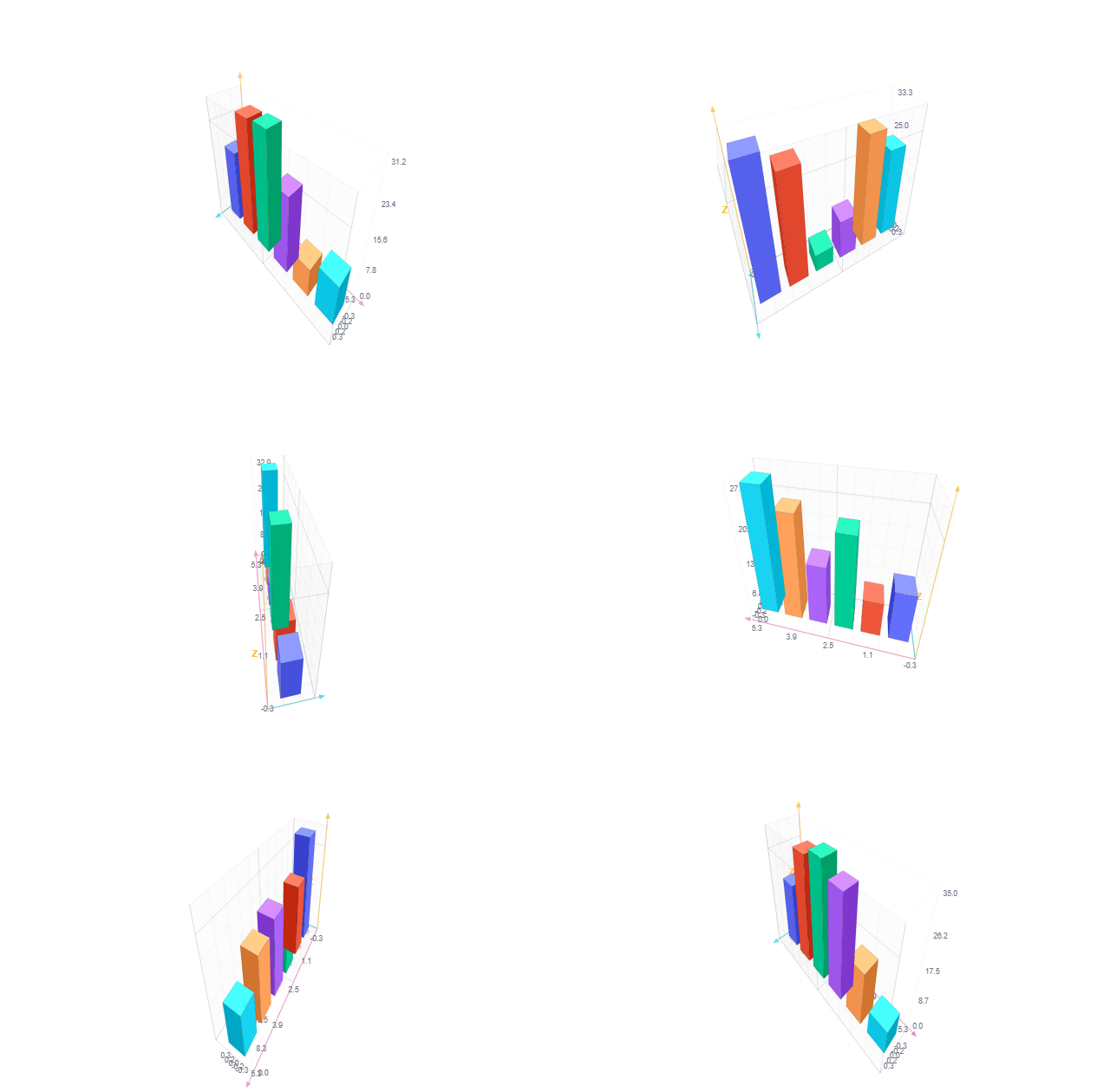
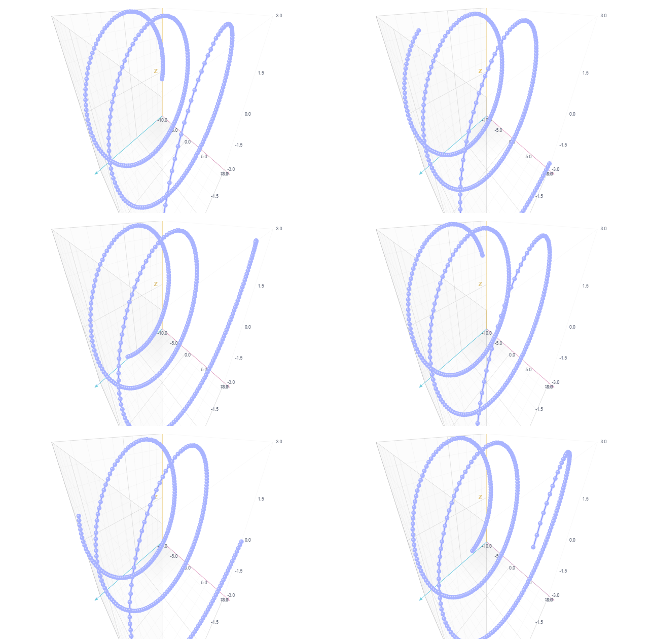
Full catalog of every variant’s own record()/push()/export_video() snippet, generated live from the Showcase registry:
Browse the full catalog
Method reference
Sera Pulse est la couche de streaming au-dessus de chaque chart natif : .push(), .push_vector(), .serve(), .record(), .replay(), .on_anomaly(). C’est gratuit, open-source, sans essai, sans licence, sans activation — comme le rendu des charts lui-même.
import seraplot as sp

chart = sp.scatter("Live feed", x=[], y=[])
chart.serve(port=8787)
chart.push([0, 1, 2], [1.2, 3.4, 2.1])
Ce qui est inclus
- Streaming —
push(),push_vector(),serve(),record()/replay(),on_anomaly(),export_standalone(). - Sera Secure —
SecureDFrame, chiffrement AES-256-GCM au repos, le texte en clair n’est jamais mis en cache ni journalisé. - Sera Firehose —
sp.firehose(...)+firehose_push(), un chart à buffer circulaire pour les flux très haute fréquence, rendu en WebGL2. - Sera Live — curseurs partagés en direct, commentaires épinglés, replay partagé sur tout chart
.serve(). - Sera Board —
serve_board()/export_board_html(), une toile infinie façon Figma de charts en direct et reliés. - SeraReport —
export_pdf(),export_docx(),export_pdf_report(). - SeraStudio —
export_gif(),export_video(), enregistrement/replay de session pour des clips de chart partageables.
Sera Secure
SecureDFrame est l’équivalent chiffré au repos (AES-256-GCM) de SeraDFrame — les colonnes restent en texte chiffré en mémoire, déchiffrées seulement le temps d’une lecture ou d’un rendu de chart :
import seraplot as sp

key = sp.SeraKey.generate()
frame = sp.SecureDFrame({"x": x_values, "y": y_values}, key.to_bytes())
chart_data = frame.to_chart_data("x", "y", key.to_bytes(), max_points=2000)
decrypt()/decrypt_column() redonnent du texte en clair à la demande ; to_chart_data()/to_chart_data_multi() déchiffrent, sous-échantillonnent et retournent des tableaux prêts pour le chart en une étape, sans jamais matérialiser de copie déchiffrée du reste du frame.
SeraReport
chart = sp.bar("Sales", labels=["Q1", "Q2", "Q3"], values=[120, 150, 90])
chart.export_pdf("sales.pdf")
chart.export_docx("sales.docx")
Conversion directe SVG vers PDF/DOCX, sans navigateur headless. export_pdf_report(charts, path, titles=None) combine plusieurs charts en un seul PDF multi-page. Nécessite un vrai contenu SVG — les charts assez grands pour dépasser leur seuil de rendu canvas natif se rendent en <canvas> à la place (même limite que export_svg()/export_png()). interactive=True (défaut) écrit aussi un .html compagnon avec un lien cliquable vers le chart en direct.
Ouvrir dans un nouvel onglet si votre navigateur ne prévisualise pas les PDF.
Sera Firehose
Un chart à buffer circulaire de taille fixe pour absorber des flux très rapides — ticks de capteurs, prix, latences de requêtes — sans bloquer l’onglet. Une fois plein, chaque nouvelle valeur écrase la plus ancienne :
chart = sp.firehose("CPU %", capacity=2_000, min_val=0.0, max_val=100.0)
chart.serve(port=8787)
for reading in sensor_stream():
    chart.firehose_push([reading])
Même limitation de débit, on_anomaly(), record()/replay(), diffusion .serve() que tout autre chart natif — rendu en WebGL2 plutôt qu’en <canvas>, donc le coût par point reste constant peu importe le nombre de valeurs arrivées depuis la dernière frame.
Ouvrir en autonome pour le voir en taille réelle.
Sera Live
Transforme tout chart .serve() en une salle partagée — chaque personne qui ouvre le lien voit les curseurs en direct, peut épingler une note ou dessiner directement sur le chart, et Replay together fait avancer toute la salle dans un enregistrement au même rythme :
chart = sp.bar("Error rate by region", labels=["us-east", "eu-west", "ap-south"], values=[12, 4, 31])
chart.record("incident.spls")
chart.serve(port=8787)
Les épingles sont de vraies annotations bookmark() — à lister ensuite avec chart.bookmarks(). collab=False désactive entièrement la présence, rien ne quitte votre machine.
Sera Board
Place plusieurs charts sur une seule toile infinie et déplaçable au lieu de cinq onglets de navigateur — une barre latérale les liste, chacun dans son propre cadre déplaçable :
errors = sp.bar("Error rate", labels=["us-east", "eu-west", "ap-south"], values=[12, 4, 31])
latency = sp.line("p99 latency (ms)", x=list(range(10)), y=[120, 118, 125, 400, 410, 190, 130, 128, 126, 124])
sp.serve_board([errors, latency], titles=["Errors", "Latency"], session="incident-01", port=8787)
serve_board() relie Sera Board à Sera Live — curseurs, épingles et dessins partagés collent au cadre de chaque chart et le suivent. Une session nommée persiste la disposition/épingles/dessins sur disque entre deux exécutions. export_board_html() écrit le même tableau en un seul fichier autonome, sans serveur requis.
SeraStudio
Rend un enregistrement .spls en GIF ou vidéo partageable — fidèle à la famille du chart quand l’enregistrement porte sa source (un heatmap thématisé garde sa vraie grille de couleurs, pas un substitut générique) :
chart = sp.bar("Sensors", labels=[str(i) for i in range(600)], values=[10.0] * 600)
chart.record("session.spls")
chart.push([3], [14.5])
chart.stop_record()
chart.export_gif("session.gif", "session.spls")
chart.export_video("session.mp4", "session.spls", format="mp4", fps=30)
sort_by_value=True donne un effet course de barres. smooth=True interpole entre les états enregistrés au lieu de sauter. reveal=True dessine l’état final progressivement au lieu de rejouer les vrais push. format vaut mp4/webm/mov/mkv/avi (ffmpeg requis dans le PATH pour la vidéo).
Catalogue complet du snippet record()/push()/export_video() propre à chaque variante, généré en direct depuis le registre du Showcase :
Parcourir le catalogue complet
Référence des méthodes
VS Code Extension
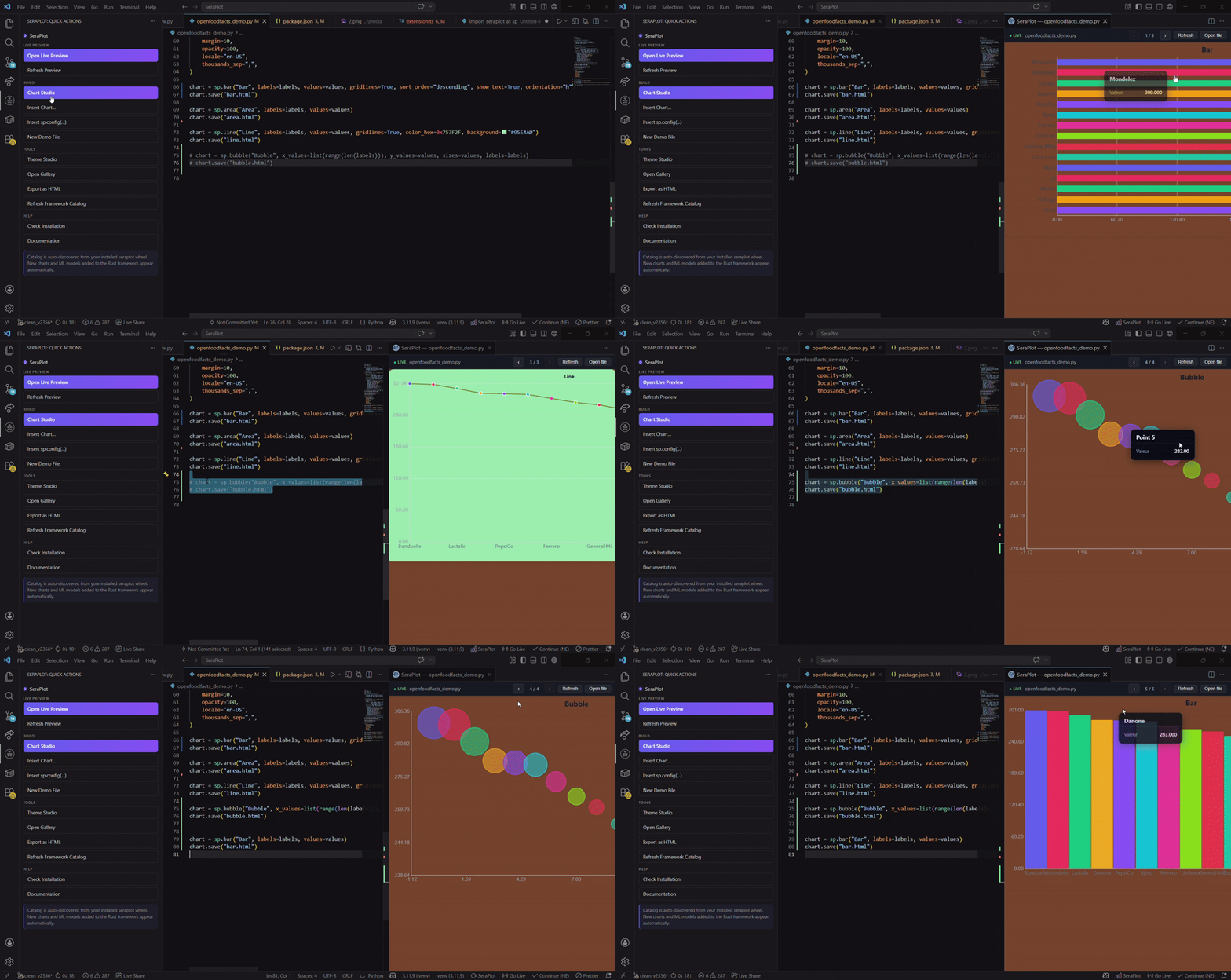
Official SeraPlot extension for Visual Studio Code — live preview, theme studio, snippets and a chart gallery.
Marketplace: https://marketplace.visualstudio.com/items?itemName=feur25.seraplot-vscode
Install
From the command palette or terminal — no browser needed:
ext install feur25.seraplot-vscodeOr from the Extensions view Ctrl+Shift+X, search SeraPlot:
Open in VS Code Marketplace →seraplot.pythonPath. Works on Windows, macOS and Linux.
Download the .vsix from the GitHub releases page, then install via terminal:
code --install-extension seraplot-vscode-0.6.1.vsixOr drag the .vsix file directly into the VS Code Extensions panel.
Commands
| ID | Title | Description |
|---|---|---|
seraplot.preview | SeraPlot: Live Preview | Render every sp.Chart of the current Python file in a side panel and refresh on save |
seraplot.themeStudio | SeraPlot: Open Theme Studio | Pick a palette + background, copy the generated sp.set_global_background(...) snippet |
seraplot.gallery | SeraPlot: Open Gallery | Browse all chart families with thumbnails and one-click code samples |
The Live Preview button also appears in the editor title bar for any .py file.
Snippets
| Prefix | Description |
|---|---|
seraplot-import | import seraplot as sp |
seraplot-bar | Minimal bar chart |
seraplot-scatter | Scatter chart |
seraplot-dashboard | 2x2 grid layout |
seraplot-automl | sp.auto_classify(...) skeleton |
seraplot-drift | sp.drift_detect(...) skeleton |
Settings
| Key | Default | Description |
|---|---|---|
seraplot.pythonPath | python | Python interpreter used to render previews |
seraplot.autoReload | true | Re-render on save |
Set seraplot.pythonPath to your project venv, e.g.
${workspaceFolder}/.venv/Scripts/python.exe on Windows or
${workspaceFolder}/.venv/bin/python on macOS / Linux.
How the preview works
- The active
.pyfile is executed viarunpy.run_pathin a child Python process usingseraplot.pythonPath. - Every
sp.Chartinstance found in the module globals is exported withsp.export_html(chart). - The HTML is concatenated and rendered inside a VS Code Webview panel.
- With
seraplot.autoReload = truethe panel re-runs automatically when the file is saved.
The preview is sandboxed in a Webview — no network access, no
eval. Charts are CSP-safe (seeconfig/csp.md).
Source
Repository: https://github.com/feur25/seraplot — folder seraplot-vscode/.
License: MIT.
Extension officielle SeraPlot pour Visual Studio Code — aperçu en direct, theme studio, snippets et galerie de graphiques.
Marketplace : https://marketplace.visualstudio.com/items?itemName=feur25.seraplot-vscode
Installation
Depuis la palette de commandes ou un terminal — sans navigateur :
ext install feur25.seraplot-vscodeOu depuis la vue Extensions Ctrl+Shift+X, cherchez SeraPlot :
Ouvrir dans le Marketplace VS Code →seraplot.pythonPath. Fonctionne sur Windows, macOS et Linux.
Téléchargez le .vsix depuis la page des releases GitHub, puis installez via le terminal :
code --install-extension seraplot-vscode-0.6.1.vsixOu glissez-déposez le fichier .vsix directement dans le panneau Extensions de VS Code.
Commandes
| ID | Titre | Description |
|---|---|---|
seraplot.preview | SeraPlot: Live Preview | Affiche tous les sp.Chart du fichier Python courant dans un panneau et rafraîchit à la sauvegarde |
seraplot.themeStudio | SeraPlot: Open Theme Studio | Choisir une palette + un fond, copier le snippet sp.set_global_background(...) généré |
seraplot.gallery | SeraPlot: Open Gallery | Parcourir toutes les familles de graphiques avec aperçus et exemples de code en un clic |
Le bouton Live Preview apparaît également dans la barre de titre de l’éditeur pour tout fichier .py.
Snippets
| Préfixe | Description |
|---|---|
seraplot-import | import seraplot as sp |
seraplot-bar | Graphique en barres minimal |
seraplot-scatter | Nuage de points |
seraplot-dashboard | Grille 2×2 |
seraplot-automl | Squelette sp.auto_classify(...) |
seraplot-drift | Squelette sp.drift_detect(...) |
Paramètres
| Clé | Défaut | Description |
|---|---|---|
seraplot.pythonPath | python | Interpréteur Python utilisé pour les aperçus |
seraplot.autoReload | true | Re-rendu à chaque sauvegarde |
Pointer seraplot.pythonPath vers le venv du projet, par exemple
${workspaceFolder}/.venv/Scripts/python.exe sous Windows ou
${workspaceFolder}/.venv/bin/python sous macOS / Linux.
Fonctionnement de l’aperçu
- Le fichier
.pyactif est exécuté viarunpy.run_pathdans un processus Python enfant utilisantseraplot.pythonPath. - Chaque instance
sp.Charttrouvée dans les globales du module est exportée avecsp.export_html(chart). - Le HTML est concaténé et rendu dans un panneau Webview de VS Code.
- Avec
seraplot.autoReload = true, le panneau se relance automatiquement à chaque sauvegarde du fichier.
L’aperçu est sandboxé dans un Webview — pas d’accès réseau, pas d’
eval. Les graphiques sont CSP-safe (voirconfig/csp.md).
Code source
Dépôt : https://github.com/feur25/seraplot — dossier seraplot-vscode/.
Licence : MIT.
About & Support
A solo project
SeraPlot is built entirely on my own, on top of a day job. I regularly rework the core of the framework to keep improving it — not because I'm the best at low-level optimisation, but because I care about delivering a complete solution that originally answered my own needs and hopefully answers yours too.
Get in touch
If you'd like a specific mechanic, feature or chart type, don't hesitate to reach out — by email only. I can't promise I'll build everything, but I'll do as much as I can.
Support the project
I work on SeraPlot for free, on top of my day job. If it saves you time, a donation is very welcome — but you absolutely don't need to donate to send me a feature request.
Donate via PayPalThanks for using Sera ✨
Un projet en solo
SeraPlot est entièrement réalisé seul, en plus d'un travail à plein temps. Je retravaille régulièrement le corps du framework pour continuer à l'améliorer — pas parce que je suis le meilleur en optimisation bas-niveau, mais parce que je tiens à offrir une solution complète qui répondait au départ à mes propres besoins et qui répond, j'espère, aussi aux vôtres.
Me contacter
Si vous voulez une mécanique, une fonctionnalité ou un type de graphique particulier, n'hésitez pas — par mail exclusivement. Je ne dis pas que je serai en capacité de tout réaliser, mais je ferai le plus possible.
Soutenir le projet
Je travaille sur SeraPlot gratuitement, en plus de mon travail. Si cela vous fait gagner du temps, un don est le bienvenu — mais il n'y a aucun besoin de faire un don pour me faire une demande de fonctionnalité.
Soutenir via PayPalMerci d'utiliser Sera ✨