Keyboard shortcuts

Press or to navigate between chapters

Press S or / to search in the book

Press ? to show this help

Press Esc to hide this help

SeraPlot

Plot anything. Train anything. Ship anywhere.

A Rust-native engine for visualization, machine learning, and zero-friction delivery — 6,000× faster than Plotly, 200× smaller, zero dependencies.

PyPI npm License

Seraplot, More than a charting library

SeraPlot is a complete data toolkit written in Rust. The same engine powers your visualizations, your machine learning, and the way you ship results to other people.

PillarWhat you get
Plot57 chart types — 33 in 2D, 17 in 3D (WebGL), 2 maps. Built-in themes, palettes, animation, zoom, crosshair, export.
TrainScikit-learn-compatible ML in Rust — DBSCAN, K-Means, RandomForest, GradientBoosting, SVM, PCA, GridSearchCV, train/test split. 1.3× to 686× faster.
Stream & scaleLive updates, downsampling for millions of points, drift detection, AutoML, diff mode, facet grids.
ShipSelf-contained 21 KB HTML — no CDN, no backend, works offline, by email, in S3, in PDFs, in Notion, in air-gapped CI.
IntegratePython, JavaScript, TypeScript, Rust. Drop-in seraplot.matplotlib as plt migration. Pandas / NumPy native.
AuthorNative VS Code extension — live preview, gallery, theme studio, snippets, auto-detection of labels / values from your code.
Persist & exportSave to HTML, PNG, SVG, PDF, pickle. Re-load trained ML models. CSP-safe output.
Stay accessibleA11y-tagged SVG, semantic HTML, keyboard navigation, locale-aware number formatting.

One library replaces: matplotlib + plotly + dash + streamlit + seaborn + parts of scikit-learn — with one pip install and zero runtime dependencies.


Same chart — three libraries

import seraplot as sp
sp.bar("Revenue by Product", labels, values).save("chart.html")
import plotly.express as px
fig = px.bar(x=labels, y=values, title="Revenue by Product")
fig.update_layout(template="plotly_white")
fig.write_html("chart.html")
import matplotlib.pyplot as plt
fig, ax = plt.subplots(figsize=(9, 5))
ax.bar(labels, values, color="#6366f1")
ax.set_title("Revenue by Product")
ax.set_ylabel("Revenue")
plt.tight_layout()
plt.savefig("chart.png")
SeraPlotPlotlyMatplotlib
Lines of code247
OutputHTMLHTMLPNG
File size21 KB4.7 MB~150 KB
Interactive
Dependencies06+3+
1-line migration

Why Seraplot?

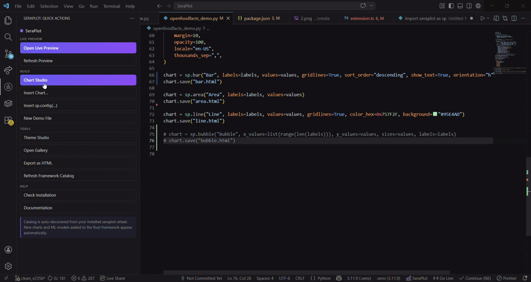
As you’ve probably understood by now, Seraplot is a tool designed to be extremely customizable, while also being much faster and more resource-efficient than existing solutions. It also provides a wide range of helpful features, such as the Seraplot extension for VSCode, which allows you to generate plots or ML methods very quickly and live, between each save of your scripts.

In addition, Seraplot is available across multiple languages such as: JS/TS, C (C# & C++), Java, Rust, Python, R & Scala. The main goal is to be highly accessible: from one language to another, the commands remain the same for greater simplicity.

In summary, Seraplot is a much more practical and independent tool that enables the generation of 2D & 3D plots, while also aiming to provide machine learning-related methods that you will find throughout the documentation. More surprises await you, such as the ability to choose different themes, a chunk system in case of crashes to resume from the error point, and even multiple aliases to use the same method (e.g., sp.build_bar_chart / sp.bar_chart / sp.bar / sp.bars).


1000 charts. Measured.

Same code, same random data, same machine. Full HTML output timed.

import seraplot as sp
categories = ["Electronics", "Clothing", "Food", "Books", "Sports", "Toys", "Health", "Auto"]
data = [...]  # 1000 pre-generated lists
for i in range(1000):
    sp.bar(f"Report #{i+1}", categories, data[i]).html

1000 charts in 6 ms — 6 µs/chart

import plotly.graph_objects as go
categories = ["Electronics", "Clothing", "Food", "Books", "Sports", "Toys", "Health", "Auto"]
data = [...]  # same 1000 pre-generated lists
for i in range(1000):
    fig = go.Figure(data=[go.Bar(x=categories, y=data[i])])
    fig.update_layout(title=f"Report #{i+1}", template="plotly_dark")
    fig.to_html(full_html=True, include_plotlyjs="cdn")

1000 charts in 37,023 ms — 6,170× slower

import matplotlib
matplotlib.use("Agg")
import matplotlib.pyplot as plt
categories = ["Electronics", "Clothing", "Food", "Books", "Sports", "Toys", "Health", "Auto"]
data = [...]  # same 1000 pre-generated lists
for i in range(1000):
    fig, ax = plt.subplots(figsize=(9, 5))
    ax.bar(categories, data[i])
    ax.set_title(f"Report #{i+1}")
    fig.savefig(f"chart_{i}.png")
    plt.close()

1000 charts in 60,352 ms — 10,058× slower

ScaleSeraPlotPlotlyMatplotlib
1,000 charts6 ms37 s60 s
10,000 charts~60 ms~6 min~10 min
100,000 charts~600 ms~1 h~1.7 h

Render core speed

Benchmark: Diabetes dataset (n=768, 40 runs). Rust render time — chart object creation, not full HTML serialization.

Pie
7,956×
Bar
6,488×
Lollipop
3,983×
Grouped Bar
3,596×
Candlestick
2,038×
Radar
1,498×
KDE
753×
ChartSeraPlotPlotly figurePlotly → HTMLMatplotlib
Pie4.272533,41615,085
Bar2.865818,16613,596
Grouped Bar5.055817,98117,445
Histogram12.42,49632,76237,973
Scatter17.03,91621,61514,141
Violin16.72,61621,34721,211
Box Plot18.42,32921,79915,590
KDE26.32,98119,80740,108
Radar11.896217,67920,942
Lollipop6.38,38225,0969,072
Candlestick8.81,47817,934N/A
Ridgeline88.8N/AN/AN/A

All times in µs.


Output file size

Plotly embeds its entire JavaScript bundle in every HTML file. SeraPlot only includes the JS needed for that specific chart type.

Pie
19 KB vs 4,733 KB — 246×
Bar
21 KB vs 4,733 KB — 225×
Scatter
39 KB vs 4,740 KB — 121×
Radar
23 KB vs 4,733 KB — 205×

Matplotlib outputs PNG/SVG/PDF (50-500 KB) — not interactive HTML.


What SeraPlot actually is

SeraPlot is not a wrapper around Plotly, Chart.js, or D3.

It is a Rust-native rendering engine that generates minimal HTML + JS per chart. A Pie chart gets Pie JS. A Bar chart gets Bar JS. Nothing else is bundled.

That's why the output is 20 KB instead of 4.7 MB.


One line migration

import seraplot.matplotlib as plt

Everything else stays the same. plt.bar(), plt.scatter(), plt.hist(), plt.show(), plt.savefig() — unchanged.


Deploy from an API

from fastapi import FastAPI
import seraplot as sp
app = FastAPI()
@app.get("/chart")
def revenue_chart():
    return sp.bar("Revenue", labels, values).html
from fastapi import FastAPI
from fastapi.responses import HTMLResponse
import plotly.express as px
app = FastAPI()
@app.get("/chart", response_class=HTMLResponse)
def revenue_chart():
    fig = px.bar(x=labels, y=values, title="Revenue")
    return fig.to_html(full_html=True)
from fastapi import FastAPI
from fastapi.responses import FileResponse
import matplotlib
matplotlib.use("Agg")
import matplotlib.pyplot as plt
import tempfile
app = FastAPI()
@app.get("/chart")
def revenue_chart():
    fig, ax = plt.subplots(figsize=(9, 5))
    ax.bar(labels, values)
    ax.set_title("Revenue")
    path = tempfile.mktemp(suffix=".png")
    plt.savefig(path)
    plt.close()
    return FileResponse(path, media_type="image/png")

Plotly returns 4.7 MB per request. Matplotlib requires disk I/O and returns a static PNG. SeraPlot returns 21 KB of interactive HTML directly from RAM.


Everything SeraPlot does

  • 57 chart types — every 2D chart has a 3D WebGL variant
  • Drop-in matplotlib APIimport seraplot.matplotlib as plt
  • Pandas & NumPy native — pass DataFrames directly
  • 7 built-in themes — dark, light, scientific, apple, notion, minimal, neon
  • Global configsp.config() sets font, zoom, crosshair, animation across all charts
  • Zero dependencies — pure Rust renderer
  • 200× smaller files — no bundled JS runtime
  • Multi-language — Python, JavaScript/TypeScript (npm), Rust, R, Scala, C#, C++, Java
  • DBSCAN up to 600× faster than scikit-learn
  • Native Machine learning — some ml methods is include by default in this tool
  • Works everywhere — Python ≥ 3.8, any OS

Seraplot - Bien plus qu'une bibliothèque de graphiques

« Tout tracer. Tout entraîner. Partout déployer. »

SeraPlot est une boîte à outils data complète écrite en Rust. Le même moteur propulse vos visualisations, votre machine learning, et la façon dont vous livrez les résultats à vos collègues.

PilierCe que vous obtenez
Tracer57 types de graphiques — 33 en 2D, 17 en 3D (WebGL), 2 cartes. Thèmes intégrés, palettes, animations, zoom, crosshair, export.
EntraînerML compatible scikit-learn en Rust — DBSCAN, K-Means, RandomForest, GradientBoosting, SVM, PCA, GridSearchCV, train/test split. De 1,3× à 686× plus rapide.
Streamer & passer à l'échelleMises à jour en direct, downsampling pour des millions de points, détection de drift, AutoML, mode diff, grilles de facettes.
DéployerHTML autonome de 21 Ko — pas de CDN, pas de backend, fonctionne hors-ligne, par e-mail, sur S3, dans des PDF, dans Notion, en CI isolée.
IntégrerPython, JavaScript, TypeScript, Rust. Migration directe seraplot.matplotlib as plt. Pandas / NumPy nativement.
CoderExtension VS Code native — aperçu en direct, galerie, studio de thèmes, snippets, détection automatique des labels / values depuis votre code.
Persister & exporterExport HTML, PNG, SVG, PDF, pickle. Rechargement des modèles ML entraînés. Sortie compatible CSP.
Rester accessibleSVG balisé a11y, HTML sémantique, navigation clavier, formatage numérique localisé.

Une seule librairie remplace : matplotlib + plotly + dash + streamlit + seaborn + une partie de scikit-learn — avec un seul pip install et zéro dépendance d'exécution.


Même graphique — trois bibliothèques

import seraplot as sp
sp.bar("Chiffre d'affaires par produit", labels, values).save("chart.html")
import plotly.express as px
fig = px.bar(x=labels, y=values, title="Chiffre d'affaires par produit")
fig.update_layout(template="plotly_white")
fig.write_html("chart.html")
import matplotlib.pyplot as plt
fig, ax = plt.subplots(figsize=(9, 5))
ax.bar(labels, values, color="#6366f1")
ax.set_title("Chiffre d'affaires par produit")
ax.set_ylabel("Chiffre d'affaires")
plt.tight_layout()
plt.savefig("chart.png")
SeraPlotPlotlyMatplotlib
Lignes de code247
SortieHTMLHTMLPNG
Taille fichier21 Ko4,7 Mo~150 Ko
Interactif
Dépendances06+3+
Migration 1 ligne

Pourquoi Seraplot ?

Comme vous l’aurez compris en arrivant jusqu’ici, Seraplot est un outil qui a pour objectif d’être extrêmement personnalisable, mais aussi beaucoup plus rapide et moins gourmand que ce qui existe déjà, en plus de proposer tout un panel d’aides, comme l’extension Seraplot dans VSCode, qui vous permettra de générer des plots ou des méthodes ML très rapidement et en live, entre chaque sauvegarde de vos scripts.

En plus de cela, Seraplot se voit distribué dans différents langages comme : JS/TS, C (C# & C++), Java, Rust, Python, R & Scala. L’objectif étant vraiment d’être ultra accessible : d’un langage à un autre, les commandes restent les mêmes pour plus de simplicité.

Pour résumer, Seraplot est un outil beaucoup plus pratique de ce qui existe déjà et complétement indépendant, en plus de compilé différente fonctionnalitée. En autre il permet la génération de plots 2D & 3D, mais aussi qui tend à proposer des méthodes liées au ML, que vous pourrez retrouver au cours de votre documentation. D’autres surprises vous attendent, que ce soit la possibilité de choisir différents thèmes, ou bien le système de chunks en cas de crash pour reprendre au point d’erreur, ou encore pour n'en citer que un dernier, le fait d’avoir différents alias pour utiliser une même méthode (ex : sp.build_bar_chart / sp.bar_chart / sp.bar / sp.bars).


1 000 graphiques. Mesurés.

Même code, mêmes données aléatoires, même machine. Sortie HTML complète chronométrée.

import seraplot as sp
categories = ["Électronique", "Vêtements", "Alimentation", "Livres", "Sport", "Jouets", "Santé", "Auto"]
data = [...]
for i in range(1000):
    sp.bar(f"Rapport #{i+1}", categories, data[i]).html

1 000 graphiques en 6 ms — 6 µs/graphique

import plotly.graph_objects as go
categories = ["Électronique", "Vêtements", "Alimentation", "Livres", "Sport", "Jouets", "Santé", "Auto"]
data = [...]
for i in range(1000):
    fig = go.Figure(data=[go.Bar(x=categories, y=data[i])])
    fig.update_layout(title=f"Rapport #{i+1}", template="plotly_dark")
    fig.to_html(full_html=True, include_plotlyjs="cdn")

1 000 graphiques en 37 023 ms — 6 170× plus lent

import matplotlib
matplotlib.use("Agg")
import matplotlib.pyplot as plt
categories = ["Électronique", "Vêtements", "Alimentation", "Livres", "Sport", "Jouets", "Santé", "Auto"]
data = [...]
for i in range(1000):
    fig, ax = plt.subplots(figsize=(9, 5))
    ax.bar(categories, data[i])
    ax.set_title(f"Rapport #{i+1}")
    fig.savefig(f"chart_{i}.png")
    plt.close()

1 000 graphiques en 60 352 ms — 10 058× plus lent

ÉchelleSeraPlotPlotlyMatplotlib
1 000 graphiques6 ms37 s60 s
10 000 graphiques~60 ms~6 min~10 min
100 000 graphiques~600 ms~1 h~1,7 h

Vitesse du moteur de rendu

Benchmark : dataset Diabetes (n=768, 40 itérations). Temps de rendu Rust — création de l'objet graphique, pas la sérialisation HTML complète.

Camembert
7 956×
Barres
6 488×
Sucette
3 983×
Barres groupées
3 596×
Bougie
2 038×
Radar
1 498×
KDE
753×
GraphiqueSeraPlotPlotly figurePlotly → HTMLMatplotlib
Camembert4,272533 41615 085
Barres2,865818 16613 596
Barres groupées5,055817 98117 445
Histogramme12,42 49632 76237 973
Nuage de points17,03 91621 61514 141
Violon16,72 61621 34721 211
Boîte à moustaches18,42 32921 79915 590
KDE26,32 98119 80740 108
Radar11,896217 67920 942
Sucette6,38 38225 0969 072
Bougie8,81 47817 934N/A
Ridgeline88,8N/AN/AN/A

Toutes les valeurs en µs.


Taille des fichiers de sortie

Plotly embarque tout son bundle JavaScript dans chaque fichier HTML. SeraPlot n'inclut que le JS nécessaire au type de graphique spécifique.

Camembert
19 Ko vs 4 733 Ko — 246×
Barres
21 Ko vs 4 733 Ko — 225×
Nuage de points
39 Ko vs 4 740 Ko — 121×
Radar
23 Ko vs 4 733 Ko — 205×

Matplotlib produit du PNG/SVG/PDF (50–500 Ko) — pas du HTML interactif.


Ce qu'est réellement SeraPlot

SeraPlot n'est pas un wrapper autour de Plotly, Chart.js ou D3.

C'est un moteur de rendu natif Rust qui génère du HTML + JS minimal par graphique. chaque chart reçoit soit js dédiée. Rien d'autre n'est embarqué.

C'est pour ça que la sortie fait 20 Ko au lieu de 4,7 Mo.


Migration en une ligne

import seraplot.matplotlib as plt

Tout le reste reste identique. plt.bar(), plt.scatter(), plt.hist(), plt.show(), plt.savefig() — inchangés.


Déployer depuis une API

from fastapi import FastAPI
import seraplot as sp
app = FastAPI()
@app.get("/chart")
def revenue_chart():
    return sp.bar("Chiffre d'affaires", labels, values).html
from fastapi import FastAPI
from fastapi.responses import HTMLResponse
import plotly.express as px
app = FastAPI()
@app.get("/chart", response_class=HTMLResponse)
def revenue_chart():
    fig = px.bar(x=labels, y=values, title="Chiffre d'affaires")
    return fig.to_html(full_html=True)
from fastapi import FastAPI
from fastapi.responses import FileResponse
import matplotlib
matplotlib.use("Agg")
import matplotlib.pyplot as plt
import tempfile
app = FastAPI()
@app.get("/chart")
def revenue_chart():
    fig, ax = plt.subplots(figsize=(9, 5))
    ax.bar(labels, values)
    ax.set_title("Chiffre d'affaires")
    path = tempfile.mktemp(suffix=".png")
    plt.savefig(path)
    plt.close()
    return FileResponse(path, media_type="image/png")

Plotly retourne 4,7 Mo par requête. Matplotlib nécessite des I/O disque et retourne un PNG statique. SeraPlot retourne 21 Ko de HTML interactif directement depuis la RAM.


Tout ce que SeraPlot fait

  • 57 types de graphiques — chaque graphique 2D a une variante 3D WebGL
  • API matplotlib drop-inimport seraplot.matplotlib as plt
  • Pandas & NumPy natifs — passez les DataFrames directement
  • 7 thèmes intégrés — dark, light, scientific, apple, notion, minimal, neon
  • Configuration globalesp.config() définit la police, le zoom, le réticule, l'animation pour tous les graphiques
  • Zéro dépendance — moteur de rendu Rust pur
  • Fichiers 200× plus petits — pas de runtime JS embarqué
  • Multi-langage — Python, JavaScript/TypeScript (npm), Rust, R, Scala, C#, C++, Java
  • DBSCAN jusqu'à 600× plus rapide que scikit-learn
  • Machine learning natif — Plusieurs methods ml, sont déjà existante dans le framework
  • Fonctionne partout — Python ≥ 3.8, tout OS

Installation

Requirements

  • Python 3.8+
  • pip 21+

SeraPlot ships as a compiled Rust extension (.pyd / .so) bundled in the wheel. There is no compiler required on the user side — the binary is pre-built for each platform.


pip

pip install seraplot
pip install seraplot==2.3.61
pip install --upgrade seraplot

uv

uv is a fast Python package manager written in Rust.

uv add seraplot

conda

conda install -c conda-forge seraplot

Or add it to your environment.yml:

dependencies:
  - pip:
    - seraplot

Why the install is this simple

SeraPlot has zero required Python dependencies. The Rust extension is entirely self-contained — the HTML output embeds its own JavaScript inline and does not load anything from a CDN. This means:

  • charts work offline, in air-gapped environments, in emails, in PDF exports via browser print
  • no version conflict with your numpy, pandas, or scipy
  • wheels available for Windows, Linux, and macOS — no compilation needed

For comparison, pip install plotly downloads ~15 MB. pip install seraplot downloads ~2 MB.

Prérequis

  • Python 3.8+
  • pip 21+

SeraPlot se distribue sous forme d'extension Rust compilée (.pyd / .so) incluse dans le wheel. Aucun compilateur n'est requis côté utilisateur — le binaire est pré-compilé pour chaque plateforme.


pip

pip install seraplot
pip install seraplot==2.3.61
pip install --upgrade seraplot

uv

uv est un gestionnaire de paquets Python rapide écrit en Rust.

uv add seraplot

conda

conda install -c conda-forge seraplot

Ou dans votre environment.yml :

dependencies:
  - pip:
    - seraplot

Pourquoi l'installation est aussi simple

SeraPlot n'a aucune dépendance Python requise. L'extension Rust est entièrement autonome — le HTML embarque son propre JavaScript sans rien charger depuis un CDN. Concrètement :

  • les graphiques fonctionnent hors ligne, en environnement isolé, par e-mail, en impression PDF
  • aucun conflit de version avec numpy, pandas ou scipy
  • wheels disponibles pour Windows, Linux et macOS — aucune compilation nécessaire

Pour comparaison, pip install plotly télécharge ~15 Mo. pip install seraplot télécharge ~2 Mo.

Démarrage rapide

Your first chart

import seraplot as sp
chart = sp.build_bar_chart(
    "Sales by Region",
    labels=["North", "South", "East", "West"],
    values=[120.0, 85.0, 200.0, 140.0],
)
const sp = require('seraplot');
const chart = sp.build_bar_chart("Sales by Region", ["North", "South", "East", "West"], {
    values: [120.0, 85.0, 200.0, 140.0],
});
import * as sp from 'seraplot';
const chart = sp.build_bar_chart("Sales by Region", ["North", "South", "East", "West"], {
    values: [120.0, 85.0, 200.0, 140.0],
});

In Jupyter, the chart displays automatically.


Save to HTML

chart.save(plot_name.html)
chart.save(plot_name.html);

Votre premier graphique

import seraplot as sp
chart = sp.build_bar_chart(
    "Ventes par région",
    labels=["Nord", "Sud", "Est", "Ouest"],
    values=[120.0, 85.0, 200.0, 140.0],
)
const sp = require('seraplot');
const chart = sp.build_bar_chart("Ventes par région", ["Nord", "Sud", "Est", "Ouest"], {
    values: [120.0, 85.0, 200.0, 140.0],
});
import * as sp from 'seraplot';
const chart = sp.build_bar_chart("Ventes par région", ["Nord", "Sud", "Est", "Ouest"], {
    values: [120.0, 85.0, 200.0, 140.0],
});

Dans Jupyter, le graphique s'affiche automatiquement.


Enregistrer en HTML

chart.save(nom_du_plot.html)
chart.save(nom_du_plot.html);

Chart Object

Every SeraPlot function returns a Chart object — a thin wrapper around a complete, standalone HTML string.


Properties

PropertyTypeDescription
htmlstrFull self-contained HTML string
chart = sp.build_bar_chart("Title", labels=["A", "B"], values=[1.0, 2.0])
print(type(chart.html))   # <class 'str'>
print(len(chart.html))    # typically 20,000–90,000 bytes

Auto-display in Jupyter

Charts display automatically when created inside a Jupyter cell. No display() call needed.

To disable:

sp.set_auto_display(False)
chart = sp.build_bar_chart("My Chart", labels=["A"], values=[1.0])

Manual display

you don't need anything, you just do make your chart, seraplot has a native display inside


Export to file

chart.save("output.html")
# or
with open("output.html", "w", encoding="utf-8") as f:
    f.write(chart.html)

Method chaining

chart = (
    sp.build_bar_chart("Sales", labels, values)
    .set_bg("#1e1e2e")
    .show_grid()
    .no_legend()
    .set_font_size(14)
)

See Chart Methods for the full reference.

Chaque fonction SeraPlot retourne un objet Chart — un wrapper léger autour d'une chaîne HTML complète et autonome.


Propriétés

PropriétéTypeDescription
htmlstrChaîne HTML complète et autonome
chart = sp.build_bar_chart("Titre", labels=["A", "B"], values=[1.0, 2.0])
print(len(chart.html))    # typiquement 20 000 à 90 000 octets

Affichage automatique dans Jupyter

Les graphiques s'affichent automatiquement à la fin d'une cellule Jupyter. Aucun appel à display() n'est nécessaire.

Pour désactiver :

sp.set_auto_display(False)

Affichage manuel

Comme dit au précédemment, vous n'avez aucunement besoin de rien, juste de crée votre chart, Seraplot à une fonction native d'affichage


Export vers fichier

chart.save("sortie.html")
# ou
with open("sortie.html", "w", encoding="utf-8") as f:
    f.write(chart.html)

Chaînage de méthodes

chart = (
    sp.build_bar_chart("Ventes", labels, values)
    .set_bg("#1e1e2e")
    .show_grid()
    .no_legend()
    .set_font_size(14)
)

Voir Méthodes du graphique pour la référence complète.

Chart Methods

These methods are available on every Chart object returned by any SeraPlot function. They all return a new Chart, so they can be chained freely.


Global config (automatic inheritance)

sp.config(**kwargs)

Set once, every chart created after inherits the configuration automatically. No per-chart override needed.

ParameterTypeEffect
fontstrFont family for all text (e.g., "Inter", "Roboto")
font_sizeintBase font size in px
title_sizeintTitle font size in px
crosshairboolCrosshair lines follow mouse hover
zoomboolMouse wheel zoom + pan (double-click resets)
animationboolFade-in animation on chart elements
animation_durationintDuration (ms), default 300
export_buttonboolDownload button on each chart
responsiveboolAuto-resize to container width
border_radiusintContainer border radius (px)
marginintContainer padding (px)
opacityfloatElement opacity 0.01.0
backgroundstrBackground color (any CSS color)
gridlinesboolShow grid lines in chart
palettelist[int]Color palette as hex ints (e.g., [0x6366F1, 0xFB7185])
localestrNumber formatting locale
thousands_sepstrThousands separator char
tooltipstrTooltip mode
import seraplot as sp

sp.config(
    font="Inter",
    font_size=14,
    title_size=22,
    crosshair=True,
    zoom=True,
    animation=True,
    animation_duration=500,
    export_button=True,
    responsive=True,
    border_radius=12,
    margin=16,
    opacity=0.85,
    background="#0f172a",
    gridlines=True,
    palette=[0x818CF8, 0xFB7185, 0x34D399, 0xFBBF24],
)

chart1 = sp.bar("Revenue", ["Q1", "Q2", "Q3"], [120, 180, 140])     # inherits ALL config
chart2 = sp.line("Trend", ["Jan", "Feb", "Mar"], [100, 110, 105])   # same config
chart3 = sp.scatter("Correlation", [1, 2, 3], [10, 20, 30])         # same config

sp.reset_config()

Reset all global config to defaults (no background, no crosshair, no zoom, etc.).

sp.reset_config()
chart = sp.bar("Clean", labels, values)  # back to defaults

Per-chart override (method chaining)

Override global config for individual charts:

MethodEffect
.font("Inter")Override font family
.title_size(22)Override title size
.set_font_size(14)Override base font size
.crosshair()Enable/add crosshair on this chart
.zoom()Enable/add zoom on this chart
.animate(300)Add animation (ms)
.export_button()Add download button
.responsive()Make responsive
.border_radius(12)Set border radius
.set_opacity(0.85)Set element opacity
.set_margin(16)Set padding
.set_bg("#color")Override background
import seraplot as sp

sp.config(font="Inter", background="#0f172a", gridlines=True)

chart1 = sp.bar("Default", labels, values)           # uses config
chart2 = sp.bar("Override", labels, values).font("Roboto").border_radius(20)  # different font + radius
chart3 = sp.line("Clean", dates, values).zoom()       # adds zoom on top of config

Background and frame

set_bg(color=None)

Sets the background color of the full HTML wrapper.

chart = sp.build_bar_chart("Sales", labels, values).set_bg("#0f172a")
chart = sp.build_scatter_chart("Data", x, y).set_bg("white")
chart = sp.build_pie_chart("Share", labels, values).set_bg(None)  # transparent

Accepts any CSS color string: "#rrggbb", "rgb(r,g,b)", named colors, or None/"transparent".


set_frame(color=None)

Sets the SVG canvas background independently of the HTML wrapper. Useful when embedding the chart inside a page with its own background.

chart = sp.build_bar_chart("Title", labels, values).set_frame("transparent")

set_global_background(color)

Module-level functions that apply a background to all charts created after the call — useful for notebook sessions with a consistent theme.

sp.set_global_background("#0f172a")   # all subsequent charts use this bg
chart1 = sp.build_bar_chart(...)
chart2 = sp.build_scatter_chart(...)
sp.reset_global_background()          # restore per-chart default
sp.set_global_background("#0f172a");  // all subsequent charts use this bg
const chart1 = sp.build_bar_chart(...);
const chart2 = sp.build_scatter_chart(...);
sp.reset_global_background();         // restore per-chart default
sp.set_global_background("#0f172a");  // all subsequent charts use this bg
const chart1 = sp.build_bar_chart(...);
const chart2 = sp.build_scatter_chart(...);
sp.reset_global_background();         // restore per-chart default

Grid and axes

show_grid()

Force gridlines on regardless of the gridlines parameter used at chart creation.

chart = sp.build_histogram("Ages", values).show_grid()

hide_grid()

Force gridlines off regardless of the gridlines parameter used at chart creation.

chart = sp.build_line_chart("Trend", labels, values, gridlines=True).hide_grid()

no_x_axis()

Removes the X-axis lines, ticks, and labels.

chart = sp.build_bar_chart("", labels, values).no_x_axis()   # keep Y only

no_y_axis()

Removes the Y-axis lines, ticks, and labels.

chart = sp.build_bar_chart("", labels, values).no_y_axis()   # keep X only

no_axes()

Removes both axes at once.

chart = sp.build_scatter_chart("", x, y).no_axes()           # remove both axes

Labels and text

show_labels(position="bottom", labels=None, colors=None)

Renders a text label on each chart element. position can be "top", "bottom", "left", or "right".

# Automatic labels derived from the chart data
chart = sp.build_bar_chart("Revenue", labels, values).show_labels(position="top")

# Custom label text per element
chart = sp.build_bar_chart("Revenue", labels, values).show_labels(
    position="top",
    labels=["$142k", "$98k", "$210k"],
    colors=["#22c55e", "#ef4444", "#22c55e"],
)

no_title()

Removes the chart title from the rendered output.

chart = sp.build_pie_chart("Internal label", labels, values).no_title()

no_legend()

Removes the legend from the rendered output.

chart = sp.build_grouped_bar("Q1", cats, series).no_legend()

set_font_size(px)

Override all text sizes in the SVG with a single pixel value.

chart = sp.build_radar_chart("Skills", labels, values).set_font_size(11)

Size and scale

scale(factor)

Scales the entire chart (SVG and canvas). Useful to produce thumbnail or high-DPI variants.

small = sp.build_bar_chart("Sales", labels, values).scale(0.5)
large = sp.build_bar_chart("Sales", labels, values).scale(2.0)

Hover

no_hover()

Disables the tooltip engine. All data-idx pointer events are removed. Useful for static embeds where hover interaction is unwanted.

chart = sp.build_scatter_chart("Distribution", x, y).no_hover()

CSS and JavaScript injection

inject_css(css)

Injects a <style> block into the HTML <head>. Gives complete access to the SVG DOM — override any internal class, change colors, animations, fonts.

SeraPlot's internal CSS classes:

ClassTarget
svg textAll text in the chart
.sp-glGridlines
.sp-ax-x, .sp-ax-yAxis lines
.sp-xt, .sp-ytAxis tick labels
.sp-xl, .sp-ylAxis title labels
g[data-legend]Legend group
.sp-ttlChart title
[data-idx]Interactive data elements (hover targets)
rect.sp-bgSVG background rect
chart = sp.build_bar_chart("Dark theme", labels, values).inject_css("""
    rect.sp-bg  { fill: #0f172a !important; }
    svg text    { fill: #e2e8f0 !important; }
    .sp-gl      { stroke: #1e293b !important; }
    [data-idx]  { opacity: 0.85; }
    [data-idx]:hover { filter: brightness(1.3); }
""")

inject_js(js)

Injects a <script> block before </body>. The entire rendered SVG DOM is accessible. Use it to add event listeners, animations, or third-party integrations.

# Highlight every bar on load
chart = sp.build_bar_chart("Sales", labels, values).inject_js("""
    document.querySelectorAll('[data-idx]').forEach((el, i) => {
        setTimeout(() => el.style.opacity = '1', i * 50);
    });
""")

# Export SVG on button click
chart = sp.build_scatter_chart("Data", x, y).inject_js("""
    const btn = document.createElement('button');
    btn.textContent = 'Download SVG';
    btn.onclick = () => {
        const svg  = document.querySelector('svg').outerHTML;
        const a    = document.createElement('a');
        a.href     = 'data:image/svg+xml;charset=utf-8,' + encodeURIComponent(svg);
        a.download = 'chart.svg';
        a.click();
    };
    document.body.appendChild(btn);
""")

Export

save(path)

Writes the HTML to a file.

chart = sp.build_pie_chart("Share", labels, values)
chart.save("report/pie.html")

to_svg()

Extracts the raw SVG string from the HTML.

svg_string = chart.to_svg()

export_svg(path)

Writes only the SVG to a file (no HTML wrapper).

chart.export_svg("chart.svg")

Ces méthodes sont disponibles sur chaque objet Chart retourné par n'importe quelle fonction SeraPlot. Elles retournent toutes un nouveau Chart — elles peuvent donc être chaînées librement.


Configuration globale (héritage automatique)

sp.config(**kwargs)

Définie une fois, chaque graphique créé ensuite hérite automatiquement de la configuration. Aucune surcharge par graphique nécessaire.

ParamètreTypeEffet
fontstrPolice pour tout le texte (ex. "Inter", "Roboto")
font_sizeintTaille de police de base en px
title_sizeintTaille de police du titre en px
crosshairboolRéticule qui suit la souris au survol
zoomboolZoom molette + déplacement (double-clic réinitialise)
animationboolAnimation d'apparition sur les éléments
animation_durationintDurée (ms), défaut 300
export_buttonboolBouton de téléchargement sur chaque graphique
responsiveboolRedimensionnement automatique à la largeur du conteneur
border_radiusintRayon des coins du conteneur (px)
marginintMarge intérieure du conteneur (px)
opacityfloatOpacité des éléments 0.01.0
backgroundstrCouleur de fond (toute couleur CSS)
gridlinesboolAfficher les lignes de grille
palettelist[int]Palette de couleurs en entiers hex (ex. [0x6366F1, 0xFB7185])
localestrLocale de formatage des nombres
thousands_sepstrCaractère séparateur des milliers
tooltipstrMode des infobulles
import seraplot as sp

sp.config(
    font="Inter",
    font_size=14,
    title_size=22,
    crosshair=True,
    zoom=True,
    animation=True,
    animation_duration=500,
    export_button=True,
    responsive=True,
    border_radius=12,
    margin=16,
    opacity=0.85,
    background="#0f172a",
    gridlines=True,
    palette=[0x818CF8, 0xFB7185, 0x34D399, 0xFBBF24],
)

chart1 = sp.bar("Chiffre d'affaires", ["T1", "T2", "T3"], [120, 180, 140])
chart2 = sp.line("Tendance", ["Jan", "Fév", "Mar"], [100, 110, 105])
chart3 = sp.scatter("Corrélation", [1, 2, 3], [10, 20, 30])

sp.reset_config()

Remet toute la configuration globale aux valeurs par défaut (pas de fond, pas de réticule, pas de zoom, etc.).

sp.reset_config()
chart = sp.bar("Propre", labels, values)

Surcharge par graphique (chaînage de méthodes)

Surcharger la configuration globale pour des graphiques individuels :

MéthodeEffet
.font("Inter")Surcharger la police
.title_size(22)Surcharger la taille du titre
.set_font_size(14)Surcharger la taille de base
.crosshair()Activer/ajouter le réticule sur ce graphique
.zoom()Activer/ajouter le zoom sur ce graphique
.animate(300)Ajouter une animation (ms)
.export_button()Ajouter un bouton de téléchargement
.responsive()Rendre responsive
.border_radius(12)Définir le rayon des coins
.set_opacity(0.85)Définir l'opacité des éléments
.set_margin(16)Définir la marge
.set_bg("#couleur")Surcharger le fond
import seraplot as sp

sp.config(font="Inter", background="#0f172a", gridlines=True)

chart1 = sp.bar("Défaut", labels, values)
chart2 = sp.bar("Surcharge", labels, values).font("Roboto").border_radius(20)
chart3 = sp.line("Propre", dates, values).zoom()

Fond et cadre

set_bg(color=None)

Définit la couleur de fond du wrapper HTML complet, pour plus d'infos une section Background existe dans cette documentation, ou vous pourrez retrouver plus ample information concernant les arrières plan, mais aussi les thèmes existant.

chart = sp.build_bar_chart("Ventes", labels, values).set_bg("#0f172a")
chart = sp.build_scatter_chart("Données", x, y).set_bg("white")
chart = sp.build_pie_chart("Parts", labels, values).set_bg(None)  # transparent

Accepte toute chaîne de couleur CSS : "#rrggbb", "rgb(r,g,b)", couleurs nommées, ou None/"transparent".


set_frame(color=None)

Définit le fond du canevas SVG indépendamment du wrapper HTML. Utile lors d'une intégration dans une page avec son propre fond.

chart = sp.build_bar_chart("Titre", labels, values).set_frame("transparent")

set_global_background(color)

Fonctions au niveau du module qui appliquent un fond à tous les graphiques créés après l'appel — utile pour les sessions notebook avec un thème cohérent.

sp.set_global_background("#0f172a")
chart1 = sp.build_bar_chart(...)
chart2 = sp.build_scatter_chart(...)
sp.reset_global_background()
sp.set_global_background("#0f172a");
const chart1 = sp.build_bar_chart(...);
const chart2 = sp.build_scatter_chart(...);
sp.reset_global_background();
sp.set_global_background("#0f172a");
const chart1 = sp.build_bar_chart(...);
const chart2 = sp.build_scatter_chart(...);
sp.reset_global_background();

Grille et axes

show_grid()

Force l'affichage des lignes de grille indépendamment du paramètre gridlines à la création.

chart = sp.build_histogram("Âges", values).show_grid()

hide_grid()

Force la désactivation des lignes de grille indépendamment du paramètre gridlines à la création.

chart = sp.build_line_chart("Tendance", labels, values, gridlines=True).hide_grid()

no_x_axis()

Supprime les lignes, ticks et étiquettes de l'axe X.

chart = sp.build_bar_chart("", labels, values).no_x_axis()

no_y_axis()

Supprime les lignes, ticks et étiquettes de l'axe Y.

chart = sp.build_bar_chart("", labels, values).no_y_axis()

no_axes()

Supprime les deux axes en une seule fois.

chart = sp.build_scatter_chart("", x, y).no_axes()

Étiquettes et texte

show_labels(position="bottom", labels=None, colors=None)

Affiche une étiquette texte sur chaque élément du graphique. position peut être "top", "bottom", "left" ou "right".

chart = sp.build_bar_chart("Chiffre d'affaires", labels, values).show_labels(position="top")

chart = sp.build_bar_chart("Chiffre d'affaires", labels, values).show_labels(
    position="top",
    labels=["142 k€", "98 k€", "210 k€"],
    colors=["#22c55e", "#ef4444", "#22c55e"],
)

no_title()

Supprime le titre du rendu.

chart = sp.build_pie_chart("Étiquette interne", labels, values).no_title()

no_legend()

Supprime la légende du rendu.

chart = sp.build_grouped_bar("T1", cats, series).no_legend()

set_font_size(px)

Surcharge toutes les tailles de texte du SVG avec une seule valeur en pixels.

chart = sp.build_radar_chart("Compétences", labels, values).set_font_size(11)

Taille et échelle

scale(factor)

Met à l'échelle tout le graphique (SVG et canevas). Utile pour produire des miniatures ou des variantes haute définition.

small = sp.build_bar_chart("Ventes", labels, values).scale(0.5)
large = sp.build_bar_chart("Ventes", labels, values).scale(2.0)

Survol

no_hover()

Désactive le moteur d'infobulles. Tous les événements pointeur data-idx sont retirés. Utile pour des intégrations statiques sans interaction au survol.

chart = sp.build_scatter_chart("Distribution", x, y).no_hover()

Injection CSS et JavaScript

inject_css(css)

Injecte un bloc <style> dans le <head> du HTML. Donne un accès complet au DOM SVG — surcharger n'importe quelle classe interne, changer les couleurs, animations, polices.

Classes CSS internes de SeraPlot :

ClasseCible
svg textTout le texte du graphique
.sp-glLignes de grille
.sp-ax-x, .sp-ax-yLignes des axes
.sp-xt, .sp-ytÉtiquettes des ticks
.sp-xl, .sp-ylTitres des axes
g[data-legend]Groupe légende
.sp-ttlTitre du graphique
[data-idx]Éléments interactifs (cibles de survol)
rect.sp-bgRectangle de fond du SVG
chart = sp.build_bar_chart("Thème sombre", labels, values).inject_css("""
    rect.sp-bg  { fill: #0f172a !important; }
    svg text    { fill: #e2e8f0 !important; }
    .sp-gl      { stroke: #1e293b !important; }
    [data-idx]  { opacity: 0.85; }
    [data-idx]:hover { filter: brightness(1.3); }
""")

inject_js(js)

Injecte un bloc <script> avant </body>. Tout le DOM SVG rendu est accessible. Utilisez-le pour ajouter des écouteurs d'événements, animations ou intégrations tierces.

chart = sp.build_bar_chart("Ventes", labels, values).inject_js("""
    document.querySelectorAll('[data-idx]').forEach((el, i) => {
        setTimeout(() => el.style.opacity = '1', i * 50);
    });
""")

chart = sp.build_scatter_chart("Données", x, y).inject_js("""
    const btn = document.createElement('button');
    btn.textContent = 'Télécharger SVG';
    btn.onclick = () => {
        const svg  = document.querySelector('svg').outerHTML;
        const a    = document.createElement('a');
        a.href     = 'data:image/svg+xml;charset=utf-8,' + encodeURIComponent(svg);
        a.download = 'chart.svg';
        a.click();
    };
    document.body.appendChild(btn);
""")

Export

save(path)

Écrit le HTML dans un fichier.

chart = sp.build_pie_chart("Parts", labels, values)
chart.save("rapport/pie.html")

to_svg()

Extrait la chaîne SVG brute du HTML.

svg_string = chart.to_svg()

export_svg(path)

Écrit uniquement le SVG dans un fichier (sans le wrapper HTML).

chart.export_svg("chart.svg")

Charts

SeraPlot supports 33 two-dimensional charts, 17 three-dimensional charts, and 2 map chart types.

SeraPlot propose 33 graphiques en 2D, 17 en 3D, et 2 types de cartes.

2D Charts

SeraPlot provides 33 two-dimensional chart types, from basic bar and line charts to specialized plots like ridgeline, dumbbell, and slideshow.

ChartFunction
Bar Chartbar()
Horizontal Barhbar()
Line Chartline()
Scatter Chartscatter()
Histogramhistogram()
Histogram Overlayhistogram_overlay()
Grouped Bargrouped_bar()
Stacked Barstacked_bar()
Heatmapheatmap()
Pie Chartpie()
Donut Chartdonut()
Box Plotboxplot()
Violin Chartviolin()
Slope Chartslope()
Sunburstsunburst()
Funnelfunnel()
Treemaptreemap()
Multi-line Chartmultiline()
Area Chartarea()
Waterfallwaterfall()
Bullet Chartbullet()
Word Cloudwordcloud()
Candlestickcandlestick()
Dumbbelldumbbell()
Bubblebubble()
Gaugegauge()
Parallel Coordinatesparallel()
Lollipoplollipop()
KDEkde()
Ridgelineridgeline()
Radarradar()
Grid Layoutgrid()
Slideshowslideshow()

SeraPlot propose 33 types de graphiques 2D, des barres et courbes basiques aux graphiques spécialisés (ridgeline, haltère, slideshow…).

GraphiqueFonction
Graphique en barresbar()
Barres horizontaleshbar()
Courbeline()
Nuage de pointsscatter()
Histogrammehistogram()
Histogramme superposéhistogram_overlay()
Barres groupéesgrouped_bar()
Barres empiléesstacked_bar()
Heatmapheatmap()
Camembertpie()
Anneaudonut()
Boîte à moustachesboxplot()
Violonviolin()
Penteslope()
Sunburstsunburst()
Entonnoirfunnel()
Treemaptreemap()
Multi-courbesmultiline()
Airesarea()
Cascadewaterfall()
Bulletbullet()
Nuage de motswordcloud()
Bougiecandlestick()
Haltèredumbbell()
Bullesbubble()
Jaugegauge()
Coordonnées parallèlesparallel()
Sucettelollipop()
KDEkde()
Ridgelineridgeline()
Radarradar()
Grillegrid()
Diaporamaslideshow()

Bar Chart

Signature

sp.build_bar_chart(
    title: str,
    labels: list[str],
    values: list[float],
    *,
    color_hex: int = 0,
    orientation: str = "v",
    show_text: bool = False,
    color_groups: list[str] | None = None,
    width: int = 900,
    height: int = 480,
    x_label: str = "",
    y_label: str = "",
    gridlines: bool = False,
    sort_order: str = "none",
    hover_json: str = "",
    legend_position: str = "right",
    palette: list[int] | None = None,
    series_names: list[str] | None = None,
    background: str | None = None,
    no_x_axis: bool = False,
    no_y_axis: bool = False,
) -> Chart

Aliases: sp.bar, sp.bar_chart, sp.bars


Description

Renders a vertical or horizontal bar chart.


Parameters

ParameterTypeDefaultDescription
titlestrrequiredChart title
labelslist[str]requiredCategory labels
valueslist[float]requiredBar values
color_hexint0Single bar color as hex int (e.g. 0xFF5733)
orientationstr"v""v" = vertical, "h" = horizontal
show_textboolFalseShow value labels on bars
color_groupslist[str] | NoneNonePer-bar group name for coloring
widthint900Canvas width in pixels
heightint480Canvas height in pixels
x_labelstr""X-axis label
y_labelstr""Y-axis label
gridlinesboolFalseShow gridlines
sort_orderstr"none""asc", "desc", or "none"
hover_jsonstr""Custom hover tooltip JSON
legend_positionstr"right""right", "left", "top", "bottom"
palettelist[int] | NoneNoneCustom color palette as list of hex ints
backgroundstr | NoneNoneBackground color (e.g. "#0f172a") or None = transparent
no_x_axisboolFalseHide X axis
no_y_axisboolFalseHide Y axis

Returns

Chart — object with .html property containing the full self-contained HTML.


Examples

Basic bar chart

import seraplot as sp
labels = ["Jan", "Feb", "Mar", "Apr", "May"]
values = [1200.0, 1850.0, 2100.0, 1750.0, 2400.0]
logo = "https://raw.githubusercontent.com/feur25/seraplot-documentation/main/logo.png"
hover = sp.build_hover_json(labels, images=[logo] * len(labels))
chart = (
    sp.build_bar_chart(
        "Monthly Revenue",
        labels=labels,
        values=values,
        x_label="Month",
        y_label="Revenue (€)",
        gridlines=True,
        hover_json=hover,
    )
    .set_bg(None)
    .show_labels(position="top")
)
const sp = require('seraplot');
const labels = ["Jan", "Feb", "Mar", "Apr", "May"]
const values = [1200.0, 1850.0, 2100.0, 1750.0, 2400.0]
const logo = "https://raw.githubusercontent.com/feur25/seraplot-documentation/main/logo.png"
const hover = sp.build_hover_json(labels,
[logo])
const chart = (
    sp.build_bar_chart("Monthly Revenue",
labels,
{
    values: values,
    x_label: "Month",
    y_label: "Revenue (€)",
    gridlines: true,
    hover_json: hover
})
    .set_bg(null)
    .show_labels(position="top")
)
import * as sp from 'seraplot';
const labels: string[] = ["Jan", "Feb", "Mar", "Apr", "May"]
const values: number[] = [1200.0, 1850.0, 2100.0, 1750.0, 2400.0]
const logo: string = "https://raw.githubusercontent.com/feur25/seraplot-documentation/main/logo.png"
const hover = sp.build_hover_json(labels,
[logo])
const chart = (
    sp.build_bar_chart("Monthly Revenue",
labels,
{
    values: values,
    x_label: "Month",
    y_label: "Revenue (€)",
    gridlines: true,
    hover_json: hover
})
    .set_bg(null)
    .show_labels(position="top")
)
▶ Live Preview

Colored groups

chart = sp.build_bar_chart(
    "Products by Category",
    labels=["A1", "A2", "B1", "B2", "C1"],
    values=[10.0, 15.0, 8.0, 12.0, 20.0],
    color_groups=["Cat A", "Cat A", "Cat B", "Cat B", "Cat C"],
    legend_position="bottom",
)

Dark background

chart = sp.build_bar_chart(
    "Dark Theme",
    labels=["Q1", "Q2", "Q3", "Q4"],
    values=[300.0, 450.0, 380.0, 520.0],
    background="#0f172a",
    width=800,
    height=400,
)

See also

Signature

sp.build_bar_chart(
    title: str,
    labels: list[str],
    values: list[float],
    *,
    color_hex: int = 0,
    orientation: str = "v",
    show_text: bool = False,
    color_groups: list[str] | None = None,
    width: int = 900,
    height: int = 480,
    x_label: str = "",
    y_label: str = "",
    gridlines: bool = False,
    sort_order: str = "none",
    hover_json: str = "",
    legend_position: str = "right",
    palette: list[int] | None = None,
    series_names: list[str] | None = None,
    background: str | None = None,
    no_x_axis: bool = False,
    no_y_axis: bool = False,
) -> Chart

Aliases: sp.bar, sp.bar_chart, sp.bars


Description

Affiche un graphique en barres vertical ou horizontal.


Paramètres

ParamètreTypeDéfautDescription
titlestrrequisTitre du graphique
labelslist[str]requisÉtiquettes des catégories
valueslist[float]requisValeurs des barres
color_hexint0Couleur unique (ex. 0xFF5733)
orientationstr"v""v" = vertical, "h" = horizontal
show_textboolFalseAfficher les valeurs sur les barres
color_groupslist[str] | NoneNoneGroupe par barre pour la coloration
widthint900Largeur du canvas en pixels
heightint480Hauteur du canvas en pixels
x_labelstr""Étiquette de l'axe X
y_labelstr""Étiquette de l'axe Y
gridlinesboolFalseAfficher les lignes de grille
sort_orderstr"none""asc", "desc" ou "none"
hover_jsonstr""JSON d'infobulle personnalisée
legend_positionstr"right""right", "left", "top", "bottom"
palettelist[int] | NoneNonePalette de couleurs personnalisée
backgroundstr | NoneNoneCouleur de fond ou None = transparent
no_x_axisboolFalseMasquer l'axe X
no_y_axisboolFalseMasquer l'axe Y

Retourne

Chart — objet avec la propriété .html contenant le HTML autonome complet.


Exemples

Graphique en barres simple

import seraplot as sp

labels = ["Jan", "Fév", "Mar", "Avr", "Mai"]
values = [1200.0, 1850.0, 2100.0, 1750.0, 2400.0]

chart = (
    sp.build_bar_chart(
        "Chiffre d'affaires mensuel",
        labels=labels,
        values=values,
        x_label="Mois",
        y_label="Chiffre d'affaires (€)",
        gridlines=True,
    )
    .set_bg(None)
    .show_labels(position="top")
)

Groupes colorés

chart = sp.build_bar_chart(
    "Produits par catégorie",
    labels=["A1", "A2", "B1", "B2", "C1"],
    values=[10.0, 15.0, 8.0, 12.0, 20.0],
    color_groups=["Cat A", "Cat A", "Cat B", "Cat B", "Cat C"],
    legend_position="bottom",
)

Voir aussi

Horizontal Bar Chart

Signature

sp.build_hbar(
    title: str,
    labels: list[str],
    values: list[float],
    *,
    color_hex: int = 0,
    show_text: bool = True,
    color_groups: list[str] | None = None,
    width: int = 900,
    height: int = 500,
    x_label: str = "",
    y_label: str = "",
    gridlines: bool = False,
    sort_order: str = "none",
    hover_json: str = "",
    legend_position: str = "right",
    palette: list[int] | None = None,
    background: str | None = None,
    no_x_axis: bool = False,
    no_y_axis: bool = False,
) -> Chart

Aliases: sp.hbar, sp.barh, sp.horizontal_bar


Description

Horizontal bar chart. Best for long category labels or ranking comparisons.


Parameters

ParameterTypeDefaultDescription
titlestrrequiredChart title
labelslist[str]requiredCategory labels
valueslist[float]requiredBar values
show_textboolTrueShow values on bars (default True for hbar)
sort_orderstr"none""asc", "desc", "none"
color_groupslist[str] | NoneNoneGroup names for color mapping
palettelist[int] | NoneNoneCustom hex color palette
backgroundstr | NoneNoneBackground CSS color
widthint900Width in pixels
heightint500Height in pixels

Returns

Chart


Examples

Top 10 ranking

import seraplot as sp
chart = sp.build_hbar(
    "Top Countries by GDP",
    labels=["USA", "China", "Germany", "Japan", "India", "UK", "France", "Brazil", "Canada", "Korea"],
    values=[25.0, 18.0, 4.1, 4.2, 3.7, 3.1, 2.9, 2.1, 2.0, 1.7],
    sort_order="desc",
    x_label="GDP (trillion USD)",
    show_text=True,
    width=900,
    height=460,
)
const sp = require('seraplot');
const chart = sp.build_hbar("Top Countries by GDP",
["USA", "China", "Germany", "Japan", "India", "UK", "France", "Brazil", "Canada", "Korea"],
{
    values: [25.0, 18.0, 4.1, 4.2, 3.7, 3.1, 2.9, 2.1, 2.0, 1.7],
    sort_order: "desc",
    x_label: "GDP (trillion USD)",
    show_text: true,
    width: 900,
    height: 460
})
import * as sp from 'seraplot';
const chart = sp.build_hbar("Top Countries by GDP",
["USA", "China", "Germany", "Japan", "India", "UK", "France", "Brazil", "Canada", "Korea"],
{
    values: [25.0, 18.0, 4.1, 4.2, 3.7, 3.1, 2.9, 2.1, 2.0, 1.7],
    sort_order: "desc",
    x_label: "GDP (trillion USD)",
    show_text: true,
    width: 900,
    height: 460
})
▶ Live Preview

See also

Signature

sp.build_hbar(
    title: str,
    labels: list[str],
    values: list[float],
    *,
    color_hex: int = 0,
    show_text: bool = True,
    color_groups: list[str] | None = None,
    width: int = 900,
    height: int = 500,
    x_label: str = "",
    y_label: str = "",
    gridlines: bool = False,
    sort_order: str = "none",
    hover_json: str = "",
    legend_position: str = "right",
    palette: list[int] | None = None,
    background: str | None = None,
    no_x_axis: bool = False,
    no_y_axis: bool = False,
) -> Chart

Aliases: sp.hbar, sp.barh, sp.horizontal_bar


Description

Graphique en barres horizontales. Particulièrement adapté aux longues étiquettes de catégories ou aux classements.


Paramètres

ParamètreTypeDéfautDescription
titlestrrequisTitre du graphique
labelslist[str]requisÉtiquettes des catégories
valueslist[float]requisValeurs des barres
show_textboolTrueAfficher les valeurs sur les barres
sort_orderstr"none""asc", "desc" ou "none"
color_groupslist[str] | NoneNoneNoms de groupe pour la coloration
palettelist[int] | NoneNonePalette de couleurs hex
backgroundstr | NoneNoneCouleur de fond CSS
widthint900Largeur en pixels
heightint500Hauteur en pixels

Retourne

Chart


Exemples

Top 10 classement

import seraplot as sp

chart = sp.build_hbar(
    "Top pays par PIB",
    labels=["USA", "Chine", "Allemagne", "Japon", "Inde", "UK", "France", "Brésil", "Canada", "Corée"],
    values=[25.0, 18.0, 4.1, 4.2, 3.7, 3.1, 2.9, 2.1, 2.0, 1.7],
    sort_order="desc",
    x_label="PIB (billions USD)",
    show_text=True,
)

Voir aussi

Line Chart

Signature

sp.build_line_chart(
    title: str,
    labels: list[str],
    values: list[float],
    *,
    color_hex: int = 0x6366F1,
    show_points: bool = True,
    width: int = 900,
    height: int = 480,
    x_label: str = "",
    y_label: str = "",
    gridlines: bool = False,
    sort_order: str = "none",
    hover_json: str = "",
    legend_position: str = "right",
    palette: list[int] | None = None,
    background: str | None = None,
    no_x_axis: bool = False,
    no_y_axis: bool = False,
) -> Chart

Aliases: sp.line, sp.line_chart


Description

Single-series line chart with optional data points.

For multiple series, use build_multiline_chart.


Parameters

ParameterTypeDefaultDescription
titlestrrequiredChart title
labelslist[str]requiredX-axis labels
valueslist[float]requiredY values
color_hexint0x6366F1Line color as hex int (indigo by default)
show_pointsboolTrueDraw circles at data points
gridlinesboolFalseHorizontal gridlines
sort_orderstr"none""asc", "desc", "none"
widthint900Width in pixels
heightint480Height in pixels

Returns

Chart


Examples

Time series

import seraplot as sp
months = ["Jan", "Feb", "Mar", "Apr", "May", "Jun",
          "Jul", "Aug", "Sep", "Oct", "Nov", "Dec"]
revenue = [1200.0, 1350.0, 1100.0, 1600.0, 1800.0, 2100.0,
           1950.0, 2300.0, 2000.0, 2500.0, 2200.0, 2800.0]
logo = "https://raw.githubusercontent.com/feur25/seraplot-documentation/main/logo.png"
hover = sp.build_hover_json(months, images=[logo] * len(months))
chart = (
    sp.build_line_chart(
        "Annual Revenue",
        labels=months,
        values=revenue,
        x_label="Month",
        y_label="Revenue (€)",
        gridlines=True,
        color_hex=0x22d3ee,
        hover_json=hover,
    )
    .set_bg(None)
    .show_grid()
)
const sp = require('seraplot');
const months = ["Jan", "Feb", "Mar", "Apr", "May", "Jun",
          "Jul", "Aug", "Sep", "Oct", "Nov", "Dec"]
const revenue = [1200.0, 1350.0, 1100.0, 1600.0, 1800.0, 2100.0,
           1950.0, 2300.0, 2000.0, 2500.0, 2200.0, 2800.0]
const logo = "https://raw.githubusercontent.com/feur25/seraplot-documentation/main/logo.png"
const hover = sp.build_hover_json(months,
[logo])
const chart = (
    sp.build_line_chart("Annual Revenue",
months,
{
    values: revenue,
    x_label: "Month",
    y_label: "Revenue (€)",
    gridlines: true,
    color_hex: 0x22d3ee,
    hover_json: hover
})
    .set_bg(null)
    .show_grid()
)
import * as sp from 'seraplot';
const months: string[] = ["Jan", "Feb", "Mar", "Apr", "May", "Jun",
          "Jul", "Aug", "Sep", "Oct", "Nov", "Dec"]
const revenue: number[] = [1200.0, 1350.0, 1100.0, 1600.0, 1800.0, 2100.0,
           1950.0, 2300.0, 2000.0, 2500.0, 2200.0, 2800.0]
const logo: string = "https://raw.githubusercontent.com/feur25/seraplot-documentation/main/logo.png"
const hover = sp.build_hover_json(months,
[logo])
const chart = (
    sp.build_line_chart("Annual Revenue",
months,
{
    values: revenue,
    x_label: "Month",
    y_label: "Revenue (€)",
    gridlines: true,
    color_hex: 0x22d3ee,
    hover_json: hover
})
    .set_bg(null)
    .show_grid()
)
▶ Live Preview

See also

  • Multi-linesp.build_multiline_chart() for multiple series
  • Area Chartsp.build_area_chart()

Signature

sp.build_line_chart(
    title: str,
    labels: list[str],
    values: list[float],
    *,
    color_hex: int = 0x6366F1,
    show_points: bool = True,
    width: int = 900,
    height: int = 480,
    x_label: str = "",
    y_label: str = "",
    gridlines: bool = False,
    sort_order: str = "none",
    hover_json: str = "",
    legend_position: str = "right",
    palette: list[int] | None = None,
    background: str | None = None,
    no_x_axis: bool = False,
    no_y_axis: bool = False,
) -> Chart

Aliases: sp.line, sp.line_chart


Description

Graphique en courbe simple avec points de données optionnels.

Pour plusieurs séries, utilisez build_multiline_chart.


Paramètres

ParamètreTypeDéfautDescription
titlestrrequisTitre du graphique
labelslist[str]requisÉtiquettes de l'axe X
valueslist[float]requisValeurs Y
color_hexint0x6366F1Couleur de la courbe (hex int)
show_pointsboolTrueDessiner des cercles aux points de données
gridlinesboolFalseLignes de grille horizontales
sort_orderstr"none""asc", "desc" ou "none"
widthint900Largeur en pixels
heightint480Hauteur en pixels

Retourne

Chart


Exemples

import seraplot as sp

mois = ["Jan", "Fév", "Mar", "Avr", "Mai", "Jun",
        "Jul", "Aoû", "Sep", "Oct", "Nov", "Déc"]
revenu = [1200.0, 1350.0, 1100.0, 1600.0, 1800.0, 2100.0,
          1950.0, 2300.0, 2000.0, 2500.0, 2200.0, 2800.0]

chart = (
    sp.build_line_chart(
        "Chiffre d'affaires annuel",
        labels=mois,
        values=revenu,
        x_label="Mois",
        y_label="Chiffre d'affaires (€)",
        gridlines=True,
        color_hex=0x22d3ee,
    )
    .set_bg(None)
)

Voir aussi

Area Chart

Signature

sp.build_area_chart(
    title: str,
    x_labels: list[str],
    series_values: list[list[float]],
    *,
    stacked: bool = False,
    series_names: list[str] | None = None,
    palette: list[int] | None = None,
    width: int = 900,
    height: int = 480,
    x_label: str = "",
    y_label: str = "",
    gridlines: bool = True,
    background: str | None = None,
    legend_position: str = "top",
    hover_json: str | None = None,
) -> Chart

Aliases: sp.area, sp.area_chart


Description

Filled area chart, optionally stacked. Ideal for showing cumulative part-to-whole over time.


Parameters

ParameterTypeDefaultDescription
titlestrrequiredChart title
x_labelslist[str]requiredX-axis tick labels
series_valueslist[list[float]]requiredOne list per series
stackedboolFalseStack areas instead of overlapping
series_nameslist[str] | NoneNoneLegend names per series
palettelist[int] | NoneNoneCustom colors
widthint900Canvas width
heightint480Canvas height
x_labelstr""X-axis label
y_labelstr""Y-axis label
gridlinesboolTrueHorizontal gridlines
legend_positionstr"top"Legend position
hover_jsonstr | NoneNoneCustom hover tooltip JSON

Returns

Chart


Examples

Overlapping areas

Stacked area

import seraplot as sp
chart = sp.build_area_chart(
    "Revenue Stacked by Region",
    x_labels=["Q1","Q2","Q3","Q4"],
    series_values=[
        [12000, 14000, 13500, 16000],
        [8000,  9200,  10000, 11500],
        [4500,  5000,  5200,  6000],
    ],
    series_names=["North", "South", "East"],
    stacked=True,
    y_label="Revenue ($)",
)
const sp = require('seraplot');
const chart = sp.build_area_chart("Revenue Stacked by Region",
["Q1", "Q2", "Q3", "Q4"],
{
    series_values: [[12000, 14000, 13500, 16000], [8000, 9200, 10000, 11500], [4500, 5000, 5200, 6000]],
    series_names: ["North", "South", "East"],
    stacked: true,
    y_label: "Revenue ($)"
})
import * as sp from 'seraplot';
const chart = sp.build_area_chart("Revenue Stacked by Region",
["Q1", "Q2", "Q3", "Q4"],
{
    series_values: [[12000, 14000, 13500, 16000], [8000, 9200, 10000, 11500], [4500, 5000, 5200, 6000]],
    series_names: ["North", "South", "East"],
    stacked: true,
    y_label: "Revenue ($)"
})
▶ Live Preview

See also

Signature

sp.build_area_chart(
    title: str,
    x_labels: list[str],
    series_values: list[list[float]],
    *,
    stacked: bool = False,
    series_names: list[str] | None = None,
    palette: list[int] | None = None,
    width: int = 900,
    height: int = 480,
    x_label: str = "",
    y_label: str = "",
    gridlines: bool = True,
    background: str | None = None,
    legend_position: str = "top",
    hover_json: str | None = None,
) -> Chart

Aliases: sp.area, sp.area_chart


Description

Graphique en aires remplies, optionnellement empilées. Idéal pour visualiser les évolutions cumulatives au fil du temps.


Paramètres

ParamètreTypeDéfautDescription
titlestrrequisTitre du graphique
x_labelslist[str]requisÉtiquettes de graduation de l'axe X
series_valueslist[list[float]]requisUne liste par série
stackedboolFalseEmpiler les aires au lieu de les superposer
series_nameslist[str] | NoneNoneNoms des séries pour la légende
palettelist[int] | NoneNoneCouleurs personnalisées
widthint900Largeur du canvas
heightint480Hauteur du canvas
x_labelstr""Étiquette de l'axe X
y_labelstr""Étiquette de l'axe Y
gridlinesboolTrueLignes de grille horizontales
legend_positionstr"top"Position de la légende
hover_jsonstr | NoneNoneJSON d'infobulle personnalisée

Retourne

Chart


Exemples

Aires empilées

import seraplot as sp

chart = sp.build_area_chart(
    "Chiffre d'affaires empiлé par région",
    x_labels=["T1","T2","T3","T4"],
    series_values=[
        [12000, 14000, 13500, 16000],
        [8000,  9200,  10000, 11500],
        [4500,  5000,  5200,  6000],
    ],
    series_names=["Nord", "Sud", "Est"],
    stacked=True,
    y_label="Chiffre d'affaires (€)",
)

Voir aussi

Multi-Line Chart

Signature

sp.build_multiline_chart(
    title: str,
    x_labels: list[str],
    series_values: list[list[float]],
    *,
    show_points: bool = True,
    series_names: list[str] | None = None,
    color_hex: int = 0x6366F1,
    palette: list[int] | None = None,
    width: int = 900,
    height: int = 480,
    x_label: str = "",
    y_label: str = "",
    gridlines: bool = True,
    background: str | None = None,
    no_x_axis: bool = False,
    no_y_axis: bool = False,
    legend_position: str = "top",
    hover_json: str | None = None,
) -> Chart

Aliases: sp.multiline


Description

Multiple line series plotted on a shared axis. Unlike build_line_chart, this accepts several series in one call.

Each inner list in series_values must have the same length as x_labels.


Parameters

ParameterTypeDefaultDescription
titlestrrequiredChart title
x_labelslist[str]requiredShared X-axis tick labels
series_valueslist[list[float]]requiredOne inner list per series
show_pointsboolTrueShow markers at data points
series_nameslist[str] | NoneNoneLegend names for each series
palettelist[int] | NoneNoneCustom hex color per series
widthint900Canvas width
heightint480Canvas height
x_labelstr""X-axis label
y_labelstr""Y-axis label
gridlinesboolTrueHorizontal gridlines
legend_positionstr"top""top", "bottom", "right"
hover_jsonstr | NoneNoneCustom hover tooltip JSON

Returns

Chart


Examples

Monthly revenue by product

import seraplot as sp
months = ["Jan","Feb","Mar","Apr","May","Jun"]
chart = sp.build_multiline_chart(
    "Monthly Revenue by Product",
    x_labels=months,
    series_values=[
        [12200, 13400, 15100, 14800, 16200, 17500],
        [8100,  9200,  9800,  10200, 11000, 12400],
        [3200,  3600,  4100,  4500,  4800,  5200],
    ],
    series_names=["Product A", "Product B", "Product C"],
    show_points=True,
    y_label="Revenue ($)",
)
const sp = require('seraplot');
const months = ["Jan","Feb","Mar","Apr","May","Jun"]
const chart = sp.build_multiline_chart("Monthly Revenue by Product",
months,
{
    series_values: [[12200, 13400, 15100, 14800, 16200, 17500], [8100, 9200, 9800, 10200, 11000, 12400], [3200, 3600, 4100, 4500, 4800, 5200]],
    series_names: ["Product A", "Product B", "Product C"],
    show_points: true,
    y_label: "Revenue ($)"
})
import * as sp from 'seraplot';
const months: string[] = ["Jan","Feb","Mar","Apr","May","Jun"]
const chart = sp.build_multiline_chart("Monthly Revenue by Product",
months,
{
    series_values: [[12200, 13400, 15100, 14800, 16200, 17500], [8100, 9200, 9800, 10200, 11000, 12400], [3200, 3600, 4100, 4500, 4800, 5200]],
    series_names: ["Product A", "Product B", "Product C"],
    show_points: true,
    y_label: "Revenue ($)"
})
▶ Live Preview

See also

Signature

sp.build_multiline_chart(
    title: str,
    x_labels: list[str],
    series_values: list[list[float]],
    *,
    show_points: bool = True,
    series_names: list[str] | None = None,
    color_hex: int = 0x6366F1,
    palette: list[int] | None = None,
    width: int = 900,
    height: int = 480,
    x_label: str = "",
    y_label: str = "",
    gridlines: bool = True,
    background: str | None = None,
    no_x_axis: bool = False,
    no_y_axis: bool = False,
    legend_position: str = "top",
    hover_json: str | None = None,
) -> Chart

Aliases: sp.multiline


Description

Graphique multi-courbes — plusieurs séries tracées sur un axe commun. Chaque liste dans series_values doit avoir la même longueur que x_labels.


Paramètres

ParamètreTypeDéfautDescription
titlestrrequisTitre du graphique
x_labelslist[str]requisÉtiquettes de l'axe X commun
series_valueslist[list[float]]requisUne liste par série
show_pointsboolTrueAfficher les marqueurs aux points de données
series_nameslist[str] | NoneNoneNoms des séries pour la légende
palettelist[int] | NoneNoneCouleurs personnalisées par série
widthint900Largeur du canvas
heightint480Hauteur du canvas
x_labelstr""Étiquette de l'axe X
y_labelstr""Étiquette de l'axe Y
gridlinesboolTrueLignes de grille horizontales
legend_positionstr"top""top", "bottom", "right"
hover_jsonstr | NoneNoneJSON d'infobulle personnalisée

Retourne

Chart


Exemples

import seraplot as sp

mois = ["Jan","Fév","Mar","Avr","Mai","Jun"]

chart = sp.build_multiline_chart(
    "Chiffre d'affaires mensuel par produit",
    x_labels=mois,
    series_values=[
        [12200, 13400, 15100, 14800, 16200, 17500],
        [8100,  9200,  9800,  10200, 11000, 12400],
        [3200,  3600,  4100,  4500,  4800,  5200],
    ],
    series_names=["Produit A", "Produit B", "Produit C"],
    show_points=True,
    y_label="Chiffre d'affaires (€)",
)

Voir aussi

Scatter Chart

Signature

sp.build_scatter_chart(
    title: str,
    x_values: list[float],
    y_values: list[float],
    *,
    color_hex: int = 0,
    show_text: bool = False,
    labels: list[str] | None = None,
    sizes: list[float] | None = None,
    color_groups: list[str] | None = None,
    width: int = 900,
    height: int = 480,
    x_label: str = "",
    y_label: str = "",
    gridlines: bool = False,
    sort_order: str = "none",
    hover_json: str = "",
    legend_position: str = "right",
    palette: list[int] | None = None,
    background: str | None = None,
    no_x_axis: bool = False,
    no_y_axis: bool = False,
    show_regression: bool = False,
    regression_type: str = "linear",
) -> Chart

Aliases: sp.scatter, sp.scatter_chart


Description

2D scatter plot with optional per-point sizing, grouping, labels, and regression line.


Parameters

ParameterTypeDefaultDescription
titlestrrequiredChart title
x_valueslist[float]requiredX coordinates
y_valueslist[float]requiredY coordinates
color_hexint0Uniform point color
show_textboolFalseShow point labels on chart
labelslist[str] | NoneNonePer-point label text
sizeslist[float] | NoneNonePer-point relative size (0.0–1.0)
color_groupslist[str] | NoneNonePer-point group name for color
show_regressionboolFalseOverlay regression line
regression_typestr"linear""linear" or "polynomial"
widthint900Width in pixels
heightint480Height in pixels
x_labelstr""X-axis label
y_labelstr""Y-axis label
gridlinesboolFalseShow gridlines
backgroundstr | NoneNoneBackground color

Returns

Chart


Examples

Basic scatter

Colored groups with regression

import seraplot as sp
import numpy as np
rng = np.random.default_rng(0)
x_a = rng.normal(0, 1, 200).tolist()
y_a = [xi * 1.5 + rng.normal() for xi in x_a]
x_b = rng.normal(3, 1, 200).tolist()
y_b = [xi * 0.5 + rng.normal() for xi in x_b]
chart = sp.build_scatter_chart(
    "Two Populations",
    x_values=x_a + x_b,
    y_values=y_a + y_b,
    color_groups=["Group A"] * 200 + ["Group B"] * 200,
    show_regression=True,
    regression_type="linear",
    x_label="X",
    y_label="Y",
)
const sp = require('seraplot');
function randn() {
  const u = 1 - Math.random(), v = Math.random();
  return Math.sqrt(-2 * Math.log(u)) * Math.cos(2 * Math.PI * v);
}
function normal(mu, sigma, n) {
  return Array.from({ length: n }, () => mu + sigma * randn());
}
const xA = normal(0, 1, 200);
const yA = xA.map(x => x * 1.5 + randn());
const xB = normal(3, 1, 200);
const yB = xB.map(x => x * 0.5 + randn());
const chart = sp.build_scatter_chart("Two Populations", [...xA, ...xB], {
    y_values: [...yA, ...yB],
    color_groups: [...Array(200).fill("Group A"), ...Array(200).fill("Group B")],
    show_regression: true,
    regression_type: "linear",
    x_label: "X",
    y_label: "Y",
});
import * as sp from 'seraplot';
function randn(): number {
  const u = 1 - Math.random(), v = Math.random();
  return Math.sqrt(-2 * Math.log(u)) * Math.cos(2 * Math.PI * v);
}
function normal(mu: number, sigma: number, n: number): number[] {
  return Array.from({ length: n }, () => mu + sigma * randn());
}
const xA: number[] = normal(0, 1, 200);
const yA: number[] = xA.map(x => x * 1.5 + randn());
const xB: number[] = normal(3, 1, 200);
const yB: number[] = xB.map(x => x * 0.5 + randn());
const chart = sp.build_scatter_chart("Two Populations", [...xA, ...xB], {
    y_values: [...yA, ...yB],
    color_groups: [...Array(200).fill("Group A"), ...Array(200).fill("Group B")],
    show_regression: true,
    regression_type: "linear",
    x_label: "X",
    y_label: "Y",
});
▶ Live Preview

See also

Signature

sp.build_scatter_chart(
    title: str,
    x_values: list[float],
    y_values: list[float],
    *,
    color_hex: int = 0,
    show_text: bool = False,
    labels: list[str] | None = None,
    sizes: list[float] | None = None,
    color_groups: list[str] | None = None,
    width: int = 900,
    height: int = 480,
    x_label: str = "",
    y_label: str = "",
    gridlines: bool = False,
    sort_order: str = "none",
    hover_json: str = "",
    legend_position: str = "right",
    palette: list[int] | None = None,
    background: str | None = None,
    no_x_axis: bool = False,
    no_y_axis: bool = False,
    show_regression: bool = False,
    regression_type: str = "linear",
) -> Chart

Aliases: sp.scatter, sp.scatter_chart


Description

Nuage de points 2D avec taille par point, regroupement, étiquettes et droite de régression optionnels.


Paramètres

ParamètreTypeDéfautDescription
titlestrrequisTitre du graphique
x_valueslist[float]requisCoordonnées X
y_valueslist[float]requisCoordonnées Y
color_hexint0Couleur uniforme des points
show_textboolFalseAfficher les étiquettes de points sur le graphique
labelslist[str] | NoneNoneTexte d'étiquette par point
sizeslist[float] | NoneNoneTaille relative par point (0.0–1.0)
color_groupslist[str] | NoneNoneNom de groupe par point pour la couleur
show_regressionboolFalseSuperposer une droite de régression
regression_typestr"linear""linear" ou "polynomial"
widthint900Largeur en pixels
heightint480Hauteur en pixels
x_labelstr""Étiquette de l'axe X
y_labelstr""Étiquette de l'axe Y
gridlinesboolFalseLignes de grille
backgroundstr | NoneNoneCouleur de fond

Retourne

Chart


Exemples

import seraplot as sp
import numpy as np

rng = np.random.default_rng(0)
x_a = rng.normal(0, 1, 200).tolist()
y_a = [xi * 1.5 + rng.normal() for xi in x_a]
x_b = rng.normal(3, 1, 200).tolist()
y_b = [xi * 0.5 + rng.normal() for xi in x_b]

chart = sp.build_scatter_chart(
    "Deux populations",
    x_values=x_a + x_b,
    y_values=y_a + y_b,
    color_groups=["Groupe A"] * 200 + ["Groupe B"] * 200,
    show_regression=True,
    regression_type="linear",
    x_label="X",
    y_label="Y",
)

Voir aussi

Histogram

Signature

sp.build_histogram(
    title: str,
    values: list[float],
    *,
    color_hex: int = 0,
    bins: int = 20,
    show_counts: bool = False,
    width: int = 900,
    height: int = 480,
    x_label: str = "",
    y_label: str = "",
    gridlines: bool = False,
    sort_order: str = "none",
    hover_json: str = "",
    legend_position: str = "right",
    palette: list[int] | None = None,
    background: str | None = None,
    no_x_axis: bool = False,
    no_y_axis: bool = False,
) -> Chart

Aliases: sp.hist, sp.histogram


Description

Distribution histogram with configurable bin count.


Parameters

ParameterTypeDefaultDescription
titlestrrequiredChart title
valueslist[float]requiredRaw numerical data
binsint20Number of histogram bins
show_countsboolFalseShow count labels above each bar
color_hexint0Bar color as hex int
widthint900Width in pixels
heightint480Height in pixels

Returns

Chart


Examples

Normal distribution

import seraplot as sp
import numpy as np
data = np.random.normal(0, 1, 5000).tolist()
chart = sp.build_histogram(
    "Normal Distribution — N(0,1)",
    values=data,
    bins=40,
    x_label="Value",
    y_label="Count",
    gridlines=True,
    show_counts=False,
)
const sp = require('seraplot');
function randn() {
  const u = 1 - Math.random(), v = Math.random();
  return Math.sqrt(-2 * Math.log(u)) * Math.cos(2 * Math.PI * v);
}
const data = Array.from({ length: 5000 }, () => randn());
const chart = sp.build_histogram("Normal Distribution — N(0,1)", {
    values: data,
    bins: 40,
    x_label: "Value",
    y_label: "Count",
    gridlines: true,
    show_counts: false,
});
import * as sp from 'seraplot';
function randn(): number {
  const u = 1 - Math.random(), v = Math.random();
  return Math.sqrt(-2 * Math.log(u)) * Math.cos(2 * Math.PI * v);
}
const data: number[] = Array.from({ length: 5000 }, () => randn());
const chart = sp.build_histogram("Normal Distribution — N(0,1)", {
    values: data,
    bins: 40,
    x_label: "Value",
    y_label: "Count",
    gridlines: true,
    show_counts: false,
});
▶ Live Preview

See also

Signature

sp.build_histogram(
    title: str,
    values: list[float],
    *,
    color_hex: int = 0,
    bins: int = 20,
    show_counts: bool = False,
    width: int = 900,
    height: int = 480,
    x_label: str = "",
    y_label: str = "",
    gridlines: bool = False,
    sort_order: str = "none",
    hover_json: str = "",
    legend_position: str = "right",
    palette: list[int] | None = None,
    background: str | None = None,
    no_x_axis: bool = False,
    no_y_axis: bool = False,
) -> Chart

Aliases: sp.hist, sp.histogram


Description

Histogramme de distribution avec nombre de classes (bins) configurable.


Paramètres

ParamètreTypeDéfautDescription
titlestrrequisTitre du graphique
valueslist[float]requisDonnées numériques brutes
binsint20Nombre de classes
show_countsboolFalseAfficher les effectifs au-dessus de chaque barre
color_hexint0Couleur des barres (hex int)
widthint900Largeur en pixels
heightint480Hauteur en pixels

Retourne

Chart


Exemples

Distribution normale

import seraplot as sp
import numpy as np

data = np.random.normal(0, 1, 5000).tolist()

chart = sp.build_histogram(
    "Distribution normale — N(0,1)",
    values=data,
    bins=40,
    x_label="Valeur",
    y_label="Effectif",
    gridlines=True,
    show_counts=False,
)

Voir aussi

Histogram Overlay

Signature

sp.build_histogram_overlay(
    title: str,
    values: list[float],
    overlay_values: list[float],
    *,
    color_hex: int = 0,
    overlay_color_hex: int = 0,
    bins: int = 20,
    series_names: list[str] | None = None,
    width: int = 900,
    height: int = 480,
    x_label: str = "",
    y_label: str = "",
    gridlines: bool = False,
    palette: list[int] | None = None,
    background: str | None = None,
    no_x_axis: bool = False,
    no_y_axis: bool = False,
) -> Chart

Aliases: sp.histogram_overlay


Description

Overlaid histogram comparing two distributions side-by-side with transparency.


Parameters

ParameterTypeDefaultDescription
titlestrrequiredChart title
valueslist[float]requiredFirst distribution data
overlay_valueslist[float]requiredSecond distribution data
binsint20Number of bins
series_nameslist[str] | NoneNoneNames for legend ["Series A", "Series B"]
color_hexint0Color for first series
overlay_color_hexint0Color for second series

Returns

Chart


Examples

import seraplot as sp
import numpy as np
rng = np.random.default_rng(42)
control = rng.normal(5.0, 1.0, 1000).tolist()
treatment = rng.normal(5.8, 1.2, 1000).tolist()
chart = sp.build_histogram_overlay(
    "Control vs Treatment",
    values=control,
    overlay_values=treatment,
    bins=30,
    series_names=["Control", "Treatment"],
    x_label="Measurement",
    y_label="Frequency",
    gridlines=True,
)
const sp = require('seraplot');
function randn() {
  const u = 1 - Math.random(), v = Math.random();
  return Math.sqrt(-2 * Math.log(u)) * Math.cos(2 * Math.PI * v);
}
const control  = Array.from({ length: 1000 }, () => 5.0 + 1.0 * randn());
const treatment = Array.from({ length: 1000 }, () => 5.8 + 1.2 * randn());
const chart = sp.build_histogram_overlay("Control vs Treatment", control, {
    overlay_values: treatment,
    bins: 30,
    series_names: ["Control", "Treatment"],
    x_label: "Measurement",
    y_label: "Frequency",
    gridlines: true,
});
import * as sp from 'seraplot';
function randn(): number {
  const u = 1 - Math.random(), v = Math.random();
  return Math.sqrt(-2 * Math.log(u)) * Math.cos(2 * Math.PI * v);
}
const control: number[]   = Array.from({ length: 1000 }, () => 5.0 + 1.0 * randn());
const treatment: number[] = Array.from({ length: 1000 }, () => 5.8 + 1.2 * randn());
const chart = sp.build_histogram_overlay("Control vs Treatment", control, {
    overlay_values: treatment,
    bins: 30,
    series_names: ["Control", "Treatment"],
    x_label: "Measurement",
    y_label: "Frequency",
    gridlines: true,
});
▶ Live Preview

See also

Signature

sp.build_histogram_overlay(
    title: str,
    values: list[float],
    overlay_values: list[float],
    *,
    color_hex: int = 0,
    overlay_color_hex: int = 0,
    bins: int = 20,
    series_names: list[str] | None = None,
    width: int = 900,
    height: int = 480,
    x_label: str = "",
    y_label: str = "",
    gridlines: bool = False,
    palette: list[int] | None = None,
    background: str | None = None,
    no_x_axis: bool = False,
    no_y_axis: bool = False,
) -> Chart

Aliases: sp.histogram_overlay


Description

Histogramme superposé pour comparer deux distributions avec transparence.


Paramètres

ParamètreTypeDéfautDescription
titlestrrequisTitre du graphique
valueslist[float]requisDonnées de la première distribution
overlay_valueslist[float]requisDonnées de la deuxième distribution
binsint20Nombre de classes
series_nameslist[str] | NoneNoneNoms pour la légende ["Série A", "Série B"]
color_hexint0Couleur de la première série
overlay_color_hexint0Couleur de la deuxième série

Retourne

Chart


Exemples

import seraplot as sp
import numpy as np

rng = np.random.default_rng(42)
controle   = rng.normal(5.0, 1.0, 1000).tolist()
traitement = rng.normal(5.8, 1.2, 1000).tolist()

chart = sp.build_histogram_overlay(
    "Contrôle vs Traitement",
    values=controle,
    overlay_values=traitement,
    bins=30,
    series_names=["Contrôle", "Traitement"],
    x_label="Mesure",
    y_label="Fréquence",
    gridlines=True,
)

Voir aussi

Grouped Bar Chart

Signature

sp.build_grouped_bar(
    title: str,
    category_labels: list[str],
    series_values: list[float],
    *,
    show_values: bool = False,
    series_names: list[str] | None = None,
    width: int = 900,
    height: int = 480,
    x_label: str = "",
    y_label: str = "",
    gridlines: bool = False,
    sort_order: str = "none",
    hover_json: str = "",
    legend_position: str = "right",
    palette: list[int] | None = None,
    background: str | None = None,
    no_x_axis: bool = False,
    no_y_axis: bool = False,
) -> Chart

Aliases: sp.grouped_bar


Description

Grouped bar chart for comparing multiple series across categories.

series_values must be a flat list of length n_categories × n_series, row-major (category-first).


Parameters

ParameterTypeDefaultDescription
titlestrrequiredChart title
category_labelslist[str]requiredCategory names on X axis
series_valueslist[float]requiredFlat values: [cat0_s0, cat0_s1, cat1_s0, cat1_s1, ...]
show_valuesboolFalseShow value labels
series_nameslist[str] | NoneNoneSeries names for legend
palettelist[int] | NoneNoneCustom color palette
widthint900Canvas width in pixels
heightint480Canvas height in pixels
legend_positionstr"right"Legend position
gridlinesboolFalseShow grid lines

Returns

Chart


Examples

import seraplot as sp
categories = ["Q1", "Q2", "Q3", "Q4"]
values = [
    120.0, 90.0, 150.0,
    130.0, 110.0, 140.0,
    100.0, 95.0,  160.0,
    140.0, 120.0, 175.0,
]
logo = "https://raw.githubusercontent.com/feur25/seraplot-documentation/main/logo.png"
hover = sp.build_hover_json(categories * 3, images=[logo] * len(categories * 3))
chart = (
    sp.build_grouped_bar(
        "Quarterly Sales by Product",
        category_labels=categories,
        series_values=values,
        series_names=["Product A", "Product B", "Product C"],
        show_values=True,
        gridlines=True,
        legend_position="bottom",
        hover_json=hover,
    )
    .set_bg(None)
)
const sp = require('seraplot');
const categories = ["Q1", "Q2", "Q3", "Q4"]
const values = [
    120.0, 90.0, 150.0,
    130.0, 110.0, 140.0,
    100.0, 95.0,  160.0,
    140.0, 120.0, 175.0,
]
const logo = "https://raw.githubusercontent.com/feur25/seraplot-documentation/main/logo.png"
const hover = sp.build_hover_json(categories * 3,
[logo])
const chart = (
    sp.build_grouped_bar("Quarterly Sales by Product",
categories,
{
    series_values: values,
    series_names: ["Product A", "Product B", "Product C"],
    show_values: true,
    gridlines: true,
    legend_position: "bottom",
    hover_json: hover
})
    .set_bg(null)
)
import * as sp from 'seraplot';
const categories: string[] = ["Q1", "Q2", "Q3", "Q4"]
const values: number[] = [
    120.0, 90.0, 150.0,
    130.0, 110.0, 140.0,
    100.0, 95.0,  160.0,
    140.0, 120.0, 175.0,
]
const logo: string = "https://raw.githubusercontent.com/feur25/seraplot-documentation/main/logo.png"
const hover = sp.build_hover_json(categories * 3,
[logo])
const chart = (
    sp.build_grouped_bar("Quarterly Sales by Product",
categories,
{
    series_values: values,
    series_names: ["Product A", "Product B", "Product C"],
    show_values: true,
    gridlines: true,
    legend_position: "bottom",
    hover_json: hover
})
    .set_bg(null)
)
▶ Live Preview

See also

Signature

sp.build_grouped_bar(
    title: str,
    category_labels: list[str],
    series_values: list[float],
    *,
    show_values: bool = False,
    series_names: list[str] | None = None,
    width: int = 900,
    height: int = 480,
    x_label: str = "",
    y_label: str = "",
    gridlines: bool = False,
    sort_order: str = "none",
    hover_json: str = "",
    legend_position: str = "right",
    palette: list[int] | None = None,
    background: str | None = None,
    no_x_axis: bool = False,
    no_y_axis: bool = False,
) -> Chart

Aliases: sp.grouped_bar


Description

Graphique en barres groupées pour comparer plusieurs séries sur les mêmes catégories.

series_values doit être une liste plate de longueur n_catégories × n_séries, en ordre catégorie-major.


Paramètres

ParamètreTypeDéfautDescription
titlestrrequisTitre du graphique
category_labelslist[str]requisNoms des catégories sur l'axe X
series_valueslist[float]requisValeurs plates : [cat0_s0, cat0_s1, cat1_s0, cat1_s1, ...]
show_valuesboolFalseAfficher les étiquettes de valeur
series_nameslist[str] | NoneNoneNoms des séries pour la légende
palettelist[int] | NoneNonePalette de couleurs personnalisée
widthint900Largeur du canvas
heightint480Hauteur du canvas
legend_positionstr"right"Position de la légende
gridlinesboolFalseLignes de grille

Retourne

Chart


Exemples

import seraplot as sp

categories = ["T1", "T2", "T3", "T4"]
valeurs = [
    120.0, 90.0, 150.0,
    130.0, 110.0, 140.0,
    100.0, 95.0,  160.0,
    140.0, 120.0, 175.0,
]

chart = (
    sp.build_grouped_bar(
        "Ventes trimestrielles par produit",
        category_labels=categories,
        series_values=valeurs,
        series_names=["Produit A", "Produit B", "Produit C"],
        show_values=True,
        gridlines=True,
        legend_position="bottom",
    )
    .set_bg(None)
)

Voir aussi

Stacked Bar Chart

Signature

sp.build_stacked_bar(
    title: str,
    category_labels: list[str],
    series_values: list[float],
    *,
    show_values: bool = False,
    series_names: list[str] | None = None,
    width: int = 900,
    height: int = 480,
    x_label: str = "",
    y_label: str = "",
    gridlines: bool = False,
    sort_order: str = "none",
    hover_json: str = "",
    legend_position: str = "right",
    palette: list[int] | None = None,
    background: str | None = None,
    no_x_axis: bool = False,
    no_y_axis: bool = False,
) -> Chart

Aliases: sp.stacked_bar


Description

Stacked bar chart. Each bar is split into segments representing series contributions.

Same flat series_values layout as build_grouped_bar.


Parameters

ParameterTypeDefaultDescription
titlestrrequiredChart title
category_labelslist[str]requiredX-axis categories
series_valueslist[float]requiredFlat values row-major [cat0_s0, cat0_s1, ...]
show_valuesboolFalseShow segment value labels
series_nameslist[str] | NoneNoneLabels for each series

Returns

Chart


Examples

import seraplot as sp
months = ["Jan", "Feb", "Mar"]
costs = [
    400.0, 150.0, 80.0,
    380.0, 170.0, 95.0,
    420.0, 160.0, 90.0,
]
chart = sp.build_stacked_bar(
    "Monthly Costs",
    category_labels=months,
    series_values=costs,
    series_names=["Labor", "Materials", "Overhead"],
    legend_position="right",
    gridlines=True,
)
const sp = require('seraplot');
const months = ["Jan", "Feb", "Mar"]
const costs = [
    400.0, 150.0, 80.0,
    380.0, 170.0, 95.0,
    420.0, 160.0, 90.0,
]
const chart = sp.build_stacked_bar("Monthly Costs",
months,
{
    series_values: costs,
    series_names: ["Labor", "Materials", "Overhead"],
    legend_position: "right",
    gridlines: true
})
import * as sp from 'seraplot';
const months: string[] = ["Jan", "Feb", "Mar"]
const costs: number[] = [
    400.0, 150.0, 80.0,
    380.0, 170.0, 95.0,
    420.0, 160.0, 90.0,
]
const chart = sp.build_stacked_bar("Monthly Costs",
months,
{
    series_values: costs,
    series_names: ["Labor", "Materials", "Overhead"],
    legend_position: "right",
    gridlines: true
})
▶ Live Preview

See also

Signature

sp.build_stacked_bar(
    title: str,
    category_labels: list[str],
    series_values: list[float],
    *,
    show_values: bool = False,
    series_names: list[str] | None = None,
    width: int = 900,
    height: int = 480,
    x_label: str = "",
    y_label: str = "",
    gridlines: bool = False,
    sort_order: str = "none",
    hover_json: str = "",
    legend_position: str = "right",
    palette: list[int] | None = None,
    background: str | None = None,
    no_x_axis: bool = False,
    no_y_axis: bool = False,
) -> Chart

Aliases: sp.stacked_bar


Description

Graphique en barres empilées. Chaque barre est divisée en segments représentant les contributions des séries.

Même disposition plate series_values que build_grouped_bar.


Paramètres

ParamètreTypeDéfautDescription
titlestrrequisTitre du graphique
category_labelslist[str]requisCatégories sur l'axe X
series_valueslist[float]requisValeurs plates ligne-major [cat0_s0, cat0_s1, ...]
show_valuesboolFalseAfficher les étiquettes de valeur sur les segments
series_nameslist[str] | NoneNoneNoms des séries pour la légende

Retourne

Chart


Exemples

import seraplot as sp

mois = ["Jan", "Fév", "Mar"]
coûts = [
    400.0, 150.0, 80.0,
    380.0, 170.0, 95.0,
    420.0, 160.0, 90.0,
]

chart = sp.build_stacked_bar(
    "Coûts mensuels",
    category_labels=mois,
    series_values=coûts,
    series_names=["Main-d\'oeuvre", "Matériaux", "Frais généraux"],
    legend_position="right",
    gridlines=True,
)

Voir aussi

Heatmap

Signature

sp.build_heatmap(
    title: str,
    labels: list[str],
    flat_matrix: list[float],
    *,
    show_values: bool = True,
    color_low: int = 0,
    color_mid: int = 0,
    color_high: int = 0,
    col_labels: list[str] | None = None,
    width: int = 900,
    height: int = 480,
    x_label: str = "",
    y_label: str = "",
    gridlines: bool = False,
    palette: list[int] | None = None,
    background: str | None = None,
    no_x_axis: bool = False,
    no_y_axis: bool = False,
) -> Chart

Aliases: sp.heatmap


Description

Color-coded matrix heatmap. Values are automatically normalized for color mapping.

flat_matrix must contain n_rows × n_cols values in row-major order.

labels = row labels. col_labels = column labels (if different from rows).


Parameters

ParameterTypeDefaultDescription
titlestrrequiredChart title
labelslist[str]requiredRow labels
flat_matrixlist[float]requiredMatrix values, row-major
show_valuesboolTrueOverlay numeric values in cells
color_lowintautoLow value color (hex int)
color_midintautoMid value color
color_highintautoHigh value color
col_labelslist[str] | NoneNoneColumn labels (defaults to labels)

Returns

Chart


Examples

Correlation matrix

import seraplot as sp
import numpy as np
features = ["Age", "Income", "Score", "Visits"]
n = len(features)
matrix = np.corrcoef(np.random.randn(4, 100)).flatten().tolist()
chart = sp.build_heatmap(
    "Feature Correlation Matrix",
    labels=features,
    flat_matrix=matrix,
    color_low=0x3b82f6,
    color_mid=0xffffff,
    color_high=0xef4444,
    show_values=True,
)
const sp = require('seraplot');
const features = ["Age", "Income", "Score", "Visits"];
// Pre-computed 4×4 correlation matrix (row-major)
const matrix = [
   1.00,  0.72, -0.15,  0.43,
   0.72,  1.00,  0.08,  0.61,
  -0.15,  0.08,  1.00, -0.27,
   0.43,  0.61, -0.27,  1.00,
];
const chart = sp.build_heatmap("Feature Correlation Matrix", features, {
    flat_matrix: matrix,
    color_low: 0x3b82f6,
    color_mid: 0xffffff,
    color_high: 0xef4444,
    show_values: true,
});
import * as sp from 'seraplot';
const features: string[] = ["Age", "Income", "Score", "Visits"];
// Pre-computed 4×4 correlation matrix (row-major)
const matrix: number[] = [
   1.00,  0.72, -0.15,  0.43,
   0.72,  1.00,  0.08,  0.61,
  -0.15,  0.08,  1.00, -0.27,
   0.43,  0.61, -0.27,  1.00,
];
const chart = sp.build_heatmap("Feature Correlation Matrix", features, {
    flat_matrix: matrix,
    color_low: 0x3b82f6,
    color_mid: 0xffffff,
    color_high: 0xef4444,
    show_values: true,
});
▶ Live Preview

See also

Signature

sp.build_heatmap(
    title: str,
    labels: list[str],
    flat_matrix: list[float],
    *,
    show_values: bool = True,
    color_low: int = 0,
    color_mid: int = 0,
    color_high: int = 0,
    col_labels: list[str] | None = None,
    width: int = 900,
    height: int = 480,
    x_label: str = "",
    y_label: str = "",
    gridlines: bool = False,
    palette: list[int] | None = None,
    background: str | None = None,
    no_x_axis: bool = False,
    no_y_axis: bool = False,
) -> Chart

Aliases: sp.heatmap


Description

Matrice colorée (heatmap). Les valeurs sont normalisées automatiquement pour le mappage de couleurs.

flat_matrix doit contenir n_lignes × n_colonnes valeurs en ordre ligne-major. labels = étiquettes de lignes. col_labels = étiquettes de colonnes.


Paramètres

ParamètreTypeDéfautDescription
titlestrrequisTitre du graphique
labelslist[str]requisÉtiquettes des lignes
flat_matrixlist[float]requisValeurs de la matrice, en ligne-major
show_valuesboolTrueAfficher les valeurs numériques dans les cellules
color_lowintautoCouleur pour les valeurs basses (hex int)
color_midintautoCouleur pour les valeurs médianes
color_highintautoCouleur pour les valeurs hautes
col_labelslist[str] | NoneNoneÉtiquettes de colonnes (par défaut = labels)

Retourne

Chart


Exemples

Matrice de corrélation

import seraplot as sp
import numpy as np

features = ["Age", "Revenu", "Score", "Visites"]
matrice = np.corrcoef(np.random.randn(4, 100)).flatten().tolist()

chart = sp.build_heatmap(
    "Matrice de corrélation des variables",
    labels=features,
    flat_matrix=matrice,
    color_low=0x3b82f6,
    color_mid=0xffffff,
    color_high=0xef4444,
    show_values=True,
)

Voir aussi

Pie Chart

Signature

sp.build_pie_chart(
    title: str,
    labels: list[str],
    values: list[float],
    *,
    show_pct: bool = True,
    width: int = 700,
    height: int = 480,
    palette: list[int] | None = None,
    background: str | None = None,
    hover_json: str | None = None,
    legend_position: str = "right",
) -> Chart

Aliases: sp.pie, sp.pie_chart


Description

Standard pie chart with optional percentage labels.


Parameters

ParameterTypeDefaultDescription
titlestrrequiredChart title
labelslist[str]requiredSlice labels
valueslist[float]requiredSlice values (auto-normalized to 100 %)
show_pctboolTrueShow percentage text inside slices
widthint700Canvas width in pixels
heightint480Canvas height in pixels
palettelist[int] | NoneNoneCustom hex color palette
backgroundstr | NoneNoneChart background color
hover_jsonstr | NoneNoneCustom hover tooltip JSON
legend_positionstr"right""right", "bottom", "top"

Returns

Chart


Examples

Market share

Custom palette

import seraplot as sp
chart = sp.build_pie_chart(
    "Revenue by Region",
    labels=["North", "South", "East", "West"],
    values=[30, 25, 20, 25],
    palette=[0x6366f1, 0x22d3ee, 0xf43f5e, 0xf59e0b],
    legend_position="bottom",
)
const sp = require('seraplot');
const chart = sp.build_pie_chart("Revenue by Region",
["North", "South", "East", "West"],
{
    values: [30, 25, 20, 25],
    palette: [0x6366f1, 0x22d3ee, 0xf43f5e, 0xf59e0b],
    legend_position: "bottom"
})
import * as sp from 'seraplot';
const chart = sp.build_pie_chart("Revenue by Region",
["North", "South", "East", "West"],
{
    values: [30, 25, 20, 25],
    palette: [0x6366f1, 0x22d3ee, 0xf43f5e, 0xf59e0b],
    legend_position: "bottom"
})
▶ Live Preview

See also

Signature

sp.build_pie_chart(
    title: str,
    labels: list[str],
    values: list[float],
    *,
    show_pct: bool = True,
    width: int = 700,
    height: int = 480,
    palette: list[int] | None = None,
    background: str | None = None,
    hover_json: str | None = None,
    legend_position: str = "right",
) -> Chart

Aliases: sp.pie, sp.pie_chart


Description

Camembert standard avec étiquettes de pourcentage optionnelles.


Paramètres

ParamètreTypeDéfautDescription
titlestrrequisTitre du graphique
labelslist[str]requisÉtiquettes des tranches
valueslist[float]requisValeurs des tranches (normalisées automatiquement à 100 %)
show_pctboolTrueAfficher les pourcentages dans les tranches
widthint700Largeur du canvas en pixels
heightint480Hauteur du canvas en pixels
palettelist[int] | NoneNonePalette de couleurs hex
backgroundstr | NoneNoneCouleur de fond
hover_jsonstr | NoneNoneJSON d'infobulle personnalisée
legend_positionstr"right""right", "bottom", "top"

Retourne

Chart


Exemples

import seraplot as sp

chart = sp.build_pie_chart(
    "Chiffre d'affaires par région",
    labels=["Nord", "Sud", "Est", "Ouest"],
    values=[30, 25, 20, 25],
    palette=[0x6366f1, 0x22d3ee, 0xf43f5e, 0xf59e0b],
    legend_position="bottom",
)

Voir aussi

Donut Chart

Signature

sp.build_donut_chart(
    title: str,
    labels: list[str],
    values: list[float],
    *,
    show_pct: bool = True,
    inner_radius_ratio: float = 0.55,
    width: int = 700,
    height: int = 480,
    palette: list[int] | None = None,
    background: str | None = None,
    hover_json: str | None = None,
    legend_position: str = "right",
) -> Chart

Aliases: sp.donut, sp.donut_chart


Description

Donut chart — identical to a pie chart with a circular hole at the center.

Diagramme en anneau — comme un camembert mais avec un trou circulaire au centre.

The inner_radius_ratio controls what fraction of the radius is the hole (0.0 = solid pie, 1.0 = invisible ring).


Parameters

ParameterTypeDefaultDescription
titlestrrequiredChart title
labelslist[str]requiredSlice labels
valueslist[float]requiredSlice values
show_pctboolTrueShow percentage labels
inner_radius_ratiofloat0.55Hole size (0.0–0.9)
widthint700Canvas width in pixels
heightint480Canvas height in pixels
palettelist[int] | NoneNoneCustom hex color palette
backgroundstr | NoneNoneChart background
hover_jsonstr | NoneNoneCustom hover tooltip JSON
legend_positionstr"right"Legend position

Returns

Chart


Examples

Basic donut

import seraplot as sp
chart = sp.build_donut_chart(
    "Budget Allocation",
    labels=["R&D", "Marketing", "Operations", "Support"],
    values=[35, 25, 30, 10],
    inner_radius_ratio=0.55,
    show_pct=True,
)
const sp = require('seraplot');
const chart = sp.build_donut_chart("Budget Allocation",
["R&D", "Marketing", "Operations", "Support"],
{
    values: [35, 25, 30, 10],
    inner_radius_ratio: 0.55,
    show_pct: true
})
import * as sp from 'seraplot';
const chart = sp.build_donut_chart("Budget Allocation",
["R&D", "Marketing", "Operations", "Support"],
{
    values: [35, 25, 30, 10],
    inner_radius_ratio: 0.55,
    show_pct: true
})
▶ Live Preview

See also

Signature

sp.build_donut_chart(
    title: str,
    labels: list[str],
    values: list[float],
    *,
    show_pct: bool = True,
    inner_radius_ratio: float = 0.55,
    width: int = 700,
    height: int = 480,
    palette: list[int] | None = None,
    background: str | None = None,
    hover_json: str | None = None,
    legend_position: str = "right",
) -> Chart

Aliases: sp.donut, sp.donut_chart


Description

Diagramme en anneau — identique à un camembert avec un trou circulaire central. inner_radius_ratio contrôle la taille du trou (0.0 = camembert plein, 1.0 = anneau invisible).


Paramètres

ParamètreTypeDéfautDescription
titlestrrequisTitre du graphique
labelslist[str]requisÉtiquettes des tranches
valueslist[float]requisValeurs des tranches
show_pctboolTrueAfficher les pourcentages
inner_radius_ratiofloat0.55Taille du trou (0.0–0.9)
widthint700Largeur du canvas en pixels
heightint480Hauteur du canvas en pixels
palettelist[int] | NoneNonePalette de couleurs hex
backgroundstr | NoneNoneFond du graphique
hover_jsonstr | NoneNoneJSON d'infobulle personnalisée
legend_positionstr"right"Position de la légende

Retourne

Chart


Exemples

import seraplot as sp

chart = sp.build_donut_chart(
    "Répartition du budget",
    labels=["R&D", "Marketing", "Opérations", "Support"],
    values=[35, 25, 30, 10],
    inner_radius_ratio=0.55,
    show_pct=True,
)

Voir aussi

Box Plot

Signature

sp.build_boxplot(
    title: str,
    category_labels: list[str],
    values: list[float],
    *,
    width: int = 900,
    height: int = 480,
    x_label: str = "",
    y_label: str = "",
    color_hex: int = 0x6366F1,
    palette: list[int] | None = None,
    background: str | None = None,
    gridlines: bool = True,
    no_x_axis: bool = False,
    no_y_axis: bool = False,
) -> Chart

Aliases: sp.boxplot, sp.box_plot


Description

Box-and-whisker plot showing statistical distribution per category. Each box displays Q1, median, Q3, and IQR whiskers.

values is a flat list concatenating all category samples; the lengths must be equal across categories (same number of values per category).


Parameters

ParameterTypeDefaultDescription
titlestrrequiredChart title
category_labelslist[str]requiredOne label per box
valueslist[float]requiredFlat list of all samples
color_hexint0x6366F1Single box fill color
palettelist[int] | NoneNonePer-category colors
widthint900Canvas width in pixels
heightint480Canvas height in pixels
x_labelstr""X-axis label
y_labelstr""Y-axis label
gridlinesboolTrueShow horizontal gridlines

Returns

Chart


Examples

Test scores by class

import seraplot as sp
import random
n = 50
groups = {
    "Class A": [random.gauss(72, 10) for _ in range(n)],
    "Class B": [random.gauss(68, 15) for _ in range(n)],
    "Class C": [random.gauss(80, 8)  for _ in range(n)],
}
labels = list(groups.keys())
values = [v for g in groups.values() for v in g]
chart = sp.build_boxplot(
    "Test Score Distribution by Class",
    category_labels=labels,
    values=values,
    y_label="Score",
    gridlines=True,
)
const sp = require('seraplot');
import random
const n = 50
const groups = {
    "Class A": [random.gauss(72, 10) for _ in range(n)],
    "Class B": [random.gauss(68, 15) for _ in range(n)],
    "Class C": [random.gauss(80, 8)  for _ in range(n)],
}
const labels = list(groups.keys())
const values = [v for g in groups.values() for v in g]
const chart = sp.build_boxplot("Test Score Distribution by Class",
labels,
{
    values: values,
    y_label: "Score",
    gridlines: true
})
import * as sp from 'seraplot';
import random
const n: number = 50
const groups = {
    "Class A": [random.gauss(72, 10) for _ in range(n)],
    "Class B": [random.gauss(68, 15) for _ in range(n)],
    "Class C": [random.gauss(80, 8)  for _ in range(n)],
}
const labels = list(groups.keys())
const values: number[] = [v for g in groups.values() for v in g]
const chart = sp.build_boxplot("Test Score Distribution by Class",
labels,
{
    values: values,
    y_label: "Score",
    gridlines: true
})
▶ Live Preview

See also

Signature

sp.build_boxplot(
    title: str,
    category_labels: list[str],
    values: list[float],
    *,
    width: int = 900,
    height: int = 480,
    x_label: str = "",
    y_label: str = "",
    color_hex: int = 0x6366F1,
    palette: list[int] | None = None,
    background: str | None = None,
    gridlines: bool = True,
    no_x_axis: bool = False,
    no_y_axis: bool = False,
) -> Chart

Aliases: sp.boxplot, sp.box_plot


Description

Boite à moustaches montrant la distribution statistique par catégorie. Chaque boîte affiche Q1, la médiane, Q3 et les moustaches IQR.

values est une liste plate concaténant tous les échantillons de toutes les catégories (même nombre de valeurs par catégorie).


Paramètres

ParamètreTypeDéfautDescription
titlestrrequisTitre du graphique
category_labelslist[str]requisUne étiquette par boîte
valueslist[float]requisListe plate de tous les échantillons
color_hexint0x6366F1Couleur de remplissage unique
palettelist[int] | NoneNoneCouleurs par catégorie
widthint900Largeur du canvas en pixels
heightint480Hauteur du canvas en pixels
x_labelstr""Étiquette de l'axe X
y_labelstr""Étiquette de l'axe Y
gridlinesboolTrueAfficher les lignes de grille horizontales

Retourne

Chart


Exemples

Résultats de tests par classe

import seraplot as sp
import random

n = 50
groupes = {
    "Classe A": [random.gauss(72, 10) for _ in range(n)],
    "Classe B": [random.gauss(68, 15) for _ in range(n)],
    "Classe C": [random.gauss(80, 8)  for _ in range(n)],
}

labels = list(groupes.keys())
values = [v for g in groupes.values() for v in g]

chart = sp.build_boxplot(
    "Distribution des scores par classe",
    category_labels=labels,
    values=values,
    y_label="Score",
    gridlines=True,
)

Voir aussi

Violin Chart

Signature

sp.build_violin(
    title: str,
    categories: list[str],
    values: list[float],
    *,
    width: int = 900,
    height: int = 480,
    x_label: str = "",
    y_label: str = "",
    color_hex: int = 0x6366F1,
    palette: list[int] | None = None,
    background: str | None = None,
    gridlines: bool = True,
    bandwidth: float = 1.0,
) -> Chart

Aliases: sp.violin


Description

Violin chart combining KDE density estimation with box-plot summary. The mirrored shape shows the full probability distribution of each group.


Parameters

ParameterTypeDefaultDescription
titlestrrequiredChart title
categorieslist[str]requiredCategory labels
valueslist[float]requiredFlat list of all category samples
color_hexint0x6366F1Single fill color
palettelist[int] | NoneNonePer-category colors
widthint900Canvas width
heightint480Canvas height
x_labelstr""X-axis label
y_labelstr""Y-axis label
gridlinesboolTrueHorizontal gridlines
bandwidthfloat1.0KDE smoothing bandwidth multiplier

Returns

Chart


Examples

Comparing salary distributions

import seraplot as sp
import random
roles = {
    "Engineer": [random.gauss(95000, 15000) for _ in range(60)],
    "Manager":  [random.gauss(110000, 20000) for _ in range(60)],
    "Analyst":  [random.gauss(75000, 12000) for _ in range(60)],
}
chart = sp.build_violin(
    "Salary Distribution by Role",
    categories=list(roles.keys()),
    values=[v for g in roles.values() for v in g],
    y_label="Salary ($)",
    palette=[0x6366f1, 0x22d3ee, 0xf43f5e],
)
const sp = require('seraplot');
import random
const roles = {
    "Engineer": [random.gauss(95000, 15000) for _ in range(60)],
    "Manager":  [random.gauss(110000, 20000) for _ in range(60)],
    "Analyst":  [random.gauss(75000, 12000) for _ in range(60)],
}
const chart = sp.build_violin("Salary Distribution by Role",
list(roles.keys()),
{
    values: [v for g in roles.values() for v in g],
    y_label: "Salary ($)",
    palette: [0x6366f1, 0x22d3ee, 0xf43f5e]
})
import * as sp from 'seraplot';
import random
const roles = {
    "Engineer": [random.gauss(95000, 15000) for _ in range(60)],
    "Manager":  [random.gauss(110000, 20000) for _ in range(60)],
    "Analyst":  [random.gauss(75000, 12000) for _ in range(60)],
}
const chart = sp.build_violin("Salary Distribution by Role",
list(roles.keys()),
{
    values: [v for g in roles.values() for v in g],
    y_label: "Salary ($)",
    palette: [0x6366f1, 0x22d3ee, 0xf43f5e]
})
▶ Live Preview

See also

Signature

sp.build_violin(
    title: str,
    categories: list[str],
    values: list[float],
    *,
    width: int = 900,
    height: int = 480,
    x_label: str = "",
    y_label: str = "",
    color_hex: int = 0x6366F1,
    palette: list[int] | None = None,
    background: str | None = None,
    gridlines: bool = True,
    bandwidth: float = 1.0,
) -> Chart

Aliases: sp.violin


Description

Graphique en violon combinant estimation KDE et résumé de boîte à moustaches. La forme en miroir montre la distribution complète de chaque groupe.


Paramètres

ParamètreTypeDéfautDescription
titlestrrequisTitre du graphique
categorieslist[str]requisÉtiquettes des catégories
valueslist[float]requisListe plate de tous les échantillons par catégorie
color_hexint0x6366F1Couleur de remplissage unique
palettelist[int] | NoneNoneCouleurs par catégorie
widthint900Largeur du canvas
heightint480Hauteur du canvas
x_labelstr""Étiquette de l'axe X
y_labelstr""Étiquette de l'axe Y
gridlinesboolTrueLignes de grille horizontales
bandwidthfloat1.0Multiplicateur de bande passante KDE

Retourne

Chart


Exemples

Comparaison des distributions de salaires

import seraplot as sp
import random

postes = {
    "Ingénieur":  [random.gauss(95000, 15000) for _ in range(60)],
    "Manager":    [random.gauss(110000, 20000) for _ in range(60)],
    "Analyste":   [random.gauss(75000, 12000) for _ in range(60)],
}

chart = sp.build_violin(
    "Distribution des salaires par poste",
    categories=list(postes.keys()),
    values=[v for g in postes.values() for v in g],
    y_label="Salaire (€)",
    palette=[0x6366f1, 0x22d3ee, 0xf43f5e],
)

Voir aussi

KDE Chart

Signature

sp.build_kde_chart(
    title: str,
    values: list[float],
    *,
    color_hex: int = 0x6366F1,
    bandwidth: float = 1.0,
    fill: bool = True,
    width: int = 900,
    height: int = 480,
    x_label: str = "",
    y_label: str = "Density",
    gridlines: bool = True,
    background: str | None = None,
    palette: list[int] | None = None,
    series_names: list[str] | None = None,
) -> Chart

Aliases: sp.kde


Description

Kernel Density Estimation (KDE) curve — a smooth, continuous estimate of a probability distribution. Better than histograms for identifying the underlying shape of data.

When multiple series are provided via a flat values list with matching series_names, several overlaid density curves are drawn.


Parameters

ParameterTypeDefaultDescription
titlestrrequiredChart title
valueslist[float]requiredSample data points
color_hexint0x6366F1Curve color
bandwidthfloat1.0Smoothing bandwidth scale factor
fillboolTrueFill area under curve
widthint900Canvas width
heightint480Canvas height
x_labelstr""X-axis label
y_labelstr"Density"Y-axis label
gridlinesboolTrueHorizontal gridlines
palettelist[int] | NoneNoneMulti-series color palette
series_nameslist[str] | NoneNoneMulti-series legend names

Returns

Chart


Examples

Single distribution

import seraplot as sp
import random
values = [random.gauss(50, 10) for _ in range(500)]
chart = sp.build_kde_chart(
    "Score Distribution",
    values=values,
    x_label="Score",
    filled=True,
    bandwidth=1.0,
)
const sp = require('seraplot');
import random
const values = [random.gauss(50, 10) for _ in range(500)]
const chart = sp.build_kde_chart("Score Distribution",
{
    values: values,
    x_label: "Score",
    filled: true,
    bandwidth: 1.0
})
import * as sp from 'seraplot';
import random
const values: number[] = [random.gauss(50, 10) for _ in range(500)]
const chart = sp.build_kde_chart("Score Distribution",
{
    values: values,
    x_label: "Score",
    filled: true,
    bandwidth: 1.0
})
▶ Live Preview

See also

Signature

sp.build_kde_chart(
    title: str,
    values: list[float],
    *,
    color_hex: int = 0x6366F1,
    bandwidth: float = 1.0,
    fill: bool = True,
    width: int = 900,
    height: int = 480,
    x_label: str = "",
    y_label: str = "Density",
    gridlines: bool = True,
    background: str | None = None,
    palette: list[int] | None = None,
    series_names: list[str] | None = None,
) -> Chart

Aliases: sp.kde


Description

Courbe d'estimation par noyau (KDE) — estimation lissée et continue d'une distribution de probabilité. Plus informative qu'un histogramme pour identifier la forme sous-jacente des données.

Plusieurs séries peuvent être superposées via series_names.


Paramètres

ParamètreTypeDéfautDescription
titlestrrequisTitre du graphique
valueslist[float]requisÉchantillons de données
color_hexint0x6366F1Couleur de la courbe
bandwidthfloat1.0Facteur de lissage de la bande passante
fillboolTrueRemplir l'aire sous la courbe
widthint900Largeur du canvas
heightint480Hauteur du canvas
x_labelstr""Étiquette de l'axe X
y_labelstr"Density"Étiquette de l'axe Y
gridlinesboolTrueLignes de grille horizontales
palettelist[int] | NoneNonePalette multi-séries
series_nameslist[str] | NoneNoneNoms des séries pour la légende

Retourne

Chart


Exemples

Distribution simple

import seraplot as sp
import random

valeurs = [random.gauss(50, 10) for _ in range(500)]

chart = sp.build_kde_chart(
    "Distribution des scores",
    values=valeurs,
    x_label="Score",
    bandwidth=1.0,
)

Voir aussi

Ridgeline Chart

Signature

sp.build_ridgeline_chart(
    title: str,
    categories: list[str],
    values: list[float],
    *,
    bandwidth: float = 1.0,
    overlap: float = 0.5,
    color_hex: int = 0x6366F1,
    palette: list[int] | None = None,
    width: int = 900,
    height: int = 480,
    x_label: str = "",
    background: str | None = None,
    gridlines: bool = False,
) -> Chart

Aliases: sp.ridgeline


Description

Ridgeline (joy) chart — stacked KDE curves per category. Excellent for comparing distributional shapes across many groups.

values is a flat list. The number of values must be divisible by len(categories) (equal samples per group).


Parameters

ParameterTypeDefaultDescription
titlestrrequiredChart title
categorieslist[str]requiredCategory labels (one ridge each)
valueslist[float]requiredFlat concatenated sample data
bandwidthfloat1.0KDE bandwidth factor
overlapfloat0.5Ridge overlap (0 = no overlap, 1 = full overlap)
color_hexint0x6366F1Single fill color
palettelist[int] | NoneNonePer-ridge colors
widthint900Canvas width
heightint480Canvas height
x_labelstr""X-axis label
gridlinesboolFalseVertical gridlines

Returns

Chart


Examples

Daily temperature ridgeline

import seraplot as sp
import random
months = ["Jan", "Apr", "Jul", "Oct"]
means  = [5, 15, 28, 16]
values = [v for m in means for v in [random.gauss(m, 4) for _ in range(100)]]
chart = sp.build_ridgeline_chart(
    "Monthly Temperature Distribution",
    categories=months,
    values=values,
    overlap=0.6,
    x_label="°C",
)
const sp = require('seraplot');
import random
const months = ["Jan", "Apr", "Jul", "Oct"]
const means  = [5, 15, 28, 16]
const values = [v for m in means for v in [random.gauss(m, 4) for _ in range(100)]]
const chart = sp.build_ridgeline_chart("Monthly Temperature Distribution",
months,
{
    values: values,
    overlap: 0.6,
    x_label: "°C"
})
import * as sp from 'seraplot';
import random
const months: string[] = ["Jan", "Apr", "Jul", "Oct"]
const means: number[] = [5, 15, 28, 16]
const values: number[] = [v for m in means for v in [random.gauss(m, 4) for _ in range(100)]]
const chart = sp.build_ridgeline_chart("Monthly Temperature Distribution",
months,
{
    values: values,
    overlap: 0.6,
    x_label: "°C"
})
▶ Live Preview

See also

Signature

sp.build_ridgeline_chart(
    title: str,
    categories: list[str],
    values: list[float],
    *,
    bandwidth: float = 1.0,
    overlap: float = 0.5,
    color_hex: int = 0x6366F1,
    palette: list[int] | None = None,
    width: int = 900,
    height: int = 480,
    x_label: str = "",
    background: str | None = None,
    gridlines: bool = False,
) -> Chart

Aliases: sp.ridgeline


Description

Graphique ridgeline (joy plot) — courbes KDE empilées par catégorie. Excellent pour comparer les formes de distribution entre de nombreux groupes.

values est une liste plate. Le nombre de valeurs doit être divisible par len(categories) (échantillons égaux par groupe).


Paramètres

ParamètreTypeDéfautDescription
titlestrrequisTitre du graphique
categorieslist[str]requisÉtiquettes des catégories (une crête par catégorie)
valueslist[float]requisÉchantillons concaténés en liste plate
bandwidthfloat1.0Facteur de bande passante KDE
overlapfloat0.5Chevauchement des crêtes (0 = aucun, 1 = complet)
color_hexint0x6366F1Couleur de remplissage unique
palettelist[int] | NoneNoneCouleurs par crête
widthint900Largeur du canvas
heightint480Hauteur du canvas
x_labelstr""Étiquette de l'axe X
gridlinesboolFalseLignes de grille verticales

Retourne

Chart


Exemples

import seraplot as sp
import random

mois = ["Jan", "Avr", "Jul", "Oct"]
moyennes = [5, 15, 28, 16]

valeurs = [v for m in moyennes for v in [random.gauss(m, 4) for _ in range(100)]]

chart = sp.build_ridgeline_chart(
    "Distribution de température mensuelle",
    categories=mois,
    values=valeurs,
    overlap=0.6,
    x_label="°C",
)

Voir aussi

Radar Chart

Signature

sp.build_radar_chart(
    title: str,
    axes: list[str],
    series: list[list[float]],
    *,
    series_names: list[str] | None = None,
    palette: list[int] | None = None,
    fill_opacity: float = 0.25,
    width: int = 600,
    height: int = 500,
    background: str | None = None,
    max_val: float | None = None,
) -> Chart

Aliases: sp.radar, sp.radar_chart


Description

Spider / radar chart — polygon per series across radial axes. Useful for profiling entities across multiple dimensions simultaneously.


Parameters

ParameterTypeDefaultDescription
titlestrrequiredChart title
axeslist[str]requiredAxis labels (dimension names)
serieslist[list[float]]requiredOne inner list per series (same length as axes)
series_nameslist[str] | NoneNoneLegend names per series
palettelist[int] | NoneNoneSeries fill colors
fill_opacityfloat0.25Polygon fill opacity (0.0–1.0)
widthint600Canvas width
heightint500Canvas height
backgroundstr | NoneNoneBackground color
max_valfloat | NoneNoneCommon max scale value (auto if None)

Returns

Chart


Examples

Player comparison

import seraplot as sp
chart = sp.build_radar_chart(
    "Player Stats Comparison",
    axes=["Speed", "Strength", "Defense", "Dribbling", "Shooting", "Passing"],
    series_values=[[85, 70, 65, 90, 88, 82], [72, 88, 79, 68, 75, 85]],
    series_names=["Player A", "Player B"],
    palette=[0x6366f1, 0xf43f5e],
)
const sp = require('seraplot');
const chart = sp.build_radar_chart("Player Stats Comparison",
["Speed", "Strength", "Defense", "Dribbling", "Shooting", "Passing"],
{
    series_values: [[85, 70, 65, 90, 88, 82], [72, 88, 79, 68, 75, 85]],
    series_names: ["Player A", "Player B"],
    palette: [0x6366f1, 0xf43f5e]
})
import * as sp from 'seraplot';
const chart = sp.build_radar_chart("Player Stats Comparison",
["Speed", "Strength", "Defense", "Dribbling", "Shooting", "Passing"],
{
    series_values: [[85, 70, 65, 90, 88, 82], [72, 88, 79, 68, 75, 85]],
    series_names: ["Player A", "Player B"],
    palette: [0x6366f1, 0xf43f5e]
})
▶ Live Preview

See also

Signature

sp.build_radar_chart(
    title: str,
    axes: list[str],
    series: list[list[float]],
    *,
    series_names: list[str] | None = None,
    palette: list[int] | None = None,
    fill_opacity: float = 0.25,
    width: int = 600,
    height: int = 500,
    background: str | None = None,
    max_val: float | None = None,
) -> Chart

Aliases: sp.radar, sp.radar_chart


Description

Graphique radar (toile d'araignée) — un polygone par série sur des axes radiaux. Idéal pour profiler des entités sur plusieurs dimensions simultanément.


Paramètres

ParamètreTypeDéfautDescription
titlestrrequisTitre du graphique
axeslist[str]requisÉtiquettes des axes (noms des dimensions)
serieslist[list[float]]requisUne liste par série (même longueur que axes)
series_nameslist[str] | NoneNoneNoms des séries pour la légende
palettelist[int] | NoneNoneCouleurs de remplissage par série
fill_opacityfloat0.25Opacité du remplissage du polygone (0.0–1.0)
widthint600Largeur du canvas
heightint500Hauteur du canvas
backgroundstr | NoneNoneCouleur de fond
max_valfloat | NoneNoneValeur maximale commune (auto si None)

Retourne

Chart


Exemples

import seraplot as sp

chart = sp.build_radar_chart(
    "Comparaison des statistiques joueurs",
    axes=["Vitesse", "Force", "Défense", "Dribble", "Tir", "Passe"],
    series=[[85, 70, 65, 90, 88, 82], [72, 88, 79, 68, 75, 85]],
    series_names=["Joueur A", "Joueur B"],
    palette=[0x6366f1, 0xf43f5e],
)

Voir aussi

Bubble Chart

Signature

sp.build_bubble(
    title: str,
    x_values: list[float],
    y_values: list[float],
    sizes: list[float],
    *,
    labels: list[str] | None = None,
    color_groups: list[str] | None = None,
    color_hex: int = 0x6366F1,
    palette: list[int] | None = None,
    width: int = 900,
    height: int = 480,
    x_label: str = "",
    y_label: str = "",
    gridlines: bool = True,
    background: str | None = None,
    hover_json: str | None = None,
) -> Chart

Aliases: sp.bubble


Description

Bubble chart: scatter plot where each point's area encodes a third dimension (sizes).


Parameters

ParameterTypeDefaultDescription
titlestrrequiredChart title
x_valueslist[float]requiredX-axis positions
y_valueslist[float]requiredY-axis positions
sizeslist[float]requiredValues that drive bubble radius
labelslist[str] | NoneNonePer-bubble text labels
color_groupslist[str] | NoneNoneGroup names for coloring
color_hexint0x6366F1Default bubble color
palettelist[int] | NoneNoneCustom palette per group
widthint900Canvas width
heightint480Canvas height
x_labelstr""X-axis label
y_labelstr""Y-axis label
gridlinesboolTrueGridlines
hover_jsonstr | NoneNoneCustom hover JSON

Returns

Chart


Examples

Gapminder-style chart

import seraplot as sp
countries = ["USA", "China", "Germany", "India", "Brazil"]
gdp       = [65000, 12500, 48000, 2100, 8800]
life_exp  = [78.5, 77.1, 81.3, 69.7, 75.2]
population= [331, 1412, 83, 1380, 212]
chart = sp.build_bubble(
    "GDP vs Life Expectancy (2023)",
    x_values=gdp,
    y_values=life_exp,
    sizes=[p / 10 for p in population],
    categories=countries,
    x_label="GDP per capita ($)",
    y_label="Life expectancy (years)",
)
const sp = require('seraplot');
const countries = ["USA", "China", "Germany", "India", "Brazil"]
const gdp       = [65000, 12500, 48000, 2100, 8800]
const life_exp  = [78.5, 77.1, 81.3, 69.7, 75.2]
const population= [331, 1412, 83, 1380, 212]
const chart = sp.build_bubble("GDP vs Life Expectancy (2023)",
gdp,
life_exp,
{
    sizes: [p / 10 for p in population],
    categories: countries,
    x_label: "GDP per capita ($)",
    y_label: "Life expectancy (years)"
})
import * as sp from 'seraplot';
const countries: string[] = ["USA", "China", "Germany", "India", "Brazil"]
const gdp: number[] = [65000, 12500, 48000, 2100, 8800]
const life_exp: number[] = [78.5, 77.1, 81.3, 69.7, 75.2]
const population= [331, 1412, 83, 1380, 212]
const chart = sp.build_bubble("GDP vs Life Expectancy (2023)",
gdp,
life_exp,
{
    sizes: [p / 10 for p in population],
    categories: countries,
    x_label: "GDP per capita ($)",
    y_label: "Life expectancy (years)"
})
▶ Live Preview

See also

Signature

sp.build_bubble(
    title: str,
    x_values: list[float],
    y_values: list[float],
    sizes: list[float],
    *,
    labels: list[str] | None = None,
    color_groups: list[str] | None = None,
    color_hex: int = 0x6366F1,
    palette: list[int] | None = None,
    width: int = 900,
    height: int = 480,
    x_label: str = "",
    y_label: str = "",
    gridlines: bool = True,
    background: str | None = None,
    hover_json: str | None = None,
) -> Chart

Aliases: sp.bubble


Description

Graphique à bulles : nuage de points où la surface de chaque point encode une troisième dimension (sizes).


Paramètres

ParamètreTypeDéfautDescription
titlestrrequisTitre du graphique
x_valueslist[float]requisPositions sur l'axe X
y_valueslist[float]requisPositions sur l'axe Y
sizeslist[float]requisValeurs déterminant le rayon des bulles
labelslist[str] | NoneNoneÉtiquettes textuelles par bulle
color_groupslist[str] | NoneNoneNoms de groupe pour la coloration
color_hexint0x6366F1Couleur par défaut des bulles
palettelist[int] | NoneNonePalette personnalisée par groupe
widthint900Largeur du canvas
heightint480Hauteur du canvas
x_labelstr""Étiquette de l'axe X
y_labelstr""Étiquette de l'axe Y
gridlinesboolTrueLignes de grille
hover_jsonstr | NoneNoneJSON d'infobulle personnalisée

Retourne

Chart


Exemples

Style Gapminder

import seraplot as sp

pays = ["USA", "Chine", "Allemagne", "Inde", "Brésil"]
pib       = [65000, 12500, 48000, 2100, 8800]
esp_vie   = [78.5, 77.1, 81.3, 69.7, 75.2]
population= [331, 1412, 83, 1380, 212]

chart = sp.build_bubble(
    "PIB vs Espérance de vie (2023)",
    x_values=pib,
    y_values=esp_vie,
    sizes=[p / 10 for p in population],
    color_groups=pays,
    x_label="PIB par habitant ($)",
    y_label="Espérance de vie (ans)",
)

Voir aussi

Slope Chart

Signature

sp.build_slope(
    title: str,
    labels: list[str],
    values_left: list[float],
    values_right: list[float],
    left_label: str,
    right_label: str,
    *,
    show_text: bool = True,
    color_hex: int = 0x6366F1,
    palette: list[int] | None = None,
    width: int = 600,
    height: int = 480,
    background: str | None = None,
) -> Chart

Aliases: sp.slope


Description

Slope chart comparing two values per entity (before/after, period A vs B). Parallel vertical axes are connected by slope lines — rising or falling.


Parameters

ParameterTypeDefaultDescription
titlestrrequiredChart title
labelslist[str]requiredEntity names (one per line)
values_leftlist[float]requiredValues on the left axis
values_rightlist[float]requiredValues on the right axis
left_labelstrrequiredLeft axis label (e.g. "2020")
right_labelstrrequiredRight axis label (e.g. "2024")
show_textboolTrueShow values next to endpoints
color_hexint0x6366F1Line color (single)
palettelist[int] | NoneNonePer-entity line colors
widthint600Canvas width
heightint480Canvas height
backgroundstr | NoneNoneChart background

Returns

Chart


Examples

Country ranking change

import seraplot as sp
chart = sp.build_slope(
    "HDI Change 2000 to 2023",
    labels=["Germany", "Japan", "Brazil", "India", "Nigeria"],
    values_left=[0.926, 0.909, 0.694, 0.493, 0.452],
    values_right=[0.950, 0.920, 0.760, 0.644, 0.548],
    left_label="2000",
    right_label="2023",
    show_text=True,
)
const sp = require('seraplot');
const chart = sp.build_slope("HDI Change 2000 to 2023",
["Germany", "Japan", "Brazil", "India", "Nigeria"],
[0.926, 0.909, 0.694, 0.493, 0.452],
{
    values_right: [0.950, 0.920, 0.760, 0.644, 0.548],
    left_label: "2000",
    right_label: "2023",
    show_text: true
})
import * as sp from 'seraplot';
const chart = sp.build_slope("HDI Change 2000 to 2023",
["Germany", "Japan", "Brazil", "India", "Nigeria"],
[0.926, 0.909, 0.694, 0.493, 0.452],
{
    values_right: [0.950, 0.920, 0.760, 0.644, 0.548],
    left_label: "2000",
    right_label: "2023",
    show_text: true
})
▶ Live Preview

See also

Signature

sp.build_slope(
    title: str,
    labels: list[str],
    values_left: list[float],
    values_right: list[float],
    left_label: str,
    right_label: str,
    *,
    show_text: bool = True,
    color_hex: int = 0x6366F1,
    palette: list[int] | None = None,
    width: int = 600,
    height: int = 480,
    background: str | None = None,
) -> Chart

Aliases: sp.slope


Description

Graphique de pente comparant deux valeurs par entité (avant/après, période A vs B). Les axes verticaux parallèles sont reliés par des lignes de pente montantes ou descendantes.


Paramètres

ParamètreTypeDéfautDescription
titlestrrequisTitre du graphique
labelslist[str]requisNoms des entités (une par ligne)
values_leftlist[float]requisValeurs sur l'axe gauche
values_rightlist[float]requisValeurs sur l'axe droit
left_labelstrrequisTitre de l'axe gauche (ex. "2020")
right_labelstrrequisTitre de l'axe droit (ex. "2024")
show_textboolTrueAfficher les valeurs aux extrémités
color_hexint0x6366F1Couleur des lignes (unique)
palettelist[int] | NoneNoneCouleurs par entité
widthint600Largeur du canvas
heightint480Hauteur du canvas
backgroundstr | NoneNoneCouleur de fond

Retourne

Chart


Exemples

import seraplot as sp

chart = sp.build_slope(
    "IDH : Évolution 2000–2023",
    labels=["Allemagne", "Japon", "Brésil", "Inde", "Nigéria"],
    values_left=[0.926, 0.909, 0.694, 0.493, 0.452],
    values_right=[0.950, 0.920, 0.760, 0.644, 0.548],
    left_label="2000",
    right_label="2023",
    show_text=True,
)

Voir aussi

Funnel Chart

Signature

sp.build_funnel(
    title: str,
    labels: list[str],
    values: list[float],
    *,
    show_text: bool = True,
    width: int = 700,
    height: int = 480,
    palette: list[int] | None = None,
    background: str | None = None,
    hover_json: str | None = None,
) -> Chart

Aliases: sp.funnel


Description

Funnel chart visualizing progressive reduction through stages (sales pipeline, conversion funnel…).

Bars are stacked and centered; each bar's width is proportional to its value.


Parameters

ParameterTypeDefaultDescription
titlestrrequiredChart title
labelslist[str]requiredStage labels (top → bottom)
valueslist[float]requiredValue at each stage
show_textboolTrueShow value + drop-off % labels
widthint700Canvas width
heightint480Canvas height
palettelist[int] | NoneNonePer-stage colors
backgroundstr | NoneNoneBackground color
hover_jsonstr | NoneNoneCustom hover JSON

Returns

Chart


Examples

Sales pipeline

import seraplot as sp
chart = sp.build_funnel(
    "Sales Pipeline Q1",
    labels=["Leads", "Qualified", "Proposal", "Negotiation", "Closed"],
    values=[5000, 2800, 1200, 600, 250],
    show_text=True,
    palette=[0x6366f1, 0x8b5cf6, 0xa78bfa, 0xc4b5fd, 0xddd6fe],
)
const sp = require('seraplot');
const chart = sp.build_funnel("Sales Pipeline Q1",
["Leads", "Qualified", "Proposal", "Negotiation", "Closed"],
{
    values: [5000, 2800, 1200, 600, 250],
    show_text: true,
    palette: [0x6366f1, 0x8b5cf6, 0xa78bfa, 0xc4b5fd, 0xddd6fe]
})
import * as sp from 'seraplot';
const chart = sp.build_funnel("Sales Pipeline Q1",
["Leads", "Qualified", "Proposal", "Negotiation", "Closed"],
{
    values: [5000, 2800, 1200, 600, 250],
    show_text: true,
    palette: [0x6366f1, 0x8b5cf6, 0xa78bfa, 0xc4b5fd, 0xddd6fe]
})
▶ Live Preview

See also

Signature

sp.build_funnel(
    title: str,
    labels: list[str],
    values: list[float],
    *,
    show_text: bool = True,
    width: int = 700,
    height: int = 480,
    palette: list[int] | None = None,
    background: str | None = None,
    hover_json: str | None = None,
) -> Chart

Aliases: sp.funnel


Description

Graphique en entonnoir visualisant la réduction progressive par étapes (pipeline de vente, entonnoir de conversion). Les barres sont centrées et proportionnelles à leur valeur.


Paramètres

ParamètreTypeDéfautDescription
titlestrrequisTitre du graphique
labelslist[str]requisÉtiquettes des étapes (haut → bas)
valueslist[float]requisValeur à chaque étape
show_textboolTrueAfficher les valeurs et le % de chute
widthint700Largeur du canvas
heightint480Hauteur du canvas
palettelist[int] | NoneNoneCouleurs par étape
backgroundstr | NoneNoneCouleur de fond
hover_jsonstr | NoneNoneJSON d'infobulle personnalisée

Retourne

Chart


Exemples

import seraplot as sp

chart = sp.build_funnel(
    "Pipeline commercial T1",
    labels=["Prospects", "Qualifiés", "Proposition", "Négociation", "Conclus"],
    values=[5000, 2800, 1200, 600, 250],
    show_text=True,
    palette=[0x6366f1, 0x8b5cf6, 0xa78bfa, 0xc4b5fd, 0xddd6fe],
)

Voir aussi

Waterfall Chart

Signature

sp.build_waterfall(
    title: str,
    labels: list[str],
    values: list[float],
    *,
    show_text: bool = True,
    width: int = 900,
    height: int = 480,
    x_label: str = "",
    y_label: str = "",
    color_pos: int = 0x22c55e,
    color_neg: int = 0xef4444,
    color_total: int = 0x6366f1,
    palette: list[int] | None = None,
    background: str | None = None,
    gridlines: bool = True,
) -> Chart

Aliases: sp.waterfall


Description

Waterfall chart showing sequential positive and negative contributions to a running total. The last bar can act as the cumulative total.

Positive values rise, negative values fall. The last bar typically represents the final total.


Parameters

ParameterTypeDefaultDescription
titlestrrequiredChart title
labelslist[str]requiredStep labels
valueslist[float]requiredStep values (positive or negative)
show_textboolTrueShow value labels on bars
color_posint0x22c55eColor for positive bars
color_negint0xef4444Color for negative bars
color_totalint0x6366f1Color for total bar
widthint900Canvas width
heightint480Canvas height
y_labelstr""Y-axis label
gridlinesboolTrueHorizontal gridlines

Returns

Chart


Examples

P&L breakdown

import seraplot as sp
chart = sp.build_waterfall(
    "Annual P&L Waterfall",
    labels=["Revenue", "COGS", "Gross Profit", "OpEx", "EBITDA", "D&A", "Net Income"],
    values=[100000, -45000, 0, -30000, 0, -5000, 0],
    show_text=True,
    y_label="$",
)
const sp = require('seraplot');
const chart = sp.build_waterfall("Annual P&L Waterfall",
["Revenue", "COGS", "Gross Profit", "OpEx", "EBITDA", "D&A", "Net Income"],
{
    values: [100000, -45000, 0, -30000, 0, -5000, 0],
    show_text: true,
    y_label: "$"
})
import * as sp from 'seraplot';
const chart = sp.build_waterfall("Annual P&L Waterfall",
["Revenue", "COGS", "Gross Profit", "OpEx", "EBITDA", "D&A", "Net Income"],
{
    values: [100000, -45000, 0, -30000, 0, -5000, 0],
    show_text: true,
    y_label: "$"
})
▶ Live Preview

See also

Signature

sp.build_waterfall(
    title: str,
    labels: list[str],
    values: list[float],
    *,
    show_text: bool = True,
    width: int = 900,
    height: int = 480,
    x_label: str = "",
    y_label: str = "",
    color_pos: int = 0x22c55e,
    color_neg: int = 0xef4444,
    color_total: int = 0x6366f1,
    palette: list[int] | None = None,
    background: str | None = None,
    gridlines: bool = True,
) -> Chart

Aliases: sp.waterfall


Description

Graphique en cascade montrant les contributions positives et négatives séquentielles à un total cumulatif. Les valeurs positives montent, les négatives descendent. La dernière barre représente généralement le total final.


Paramètres

ParamètreTypeDéfautDescription
titlestrrequisTitre du graphique
labelslist[str]requisÉtiquettes des étapes
valueslist[float]requisValeurs des étapes (positives ou négatives)
show_textboolTrueAfficher les valeurs sur les barres
color_posint0x22c55eCouleur des barres positives
color_negint0xef4444Couleur des barres négatives
color_totalint0x6366f1Couleur des barres total
widthint900Largeur du canvas
heightint480Hauteur du canvas
y_labelstr""Étiquette de l'axe Y
gridlinesboolTrueLignes de grille horizontales

Retourne

Chart


Exemples

Compte de résultat

import seraplot as sp

chart = sp.build_waterfall(
    "Cascade Résultat annuel",
    labels=["Chiffre d'affaires", "Coût des ventes", "Marge brute", "Charges", "EBITDA", "D&A", "Résultat net"],
    values=[100000, -45000, 0, -30000, 0, -5000, 0],
    show_text=True,
    y_label="€",
)

Voir aussi

Sunburst Chart

Signature

sp.build_sunburst(
    title: str,
    labels: list[str],
    parents: list[str],
    values: list[float],
    *,
    width: int = 700,
    height: int = 480,
    palette: list[int] | None = None,
    background: str | None = None,
    hover_json: str | None = None,
) -> Chart

Aliases: sp.sunburst


Description

Hierarchical sunburst chart. Nodes are arranged in concentric rings radiating outward from the root.

The labels and parents lists define a tree: each entry in labels[i] has parents[i] as its parent ("" for root nodes). values controls arc size.


Parameters

ParameterTypeDefaultDescription
titlestrrequiredChart title
labelslist[str]requiredNode labels
parentslist[str]requiredParent label per node ("" = root)
valueslist[float]requiredNode size values
widthint700Canvas width
heightint480Canvas height
palettelist[int] | NoneNoneCustom colors
backgroundstr | NoneNoneBackground color
hover_jsonstr | NoneNoneCustom hover JSON

Returns

Chart


Examples

Company org chart

import seraplot as sp
labels  = ["Corp", "Sales", "Tech", "HR", "B2B", "B2C", "Frontend", "Backend"]
parents = ["",       "Corp", "Corp","Corp","Sales","Sales","Tech",    "Tech"]
values  = [1,        40,     50,    10,    25,     15,     30,        20]
chart = sp.build_sunburst(
    "Headcount by Department",
    labels=labels,
    parents=parents,
    values=values,
)
const sp = require('seraplot');
const labels  = ["Corp", "Sales", "Tech", "HR", "B2B", "B2C", "Frontend", "Backend"]
const parents = ["",       "Corp", "Corp","Corp","Sales","Sales","Tech",    "Tech"]
const values  = [1,        40,     50,    10,    25,     15,     30,        20]
const chart = sp.build_sunburst("Headcount by Department",
labels,
parents,
{
    values: values
})
import * as sp from 'seraplot';
const labels: string[] = ["Corp", "Sales", "Tech", "HR", "B2B", "B2C", "Frontend", "Backend"]
const parents: string[] = ["",       "Corp", "Corp","Corp","Sales","Sales","Tech",    "Tech"]
const values: number[] = [1,        40,     50,    10,    25,     15,     30,        20]
const chart = sp.build_sunburst("Headcount by Department",
labels,
parents,
{
    values: values
})
▶ Live Preview

See also

Signature

sp.build_sunburst(
    title: str,
    labels: list[str],
    parents: list[str],
    values: list[float],
    *,
    width: int = 700,
    height: int = 480,
    palette: list[int] | None = None,
    background: str | None = None,
    hover_json: str | None = None,
) -> Chart

Aliases: sp.sunburst


Description

Graphique sunburst hiérarchique. Les nœuds sont disposés en anneaux concentriques rayonnant depuis la racine.

labels[i] a parents[i] comme parent ("" pour les nœuds racine). values contrôle la taille des arcs.


Paramètres

ParamètreTypeDéfautDescription
titlestrrequisTitre du graphique
labelslist[str]requisÉtiquettes des nœuds
parentslist[str]requisParent de chaque nœud ("" = racine)
valueslist[float]requisValeurs de taille des nœuds
widthint700Largeur du canvas
heightint480Hauteur du canvas
palettelist[int] | NoneNoneCouleurs personnalisées
backgroundstr | NoneNoneCouleur de fond
hover_jsonstr | NoneNoneJSON d'infobulle personnalisée

Retourne

Chart


Exemples

import seraplot as sp

labels  = ["Société", "Ventes", "Tech", "RH", "B2B", "B2C", "Frontend", "Backend"]
parents = ["",         "Société", "Société", "Société", "Ventes", "Ventes", "Tech", "Tech"]
values  = [1,           40,       50,     10,   25,     15,     30,        20]

chart = sp.build_sunburst(
    "Effectifs par département",
    labels=labels,
    parents=parents,
    values=values,
)

Voir aussi

Treemap

Signature

sp.build_treemap(
    title: str,
    labels: list[str],
    values: list[float],
    *,
    parents: list[str] | None = None,
    width: int = 900,
    height: int = 480,
    palette: list[int] | None = None,
    background: str | None = None,
    hover_json: str | None = None,
) -> Chart

Aliases: sp.treemap


Description

Treemap — square-based space-filling hierarchy visualization. Tiles are sized proportionally to their value.

When parents is provided, the hierarchy is rendered as nested rectangles. Without parents, a flat treemap is drawn.


Parameters

ParameterTypeDefaultDescription
titlestrrequiredChart title
labelslist[str]requiredTile labels
valueslist[float]requiredTile sizes
parentslist[str] | NoneNoneOptional parent labels for hierarchy
widthint900Canvas width
heightint480Canvas height
palettelist[int] | NoneNoneCustom color palette
backgroundstr | NoneNoneBackground color
hover_jsonstr | NoneNoneCustom hover JSON

Returns

Chart


Examples

Flat treemap (market cap)

Hierarchical treemap

import seraplot as sp
labels  = ["Electronics", "Phones", "Laptops", "Clothing", "Shirts", "Pants"]
parents = ["",            "Electronics","Electronics","","Clothing","Clothing"]
values  = [1, 400, 350, 1, 200, 150]
chart = sp.build_treemap(
    "Revenue by Category",
    labels=labels,
    values=values,
    parents=parents,
)
const sp = require('seraplot');
const labels  = ["Electronics", "Phones", "Laptops", "Clothing", "Shirts", "Pants"]
const parents = ["",            "Electronics","Electronics","","Clothing","Clothing"]
const values  = [1, 400, 350, 1, 200, 150]
const chart = sp.build_treemap("Revenue by Category",
labels,
{
    values: values,
    parents: parents
})
import * as sp from 'seraplot';
const labels: string[] = ["Electronics", "Phones", "Laptops", "Clothing", "Shirts", "Pants"]
const parents: string[] = ["",            "Electronics","Electronics","","Clothing","Clothing"]
const values: number[] = [1, 400, 350, 1, 200, 150]
const chart = sp.build_treemap("Revenue by Category",
labels,
{
    values: values,
    parents: parents
})
▶ Live Preview

See also

Signature

sp.build_treemap(
    title: str,
    labels: list[str],
    values: list[float],
    *,
    parents: list[str] | None = None,
    width: int = 900,
    height: int = 480,
    palette: list[int] | None = None,
    background: str | None = None,
    hover_json: str | None = None,
) -> Chart

Aliases: sp.treemap


Description

Treemap — visualisation hiérarchique à base de rectangles. Les tuiles sont proportionnelles à leur valeur. Avec parents, rendu en rectangles imbriqués. Sans parents, treemap plat.


Paramètres

ParamètreTypeDéfautDescription
titlestrrequisTitre du graphique
labelslist[str]requisÉtiquettes des tuiles
valueslist[float]requisTailles des tuiles
parentslist[str] | NoneNoneÉtiquettes parents optionnelles pour la hiérarchie
widthint900Largeur du canvas
heightint480Hauteur du canvas
palettelist[int] | NoneNonePalette de couleurs
backgroundstr | NoneNoneCouleur de fond
hover_jsonstr | NoneNoneJSON d'infobulle personnalisée

Retourne

Chart


Exemples

Treemap hiérarchique

import seraplot as sp

labels  = ["Electronique", "Téléphones", "Portables", "Vêtements", "Chemises", "Pantalons"]
parents = ["",             "Electronique","Electronique","","Vêtements","Vêtements"]
values  = [1, 400, 350, 1, 200, 150]

chart = sp.build_treemap(
    "Chiffre d'affaires par catégorie",
    labels=labels,
    values=values,
    parents=parents,
)

Voir aussi

Candlestick Chart

Signature

sp.build_candlestick(
    title: str,
    dates: list[str],
    opens: list[float],
    highs: list[float],
    lows: list[float],
    closes: list[float],
    *,
    width: int = 1000,
    height: int = 480,
    x_label: str = "",
    y_label: str = "",
    color_up: int = 0x22c55e,
    color_down: int = 0xef4444,
    background: str | None = None,
    gridlines: bool = True,
    hover_json: str | None = None,
) -> Chart

Aliases: sp.candlestick


Description

Financial candlestick chart for OHLC (Open / High / Low / Close) price data.

Green candles indicate a price rise (close > open), red candles a fall.


Parameters

ParameterTypeDefaultDescription
titlestrrequiredChart title
dateslist[str]requiredDate/time labels for X-axis
openslist[float]requiredOpening prices
highslist[float]requiredSession high prices
lowslist[float]requiredSession low prices
closeslist[float]requiredClosing prices
color_upint0x22c55eBullish candle fill color
color_downint0xef4444Bearish candle fill color
widthint1000Canvas width
heightint480Canvas height
y_labelstr""Y-axis label
gridlinesboolTrueHorizontal gridlines
hover_jsonstr | NoneNoneCustom hover JSON

Returns

Chart


Examples

Stock price chart

import seraplot as sp
chart = sp.build_candlestick(
    "AAPL - January 2024",
    ["Jan 2","Jan 3","Jan 4","Jan 5","Jan 8","Jan 9","Jan 10"],
    [185.0, 184.2, 182.5, 181.0, 183.5, 185.0, 186.0],
    [186.5, 185.0, 183.8, 183.5, 186.0, 187.2, 188.0],
    [183.5, 182.0, 180.5, 180.0, 183.0, 184.5, 185.5],
    [184.2, 182.5, 181.0, 183.5, 185.0, 186.0, 187.5],
    y_label="Price ($)",
)
const sp = require('seraplot');
const chart = sp.build_candlestick("AAPL - January 2024",
["Jan 2", "Jan 3", "Jan 4", "Jan 5", "Jan 8", "Jan 9", "Jan 10"],
[185.0, 184.2, 182.5, 181.0, 183.5, 185.0, 186.0],
[186.5, 185.0, 183.8, 183.5, 186.0, 187.2, 188.0],
[183.5, 182.0, 180.5, 180.0, 183.0, 184.5, 185.5],
[184.2, 182.5, 181.0, 183.5, 185.0, 186.0, 187.5],
{
    y_label: "Price ($)"
})
import * as sp from 'seraplot';
const chart = sp.build_candlestick("AAPL - January 2024",
["Jan 2", "Jan 3", "Jan 4", "Jan 5", "Jan 8", "Jan 9", "Jan 10"],
[185.0, 184.2, 182.5, 181.0, 183.5, 185.0, 186.0],
[186.5, 185.0, 183.8, 183.5, 186.0, 187.2, 188.0],
[183.5, 182.0, 180.5, 180.0, 183.0, 184.5, 185.5],
[184.2, 182.5, 181.0, 183.5, 185.0, 186.0, 187.5],
{
    y_label: "Price ($)"
})
▶ Live Preview

See also

Signature

sp.build_candlestick(
    title: str,
    dates: list[str],
    opens: list[float],
    highs: list[float],
    lows: list[float],
    closes: list[float],
    *,
    width: int = 1000,
    height: int = 480,
    x_label: str = "",
    y_label: str = "",
    color_up: int = 0x22c55e,
    color_down: int = 0xef4444,
    background: str | None = None,
    gridlines: bool = True,
    hover_json: str | None = None,
) -> Chart

Aliases: sp.candlestick


Description

Graphique bougie financier pour données OHLC (Ouverture / Haut / Bas / Fermeture). Bougies vertes = hausse (clôture > ouverture), bougies rouges = baisse.


Paramètres

ParamètreTypeDéfautDescription
titlestrrequisTitre du graphique
dateslist[str]requisÉtiquettes dates/heures pour l'axe X
openslist[float]requisPrix d'ouverture
highslist[float]requisPrix hauts de séance
lowslist[float]requisPrix bas de séance
closeslist[float]requisPrix de clôture
color_upint0x22c55eCouleur de la bougie haussiere
color_downint0xef4444Couleur de la bougie baissière
widthint1000Largeur du canvas
heightint480Hauteur du canvas
y_labelstr""Étiquette de l'axe Y
gridlinesboolTrueLignes de grille horizontales
hover_jsonstr | NoneNoneJSON d'infobulle personnalisée

Retourne

Chart


Exemples

import seraplot as sp

chart = sp.build_candlestick(
    "AAPL - Janvier 2024",
    ["2 jan","3 jan","4 jan","5 jan","8 jan","9 jan","10 jan"],
    [185.0, 184.2, 182.5, 181.0, 183.5, 185.0, 186.0],
    [186.5, 185.0, 183.8, 183.5, 186.0, 187.2, 188.0],
    [183.5, 182.0, 180.5, 180.0, 183.0, 184.5, 185.5],
    [184.2, 182.5, 181.0, 183.5, 185.0, 186.0, 187.5],
    y_label="Prix ($)",
)

Voir aussi

Dumbbell Chart

Signature

sp.build_dumbbell(
    title: str,
    labels: list[str],
    values_start: list[float],
    values_end: list[float],
    *,
    show_text: bool = True,
    color_start: int = 0x6366f1,
    color_end: int = 0xf43f5e,
    width: int = 900,
    height: int = 480,
    x_label: str = "",
    y_label: str = "",
    background: str | None = None,
    gridlines: bool = True,
    hover_json: str | None = None,
) -> Chart

Aliases: sp.dumbbell


Description

Dumbbell chart — a horizontal line connecting two data points per category, ideal for showing the gap or change between two states.


Parameters

ParameterTypeDefaultDescription
titlestrrequiredChart title
labelslist[str]requiredCategory labels
values_startlist[float]requiredLeft (start) values
values_endlist[float]requiredRight (end) values
show_textboolTrueShow endpoint value labels
color_startint0x6366f1Start point color
color_endint0xf43f5eEnd point color
widthint900Canvas width
heightint480Canvas height
gridlinesboolTrueVertical gridlines
hover_jsonstr | NoneNoneCustom hover JSON

Returns

Chart


Examples

Life expectancy 2000 vs 2023

import seraplot as sp
chart = sp.build_dumbbell(
    "Life Expectancy: 2000 vs 2023",
    labels=["Japan", "Germany", "Brazil", "India", "Nigeria"],
    values_start=[81.2, 78.1, 70.4, 62.8, 46.5],
    values_end=[84.3, 81.5, 75.2, 70.8, 54.9],
    x_label="Age (years)",
)
const sp = require('seraplot');
const chart = sp.build_dumbbell("Life Expectancy: 2000 vs 2023",
["Japan", "Germany", "Brazil", "India", "Nigeria"],
[81.2, 78.1, 70.4, 62.8, 46.5],
{
    values_end: [84.3, 81.5, 75.2, 70.8, 54.9],
    x_label: "Age (years)"
})
import * as sp from 'seraplot';
const chart = sp.build_dumbbell("Life Expectancy: 2000 vs 2023",
["Japan", "Germany", "Brazil", "India", "Nigeria"],
[81.2, 78.1, 70.4, 62.8, 46.5],
{
    values_end: [84.3, 81.5, 75.2, 70.8, 54.9],
    x_label: "Age (years)"
})
▶ Live Preview

See also

Signature

sp.build_dumbbell(
    title: str,
    labels: list[str],
    values_start: list[float],
    values_end: list[float],
    *,
    show_text: bool = True,
    color_start: int = 0x6366f1,
    color_end: int = 0xf43f5e,
    width: int = 900,
    height: int = 480,
    x_label: str = "",
    y_label: str = "",
    background: str | None = None,
    gridlines: bool = True,
    hover_json: str | None = None,
) -> Chart

Aliases: sp.dumbbell


Description

Graphique haltère — une ligne horizontale reliant deux valeurs par catégorie, idéal pour montrer l'écart ou l'évolution entre deux états.


Paramètres

ParamètreTypeDéfautDescription
titlestrrequisTitre du graphique
labelslist[str]requisÉtiquettes des catégories
values_startlist[float]requisValeurs de départ (gauche)
values_endlist[float]requisValeurs d'arrivée (droite)
show_textboolTrueAfficher les valeurs aux extrémités
color_startint0x6366f1Couleur du point de départ
color_endint0xf43f5eCouleur du point d'arrivée
widthint900Largeur du canvas
heightint480Hauteur du canvas
gridlinesboolTrueLignes de grille verticales
hover_jsonstr | NoneNoneJSON d'infobulle personnalisée

Retourne

Chart


Exemples

import seraplot as sp

chart = sp.build_dumbbell(
    "Espérance de vie : 2000 vs 2023",
    labels=["Japon", "Allemagne", "Brésil", "Inde", "Nigéria"],
    values_start=[81.2, 78.1, 70.4, 62.8, 46.5],
    values_end=[84.3, 81.5, 75.2, 70.8, 54.9],
    x_label="Âge (ans)",
)

Voir aussi

Bullet Chart

Signature

sp.build_bullet(
    title: str,
    labels: list[str],
    values: list[float],
    *,
    targets: list[float] | None = None,
    max_vals: list[float] | None = None,
    ranges: list[list[float]] | None = None,
    show_text: bool = True,
    width: int = 900,
    height: int = 480,
    x_label: str = "",
    background: str | None = None,
    palette: list[int] | None = None,
) -> Chart

Aliases: sp.bullet


Description

Bullet chart — a compact bar that shows a value against a target and qualitative ranges (poor / acceptable / good).

Inspired by Tufte's bullet graph design.


Parameters

ParameterTypeDefaultDescription
titlestrrequiredChart title
labelslist[str]requiredMetric labels
valueslist[float]requiredActual measured values
targetslist[float] | NoneNoneTarget lines per metric
max_valslist[float] | NoneNoneScale maximum per metric
rangeslist[list[float]] | NoneNoneQualitative ranges [[poor, ok, good], ...]
show_textboolTrueShow value labels
widthint900Canvas width
heightint480Canvas height

Returns

Chart


Examples

KPI dashboard

import seraplot as sp
chart = sp.build_bullet(
    "KPI Dashboard",
    labels=["Revenue", "Satisfaction", "New Users"],
    values=[87500, 4.2, 1340],
    targets=[100000, 4.5, 1500],
    max_vals=[120000, 5.0, 2000],
)
const sp = require('seraplot');
const chart = sp.build_bullet("KPI Dashboard",
["Revenue", "Satisfaction", "New Users"],
{
    values: [87500, 4.2, 1340],
    targets: [100000, 4.5, 1500],
    max_vals: [120000, 5.0, 2000]
})
import * as sp from 'seraplot';
const chart = sp.build_bullet("KPI Dashboard",
["Revenue", "Satisfaction", "New Users"],
{
    values: [87500, 4.2, 1340],
    targets: [100000, 4.5, 1500],
    max_vals: [120000, 5.0, 2000]
})
▶ Live Preview

See also

Signature

sp.build_bullet(
    title: str,
    labels: list[str],
    values: list[float],
    *,
    targets: list[float] | None = None,
    max_vals: list[float] | None = None,
    ranges: list[list[float]] | None = None,
    show_text: bool = True,
    width: int = 900,
    height: int = 480,
    x_label: str = "",
    background: str | None = None,
    palette: list[int] | None = None,
) -> Chart

Aliases: sp.bullet


Description

Graphique en barres compactes montrant une valeur face à une cible et des zones qualitatives (mauvais / acceptable / bon). Inspiré du bullet graph de Tufte.


Paramètres

ParamètreTypeDéfautDescription
titlestrrequisTitre du graphique
labelslist[str]requisÉtiquettes des indicateurs
valueslist[float]requisValeurs mesurées
targetslist[float] | NoneNoneLignes cibles par indicateur
max_valslist[float] | NoneNoneMaximum de l'échelle par indicateur
rangeslist[list[float]] | NoneNoneZones qualitatives [[mauvais, ok, bon], ...]
show_textboolTrueAfficher les valeurs
widthint900Largeur du canvas
heightint480Hauteur du canvas

Retourne

Chart


Exemples

Tableau de bord KPI

import seraplot as sp

chart = sp.build_bullet(
    "Tableau de bord KPI",
    labels=["Chiffre d'affaires", "Satisfaction", "Nouveaux utilisateurs"],
    values=[87500, 4.2, 1340],
    targets=[100000, 4.5, 1500],
    max_vals=[120000, 5.0, 2000],
)

Voir aussi

Gauge Chart

Signature

sp.build_gauge(
    title: str,
    value: float,
    *,
    min_val: float = 0.0,
    max_val: float = 100.0,
    thresholds: list[float] | None = None,
    threshold_colors: list[int] | None = None,
    color_hex: int = 0x6366F1,
    width: int = 500,
    height: int = 350,
    show_value: bool = True,
    background: str | None = None,
    label: str = "",
) -> Chart

Aliases: sp.gauge


Description

Semicircular gauge (speedometer) chart. Colored arcs can indicate thresholds (danger / warning / ok).


Parameters

ParameterTypeDefaultDescription
titlestrrequiredChart title
valuefloatrequiredCurrent reading
min_valfloat0.0Scale minimum
max_valfloat100.0Scale maximum
thresholdslist[float] | NoneNoneZone boundaries within [min,max]
threshold_colorslist[int] | NoneNoneColors for each threshold zone
color_hexint0x6366F1Needle color
widthint500Canvas width
heightint350Canvas height
show_valueboolTrueDisplay numeric value below needle
labelstr""Unit label under the value

Returns

Chart


Examples

CPU usage gauge

import seraplot as sp
chart = sp.build_gauge(
    "CPU Usage",
    value=73.5,
    min_val=0,
    max_val=100,
    label="%",
)
const sp = require('seraplot');
const chart = sp.build_gauge("CPU Usage",
{
    value: 73.5,
    min_val: 0,
    max_val: 100,
    label: "%"
})
import * as sp from 'seraplot';
const chart = sp.build_gauge("CPU Usage",
{
    value: 73.5,
    min_val: 0,
    max_val: 100,
    label: "%"
})
▶ Live Preview

See also

Signature

sp.build_gauge(
    title: str,
    value: float,
    *,
    min_val: float = 0.0,
    max_val: float = 100.0,
    thresholds: list[float] | None = None,
    threshold_colors: list[int] | None = None,
    color_hex: int = 0x6366F1,
    width: int = 500,
    height: int = 350,
    show_value: bool = True,
    background: str | None = None,
    label: str = "",
) -> Chart

Aliases: sp.gauge


Description

Jauge semicirculaire (tachymètre). Les arcs colorés indiquent les seuils (danger / avertissement / ok).


Paramètres

ParamètreTypeDéfautDescription
titlestrrequisTitre du graphique
valuefloatrequisValeur actuelle
min_valfloat0.0Minimum de l'échelle
max_valfloat100.0Maximum de l'échelle
thresholdslist[float] | NoneNoneLimites de zones dans [min,max]
threshold_colorslist[int] | NoneNoneCouleurs par zone de seuil
color_hexint0x6366F1Couleur de l'aiguille
widthint500Largeur du canvas
heightint350Hauteur du canvas
show_valueboolTrueAfficher la valeur numérique sous l'aiguille
labelstr""Étiquette d'unité sous la valeur

Retourne

Chart


Exemples

import seraplot as sp

chart = sp.build_gauge(
    "Utilisation CPU",
    value=73.5,
    min_val=0,
    max_val=100,
    label="%",
)

Voir aussi

Lollipop Chart

Signature

sp.build_lollipop_chart(
    title: str,
    labels: list[str],
    values: list[float],
    *,
    color_hex: int = 0x6366F1,
    palette: list[int] | None = None,
    orientation: str = "v",
    show_text: bool = False,
    sort_order: str = "none",
    width: int = 900,
    height: int = 480,
    x_label: str = "",
    y_label: str = "",
    gridlines: bool = True,
    background: str | None = None,
    no_x_axis: bool = False,
    no_y_axis: bool = False,
) -> Chart

Aliases: sp.lollipop


Description

Lollipop chart — a cleaner alternative to bar charts using a thin stem and a circle at the end. Reduces ink-to-data ratio compared to filled bars.


Parameters

ParameterTypeDefaultDescription
titlestrrequiredChart title
labelslist[str]requiredCategory labels
valueslist[float]requiredValues per category
color_hexint0x6366F1Stem and dot color
palettelist[int] | NoneNonePer-category colors
orientationstr"v""v" (vertical) or "h" (horizontal)
show_textboolFalseShow value labels
sort_orderstr"none""asc", "desc", or "none"
widthint900Canvas width
heightint480Canvas height
x_labelstr""X-axis label
y_labelstr""Y-axis label
gridlinesboolTrueShow gridlines

Returns

Chart


Examples

Sorted lollipop

import seraplot as sp
chart = sp.build_lollipop_chart(
    "Top Countries by GDP per Capita",
    labels=["Luxembourg", "Switzerland", "USA", "Germany", "France"],
    values=[135605, 92434, 76398, 50802, 42409],
    orientation="h",
    sort_order="desc",
    show_values=True,
    x_label="GDP per capita ($)",
)
const sp = require('seraplot');
const chart = sp.build_lollipop_chart("Top Countries by GDP per Capita",
["Luxembourg", "Switzerland", "USA", "Germany", "France"],
{
    values: [135605, 92434, 76398, 50802, 42409],
    orientation: "h",
    sort_order: "desc",
    show_values: true,
    x_label: "GDP per capita ($)"
})
import * as sp from 'seraplot';
const chart = sp.build_lollipop_chart("Top Countries by GDP per Capita",
["Luxembourg", "Switzerland", "USA", "Germany", "France"],
{
    values: [135605, 92434, 76398, 50802, 42409],
    orientation: "h",
    sort_order: "desc",
    show_values: true,
    x_label: "GDP per capita ($)"
})
▶ Live Preview

See also

Signature

sp.build_lollipop_chart(
    title: str,
    labels: list[str],
    values: list[float],
    *,
    color_hex: int = 0x6366F1,
    palette: list[int] | None = None,
    orientation: str = "v",
    show_text: bool = False,
    sort_order: str = "none",
    width: int = 900,
    height: int = 480,
    x_label: str = "",
    y_label: str = "",
    gridlines: bool = True,
    background: str | None = None,
    no_x_axis: bool = False,
    no_y_axis: bool = False,
) -> Chart

Aliases: sp.lollipop


Description

Graphique en sucette — alternative épurée aux barres avec une tige fine et un cercle au bout. Réduit le ratio encre/données par rapport aux barres remplies.


Paramètres

ParamètreTypeDéfautDescription
titlestrrequisTitre du graphique
labelslist[str]requisÉtiquettes des catégories
valueslist[float]requisValeurs par catégorie
color_hexint0x6366F1Couleur de la tige et du point
palettelist[int] | NoneNoneCouleurs par catégorie
orientationstr"v""v" (vertical) ou "h" (horizontal)
show_textboolFalseAfficher les étiquettes de valeur
sort_orderstr"none""asc", "desc" ou "none"
widthint900Largeur du canvas
heightint480Hauteur du canvas
x_labelstr""Étiquette de l'axe X
y_labelstr""Étiquette de l'axe Y
gridlinesboolTrueAfficher les lignes de grille

Retourne

Chart


Exemples

import seraplot as sp

chart = sp.build_lollipop_chart(
    "Top pays par PIB par habitant",
    labels=["Luxembourg", "Suisse", "USA", "Allemagne", "France"],
    values=[135605, 92434, 76398, 50802, 42409],
    orientation="h",
    sort_order="desc",
    show_text=True,
    x_label="PIB par habitant ($)",
)

Voir aussi

Parallel Coordinates

Signature

sp.build_parallel(
    title: str,
    axes: list[str],
    series: list[list[float]],
    *,
    series_names: list[str] | None = None,
    color_groups: list[str] | None = None,
    palette: list[int] | None = None,
    width: int = 1000,
    height: int = 480,
    background: str | None = None,
    line_opacity: float = 0.6,
) -> Chart

Aliases: sp.parallel


Description

Parallel coordinates chart — each axis is a dimension, each line is an observation. Ideal for detecting patterns in high-dimensional data.


Parameters

ParameterTypeDefaultDescription
titlestrrequiredChart title
axeslist[str]requiredAxis labels (one per dimension)
serieslist[list[float]]requiredOne inner list per observation (must match len(axes))
series_nameslist[str] | NoneNoneLabel per observation
color_groupslist[str] | NoneNoneGroup names for coloring lines
palettelist[int] | NoneNoneCustom group colors
widthint1000Canvas width
heightint480Canvas height
backgroundstr | NoneNoneBackground color
line_opacityfloat0.6Line opacity (0.0–1.0)

Returns

Chart


Examples

Iris dataset parallel coordinates

import seraplot as sp
axes = ["Sepal Length", "Sepal Width", "Petal Length", "Petal Width"]
data = [
    [5.1, 3.5, 1.4, 0.2],
    [6.7, 3.1, 4.7, 1.5],
    [6.3, 3.3, 6.0, 2.5],
]
groups = ["Setosa", "Versicolor", "Virginica"]
chart = sp.build_parallel(
    "Iris Parallel Coordinates",
    axes=axes,
    series_values=data,
    palette=[0x6366f1, 0x22d3ee, 0xf43f5e],
)
const sp = require('seraplot');
const axes = ["Sepal Length", "Sepal Width", "Petal Length", "Petal Width"]
const data = [
    [5.1, 3.5, 1.4, 0.2],
    [6.7, 3.1, 4.7, 1.5],
    [6.3, 3.3, 6.0, 2.5],
]
const groups = ["Setosa", "Versicolor", "Virginica"]
const chart = sp.build_parallel("Iris Parallel Coordinates",
axes,
{
    series_values: data,
    palette: [0x6366f1, 0x22d3ee, 0xf43f5e]
})
import * as sp from 'seraplot';
const axes: string[] = ["Sepal Length", "Sepal Width", "Petal Length", "Petal Width"]
const data: number[] = [
    [5.1, 3.5, 1.4, 0.2],
    [6.7, 3.1, 4.7, 1.5],
    [6.3, 3.3, 6.0, 2.5],
]
const groups: string[] = ["Setosa", "Versicolor", "Virginica"]
const chart = sp.build_parallel("Iris Parallel Coordinates",
axes,
{
    series_values: data,
    palette: [0x6366f1, 0x22d3ee, 0xf43f5e]
})
▶ Live Preview

See also

Signature

sp.build_parallel(
    title: str,
    axes: list[str],
    series: list[list[float]],
    *,
    series_names: list[str] | None = None,
    color_groups: list[str] | None = None,
    palette: list[int] | None = None,
    width: int = 1000,
    height: int = 480,
    background: str | None = None,
    line_opacity: float = 0.6,
) -> Chart

Aliases: sp.parallel


Description

Coordonnées parallèles — chaque axe est une dimension, chaque ligne est une observation. Idéal pour détecter des motifs dans des données multidimensionnelles.


Paramètres

ParamètreTypeDéfautDescription
titlestrrequisTitre du graphique
axeslist[str]requisÉtiquettes des axes (une par dimension)
serieslist[list[float]]requisUne liste par observation (même longueur que axes)
series_nameslist[str] | NoneNoneÉtiquette par observation
color_groupslist[str] | NoneNoneNoms de groupe pour la coloration des lignes
palettelist[int] | NoneNoneCouleurs personnalisées par groupe
widthint1000Largeur du canvas
heightint480Hauteur du canvas
backgroundstr | NoneNoneCouleur de fond
line_opacityfloat0.6Opacité des lignes (0.0–1.0)

Retourne

Chart


Exemples

import seraplot as sp

axes = ["Long. sépale", "Larg. sépale", "Long. pétale", "Larg. pétale"]

data = [
    [5.1, 3.5, 1.4, 0.2],
    [6.7, 3.1, 4.7, 1.5],
    [6.3, 3.3, 6.0, 2.5],
]
groupes = ["Setosa", "Versicolor", "Virginica"]

chart = sp.build_parallel(
    "Coordonnées parallèles — Iris",
    axes=axes,
    series=data,
    color_groups=groupes,
    palette=[0x6366f1, 0x22d3ee, 0xf43f5e],
)

Voir aussi

Word Cloud

Signature

sp.build_wordcloud(
    title: str,
    words: list[str],
    weights: list[float],
    *,
    width: int = 900,
    height: int = 480,
    palette: list[int] | None = None,
    background: str | None = None,
    max_words: int = 200,
) -> Chart

Aliases: sp.wordcloud


Description

Word cloud (tag cloud) where font size reflects the weight of each word.

Words with higher weights are displayed larger. Layout is computed via a spiral placement algorithm.


Parameters

ParameterTypeDefaultDescription
titlestrrequiredChart title
wordslist[str]requiredWord
weightslist[float]requiredWeight per word (higher = larger)
widthint900Canvas width
heightint480Canvas height
palettelist[int] | NoneNoneCustom color palette
backgroundstr | NoneNoneBackground color
max_wordsint200Maximum number of words rendered

Returns

Chart


Examples

Technology popularity

import seraplot as sp
from collections import Counter
text = "python python rust rust rust go go java javascript python data ml deep learning neural"
counts = Counter(text.split())
chart = sp.build_wordcloud(
    "Tech Mentions",
    words=list(counts.keys()),
    frequencies=list(counts.values()),
    palette=[0x6366f1, 0x22d3ee, 0xf43f5e, 0xf59e0b, 0x10b981],
)
const sp = require('seraplot');
from collections import Counter
const text = "python python rust rust rust go go java javascript python data ml deep learning neural"
const counts = Counter(text.split())
const chart = sp.build_wordcloud("Tech Mentions",
list(counts.keys()),
{
    frequencies: list(counts.values()),
    palette: [0x6366f1, 0x22d3ee, 0xf43f5e, 0xf59e0b, 0x10b981]
})
import * as sp from 'seraplot';
from collections import Counter
const text: string = "python python rust rust rust go go java javascript python data ml deep learning neural"
const counts = Counter(text.split())
const chart = sp.build_wordcloud("Tech Mentions",
list(counts.keys()),
{
    frequencies: list(counts.values()),
    palette: [0x6366f1, 0x22d3ee, 0xf43f5e, 0xf59e0b, 0x10b981]
})
▶ Live Preview

See also

Signature

sp.build_wordcloud(
    title: str,
    words: list[str],
    weights: list[float],
    *,
    width: int = 900,
    height: int = 480,
    palette: list[int] | None = None,
    background: str | None = None,
    max_words: int = 200,
) -> Chart

Aliases: sp.wordcloud


Description

Nuage de mots où la taille de la police reflète le poids de chaque mot. Les mots avec un weights plus élevé sont affichés en plus grand. La disposition est calculée via un algorithme de placement en spirale.


Paramètres

ParamètreTypeDéfautDescription
titlestrrequisTitre du graphique
wordslist[str]requisListe des mots
weightslist[float]requisPoids par mot (plus élevé = plus grand)
widthint900Largeur du canvas
heightint480Hauteur du canvas
palettelist[int] | NoneNonePalette de couleurs
backgroundstr | NoneNoneCouleur de fond
max_wordsint200Nombre maximum de mots affichés

Retourne

Chart


Exemples

Popularité des technologies

import seraplot as sp
from collections import Counter

texte = "python python rust rust rust go go java javascript python data ml deep learning neural"
counts = Counter(texte.split())

chart = sp.build_wordcloud(
    "Mentions technologiques",
    words=list(counts.keys()),
    weights=list(counts.values()),
    palette=[0x6366f1, 0x22d3ee, 0xf43f5e, 0xf59e0b, 0x10b981],
)

Voir aussi

Grid Layout

Signature

sp.build_grid(
    charts: list[Chart],
    *,
    cols: int = 2,
    width: int = 1200,
    height: int = 800,
    background: str | None = None,
    gap: int = 12,
    title: str = "",
) -> Chart

Aliases: sp.grid


Description

Arranges multiple charts in a responsive grid layout within a single HTML output.

Arrange plusieurs graphiques dans une mise en page grille responsive dans un seul fichier HTML.

Charts are placed left-to-right, top-to-bottom. When len(charts) is not divisible by cols, the last row is left-aligned.


Parameters

ParameterTypeDefaultDescription
chartslist[Chart]requiredChart objects to embed
colsint2Number of columns
widthint1200Total grid container width in pixels
heightint800Total grid container height in pixels
backgroundstr | NoneNoneGrid background color
gapint12Gap in pixels between cells
titlestr""Optional header above the grid

Returns

Chart (composite)


Examples

Dashboard with 4 charts

import seraplot as sp
bar   = sp.build_bar_chart("Revenue", labels=["A","B","C"], values=[100,200,150])
pie   = sp.build_pie_chart("Share",   labels=["A","B"],     values=[60,40])
line  = sp.build_line_chart("Trend",  labels=["Jan","Feb","Mar"], values=[10,20,15])
hist  = sp.build_histogram("Dist",    values=[1,2,2,3,3,3,4,4,5])
dashboard = sp.build_grid(
    [bar, pie, line, hist],
    cols=2,
)
const sp = require('seraplot');
const bar   = sp.build_bar_chart("Revenue",
["A", "B", "C"],
{
    values: [100, 200, 150]
})
const pie   = sp.build_pie_chart("Share",
["A", "B"],
{
    values: [60, 40]
})
const line  = sp.build_line_chart("Trend",
["Jan", "Feb", "Mar"],
{
    values: [10, 20, 15]
})
const hist  = sp.build_histogram("Dist",
{
    values: [1, 2, 2, 3, 3, 3, 4, 4, 5]
})
const dashboard = sp.build_grid([bar, pie, line, hist],
2)
import * as sp from 'seraplot';
const bar   = sp.build_bar_chart("Revenue",
["A", "B", "C"],
{
    values: [100, 200, 150]
})
const pie   = sp.build_pie_chart("Share",
["A", "B"],
{
    values: [60, 40]
})
const line  = sp.build_line_chart("Trend",
["Jan", "Feb", "Mar"],
{
    values: [10, 20, 15]
})
const hist  = sp.build_histogram("Dist",
{
    values: [1, 2, 2, 3, 3, 3, 4, 4, 5]
})
const dashboard = sp.build_grid([bar, pie, line, hist],
2)
▶ Live Preview

See also

Signature

sp.build_grid(
    charts: list[Chart],
    *,
    cols: int = 2,
    width: int = 1200,
    height: int = 800,
    background: str | None = None,
    gap: int = 12,
    title: str = "",
) -> Chart

Aliases: sp.grid


Description

Dispose plusieurs graphiques dans une grille responsive au sein d'un seul fichier HTML. Les graphiques sont placés de gauche à droite et de haut en bas. Si len(charts) n'est pas divisible par cols, la dernière ligne est alignée à gauche.


Paramètres

ParamètreTypeDéfautDescription
chartslist[Chart]requisObjets Chart à intégrer
colsint2Nombre de colonnes
widthint1200Largeur totale du conteneur en pixels
heightint800Hauteur totale du conteneur en pixels
backgroundstr | NoneNoneCouleur de fond de la grille
gapint12Espacement en pixels entre les cellules
titlestr""En-tête optionnel au-dessus de la grille

Retourne

Chart (composite)


Exemples

import seraplot as sp

bar   = sp.build_bar_chart("Chiffre d'affaires", labels=["A","B","C"], values=[100,200,150])
pie   = sp.build_pie_chart("Parts", labels=["A","B"], values=[60,40])
line  = sp.build_line_chart("Tendance", labels=["Jan","Fév","Mar"], values=[10,20,15])
hist  = sp.build_histogram("Distribution", values=[1,2,2,3,3,3,4,4,5])

tableau = sp.build_grid(
    [bar, pie, line, hist],
    cols=2,
)

Voir aussi

Slideshow

Signature

sp.build_slideshow(
    charts: list[Chart],
    *,
    title: str = "",
    width: int = 1000,
    height: int = 600,
    background: str | None = None,
    autoplay: bool = False,
    interval_ms: int = 3000,
) -> Chart

Aliases: sp.slideshow


Description

Wraps multiple charts in an interactive slideshow with Previous / Next navigation controls. All charts are pre-rendered; switching slides requires no server round-trip.


Parameters

ParameterTypeDefaultDescription
chartslist[Chart]requiredChart objects to display
titlestr""Slideshow title
widthint1000Container width in pixels
heightint600Container height in pixels
backgroundstr | NoneNoneBackground color
autoplayboolFalseAuto-advance slides
interval_msint3000Auto-advance interval in milliseconds

Returns

Chart (composite)


Examples

Quarterly report slideshow

import seraplot as sp
slides = [
    sp.build_bar_chart("Q1 Revenue", labels=["A","B","C"], values=[120,80,95]),
    sp.build_line_chart("Growth Trend", labels=["Jan","Feb","Mar"], values=[10,14,18]),
    sp.build_pie_chart("Market Share", labels=["Us","Them"], values=[55,45]),
]
deck = sp.build_slideshow(slides, title="Q1 Board Deck")
const sp = require('seraplot');
const slides = [
    sp.build_bar_chart("Q1 Revenue",
["A", "B", "C"],
{
    values: [120, 80, 95]
}),
    sp.build_line_chart("Growth Trend",
["Jan", "Feb", "Mar"],
{
    values: [10, 14, 18]
}),
    sp.build_pie_chart("Market Share",
["Us", "Them"],
{
    values: [55, 45]
}),
]
const deck = sp.build_slideshow(slides,
"Q1 Board Deck")
import * as sp from 'seraplot';
const slides: number[] = [
    sp.build_bar_chart("Q1 Revenue",
["A", "B", "C"],
{
    values: [120, 80, 95]
}),
    sp.build_line_chart("Growth Trend",
["Jan", "Feb", "Mar"],
{
    values: [10, 14, 18]
}),
    sp.build_pie_chart("Market Share",
["Us", "Them"],
{
    values: [55, 45]
}),
]
const deck = sp.build_slideshow(slides,
"Q1 Board Deck")
▶ Live Preview

See also

Signature

sp.build_slideshow(
    charts: list[Chart],
    *,
    title: str = "",
    width: int = 1000,
    height: int = 600,
    background: str | None = None,
    autoplay: bool = False,
    interval_ms: int = 3000,
) -> Chart

Aliases: sp.slideshow


Description

Emballe plusieurs graphiques dans un diaporama interactif avec navigation Précédent/Suivant. Tous les graphiques sont pré-rendus ; la navigation ne nécessite aucun aller-retour serveur.


Paramètres

ParamètreTypeDéfautDescription
chartslist[Chart]requisObjets Chart à afficher
titlestr""Titre du diaporama
widthint1000Largeur du conteneur en pixels
heightint600Hauteur du conteneur en pixels
backgroundstr | NoneNoneCouleur de fond
autoplayboolFalseAvance automatique des diapositives
interval_msint3000Intervalle d'avance automatique en millisecondes

Retourne

Chart (composite)


Exemples

import seraplot as sp

diapositives = [
    sp.build_bar_chart("CA T1", labels=["A","B","C"], values=[120,80,95]),
    sp.build_line_chart("Tendance", labels=["Jan","Fév","Mar"], values=[10,14,18]),
    sp.build_pie_chart("Parts de marché", labels=["Nous","Eux"], values=[55,45]),
]

presentation = sp.build_slideshow(diapositives, title="Rapport T1")

Voir aussi

3D Charts

SeraPlot provides 17 three-dimensional chart types rendered with full WebGL acceleration.

ChartFunction
Scatter 3Dscatter3d()
Bar 3Dbar3d()
Line 3Dline3d()
Radar 3Dradar3d()
Lollipop 3Dlollipop3d()
KDE 3Dkde3d()
Ridgeline 3Dridgeline3d()
Bubble 3Dbubble3d()
Pie 3Dpie3d()
Violin 3Dviolin3d()
Heatmap 3Dheatmap3d()
Candlestick 3Dcandlestick3d()
Dumbbell 3Ddumbbell3d()
Funnel 3Dfunnel3d()
Sunburst 3Dsunburst3d()
Stacked Bar 3Dstacked_bar3d()
Globe 3Dglobe3d()

SeraPlot propose 17 types de graphiques tridimensionnels rendus avec acc\u00e9l\u00e9ration WebGL compl\u00e8te.

GraphiqueFonction
Nuage de points 3Dscatter3d()
Barres 3Dbar3d()
Courbe 3Dline3d()
Radar 3Dradar3d()
Sucette 3Dlollipop3d()
KDE 3Dkde3d()
Ridgeline 3Dridgeline3d()
Bulles 3Dbubble3d()
Camembert 3Dpie3d()
Violon 3Dviolin3d()
Heatmap 3Dheatmap3d()
Bougie 3Dcandlestick3d()
Halt\u00e8re 3Ddumbbell3d()
Entonnoir 3Dfunnel3d()
Sunburst 3Dsunburst3d()
Barres empil\u00e9es 3Dstacked_bar3d()
Globe 3Dglobe3d()

Scatter 3D

Signature

sp.build_scatter3d_chart(
    title: str,
    x: list[float],
    y: list[float],
    z: list[float],
    *,
    color_values: list[float] | None = None,
    color_labels: list[str] | None = None,
    series_names: list[str] | None = None,
    bg_color: str = "#1a1a2e",
    width: int = 900,
    height: int = 600,
    x_label: str = "X",
    y_label: str = "Y",
    z_label: str = "Z",
    hover_json: str | None = None,
    palette: list[int] | None = None,
) -> Chart

Aliases: sp.scatter3d


Description

GPU-accelerated 3D scatter plot rendered via WebGL. Handles millions of points at interactive frame rates.

Use color_values for a continuous color scale, or color_labels for categorical coloring.


Parameters

ParameterTypeDefaultDescription
titlestrrequiredChart title
xlist[float]requiredX coordinates
ylist[float]requiredY coordinates
zlist[float]requiredZ coordinates
color_valueslist[float] | NoneNoneContinuous colormap values
color_labelslist[str] | NoneNoneCategorical color group labels
series_nameslist[str] | NoneNoneSeries legend names
bg_colorstr"#1a1a2e"Canvas background color
widthint900Canvas width
heightint600Canvas height
x_labelstr"X"X-axis label
y_labelstr"Y"Y-axis label
z_labelstr"Z"Z-axis label
hover_jsonstr | NoneNoneCustom hover JSON
palettelist[int] | NoneNoneCustom color palette

Returns

Chart


Performance

The renderer uses a single gl.drawArrays(POINTS, …) call per frame. Tested at 10 million points at 60 fps on a mid-range GPU.


Examples

3D scatter with categorical colors

import seraplot as sp
import random
n = 1000
x = [random.gauss(0, 1) for _ in range(n)]
y = [random.gauss(0, 1) for _ in range(n)]
z = [random.gauss(0, 1) for _ in range(n)]
groups = [random.choice(["A", "B", "C"]) for _ in range(n)]
chart = sp.build_scatter3d_chart(
    "3D Point Cloud",
    x_values=x, y_values=y, z_values=z,
    color_labels=groups,
    x_label="X", y_label="Y", z_label="Z",
)
const sp = require('seraplot');
import random
const n = 1000
const x = [random.gauss(0, 1) for _ in range(n)]
const y = [random.gauss(0, 1) for _ in range(n)]
const z = [random.gauss(0, 1) for _ in range(n)]
const groups = [random.choice(["A", "B", "C"]) for _ in range(n)]
const chart = sp.build_scatter3d_chart("3D Point Cloud",
x,
y,
{
    z_values: z,
    color_labels: groups,
    x_label: "X",
    y_label: "Y",
    z_label: "Z"
})
import * as sp from 'seraplot';
import random
const n: number = 1000
const x: number[] = [random.gauss(0, 1) for _ in range(n)]
const y: number[] = [random.gauss(0, 1) for _ in range(n)]
const z: number[] = [random.gauss(0, 1) for _ in range(n)]
const groups: string[] = [random.choice(["A", "B", "C"]) for _ in range(n)]
const chart = sp.build_scatter3d_chart("3D Point Cloud",
x,
y,
{
    z_values: z,
    color_labels: groups,
    x_label: "X",
    y_label: "Y",
    z_label: "Z"
})
▶ Live Preview

See also

Signature

sp.build_scatter3d_chart(
    title: str,
    x: list[float],
    y: list[float],
    z: list[float],
    *,
    color_values: list[float] | None = None,
    color_labels: list[str] | None = None,
    series_names: list[str] | None = None,
    bg_color: str = "#1a1a2e",
    width: int = 900,
    height: int = 600,
    x_label: str = "X",
    y_label: str = "Y",
    z_label: str = "Z",
    hover_json: str | None = None,
    palette: list[int] | None = None,
) -> Chart

Aliases: sp.scatter3d


Description

Nuage de points 3D accéléré GPU via WebGL. Gère des millions de points à des fréquences d'images interactives.

Utilisez color_values pour une échelle de couleur continue, ou color_labels pour un coloriage catégoriel.


Paramètres

ParamètreTypeDéfautDescription
titlestrrequisTitre du graphique
xlist[float]requisCoordonnées X
ylist[float]requisCoordonnées Y
zlist[float]requisCoordonnées Z
color_valueslist[float] | NoneNoneValeurs de colormap continues
color_labelslist[str] | NoneNoneGroupes de couleur catégoriels
series_nameslist[str] | NoneNoneNoms des séries pour la légende
bg_colorstr"#1a1a2e"Couleur de fond
widthint900Largeur du canvas
heightint600Hauteur du canvas
x_labelstr"X"Étiquette de l'axe X
y_labelstr"Y"Étiquette de l'axe Y
z_labelstr"Z"Étiquette de l'axe Z
hover_jsonstr | NoneNoneJSON d'infobulle personnalisée
palettelist[int] | NoneNonePalette de couleurs

Retourne

Chart


Performance

Le moteur de rendu utilise un seul appel gl.drawArrays(POINTS, …) par frame. Testé avec 10 millions de points à 60 fps sur un GPU milieu de gamme.


Exemples

Nuage 3D avec couleurs catégorielles

import seraplot as sp
import random
n = 1000
x = [random.gauss(0, 1) for _ in range(n)]
y = [random.gauss(0, 1) for _ in range(n)]
z = [random.gauss(0, 1) for _ in range(n)]
groupes = [random.choice(["A", "B", "C"]) for _ in range(n)]
chart = sp.build_scatter3d_chart(
    "Nuage 3D",
    x_values=x, y_values=y, z_values=z,
    color_labels=groupes,
    x_label="X", y_label="Y", z_label="Z",
)
const sp = require('seraplot');
const n = 1000;
const x = Array.from({length: n}, () => Math.random() * 6 - 3);
const y = Array.from({length: n}, () => Math.random() * 6 - 3);
const z = Array.from({length: n}, () => Math.random() * 6 - 3);
const groupes = Array.from({length: n}, () => ["A","B","C"][Math.floor(Math.random()*3)]);
const chart = sp.build_scatter3d_chart("Nuage 3D", x, y, {
    z_values: z,
    color_labels: groupes,
    x_label: "X", y_label: "Y", z_label: "Z"
});
import * as sp from 'seraplot';
const n: number = 1000;
const x: number[] = Array.from({length: n}, () => Math.random() * 6 - 3);
const y: number[] = Array.from({length: n}, () => Math.random() * 6 - 3);
const z: number[] = Array.from({length: n}, () => Math.random() * 6 - 3);
const groupes: string[] = Array.from({length: n}, () => ["A","B","C"][Math.floor(Math.random()*3)]);
const chart = sp.build_scatter3d_chart("Nuage 3D", x, y, {
    z_values: z,
    color_labels: groupes,
    x_label: "X", y_label: "Y", z_label: "Z"
});
▶ Aperçu en direct

Voir aussi

Bar Chart 3D

Signature

sp.build_bar3d_chart(
    title: str,
    labels: list[str],
    values: list[float],
    *,
    color_hex: int = 0x6366F1,
    palette: list[int] | None = None,
    bg_color: str = "#1a1a2e",
    width: int = 900,
    height: int = 600,
    x_label: str = "",
    y_label: str = "",
    z_label: str = "",
    show_text: bool = False,
) -> Chart

Aliases: sp.bar3d


Description

3D bar chart rendering bars as extruded rectangular prisms on a WebGL canvas.


Parameters

ParameterTypeDefaultDescription
titlestrrequiredChart title
labelslist[str]requiredBar labels
valueslist[float]requiredBar heights
color_hexint0x6366F1Single bar color
palettelist[int] | NoneNonePer-bar colors
bg_colorstr"#1a1a2e"Background color
widthint900Canvas width
heightint600Canvas height
x_labelstr""X-axis label
y_labelstr""Y-axis label
z_labelstr""Z-axis label
show_textboolFalseShow value labels

Returns

Chart


Examples

import seraplot as sp
chart = sp.build_bar3d_chart(
    "Sales by Product",
    x_values=[0.0, 1.0, 2.0, 3.0, 0.0, 1.0, 2.0, 3.0],
    y_values=[0.0, 0.0, 0.0, 0.0, 1.0, 1.0, 1.0, 1.0],
    z_values=[420.0, 380.0, 290.0, 510.0, 480.0, 420.0, 350.0, 590.0],
    x_label="Product",
    y_label="Year",
    z_label="Units",
)
const sp = require('seraplot');
const chart = sp.build_bar3d_chart("Sales by Product",
[0.0, 1.0, 2.0, 3.0, 0.0, 1.0, 2.0, 3.0],
[0.0, 0.0, 0.0, 0.0, 1.0, 1.0, 1.0, 1.0],
{
    z_values: [420.0, 380.0, 290.0, 510.0, 480.0, 420.0, 350.0, 590.0],
    x_label: "Product",
    y_label: "Year",
    z_label: "Units"
})
import * as sp from 'seraplot';
const chart = sp.build_bar3d_chart("Sales by Product",
[0.0, 1.0, 2.0, 3.0, 0.0, 1.0, 2.0, 3.0],
[0.0, 0.0, 0.0, 0.0, 1.0, 1.0, 1.0, 1.0],
{
    z_values: [420.0, 380.0, 290.0, 510.0, 480.0, 420.0, 350.0, 590.0],
    x_label: "Product",
    y_label: "Year",
    z_label: "Units"
})
▶ Live Preview

See also

Signature

sp.build_bar3d_chart(
    title: str,
    labels: list[str],
    values: list[float],
    *,
    color_hex: int = 0x6366F1,
    palette: list[int] | None = None,
    bg_color: str = "#1a1a2e",
    width: int = 900,
    height: int = 600,
    x_label: str = "",
    y_label: str = "",
    z_label: str = "",
    show_text: bool = False,
) -> Chart

Aliases: sp.bar3d


Description

Graphique en barres 3D rendant les barres comme des prismes rectangulaires extrudés sur un canvas WebGL.


Paramètres

ParamètreTypeDéfautDescription
titlestrrequisTitre du graphique
labelslist[str]requisÉtiquettes des barres
valueslist[float]requisHauteurs des barres
color_hexint0x6366F1Couleur unique des barres
palettelist[int] | NoneNoneCouleurs par barre
bg_colorstr"#1a1a2e"Couleur de fond
widthint900Largeur du canvas
heightint600Hauteur du canvas
x_labelstr""Étiquette de l'axe X
y_labelstr""Étiquette de l'axe Y
z_labelstr""Étiquette de l'axe Z
show_textboolFalseAfficher les étiquettes de valeur

Retourne

Chart


Exemples

import seraplot as sp

chart = sp.build_bar3d_chart(
    "Ventes par produit",
    x_values=[0.0, 1.0, 2.0, 3.0, 0.0, 1.0, 2.0, 3.0],
    y_values=[0.0, 0.0, 0.0, 0.0, 1.0, 1.0, 1.0, 1.0],
    z_values=[420.0, 380.0, 290.0, 510.0, 480.0, 420.0, 350.0, 590.0],
    x_label="Produit",
    y_label="Année",
    z_label="Unités",
)

Voir aussi

Line Chart 3D

Signature

sp.build_line3d_chart(
    title: str,
    x: list[float],
    y: list[float],
    z: list[float],
    *,
    color_hex: int = 0x6366F1,
    palette: list[int] | None = None,
    bg_color: str = "#1a1a2e",
    width: int = 900,
    height: int = 600,
    x_label: str = "X",
    y_label: str = "Y",
    z_label: str = "Z",
    series_names: list[str] | None = None,
    show_points: bool = True,
) -> Chart

Aliases: sp.line3d


Description

3D line chart connecting sequential points in 3D space. Useful for trajectories, time-series in 3D space, and parametric curves.


Parameters

ParameterTypeDefaultDescription
titlestrrequiredChart title
xlist[float]requiredX coordinates
ylist[float]requiredY coordinates
zlist[float]requiredZ coordinates
color_hexint0x6366F1Line color
palettelist[int] | NoneNoneMulti-series colors
bg_colorstr"#1a1a2e"Background color
widthint900Canvas width
heightint600Canvas height
x_labelstr"X"X-axis label
y_labelstr"Y"Y-axis label
z_labelstr"Z"Z-axis label
series_nameslist[str] | NoneNoneSeries legend names
show_pointsboolTrueShow point markers

Returns

Chart


Examples

Helix trajectory

import seraplot as sp
import math
t = [i * 0.1 for i in range(100)]
x = [math.cos(v) for v in t]
y = [math.sin(v) for v in t]
z = t
chart = sp.build_line3d_chart(
    "Helix",
    x_values=x, y_values=y, z_values=z,
    x_label="cos(t)", y_label="sin(t)", z_label="t",
)
const sp = require('seraplot');
import math
const t = [i * 0.1 for i in range(100)]
const x = [math.cos(v) for v in t]
const y = [math.sin(v) for v in t]
const z = t
const chart = sp.build_line3d_chart("Helix",
x,
y,
{
    z_values: z,
    x_label: "cos(t)",
    y_label: "sin(t)",
    z_label: "t"
})
import * as sp from 'seraplot';
import math
const t: number[] = [i * 0.1 for i in range(100)]
const x: number[] = [math.cos(v) for v in t]
const y: number[] = [math.sin(v) for v in t]
const z = t
const chart = sp.build_line3d_chart("Helix",
x,
y,
{
    z_values: z,
    x_label: "cos(t)",
    y_label: "sin(t)",
    z_label: "t"
})
▶ Live Preview

See also

Signature

sp.build_line3d_chart(
    title: str,
    x: list[float],
    y: list[float],
    z: list[float],
    *,
    color_hex: int = 0x6366F1,
    palette: list[int] | None = None,
    bg_color: str = "#1a1a2e",
    width: int = 900,
    height: int = 600,
    x_label: str = "X",
    y_label: str = "Y",
    z_label: str = "Z",
    series_names: list[str] | None = None,
    show_points: bool = True,
) -> Chart

Aliases: sp.line3d


Description

Graphique en courbe 3D connectant des points séquentiels dans l'espace 3D. Utile pour les trajectoires, les séries temporelles 3D et les courbes paramétriques.


Paramètres

ParamètreTypeDéfautDescription
titlestrrequisTitre du graphique
xlist[float]requisCoordonnées X
ylist[float]requisCoordonnées Y
zlist[float]requisCoordonnées Z
color_hexint0x6366F1Couleur de la courbe
palettelist[int] | NoneNoneCouleurs multi-séries
bg_colorstr"#1a1a2e"Couleur de fond
widthint900Largeur du canvas
heightint600Hauteur du canvas
x_labelstr"X"Étiquette de l'axe X
y_labelstr"Y"Étiquette de l'axe Y
z_labelstr"Z"Étiquette de l'axe Z
series_nameslist[str] | NoneNoneNoms des séries pour la légende
show_pointsboolTrueAfficher les marqueurs de points

Retourne

Chart


Exemples

import seraplot as sp
import math

t = [i * 0.1 for i in range(100)]
x = [math.cos(v) for v in t]
y = [math.sin(v) for v in t]
z = t

chart = sp.build_line3d_chart(
    "Hélice",
    x_values=x, y_values=y, z_values=z,
    x_label="cos(t)", y_label="sin(t)", z_label="t",
)

Voir aussi

Radar Chart 3D

Signature

sp.build_radar3d_chart(
    title: str,
    axes: list[str],
    series: list[list[float]],
    *,
    series_names: list[str] | None = None,
    palette: list[int] | None = None,
    bg_color: str = "#1a1a2e",
    width: int = 700,
    height: int = 600,
    max_val: float | None = None,
    fill_opacity: float = 0.25,
) -> Chart

Aliases: sp.radar3d


Description

3D rendered radar (spider) chart. Same concept as the 2D radar but rendered in a WebGL 3D scene.


Parameters

ParameterTypeDefaultDescription
titlestrrequiredChart title
axeslist[str]requiredAxis labels
serieslist[list[float]]requiredValues per series per axis
series_nameslist[str] | NoneNoneLegend names
palettelist[int] | NoneNoneSeries colors
bg_colorstr"#1a1a2e"Background color
widthint700Canvas width
heightint600Canvas height
max_valfloat | NoneNoneCommon scale maximum
fill_opacityfloat0.25Fill opacity

Returns

Chart


Examples

import seraplot as sp
chart = sp.build_radar3d_chart(
    "Skills Comparison 3D",
    axes=["Python", "Rust", "SQL", "ML", "DevOps"],
    series_values=[
        [9, 7, 8, 8, 6],
        [5, 10, 6, 4, 9],
    ],
    series_names=["Alice", "Bob"],
)
const sp = require('seraplot');
const chart = sp.build_radar3d_chart("Skills Comparison 3D",
["Python", "Rust", "SQL", "ML", "DevOps"],
{
    series_values: [[9, 7, 8, 8, 6], [5, 10, 6, 4, 9]],
    series_names: ["Alice", "Bob"]
})
import * as sp from 'seraplot';
const chart = sp.build_radar3d_chart("Skills Comparison 3D",
["Python", "Rust", "SQL", "ML", "DevOps"],
{
    series_values: [[9, 7, 8, 8, 6], [5, 10, 6, 4, 9]],
    series_names: ["Alice", "Bob"]
})
▶ Live Preview

See also

Signature

sp.build_radar3d_chart(
    title: str,
    axes: list[str],
    series: list[list[float]],
    *,
    series_names: list[str] | None = None,
    palette: list[int] | None = None,
    bg_color: str = "#1a1a2e",
    width: int = 700,
    height: int = 600,
    max_val: float | None = None,
    fill_opacity: float = 0.25,
) -> Chart

Aliases: sp.radar3d


Description

Graphique radar 3D (toile d'araignée). Même concept que le radar 2D mais rendu dans une scène WebGL.


Paramètres

ParamètreTypeDéfautDescription
titlestrrequisTitre du graphique
axeslist[str]requisÉtiquettes des axes
serieslist[list[float]]requisValeurs par série par axe
series_nameslist[str] | NoneNoneNoms de légende
palettelist[int] | NoneNoneCouleurs des séries
bg_colorstr"#1a1a2e"Couleur de fond
widthint700Largeur du canvas
heightint600Hauteur du canvas
max_valfloat | NoneNoneMaximum de l'échelle commune
fill_opacityfloat0.25Opacité du remplissage

Retourne

Chart


Exemples

import seraplot as sp

chart = sp.build_radar3d_chart(
    "Comparaison de compétences 3D",
    axes=["Python", "Rust", "SQL", "ML", "DevOps"],
    series_values=[
        [9, 7, 8, 8, 6],
        [5, 10, 6, 4, 9],
    ],
    series_names=["Alice", "Bob"],
)

Voir aussi

Lollipop Chart 3D

Signature

sp.build_lollipop3d_chart(
    title: str,
    labels: list[str],
    values: list[float],
    *,
    color_hex: int = 0x6366F1,
    palette: list[int] | None = None,
    bg_color: str = "#1a1a2e",
    width: int = 900,
    height: int = 600,
    x_label: str = "",
    y_label: str = "",
    z_label: str = "",
    show_text: bool = False,
) -> Chart

Aliases: sp.lollipop3d


Description

3D lollipop chart — stems and spheres rendered in a WebGL scene.


Parameters

ParameterTypeDefaultDescription
titlestrrequiredChart title
labelslist[str]requiredCategory labels
valueslist[float]requiredValues per category
color_hexint0x6366F1Stem and sphere color
palettelist[int] | NoneNonePer-category colors
bg_colorstr"#1a1a2e"Background color
widthint900Canvas width
heightint600Canvas height
show_textboolFalseShow value labels

Returns

Chart


Examples

import seraplot as sp
chart = sp.build_lollipop3d_chart(
    "Monthly Sales 3D",
    x_values=[1.0, 2.0, 3.0, 4.0, 5.0],
    y_values=[0.0, 0.0, 0.0, 0.0, 0.0],
    z_values=[120.0, 95.0, 140.0, 110.0, 160.0],
)
const sp = require('seraplot');
const chart = sp.build_lollipop3d_chart("Monthly Sales 3D",
[1.0, 2.0, 3.0, 4.0, 5.0],
[0.0, 0.0, 0.0, 0.0, 0.0],
{
    z_values: [120.0, 95.0, 140.0, 110.0, 160.0]
})
import * as sp from 'seraplot';
const chart = sp.build_lollipop3d_chart("Monthly Sales 3D",
[1.0, 2.0, 3.0, 4.0, 5.0],
[0.0, 0.0, 0.0, 0.0, 0.0],
{
    z_values: [120.0, 95.0, 140.0, 110.0, 160.0]
})
▶ Live Preview

See also

Signature

sp.build_lollipop3d_chart(
    title: str,
    labels: list[str],
    values: list[float],
    *,
    color_hex: int = 0x6366F1,
    palette: list[int] | None = None,
    bg_color: str = "#1a1a2e",
    width: int = 900,
    height: int = 600,
    x_label: str = "",
    y_label: str = "",
    z_label: str = "",
    show_text: bool = False,
) -> Chart

Aliases: sp.lollipop3d


Description

Graphique en sucette 3D — tiges et sphères rendus dans une scène WebGL.


Paramètres

ParamètreTypeDéfautDescription
titlestrrequisTitre du graphique
labelslist[str]requisÉtiquettes des catégories
valueslist[float]requisValeurs par catégorie
color_hexint0x6366F1Couleur des tiges et sphères
palettelist[int] | NoneNoneCouleurs par catégorie
bg_colorstr"#1a1a2e"Couleur de fond
widthint900Largeur du canvas
heightint600Hauteur du canvas
show_textboolFalseAfficher les étiquettes de valeur

Retourne

Chart


Exemples

import seraplot as sp

chart = sp.build_lollipop3d_chart(
    "Ventes mensuelles 3D",
    x_values=[1.0, 2.0, 3.0, 4.0, 5.0],
    y_values=[0.0, 0.0, 0.0, 0.0, 0.0],
    z_values=[120.0, 95.0, 140.0, 110.0, 160.0],
)

Voir aussi

KDE Chart 3D

Signature

sp.build_kde3d_chart(
    title: str,
    x: list[float],
    y: list[float],
    *,
    bandwidth: float = 1.0,
    resolution: int = 50,
    palette: list[int] | None = None,
    bg_color: str = "#1a1a2e",
    width: int = 900,
    height: int = 600,
    x_label: str = "X",
    y_label: str = "Y",
    z_label: str = "Density",
) -> Chart

Aliases: sp.kde3d


Description

2D Kernel Density Estimation rendered as a 3D surface mesh over a grid. Visualizes the joint density of two variables.


Parameters

ParameterTypeDefaultDescription
titlestrrequiredChart title
xlist[float]requiredX sample data
ylist[float]requiredY sample data
bandwidthfloat1.0KDE bandwidth factor
resolutionint50Grid resolution (n × n)
palettelist[int] | NoneNoneColor gradient palette
bg_colorstr"#1a1a2e"Background color
widthint900Canvas width
heightint600Canvas height
x_labelstr"X"X-axis label
y_labelstr"Y"Y-axis label
z_labelstr"Density"Z-axis label

Returns

Chart


Examples

import seraplot as sp
import random
values = (
    [random.gauss(-2, 1) for _ in range(200)] +
    [random.gauss(0, 0.8) for _ in range(200)] +
    [random.gauss(3, 1.2) for _ in range(200)]
)
categories = ["Group A"] * 200 + ["Group B"] * 200 + ["Group C"] * 200
chart = sp.build_kde3d_chart(
    "Density by Group",
    values,
    categories=categories,
)
const sp = require('seraplot');
import random
const values = (
    [random.gauss(-2, 1) for _ in range(200)] +
    [random.gauss(0, 0.8) for _ in range(200)] +
    [random.gauss(3, 1.2) for _ in range(200)]
)
const categories = ["Group A"] * 200 + ["Group B"] * 200 + ["Group C"] * 200
const chart = sp.build_kde3d_chart("Density by Group",
values,
{
    categories: categories
})
import * as sp from 'seraplot';
import random
const values = (
    [random.gauss(-2, 1) for _ in range(200)] +
    [random.gauss(0, 0.8) for _ in range(200)] +
    [random.gauss(3, 1.2) for _ in range(200)]
)
const categories: string[] = ["Group A"] * 200 + ["Group B"] * 200 + ["Group C"] * 200
const chart = sp.build_kde3d_chart("Density by Group",
values,
{
    categories: categories
})
▶ Live Preview

See also

Signature

sp.build_kde3d_chart(
    title: str,
    x: list[float],
    y: list[float],
    *,
    bandwidth: float = 1.0,
    resolution: int = 50,
    palette: list[int] | None = None,
    bg_color: str = "#1a1a2e",
    width: int = 900,
    height: int = 600,
    x_label: str = "X",
    y_label: str = "Y",
    z_label: str = "Density",
) -> Chart

Aliases: sp.kde3d


Description

Estimation par noyau 2D rendue comme une surface maillage 3D. Visualise la densité jointe de deux variables.


Paramètres

ParamètreTypeDéfautDescription
titlestrrequisTitre du graphique
xlist[float]requisDonnées X
ylist[float]requisDonnées Y
bandwidthfloat1.0Facteur de bande passante KDE
resolutionint50Résolution de la grille (n × n)
palettelist[int] | NoneNonePalette de gradient de couleur
bg_colorstr"#1a1a2e"Couleur de fond
widthint900Largeur du canvas
heightint600Hauteur du canvas
x_labelstr"X"Étiquette de l'axe X
y_labelstr"Y"Étiquette de l'axe Y
z_labelstr"Density"Étiquette de l'axe Z

Retourne

Chart


Exemples

import seraplot as sp
import random

x = [random.gauss(0, 1) for _ in range(400)]
y = [xi * 0.5 + random.gauss(0, 0.5) for xi in x]

chart = sp.build_kde3d_chart(
    "Densité jointe X vs Y",
    x=x, y=y,
    x_label="X", y_label="Y", z_label="Densité",
)

Voir aussi

Ridgeline Chart 3D

Signature

sp.build_ridgeline3d_chart(
    title: str,
    categories: list[str],
    values: list[float],
    *,
    bandwidth: float = 1.0,
    palette: list[int] | None = None,
    bg_color: str = "#1a1a2e",
    width: int = 900,
    height: int = 600,
    x_label: str = "",
    y_label: str = "",
    z_label: str = "Density",
) -> Chart

Aliases: sp.ridgeline3d


Description

Ridgeline chart in 3D — KDE surfaces per category arranged along the Y axis in a WebGL scene.


Parameters

ParameterTypeDefaultDescription
titlestrrequiredChart title
categorieslist[str]requiredCategory labels
valueslist[float]requiredFlat concatenated sample data
bandwidthfloat1.0KDE bandwidth
palettelist[int] | NoneNonePer-ridge colors
bg_colorstr"#1a1a2e"Background
widthint900Canvas width
heightint600Canvas height
z_labelstr"Density"Z-axis label

Returns

Chart


Examples

import seraplot as sp
import random
cats   = ["Low", "Medium", "High"]
means  = [10, 50, 90]
values = [v for m in means for v in [random.gauss(m, 8) for _ in range(150)]]
chart = sp.build_ridgeline3d_chart(
    "Score Distribution by Group",
    categories=cats,
    values=values,
)
const sp = require('seraplot');
import random
const cats   = ["Low", "Medium", "High"]
const means  = [10, 50, 90]
const values = [v for m in means for v in [random.gauss(m, 8) for _ in range(150)]]
const chart = sp.build_ridgeline3d_chart("Score Distribution by Group",
cats,
{
    values: values
})
import * as sp from 'seraplot';
import random
const cats: string[] = ["Low", "Medium", "High"]
const means: number[] = [10, 50, 90]
const values: number[] = [v for m in means for v in [random.gauss(m, 8) for _ in range(150)]]
const chart = sp.build_ridgeline3d_chart("Score Distribution by Group",
cats,
{
    values: values
})
▶ Live Preview

See also

Signature

sp.build_ridgeline3d_chart(
    title: str,
    categories: list[str],
    values: list[float],
    *,
    bandwidth: float = 1.0,
    palette: list[int] | None = None,
    bg_color: str = "#1a1a2e",
    width: int = 900,
    height: int = 600,
    x_label: str = "",
    y_label: str = "",
    z_label: str = "Density",
) -> Chart

Aliases: sp.ridgeline3d


Description

Ridgeline 3D — surfaces KDE par catégorie arrangées le long de l'axe Y dans une scène WebGL.


Paramètres

ParamètreTypeDéfautDescription
titlestrrequisTitre du graphique
categorieslist[str]requisÉtiquettes des catégories
valueslist[float]requisDonnées concaténées en plat
bandwidthfloat1.0Bande passante KDE
palettelist[int] | NoneNoneCouleurs par ridge
bg_colorstr"#1a1a2e"Couleur de fond
widthint900Largeur du canvas
heightint600Hauteur du canvas
z_labelstr"Density"Étiquette de l'axe Z

Retourne

Chart


Exemples

import seraplot as sp
import random

cats   = ["Faible", "Moyen", "Haut"]
means  = [10, 50, 90]
values = [v for m in means for v in [random.gauss(m, 8) for _ in range(150)]]

chart = sp.build_ridgeline3d_chart(
    "Distribution des scores par groupe",
    categories=cats,
    values=values,
)

Voir aussi

Bubble Chart 3D

Signature

sp.build_bubble3d_chart(
    title: str,
    x: list[float],
    y: list[float],
    z: list[float],
    sizes: list[float],
    *,
    color_labels: list[str] | None = None,
    color_values: list[float] | None = None,
    palette: list[int] | None = None,
    bg_color: str = "#1a1a2e",
    width: int = 900,
    height: int = 600,
    x_label: str = "X",
    y_label: str = "Y",
    z_label: str = "Z",
    hover_json: str | None = None,
) -> Chart

Aliases: sp.bubble3d


Description

3D bubble chart — scatter in XYZ space where bubble radius encodes a fourth dimension.


Parameters

ParameterTypeDefaultDescription
titlestrrequiredChart title
xlist[float]requiredX positions
ylist[float]requiredY positions
zlist[float]requiredZ positions
sizeslist[float]requiredBubble radii
color_labelslist[str] | NoneNoneCategorical color groups
color_valueslist[float] | NoneNoneContinuous colormap values
palettelist[int] | NoneNoneCustom color palette
bg_colorstr"#1a1a2e"Background color
widthint900Canvas width
heightint600Canvas height
hover_jsonstr | NoneNoneCustom hover JSON

Returns

Chart


Examples

import seraplot as sp
import random
n = 200
chart = sp.build_bubble3d_chart(
    "4D Dataset",
    x_values=[random.gauss(0,1) for _ in range(n)],
    y_values=[random.gauss(0,1) for _ in range(n)],
    z_values=[random.gauss(0,1) for _ in range(n)],
    size_values=[random.uniform(5, 30) for _ in range(n)],
    color_labels=[random.choice(["A","B","C"]) for _ in range(n)],
)
const sp = require('seraplot');
import random
const n = 200
const chart = sp.build_bubble3d_chart("4D Dataset",
[random.gauss(0,1) for _ in range(n)],
[random.gauss(0,1) for _ in range(n)],
[random.gauss(0,1) for _ in range(n)],
{
    size_values: [random.uniform(5, 30) for _ in range(n)],
    color_labels: [random.choice(["A","B","C"]) for _ in range(n)]
})
import * as sp from 'seraplot';
import random
const n: number = 200
const chart = sp.build_bubble3d_chart("4D Dataset",
[random.gauss(0,1) for _ in range(n)],
[random.gauss(0,1) for _ in range(n)],
[random.gauss(0,1) for _ in range(n)],
{
    size_values: [random.uniform(5, 30) for _ in range(n)],
    color_labels: [random.choice(["A","B","C"]) for _ in range(n)]
})
▶ Live Preview

See also

Signature

sp.build_bubble3d_chart(
    title: str,
    x: list[float],
    y: list[float],
    z: list[float],
    sizes: list[float],
    *,
    color_labels: list[str] | None = None,
    color_values: list[float] | None = None,
    palette: list[int] | None = None,
    bg_color: str = "#1a1a2e",
    width: int = 900,
    height: int = 600,
    x_label: str = "X",
    y_label: str = "Y",
    z_label: str = "Z",
    hover_json: str | None = None,
) -> Chart

Aliases: sp.bubble3d


Description

Graphique à bulles 3D — nuage de points XYZ où le rayon des bulles encode une quatrième dimension.


Paramètres

ParamètreTypeDéfautDescription
titlestrrequisTitre du graphique
xlist[float]requisPositions X
ylist[float]requisPositions Y
zlist[float]requisPositions Z
sizeslist[float]requisRayons des bulles
color_labelslist[str] | NoneNoneGroupes de couleur catégoriels
color_valueslist[float] | NoneNoneValeurs de colormap continues
palettelist[int] | NoneNonePalette de couleurs
bg_colorstr"#1a1a2e"Couleur de fond
widthint900Largeur du canvas
heightint600Hauteur du canvas
hover_jsonstr | NoneNoneJSON d'infobulle personnalisée

Retourne

Chart


Exemples

import seraplot as sp
import random

n = 200
chart = sp.build_bubble3d_chart(
    "Jeu de données 4D",
    x_values=[random.gauss(0,1) for _ in range(n)],
    y_values=[random.gauss(0,1) for _ in range(n)],
    z_values=[random.gauss(0,1) for _ in range(n)],
    size_values=[random.uniform(5, 30) for _ in range(n)],
    color_labels=[random.choice(["A","B","C"]) for _ in range(n)],
)

Voir aussi

Pie Chart 3D

Signature

sp.build_pie3d_chart(
    title: str,
    labels: list[str],
    values: list[float],
    *,
    show_pct: bool = True,
    extrusion: float = 0.2,
    bg_color: str = "#1a1a2e",
    palette: list[int] | None = None,
    width: int = 700,
    height: int = 600,
    hover_json: str | None = None,
) -> Chart

Aliases: sp.pie3d


Description

3D pie chart rendered as extruded arc segments in a WebGL scene.


Parameters

ParameterTypeDefaultDescription
titlestrrequiredChart title
labelslist[str]requiredSlice labels
valueslist[float]requiredSlice values
show_pctboolTrueShow percentage labels
extrusionfloat0.2Depth of pie extrusion
bg_colorstr"#1a1a2e"Background color
palettelist[int] | NoneNoneCustom palette
widthint700Canvas width
heightint600Canvas height
hover_jsonstr | NoneNoneCustom hover JSON

Returns

Chart


Examples

import seraplot as sp
chart = sp.build_pie3d_chart(
    "Market Share 3D",
    labels=["Chrome", "Safari", "Firefox", "Edge"],
    values=[65, 19, 4, 4],
)
const sp = require('seraplot');
const chart = sp.build_pie3d_chart("Market Share 3D",
["Chrome", "Safari", "Firefox", "Edge"],
{
    values: [65, 19, 4, 4]
})
import * as sp from 'seraplot';
const chart = sp.build_pie3d_chart("Market Share 3D",
["Chrome", "Safari", "Firefox", "Edge"],
{
    values: [65, 19, 4, 4]
})
▶ Live Preview

See also

Signature

sp.build_pie3d_chart(
    title: str,
    labels: list[str],
    values: list[float],
    *,
    show_pct: bool = True,
    extrusion: float = 0.2,
    bg_color: str = "#1a1a2e",
    palette: list[int] | None = None,
    width: int = 700,
    height: int = 600,
    hover_json: str | None = None,
) -> Chart

Aliases: sp.pie3d


Description

Camembert 3D rendu comme des segments d'arc extrudés dans une scène WebGL.


Paramètres

ParamètreTypeDéfautDescription
titlestrrequisTitre du graphique
labelslist[str]requisÉtiquettes des parts
valueslist[float]requisValeurs des parts
show_pctboolTrueAfficher les pourcentages
extrusionfloat0.2Profondeur d'extrusion
bg_colorstr"#1a1a2e"Couleur de fond
palettelist[int] | NoneNonePalette personnalisée
widthint700Largeur du canvas
heightint600Hauteur du canvas
hover_jsonstr | NoneNoneJSON d'infobulle personnalisée

Retourne

Chart


Exemples

import seraplot as sp

chart = sp.build_pie3d_chart(
    "Parts de marché 3D",
    labels=["Chrome", "Safari", "Firefox", "Edge"],
    values=[65, 19, 4, 4],
)

Voir aussi

Violin Chart 3D

Signature

sp.build_violin3d_chart(
    title: str,
    categories: list[str],
    values: list[float],
    *,
    bandwidth: float = 1.0,
    palette: list[int] | None = None,
    bg_color: str = "#1a1a2e",
    width: int = 900,
    height: int = 600,
    x_label: str = "",
    y_label: str = "",
    z_label: str = "Density",
) -> Chart

Aliases: sp.violin3d


Description

3D violin chart — KDE-based distribution surfaces per category rendered in WebGL.


Parameters

ParameterTypeDefaultDescription
titlestrrequiredChart title
categorieslist[str]requiredCategory labels
valueslist[float]requiredFlat sample data (equal count per category)
bandwidthfloat1.0KDE bandwidth
palettelist[int] | NoneNonePer-category colors
bg_colorstr"#1a1a2e"Background color
widthint900Canvas width
heightint600Canvas height

Returns

Chart


Examples

import seraplot as sp
import random
groups = ["Control", "Treatment A", "Treatment B"]
means  = [50, 65, 72]
values = [v for m in means for v in [random.gauss(m, 8) for _ in range(80)]]
chart = sp.build_violin3d_chart(
    "Trial Results",
    categories=groups,
    values=values,
)
const sp = require('seraplot');
import random
const groups = ["Control", "Treatment A", "Treatment B"]
const means  = [50, 65, 72]
const values = [v for m in means for v in [random.gauss(m, 8) for _ in range(80)]]
const chart = sp.build_violin3d_chart("Trial Results",
{
    categories: groups,
    values: values
})
import * as sp from 'seraplot';
import random
const groups: string[] = ["Control", "Treatment A", "Treatment B"]
const means: number[] = [50, 65, 72]
const values: number[] = [v for m in means for v in [random.gauss(m, 8) for _ in range(80)]]
const chart = sp.build_violin3d_chart("Trial Results",
{
    categories: groups,
    values: values
})
▶ Live Preview

See also

Signature

sp.build_violin3d_chart(
    title: str,
    categories: list[str],
    values: list[float],
    *,
    bandwidth: float = 1.0,
    palette: list[int] | None = None,
    bg_color: str = "#1a1a2e",
    width: int = 900,
    height: int = 600,
    x_label: str = "",
    y_label: str = "",
    z_label: str = "Density",
) -> Chart

Aliases: sp.violin3d


Description

Graphique en violon 3D — surfaces de distribution basées sur KDE par catégorie rendues en WebGL.


Paramètres

ParamètreTypeDéfautDescription
titlestrrequisTitre du graphique
categorieslist[str]requisÉtiquettes des catégories
valueslist[float]requisDonnées échantillon plates (nombre égal par catégorie)
bandwidthfloat1.0Bande passante KDE
palettelist[int] | NoneNoneCouleurs par catégorie
bg_colorstr"#1a1a2e"Couleur de fond
widthint900Largeur du canvas
heightint600Hauteur du canvas

Retourne

Chart


Exemples

import seraplot as sp
import random

groupes = ["Contrôle", "Traitement A", "Traitement B"]
means  = [50, 65, 72]
values = [v for m in means for v in [random.gauss(m, 8) for _ in range(80)]]

chart = sp.build_violin3d_chart(
    "Résultats de l'essai",
    categories=groupes,
    values=values,
)

Voir aussi

Heatmap 3D

Signature

sp.build_heatmap3d_chart(
    title: str,
    labels: list[str],
    flat_matrix: list[float],
    *,
    col_labels: list[str] | None = None,
    color_low: int = 0,
    color_high: int = 0,
    extrusion_scale: float = 1.0,
    bg_color: str = "#1a1a2e",
    width: int = 900,
    height: int = 600,
    x_label: str = "",
    y_label: str = "",
    z_label: str = "",
) -> Chart

Aliases: sp.heatmap3d


Description

3D heatmap where cell values are extruded as bars rising from a flat grid. Higher values produce taller columns.


Parameters

ParameterTypeDefaultDescription
titlestrrequiredChart title
labelslist[str]requiredRow labels
flat_matrixlist[float]requiredMatrix values, row-major
col_labelslist[str] | NoneNoneColumn labels
color_lowintautoLow value color
color_highintautoHigh value color
extrusion_scalefloat1.0Height multiplier for bars
bg_colorstr"#1a1a2e"Background color
widthint900Canvas width
heightint600Canvas height

Returns

Chart


Examples

import seraplot as sp
features = ["A", "B", "C", "D"]
n = len(features)
matrix = [[abs(i - j) * 0.25 for j in range(n)] for i in range(n)]
chart = sp.build_heatmap3d_chart(
    "Distance Matrix 3D",
    x_labels=features,
    y_labels=features,
    values=matrix,
)
const sp = require('seraplot');
const features = ["A", "B", "C", "D"]
const n = len(features)
const matrix = [[abs(i - j) * 0.25 for j in range(n)] for i in range(n)]
const chart = sp.build_heatmap3d_chart("Distance Matrix 3D",
features,
features,
{
    values: matrix
})
import * as sp from 'seraplot';
const features: string[] = ["A", "B", "C", "D"]
const n = len(features)
const matrix: number[] = [[abs(i - j) * 0.25 for j in range(n)] for i in range(n)]
const chart = sp.build_heatmap3d_chart("Distance Matrix 3D",
features,
features,
{
    values: matrix
})
▶ Live Preview

See also

Signature

sp.build_heatmap3d_chart(
    title: str,
    labels: list[str],
    flat_matrix: list[float],
    *,
    col_labels: list[str] | None = None,
    color_low: int = 0,
    color_high: int = 0,
    extrusion_scale: float = 1.0,
    bg_color: str = "#1a1a2e",
    width: int = 900,
    height: int = 600,
    x_label: str = "",
    y_label: str = "",
    z_label: str = "",
) -> Chart

Aliases: sp.heatmap3d


Description

Heatmap 3D où les valeurs sont extrudées comme des barres s'élevant d'une grille plate. Les valeurs plus hautes produisent des colonnes plus élevées.


Paramètres

ParamètreTypeDéfautDescription
titlestrrequisTitre du graphique
labelslist[str]requisÉtiquettes des lignes
flat_matrixlist[float]requisValeurs de la matrice, en ligne-major
col_labelslist[str] | NoneNoneÉtiquettes de colonnes
color_lowintautoCouleur pour les valeurs basses
color_highintautoCouleur pour les valeurs hautes
extrusion_scalefloat1.0Multiplicateur de hauteur des barres
bg_colorstr"#1a1a2e"Couleur de fond
widthint900Largeur du canvas
heightint600Hauteur du canvas

Retourne

Chart


Exemples

import seraplot as sp

features = ["A", "B", "C", "D"]
n = len(features)
matrice = [[abs(i - j) * 0.25 for j in range(n)] for i in range(n)]
flat = [v for row in matrice for v in row]

chart = sp.build_heatmap3d_chart(
    "Matrice de distance 3D",
    labels=features,
    flat_matrix=flat,
    col_labels=features,
)

Voir aussi

Candlestick Chart 3D

Signature

sp.build_candlestick3d_chart(
    title: str,
    dates: list[str],
    opens: list[float],
    highs: list[float],
    lows: list[float],
    closes: list[float],
    *,
    color_up: int = 0x22c55e,
    color_down: int = 0xef4444,
    bg_color: str = "#1a1a2e",
    width: int = 1000,
    height: int = 600,
    x_label: str = "",
    y_label: str = "",
    z_label: str = "",
    hover_json: str | None = None,
) -> Chart

Aliases: sp.candlestick3d


Description

OHLC candlestick chart rendered in 3D WebGL. Candles are extruded as 3D prisms.


Parameters

ParameterTypeDefaultDescription
titlestrrequiredChart title
dateslist[str]requiredDate labels
openslist[float]requiredOpen prices
highslist[float]requiredHigh prices
lowslist[float]requiredLow prices
closeslist[float]requiredClose prices
color_upint0x22c55eBullish candle color
color_downint0xef4444Bearish candle color
bg_colorstr"#1a1a2e"Background
widthint1000Canvas width
heightint600Canvas height

Returns

Chart


Examples

import seraplot as sp
chart = sp.build_candlestick3d_chart(
    "BTC/USD 3D",
    labels=["Mon", "Tue", "Wed", "Thu", "Fri"],
    open= [42000, 43500, 41800, 44000, 45200],
    high= [44000, 44200, 43500, 46000, 47000],
    low=  [41500, 43000, 40000, 43500, 44800],
    close=[43500, 41800, 44000, 45200, 46500],
)
const sp = require('seraplot');
const chart = sp.build_candlestick3d_chart("BTC/USD 3D",
["Mon", "Tue", "Wed", "Thu", "Fri"],
[42000, 43500, 41800, 44000, 45200],
[44000, 44200, 43500, 46000, 47000],
[41500, 43000, 40000, 43500, 44800],
{
    close: [43500, 41800, 44000, 45200, 46500]
})
import * as sp from 'seraplot';
const chart = sp.build_candlestick3d_chart("BTC/USD 3D",
["Mon", "Tue", "Wed", "Thu", "Fri"],
[42000, 43500, 41800, 44000, 45200],
[44000, 44200, 43500, 46000, 47000],
[41500, 43000, 40000, 43500, 44800],
{
    close: [43500, 41800, 44000, 45200, 46500]
})
▶ Live Preview

See also

Signature

sp.build_candlestick3d_chart(
    title: str,
    dates: list[str],
    opens: list[float],
    highs: list[float],
    lows: list[float],
    closes: list[float],
    *,
    color_up: int = 0x22c55e,
    color_down: int = 0xef4444,
    bg_color: str = "#1a1a2e",
    width: int = 1000,
    height: int = 600,
    x_label: str = "",
    y_label: str = "",
    z_label: str = "",
    hover_json: str | None = None,
) -> Chart

Aliases: sp.candlestick3d


Description

Graphique bougie OHLC rendu en WebGL 3D. Les bougies sont extrudées comme des prismes 3D.


Paramètres

ParamètreTypeDéfautDescription
titlestrrequisTitre du graphique
dateslist[str]requisÉtiquettes de dates
openslist[float]requisPrix d'ouverture
highslist[float]requisPrix hauts
lowslist[float]requisPrix bas
closeslist[float]requisPrix de clôture
color_upint0x22c55eCouleur des bougies haussières
color_downint0xef4444Couleur des bougies baissières
bg_colorstr"#1a1a2e"Couleur de fond
widthint1000Largeur du canvas
heightint600Hauteur du canvas

Retourne

Chart


Exemples

import seraplot as sp

chart = sp.build_candlestick3d_chart(
    "BTC/USD 3D",
    labels=["Lun", "Mar", "Mer", "Jeu", "Ven"],
    open= [42000, 43500, 41800, 44000, 45200],
    high= [44000, 44200, 43500, 46000, 47000],
    low=  [41500, 43000, 40000, 43500, 44800],
    close=[43500, 41800, 44000, 45200, 46500],
)

Voir aussi

Dumbbell Chart 3D

Signature

sp.build_dumbbell3d_chart(
    title: str,
    labels: list[str],
    values_start: list[float],
    values_end: list[float],
    *,
    color_start: int = 0x6366f1,
    color_end: int = 0xf43f5e,
    bg_color: str = "#1a1a2e",
    width: int = 900,
    height: int = 600,
    x_label: str = "",
    y_label: str = "",
    z_label: str = "",
    show_text: bool = False,
) -> Chart

Aliases: sp.dumbbell3d


Description

Dumbbell chart in 3D — connects start and end spheres with a 3D tube.


Parameters

ParameterTypeDefaultDescription
titlestrrequiredChart title
labelslist[str]requiredCategory labels
values_startlist[float]requiredStart values
values_endlist[float]requiredEnd values
color_startint0x6366f1Start sphere color
color_endint0xf43f5eEnd sphere color
bg_colorstr"#1a1a2e"Background
widthint900Canvas width
heightint600Canvas height
show_textboolFalseShow value labels

Returns

Chart


Examples

import seraplot as sp
chart = sp.build_dumbbell3d_chart(
    "Before vs After 3D",
    labels=["Group A", "Group B", "Group C"],
    values_start=[40, 55, 70],
    values_end=[60, 75, 85],
)
const sp = require('seraplot');
const chart = sp.build_dumbbell3d_chart("Before vs After 3D",
["Group A", "Group B", "Group C"],
[40, 55, 70],
{
    values_end: [60, 75, 85]
})
import * as sp from 'seraplot';
const chart = sp.build_dumbbell3d_chart("Before vs After 3D",
["Group A", "Group B", "Group C"],
[40, 55, 70],
{
    values_end: [60, 75, 85]
})
▶ Live Preview

See also

Signature

sp.build_dumbbell3d_chart(
    title: str,
    labels: list[str],
    values_start: list[float],
    values_end: list[float],
    *,
    color_start: int = 0x6366f1,
    color_end: int = 0xf43f5e,
    bg_color: str = "#1a1a2e",
    width: int = 900,
    height: int = 600,
    x_label: str = "",
    y_label: str = "",
    z_label: str = "",
    show_text: bool = False,
) -> Chart

Aliases: sp.dumbbell3d


Description

Graphique haltère 3D — connecte les sphères de début et de fin avec un tube 3D.


Paramètres

ParamètreTypeDéfautDescription
titlestrrequisTitre du graphique
labelslist[str]requisÉtiquettes des catégories
values_startlist[float]requisValeurs de départ
values_endlist[float]requisValeurs d'arrivée
color_startint0x6366f1Couleur de la sphère de départ
color_endint0xf43f5eCouleur de la sphère d'arrivée
bg_colorstr"#1a1a2e"Couleur de fond
widthint900Largeur du canvas
heightint600Hauteur du canvas
show_textboolFalseAfficher les étiquettes de valeur

Retourne

Chart


Exemples

import seraplot as sp

chart = sp.build_dumbbell3d_chart(
    "Avant vs Après 3D",
    labels=["Groupe A", "Groupe B", "Groupe C"],
    values_start=[40, 55, 70],
    values_end=[60, 75, 85],
)

Voir aussi

Funnel Chart 3D

Signature

sp.build_funnel3d_chart(
    title: str,
    labels: list[str],
    values: list[float],
    *,
    show_text: bool = True,
    palette: list[int] | None = None,
    bg_color: str = "#1a1a2e",
    width: int = 700,
    height: int = 600,
    hover_json: str | None = None,
) -> Chart

Aliases: sp.funnel3d


Description

3D funnel chart where each stage is a truncated cone (frustum) in a WebGL scene.


Parameters

ParameterTypeDefaultDescription
titlestrrequiredChart title
labelslist[str]requiredStage labels
valueslist[float]requiredStage values
show_textboolTrueShow value labels
palettelist[int] | NoneNonePer-stage colors
bg_colorstr"#1a1a2e"Background
widthint700Canvas width
heightint600Canvas height
hover_jsonstr | NoneNoneCustom hover JSON

Returns

Chart


Examples

import seraplot as sp
chart = sp.build_funnel3d_chart(
    "Conversion Funnel 3D",
    labels=["Visitors", "Leads", "Opportunities", "Proposals", "Won"],
    values=[10000, 3200, 1100, 450, 120],
)
const sp = require('seraplot');
const chart = sp.build_funnel3d_chart("Conversion Funnel 3D",
["Visitors", "Leads", "Opportunities", "Proposals", "Won"],
{
    values: [10000, 3200, 1100, 450, 120]
})
import * as sp from 'seraplot';
const chart = sp.build_funnel3d_chart("Conversion Funnel 3D",
["Visitors", "Leads", "Opportunities", "Proposals", "Won"],
{
    values: [10000, 3200, 1100, 450, 120]
})
▶ Live Preview

See also

Signature

sp.build_funnel3d_chart(
    title: str,
    labels: list[str],
    values: list[float],
    *,
    show_text: bool = True,
    palette: list[int] | None = None,
    bg_color: str = "#1a1a2e",
    width: int = 700,
    height: int = 600,
    hover_json: str | None = None,
) -> Chart

Aliases: sp.funnel3d


Description

Entonnoir 3D où chaque étape est un cône tronqué (frustum) dans une scène WebGL.


Paramètres

ParamètreTypeDéfautDescription
titlestrrequisTitre du graphique
labelslist[str]requisÉtiquettes des étapes
valueslist[float]requisValeurs des étapes
show_textboolTrueAfficher les étiquettes de valeur
palettelist[int] | NoneNoneCouleurs par étape
bg_colorstr"#1a1a2e"Couleur de fond
widthint700Largeur du canvas
heightint600Hauteur du canvas
hover_jsonstr | NoneNoneJSON d'infobulle personnalisée

Retourne

Chart


Exemples

import seraplot as sp

chart = sp.build_funnel3d_chart(
    "Entonnoir de conversion 3D",
    labels=["Visiteurs", "Prospects", "Opportunités", "Propositions", "Conclus"],
    values=[10000, 3200, 1100, 450, 120],
)

Voir aussi

Sunburst Chart 3D

Signature

sp.build_sunburst3d_chart(
    title: str,
    labels: list[str],
    parents: list[str],
    values: list[float],
    *,
    extrusion: float = 0.15,
    bg_color: str = "#1a1a2e",
    palette: list[int] | None = None,
    width: int = 700,
    height: int = 600,
    hover_json: str | None = None,
) -> Chart

Aliases: sp.sunburst3d


Description

3D sunburst chart — concentric extruded arc rings in a WebGL scene.


Parameters

ParameterTypeDefaultDescription
titlestrrequiredChart title
labelslist[str]requiredNode labels
parentslist[str]requiredParent labels
valueslist[float]requiredNode sizes
extrusionfloat0.15Depth of arc extrusion
bg_colorstr"#1a1a2e"Background
palettelist[int] | NoneNoneCustom palette
widthint700Canvas width
heightint600Canvas height
hover_jsonstr | NoneNoneCustom hover JSON

Returns

Chart


Examples

import seraplot as sp
labels  = ["Root", "A", "B", "A1", "A2", "B1"]
parents = ["", "Root", "Root", "A", "A", "B"]
values  = [1, 40, 60, 25, 15, 60]
chart = sp.build_sunburst3d_chart(
    "Org Chart 3D",
    labels=labels, parents=parents, values=values,
)
const sp = require('seraplot');
const labels  = ["Root", "A", "B", "A1", "A2", "B1"]
const parents = ["", "Root", "Root", "A", "A", "B"]
const values  = [1, 40, 60, 25, 15, 60]
const chart = sp.build_sunburst3d_chart("Org Chart 3D",
labels,
parents,
{
    values: values
})
import * as sp from 'seraplot';
const labels: string[] = ["Root", "A", "B", "A1", "A2", "B1"]
const parents: string[] = ["", "Root", "Root", "A", "A", "B"]
const values: number[] = [1, 40, 60, 25, 15, 60]
const chart = sp.build_sunburst3d_chart("Org Chart 3D",
labels,
parents,
{
    values: values
})
▶ Live Preview

See also

Signature

sp.build_sunburst3d_chart(
    title: str,
    labels: list[str],
    parents: list[str],
    values: list[float],
    *,
    extrusion: float = 0.15,
    bg_color: str = "#1a1a2e",
    palette: list[int] | None = None,
    width: int = 700,
    height: int = 600,
    hover_json: str | None = None,
) -> Chart

Aliases: sp.sunburst3d


Description

Sunburst 3D — anneaux d'arc extrudés concentriques dans une scène WebGL.


Paramètres

ParamètreTypeDéfautDescription
titlestrrequisTitre du graphique
labelslist[str]requisÉtiquettes des nœuds
parentslist[str]requisÉtiquettes des parents
valueslist[float]requisTailles des nœuds
extrusionfloat0.15Profondeur d'extrusion des arcs
bg_colorstr"#1a1a2e"Couleur de fond
palettelist[int] | NoneNonePalette personnalisée
widthint700Largeur du canvas
heightint600Hauteur du canvas
hover_jsonstr | NoneNoneJSON d'infobulle personnalisée

Retourne

Chart


Exemples

import seraplot as sp

labels  = ["Racine", "A", "B", "A1", "A2", "B1"]
parents = ["", "Racine", "Racine", "A", "A", "B"]
values  = [1, 40, 60, 25, 15, 60]

chart = sp.build_sunburst3d_chart(
    "Organigramme 3D",
    labels=labels, parents=parents, values=values,
)

Voir aussi

Stacked Bar Chart 3D

Signature

sp.build_stacked_bar3d_chart(
    title: str,
    category_labels: list[str],
    series_values: list[float],
    *,
    series_names: list[str] | None = None,
    show_values: bool = False,
    palette: list[int] | None = None,
    bg_color: str = "#1a1a2e",
    width: int = 900,
    height: int = 600,
    x_label: str = "",
    y_label: str = "",
    z_label: str = "",
) -> Chart

Aliases: sp.stacked_bar3d


Description

3D stacked bar chart — each bar is segmented into series, rendered as stacked prisms.

series_values is a flat list in row-major order: [cat0_s0, cat0_s1, …, cat1_s0, …].


Parameters

ParameterTypeDefaultDescription
titlestrrequiredChart title
category_labelslist[str]requiredCategory labels
series_valueslist[float]requiredFlat row-major series data
series_nameslist[str] | NoneNoneLegend names
show_valuesboolFalseLabels on segments
palettelist[int] | NoneNonePer-series colors
bg_colorstr"#1a1a2e"Background
widthint900Canvas width
heightint600Canvas height

Returns

Chart


Examples

import seraplot as sp
categories = ["Q1", "Q2", "Q3", "Q4"]
series_data = [
    [30, 40, 25, 50],
    [20, 35, 45, 30],
    [50, 25, 30, 20],
]
chart = sp.build_stacked_bar3d_chart(
    "Quarterly Revenue 3D",
    category_labels=categories,
    series_values=series_data,
    series_names=["Product A", "Product B", "Product C"],
)
const sp = require('seraplot');
const categories = ["Q1", "Q2", "Q3", "Q4"]
const series_data = [
    [30, 40, 25, 50],
    [20, 35, 45, 30],
    [50, 25, 30, 20],
]
const chart = sp.build_stacked_bar3d_chart("Quarterly Revenue 3D",
categories,
{
    series_values: series_data,
    series_names: ["Product A", "Product B", "Product C"]
})
import * as sp from 'seraplot';
const categories: string[] = ["Q1", "Q2", "Q3", "Q4"]
const series_data: number[] = [
    [30, 40, 25, 50],
    [20, 35, 45, 30],
    [50, 25, 30, 20],
]
const chart = sp.build_stacked_bar3d_chart("Quarterly Revenue 3D",
categories,
{
    series_values: series_data,
    series_names: ["Product A", "Product B", "Product C"]
})
▶ Live Preview

See also

Signature

sp.build_stacked_bar3d_chart(
    title: str,
    category_labels: list[str],
    series_values: list[float],
    *,
    series_names: list[str] | None = None,
    show_values: bool = False,
    palette: list[int] | None = None,
    bg_color: str = "#1a1a2e",
    width: int = 900,
    height: int = 600,
    x_label: str = "",
    y_label: str = "",
    z_label: str = "",
) -> Chart

Aliases: sp.stacked_bar3d


Description

Graphique en barres empilées 3D — chaque barre est segmentée en séries, rendues comme des prismes empilés.

series_values est une liste plate en ordre ligne-major : [cat0_s0, cat0_s1, …, cat1_s0, …].


Paramètres

ParamètreTypeDéfautDescription
titlestrrequisTitre du graphique
category_labelslist[str]requisÉtiquettes des catégories
series_valueslist[float]requisDonnées en ligne-major
series_nameslist[str] | NoneNoneNoms de légende
show_valuesboolFalseÉtiquettes sur les segments
palettelist[int] | NoneNoneCouleurs par série
bg_colorstr"#1a1a2e"Couleur de fond
widthint900Largeur du canvas
heightint600Hauteur du canvas

Retourne

Chart


Exemples

import seraplot as sp

categories = ["T1", "T2", "T3", "T4"]
données = [
    [30, 40, 25, 50],
    [20, 35, 45, 30],
    [50, 25, 30, 20],
]

chart = sp.build_stacked_bar3d_chart(
    "Revenus trimestriels 3D",
    category_labels=categories,
    series_values=données,
    series_names=["Produit A", "Produit B", "Produit C"],
)

Voir aussi

Globe 3D

Signature

sp.build_globe3d_chart(
    title: str,
    labels: list[str],
    latitudes: list[float],
    longitudes: list[float],
    values: list[float],
    *,
    color_hex: int = 0x6366F1,
    palette: list[int] | None = None,
    bg_color: str = "#0f172a",
    width: int = 900,
    height: int = 700,
    hover_json: str | None = None,
    bar_height_scale: float = 1.0,
    show_graticule: bool = True,
) -> Chart

Aliases: sp.globe3d


Description

Interactive 3D globe — geo data plotted as vertical bars or spikes on a sphere. Drag to rotate, scroll to zoom.


Parameters

ParameterTypeDefaultDescription
titlestrrequiredChart title
labelslist[str]requiredLocation names
latitudeslist[float]requiredDecimal latitudes
longitudeslist[float]requiredDecimal longitudes
valueslist[float]requiredBar heights per location
color_hexint0x6366F1Default bar color
palettelist[int] | NoneNoneCustom palette
bg_colorstr"#0f172a"Background color
widthint900Canvas width
heightint700Canvas height
bar_height_scalefloat1.0Global height multiplier
show_graticuleboolTrueDraw lat/lon grid lines
hover_jsonstr | NoneNoneCustom hover JSON

Returns

Chart


Examples

World population

import seraplot as sp
chart = sp.build_globe3d_chart(
    "World Population Spikes",
    labels=["China", "India", "USA", "Brazil", "Nigeria"],
    latitudes=[35.86, 20.59, 37.09, -14.23, 9.08],
    longitudes=[104.19, 78.96, -95.71, -51.92, 8.67],
    values=[1412, 1380, 331, 212, 218],
)
const sp = require('seraplot');
const chart = sp.build_globe3d_chart("World Population Spikes",
["China", "India", "USA", "Brazil", "Nigeria"],
[35.86, 20.59, 37.09, -14.23, 9.08],
{
    longitudes: [104.19, 78.96, -95.71, -51.92, 8.67],
    values: [1412, 1380, 331, 212, 218]
})
import * as sp from 'seraplot';
const chart = sp.build_globe3d_chart("World Population Spikes",
["China", "India", "USA", "Brazil", "Nigeria"],
[35.86, 20.59, 37.09, -14.23, 9.08],
{
    longitudes: [104.19, 78.96, -95.71, -51.92, 8.67],
    values: [1412, 1380, 331, 212, 218]
})
▶ Live Preview

See also

Signature

sp.build_globe3d_chart(
    title: str,
    labels: list[str],
    latitudes: list[float],
    longitudes: list[float],
    values: list[float],
    *,
    color_hex: int = 0x6366F1,
    palette: list[int] | None = None,
    bg_color: str = "#0f172a",
    width: int = 900,
    height: int = 700,
    hover_json: str | None = None,
    bar_height_scale: float = 1.0,
    show_graticule: bool = True,
) -> Chart

Aliases: sp.globe3d


Description

Globe interactif 3D — données géographiques tracées comme des barres verticales sur une sphère. Faites glisser pour tourner, défilez pour zoomer.


Paramètres

ParamètreTypeDéfautDescription
titlestrrequisTitre du graphique
labelslist[str]requisNoms des lieux
latitudeslist[float]requisLatitudes décimales
longitudeslist[float]requisLongitudes décimales
valueslist[float]requisHauteurs des barres par lieu
color_hexint0x6366F1Couleur par défaut des barres
palettelist[int] | NoneNonePalette personnalisée
bg_colorstr"#0f172a"Couleur de fond
widthint900Largeur du canvas
heightint700Hauteur du canvas
bar_height_scalefloat1.0Multiplicateur global de hauteur
show_graticuleboolTrueDessiner les lignes de latitude/longitude
hover_jsonstr | NoneNoneJSON d'infobulle personnalisée

Retourne

Chart


Exemples

import seraplot as sp

chart = sp.build_globe3d_chart(
    "Population mondiale",
    labels=["Chine", "Inde", "USA", "Brésil", "Nigéria"],
    latitudes=[35.86, 20.59, 37.09, -14.23, 9.08],
    longitudes=[104.19, 78.96, -95.71, -51.92, 8.67],
    values=[1412, 1380, 331, 212, 218],
)

Voir aussi

Map Charts

SeraPlot provides geographic chart types for visualizing spatial data on world maps.

ChartFunction
Bubble Mapbubble_map()
Choroplethchoropleth()

SeraPlot propose des types de graphiques géographiques pour visualiser des données spatiales sur des cartes mondiales.

GraphiqueFonction
Carte à bullesbubble_map()
Choroplethchoropleth()

Bubble Map

Signature

sp.build_bubble_map(
    title: str,
    labels: list[str],
    values: list[float],
    *,
    latitudes: list[float] | None = None,
    longitudes: list[float] | None = None,
    iso_codes: list[str] | None = None,
    color_hex: int = 0x6366F1,
    palette: list[int] | None = None,
    width: int = 1000,
    height: int = 600,
    background: str | None = None,
    hover_json: str | None = None,
    bubble_opacity: float = 0.6,
    min_bubble_size: float = 5.0,
    max_bubble_size: float = 50.0,
) -> Chart

Aliases: sp.bubble_map


Description

World map with proportional bubbles at geographic coordinates. Use iso_codes for country-level data (the library resolves centroids automatically), or pass explicit latitudes / longitudes.


Parameters

ParameterTypeDefaultDescription
titlestrrequiredChart title
labelslist[str]requiredLocation names
valueslist[float]requiredBubble sizes
latitudeslist[float] | NoneNoneManual latitudes
longitudeslist[float] | NoneNoneManual longitudes
iso_codeslist[str] | NoneNoneISO-3166 alpha-3 country codes
color_hexint0x6366F1Bubble color
palettelist[int] | NoneNoneMulti-group palette
widthint1000Canvas width
heightint600Canvas height
bubble_opacityfloat0.6Bubble transparency (0–1)
min_bubble_sizefloat5.0Minimum bubble radius in pixels
max_bubble_sizefloat50.0Maximum bubble radius in pixels
hover_jsonstr | NoneNoneCustom hover JSON

Returns

Chart


Examples

GDP per country (ISO code lookup)

import seraplot as sp
chart = sp.build_bubble_map(
    "GDP by Country",
    labels=["USA", "CHN", "DEU", "JPN", "FRA"],
    values=[25500, 17700, 4400, 4200, 3100],
)
const sp = require('seraplot');
const chart = sp.build_bubble_map("GDP by Country",
["USA", "CHN", "DEU", "JPN", "FRA"],
{
    values: [25500, 17700, 4400, 4200, 3100]
})
import * as sp from 'seraplot';
const chart = sp.build_bubble_map("GDP by Country",
["USA", "CHN", "DEU", "JPN", "FRA"],
{
    values: [25500, 17700, 4400, 4200, 3100]
})
▶ Live Preview

Custom coordinates

import seraplot as sp

chart = sp.build_bubble_map(
    "City Populations",
    labels=["Paris", "Tokyo", "New York", "Lagos"],
    values=[11, 37, 20, 15],
    latitudes=[48.85, 35.68, 40.71, 6.52],
    longitudes=[2.35, 139.69, -74.01, 3.38],
)

See also

Signature

sp.build_bubble_map(
    title: str,
    labels: list[str],
    values: list[float],
    *,
    latitudes: list[float] | None = None,
    longitudes: list[float] | None = None,
    iso_codes: list[str] | None = None,
    color_hex: int = 0x6366F1,
    palette: list[int] | None = None,
    width: int = 1000,
    height: int = 600,
    background: str | None = None,
    hover_json: str | None = None,
    bubble_opacity: float = 0.6,
    min_bubble_size: float = 5.0,
    max_bubble_size: float = 50.0,
) -> Chart

Aliases: sp.bubble_map


Description

Carte mondiale avec des bulles proportionnelles aux coordonnées géographiques. Utilisez iso_codes pour les données par pays (la bibliothèque résout les centroïdes automatiquement), ou passez des latitudes / longitudes explicites.


Paramètres

ParamètreTypeDéfautDescription
titlestrrequisTitre du graphique
labelslist[str]requisNoms des lieux
valueslist[float]requisTailles des bulles
latitudeslist[float] | NoneNoneLatitudes manuelles
longitudeslist[float] | NoneNoneLongitudes manuelles
iso_codeslist[str] | NoneNoneCodes ISO-3166 alpha-3 des pays
color_hexint0x6366F1Couleur des bulles
palettelist[int] | NoneNonePalette multi-groupes
widthint1000Largeur du canvas
heightint600Hauteur du canvas
bubble_opacityfloat0.6Transparence des bulles (0–1)
min_bubble_sizefloat5.0Rayon minimal des bulles en pixels
max_bubble_sizefloat50.0Rayon maximal des bulles en pixels
hover_jsonstr | NoneNoneJSON d'infobulle personnalisée

Retourne

Chart


Exemples

import seraplot as sp

chart = sp.build_bubble_map(
    "PIB par pays",
    labels=["USA", "CHN", "DEU", "JPN", "FRA"],
    values=[25500, 17700, 4400, 4200, 3100],
)
import seraplot as sp

chart = sp.build_bubble_map(
    "Populations urbaines",
    labels=["Paris", "Tokyo", "New York", "Lagos"],
    values=[11, 37, 20, 15],
    latitudes=[48.85, 35.68, 40.71, 6.52],
    longitudes=[2.35, 139.69, -74.01, 3.38],
)

Voir aussi

Choropleth Map

Signature

sp.build_choropleth(
    title: str,
    labels: list[str],
    values: list[float],
    *,
    iso_codes: list[str] | None = None,
    color_low: int = 0,
    color_high: int = 0,
    palette: list[int] | None = None,
    width: int = 1000,
    height: int = 600,
    background: str | None = None,
    hover_json: str | None = None,
    show_legend: bool = True,
    null_color: int = 0xdddddd,
) -> Chart

Aliases: sp.choropleth


Description

Choropleth (filled map) — country or region polygons colored by a scalar value.

Countries without data receive the null_color. Provide iso_codes (ISO-3166 alpha-3) to match countries automatically.


Parameters

ParameterTypeDefaultDescription
titlestrrequiredChart title
labelslist[str]requiredCountry
valueslist[float]requiredValues to color by
iso_codeslist[str] | NoneNoneISO-3166 alpha-3 codes
color_lowintautoLow value color
color_highintautoHigh value color
null_colorint0xddddddColor for countries with no data
widthint1000Canvas width
heightint600Canvas height
show_legendboolTrueShow color scale legend
hover_jsonstr | NoneNoneCustom hover JSON

Returns

Chart


Examples

Unemployment rate choropleth

import seraplot as sp
chart = sp.build_choropleth(
    "Unemployment Rate by Country",
    labels=["FRA", "DEU", "ESP", "ITA", "PRT"],
    values=[7.1, 3.0, 11.8, 6.7, 6.2],
)
const sp = require('seraplot');
const chart = sp.build_choropleth("Unemployment Rate by Country",
["FRA", "DEU", "ESP", "ITA", "PRT"],
{
    values: [7.1, 3.0, 11.8, 6.7, 6.2]
})
import * as sp from 'seraplot';
const chart = sp.build_choropleth("Unemployment Rate by Country",
["FRA", "DEU", "ESP", "ITA", "PRT"],
{
    values: [7.1, 3.0, 11.8, 6.7, 6.2]
})
▶ Live Preview

See also

Signature

sp.build_choropleth(
    title: str,
    labels: list[str],
    values: list[float],
    *,
    iso_codes: list[str] | None = None,
    color_low: int = 0,
    color_high: int = 0,
    palette: list[int] | None = None,
    width: int = 1000,
    height: int = 600,
    background: str | None = None,
    hover_json: str | None = None,
    show_legend: bool = True,
    null_color: int = 0xdddddd,
) -> Chart

Aliases: sp.choropleth


Description

Carte choro-plèthe — polygones de pays/régions colorés par une valeur scalaire. Les pays sans données reçoivent la null_color. Fournissez des iso_codes (ISO-3166 alpha-3) pour associer les pays automatiquement.


Paramètres

ParamètreTypeDéfautDescription
titlestrrequisTitre du graphique
labelslist[str]requisPays
valueslist[float]requisValeurs pour la colorisation
iso_codeslist[str] | NoneNoneCodes ISO-3166 alpha-3
color_lowintautoCouleur pour les valeurs basses
color_highintautoCouleur pour les valeurs hautes
null_colorint0xddddddCouleur des pays sans données
widthint1000Largeur du canvas
heightint600Hauteur du canvas
show_legendboolTrueAfficher l'échelle de couleur
hover_jsonstr | NoneNoneJSON d'infobulle personnalisée

Retourne

Chart


Exemples

import seraplot as sp

chart = sp.build_choropleth(
    "Taux de chômage par pays",
    labels=["FRA", "DEU", "ESP", "ITA", "PRT"],
    values=[7.1, 3.0, 11.8, 6.7, 6.2],
)

Voir aussi

Machine Learning

SeraPlot provides a complete scikit-learn-compatible ML framework written in Rust with Python bindings. All models follow the same fit / predict / score API.

All models are faster than scikit-learn on equivalent tasks, with 1.3× to 686× speedups depending on the algorithm.


Quick Start

import seraplot as sp
import numpy as np

X_train, X_test, y_train, y_test = sp.train_test_split(X, y, test_size=0.2)

model = sp.GradientBoostingClassifier(n_estimators=100, learning_rate=0.1)
model.fit(X_train, y_train)

print(f"Accuracy: {model.score(X_test, y_test):.4f}")
print(f"Classes: {model.classes_}")
proba = model.predict_proba(X_test)

Model Index

Supervised — Linear Models

ClassTaskDescription
LinearRegressionRegressionOrdinary least squares
RidgeRegressionL2-regularized OLS (Cholesky solver)
RidgeClassifierClassificationRidge regression rounded to nearest class
LassoRegressionL1-regularized (coordinate descent)
ElasticNetRegressionL1 + L2 combined (coordinate descent)
LogisticRegressionClassificationNewton-Raphson with full joint Hessian + line search
SGDClassifierClassificationStochastic gradient descent (hinge / log / huber)
SGDRegressorRegressionStochastic gradient descent (squared loss)

Supervised — Tree-Based

ClassTaskDescription
DecisionTreeClassifierClassificationCART with Gini or Entropy criterion
DecisionTreeRegressorRegressionCART with MSE criterion
RandomForestClassifierClassificationBagged trees with feature subsampling
RandomForestRegressorRegressionBagged trees with feature subsampling
GradientBoostingClassifierClassificationSoftmax boosting with Newton-Raphson leaf values
GradientBoostingRegressorRegressionResidual boosting with shrinkage
AdaBoostClassifierClassificationSAMME.R with Laplace-smoothed probabilities
AdaBoostRegressorRegressionWeighted median AdaBoost.R2

Supervised — Neighbors

ClassTaskDescription
KNeighborsClassifierClassificationBrute-force KNN with thread-local buffers
KNeighborsRegressorRegressionKNN with uniform or distance weighting
NearestCentroidClassificationClassify by nearest class centroid

Supervised — Naive Bayes

ClassTaskDescription
GaussianNBClassificationGaussian likelihood per feature
MultinomialNBClassificationCount/frequency features
BernoulliNBClassificationBinary features with binarization threshold

Supervised — SVM

ClassTaskDescription
LinearSVCClassificationDual coordinate descent hinge loss
LinearSVRRegressionEpsilon-insensitive loss

Unsupervised — Clustering

ClassTaskDescription
KMeansClusteringLloyd's algorithm with k-means++ init
DBSCANClusteringDensity-based spatial clustering

Preprocessing

ClassDescription
StandardScalerZero mean, unit variance
MinMaxScalerScale to [min, max] range
RobustScalerMedian/IQR scaling (outlier-robust)
MaxAbsScalerScale by max absolute value
NormalizerRow-wise L1/L2/Max normalization

Decomposition

ClassDescription
PCAPrincipal Component Analysis
TruncatedSVDTruncated SVD (no centering)

Evaluation

FunctionDescription
accuracy_scoreClassification accuracy
mean_squared_errorMSE for regression
mean_absolute_errorMAE for regression
r2_scoreCoefficient of determination
classification_reportPer-class precision/recall/f1
train_test_splitStratified train/test split

Model Selection

ClassDescription
GridSearchCVExhaustive grid search with cross-validation
RandomizedSearchCVRandom search with cross-validation
HalvingGridSearchCVGrid search with successive halving
HalvingRandomSearchCVRandom search with successive halving

Common API

All supervised models implement:

model.fit(X, y)                 # Train on data
model.predict(X) -> list        # Predict labels/values
model.score(X, y) -> float      # Accuracy (clf) or R² (reg)

Classifiers additionally provide:

model.predict_proba(X) -> ndarray   # Class probabilities (n, n_classes)
model.classes_ -> list[int]          # Unique sorted class labels

Linear models expose:

model.coef_ -> list[float] | ndarray
model.intercept_ -> float | ndarray

Benchmarks vs scikit-learn

ModelSpeedupNotes
GradientBoosting55×Newton-Raphson leaf values
RandomForest4–14×Rayon parallel tree building
AdaBoost6.7×SAMME.R with Laplace smoothing
DecisionTreeOptimized column-major splitting
GaussianNB4.5×SIMD-friendly log-likelihood
LinearSVC3.3×Dual coordinate descent
KNN1.3×Thread-local zero-alloc buffers
LogisticRegression1.2×Full joint Hessian Newton
Pipeline (10 classes)8.3×Digits dataset end-to-end
GridSearch Ridge15×Direct Cholesky solver
GridSearch Lasso418×Gram cache + coordinate descent
GridSearch ElasticNet686×Gram cache + coordinate descent
GridSearch LogReg42×IRLS fast path
GridSearch KNN119×Distance matrix cache
GridSearch RF14×Parallel tree building
GridSearch GB14×Parallel boosting

SeraPlot fournit un framework ML complet, compatible scikit-learn, écrit en Rust avec des liaisons Python. Tous les modèles respectent la même API fit / predict / score.

Tous les modèles sont plus rapides que scikit-learn sur des tâches équivalentes, avec des accélérations de 1,3× à 686× selon l'algorithme.


Démarrage rapide

import seraplot as sp
import numpy as np

X_train, X_test, y_train, y_test = sp.train_test_split(X, y, test_size=0.2)

model = sp.GradientBoostingClassifier(n_estimators=100, learning_rate=0.1)
model.fit(X_train, y_train)
print(f"Précision : {model.score(X_test, y_test):.4f}")

API commune

Tous les modèles supervisés implémentent :

model.fit(X, y)              # Entraîner sur les données
model.predict(X) -> list     # Prédire les étiquettes/valeurs
model.score(X, y) -> float   # Précision (clf) ou R² (rég)

Performances vs scikit-learn

ModèleAccélérationNotes
GradientBoosting55×Valeurs feuilles Newton-Raphson
RandomForest4–14×Construction d'arbres parallèle
AdaBoost6,7×SAMME.R avec lissage de Laplace
DecisionTreeDivision colonne-majeure optimisée
GaussianNB4,5×Log-vraisemblance optimisée SIMD
LinearSVC3,3×Descente de coordonnées duale
KNN1,3×Tampons thread-local sans allocation

Clustering

SeraPlot provides two clustering algorithms — K-Means and DBSCAN — each available as both a one-call chart function and a reusable class API.

ModelTypeDescription
K-Means ChartChart2D K-Means clustering visualization with inertia display
KMeans ClassClass APIN-dimensional K-Means with sklearn-compatible interface
DBSCAN 2DChart2D DBSCAN density-based clustering chart
DBSCAN 3DChart3D DBSCAN clustering visualization
DBSCAN ClassClass APIDBSCAN class with labels_, n_clusters_, n_noise_

When to use each

  • Use chart functions (sp.kmeans(), sp.build_dbscan_chart()) for quick one-liner visualizations.
  • Use class APIs (sp.KMeans(), sp.DBSCAN()) when you need the cluster labels or centroids for downstream processing.

SeraPlot propose deux algorithmes de clustering — K-Means et DBSCAN — disponibles en tant que fonction graphique et en tant qu'API classe.

ModèleTypeDescription
Graphique K-MeansGraphiqueVisualisation K-Means 2D avec affichage de l'inertie
Classe KMeansAPI ClasseK-Means N-dimensionnel compatible scikit-learn
DBSCAN 2DGraphiqueGraphique de clustering DBSCAN par densité en 2D
DBSCAN 3DGraphiqueVisualisation DBSCAN en 3D
Classe DBSCANAPI ClasseClasse DBSCAN avec labels_, n_clusters_, n_noise_

Quand utiliser chaque variante

  • Utilisez les fonctions graphiques (sp.kmeans(), sp.build_dbscan_chart()) pour des visualisations rapides en une ligne.
  • Utilisez les API classes (sp.KMeans(), sp.DBSCAN()) quand vous avez besoin des labels de clusters ou des centroïdes pour un traitement ultérieur.

K-Means Chart

Signature

sp.build_kmeans_chart(
    title: str,
    x_values: list[float],
    y_values: list[float],
    *,
    k: int = 3,
    max_iter: int = 300,
    tol: float = 1e-4,
    mini_batch: bool = False,
    batch_size: int = 1000,
    width: int = 1000,
    height: int = 580,
    x_label: str = "",
    y_label: str = "",
    gridlines: bool = True,
    palette: list[int] | None = None,
    background: str | None = None,
) -> Chart

Aliases: sp.kmeans, sp.kmeans_chart


Description

2D K-Means clustering chart. Runs K-Means++ initialization followed by parallel centroid assignment and converges in typically < 20 iterations. Each cluster is displayed in a distinct color with its centroid shown as a bold + marker.

SeraPlot's K-Means runs thousands× faster than scikit-learn on large datasets thanks to:

  • K-Means++ seeding for fast convergence (O(k·n) deterministic-quality init)
  • Parallel assignment — scoped threads over CPU-affine chunks (zero-copy)
  • Mini-batch — automatic switch for n > 100 000, or set mini_batch=True
  • SIMD-friendly distance — 4-way unrolled inner loop autovectorized by LLVM

Inertia (sum of squared distances to centroids) is displayed in the chart corner.


Parameters

ParameterTypeDefaultDescription
titlestrrequiredChart title
x_valueslist[float]requiredX coordinates
y_valueslist[float]requiredY coordinates
kint3Number of clusters
max_iterint300Maximum number of EM iterations
tolfloat1e-4Convergence tolerance on inertia delta
mini_batchboolFalseForce mini-batch mode (auto for n > 100 000)
batch_sizeint1000Mini-batch size
widthint1000Canvas width in pixels
heightint580Canvas height in pixels
x_labelstr""X-axis label
y_labelstr""Y-axis label
gridlinesboolTrueShow gridlines
palettelist[int] | NoneNoneCustom cluster colors (hex int list)
backgroundstr | NoneNoneChart background color

Returns

Chart


Examples

Basic usage

import seraplot as sp
import random, math

random.seed(42)
centers = [(-2, -2), (2, -2), (0, 2)]
pts = [(cx + random.gauss(0, 0.4), cy + random.gauss(0, 0.4))
       for cx, cy in centers for _ in range(400)]
x, y = zip(*pts)

chart = sp.kmeans(
    title="K-Means Clustering",
    x_values=list(x),
    y_values=list(y),
    k=3,
    x_label="Feature 1",
    y_label="Feature 2",
)
chart.show()

Large dataset (mini-batch)

import seraplot as sp
import random

random.seed(0)
x = [random.gauss(i % 5, 0.3) for i in range(500_000)]
y = [random.gauss(i % 5, 0.3) for i in range(500_000)]

# mini_batch activates automatically for n > 100 000
chart = sp.kmeans(
    title="Large Dataset K-Means",
    x_values=x,
    y_values=y,
    k=5,
    mini_batch=True,
    batch_size=2000,
)
chart.show()

Algorithmic Functioning

K-Means minimises the total inertia — the sum of squared distances from each point to its assigned centroid:

$$J = \sum_{i=1}^{n} \|x_i - \mu_{c(x_i)}\|^2$$

K-Means++ initialisation

The first centroid $\mu_1$ is chosen uniformly at random. Each subsequent centroid $\mu_j$ is sampled with probability proportional to $D(x)^2$ — the squared distance to the nearest already-placed centroid. This seeding strategy reduces the expected inertia at convergence to $O(\log k)$ of optimal.

EM iterations

  1. Assignment: $c(x_i) = \underset{k}{\arg\min}\ |x_i - \mu_k|^2$
  2. Update: $\mu_k = \dfrac{1}{|C_k|}\displaystyle\sum_{x_i \in C_k} x_i$

Iterations run until the inertia delta falls below tol or max_iter is reached.

Mini-batch

At each step a random subset of batch_size points updates the centroids. This reduces memory pressure and runtime for large datasets ($n > 100,000$) at a small quality cost.

Signature

sp.build_kmeans_chart(
    title: str,
    x_values: list[float],
    y_values: list[float],
    *,
    k: int = 3,
    max_iter: int = 300,
    tol: float = 1e-4,
    mini_batch: bool = False,
    batch_size: int = 1000,
    width: int = 1000,
    height: int = 580,
    x_label: str = "",
    y_label: str = "",
    gridlines: bool = True,
    palette: list[int] | None = None,
    background: str | None = None,
) -> Chart

Alias : sp.kmeans, sp.kmeans_chart


Description

Graphique de clustering K-Means en 2D. Exécute l'initialisation K-Means++ suivie d'une assignation parallèle des centroïdes et converge généralement en moins de 20 itérations. Chaque cluster est affiché dans une couleur distincte avec son centroïde marqué par un + en gras.

Le K-Means de SeraPlot tourne des milliers de fois plus vite que scikit-learn sur de grands jeux de données grâce à :

  • K-Means++ pour une convergence rapide (init de qualité déterministe en O(k·n))
  • Assignation parallèle — threads scopés sur chunks affines au CPU (zéro copie)
  • Mini-batch — bascule automatique pour n > 100 000, ou via mini_batch=True
  • Distance SIMD-friendly — boucle interne déroulée 4× autovectorisée par LLVM

L'inertie (somme des distances au carré aux centroïdes) est affichée dans le coin du graphique.


Paramètres

ParamètreTypeDéfautDescription
titlestrrequisTitre du graphique
x_valueslist[float]requisCoordonnées X
y_valueslist[float]requisCoordonnées Y
kint3Nombre de clusters
max_iterint300Nombre maximum d'itérations EM
tolfloat1e-4Tolérance de convergence sur le delta d'inertie
mini_batchboolFalseForcer le mode mini-batch (auto pour n > 100 000)
batch_sizeint1000Taille des mini-batchs
widthint1000Largeur du canevas en pixels
heightint580Hauteur du canevas en pixels
x_labelstr""Étiquette de l'axe X
y_labelstr""Étiquette de l'axe Y
gridlinesboolTrueAfficher les lignes de grille
palettelist[int] | NoneNoneCouleurs personnalisées des clusters
backgroundstr | NoneNoneCouleur de fond du graphique

Retourne

Chart


Exemples

Usage basique

import seraplot as sp
import random

random.seed(42)
centres = [(-2, -2), (2, -2), (0, 2)]
pts = [(cx + random.gauss(0, 0.4), cy + random.gauss(0, 0.4))
       for cx, cy in centres for _ in range(400)]
x, y = zip(*pts)

chart = sp.kmeans(
    title="Clustering K-Means",
    x_values=list(x),
    y_values=list(y),
    k=3,
    x_label="Variable 1",
    y_label="Variable 2",
)
chart.show()

Grand jeu de données (mini-batch)

import seraplot as sp
import random

random.seed(0)
x = [random.gauss(i % 5, 0.3) for i in range(500_000)]
y = [random.gauss(i % 5, 0.3) for i in range(500_000)]

chart = sp.kmeans(
    title="K-Means sur grand jeu de données",
    x_values=x,
    y_values=y,
    k=5,
    mini_batch=True,
    batch_size=2000,
)
chart.show()

Fonctionnement algorithmique

K-Means minimise l'inertie totale — la somme des carrés des distances de chaque point à son centroïde assigné :

$$J = \sum_{i=1}^{n} \|x_i - \mu_{c(x_i)}\|^2$$

Initialisation K-Means++

Le premier centroïde $\mu_1$ est choisi de façon uniforme aléatoire. Chaque centroïde suivant $\mu_j$ est échantillonné avec une probabilité proportionnelle à $D(x)^2$ — la distance au carré au centroïde le plus proche déjà placé. Cette stratégie d'amorçage réduit l'inertie attendue à la convergence à $O(\log k)$ de l'optimal.

Itérations EM

  1. Affectation : $c(x_i) = \underset{k}{\arg\min}\ |x_i - \mu_k|^2$
  2. Mise à jour : $\mu_k = \dfrac{1}{|C_k|}\displaystyle\sum_{x_i \in C_k} x_i$

Les itérations tournent jusqu'à ce que le delta d'inertie passe sous tol ou que max_iter soit atteint.

Mini-batch

À chaque étape, un sous-ensemble aléatoire de batch_size points met à jour les centroïdes. Cela réduit la pression mémoire et le temps d'exécution pour les grands jeux de données ($n > 100,000$) au prix d'une légère perte de qualité.

KMeans Class

Signature

model = sp.KMeans(
    k: int = 3,
    max_iter: int = 300,
    tol: float = 1e-4,
    mini_batch: bool = False,
    batch_size: int = 1000,
)

model.fit(x: list[list[float]]) -> None
model.fit_predict(x: list[list[float]]) -> list[int]
model.predict(x: list[list[float]]) -> list[int]
model.transform(x: list[list[float]]) -> list[list[float]]

model.labels_     -> list[int]
model.centroids_  -> list[list[float]]
model.inertia_    -> float
model.n_iter_     -> int
model.n_clusters  -> int

Description

High-performance K-Means class for N-dimensional data with a scikit-learn-compatible API.


Constructor Parameters

ParameterTypeDefaultDescription
kint3Number of clusters
max_iterint300Maximum EM iterations
tolfloat1e-4Convergence tolerance on inertia delta
mini_batchboolFalseForce mini-batch mode
batch_sizeint1000Mini-batch sample size

Methods

fit(x)

Runs K-Means on the N-D data. Populates labels_, centroids_, and inertia_.

ArgumentTypeDescription
xlist[list[float]]Data matrix (rows = samples, cols = features)

fit_predict(x) -> list[int]

Equivalent to fit(x) then returning labels_.

predict(x) -> list[int]

Assign new samples to the nearest centroid (does not refit).

transform(x) -> list[list[float]]

Return Euclidean distance from each sample to each centroid (shape: n_samples × k).


Attributes

AttributeTypeDescription
labels_list[int]Cluster index per point (0-based)
centroids_list[list[float]]Final centroid coordinates (k × dims)
inertia_floatSum of squared distances to assigned centroids
n_iter_intNumber of iterations run
n_clustersintEffective number of clusters found
kintRequested k

Examples

Basic N-D clustering

import seraplot as sp
import random

random.seed(42)
centers = [(-2, -2, 0), (2, -2, 0), (0, 2, 1)]
data = [[cx + random.gauss(0, 0.4), cy + random.gauss(0, 0.4), cz + random.gauss(0, 0.3)]
        for cx, cy, cz in centers for _ in range(300)]

model = sp.KMeans(k=3)
labels = model.fit_predict(data)

print(f"Clusters: {model.n_clusters}")
print(f"Inertia: {model.inertia_:.2f}")
print(f"Centroids: {model.centroids_}")

Combine class + chart

import seraplot as sp
import random

random.seed(0)
pts = [(random.gauss(cx, 0.3), random.gauss(cy, 0.3))
       for cx, cy in [(0,0),(3,0),(1.5,2.5)] for _ in range(500)]
x, y = zip(*pts)

model = sp.KMeans(k=3)
labels = model.fit_predict([[xi, yi] for xi, yi in zip(x, y)])

# Build chart with known labels
chart = sp.kmeans(
    title="K-Means Result",
    x_values=list(x),
    y_values=list(y),
    k=3,
)
chart.show()
print(f"Inertia: {model.inertia_:.4f}")

Distance transform

import seraplot as sp

data = [[1.0, 2.0], [3.0, 4.0], [5.0, 6.0], [0.0, 0.0]]

model = sp.KMeans(k=2)
model.fit(data)

distances = model.transform(data)
for i, row in enumerate(distances):
    print(f"Point {i}: distances to centroids = {[f'{d:.3f}' for d in row]}")

Algorithmic Functioning

K-Means minimises the total inertia — the sum of squared distances from each point to its assigned centroid:

$$J = \sum_{i=1}^{n} \|x_i - \mu_{c(x_i)}\|^2$$

K-Means++ initialisation

The first centroid $\mu_1$ is chosen uniformly at random. Each subsequent centroid $\mu_j$ is sampled with probability proportional to $D(x)^2$ — the squared distance to the nearest already-placed centroid. This reduces the expected inertia at convergence to $O(\log k)$ of optimal.

EM iterations

  1. Assignment: $c(x_i) = \underset{k}{\arg\min}\ |x_i - \mu_k|^2$
  2. Update: $\mu_k = \dfrac{1}{|C_k|}\displaystyle\sum_{x_i \in C_k} x_i$

Iterations run until inertia delta $< $ tol or max_iter is reached.

transform(x) returns the $n \times k$ matrix of Euclidean distances from each sample to each centroid, useful for soft-assignment and feature engineering.

Description

Classe K-Means haute performance pour données N-dimensionnelles, compatible avec l'API scikit-learn. Passe automatiquement en mode mini-batch pour n > 100 000.

Constructeur

ParamètreTypeDéfautDescription
kint3Nombre de clusters
max_iterint300Nombre maximum d'itérations
tolfloat1e-4Tolérance de convergence
mini_batchboolFalseForcer le mode mini-batch
batch_sizeint1000Taille du mini-batch

Méthodes

MéthodeDescription
fit(x)Ajuste le modèle
fit_predict(x)Ajuste et retourne les labels
predict(x)Prédit les clusters
transform(x)Distances aux centroïdes

Attributs

AttributDescription
labels_Labels par point
centroids_Coordonnées des centroïdes
inertia_Inertie finale
n_iter_Nombre d'itérations

Fonctionnement algorithmique

K-Means minimise l'inertie totale — la somme des carrés des distances de chaque point à son centroïde assigné :

$$J = \sum_{i=1}^{n} \|x_i - \mu_{c(x_i)}\|^2$$

Initialisation K-Means++

Le premier centroïde $\mu_1$ est choisi de façon uniforme aléatoire. Chaque centroïde suivant $\mu_j$ est échantillonné avec une probabilité proportionnelle à $D(x)^2$ — la distance au carré au centroïde le plus proche déjà placé. Cela réduit l'inertie attendue à la convergence à $O(\log k)$ de l'optimal.

Itérations EM

  1. Affectation : $c(x_i) = \underset{k}{\arg\min}\ |x_i - \mu_k|^2$
  2. Mise à jour : $\mu_k = \dfrac{1}{|C_k|}\displaystyle\sum_{x_i \in C_k} x_i$

Les itérations tournent jusqu'à ce que le delta d'inertie passe sous tol ou que max_iter soit atteint.

transform(x) retourne la matrice $n \times k$ des distances euclidiennes de chaque échantillon à chaque centroïde, utile pour l'affectation douce et l'ingénierie de caractéristiques.

DBSCAN Chart

Signature

sp.build_dbscan_chart(
    title: str,
    x_values: list[float],
    y_values: list[float],
    *,
    eps: float = 0.5,
    min_samples: int = 5,
    width: int = 900,
    height: int = 480,
    x_label: str = "",
    y_label: str = "",
    gridlines: bool = True,
    palette: list[int] | None = None,
    background: str | None = None,
    normalize: bool = False,
) -> Chart

Aliases: sp.dbscan


Description

2D DBSCAN clustering chart. Runs the DBSCAN algorithm (implemented in Rust) and plots each point colored by cluster membership. Noise points are shown in grey.

SeraPlot's DBSCAN runs up to 600× faster than scikit-learn on large datasets.


Parameters

ParameterTypeDefaultDescription
titlestrrequiredChart title
x_valueslist[float]requiredX coordinates of data points
y_valueslist[float]requiredY coordinates of data points
epsfloat0.5Maximum neighborhood distance (epsilon)
min_samplesint5Minimum points to form a dense region
widthint900Canvas width in pixels
heightint480Canvas height in pixels
x_labelstr""X-axis label
y_labelstr""Y-axis label
gridlinesboolTrueShow gridlines
palettelist[int] | NoneNoneCustom cluster colors
backgroundstr | NoneNoneChart background color
normalizeboolFalseNormalize features to [0, 1] before clustering

Returns

Chart


Performance vs scikit-learn

SeraPlot's DBSCAN is implemented entirely in Rust with spatial indexing. On the same hardware and dataset it runs up to 600× faster than scikit-learn's implementation.

Dataset sizeSeraPlotscikit-learnSpeedup
1,000 pts~0.2 ms~5 ms~25×
10,000 pts~1.5 ms~200 ms~130×
100,000 pts~50 ms~30,000 ms~600×
500,000 pts~280 mstimeout

The gap widens with dataset size because SeraPlot uses a KD-tree with SIMD acceleration internally, while scikit-learn's pure Python overhead dominates at high point counts.

build_dbscan_chart runs the algorithm and renders the chart in a single call. If you only need the cluster labels (no chart), use the DBSCAN class which is sklearn-compatible (fit, labels_, n_clusters_, n_noise_).


Choosing eps and min_samples

  • eps: Start with a k-distance graph. A good eps is where the sorted k-nearest-neighbor distances show a "knee". Too small → everything is noise. Too large → everything is one cluster.
  • min_samples: Typically set to dim × 2 where dim is the number of features. Larger values produce more robust clusters but may mark more points as noise.

Examples

Synthetic blobs

import seraplot as sp
import random
def make_blob(cx, cy, n=150, s=0.5):
    return [(cx + random.gauss(0, s), cy + random.gauss(0, s)) for _ in range(n)]
pts  = make_blob(0, 0) + make_blob(5, 5) + make_blob(10, 0)
x, y = zip(*pts)
chart = sp.build_dbscan_chart(
    "DBSCAN Clustering",
    x_values=list(x),
    y_values=list(y),
    eps=1.0,
    min_samples=5,
    x_label="Feature 1",
    y_label="Feature 2",
)
const sp = require('seraplot');
import random
def make_blob(cx, cy, {n: 150, s: 0.5}):
    return [(cx + random.gauss(0, s), cy + random.gauss(0, s)) for _ in range(n)]
const pts  = make_blob(0, 0) + make_blob(5, 5) + make_blob(10, 0)
x, y = zip(*pts)
const chart = sp.build_dbscan_chart("DBSCAN Clustering",
list(x),
{
    y_values: list(y),
    eps: 1.0,
    min_samples: 5,
    x_label: "Feature 1",
    y_label: "Feature 2"
})
import * as sp from 'seraplot';
import random
def make_blob(cx, cy, {n: 150, s: 0.5}):
    return [(cx + random.gauss(0, s), cy + random.gauss(0, s)) for _ in range(n)]
const pts  = make_blob(0, 0) + make_blob(5, 5) + make_blob(10, 0)
x, y = zip(*pts)
const chart = sp.build_dbscan_chart("DBSCAN Clustering",
list(x),
{
    y_values: list(y),
    eps: 1.0,
    min_samples: 5,
    x_label: "Feature 1",
    y_label: "Feature 2"
})
▶ Live Preview

With normalization

import seraplot as sp

chart = sp.build_dbscan_chart(
    "DBSCAN — Normalized",
    x_values=x,
    y_values=y,
    eps=0.1,
    min_samples=5,
    normalize=True,
)

Algorithmic Functioning

DBSCAN groups points that lie in dense regions and marks isolated points as noise. It requires no prior specification of the number of clusters.

Core concepts

For a point $p$, its $\epsilon$-neighbourhood is:

$$N_\epsilon(p) = \{q \in D : \|p - q\| \leq \epsilon\}$$
  • Core point: $|N_\epsilon(p)| \geq \text{min_samples}$
  • Border point: reachable from a core point but not itself a core point
  • Noise point: not reachable from any core point — assigned label $-1$

Clusters are the maximal sets of density-connected points. Two points are density-connected if there exists a chain of directly density-reachable steps through core points linking them.

Implementation

SeraPlot builds a KD-tree over the input for $O(\log n)$ radius queries, then expands each unvisited core point via parallel BFS. SIMD-accelerated distance computation is applied at each leaf node.

When normalize=True, features are scaled to $[0, 1]$ before tree construction, preventing high-magnitude dimensions from dominating $\epsilon$.


See also

Signature

sp.build_dbscan_chart(
    title: str,
    x_values: list[float],
    y_values: list[float],
    *,
    eps: float = 0.5,
    min_samples: int = 5,
    width: int = 900,
    height: int = 480,
    x_label: str = "",
    y_label: str = "",
    gridlines: bool = True,
    palette: list[int] | None = None,
    background: str | None = None,
    normalize: bool = False,
) -> Chart

Alias : sp.dbscan


Description

Graphique de clustering DBSCAN 2D. Exécute l'algorithme DBSCAN (implémenté en Rust) et trace chaque point coloré selon son appartenance à un cluster. Les points de bruit sont affichés en gris.

Le DBSCAN de SeraPlot tourne jusqu'à 600× plus vite que scikit-learn sur de grands jeux de données.


Paramètres

ParamètreTypeDéfautDescription
titlestrrequisTitre du graphique
x_valueslist[float]requisCoordonnées X des points
y_valueslist[float]requisCoordonnées Y des points
epsfloat0.5Distance maximale de voisinage (epsilon)
min_samplesint5Points minimum pour former une région dense
widthint900Largeur du canevas en pixels
heightint480Hauteur du canevas en pixels
x_labelstr""Étiquette de l'axe X
y_labelstr""Étiquette de l'axe Y
gridlinesboolTrueAfficher les lignes de grille
palettelist[int] | NoneNoneCouleurs personnalisées des clusters
backgroundstr | NoneNoneCouleur de fond du graphique
normalizeboolFalseNormaliser les variables dans [0, 1] avant le clustering

Retourne

Chart


Performance vs scikit-learn

Le DBSCAN de SeraPlot est entièrement implémenté en Rust avec indexation spatiale. Sur le même matériel et le même jeu de données, il tourne jusqu'à 600× plus vite que l'implémentation de scikit-learn.

Taille du jeuSeraPlotscikit-learnAccélération
1 000 pts~0,2 ms~5 ms~25×
10 000 pts~1,5 ms~200 ms~130×
100 000 pts~50 ms~30 000 ms~600×
500 000 pts~280 mstimeout

L'écart se creuse avec la taille car SeraPlot utilise un KD-tree avec accélération SIMD en interne, tandis que la surcharge Python pure de scikit-learn domine à grand nombre de points.

build_dbscan_chart exécute l'algorithme et rend le graphique en un seul appel. Si vous n'avez besoin que des étiquettes de cluster (pas du graphique), utilisez la classe DBSCAN qui est compatible sklearn (fit, labels_, n_clusters_, n_noise_).


Choisir eps et min_samples

  • eps : commencez par un graphe k-distance. Un bon eps correspond au "coude" des distances triées aux k plus proches voisins. Trop petit → tout est du bruit. Trop grand → tout devient un seul cluster.
  • min_samples : typiquement dim × 2dim est le nombre de variables. Des valeurs plus grandes produisent des clusters plus robustes mais marquent plus de points comme bruit.

Exemples

Blobs synthétiques

import seraplot as sp
import random
def make_blob(cx, cy, n=150, s=0.5):
    return [(cx + random.gauss(0, s), cy + random.gauss(0, s)) for _ in range(n)]
pts  = make_blob(0, 0) + make_blob(5, 5) + make_blob(10, 0)
x, y = zip(*pts)
chart = sp.build_dbscan_chart(
    "Clustering DBSCAN",
    x_values=list(x),
    y_values=list(y),
    eps=1.0,
    min_samples=5,
    x_label="Variable 1",
    y_label="Variable 2",
)
const sp = require('seraplot');
function makeBlob(cx, cy, n = 150, s = 0.5) {
    return Array.from({length: n}, () => [cx + (Math.random()-0.5)*s*2, cy + (Math.random()-0.5)*s*2]);
}
const pts = [...makeBlob(0,0), ...makeBlob(5,5), ...makeBlob(10,0)];
const x = pts.map(p => p[0]);
const y = pts.map(p => p[1]);
const chart = sp.build_dbscan_chart("Clustering DBSCAN", x, {
    y_values: y, eps: 1.0, min_samples: 5,
    x_label: "Variable 1", y_label: "Variable 2"
});
import * as sp from 'seraplot';
function makeBlob(cx: number, cy: number, n = 150, s = 0.5): [number, number][] {
    return Array.from({length: n}, () => [cx + (Math.random()-0.5)*s*2, cy + (Math.random()-0.5)*s*2]);
}
const pts = [...makeBlob(0,0), ...makeBlob(5,5), ...makeBlob(10,0)];
const x: number[] = pts.map(p => p[0]);
const y: number[] = pts.map(p => p[1]);
const chart = sp.build_dbscan_chart("Clustering DBSCAN", x, {
    y_values: y, eps: 1.0, min_samples: 5,
    x_label: "Variable 1", y_label: "Variable 2"
});
▶ Aperçu en direct

Avec normalisation

import seraplot as sp

chart = sp.build_dbscan_chart(
    "DBSCAN — Normalisé",
    x_values=x,
    y_values=y,
    eps=0.1,
    min_samples=5,
    normalize=True,
)

Fonctionnement algorithmique

DBSCAN regroupe les points situés dans des régions denses et marque les points isolés comme du bruit. Il ne nécessite pas de spécifier le nombre de clusters à l'avance.

Concepts clés

Pour un point $p$, son $\epsilon$-voisinage est :

$$N_\epsilon(p) = \{q \in D : \|p - q\| \leq \epsilon\}$$
  • Point cœur : $|N_\epsilon(p)| \geq \text{min_samples}$
  • Point frontière : accessible depuis un point cœur, mais pas lui-même un point cœur
  • Point bruit : non accessible depuis aucun point cœur — label $-1$

Les clusters sont les ensembles maximaux de points densément connexes. Deux points sont densément connexes s'il existe une chaîne de sauts directement accessibles les reliant via des points cœurs.

Implémentation

SeraPlot construit un KD-tree sur les points d'entrée pour des requêtes de rayon en $O(\log n)$, puis étend chaque point cœur non visité par BFS parallèle. Un calcul de distance accéléré par SIMD est appliqué à chaque feuille de l'arbre.

Avec normalize=True, les variables sont normalisées dans $[0, 1]$ avant la construction de l'arbre, pour éviter que les dimensions à grande magnitude dominent $\epsilon$.


Voir aussi

DBSCAN 3D Chart

Signature

sp.build_dbscan_chart_3d(
    title: str,
    x: list[float],
    y: list[float],
    z: list[float],
    *,
    eps: float = 0.5,
    min_samples: int = 5,
    width: int = 900,
    height: int = 600,
    x_label: str = "X",
    y_label: str = "Y",
    z_label: str = "Z",
    bg_color: str = "#1a1a2e",
    normalize: bool = False,
    palette: list[int] | None = None,
) -> Chart

Aliases: sp.dbscan3d


Description

DBSCAN clustering in 3D — rendered via GPU WebGL. Each cluster is assigned a distinct color; noise points are grey.


Parameters

ParameterTypeDefaultDescription
titlestrrequiredChart title
xlist[float]requiredX coordinates
ylist[float]requiredY coordinates
zlist[float]requiredZ coordinates
epsfloat0.5Neighborhood radius
min_samplesint5Core point threshold
widthint900Canvas width
heightint600Canvas height
x_labelstr"X"X-axis label
y_labelstr"Y"Y-axis label
z_labelstr"Z"Z-axis label
bg_colorstr"#1a1a2e"Background color
normalizeboolFalseNormalize XYZ to [0, 1]
palettelist[int] | NoneNoneCustom cluster colors

Returns

Chart


Examples

3D clusters

import seraplot as sp
import random
def blob3d(cx, cy, cz, n=200, s=0.4):
    return [(cx+random.gauss(0,s), cy+random.gauss(0,s), cz+random.gauss(0,s))
            for _ in range(n)]
pts = blob3d(0,0,0) + blob3d(5,5,5) + blob3d(10,0,5)
x, y, z = zip(*pts)
chart = sp.build_dbscan_chart_3d(
    "3D DBSCAN",
    x_values=list(x), y_values=list(y), z_values=list(z),
    eps=1.2,
    min_samples=5,
)
const sp = require('seraplot');
import random
def blob3d(cx, cy, cz, {n: 200, s: 0.4}):
    return [(cx+random.gauss(0,s), cy+random.gauss(0,s), cz+random.gauss(0,s))
            for _ in range(n)]
const pts = blob3d(0,0,0) + blob3d(5,5,5) + blob3d(10,0,5)
x, y, z = zip(*pts)
const chart = sp.build_dbscan_chart_3d("3D DBSCAN",
list(x),
list(y),
{
    z_values: list(z),
    eps: 1.2,
    min_samples: 5
})
import * as sp from 'seraplot';
import random
def blob3d(cx, cy, cz, {n: 200, s: 0.4}):
    return [(cx+random.gauss(0,s), cy+random.gauss(0,s), cz+random.gauss(0,s))
            for _ in range(n)]
const pts = blob3d(0,0,0) + blob3d(5,5,5) + blob3d(10,0,5)
x, y, z = zip(*pts)
const chart = sp.build_dbscan_chart_3d("3D DBSCAN",
list(x),
list(y),
{
    z_values: list(z),
    eps: 1.2,
    min_samples: 5
})
▶ Live Preview

Algorithmic Functioning

DBSCAN groups points that lie in dense regions and marks isolated points as noise. It requires no prior specification of the number of clusters.

For a point $p$, its $\epsilon$-neighbourhood is:

$$N_\epsilon(p) = \{q \in D : \|p - q\| \leq \epsilon\}$$
  • Core point: $|N_\epsilon(p)| \geq \text{min_samples}$
  • Border point: reachable from a core point but not itself a core point
  • Noise point: not reachable from any core point — assigned label $-1$

The 3D variant operates identically in $\mathbb{R}^3$ — the KD-tree extends to three dimensions with SIMD-accelerated Euclidean distance $|p - q| = \sqrt{\Delta x^2 + \Delta y^2 + \Delta z^2}$.

When normalize=True, each axis is scaled to $[0, 1]$ independently before clustering, so that the scale of $z$ does not distort $\epsilon$.


See also

Description

Clustering DBSCAN en 3D — rendu via WebGL GPU. Chaque cluster est coloré distinctement ; les points bruit sont gris.

Paramètres

ParamètreTypeDéfautDescription
titlestrrequisTitre du graphique
xlist[float]requisCoordonnées X
ylist[float]requisCoordonnées Y
zlist[float]requisCoordonnées Z
epsfloat0.5Distance maximale de voisinage
min_samplesint5Minimum de points pour une région dense
normalizeboolFalseNormaliser les variables avant le clustering

Fonctionnement algorithmique

DBSCAN regroupe les points situés dans des régions denses et marque les points isolés comme du bruit. Il ne nécessite pas de spécifier le nombre de clusters à l'avance.

Pour un point $p$, son $\epsilon$-voisinage est :

$$N_\epsilon(p) = \{q \in D : \|p - q\| \leq \epsilon\}$$
  • Point cœur : $|N_\epsilon(p)| \geq \text{min_samples}$
  • Point frontière : accessible depuis un point cœur, mais pas lui-même un point cœur
  • Point bruit : non accessible depuis aucun point cœur — label $-1$

La variante 3D fonctionne identiquement dans $\mathbb{R}^3$ — le KD-tree s'étend à trois dimensions avec un calcul de distance euclidienne $|p - q| = \sqrt{\Delta x^2 + \Delta y^2 + \Delta z^2}$ accéléré par SIMD.

Avec normalize=True, chaque axe est normalisé dans $[0, 1]$ indépendamment avant le clustering, de façon à ce que l'échelle de $z$ ne distorde pas $\epsilon$.

DBSCAN Class

Signature

model = sp.DBSCAN(eps: float = 0.5, min_samples: int = 5)

model.fit(x: list[float], y: list[float]) -> None
model.fit_predict(x: list[float], y: list[float]) -> list[int]

model.labels_      -> list[int]
model.n_clusters_  -> int
model.n_noise_     -> int

Description

Low-level DBSCAN class for programmatic access to cluster labels. -1 labels indicate noise points (not part of any cluster).


Constructor Parameters

ParameterTypeDefaultDescription
epsfloat0.5Neighborhood distance threshold
min_samplesint5Minimum points to form a cluster core

Methods

fit(x, y)

Runs DBSCAN on the 2D data. Populates labels_, n_clusters_, and n_noise_.

ArgumentTypeDescription
xlist[float]X coordinates
ylist[float]Y coordinates

fit_predict(x, y) -> list[int]

Equivalent to calling fit(x, y) then returning labels_.


Attributes

AttributeTypeDescription
labels_list[int]Cluster label per point (-1 = noise)
n_clusters_intNumber of identified clusters
n_noise_intNumber of noise points

Examples

Accessing labels

from seraplot import DBSCAN
import seraplot as sp
x = [1.0, 1.1, 1.2, 10.0, 10.1, 99.0]
y = [1.0, 0.9, 1.1, 10.2, 10.0, 99.0]
xy = [[xi, yi] for xi, yi in zip(x, y)]
model = DBSCAN(eps=0.5, min_samples=2)
labels = model.fit_predict(xy)
chart = sp.build_scatter_chart(
    f"DBSCAN ({model.n_clusters_} clusters)",
    x_values=x,
    y_values=y,
    color_groups=[str(lbl) for lbl in labels],
)
from seraplot import DBSCAN
const sp = require('seraplot');
const x = [1.0, 1.1, 1.2, 10.0, 10.1, 99.0]
const y = [1.0, 0.9, 1.1, 10.2, 10.0, 99.0]
const xy = [[xi, yi] for xi, yi in zip(x, y)]
const model = DBSCAN({eps: 0.5, min_samples: 2})
const labels = model.fit_predict(xy)
const chart = sp.build_scatter_chart(f"DBSCAN ({model.n_clusters_} clusters)",
x,
{
    y_values: y,
    color_groups: [str(lbl) for lbl in labels]
})
from seraplot import DBSCAN
import * as sp from 'seraplot';
const x: number[] = [1.0, 1.1, 1.2, 10.0, 10.1, 99.0]
const y: number[] = [1.0, 0.9, 1.1, 10.2, 10.0, 99.0]
const xy: number[] = [[xi, yi] for xi, yi in zip(x, y)]
const model = DBSCAN({eps: 0.5, min_samples: 2})
const labels = model.fit_predict(xy)
const chart = sp.build_scatter_chart(f"DBSCAN ({model.n_clusters_} clusters)",
x,
{
    y_values: y,
    color_groups: [str(lbl) for lbl in labels]
})
▶ Live Preview

Pipeline: cluster then visualize

import seraplot as sp

model = sp.DBSCAN(eps=1.0, min_samples=5)
model.fit(x_data, y_data)

color_groups = [str(lbl) for lbl in model.labels_]

chart = sp.build_scatter_chart(
    f"DBSCAN ({model.n_clusters_} clusters)",
    x_values=x_data,
    y_values=y_data,
    color_groups=color_groups,
)

Algorithmic Functioning

The DBSCAN class exposes the same Rust-backed algorithm as the chart variant.

For a point $p$, its $\epsilon$-neighbourhood is:

$$N_\epsilon(p) = \{q \in D : \|p - q\| \leq \epsilon\}$$
  • Core point: $|N_\epsilon(p)| \geq \text{min_samples}$
  • Border point: reachable from a core point but not itself a core point
  • Noise point: not reachable from any core point — label $-1$

SeraPlot builds a KD-tree for $O(\log n)$ radius queries and expands clusters via parallel BFS with SIMD distance acceleration. n_clusters_ counts only true clusters; noise points are excluded.


See also

Description

Classe DBSCAN bas niveau pour un accès programmatique aux labels de cluster. Les points bruit ont le label -1.

Constructeur

ParamètreTypeDéfautDescription
epsfloat0.5Distance maximale de voisinage
min_samplesint5Nombre minimum de points pour une région dense

Méthodes

MéthodeDescription
fit(x, y)Ajuste le modèle
fit_predict(x, y)Ajuste et retourne les labels

Attributs

AttributDescription
labels_Liste des labels par point (−1 = bruit)
n_clusters_Nombre de clusters trouvés
n_noise_Nombre de points bruit

Fonctionnement algorithmique

La classe DBSCAN expose le même algorithme Rust que la variante graphique.

Pour un point $p$, son $\epsilon$-voisinage est :

$$N_\epsilon(p) = \{q \in D : \|p - q\| \leq \epsilon\}$$
  • Point cœur : $|N_\epsilon(p)| \geq \text{min_samples}$
  • Point frontière : accessible depuis un point cœur, mais pas lui-même un point cœur
  • Point bruit : non accessible depuis aucun point cœur — label $-1$

SeraPlot construit un KD-tree pour des requêtes de rayon en $O(\log n)$ et étend les clusters par BFS parallèle avec accélération SIMD. n_clusters_ ne compte que les vrais clusters ; les points bruit en sont exclus.

Linear Models

Linear models learn a linear relationship between features and the target. SeraPlot implements the full sklearn-compatible suite for both regression and classification.

ModelTaskDescription
LinearRegressionRegressionOrdinary least squares (OLS) with optional intercept
Ridge / RidgeClassifierBothL2-regularised regression and classification
LassoRegressionL1-regularised regression with coordinate descent
ElasticNetRegressionCombined L1 + L2 regularisation
LogisticRegressionClassificationSigmoid + L2 regularisation, L-BFGS optimiser
SGDClassifier / SGDRegressorBothStochastic gradient descent with multiple loss functions

Choosing the right model

SituationRecommended model
No regularisation neededLinearRegression
Collinear featuresRidge
Feature selection (sparse output)Lasso
Mix of sparsity and groupingElasticNet
Binary / multi-class classificationLogisticRegression
Very large datasetsSGDClassifier / SGDRegressor

Les modèles linéaires apprennent une relation linéaire entre les variables et la cible. SeraPlot implémente la suite complète compatible scikit-learn pour la régression et la classification.

ModèleTâcheDescription
LinearRegressionRégressionMoindres carrés ordinaires (OLS) avec intercept optionnel
Ridge / RidgeClassifierLes deuxRégression et classification avec régularisation L2
LassoRégressionRégression avec régularisation L1 et descente de coordonnées
ElasticNetRégressionRégularisation combinée L1 + L2
LogisticRegressionClassificationSigmoïde + régularisation L2, optimiseur L-BFGS
SGDClassifier / SGDRegressorLes deuxDescente de gradient stochastique avec plusieurs fonctions de perte

Choisir le bon modèle

SituationModèle recommandé
Aucune régularisation nécessaireLinearRegression
Variables corréléesRidge
Sélection de variables (sortie sparse)Lasso
Mix de sparsité et groupementElasticNet
Classification binaire / multi-classeLogisticRegression
Très grands ensembles de donnéesSGDClassifier / SGDRegressor

LinearRegression

API Reference

Signature

model = sp.LinearRegression(fit_intercept=True)

model.fit(X, y)
model.predict(X)   -> list[float]
model.score(X, y)  -> float
model.get_params() -> dict
model.set_params(fit_intercept=...)

Constructor parameters

ParameterTypeDefaultDescription
fit_interceptboolTrueFit a bias term

Attributes

AttributeTypeDescription
coef_list[float]Fitted coefficients, shape $(p,)$
intercept_floatBias term (0 if fit_intercept=False)
fit_intercept_boolWhether a bias was fitted
n_features_in_intNumber of input features
Example
import seraplot as sp
import numpy as np

X = np.random.randn(500, 3)
y = X @ np.array([2.0, -1.0, 0.5]) + np.random.randn(500) * 0.1

model = sp.LinearRegression()
model.fit(X, y)
print(f"R2: {model.score(X, y):.6f}")
print(f"coef: {model.coef_}")

Algorithmic Functioning

Ordinary Least Squares minimises the residual sum of squares:

$$\hat{\beta} = \underset{\beta}{\arg\min}\ \|y - X\beta\|_2^2$$

The closed-form solution is the normal equation:

$$\hat{\beta} = (X^TX)^{-1}X^T y$$

Solver — The Gram matrix $G = X^TX \in \mathbb{R}^{p \times p}$ is factored via Cholesky ($G = LL^T$). If $G$ is not positive-definite the solver falls back to QR decomposition of $X$.

When fit_intercept=True, $X$ is first augmented with a column of ones:

$$X_{\text{aug}} = \begin{bmatrix} 1 & x_{1}^T \\ \vdots & \vdots \\ 1 & x_{n}^T \end{bmatrix} \in \mathbb{R}^{n \times (p+1)}$$

The intercept $\hat{\beta}0$ and coefficients $\hat{\beta}{1:p}$ are then extracted from the joint solution. The intercept is never regularised.

Score returns the coefficient of determination:

$$R^2 = 1 - \frac{\displaystyle\sum_{i=1}^n (y_i - \hat{y}_i)^2}{\displaystyle\sum_{i=1}^n (y_i - \bar{y})^2}$$

Référence API

Signature

model = sp.LinearRegression(fit_intercept=True)

model.fit(X, y)
model.predict(X)   -> list[float]
model.score(X, y)  -> float
model.get_params() -> dict
model.set_params(fit_intercept=...)

Paramètres du constructeur

ParamètreTypeDéfautDescription
fit_interceptboolTrueAjuster un terme de biais

Attributs

AttributTypeDescription
coef_list[float]Coefficients ajustés, forme $(p,)$
intercept_floatTerme de biais (0 si fit_intercept=False)
fit_intercept_boolSi le biais a été ajusté
n_features_in_intNombre de variables d'entrée
Exemple
import seraplot as sp
import numpy as np

X = np.random.randn(500, 3)
y = X @ np.array([2.0, -1.0, 0.5]) + np.random.randn(500) * 0.1

model = sp.LinearRegression()
model.fit(X, y)
print(f"R2 : {model.score(X, y):.6f}")
print(f"coef : {model.coef_}")

Fonctionnement algorithmique

La régression par moindres carrés ordinaires minimise la somme des carrés des résidus :

$$\hat{\beta} = \underset{\beta}{\arg\min}\ \|y - X\beta\|_2^2$$

La solution exacte est l'équation normale :

$$\hat{\beta} = (X^TX)^{-1}X^T y$$

Solveur — La matrice de Gram $G = X^TX \in \mathbb{R}^{p \times p}$ est factorisée via Cholesky ($G = LL^T$). Si $G$ n'est pas définie positive, le solveur bascule sur la décomposition QR de $X$.

Avec fit_intercept=True, $X$ est d'abord augmentée d'une colonne de uns :

$$X_{\text{aug}} = \begin{bmatrix} 1 & x_{1}^T \\ \vdots & \vdots \\ 1 & x_{n}^T \end{bmatrix} \in \mathbb{R}^{n \times (p+1)}$$

Le biais $\hat{\beta}0$ et les coefficients $\hat{\beta}{1:p}$ sont extraits de la solution jointe. Le biais n'est jamais régularisé.

Score retourne le coefficient de détermination :

$$R^2 = 1 - \frac{\displaystyle\sum_{i=1}^n (y_i - \hat{y}_i)^2}{\displaystyle\sum_{i=1}^n (y_i - \bar{y})^2}$$

Ridge / RidgeClassifier

API Reference

Signature

reg = sp.Ridge(alpha=1.0, fit_intercept=True)
clf = sp.RidgeClassifier(alpha=1.0)

model.fit(X, y)
model.predict(X)   -> list[float] | list[int]
model.score(X, y)  -> float
model.get_params() -> dict
model.set_params(alpha=..., fit_intercept=...)

Constructor parameters

ParameterTypeDefaultDescription
alphafloat1.0L2 regularisation strength — larger values shrink coefficients more
fit_interceptboolTrueFit a bias term (Ridge only)

Attributes — Ridge

AttributeTypeDescription
coef_list[float]Fitted coefficients, shape $(p,)$
intercept_floatBias term
alpha_floatRegularisation parameter
fit_intercept_boolWhether a bias was fitted

Attributes — RidgeClassifier

AttributeTypeDescription
coef_list[float]Fitted coefficients
intercept_floatBias term
classes_list[int]Unique class labels
Example
import seraplot as sp
import numpy as np

X = np.random.randn(300, 5)
y = X @ np.array([1.0, -2.0, 0.5, 1.5, -0.8]) + np.random.randn(300)

reg = sp.Ridge(alpha=0.5)
reg.fit(X, y)
print(f"R2: {reg.score(X, y):.4f}")

clf = sp.RidgeClassifier(alpha=1.0)
clf.fit(X, (y > 0).astype(int))
print(f"Accuracy: {clf.score(X, (y > 0).astype(int)):.4f}")

Algorithmic Functioning

Ridge adds an L2 penalty to the OLS objective to shrink coefficients toward zero:

$$\hat{\beta} = \underset{\beta}{\arg\min}\ \|y - X\beta\|_2^2 + \alpha\|\beta\|_2^2$$

The closed-form solution is:

$$\hat{\beta} = (X^TX + \alpha I)^{-1}X^T y$$

The ridge term $\alpha I$ shifts all eigenvalues of $X^TX$ upward by $\alpha$, guaranteeing the matrix is positive-definite and invertible regardless of multicollinearity. The solution is computed via Cholesky decomposition of $(X^TX + \alpha I)$.

When fit_intercept=True, $X$ is centered before regularisation:

$$\hat{\beta} = (X^TX + \alpha I_p)^{-1}X^T y, \qquad \hat{\beta}_0 = \bar{y} - \bar{x}^T\hat{\beta}$$

RidgeClassifier encodes multi-class labels as a binary indicator matrix $Y \in {0,1}^{n \times K}$, solves Ridge regression jointly, and assigns:

$$\hat{y} = \underset{k}{\arg\max}\ \hat{Y}_{:,k}$$

The variance-bias trade-off is controlled by $\alpha$: larger $\alpha$ increases bias but reduces variance.

Référence API

Signature

reg = sp.Ridge(alpha=1.0, fit_intercept=True)
clf = sp.RidgeClassifier(alpha=1.0)

model.fit(X, y)
model.predict(X)   -> list[float] | list[int]
model.score(X, y)  -> float
model.get_params() -> dict
model.set_params(alpha=..., fit_intercept=...)

Paramètres du constructeur

ParamètreTypeDéfautDescription
alphafloat1.0Force de régularisation L2 — plus $\alpha$ est grand, plus les coefficients sont pénalisés
fit_interceptboolTrueAjuster un terme de biais (Ridge uniquement)

Attributs — Ridge

AttributTypeDescription
coef_list[float]Coefficients ajustés, forme $(p,)$
intercept_floatTerme de biais
alpha_floatParamètre de régularisation
fit_intercept_boolSi le biais a été ajusté

Attributs — RidgeClassifier

AttributTypeDescription
coef_list[float]Coefficients ajustés
intercept_floatTerme de biais
classes_list[int]Labels de classes uniques
Exemple
import seraplot as sp
import numpy as np

X = np.random.randn(300, 5)
y = X @ np.array([1.0, -2.0, 0.5, 1.5, -0.8]) + np.random.randn(300)

reg = sp.Ridge(alpha=0.5)
reg.fit(X, y)
print(f"R2 : {reg.score(X, y):.4f}")

clf = sp.RidgeClassifier(alpha=1.0)
clf.fit(X, (y > 0).astype(int))
print(f"Précision : {clf.score(X, (y > 0).astype(int)):.4f}")

Fonctionnement algorithmique

Ridge ajoute une pénalité L2 à l'objectif des moindres carrés pour rétrécir les coefficients vers zéro :

$$\hat{\beta} = \underset{\beta}{\arg\min}\ \|y - X\beta\|_2^2 + \alpha\|\beta\|_2^2$$

La solution exacte est :

$$\hat{\beta} = (X^TX + \alpha I)^{-1}X^T y$$

Le terme $\alpha I$ décale vers le haut toutes les valeurs propres de $X^TX$, garantissant que la matrice est définie positive et donc inversible même en cas de multicolinéarité. La solution est calculée via décomposition de Cholesky de $(X^TX + \alpha I)$.

Avec fit_intercept=True, $X$ est centrée avant régularisation :

$$\hat{\beta} = (X^TX + \alpha I_p)^{-1}X^T y, \qquad \hat{\beta}_0 = \bar{y} - \bar{x}^T\hat{\beta}$$

RidgeClassifier encode les labels multi-classes dans une matrice indicatrice $Y \in {0,1}^{n \times K}$, résout Ridge de façon jointe, puis affecte :

$$\hat{y} = \underset{k}{\arg\max}\ \hat{Y}_{:,k}$$

Le compromis biais-variance est contrôlé par $\alpha$ : un $\alpha$ plus grand augmente le biais mais réduit la variance.

Lasso

API Reference

Signature

model = sp.Lasso(alpha=1.0, max_iter=1000, tol=1e-4, fit_intercept=True)

model.fit(X, y)
model.predict(X)   -> list[float]
model.score(X, y)  -> float
model.get_params() -> dict
model.set_params(alpha=..., max_iter=..., tol=..., fit_intercept=...)

Constructor parameters

ParameterTypeDefaultDescription
alphafloat1.0L1 penalty strength
max_iterint1000Maximum coordinate descent iterations
tolfloat1e-4Convergence tolerance
fit_interceptboolTrueFit a bias term

Attributes

AttributeTypeDescription
coef_list[float]Fitted coefficients (sparse)
intercept_floatBias term
alpha_floatRegularisation parameter
n_iter_intActual iterations performed
Example
import seraplot as sp
import numpy as np

X = np.random.randn(300, 20)
true_coef = np.zeros(20)
true_coef[:3] = [3.0, -2.0, 1.5]
y = X @ true_coef + np.random.randn(300) * 0.2

model = sp.Lasso(alpha=0.1)
model.fit(X, y)
non_zero = sum(1 for c in model.coef_ if abs(c) > 1e-6)
print(f"R2: {model.score(X, y):.4f}")
print(f"Non-zero coefficients: {non_zero} / 20")

Algorithmic Functioning

Lasso minimises the L1-penalised objective:

$$\hat{\beta} = \underset{\beta}{\arg\min}\ \frac{1}{2n}\|y - X\beta\|_2^2 + \alpha\|\beta\|_1$$

Coordinate descent updates one coefficient at a time while holding the rest fixed. For each $j$:

$$r_j = y - X_{-j}\hat{\beta}_{-j}$$
$$\hat{\beta}_j \leftarrow \frac{S\!\left(X_j^T r_j / n,\ \alpha\right)}{\|X_j\|_2^2 / n}$$

where $S(\cdot, \lambda)$ is the soft-threshold operator:

$$S(z, \lambda) = \text{sign}(z)\max(|z| - \lambda, 0)$$

This sets small coefficients exactly to zero, producing sparse solutions.

Convergence — iterations stop when $\max_j |\beta_j^{(t)} - \beta_j^{(t-1)}| < \texttt{tol}$ or after max_iter passes. The checkpoint_id argument enables training resumed across multiple Python calls.

Référence API

Signature

model = sp.Lasso(alpha=1.0, max_iter=1000, tol=1e-4, fit_intercept=True)

model.fit(X, y)
model.predict(X)   -> list[float]
model.score(X, y)  -> float
model.get_params() -> dict
model.set_params(alpha=..., max_iter=..., tol=..., fit_intercept=...)

Paramètres du constructeur

ParamètreTypeDéfautDescription
alphafloat1.0Force de pénalité L1
max_iterint1000Nombre maximum d'itérations de descente de coordonnées
tolfloat1e-4Tolérance de convergence
fit_interceptboolTrueAjuster un terme de biais

Attributs

AttributTypeDescription
coef_list[float]Coefficients ajustés (creux)
intercept_floatTerme de biais
alpha_floatParamètre de régularisation
n_iter_intNombre d'itérations réalisées
Exemple
import seraplot as sp
import numpy as np

X = np.random.randn(300, 20)
true_coef = np.zeros(20)
true_coef[:3] = [3.0, -2.0, 1.5]
y = X @ true_coef + np.random.randn(300) * 0.2

model = sp.Lasso(alpha=0.1)
model.fit(X, y)
non_zero = sum(1 for c in model.coef_ if abs(c) > 1e-6)
print(f"R2 : {model.score(X, y):.4f}")
print(f"Coefficients non nuls : {non_zero} / 20")

Fonctionnement algorithmique

Lasso minimise l'objectif avec pénalité L1 :

$$\hat{\beta} = \underset{\beta}{\arg\min}\ \frac{1}{2n}\|y - X\beta\|_2^2 + \alpha\|\beta\|_1$$

La descente de coordonnées met à jour un coefficient à la fois en fixant les autres. Pour chaque $j$ :

$$r_j = y - X_{-j}\hat{\beta}_{-j}$$
$$\hat{\beta}_j \leftarrow \frac{S\!\left(X_j^T r_j / n,\ \alpha\right)}{\|X_j\|_2^2 / n}$$

où $S(\cdot, \lambda)$ est l'opérateur de seuillage doux :

$$S(z, \lambda) = \text{sign}(z)\max(|z| - \lambda, 0)$$

Cela annule exactement les petits coefficients, produisant des solutions creuses.

Convergence — Les itérations s'arrêtent quand $\max_j |\beta_j^{(t)} - \beta_j^{(t-1)}| < \texttt{tol}$ ou après max_iter passes. L'argument checkpoint_id permet un entraînement repris entre plusieurs appels Python.

ElasticNet

API Reference

Signature

model = sp.ElasticNet(
    alpha=1.0,
    l1_ratio=0.5,
    max_iter=1000,
    tol=1e-4,
    fit_intercept=True,
)

model.fit(X, y)
model.predict(X)   -> list[float]
model.score(X, y)  -> float
model.get_params() -> dict
model.set_params(alpha=..., l1_ratio=..., max_iter=..., tol=..., fit_intercept=...)

Constructor parameters

ParameterTypeDefaultDescription
alphafloat1.0Overall penalty strength
l1_ratiofloat0.5Mix between L1 and L2: 0 = pure Ridge, 1 = pure Lasso
max_iterint1000Maximum coordinate descent iterations
tolfloat1e-4Convergence tolerance
fit_interceptboolTrueFit a bias term

Attributes

AttributeTypeDescription
coef_list[float]Fitted coefficients
intercept_floatBias term
n_iter_intActual iterations performed
Example
import seraplot as sp
import numpy as np

X = np.random.randn(400, 15)
true_coef = np.zeros(15)
true_coef[:5] = [2.0, -1.5, 1.0, -0.5, 0.8]
y = X @ true_coef + np.random.randn(400) * 0.3

model = sp.ElasticNet(alpha=0.1, l1_ratio=0.7)
model.fit(X, y)
non_zero = sum(1 for c in model.coef_ if abs(c) > 1e-6)
print(f"R2: {model.score(X, y):.4f}")
print(f"Non-zero: {non_zero} / 15")

Algorithmic Functioning

ElasticNet combines both L1 and L2 penalties:

$$\hat{\beta} = \underset{\beta}{\arg\min}\ \frac{1}{2n}\|y - X\beta\|_2^2 + \alpha\!\left[\rho\|\beta\|_1 + \frac{1-\rho}{2}\|\beta\|_2^2\right]$$

where $\rho$ = l1_ratio. Setting $\rho = 1$ recovers Lasso; $\rho = 0$ recovers Ridge.

Coordinate descent update for coefficient $j$:

$$\hat{\beta}_j \leftarrow \frac{S\!\left(X_j^T r_j / n,\ \alpha\rho\right)}{\|X_j\|_2^2 / n + \alpha(1-\rho)}$$

where $S(\cdot, \lambda)$ is the soft-threshold operator. The L2 term appears in the denominator, providing grouping behaviour: correlated features tend to receive similar non-zero coefficients.

l1_ratioBehaviour
1Lasso — sparse solutions
0Ridge — dense, shrunk solutions
(0, 1)ElasticNet — sparse + stable

The checkpoint_id argument enables training resumed across multiple Python calls.

Référence API

Signature

model = sp.ElasticNet(
    alpha=1.0,
    l1_ratio=0.5,
    max_iter=1000,
    tol=1e-4,
    fit_intercept=True,
)

model.fit(X, y)
model.predict(X)   -> list[float]
model.score(X, y)  -> float
model.get_params() -> dict
model.set_params(alpha=..., l1_ratio=..., max_iter=..., tol=..., fit_intercept=...)

Paramètres du constructeur

ParamètreTypeDéfautDescription
alphafloat1.0Force globale de pénalité
l1_ratiofloat0.5Mélange L1/L2 : 0 = Ridge pur, 1 = Lasso pur
max_iterint1000Nombre maximum d'itérations
tolfloat1e-4Tolérance de convergence
fit_interceptboolTrueAjuster un terme de biais

Attributs

AttributTypeDescription
coef_list[float]Coefficients ajustés
intercept_floatTerme de biais
n_iter_intNombre d'itérations réalisées
Exemple
import seraplot as sp
import numpy as np

X = np.random.randn(400, 15)
true_coef = np.zeros(15)
true_coef[:5] = [2.0, -1.5, 1.0, -0.5, 0.8]
y = X @ true_coef + np.random.randn(400) * 0.3

model = sp.ElasticNet(alpha=0.1, l1_ratio=0.7)
model.fit(X, y)
non_zero = sum(1 for c in model.coef_ if abs(c) > 1e-6)
print(f"R2 : {model.score(X, y):.4f}")
print(f"Non nuls : {non_zero} / 15")

Fonctionnement algorithmique

ElasticNet combine les pénalités L1 et L2 :

$$\hat{\beta} = \underset{\beta}{\arg\min}\ \frac{1}{2n}\|y - X\beta\|_2^2 + \alpha\!\left[\rho\|\beta\|_1 + \frac{1-\rho}{2}\|\beta\|_2^2\right]$$

où $\rho$ = l1_ratio. Avec $\rho = 1$ on retrouve Lasso ; avec $\rho = 0$ on retrouve Ridge.

Descente de coordonnées pour le coefficient $j$ :

$$\hat{\beta}_j \leftarrow \frac{S\!\left(X_j^T r_j / n,\ \alpha\rho\right)}{\|X_j\|_2^2 / n + \alpha(1-\rho)}$$

où $S(\cdot, \lambda)$ est l'opérateur de seuillage doux. Le terme L2 apparaît au dénominateur, favorisant le regroupement : les variables corrélées tendent à recevoir des coefficients non nuls similaires.

l1_ratioComportement
1Lasso — solutions creuses
0Ridge — solutions denses et rétrécies
(0, 1)ElasticNet — creux + stable

L'argument checkpoint_id permet de reprendre l'entraînement entre plusieurs appels Python.

LogisticRegression

API Reference

Signature

model = sp.LogisticRegression(
    C=1.0,
    max_iter=100,
    tol=1e-4,
    fit_intercept=True,
    multi_class="ovr",
)

model.fit(X, y)
model.predict(X)        -> list[int]
model.predict_proba(X)  -> list[list[float]]
model.score(X, y)       -> float
model.get_params()      -> dict
model.set_params(C=..., max_iter=..., tol=..., fit_intercept=..., multi_class=...)

Constructor parameters

ParameterTypeDefaultDescription
Cfloat1.0Inverse regularisation strength (larger = less regularisation)
max_iterint100Maximum L-BFGS iterations
tolfloat1e-4Convergence tolerance
fit_interceptboolTrueFit a bias term
multi_classstr"ovr"Strategy for multi-class: "ovr" (One-vs-Rest)

Attributes

AttributeTypeDescription
coef_list[float]Fitted coefficients
intercept_floatBias term
classes_list[int]Unique class labels
n_iter_intActual iterations performed
Example
import seraplot as sp
import numpy as np

X = np.random.randn(400, 4)
y = (X[:, 0] + X[:, 1] > 0).astype(int)

model = sp.LogisticRegression(C=1.0, max_iter=200)
model.fit(X, y)
print(f"Accuracy: {model.score(X, y):.4f}")
proba = model.predict_proba(X)
print(f"P(class=1) sample 0: {proba[0][1]:.4f}")

Algorithmic Functioning

Logistic Regression fits a linear decision boundary using the sigmoid function:

$$\sigma(z) = \frac{1}{1 + e^{-z}}, \qquad z = x^T\beta + \beta_0$$

The model minimises the cross-entropy loss with L2 regularisation:

$$\mathcal{L}(\beta) = -\frac{1}{n}\sum_{i=1}^n \left[y_i \log \hat{p}_i + (1-y_i)\log(1-\hat{p}_i)\right] + \frac{1}{2C}\|\beta\|_2^2$$

Optimiser — parameters are updated via L-BFGS (Limited-memory Broyden-Fletcher-Goldfarb-Shanno), a quasi-Newton method that approximates the inverse Hessian using the last $m$ gradient differences.

Multiclass (OvR) — for $K > 2$ classes, $K$ binary classifiers are trained independently. Class $k$ vs rest:

$$\hat{p}_k(x) = \sigma\!\left(x^T\beta_k + \beta_{0,k}\right)$$

Prediction assigns the class with the highest probability:

$$\hat{y} = \underset{k}{\arg\max}\ \sigma(x^T\beta_k)$$

Référence API

Signature

model = sp.LogisticRegression(
    C=1.0,
    max_iter=100,
    tol=1e-4,
    fit_intercept=True,
    multi_class="ovr",
)

model.fit(X, y)
model.predict(X)        -> list[int]
model.predict_proba(X)  -> list[list[float]]
model.score(X, y)       -> float
model.get_params()      -> dict
model.set_params(C=..., max_iter=..., tol=..., fit_intercept=..., multi_class=...)

Paramètres du constructeur

ParamètreTypeDéfautDescription
Cfloat1.0Inverse de la force de régularisation (plus grand = moins de régularisation)
max_iterint100Nombre maximum d'itérations L-BFGS
tolfloat1e-4Tolérance de convergence
fit_interceptboolTrueAjuster un terme de biais
multi_classstr"ovr"Stratégie multi-classe : "ovr" (Un-contre-Tous)

Attributs

AttributTypeDescription
coef_list[float]Coefficients ajustés
intercept_floatTerme de biais
classes_list[int]Labels de classes uniques
n_iter_intNombre d'itérations réalisées
Exemple
import seraplot as sp
import numpy as np

X = np.random.randn(400, 4)
y = (X[:, 0] + X[:, 1] > 0).astype(int)

model = sp.LogisticRegression(C=1.0, max_iter=200)
model.fit(X, y)
print(f"Précision : {model.score(X, y):.4f}")
proba = model.predict_proba(X)
print(f"P(classe=1) échantillon 0 : {proba[0][1]:.4f}")

Fonctionnement algorithmique

La régression logistique ajuste une frontière de décision linéaire à l'aide de la fonction sigmoïde :

$$\sigma(z) = \frac{1}{1 + e^{-z}}, \qquad z = x^T\beta + \beta_0$$

Le modèle minimise la perte d'entropie croisée avec régularisation L2 :

$$\mathcal{L}(\beta) = -\frac{1}{n}\sum_{i=1}^n \left[y_i \log \hat{p}_i + (1-y_i)\log(1-\hat{p}_i)\right] + \frac{1}{2C}\|\beta\|_2^2$$

Optimiseur — les paramètres sont mis à jour via L-BFGS (Limited-memory Broyden-Fletcher-Goldfarb-Shanno), une méthode quasi-Newton qui approxime l'inverse de la Hessienne à partir des $m$ dernières différences de gradient.

Multi-classe (OvR) — pour $K > 2$ classes, $K$ classificateurs binaires sont entraînés indépendamment. Classe $k$ contre le reste :

$$\hat{p}_k(x) = \sigma\!\left(x^T\beta_k + \beta_{0,k}\right)$$

Prédiction affecte la classe avec la probabilité la plus haute :

$$\hat{y} = \underset{k}{\arg\max}\ \sigma(x^T\beta_k)$$

SGDClassifier / SGDRegressor

API Reference

Signature

clf = sp.SGDClassifier(
    loss="hinge", alpha=0.0001, max_iter=1000,
    tol=1e-3, fit_intercept=True, eta0=1.0
)
reg = sp.SGDRegressor(
    loss="squared_error", alpha=0.0001, max_iter=1000,
    tol=1e-3, fit_intercept=True, eta0=0.01, epsilon=0.1
)

model.fit(X, y, checkpoint_id=None)
model.predict(X)             -> list[int] | list[float]
model.score(X, y)            -> float
model.decision_function(X)   -> list[float]   # classifier only
model.get_params()           -> dict
model.set_params(alpha=..., max_iter=..., tol=..., eta0=..., epsilon=...)

Constructor parameters — SGDClassifier

ParameterTypeDefaultDescription
lossstr"hinge""hinge", "squared_hinge", "log_loss", "modified_huber"
alphafloat1e-4L2 regularisation strength
max_iterint1000Passes over the training set
tolfloat1e-3Convergence tolerance
fit_interceptboolTrueFit a bias term
eta0float1.0Initial learning rate

Constructor parameters — SGDRegressor

ParameterTypeDefaultDescription
lossstr"squared_error""squared_error", "huber", "epsilon_insensitive"
alphafloat1e-4L2 regularisation strength
max_iterint1000Passes over the training set
tolfloat1e-3Convergence tolerance
fit_interceptboolTrueFit a bias term
eta0float0.01Initial learning rate
epsilonfloat0.1Insensitivity zone for Huber / $\varepsilon$-SVR loss

Attributes

AttributeTypeDescription
coef_list[float]Fitted coefficients
intercept_floatBias term
n_iter_intIterations run
classes_list[int]Unique classes (classifier only)
Example
import seraplot as sp
import numpy as np

X = np.random.randn(1000, 10)
y = (X[:, 0] - X[:, 1] > 0).astype(int)

clf = sp.SGDClassifier(loss="hinge", alpha=1e-4, eta0=0.1)
clf.fit(X, y)
print(f"Accuracy: {clf.score(X, y):.4f}")

reg = sp.SGDRegressor(loss="squared_error", alpha=1e-4, eta0=0.01)
reg.fit(X, X[:, 0] * 2 - 1)
print(f"R²: {reg.score(X, X[:, 0] * 2 - 1):.4f}")

Algorithmic Functioning

Stochastic Gradient Descent processes one sample at a time, performing a noisy gradient step that scales to large datasets:

$$\beta^{(t+1)} \leftarrow \beta^{(t)} - \eta_t \nabla_\beta \mathcal{L}_i(\beta^{(t)})$$

where $i$ is drawn uniformly from ${1, \ldots, n}$ and $\mathcal{L}_i$ is the per-sample loss. The learning rate decays over time:

$$\eta_t = \frac{\eta_0}{1 + \alpha \cdot t}$$

L2 regularisation is applied as weight decay before each step:

$$\beta^{(t)} \leftarrow \beta^{(t)}(1 - \eta_t \alpha)$$

Classifier losses and their gradients:

Loss$\mathcal{L}(y, f)$Gradient w.r.t. $f$
Hinge$\max(0,\ 1 - yf)$$-y \cdot \mathbf{1}[yf < 1]$
Squared Hinge$\max(0,\ 1 - yf)^2$$-2y(1-yf) \cdot \mathbf{1}[yf < 1]$
Log loss$\log(1 + e^{-yf})$$-y,\sigma(-yf)$
Modified Huber$\max(0, 1-yf)^2$ if $yf \geq -1$, else $-4yf$smooth hinge

Regressor losses:

Loss$\mathcal{L}(y, f)$Notes
Squared error$\tfrac{1}{2}(y-f)^2$Standard MSE gradient
Huber$\tfrac{1}{2}(y-f)^2$ if $|y-f| \leq \varepsilon$, else $\varepsilon(|y-f| - \tfrac{\varepsilon}{2})$Robust to outliers
$\varepsilon$-insensitive$\max(0, |y-f| - \varepsilon)$SVR-style zero zone

The checkpoint_id argument enables resumable multi-epoch training.

Référence API

Signature

clf = sp.SGDClassifier(
    loss="hinge", alpha=0.0001, max_iter=1000,
    tol=1e-3, fit_intercept=True, eta0=1.0
)
reg = sp.SGDRegressor(
    loss="squared_error", alpha=0.0001, max_iter=1000,
    tol=1e-3, fit_intercept=True, eta0=0.01, epsilon=0.1
)

model.fit(X, y, checkpoint_id=None)
model.predict(X)             -> list[int] | list[float]
model.score(X, y)            -> float
model.decision_function(X)   -> list[float]   # classificateur seulement
model.get_params()           -> dict
model.set_params(alpha=..., max_iter=..., tol=..., eta0=..., epsilon=...)

Paramètres du constructeur — SGDClassifier

ParamètreTypeDéfautDescription
lossstr"hinge""hinge", "squared_hinge", "log_loss", "modified_huber"
alphafloat1e-4Force de régularisation L2
max_iterint1000Passes sur l'ensemble d'entraînement
tolfloat1e-3Tolérance de convergence
fit_interceptboolTrueAjuster un terme de biais
eta0float1.0Taux d'apprentissage initial

Paramètres du constructeur — SGDRegressor

ParamètreTypeDéfautDescription
lossstr"squared_error""squared_error", "huber", "epsilon_insensitive"
alphafloat1e-4Force de régularisation L2
max_iterint1000Passes sur l'ensemble d'entraînement
tolfloat1e-3Tolérance de convergence
fit_interceptboolTrueAjuster un terme de biais
eta0float0.01Taux d'apprentissage initial
epsilonfloat0.1Zone d'insensibilité pour la perte Huber / $\varepsilon$-SVR

Attributs

AttributTypeDescription
coef_list[float]Coefficients ajustés
intercept_floatTerme de biais
n_iter_intItérations effectuées
classes_list[int]Classes uniques (classificateur uniquement)
Exemple
import seraplot as sp
import numpy as np

X = np.random.randn(1000, 10)
y = (X[:, 0] - X[:, 1] > 0).astype(int)

clf = sp.SGDClassifier(loss="hinge", alpha=1e-4, eta0=0.1)
clf.fit(X, y)
print(f"Précision : {clf.score(X, y):.4f}")

reg = sp.SGDRegressor(loss="squared_error", alpha=1e-4, eta0=0.01)
reg.fit(X, X[:, 0] * 2 - 1)
print(f"R² : {reg.score(X, X[:, 0] * 2 - 1):.4f}")

Fonctionnement algorithmique

La descente de gradient stochastique traite un échantillon à la fois, effectuant une mise à jour de gradient bruitée qui passe à l'échelle pour les grands jeux de données :

$$\beta^{(t+1)} \leftarrow \beta^{(t)} - \eta_t \nabla_\beta \mathcal{L}_i(\beta^{(t)})$$

où $i$ est tiré uniformément dans ${1, \ldots, n}$ et $\mathcal{L}_i$ est la perte par échantillon. Le taux d'apprentissage décroît au fil du temps :

$$\eta_t = \frac{\eta_0}{1 + \alpha \cdot t}$$

La régularisation L2 est appliquée comme décroissance des poids avant chaque étape :

$$\beta^{(t)} \leftarrow \beta^{(t)}(1 - \eta_t \alpha)$$

Pertes du classificateur et leurs gradients :

Perte$\mathcal{L}(y, f)$Gradient par rapport à $f$
Hinge$\max(0,\ 1 - yf)$$-y \cdot \mathbf{1}[yf < 1]$
Hinge carré$\max(0,\ 1 - yf)^2$$-2y(1-yf) \cdot \mathbf{1}[yf < 1]$
Log loss$\log(1 + e^{-yf})$$-y,\sigma(-yf)$
Huber modifié$\max(0, 1-yf)^2$ si $yf \geq -1$, sinon $-4yf$hinge lisse

Pertes du régresseur :

Perte$\mathcal{L}(y, f)$Notes
Erreur quadratique$\tfrac{1}{2}(y-f)^2$Gradient MSE standard
Huber$\tfrac{1}{2}(y-f)^2$ si $|y-f| \leq \varepsilon$, sinon $\varepsilon(|y-f| - \tfrac{\varepsilon}{2})$Robuste aux valeurs aberrantes
$\varepsilon$-insensible$\max(0, |y-f| - \varepsilon)$Zone zéro style SVR

L'argument checkpoint_id permet un entraînement multi-époque repris.

Tree-Based Models

Tree-based models partition the feature space using a hierarchy of decision rules. They handle non-linear relationships natively and require minimal preprocessing.

ModelTaskDescription
DecisionTreeBothSingle decision tree (classifier and regressor)
RandomForestBothEnsemble of decorrelated decision trees via bagging
GradientBoostingBothSequential boosting with gradient descent on residuals
AdaBoostBothAdaptive boosting with sample reweighting

Choosing the right model

SituationRecommended model
Interpretability requiredDecisionTreeClassifier
High accuracy, parallel trainingRandomForestClassifier
Best accuracy, careful tuningGradientBoostingClassifier
Simple boosting, fast trainingAdaBoostClassifier

Key properties

  • All models expose feature_importances_ for feature selection.
  • All support fit, predict, score, get_params, set_params.
  • Ensemble models (RandomForest, GradientBoosting, AdaBoost) are significantly more robust to overfitting than a single decision tree.

Les modèles basés sur les arbres partitionnent l'espace des variables à l'aide d'une hiérarchie de règles de décision. Ils gèrent nativement les relations non linéaires et nécessitent peu de prétraitement.

ModèleTâcheDescription
DecisionTreeLes deuxArbre de décision unique (classifieur et régresseur)
RandomForestLes deuxEnsemble d'arbres décorrélés via le bagging
GradientBoostingLes deuxBoosting séquentiel avec descente de gradient sur les résidus
AdaBoostLes deuxBoosting adaptatif avec rééchantillonnage

Choisir le bon modèle

SituationModèle recommandé
Interprétabilité requiseDecisionTreeClassifier
Haute précision, entraînement parallèleRandomForestClassifier
Meilleure précision, réglage finGradientBoostingClassifier
Boosting simple, entraînement rapideAdaBoostClassifier

Propriétés clés

  • Tous les modèles exposent feature_importances_ pour la sélection de variables.
  • Tous supportent fit, predict, score, get_params, set_params.
  • Les modèles ensemblistes (RandomForest, GradientBoosting, AdaBoost) sont bien plus robustes au surapprentissage qu'un arbre de décision unique.

DecisionTreeClassifier / DecisionTreeRegressor

API Reference

Signature

clf = sp.DecisionTreeClassifier(
    max_depth=10, min_samples_split=2,
    min_samples_leaf=1, max_features=None, criterion="gini"
)
reg = sp.DecisionTreeRegressor(
    max_depth=10, min_samples_split=2,
    min_samples_leaf=1, max_features=None
)

model.fit(X, y)
model.predict(X)                -> list[int] | list[float]
model.predict_proba(X)          -> ndarray (n, K)   # classifier only
model.score(X, y)               -> float
model.get_params()              -> dict
model.set_params(max_depth=..., min_samples_split=..., min_samples_leaf=...)

Constructor parameters

ParameterTypeDefaultDescription
max_depthint10Maximum tree depth
min_samples_splitint2Minimum samples to split an internal node
min_samples_leafint1Minimum samples required at a leaf
max_featuresint | NoneNoneNumber of features to consider per split (all if None)
criterionstr"gini"Split quality: "gini" or "entropy" (classifier only)

Attributes

AttributeTypeDescription
feature_importances_list[float]Total impurity decrease per feature, normalised to sum 1
classes_list[int]Unique class labels (classifier only)
max_depth_intTree depth parameter
Example
import seraplot as sp
import numpy as np

X = np.random.randn(400, 5)
y = (X[:, 0] + X[:, 1] > 0).astype(int)

clf = sp.DecisionTreeClassifier(max_depth=5, criterion="gini")
clf.fit(X, y)
print(f"Accuracy: {clf.score(X, y):.4f}")
print(f"Importances: {clf.feature_importances_}")

Algorithmic Functioning

A decision tree recursively partitions the feature space by finding the best binary split at each node.

Classifier — Impurity measures:

Gini impurity at node $t$ containing class proportions $p_{tk}$:

$$G(t) = 1 - \sum_{k=1}^K p_{tk}^2$$

Entropy (information content):

$$H(t) = -\sum_{k=1}^K p_{tk} \log_2 p_{tk}$$

Best split on feature $j$ at threshold $\theta$:

$$\Delta I(t, j, \theta) = I(t) - \frac{|t_L|}{|t|}I(t_L) - \frac{|t_R|}{|t|}I(t_R)$$

where $I \in {G, H}$, and $t_L, t_R$ are the left/right child nodes. The split $(j^, \theta^)$ that maximises $\Delta I$ is selected.

Regressor — MSE impurity:

$$I_{\text{MSE}}(t) = \frac{1}{|t|}\sum_{i \in t}(y_i - \bar{y}_t)^2, \qquad \bar{y}_t = \frac{1}{|t|}\sum_{i \in t} y_i$$

Leaf prediction is the mean $\bar{y}_t$; split selection maximises variance reduction.

Stopping conditions: a node becomes a leaf when $\text{depth} \geq \texttt{max_depth}$, $|t| < \texttt{min_samples_split}$, or all child nodes would have $|t_{\text{child}}| < \texttt{min_samples_leaf}$.

Feature importance aggregates impurity decreases weighted by node sample count:

$$\text{FI}(j) = \sum_{t : j_t = j} \frac{|t|}{n} \cdot \Delta I(t, j, \theta_t)$$

normalised so $\sum_j \text{FI}(j) = 1$.

Référence API

Signature

clf = sp.DecisionTreeClassifier(
    max_depth=10, min_samples_split=2,
    min_samples_leaf=1, max_features=None, criterion="gini"
)
reg = sp.DecisionTreeRegressor(
    max_depth=10, min_samples_split=2,
    min_samples_leaf=1, max_features=None
)

model.fit(X, y)
model.predict(X)                -> list[int] | list[float]
model.predict_proba(X)          -> ndarray (n, K)   # classificateur seulement
model.score(X, y)               -> float
model.get_params()              -> dict
model.set_params(max_depth=..., min_samples_split=..., min_samples_leaf=...)

Paramètres du constructeur

ParamètreTypeDéfautDescription
max_depthint10Profondeur maximale de l'arbre
min_samples_splitint2Nombre minimum d'échantillons pour diviser un nœud interne
min_samples_leafint1Nombre minimum d'échantillons requis dans une feuille
max_featuresint | NoneNoneNombre de features à considérer par division (tous si None)
criterionstr"gini"Qualité de division : "gini" ou "entropy" (classificateur seulement)

Attributs

AttributTypeDescription
feature_importances_list[float]Diminution totale d'impureté par feature, normalisée à 1
classes_list[int]Labels de classes uniques (classificateur seulement)
max_depth_intParamètre de profondeur de l'arbre
Exemple
import seraplot as sp
import numpy as np

X = np.random.randn(400, 5)
y = (X[:, 0] + X[:, 1] > 0).astype(int)

clf = sp.DecisionTreeClassifier(max_depth=5, criterion="gini")
clf.fit(X, y)
print(f"Précision : {clf.score(X, y):.4f}")
print(f"Importances : {clf.feature_importances_}")

Fonctionnement algorithmique

Un arbre de décision partitionne récursivement l'espace des features en trouvant la meilleure division binaire à chaque nœud.

Classificateur — Mesures d'impureté :

Impureté de Gini au nœud $t$ avec les proportions de classes $p_{tk}$ :

$$G(t) = 1 - \sum_{k=1}^K p_{tk}^2$$

Entropie (contenu informationnel) :

$$H(t) = -\sum_{k=1}^K p_{tk} \log_2 p_{tk}$$

Meilleure division sur la feature $j$ au seuil $\theta$ :

$$\Delta I(t, j, \theta) = I(t) - \frac{|t_L|}{|t|}I(t_L) - \frac{|t_R|}{|t|}I(t_R)$$

où $I \in {G, H}$, et $t_L, t_R$ sont les nœuds enfants gauche/droite. La division $(j^, \theta^)$ maximisant $\Delta I$ est sélectionnée.

Régresseur — Impureté MSE :

$$I_{\text{MSE}}(t) = \frac{1}{|t|}\sum_{i \in t}(y_i - \bar{y}_t)^2, \qquad \bar{y}_t = \frac{1}{|t|}\sum_{i \in t} y_i$$

La prédiction d'une feuille est la moyenne $\bar{y}_t$ ; la sélection de division maximise la réduction de variance.

Conditions d'arrêt : un nœud devient une feuille quand $\text{profondeur} \geq \texttt{max_depth}$, $|t| < \texttt{min_samples_split}$, ou tous les nœuds enfants auraient $|t_{\text{enfant}}| < \texttt{min_samples_leaf}$.

Importance des features agrège les diminutions d'impureté pondérées par le nombre d'échantillons du nœud :

$$\text{FI}(j) = \sum_{t : j_t = j} \frac{|t|}{n} \cdot \Delta I(t, j, \theta_t)$$

normalisée de sorte que $\sum_j \text{FI}(j) = 1$.

RandomForestClassifier / RandomForestRegressor

API Reference

Signature

clf = sp.RandomForestClassifier(
    n_estimators=100, max_depth=10, min_samples_split=2,
    min_samples_leaf=1, max_features="sqrt"
)
reg = sp.RandomForestRegressor(
    n_estimators=100, max_depth=10, min_samples_split=2,
    min_samples_leaf=1, max_features="sqrt"
)

model.fit(X, y)
model.predict(X)               -> list[int] | list[float]
model.predict_proba(X)         -> ndarray (n, K)   # classifier only
model.score(X, y)              -> float
model.get_params()             -> dict
model.set_params(n_estimators=..., max_depth=..., min_samples_split=..., min_samples_leaf=...)

Constructor parameters

ParameterTypeDefaultDescription
n_estimatorsint100Number of trees
max_depthint10Maximum depth per tree
min_samples_splitint2Minimum samples to split a node
min_samples_leafint1Minimum samples at a leaf
max_featuresstr"sqrt"Features per split: "sqrt", "log2", "all"

Attributes

AttributeTypeDescription
feature_importances_list[float]Mean impurity decrease per feature across all trees
classes_list[int]Unique class labels (classifier only)
n_estimators_intNumber of trees
Example
import seraplot as sp
import numpy as np

X = np.random.randn(500, 10)
y = (X[:, 0] + X[:, 2] - X[:, 4] > 0).astype(int)

clf = sp.RandomForestClassifier(n_estimators=200, max_depth=8)
clf.fit(X, y)
print(f"Accuracy: {clf.score(X, y):.4f}")
print(f"Top feature: {np.argmax(clf.feature_importances_)}")

Algorithmic Functioning

Random Forest is an ensemble of $B$ decorrelated decision trees trained on bootstrap samples of the data, with random feature subsampling at each split.

Bootstrap sampling — each tree $T_b$ is trained on $n$ samples drawn with replacement from the training set:

$$\mathcal{D}_b = \{(x_i, y_i)\}_{i \sim \text{Uniform}(1,n)}^n$$

Random feature subsampling — at each node split, only $m$ features are considered (not all $p$):

$$m = \begin{cases} \lfloor\sqrt{p}\rfloor & \texttt{max\_features="sqrt"} \\ \lfloor\log_2 p\rfloor & \texttt{max\_features="log2"} \\ p & \texttt{max\_features="all"} \end{cases}$$

This decorrelates trees: even when one feature is dominant, other trees will be forced to find alternative splits.

Prediction — Classifier (majority vote):

$$\hat{y} = \underset{k}{\arg\max} \sum_{b=1}^B \mathbf{1}\bigl[T_b(x) = k\bigr]$$

Prediction — Regressor (average):

$$\hat{y} = \frac{1}{B}\sum_{b=1}^B T_b(x)$$

Feature importance averages per-tree importances:

$$\text{FI}(j) = \frac{1}{B}\sum_{b=1}^B \text{FI}_b(j)$$

The ensemble variance is reduced relative to a single tree by a factor approaching $\frac{1}{B}$ as trees become decorrelated (via the random subsampling).

Référence API

Signature

clf = sp.RandomForestClassifier(
    n_estimators=100, max_depth=10, min_samples_split=2,
    min_samples_leaf=1, max_features="sqrt"
)
reg = sp.RandomForestRegressor(
    n_estimators=100, max_depth=10, min_samples_split=2,
    min_samples_leaf=1, max_features="sqrt"
)

model.fit(X, y)
model.predict(X)               -> list[int] | list[float]
model.predict_proba(X)         -> ndarray (n, K)   # classificateur seulement
model.score(X, y)              -> float
model.get_params()             -> dict
model.set_params(n_estimators=..., max_depth=..., min_samples_split=..., min_samples_leaf=...)

Paramètres du constructeur

ParamètreTypeDéfautDescription
n_estimatorsint100Nombre d'arbres
max_depthint10Profondeur maximale par arbre
min_samples_splitint2Nombre minimum d'échantillons pour diviser un nœud
min_samples_leafint1Nombre minimum d'échantillons dans une feuille
max_featuresstr"sqrt"Features par division : "sqrt", "log2", "all"

Attributs

AttributTypeDescription
feature_importances_list[float]Diminution d'impureté moyenne par feature sur tous les arbres
classes_list[int]Labels de classes uniques (classificateur seulement)
n_estimators_intNombre d'arbres
Exemple
import seraplot as sp
import numpy as np

X = np.random.randn(500, 10)
y = (X[:, 0] + X[:, 2] - X[:, 4] > 0).astype(int)

clf = sp.RandomForestClassifier(n_estimators=200, max_depth=8)
clf.fit(X, y)
print(f"Précision : {clf.score(X, y):.4f}")
print(f"Feature principale : {np.argmax(clf.feature_importances_)}")

Fonctionnement algorithmique

Random Forest est un ensemble de $B$ arbres de décision décorrélés entraînés sur des échantillons bootstrap des données, avec sous-échantillonnage aléatoire des features à chaque division.

Échantillonnage bootstrap — chaque arbre $T_b$ est entraîné sur $n$ échantillons tirés avec remise depuis l'ensemble d'entraînement :

$$\mathcal{D}_b = \{(x_i, y_i)\}_{i \sim \text{Uniforme}(1,n)}^n$$

Sous-échantillonnage aléatoire des features — à chaque division de nœud, seules $m$ features sont considérées (pas toutes les $p$) :

$$m = \begin{cases} \lfloor\sqrt{p}\rfloor & \texttt{max\_features="sqrt"} \\ \lfloor\log_2 p\rfloor & \texttt{max\_features="log2"} \\ p & \texttt{max\_features="all"} \end{cases}$$

Cela décorrèle les arbres : même quand une feature est dominante, les autres arbres sont forcés de trouver des divisions alternatives.

Prédiction — Classificateur (vote majoritaire) :

$$\hat{y} = \underset{k}{\arg\max} \sum_{b=1}^B \mathbf{1}\bigl[T_b(x) = k\bigr]$$

Prédiction — Régresseur (moyenne) :

$$\hat{y} = \frac{1}{B}\sum_{b=1}^B T_b(x)$$

Importance des features fait la moyenne des importances par arbre :

$$\text{FI}(j) = \frac{1}{B}\sum_{b=1}^B \text{FI}_b(j)$$

La variance de l'ensemble est réduite par rapport à un seul arbre d'un facteur approchant $\frac{1}{B}$ à mesure que les arbres se décorrèlent (via le sous-échantillonnage aléatoire).

GradientBoostingClassifier / GradientBoostingRegressor

API Reference

Signature

clf = sp.GradientBoostingClassifier(
    n_estimators=100, learning_rate=0.1, max_depth=3,
    min_samples_split=2, min_samples_leaf=1
)
reg = sp.GradientBoostingRegressor(
    n_estimators=100, learning_rate=0.1, max_depth=3,
    min_samples_split=2, min_samples_leaf=1
)

model.fit(X, y)
model.predict(X)               -> list[int] | list[float]
model.predict_proba(X)         -> ndarray (n, K)   # classifier only
model.score(X, y)              -> float
model.get_params()             -> dict
model.set_params(n_estimators=..., learning_rate=..., max_depth=...)

Constructor parameters

ParameterTypeDefaultDescription
n_estimatorsint100Number of boosting stages (trees)
learning_ratefloat0.1Shrinkage applied to each tree's contribution
max_depthint3Maximum depth per tree
min_samples_splitint2Minimum samples to split a node
min_samples_leafint1Minimum samples at a leaf

Attributes

AttributeTypeDescription
classes_list[int]Unique class labels (classifier only)
n_estimators_intNumber of trees
learning_rate_floatShrinkage factor
max_depth_intTree depth
Example
import seraplot as sp
import numpy as np

X = np.random.randn(600, 8)
y = (X[:, 0] ** 2 + X[:, 1] > 1).astype(int)

clf = sp.GradientBoostingClassifier(n_estimators=150, learning_rate=0.05, max_depth=4)
clf.fit(X, y)
print(f"Accuracy: {clf.score(X, y):.4f}")

Algorithmic Functioning

Gradient Boosting constructs an additive model $F_M(x)$ by sequentially fitting shallow trees to the negative gradient of the loss.

Initialisation with the optimal constant prediction:

$$F_0(x) = \underset{\gamma}{\arg\min} \sum_{i=1}^n \mathcal{L}(y_i, \gamma)$$

Boosting iteration $m = 1, \ldots, M$:

1. Compute pseudo-residuals (negative gradient of the loss w.r.t. the current prediction):

$$r_{im} = -\frac{\partial \mathcal{L}(y_i, F(x_i))}{\partial F(x_i)}\Bigg|_{F = F_{m-1}}$$

2. Fit a decision tree $h_m$ to the pseudo-residuals ${(x_i, r_{im})}$.

3. Update the model with shrinkage $\nu$ (learning rate):

$$F_m(x) = F_{m-1}(x) + \nu \cdot h_m(x)$$

Regressor (L2 loss) — pseudo-residuals are simply the ordinary residuals:

$$r_{im} = y_i - F_{m-1}(x_i)$$

Classifier (log loss / deviance) — models the log-odds. Pseudo-residuals are:

$$r_{im} = y_i - p_{m-1}(x_i), \qquad p_{m-1}(x_i) = \sigma(F_{m-1}(x_i))$$

Multiclass: $K$ trees are grown per stage, one per class (OvR log-loss).

Effect of learning_rate — smaller $\nu$ requires more trees but generalises better. The optimal model balances $M$ and $\nu$ jointly.

Référence API

Signature

clf = sp.GradientBoostingClassifier(
    n_estimators=100, learning_rate=0.1, max_depth=3,
    min_samples_split=2, min_samples_leaf=1
)
reg = sp.GradientBoostingRegressor(
    n_estimators=100, learning_rate=0.1, max_depth=3,
    min_samples_split=2, min_samples_leaf=1
)

model.fit(X, y)
model.predict(X)               -> list[int] | list[float]
model.predict_proba(X)         -> ndarray (n, K)   # classificateur seulement
model.score(X, y)              -> float
model.get_params()             -> dict
model.set_params(n_estimators=..., learning_rate=..., max_depth=...)

Paramètres du constructeur

ParamètreTypeDéfautDescription
n_estimatorsint100Nombre de stages de boosting (arbres)
learning_ratefloat0.1Rétrécissement appliqué à la contribution de chaque arbre
max_depthint3Profondeur maximale par arbre
min_samples_splitint2Nombre minimum d'échantillons pour diviser un nœud
min_samples_leafint1Nombre minimum d'échantillons dans une feuille

Attributs

AttributTypeDescription
classes_list[int]Labels de classes uniques (classificateur seulement)
n_estimators_intNombre d'arbres
learning_rate_floatFacteur de rétrécissement
max_depth_intProfondeur des arbres
Exemple
import seraplot as sp
import numpy as np

X = np.random.randn(600, 8)
y = (X[:, 0] ** 2 + X[:, 1] > 1).astype(int)

clf = sp.GradientBoostingClassifier(n_estimators=150, learning_rate=0.05, max_depth=4)
clf.fit(X, y)
print(f"Précision : {clf.score(X, y):.4f}")

Fonctionnement algorithmique

Le Gradient Boosting construit un modèle additif $F_M(x)$ en ajustant séquentiellement des arbres peu profonds au gradient négatif de la perte.

Initialisation avec la prédiction constante optimale :

$$F_0(x) = \underset{\gamma}{\arg\min} \sum_{i=1}^n \mathcal{L}(y_i, \gamma)$$

Itération de boosting $m = 1, \ldots, M$ :

1. Calcul des pseudo-résidus (gradient négatif de la perte par rapport à la prédiction courante) :

$$r_{im} = -\frac{\partial \mathcal{L}(y_i, F(x_i))}{\partial F(x_i)}\Bigg|_{F = F_{m-1}}$$

2. Ajuster un arbre de décision $h_m$ aux pseudo-résidus ${(x_i, r_{im})}$.

3. Mettre à jour le modèle avec le rétrécissement $\nu$ (learning rate) :

$$F_m(x) = F_{m-1}(x) + \nu \cdot h_m(x)$$

Régresseur (perte L2) — les pseudo-résidus sont simplement les résidus ordinaires :

$$r_{im} = y_i - F_{m-1}(x_i)$$

Classificateur (log loss / déviance) — modélise les log-odds. Pseudo-résidus :

$$r_{im} = y_i - p_{m-1}(x_i), \qquad p_{m-1}(x_i) = \sigma(F_{m-1}(x_i))$$

Multiclasse : $K$ arbres sont construits par stage, un par classe (log-loss OvR).

Effet du learning_rate — un $\nu$ plus petit nécessite plus d'arbres mais généralise mieux. Le modèle optimal équilibre $M$ et $\nu$ conjointement.

AdaBoostClassifier / AdaBoostRegressor

API Reference

Signature

clf = sp.AdaBoostClassifier(
    n_estimators=50, learning_rate=1.0
)
reg = sp.AdaBoostRegressor(
    n_estimators=50, learning_rate=1.0
)

model.fit(X, y)
model.predict(X)               -> list[int] | list[float]
model.predict_proba(X)         -> ndarray (n, K)   # classifier only
model.score(X, y)              -> float
model.get_params()             -> dict
model.set_params(n_estimators=..., learning_rate=...)

Constructor parameters

ParameterTypeDefaultDescription
n_estimatorsint50Maximum number of weak learners
learning_ratefloat1.0Shrinkage applied to each weak learner's contribution

Attributes

AttributeTypeDescription
classes_list[int]Unique class labels (classifier only)
estimator_weights_list[float]Weight $\alpha_m$ assigned to each weak learner
estimator_errors_list[float]Weighted error of each weak learner
Example
import seraplot as sp
import numpy as np

X = np.random.randn(300, 4)
y = np.sign(X[:, 0] * X[:, 1]).astype(int)

clf = sp.AdaBoostClassifier(n_estimators=100, learning_rate=0.5)
clf.fit(X, y)
print(f"Accuracy: {clf.score(X, y):.4f}")

Algorithmic Functioning

AdaBoost (Adaptive Boosting) builds a weighted sum of weak classifiers by iteratively re-weighting misclassified samples.

Initialisation — uniform sample weights:

$$w_i^{(1)} = \frac{1}{n}, \quad i = 1, \ldots, n$$

Boosting iteration $m = 1, \ldots, M$:

1. Fit a weak learner $h_m$ to the weighted dataset.

2. Compute the weighted error:

$$\varepsilon_m = \sum_{i=1}^n w_i^{(m)} \cdot \mathbf{1}\bigl[h_m(x_i) \neq y_i\bigr]$$

3. Compute the learner weight (contribution of $h_m$):

$$\alpha_m = \nu \cdot \frac{1}{2}\ln\!\left(\frac{1 - \varepsilon_m}{\varepsilon_m}\right)$$

where $\nu$ is the learning_rate. A perfect classifier ($\varepsilon_m = 0$) receives $\alpha_m \to \infty$; a random guesser ($\varepsilon_m = 0.5$) receives $\alpha_m = 0$.

4. Update and renormalise sample weights, down-weighting correctly classified samples:

$$w_i^{(m+1)} \propto w_i^{(m)} \exp\!\bigl(-\alpha_m y_i h_m(x_i)\bigr)$$

Final classifier — weighted majority vote:

$$F(x) = \text{sign}\!\left(\sum_{m=1}^M \alpha_m h_m(x)\right)$$

Regressor (AdaBoost.R2) — weak learners are fitted to the residuals weighted by a loss-based sample reweighting scheme, and the ensemble prediction is the weighted median.

Stopping condition: if $\varepsilon_m \geq 0.5$, the iteration is stopped early (the current learner is no better than random).

Référence API

Signature

clf = sp.AdaBoostClassifier(
    n_estimators=50, learning_rate=1.0
)
reg = sp.AdaBoostRegressor(
    n_estimators=50, learning_rate=1.0
)

model.fit(X, y)
model.predict(X)               -> list[int] | list[float]
model.predict_proba(X)         -> ndarray (n, K)   # classificateur seulement
model.score(X, y)              -> float
model.get_params()             -> dict
model.set_params(n_estimators=..., learning_rate=...)

Paramètres du constructeur

ParamètreTypeDéfautDescription
n_estimatorsint50Nombre maximum d'apprenants faibles
learning_ratefloat1.0Rétrécissement appliqué à la contribution de chaque apprenant faible

Attributs

AttributTypeDescription
classes_list[int]Labels de classes uniques (classificateur seulement)
estimator_weights_list[float]Poids $\alpha_m$ attribué à chaque apprenant faible
estimator_errors_list[float]Erreur pondérée de chaque apprenant faible
Exemple
import seraplot as sp
import numpy as np

X = np.random.randn(300, 4)
y = np.sign(X[:, 0] * X[:, 1]).astype(int)

clf = sp.AdaBoostClassifier(n_estimators=100, learning_rate=0.5)
clf.fit(X, y)
print(f"Précision : {clf.score(X, y):.4f}")

Fonctionnement algorithmique

AdaBoost (Adaptive Boosting) construit une somme pondérée de classificateurs faibles en ré-pondérant itérativement les échantillons mal classifiés.

Initialisation — poids d'échantillons uniformes :

$$w_i^{(1)} = \frac{1}{n}, \quad i = 1, \ldots, n$$

Itération de boosting $m = 1, \ldots, M$ :

1. Ajuster un apprenant faible $h_m$ au jeu de données pondéré.

2. Calculer l'erreur pondérée :

$$\varepsilon_m = \sum_{i=1}^n w_i^{(m)} \cdot \mathbf{1}\bigl[h_m(x_i) \neq y_i\bigr]$$

3. Calculer le poids de l'apprenant (contribution de $h_m$) :

$$\alpha_m = \nu \cdot \frac{1}{2}\ln\!\left(\frac{1 - \varepsilon_m}{\varepsilon_m}\right)$$

où $\nu$ est le learning_rate. Un classificateur parfait ($\varepsilon_m = 0$) reçoit $\alpha_m \to \infty$ ; un devineur aléatoire ($\varepsilon_m = 0,5$) reçoit $\alpha_m = 0$.

4. Mettre à jour et renormaliser les poids des échantillons, en réduisant le poids des échantillons correctement classifiés :

$$w_i^{(m+1)} \propto w_i^{(m)} \exp\!\bigl(-\alpha_m y_i h_m(x_i)\bigr)$$

Classificateur final — vote majoritaire pondéré :

$$F(x) = \text{sign}\!\left(\sum_{m=1}^M \alpha_m h_m(x)\right)$$

Régresseur (AdaBoost.R2) — les apprenants faibles sont ajustés aux résidus pondérés par un schéma de ré-pondération basé sur la perte, et la prédiction de l'ensemble est la médiane pondérée.

Condition d'arrêt : si $\varepsilon_m \geq 0,5$, l'itération s'arrête prématurément (l'apprenant courant n'est pas meilleur qu'aléatoire).

Neighbors

Instance-based models make predictions by looking at the closest training examples in feature space. No explicit model is fitted — the training data itself is the model.

ModelTaskDescription
KNeighborsClassifier / KNeighborsRegressorBothk-nearest neighbours using Euclidean distance

Key properties

  • Non-parametric — no assumptions about the data distribution.
  • Lazy learning — training is $O(1)$; all computation is deferred to prediction time.
  • Effect of k — small $k$ = high variance (overfitting); large $k$ = high bias (underfitting). Tune via cross-validation.
  • Works best on low-to-medium dimensional datasets. Performance degrades in high dimensions (curse of dimensionality).

Les modèles à base d'instances font des prédictions en cherchant les exemples d'entraînement les plus proches dans l'espace des variables. Aucun modèle explicite n'est ajusté — les données d'entraînement constituent le modèle.

ModèleTâcheDescription
KNeighborsClassifier / KNeighborsRegressorLes deuxk plus proches voisins avec distance euclidienne

Propriétés clés

  • Non-paramétrique — aucune hypothèse sur la distribution des données.
  • Apprentissage paresseux — l'entraînement est $O(1)$ ; tout le calcul est reporté à la prédiction.
  • Effet de k — petit $k$ = forte variance (surapprentissage) ; grand $k$ = fort biais (sous-apprentissage). À régler par validation croisée.
  • Fonctionne mieux sur des données de dimension faible à moyenne. Les performances se dégradent en haute dimension (malédiction de la dimensionnalité).

KNeighborsClassifier / KNeighborsRegressor

API Reference

Signature

clf = sp.KNeighborsClassifier(n_neighbors=5)
reg = sp.KNeighborsRegressor(n_neighbors=5)

model.fit(X, y)
model.predict(X)               -> list[int] | list[float]
model.predict_proba(X)         -> ndarray (n, K)   # classifier only
model.score(X, y)              -> float
model.get_params()             -> dict
model.set_params(n_neighbors=...)

Constructor parameters

ParameterTypeDefaultDescription
n_neighborsint5Number of nearest neighbours $k$

Attributes

AttributeTypeDescription
classes_list[int]Unique class labels (classifier only)
n_neighbors_intThe $k$ value in use
Example
import seraplot as sp
import numpy as np

X = np.random.randn(400, 4)
y = (X[:, 0] ** 2 + X[:, 1] ** 2 < 1).astype(int)

clf = sp.KNeighborsClassifier(n_neighbors=7)
clf.fit(X, y)
print(f"Accuracy: {clf.score(X, y):.4f}")

reg = sp.KNeighborsRegressor(n_neighbors=7)
reg.fit(X, X[:, 0] + X[:, 1])
print(f"R²: {reg.score(X, X[:, 0] + X[:, 1]):.4f}")

Algorithmic Functioning

$k$-Nearest Neighbours is a non-parametric, lazy algorithm: no model is fitted at training time — the entire dataset is stored and queried at prediction time.

Distance metric — Euclidean distance between two points $x, x' \in \mathbb{R}^p$:

$$d(x, x') = \|x - x'\|_2 = \sqrt{\sum_{j=1}^p (x_j - x'_j)^2}$$

Neighbourhood — for a query point $x$, the $k$ nearest training samples:

$$\mathcal{N}_k(x) = \text{top-}k \text{ smallest } d(x, x_i), \quad x_i \in \mathcal{D}_{\text{train}}$$

Classifier — majority vote across the $k$ neighbours:

$$\hat{y} = \underset{c}{\arg\max} \sum_{x_i \in \mathcal{N}_k(x)} \mathbf{1}[y_i = c]$$

Class probability estimate:

$$\hat{p}(y = c \mid x) = \frac{1}{k}\sum_{x_i \in \mathcal{N}_k(x)} \mathbf{1}[y_i = c]$$

Regressor — mean of neighbours:

$$\hat{y} = \frac{1}{k}\sum_{x_i \in \mathcal{N}_k(x)} y_i$$

Complexity trade-offs:

  • Training: $O(1)$ — just store $\mathcal{D}$
  • Prediction: $O(nd)$ — brute-force scan (no index built)
  • Memory: $O(nd)$ — full training set retained

Effect of $k$ — small $k$ fits the training data tightly (high variance); large $k$ smooths the decision boundary (high bias). Optimal $k$ is tuned via cross-validation.

Référence API

Signature

clf = sp.KNeighborsClassifier(n_neighbors=5)
reg = sp.KNeighborsRegressor(n_neighbors=5)

model.fit(X, y)
model.predict(X)               -> list[int] | list[float]
model.predict_proba(X)         -> ndarray (n, K)   # classificateur seulement
model.score(X, y)              -> float
model.get_params()             -> dict
model.set_params(n_neighbors=...)

Paramètres du constructeur

ParamètreTypeDéfautDescription
n_neighborsint5Nombre de voisins les plus proches $k$

Attributs

AttributTypeDescription
classes_list[int]Labels de classes uniques (classificateur seulement)
n_neighbors_intLa valeur $k$ utilisée
Exemple
import seraplot as sp
import numpy as np

X = np.random.randn(400, 4)
y = (X[:, 0] ** 2 + X[:, 1] ** 2 < 1).astype(int)

clf = sp.KNeighborsClassifier(n_neighbors=7)
clf.fit(X, y)
print(f"Précision : {clf.score(X, y):.4f}")

reg = sp.KNeighborsRegressor(n_neighbors=7)
reg.fit(X, X[:, 0] + X[:, 1])
print(f"R² : {reg.score(X, X[:, 0] + X[:, 1]):.4f}")

Fonctionnement algorithmique

$k$-Nearest Neighbours est un algorithme non-paramétrique et paresseux : aucun modèle n'est ajusté lors de l'entraînement — l'ensemble du jeu de données est stocké et interrogé au moment de la prédiction.

Métrique de distance — distance euclidienne entre deux points $x, x' \in \mathbb{R}^p$ :

$$d(x, x') = \|x - x'\|_2 = \sqrt{\sum_{j=1}^p (x_j - x'_j)^2}$$

Voisinage — pour un point de requête $x$, les $k$ échantillons d'entraînement les plus proches :

$$\mathcal{N}_k(x) = \text{top-}k \text{ plus petites } d(x, x_i), \quad x_i \in \mathcal{D}_{\text{train}}$$

Classificateur — vote majoritaire parmi les $k$ voisins :

$$\hat{y} = \underset{c}{\arg\max} \sum_{x_i \in \mathcal{N}_k(x)} \mathbf{1}[y_i = c]$$

Estimation de la probabilité de classe :

$$\hat{p}(y = c \mid x) = \frac{1}{k}\sum_{x_i \in \mathcal{N}_k(x)} \mathbf{1}[y_i = c]$$

Régresseur — moyenne des voisins :

$$\hat{y} = \frac{1}{k}\sum_{x_i \in \mathcal{N}_k(x)} y_i$$

Compromis de complexité :

  • Entraînement : $O(1)$ — juste stocker $\mathcal{D}$
  • Prédiction : $O(nd)$ — scan brute-force (aucun index construit)
  • Mémoire : $O(nd)$ — ensemble d'entraînement complet retenu

Effet de $k$ — un $k$ petit ajuste étroitement les données d'entraînement (haute variance) ; un grand $k$ lisse la frontière de décision (biais élevé). Le $k$ optimal est ajusté par validation croisée.

Naive Bayes

Naive Bayes classifiers apply Bayes' theorem with the assumption that features are conditionally independent given the class. Despite this strong assumption, they are fast, interpretable, and surprisingly effective for text and categorical data.

ModelBest forDescription
GaussianNBContinuous featuresAssumes Gaussian (normal) distribution per feature per class
MultinomialNBCount / frequency dataModels feature counts (e.g., word frequencies in text)
BernoulliNBBinary featuresModels binary presence/absence of features

All three are documented on the same page: GaussianNB / MultinomialNB / BernoulliNB.

Key properties

  • Extremely fast to train — $O(nd)$ time.
  • Works well with small datasets.
  • Naturally handles multi-class classification.
  • Requires feature scaling only for GaussianNB with very different variance ranges.

Les classifieurs Naive Bayes appliquent le théorème de Bayes en supposant que les variables sont conditionnellement indépendantes sachant la classe. Malgré cette hypothèse forte, ils sont rapides, interprétables et étonnamment efficaces pour les données textuelles et catégorielles.

ModèleIdéal pourDescription
GaussianNBVariables continuesSuppose une distribution gaussienne par variable par classe
MultinomialNBDonnées de comptage / fréquenceModélise les comptages de variables (ex. : fréquences de mots)
BernoulliNBVariables binairesModélise la présence/absence binaire de variables

Les trois sont documentés sur la même page : GaussianNB / MultinomialNB / BernoulliNB.

Propriétés clés

  • Très rapide à entraîner — temps $O(nd)$.
  • Fonctionne bien avec de petits ensembles de données.
  • Gère nativement la classification multi-classe.
  • La normalisation des variables n'est nécessaire que pour GaussianNB avec des plages de variance très différentes.

GaussianNB / MultinomialNB / BernoulliNB

API Reference

Signature

clf = sp.GaussianNB(var_smoothing=1e-9)
clf = sp.MultinomialNB(alpha=1.0)
clf = sp.BernoulliNB(alpha=1.0)

model.fit(X, y)
model.predict(X)               -> list[int]
model.predict_proba(X)         -> ndarray (n, K)
model.score(X, y)              -> float
model.get_params()             -> dict
model.set_params(var_smoothing=...) | set_params(alpha=...)

Constructor parameters — GaussianNB

ParameterTypeDefaultDescription
var_smoothingfloat1e-9Fraction of the largest variance added to all variances for stability

Constructor parameters — MultinomialNB

ParameterTypeDefaultDescription
alphafloat1.0Laplace/Lidstone smoothing parameter

Constructor parameters — BernoulliNB

ParameterTypeDefaultDescription
alphafloat1.0Laplace/Lidstone smoothing parameter

Attributes (all variants)

AttributeTypeDescription
classes_list[int]Unique class labels
class_prior_list[float]Prior probability $P(y=k)$ per class
class_count_list[float]Number of training samples per class
Example
import seraplot as sp
import numpy as np

X = np.random.randn(500, 6)
y = (X[:, 0] + X[:, 1] > 0).astype(int)

gnb = sp.GaussianNB()
gnb.fit(X, y)
print(f"GaussianNB accuracy: {gnb.score(X, y):.4f}")

X_counts = np.random.randint(0, 10, (500, 6)).astype(float)
mnb = sp.MultinomialNB(alpha=1.0)
mnb.fit(X_counts, y)
print(f"MultinomialNB accuracy: {mnb.score(X_counts, y):.4f}")

X_bin = (X > 0).astype(float)
bnb = sp.BernoulliNB(alpha=1.0)
bnb.fit(X_bin, y)
print(f"BernoulliNB accuracy: {bnb.score(X_bin, y):.4f}")

Algorithmic Functioning

All three variants apply Bayes' theorem with class-conditional independence:

$$\hat{y} = \underset{k}{\arg\max}\; P(y=k) \prod_{j=1}^p P(x_j \mid y=k)$$

The three models differ only in how $P(x_j \mid y=k)$ is modelled.


GaussianNB — continuous features

Assumes each feature is Gaussian within each class. Parameters are estimated from training data:

$$\mu_{kj} = \frac{1}{n_k}\sum_{i: y_i=k} x_{ij}, \qquad \sigma^2_{kj} = \frac{1}{n_k}\sum_{i: y_i=k}(x_{ij} - \mu_{kj})^2 + \varepsilon_{\text{smooth}}$$

where $\varepsilon_{\text{smooth}} = \texttt{var_smoothing} \cdot \max_j \hat{\sigma}^2_j$ prevents zero variances.

Likelihood:

$$P(x_j \mid y=k) = \frac{1}{\sqrt{2\pi\sigma^2_{kj}}} \exp\!\left(-\frac{(x_j - \mu_{kj})^2}{2\sigma^2_{kj}}\right)$$

MultinomialNB — count features

Designed for count data (e.g. word frequencies). Feature conditional is a multinomial distribution:

$$P(x_j \mid y=k) = \frac{N_{kj} + \alpha}{N_k + \alpha p}$$

where $N_{kj} = \sum_{i:y_i=k} x_{ij}$ is the total count of feature $j$ in class $k$, $N_k = \sum_j N_{kj}$, and $\alpha$ is the Laplace smoothing term.


BernoulliNB — binary features

Designed for binary/boolean feature vectors. For each feature $j$:

$$P(x_j = 1 \mid y=k) = \frac{N_{kj} + \alpha}{n_k + 2\alpha}$$

and the likelihood explicitly accounts for absent features:

$$P(x_j \mid y=k) = P(x_j=1 \mid y=k)^{x_j}\cdot\bigl(1 - P(x_j=1 \mid y=k)\bigr)^{1-x_j}$$

All three variants compute the final log-probability in log-space to avoid underflow:

$$\log P(y=k \mid x) \propto \log P(y=k) + \sum_{j=1}^p \log P(x_j \mid y=k)$$

Référence API

Signature

clf = sp.GaussianNB(var_smoothing=1e-9)
clf = sp.MultinomialNB(alpha=1.0)
clf = sp.BernoulliNB(alpha=1.0)

model.fit(X, y)
model.predict(X)               -> list[int]
model.predict_proba(X)         -> ndarray (n, K)
model.score(X, y)              -> float
model.get_params()             -> dict
model.set_params(var_smoothing=...) | set_params(alpha=...)

Paramètres du constructeur — GaussianNB

ParamètreTypeDéfautDescription
var_smoothingfloat1e-9Fraction de la plus grande variance ajoutée à toutes les variances pour la stabilité

Paramètres du constructeur — MultinomialNB

ParamètreTypeDéfautDescription
alphafloat1.0Paramètre de lissage Laplace/Lidstone

Paramètres du constructeur — BernoulliNB

ParamètreTypeDéfautDescription
alphafloat1.0Paramètre de lissage Laplace/Lidstone

Attributs (toutes variantes)

AttributTypeDescription
classes_list[int]Labels de classes uniques
class_prior_list[float]Probabilité a priori $P(y=k)$ par classe
class_count_list[float]Nombre d'échantillons d'entraînement par classe
Exemple
import seraplot as sp
import numpy as np

X = np.random.randn(500, 6)
y = (X[:, 0] + X[:, 1] > 0).astype(int)

gnb = sp.GaussianNB()
gnb.fit(X, y)
print(f"Précision GaussianNB : {gnb.score(X, y):.4f}")

X_counts = np.random.randint(0, 10, (500, 6)).astype(float)
mnb = sp.MultinomialNB(alpha=1.0)
mnb.fit(X_counts, y)
print(f"Précision MultinomialNB : {mnb.score(X_counts, y):.4f}")

X_bin = (X > 0).astype(float)
bnb = sp.BernoulliNB(alpha=1.0)
bnb.fit(X_bin, y)
print(f"Précision BernoulliNB : {bnb.score(X_bin, y):.4f}")

Fonctionnement algorithmique

Les trois variantes appliquent le théorème de Bayes avec indépendance conditionnelle aux classes :

$$\hat{y} = \underset{k}{\arg\max}\; P(y=k) \prod_{j=1}^p P(x_j \mid y=k)$$

Les trois modèles diffèrent uniquement dans la façon dont $P(x_j \mid y=k)$ est modélisé.


GaussianNB — features continues

Suppose que chaque feature suit une loi gaussienne au sein de chaque classe. Les paramètres sont estimés à partir des données d'entraînement :

$$\mu_{kj} = \frac{1}{n_k}\sum_{i: y_i=k} x_{ij}, \qquad \sigma^2_{kj} = \frac{1}{n_k}\sum_{i: y_i=k}(x_{ij} - \mu_{kj})^2 + \varepsilon_{\text{smooth}}$$

où $\varepsilon_{\text{smooth}} = \texttt{var_smoothing} \cdot \max_j \hat{\sigma}^2_j$ évite les variances nulles.

Vraisemblance :

$$P(x_j \mid y=k) = \frac{1}{\sqrt{2\pi\sigma^2_{kj}}} \exp\!\left(-\frac{(x_j - \mu_{kj})^2}{2\sigma^2_{kj}}\right)$$

MultinomialNB — features de comptage

Conçu pour les données de comptage (par ex. fréquences de mots). La conditionnelle de feature est une distribution multinomiale :

$$P(x_j \mid y=k) = \frac{N_{kj} + \alpha}{N_k + \alpha p}$$

où $N_{kj} = \sum_{i:y_i=k} x_{ij}$ est le comptage total de la feature $j$ dans la classe $k$, $N_k = \sum_j N_{kj}$, et $\alpha$ est le terme de lissage de Laplace.


BernoulliNB — features binaires

Conçu pour les vecteurs de features binaires/booléens. Pour chaque feature $j$ :

$$P(x_j = 1 \mid y=k) = \frac{N_{kj} + \alpha}{n_k + 2\alpha}$$

et la vraisemblance prend explicitement en compte les features absentes :

$$P(x_j \mid y=k) = P(x_j=1 \mid y=k)^{x_j}\cdot\bigl(1 - P(x_j=1 \mid y=k)\bigr)^{1-x_j}$$

Les trois variantes calculent la log-probabilité finale dans l'espace logarithmique pour éviter le sous-dépassement :

$$\log P(y=k \mid x) \propto \log P(y=k) + \sum_{j=1}^p \log P(x_j \mid y=k)$$

SVM — Support Vector Machines

Support Vector Machines find the optimal hyperplane that maximises the margin between classes (classification) or fits within an epsilon-tube around the data (regression).

ModelTaskDescription
LinearSVC / LinearSVRBothLinear kernel SVM for large-scale problems

Key properties

  • LinearSVC — classification with a linear kernel. Scales well to large datasets via coordinate descent.
  • LinearSVR — regression with an epsilon-insensitive loss function.
  • Both use L2 regularisation controlled by C (smaller = stronger regularisation).
  • Best suited for linearly separable problems or high-dimensional sparse data (e.g., text classification).

When to use SVM

SituationAdvice
Large dataset, linear problemLinearSVC / LinearSVR
Non-linear boundariesUse GradientBoosting or RandomForest instead
Text / NLP classificationLinearSVC is a strong baseline

Les machines à vecteurs de support trouvent l'hyperplan optimal qui maximise la marge entre les classes (classification) ou s'adapte dans un tube epsilon autour des données (régression).

ModèleTâcheDescription
LinearSVC / LinearSVRLes deuxSVM à noyau linéaire pour les problèmes à grande échelle

Propriétés clés

  • LinearSVC — classification avec un noyau linéaire. Passe à l'échelle grâce à la descente de coordonnées.
  • LinearSVR — régression avec une fonction de perte insensible à epsilon.
  • Les deux utilisent une régularisation L2 contrôlée par C (plus petit = régularisation plus forte).
  • Idéal pour les problèmes linéairement séparables ou les données sparses en haute dimension (ex. : classification de texte).

Quand utiliser SVM

SituationConseil
Grand ensemble de données, problème linéaireLinearSVC / LinearSVR
Frontières non linéairesUtiliser GradientBoosting ou RandomForest
Classification texte / NLPLinearSVC est une bonne ligne de base

LinearSVC / LinearSVR

API Reference

Signature

clf = sp.LinearSVC(
    c=1.0, max_iter=1000, tol=1e-4, fit_intercept=True
)
reg = sp.LinearSVR(
    c=1.0, epsilon=0.1, max_iter=1000, tol=1e-4, fit_intercept=True
)

model.fit(X, y)
model.predict(X)               -> list[int] | list[float]
model.score(X, y)              -> float
clf.decision_function(X)       -> list[float]   # LinearSVC only
model.get_params()             -> dict
model.set_params(c=..., max_iter=..., tol=...)

Constructor parameters — LinearSVC

ParameterTypeDefaultDescription
cfloat1.0Inverse regularisation strength (smaller = stronger)
max_iterint1000Maximum training epochs
tolfloat1e-4Convergence tolerance
fit_interceptboolTrueFit a bias term

Constructor parameters — LinearSVR

ParameterTypeDefaultDescription
cfloat1.0Inverse regularisation strength
epsilonfloat0.1Half-width of the $\varepsilon$-insensitive tube
max_iterint1000Maximum training epochs
tolfloat1e-4Convergence tolerance
fit_interceptboolTrueFit a bias term

Attributes

AttributeTypeDescription
classes_list[int]Unique class labels (LinearSVC only)
coef_listWeight coefficients — shape (K, p) for multiclass SVC, (p,) for SVR
intercept_float | list[float]Bias term(s)
C_floatRegularisation parameter
Example
import seraplot as sp
import numpy as np

X = np.random.randn(500, 4)
y = (X[:, 0] + X[:, 1] > 0).astype(int)

clf = sp.LinearSVC(c=1.0, fit_intercept=True)
clf.fit(X, y)
print(f"Accuracy: {clf.score(X, y):.4f}")
print(f"Margins: {clf.decision_function(X[:3])}")

reg = sp.LinearSVR(c=1.0, epsilon=0.05)
reg.fit(X, X[:, 0] * 2 - X[:, 2])
print(f"R²: {reg.score(X, X[:, 0] * 2 - X[:, 2]):.4f}")

Algorithmic Functioning

Both models are solved via the dual coordinate descent method on the kernelised SVM dual problem restricted to a linear kernel.

LinearSVC — Primal objective (hinge loss + L2 regularisation):

$$\min_{w, b} \frac{1}{2}\|w\|^2 + C \sum_{i=1}^n \max\!\bigl(0,\, 1 - y_i(w^\top x_i + b)\bigr)$$

The constraint $y_i(w^\top x_i + b) \geq 1$ defines the margin; misclassified points contribute a hinge penalty.

Dual form — introduce per-sample dual variables $\alpha_i \in [0, C]$:

$$\max_{\alpha} \sum_{i=1}^n \alpha_i - \frac{1}{2}\sum_{i,j} \alpha_i \alpha_j y_i y_j x_i^\top x_j \quad \text{s.t.} \quad \sum_i \alpha_i y_i = 0$$

Dual coordinate descent updates one $\alpha_i$ at a time, solving the 1-d quadratic subproblem analytically with clipping to $[0, C]$.

Prediction — signed margin:

$$f(x) = w^\top x + b = \sum_{i} \alpha_i y_i x_i^\top x + b$$

For multiclass (OvR): $K$ binary SVMs are trained, and the class with the highest margin wins.

LinearSVR — Primal objective ($\varepsilon$-insensitive loss):

$$\min_{w, b} \frac{1}{2}\|w\|^2 + C \sum_{i=1}^n \max\!\bigl(0,\, |y_i - (w^\top x_i + b)| - \varepsilon\bigr)$$

Residuals smaller than $\varepsilon$ incur zero penalty — the model ignores small errors and focuses on larger deviations.

Référence API

Signature

clf = sp.LinearSVC(
    c=1.0, max_iter=1000, tol=1e-4, fit_intercept=True
)
reg = sp.LinearSVR(
    c=1.0, epsilon=0.1, max_iter=1000, tol=1e-4, fit_intercept=True
)

model.fit(X, y)
model.predict(X)               -> list[int] | list[float]
model.score(X, y)              -> float
clf.decision_function(X)       -> list[float]   # LinearSVC seulement
model.get_params()             -> dict
model.set_params(c=..., max_iter=..., tol=...)

Paramètres du constructeur — LinearSVC

ParamètreTypeDéfautDescription
cfloat1.0Inverse de la force de régularisation (plus petit = plus fort)
max_iterint1000Nombre maximum d'époques d'entraînement
tolfloat1e-4Tolérance de convergence
fit_interceptboolTrueAjuster un terme de biais

Paramètres du constructeur — LinearSVR

ParamètreTypeDéfautDescription
cfloat1.0Inverse de la force de régularisation
epsilonfloat0.1Demi-largeur du tube $\varepsilon$-insensible
max_iterint1000Nombre maximum d'époques d'entraînement
tolfloat1e-4Tolérance de convergence
fit_interceptboolTrueAjuster un terme de biais

Attributs

AttributTypeDescription
classes_list[int]Labels de classes uniques (LinearSVC seulement)
coef_listCoefficients de poids — forme (K, p) pour SVC multiclasse, (p,) pour SVR
intercept_float | list[float]Terme(s) de biais
C_floatParamètre de régularisation
Exemple
import seraplot as sp
import numpy as np

X = np.random.randn(500, 4)
y = (X[:, 0] + X[:, 1] > 0).astype(int)

clf = sp.LinearSVC(c=1.0, fit_intercept=True)
clf.fit(X, y)
print(f"Précision : {clf.score(X, y):.4f}")
print(f"Marges : {clf.decision_function(X[:3])}")

reg = sp.LinearSVR(c=1.0, epsilon=0.05)
reg.fit(X, X[:, 0] * 2 - X[:, 2])
print(f"R² : {reg.score(X, X[:, 0] * 2 - X[:, 2]):.4f}")

Fonctionnement algorithmique

Les deux modèles sont résolus via la méthode de descente de coordonnées duale sur le problème dual SVM noyauté restreint au noyau linéaire.

LinearSVC — Objectif primal (perte hinge + régularisation L2) :

$$\min_{w, b} \frac{1}{2}\|w\|^2 + C \sum_{i=1}^n \max\!\bigl(0,\, 1 - y_i(w^\top x_i + b)\bigr)$$

La contrainte $y_i(w^\top x_i + b) \geq 1$ définit la marge ; les points mal classifiés contribuent une pénalité hinge.

Forme duale — introduire des variables duales $\alpha_i \in [0, C]$ par échantillon :

$$\max_{\alpha} \sum_{i=1}^n \alpha_i - \frac{1}{2}\sum_{i,j} \alpha_i \alpha_j y_i y_j x_i^\top x_j \quad \text{s.t.} \quad \sum_i \alpha_i y_i = 0$$

La descente de coordonnées duale met à jour un $\alpha_i$ à la fois, résolvant analytiquement le sous-problème quadratique 1-d avec écrêtage à $[0, C]$.

Prédiction — marge signée :

$$f(x) = w^\top x + b = \sum_{i} \alpha_i y_i x_i^\top x + b$$

Pour le multiclasse (OvR) : $K$ SVMs binaires sont entraînés, et la classe avec la marge la plus haute l'emporte.

LinearSVR — Objectif primal (perte $\varepsilon$-insensible) :

$$\min_{w, b} \frac{1}{2}\|w\|^2 + C \sum_{i=1}^n \max\!\bigl(0,\, |y_i - (w^\top x_i + b)| - \varepsilon\bigr)$$

Les résidus plus petits que $\varepsilon$ n'entraînent aucune pénalité — le modèle ignore les petites erreurs et se concentre sur les déviations plus grandes.

Preprocessing

Preprocessing transformers scale and normalise features before feeding them to a model. Most linear models and distance-based models (KNN, SVM) require feature scaling to work correctly.

TransformerDescription
StandardScalerZero mean, unit variance — $z = (x - \mu) / \sigma$
MinMaxScalerScales to a fixed range $[0, 1]$ by default
RobustScalerUses median and IQR — robust to outliers
MaxAbsScalerDivides by the maximum absolute value — preserves sparsity
NormalizerScales each sample to unit norm

All transformers are documented on the same page: Preprocessing.

Typical pipeline

import seraplot as sp
import numpy as np

X_train, X_test, y_train, y_test = sp.train_test_split(X, y, test_size=0.2)

scaler = sp.StandardScaler()
X_train_scaled = scaler.fit_transform(X_train)
X_test_scaled  = scaler.transform(X_test)   # use fit parameters from train set

model = sp.LogisticRegression()
model.fit(X_train_scaled, y_train)

Always fit the scaler on the training set only, then apply the same transformation to the test set.

Les transformateurs de prétraitement normalisent les variables avant de les fournir à un modèle. La plupart des modèles linéaires et des modèles basés sur la distance (KNN, SVM) nécessitent une normalisation pour fonctionner correctement.

TransformateurDescription
StandardScalerMoyenne nulle, variance unitaire — $z = (x - \mu) / \sigma$
MinMaxScalerMise à l'échelle dans une plage fixe $[0, 1]$ par défaut
RobustScalerUtilise la médiane et l'IQR — robuste aux valeurs aberrantes
MaxAbsScalerDivise par la valeur absolue maximale — préserve la sparsité
NormalizerMet chaque échantillon à norme unitaire

Tous les transformateurs sont documentés sur la même page : Preprocessing.

Pipeline typique

import seraplot as sp
import numpy as np

X_train, X_test, y_train, y_test = sp.train_test_split(X, y, test_size=0.2)

scaler = sp.StandardScaler()
X_train_scaled = scaler.fit_transform(X_train)
X_test_scaled  = scaler.transform(X_test)   # utiliser les paramètres du jeu d'entraînement

model = sp.LogisticRegression()
model.fit(X_train_scaled, y_train)

Toujours ajuster le normaliseur sur le jeu d'entraînement uniquement, puis appliquer la même transformation au jeu de test.

StandardScaler / MinMaxScaler / RobustScaler / MaxAbsScaler / Normalizer

API Reference

Signature

scaler = sp.StandardScaler(with_mean=True, with_std=True)
scaler = sp.MinMaxScaler(feature_range=(0.0, 1.0))
scaler = sp.RobustScaler(with_centering=True, with_scaling=True, quantile_range=(25.0, 75.0))
scaler = sp.MaxAbsScaler()
scaler = sp.Normalizer(norm="l2")

scaler.fit(X)
X_scaled  = scaler.transform(X)       -> ndarray
X_back    = scaler.inverse_transform(X_scaled) -> ndarray   # most scalers
X_scaled  = scaler.fit_transform(X)   -> ndarray

Constructor parameters — StandardScaler

ParameterTypeDefaultDescription
with_meanboolTrueSubtract the mean
with_stdboolTrueDivide by standard deviation

Constructor parameters — MinMaxScaler

ParameterTypeDefaultDescription
feature_rangetuple(float,float)(0.0, 1.0)Desired output range

Constructor parameters — RobustScaler

ParameterTypeDefaultDescription
with_centeringboolTrueSubtract the median
with_scalingboolTrueDivide by IQR
quantile_rangetuple(float,float)(25.0, 75.0)Quantile range for IQR

Constructor parameters — Normalizer

ParameterTypeDefaultDescription
normstr"l2"Per-sample norm: "l1", "l2", "max"

Attributes

AttributeTypeDescription
mean_list[float]Per-feature mean (StandardScaler)
scale_list[float]Per-feature scale factor
min_list[float]Per-feature minimum (MinMaxScaler)
data_range_list[float]Per-feature range (MinMaxScaler)
center_list[float]Per-feature median (RobustScaler)
max_abs_list[float]Per-feature maximum absolute value (MaxAbsScaler)
Example
import seraplot as sp
import numpy as np

X_train = np.random.randn(300, 4) * [5, 2, 0.1, 100]
X_test  = np.random.randn(50, 4)  * [5, 2, 0.1, 100]

scaler = sp.StandardScaler()
X_tr = scaler.fit_transform(X_train)
X_te = scaler.transform(X_test)
print(f"Train mean≈0: {X_tr.mean(0).round(3)}")

mm = sp.MinMaxScaler(feature_range=(0.0, 1.0))
print(f"MinMax range: {mm.fit_transform(X_train).min(0).round(3)}, {mm.fit_transform(X_train).max(0).round(3)}")

Algorithmic Functioning

Each scaler applies a column-wise linear transformation fitted on the training set and applied identically to any new data.


StandardScaler

Standardises features to zero mean and unit variance:

$$x'_j = \frac{x_j - \mu_j}{\sigma_j}$$

where $\mu_j = \frac{1}{n}\sum_i x_{ij}$ and $\sigma_j = \sqrt{\frac{1}{n}\sum_i (x_{ij}-\mu_j)^2}$.


MinMaxScaler

Rescales each feature into the interval $[a, b]$ (feature_range):

$$x'_j = a + \frac{x_j - \min_j}{\max_j - \min_j}(b - a)$$

Sensitive to outliers since it uses $\min$ and $\max$.


RobustScaler

Uses median and interquartile range (IQR), making it robust to outliers:

$$x'_j = \frac{x_j - Q_{50}(j)}{Q_{75}(j) - Q_{25}(j)}$$

where $Q_p(j)$ is the $p$-th percentile of feature $j$.


MaxAbsScaler

Scales each feature by its maximum absolute value, preserving sparsity and the origin:

$$x'_j = \frac{x_j}{\max_i |x_{ij}|}$$

Result lies in $[-1, 1]$.


Normalizer

Scales each sample (row) to unit norm, applied independently of fit:

$$x'_i = \frac{x_i}{\|x_i\|_p}, \qquad p \in \{1, 2, \infty\}$$

No fit step is required — the transformation is stateless.

Inverse transform is defined for StandardScaler, MinMaxScaler, RobustScaler, and MaxAbsScaler:

$$x_j = x'_j \cdot \text{scale}_j + \text{center}_j$$

Référence API

Signature

scaler = sp.StandardScaler(with_mean=True, with_std=True)
scaler = sp.MinMaxScaler(feature_range=(0.0, 1.0))
scaler = sp.RobustScaler(with_centering=True, with_scaling=True, quantile_range=(25.0, 75.0))
scaler = sp.MaxAbsScaler()
scaler = sp.Normalizer(norm="l2")

scaler.fit(X)
X_scaled  = scaler.transform(X)       -> ndarray
X_back    = scaler.inverse_transform(X_scaled) -> ndarray   # la plupart des scalers
X_scaled  = scaler.fit_transform(X)   -> ndarray

Paramètres du constructeur — StandardScaler

ParamètreTypeDéfautDescription
with_meanboolTrueSoustraire la moyenne
with_stdboolTrueDiviser par l'écart-type

Paramètres du constructeur — MinMaxScaler

ParamètreTypeDéfautDescription
feature_rangetuple(float,float)(0.0, 1.0)Plage de sortie souhaitée

Paramètres du constructeur — RobustScaler

ParamètreTypeDéfautDescription
with_centeringboolTrueSoustraire la médiane
with_scalingboolTrueDiviser par l'IQR
quantile_rangetuple(float,float)(25.0, 75.0)Plage de quantiles pour l'IQR

Paramètres du constructeur — Normalizer

ParamètreTypeDéfautDescription
normstr"l2"Norme par échantillon : "l1", "l2", "max"

Attributs

AttributTypeDescription
mean_list[float]Moyenne par feature (StandardScaler)
scale_list[float]Facteur d'échelle par feature
min_list[float]Minimum par feature (MinMaxScaler)
data_range_list[float]Plage par feature (MinMaxScaler)
center_list[float]Médiane par feature (RobustScaler)
max_abs_list[float]Valeur absolue maximale par feature (MaxAbsScaler)
Exemple
import seraplot as sp
import numpy as np

X_train = np.random.randn(300, 4) * [5, 2, 0.1, 100]
X_test  = np.random.randn(50, 4)  * [5, 2, 0.1, 100]

scaler = sp.StandardScaler()
X_tr = scaler.fit_transform(X_train)
X_te = scaler.transform(X_test)
print(f"Moyenne train≈0 : {X_tr.mean(0).round(3)}")

mm = sp.MinMaxScaler(feature_range=(0.0, 1.0))
print(f"Plage MinMax : {mm.fit_transform(X_train).min(0).round(3)}, {mm.fit_transform(X_train).max(0).round(3)}")

Fonctionnement algorithmique

Chaque scaler applique une transformation linéaire colonne par colonne ajustée sur l'ensemble d'entraînement et appliquée de manière identique à toute nouvelle donnée.


StandardScaler

Standardise les features à moyenne nulle et variance unitaire :

$$x'_j = \frac{x_j - \mu_j}{\sigma_j}$$

où $\mu_j = \frac{1}{n}\sum_i x_{ij}$ et $\sigma_j = \sqrt{\frac{1}{n}\sum_i (x_{ij}-\mu_j)^2}$.


MinMaxScaler

Redimensionne chaque feature dans l'intervalle $[a, b]$ (feature_range) :

$$x'_j = a + \frac{x_j - \min_j}{\max_j - \min_j}(b - a)$$

Sensible aux valeurs aberrantes car il utilise $\min$ et $\max$.


RobustScaler

Utilise la médiane et l'écart interquartile (IQR), le rendant robuste aux valeurs aberrantes :

$$x'_j = \frac{x_j - Q_{50}(j)}{Q_{75}(j) - Q_{25}(j)}$$

où $Q_p(j)$ est le $p$-ième percentile de la feature $j$.


MaxAbsScaler

Met à l'échelle chaque feature par sa valeur absolue maximale, préservant la sparsité et l'origine :

$$x'_j = \frac{x_j}{\max_i |x_{ij}|}$$

Le résultat est dans $[-1, 1]$.


Normalizer

Met à l'échelle chaque échantillon (ligne) à une norme unitaire, appliqué indépendamment du fit :

$$x'_i = \frac{x_i}{\|x_i\|_p}, \qquad p \in \{1, 2, \infty\}$$

Aucune étape fit n'est requise — la transformation est sans état.

Transformation inverse définie pour StandardScaler, MinMaxScaler, RobustScaler et MaxAbsScaler :

$$x_j = x'_j \cdot \text{scale}_j + \text{center}_j$$

Decomposition

Decomposition methods reduce the dimensionality of the data by projecting it onto a lower-dimensional subspace that captures the most variance or structure.

MethodDescription
PCAPrincipal Component Analysis — finds orthogonal axes of maximum variance
TruncatedSVDSingular Value Decomposition — works directly on sparse matrices

Both are documented on the same page: PCA / TruncatedSVD.

When to use

SituationMethod
Dense feature matrixPCA
Sparse data (e.g., TF-IDF text)TruncatedSVD
Visualisation in 2D / 3DPCA(n_components=2) or (n_components=3)
Noise reduction before modellingPCA with a variance threshold

Typical pipeline

import seraplot as sp
import numpy as np

pca = sp.PCA(n_components=2)
X_2d = pca.fit_transform(X)

print(f"Explained variance: {pca.explained_variance_ratio_}")

Les méthodes de décomposition réduisent la dimensionnalité des données en les projetant sur un sous-espace de dimension inférieure qui capture le maximum de variance ou de structure.

MéthodeDescription
PCAAnalyse en composantes principales — trouve les axes orthogonaux de variance maximale
TruncatedSVDDécomposition en valeurs singulières — fonctionne directement sur les matrices sparses

Les deux sont documentés sur la même page : PCA / TruncatedSVD.

Quand utiliser

SituationMéthode
Matrice densePCA
Données sparses (ex. : TF-IDF)TruncatedSVD
Visualisation en 2D / 3DPCA(n_components=2) ou (n_components=3)
Réduction de bruit avant modélisationPCA avec un seuil de variance

Pipeline typique

import seraplot as sp
import numpy as np

pca = sp.PCA(n_components=2)
X_2d = pca.fit_transform(X)

print(f"Variance expliquée : {pca.explained_variance_ratio_}")

PCA / TruncatedSVD

API Reference

Signature

pca  = sp.PCA(n_components=2, whiten=False)
tsvd = sp.TruncatedSVD(n_components=2, n_iter=5)

model.fit(X)
X_reduced  = model.transform(X)        -> ndarray (n, k)
X_back     = model.inverse_transform(T) -> ndarray (n, p)
X_reduced  = model.fit_transform(X)    -> ndarray (n, k)
model.get_params()                     -> dict
model.set_params(n_components=...)

Constructor parameters — PCA

ParameterTypeDefaultDescription
n_componentsint2Number of principal components to keep
whitenboolFalseScale components to unit variance

Constructor parameters — TruncatedSVD

ParameterTypeDefaultDescription
n_componentsint2Number of singular vectors to compute
n_iterint5Power iterations for randomised SVD

Attributes

AttributeTypeDescription
components_ndarray (k, p)Principal axes in feature space
explained_variance_list[float]Variance explained per component
explained_variance_ratio_list[float]Fraction of total variance per component
singular_values_list[float]Singular values of the centred data matrix
mean_list[float]Per-feature mean used for centring (PCA only)
Example
import seraplot as sp
import numpy as np

X = np.random.randn(400, 20)

pca = sp.PCA(n_components=5)
T = pca.fit_transform(X)
print(f"Explained variance ratio: {[f'{v:.3f}' for v in pca.explained_variance_ratio_]}")
print(f"Reduced shape: {T.shape}")   # (400, 5)

tsvd = sp.TruncatedSVD(n_components=5, n_iter=10)
T2 = tsvd.fit_transform(X)
print(f"TruncatedSVD shape: {T2.shape}")

Algorithmic Functioning

Both algorithms find low-dimensional linear projections that maximise preserved variance.


PCA — Principal Component Analysis

1. Centre the data matrix:

$$\tilde{X} = X - \mathbf{1}\mu^\top, \qquad \mu_j = \frac{1}{n}\sum_i x_{ij}$$

2. Compute the covariance matrix and its eigendecomposition:

$$C = \frac{1}{n}\tilde{X}^\top\tilde{X} = V \Lambda V^\top$$

where $V \in \mathbb{R}^{p \times p}$ has eigenvectors as columns and $\Lambda = \text{diag}(\lambda_1, \ldots, \lambda_p)$ with $\lambda_1 \geq \cdots \geq \lambda_p \geq 0$.

In practice this is computed via the economy SVD of $\tilde{X}$:

$$\tilde{X} = U \Sigma V^\top \implies \lambda_i = \frac{\sigma_i^2}{n}$$

3. Project onto the $k$ leading components:

$$T = \tilde{X} V_k, \qquad V_k = V[:, :k]$$

Whitening (optional): $T_{\text{white}} = T \cdot \text{diag}(\lambda_1^{-1/2}, \ldots, \lambda_k^{-1/2})$, giving each component unit variance.

Explained variance ratio:

$$\text{EVR}_i = \frac{\lambda_i}{\sum_j \lambda_j}$$

Inverse transform (approximate reconstruction):

$$\hat{X} = T V_k^\top + \mu^\top$$

TruncatedSVD

Directly computes a rank-$k$ SVD without centring, making it suitable for sparse matrices (e.g. TF-IDF):

$$X \approx U_k \Sigma_k V_k^\top$$

Uses a randomised power iteration algorithm:

$$Y = (XX^\top)^q X \Omega, \quad \Omega \in \mathbb{R}^{p \times (k + \text{oversampling})}$$

where $q = \lceil\texttt{n_iter}/2\rceil$ power steps amplify the signal of the top singular vectors. The QR factorisation of $Y$ gives an orthonormal basis, and the final SVD is computed on the reduced system.

Projection: $T = X V_k$, with inverse $\hat{X} = T V_k^\top$.

Référence API

Signature

pca  = sp.PCA(n_components=2, whiten=False)
tsvd = sp.TruncatedSVD(n_components=2, n_iter=5)

model.fit(X)
X_reduced  = model.transform(X)        -> ndarray (n, k)
X_back     = model.inverse_transform(T) -> ndarray (n, p)
X_reduced  = model.fit_transform(X)    -> ndarray (n, k)
model.get_params()                     -> dict
model.set_params(n_components=...)

Paramètres du constructeur — PCA

ParamètreTypeDéfautDescription
n_componentsint2Nombre de composantes principales à conserver
whitenboolFalseMettre les composantes à variance unitaire

Paramètres du constructeur — TruncatedSVD

ParamètreTypeDéfautDescription
n_componentsint2Nombre de vecteurs singuliers à calculer
n_iterint5Itérations de puissance pour SVD randomisée

Attributs

AttributTypeDescription
components_ndarray (k, p)Axes principaux dans l'espace des features
explained_variance_list[float]Variance expliquée par composante
explained_variance_ratio_list[float]Fraction de la variance totale par composante
singular_values_list[float]Valeurs singulières de la matrice de données centrée
mean_list[float]Moyenne par feature pour le centrage (PCA seulement)
Exemple
import seraplot as sp
import numpy as np

X = np.random.randn(400, 20)

pca = sp.PCA(n_components=5)
T = pca.fit_transform(X)
print(f"Ratio de variance expliquée : {[f'{v:.3f}' for v in pca.explained_variance_ratio_]}")
print(f"Forme réduite : {T.shape}")   # (400, 5)

tsvd = sp.TruncatedSVD(n_components=5, n_iter=10)
T2 = tsvd.fit_transform(X)
print(f"Forme TruncatedSVD : {T2.shape}")

Fonctionnement algorithmique

Les deux algorithmes trouvent des projections linéaires de faible dimension qui maximisent la variance préservée.


PCA — Analyse en Composantes Principales

1. Centrer la matrice de données :

$$\tilde{X} = X - \mathbf{1}\mu^\top, \qquad \mu_j = \frac{1}{n}\sum_i x_{ij}$$

2. Calculer la matrice de covariance et sa décomposition propre :

$$C = \frac{1}{n}\tilde{X}^\top\tilde{X} = V \Lambda V^\top$$

où $V \in \mathbb{R}^{p \times p}$ a les vecteurs propres en colonnes et $\Lambda = \text{diag}(\lambda_1, \ldots, \lambda_p)$ avec $\lambda_1 \geq \cdots \geq \lambda_p \geq 0$.

En pratique, cela est calculé via la SVD économique de $\tilde{X}$ :

$$\tilde{X} = U \Sigma V^\top \implies \lambda_i = \frac{\sigma_i^2}{n}$$

3. Projeter sur les $k$ composantes principales :

$$T = \tilde{X} V_k, \qquad V_k = V[:, :k]$$

Blanchiment (optionnel) : $T_{\text{blanc}} = T \cdot \text{diag}(\lambda_1^{-1/2}, \ldots, \lambda_k^{-1/2})$, donnant à chaque composante une variance unitaire.

Ratio de variance expliquée :

$$\text{EVR}_i = \frac{\lambda_i}{\sum_j \lambda_j}$$

Transformation inverse (reconstruction approchée) :

$$\hat{X} = T V_k^\top + \mu^\top$$

TruncatedSVD

Calcule directement une SVD de rang $k$ sans centrage, la rendant adaptée aux matrices creuses (ex. TF-IDF) :

$$X \approx U_k \Sigma_k V_k^\top$$

Utilise un algorithme d'itération de puissance randomisée :

$$Y = (XX^\top)^q X \Omega, \quad \Omega \in \mathbb{R}^{p \times (k + \text{sursampling})}$$

où $q = \lceil\texttt{n_iter}/2\rceil$ étapes de puissance amplifient le signal des vecteurs singuliers principaux. La factorisation QR de $Y$ fournit une base orthonormale, et la SVD finale est calculée sur le système réduit.

Projection : $T = X V_k$, avec inverse $\hat{X} = T V_k^\top$.

Model Selection

Model selection tools automate hyperparameter search using cross-validation. SeraPlot provides four search strategies, from exhaustive grid search to efficient successive halving.

ClassStrategyDescription
GridSearchCVExhaustiveEvaluates every combination in the parameter grid
RandomizedSearchCVRandomSamples n_iter combinations uniformly at random
HalvingGridSearchCVHalvingExhaustive candidates + successive halving to reduce cost
HalvingRandomSearchCVHalving + RandomRandom candidates + successive halving

All four are documented on the same page: GridSearchCV / RandomizedSearchCV / Halving.

Choosing a search strategy

SituationRecommended
Small parameter gridGridSearchCV
Large parameter spaceRandomizedSearchCV
Large dataset + large gridHalvingGridSearchCV
Large dataset + large spaceHalvingRandomSearchCV

Quick example

import seraplot as sp
import numpy as np

X = np.random.randn(500, 5)
y = (X[:, 0] + X[:, 1] > 0).astype(int)

gs = sp.GridSearchCV(
    "LogisticRegression",
    {"C": [0.01, 0.1, 1.0, 10.0]},
    cv=5,
    scoring="accuracy",
)
gs.fit(X, y)
print(f"Best C: {gs.best_params_}")
print(f"CV accuracy: {gs.best_score_:.4f}")

Les outils de sélection de modèles automatisent la recherche d'hyperparamètres par validation croisée. SeraPlot propose quatre stratégies de recherche, de la grille exhaustive au halving successif efficace.

ClasseStratégieDescription
GridSearchCVExhaustiveÉvalue toutes les combinaisons de la grille de paramètres
RandomizedSearchCVAléatoireÉchantillonne n_iter combinaisons uniformément au hasard
HalvingGridSearchCVHalvingCandidats exhaustifs + halving successif pour réduire le coût
HalvingRandomSearchCVHalving + AléatoireCandidats aléatoires + halving successif

Les quatre sont documentés sur la même page : GridSearchCV / RandomizedSearchCV / Halving.

Choisir une stratégie de recherche

SituationRecommandé
Petite grille de paramètresGridSearchCV
Grand espace de paramètresRandomizedSearchCV
Grand jeu de données + grande grilleHalvingGridSearchCV
Grand jeu de données + grand espaceHalvingRandomSearchCV

Exemple rapide

import seraplot as sp
import numpy as np

X = np.random.randn(500, 5)
y = (X[:, 0] + X[:, 1] > 0).astype(int)

gs = sp.GridSearchCV(
    "LogisticRegression",
    {"C": [0.01, 0.1, 1.0, 10.0]},
    cv=5,
    scoring="accuracy",
)
gs.fit(X, y)
print(f"Meilleur C : {gs.best_params_}")
print(f"Précision CV : {gs.best_score_:.4f}")

Model Selection — GridSearch

API Reference

GridSearchCV

gs = sp.GridSearchCV(estimator, param_grid, cv=5, seed=42, scoring="auto")
gs.fit(X, y)

RandomizedSearchCV

rs = sp.RandomizedSearchCV(estimator, param_distributions, n_iter=10, cv=5, seed=42, scoring="auto")
rs.fit(X, y)

HalvingGridSearchCV

hgs = sp.HalvingGridSearchCV(estimator, param_grid, cv=5, factor=3, seed=42, scoring="auto")
hgs.fit(X, y)

HalvingRandomSearchCV

hrs = sp.HalvingRandomSearchCV(estimator, param_distributions, n_candidates=256, cv=5, factor=3, seed=42, scoring="auto")
hrs.fit(X, y)

Constructor parameters — GridSearchCV

ParameterTypeDefaultDescription
estimatorstrModel name, e.g. "Ridge", "RandomForestClassifier"
param_griddict[str, list]Exhaustive grid of hyperparameters
cvint5Number of cross-validation folds
seedint42Random seed for fold shuffling
scoringstr"auto"Scoring metric (see below)

Constructor parameters — RandomizedSearchCV

ParameterTypeDefaultDescription
estimatorstrModel name
param_distributionsdict[str, list]Parameter distributions to sample from
n_iterint10Number of random parameter combinations
cvint5Number of cross-validation folds
seedint42Random seed
scoringstr"auto"Scoring metric

Constructor parameters — HalvingGridSearchCV

ParameterTypeDefaultDescription
estimatorstrModel name
param_griddict[str, list]Exhaustive grid of hyperparameters
cvint5Number of cross-validation folds
factorint3Halving factor — eliminates $1 - \frac{1}{\text{factor}}$ candidates per round
seedint42Random seed
scoringstr"auto"Scoring metric

Constructor parameters — HalvingRandomSearchCV

ParameterTypeDefaultDescription
estimatorstrModel name
param_distributionsdict[str, list]Parameter distributions to sample from
n_candidatesint256Initial number of random candidates
cvint5Number of cross-validation folds
factorint3Halving factor
seedint42Random seed
scoringstr"auto"Scoring metric

Attributes (all classes)

AttributeTypeDescription
best_params_dictBest hyperparameter combination found
best_score_floatMean CV score of the best combination
n_iterations_intNumber of halving iterations (Halving variants only)

Scoring

"auto" selects the default metric: for regressors, accuracy for classifiers.

Regression metrics

ValueFormula
"r2"$R^2 = 1 - \frac{\sum(y_i - \hat y_i)^2}{\sum(y_i - \bar y)^2}$
"neg_mean_squared_error"$-\frac{1}{n}\sum(y_i - \hat y_i)^2$
"neg_mean_absolute_error"$-\frac{1}{n}\sum|y_i - \hat y_i|$

Classification metrics

ValueFormula
"accuracy"$\frac{\text{correct}}{n}$
"f1" / "f1_weighted" / "f1_macro"$F_1 = \frac{2 \cdot P \cdot R}{P + R}$
"precision" / "precision_weighted" / "precision_macro"$P = \frac{TP}{TP + FP}$
"recall" / "recall_weighted" / "recall_macro"$R = \frac{TP}{TP + FN}$

Example — GridSearchCV (regression)
import seraplot as sp
import numpy as np

X = np.random.randn(500, 5)
y = X @ np.array([1.0, -2.0, 0.5, 1.5, -0.8]) + np.random.randn(500) * 0.5

gs = sp.GridSearchCV(
    "Ridge",
    {"alpha": [0.01, 0.1, 1.0, 10.0]},
    cv=5,
    scoring="neg_mean_squared_error",
)
gs.fit(X, y)
print(f"Best params: {gs.best_params_}")
print(f"Best score:  {gs.best_score_:.4f}")
Example — RandomizedSearchCV (classification)
import seraplot as sp
import numpy as np

X = np.random.randn(500, 10)
y = (X[:, 0] + X[:, 1] > 0).astype(int)

rs = sp.RandomizedSearchCV(
    "RandomForestClassifier",
    {
        "n_estimators": [50, 100, 200],
        "max_depth": [3, 5, 10, 15],
        "min_samples_split": [2, 5, 10],
    },
    n_iter=20,
    cv=5,
    scoring="f1",
)
rs.fit(X, y)
print(f"Best params: {rs.best_params_}")
print(f"Best score:  {rs.best_score_:.4f}")
Example — HalvingRandomSearchCV
import seraplot as sp
import numpy as np

X = np.random.randn(1000, 8)
y = X @ np.random.randn(8) + np.random.randn(1000) * 0.3

hrs = sp.HalvingRandomSearchCV(
    "Lasso",
    {"alpha": [0.001, 0.01, 0.1, 0.5, 1.0, 5.0, 10.0]},
    n_candidates=256,
    factor=3,
    cv=5,
)
hrs.fit(X, y)
print(f"Best params:  {hrs.best_params_}")
print(f"Best score:   {hrs.best_score_:.4f}")
print(f"Iterations:   {hrs.n_iterations_}")

Algorithmic Functioning

Cross-Validation

Each candidate is evaluated using stratified k-fold (classification) or shuffled k-fold (regression). For $k$ folds, the dataset is split into $k$ subsets; the model trains on $k-1$ folds and scores on the held-out fold. The final score is the mean over all $k$ folds:

$$\text{score} = \frac{1}{k}\sum_{i=1}^{k} S\bigl(\hat f_{-i},\, X_i,\, y_i\bigr)$$

GridSearchCV evaluates every combination in the Cartesian product of the parameter grid:

$$N_{\text{combos}} = \prod_{j=1}^{d} |V_j|$$

where $|V_j|$ is the number of values for the $j$-th parameter.

RandomizedSearchCV samples $n_{\text{iter}}$ combinations uniformly at random.

Successive Halving

HalvingGridSearchCV and HalvingRandomSearchCV use the successive halving strategy. Starting with a small resource budget $r_0$ and all candidates, each round:

  1. Evaluate all remaining candidates with resource $r_i$
  2. Keep the top $\frac{1}{\text{factor}}$ candidates
  3. Increase the resource: $r_{i+1} = r_i \times \text{factor}$

The initial resource is:

$$r_0 = \max\!\left(\left\lfloor\frac{n}{\text{factor}^{n_{\text{iters}}}}\right\rfloor,\, 1\right) \quad\text{where}\quad n_{\text{iters}} = \lceil\log_{\text{factor}}(C)\rceil$$

and $C$ is the number of candidates. This eliminates weak configurations early while spending full resources only on promising ones.

Optimizations

OptimizationModelsDescription
Gram matrix cacheLasso, ElasticNet, LinearRegressionPrecompute $X^TX$ and $X^Ty$ per fold once, reuse across all $\alpha$ values
KNN distance cacheKNeighborsClassifier, KNeighborsRegressorPrecompute full distance matrix per fold, reuse across all $k$ values
IRLS fast pathLogisticRegressionWarm-started iteratively reweighted least squares
Parallel evaluationAllRayon par_iter over parameter combinations

Benchmarks vs scikit-learn GridSearchCV

ModelSeraPlotscikit-learnSpeedup
Ridge5.6 ms82 ms15×
Lasso2.9 ms1 200 ms418×
ElasticNet3.3 ms2 283 ms686×
LogisticRegression137 ms5 745 ms42×
KNN12.9 ms1 543 ms119×
RandomForest6.9 s96.8 s14×
GradientBoosting23.3 s320 s14×

Référence API

GridSearchCV

gs = sp.GridSearchCV(estimator, param_grid, cv=5, seed=42, scoring="auto")
gs.fit(X, y)

RandomizedSearchCV

rs = sp.RandomizedSearchCV(estimator, param_distributions, n_iter=10, cv=5, seed=42, scoring="auto")
rs.fit(X, y)

HalvingGridSearchCV

hgs = sp.HalvingGridSearchCV(estimator, param_grid, cv=5, factor=3, seed=42, scoring="auto")
hgs.fit(X, y)

HalvingRandomSearchCV

hrs = sp.HalvingRandomSearchCV(estimator, param_distributions, n_candidates=256, cv=5, factor=3, seed=42, scoring="auto")
hrs.fit(X, y)

Paramètres du constructeur — GridSearchCV

ParamètreTypeDéfautDescription
estimatorstrNom du modèle, ex. "Ridge", "RandomForestClassifier"
param_griddict[str, list]Grille exhaustive d'hyperparamètres
cvint5Nombre de plis de validation croisée
seedint42Graine aléatoire
scoringstr"auto"Métrique de score (voir ci-dessous)

Paramètres du constructeur — RandomizedSearchCV

ParamètreTypeDéfautDescription
estimatorstrNom du modèle
param_distributionsdict[str, list]Distributions à échantillonner
n_iterint10Nombre de combinaisons aléatoires
cvint5Nombre de plis
seedint42Graine aléatoire
scoringstr"auto"Métrique de score

Paramètres du constructeur — HalvingGridSearchCV

ParamètreTypeDéfautDescription
estimatorstrNom du modèle
param_griddict[str, list]Grille exhaustive
cvint5Nombre de plis
factorint3Facteur de réduction — élimine $1 - \frac{1}{\text{factor}}$ candidats par tour
seedint42Graine aléatoire
scoringstr"auto"Métrique de score

Paramètres du constructeur — HalvingRandomSearchCV

ParamètreTypeDéfautDescription
estimatorstrNom du modèle
param_distributionsdict[str, list]Distributions à échantillonner
n_candidatesint256Nombre initial de candidats
cvint5Nombre de plis
factorint3Facteur de réduction
seedint42Graine aléatoire
scoringstr"auto"Métrique de score

Attributs (toutes les classes)

AttributTypeDescription
best_params_dictMeilleure combinaison d'hyperparamètres
best_score_floatScore CV moyen de la meilleure combinaison
n_iterations_intNombre d'itérations (variantes Halving uniquement)

Scoring

"auto" sélectionne la métrique par défaut : pour les régresseurs, accuracy pour les classifieurs.

Métriques de régression

ValeurFormule
"r2"$R^2 = 1 - \frac{\sum(y_i - \hat y_i)^2}{\sum(y_i - \bar y)^2}$
"neg_mean_squared_error"$-\frac{1}{n}\sum(y_i - \hat y_i)^2$
"neg_mean_absolute_error"$-\frac{1}{n}\sum|y_i - \hat y_i|$

Métriques de classification

ValeurFormule
"accuracy"$\frac{\text{correct}}{n}$
"f1" / "f1_weighted" / "f1_macro"$F_1 = \frac{2 \cdot P \cdot R}{P + R}$
"precision" / "precision_weighted" / "precision_macro"$P = \frac{TP}{TP + FP}$
"recall" / "recall_weighted" / "recall_macro"$R = \frac{TP}{TP + FN}$

Exemple — GridSearchCV (régression)
import seraplot as sp
import numpy as np

X = np.random.randn(500, 5)
y = X @ np.array([1.0, -2.0, 0.5, 1.5, -0.8]) + np.random.randn(500) * 0.5

gs = sp.GridSearchCV(
    "Ridge",
    {"alpha": [0.01, 0.1, 1.0, 10.0]},
    cv=5,
    scoring="neg_mean_squared_error",
)
gs.fit(X, y)
print(f"Meilleurs params : {gs.best_params_}")
print(f"Meilleur score :   {gs.best_score_:.4f}")
Exemple — RandomizedSearchCV (classification)
import seraplot as sp
import numpy as np

X = np.random.randn(500, 10)
y = (X[:, 0] + X[:, 1] > 0).astype(int)

rs = sp.RandomizedSearchCV(
    "RandomForestClassifier",
    {
        "n_estimators": [50, 100, 200],
        "max_depth": [3, 5, 10, 15],
        "min_samples_split": [2, 5, 10],
    },
    n_iter=20,
    cv=5,
    scoring="f1",
)
rs.fit(X, y)
print(f"Meilleurs params : {rs.best_params_}")
print(f"Meilleur score :   {rs.best_score_:.4f}")
Exemple — HalvingRandomSearchCV
import seraplot as sp
import numpy as np

X = np.random.randn(1000, 8)
y = X @ np.random.randn(8) + np.random.randn(1000) * 0.3

hrs = sp.HalvingRandomSearchCV(
    "Lasso",
    {"alpha": [0.001, 0.01, 0.1, 0.5, 1.0, 5.0, 10.0]},
    n_candidates=256,
    factor=3,
    cv=5,
)
hrs.fit(X, y)
print(f"Meilleurs params : {hrs.best_params_}")
print(f"Meilleur score :   {hrs.best_score_:.4f}")
print(f"Itérations :       {hrs.n_iterations_}")

Fonctionnement algorithmique

Validation croisée

Chaque candidat est évalué par k-fold stratifié (classification) ou k-fold mélangé (régression). Le score final est la moyenne sur les $k$ plis :

$$\text{score} = \frac{1}{k}\sum_{i=1}^{k} S\bigl(\hat f_{-i},\, X_i,\, y_i\bigr)$$

Recherche exhaustive vs aléatoire

GridSearchCV évalue chaque combinaison du produit cartésien :

$$N_{\text{combos}} = \prod_{j=1}^{d} |V_j|$$

RandomizedSearchCV échantillonne $n_{\text{iter}}$ combinaisons uniformément.

Successive Halving (réduction successive)

HalvingGridSearchCV et HalvingRandomSearchCV utilisent la stratégie de réduction successive. À chaque tour :

  1. Évaluer tous les candidats restants avec le budget $r_i$
  2. Garder le top $\frac{1}{\text{factor}}$ des candidats
  3. Augmenter le budget : $r_{i+1} = r_i \times \text{factor}$

Le budget initial est :

$$r_0 = \max\!\left(\left\lfloor\frac{n}{\text{factor}^{n_{\text{iters}}}}\right\rfloor,\, 1\right) \quad\text{où}\quad n_{\text{iters}} = \lceil\log_{\text{factor}}(C)\rceil$$

Les configurations faibles sont éliminées tôt ; seules les prometteuses reçoivent le budget complet.

Optimisations

OptimisationModèlesDescription
Cache matrice de GramLasso, ElasticNet, LinearRegressionPrécalcul de $X^TX$ et $X^Ty$ par pli, réutilisé pour toutes les valeurs de $\alpha$
Cache distances KNNKNeighborsClassifier, KNeighborsRegressorPrécalcul de la matrice de distances par pli
Chemin rapide IRLSLogisticRegressionMoindres carrés repondérés itérativement avec démarrage à chaud
Évaluation parallèleTouspar_iter Rayon sur les combinaisons

Performances vs scikit-learn GridSearchCV

ModèleSeraPlotscikit-learnAccélération
Ridge5,6 ms82 ms15×
Lasso2,9 ms1 200 ms418×
ElasticNet3,3 ms2 283 ms686×
LogisticRegression137 ms5 745 ms42×
KNN12,9 ms1 543 ms119×
RandomForest6,9 s96,8 s14×
GradientBoosting23,3 s320 s14×

Metrics

API Reference

Signature

sp.accuracy_score(y_true, y_pred)               -> float
sp.mean_squared_error(y_true, y_pred)           -> float
sp.mean_absolute_error(y_true, y_pred)          -> float
sp.r2_score(y_true, y_pred)                     -> float
sp.classification_report(y_true, y_pred)        -> str
sp.confusion_matrix(y_true, y_pred)             -> list[list[int]]

Function signatures

FunctionInputOutputDescription
accuracy_scorey_true, y_pred: list[int]floatFraction of correct predictions
mean_squared_errory_true, y_pred: list[float]floatAverage squared error
mean_absolute_errory_true, y_pred: list[float]floatAverage absolute error
r2_scorey_true, y_pred: list[float]floatCoefficient of determination
classification_reporty_true, y_pred: list[int]strPer-class precision / recall / F1 table
confusion_matrixy_true, y_pred: list[int]list[list[int]]$K \times K$ confusion matrix
Classification metrics example
import seraplot as sp

y_true = [0, 0, 1, 1, 2, 2, 2]
y_pred = [0, 1, 1, 1, 2, 0, 2]

print(f"Accuracy: {sp.accuracy_score(y_true, y_pred):.4f}")
print(sp.classification_report(y_true, y_pred))
print(sp.confusion_matrix(y_true, y_pred))
Regression metrics example
import seraplot as sp
import numpy as np

y_true = [3.0, -0.5, 2.0, 7.0]
y_pred = [2.5, 0.0, 2.1, 7.8]

print(f"MSE: {sp.mean_squared_error(y_true, y_pred):.4f}")
print(f"MAE: {sp.mean_absolute_error(y_true, y_pred):.4f}")
print(f"R²:  {sp.r2_score(y_true, y_pred):.4f}")

Algorithmic Functioning


Classification metrics

Accuracy — fraction of predictions that match the true label:

$$\text{Accuracy} = \frac{1}{n}\sum_{i=1}^n \mathbf{1}[\hat{y}_i = y_i]$$

Confusion matrix — $K \times K$ matrix where entry $(k, j)$ is the number of samples of true class $k$ predicted as class $j$:

$$C_{kj} = |\{i : y_i = k,\; \hat{y}_i = j\}|$$

Per-class metrics derived from the confusion matrix (TP, FP, FN per class $k$):

$$\text{Precision}_k = \frac{C_{kk}}{\sum_j C_{jk}}, \qquad \text{Recall}_k = \frac{C_{kk}}{\sum_j C_{kj}}$$
$$\text{F1}_k = 2 \cdot \frac{\text{Precision}_k \cdot \text{Recall}_k}{\text{Precision}_k + \text{Recall}_k}$$

classification_report aggregates these per class and also reports macro (unweighted mean) and weighted (weighted by support) averages.


Regression metrics

Mean Squared Error (MSE):

$$\text{MSE} = \frac{1}{n}\sum_{i=1}^n (y_i - \hat{y}_i)^2$$

Mean Absolute Error (MAE):

$$\text{MAE} = \frac{1}{n}\sum_{i=1}^n |y_i - \hat{y}_i|$$

MAE is less sensitive to outliers than MSE since it uses $|\cdot|$ instead of $(\cdot)^2$.

$R^2$ score (coefficient of determination) — proportion of variance explained by the model:

$$R^2 = 1 - \frac{\sum_i (y_i - \hat{y}_i)^2}{\sum_i (y_i - \bar{y})^2}, \qquad \bar{y} = \frac{1}{n}\sum_i y_i$$

$R^2 = 1$ means a perfect fit; $R^2 = 0$ means the model predicts the mean; $R^2 < 0$ means worse than the mean predictor.

Référence API

Signature

sp.accuracy_score(y_true, y_pred)               -> float
sp.mean_squared_error(y_true, y_pred)           -> float
sp.mean_absolute_error(y_true, y_pred)          -> float
sp.r2_score(y_true, y_pred)                     -> float
sp.classification_report(y_true, y_pred)        -> str
sp.confusion_matrix(y_true, y_pred)             -> list[list[int]]

Signatures des fonctions

FonctionEntréeSortieDescription
accuracy_scorey_true, y_pred: list[int]floatFraction de prédictions correctes
mean_squared_errory_true, y_pred: list[float]floatErreur quadratique moyenne
mean_absolute_errory_true, y_pred: list[float]floatErreur absolue moyenne
r2_scorey_true, y_pred: list[float]floatCoefficient de détermination
classification_reporty_true, y_pred: list[int]strTableau précision / rappel / F1 par classe
confusion_matrixy_true, y_pred: list[int]list[list[int]]Matrice de confusion $K \times K$
Exemple métriques de classification
import seraplot as sp

y_true = [0, 0, 1, 1, 2, 2, 2]
y_pred = [0, 1, 1, 1, 2, 0, 2]

print(f"Précision : {sp.accuracy_score(y_true, y_pred):.4f}")
print(sp.classification_report(y_true, y_pred))
print(sp.confusion_matrix(y_true, y_pred))
Exemple métriques de régression
import seraplot as sp
import numpy as np

y_true = [3.0, -0.5, 2.0, 7.0]
y_pred = [2.5, 0.0, 2.1, 7.8]

print(f"MSE : {sp.mean_squared_error(y_true, y_pred):.4f}")
print(f"MAE : {sp.mean_absolute_error(y_true, y_pred):.4f}")
print(f"R² :  {sp.r2_score(y_true, y_pred):.4f}")

Fonctionnement algorithmique


Métriques de classification

Exactitude — fraction des prédictions qui correspondent à la vraie étiquette :

$$\text{Exactitude} = \frac{1}{n}\sum_{i=1}^n \mathbf{1}[\hat{y}_i = y_i]$$

Matrice de confusion — matrice $K \times K$ où l'entrée $(k, j)$ est le nombre d'échantillons de la vraie classe $k$ prédits comme classe $j$ :

$$C_{kj} = |\{i : y_i = k,\; \hat{y}_i = j\}|$$

Métriques par classe dérivées de la matrice de confusion (VP, FP, FN par classe $k$) :

$$\text{Précision}_k = \frac{C_{kk}}{\sum_j C_{jk}}, \qquad \text{Rappel}_k = \frac{C_{kk}}{\sum_j C_{kj}}$$
$$\text{F1}_k = 2 \cdot \frac{\text{Précision}_k \cdot \text{Rappel}_k}{\text{Précision}_k + \text{Rappel}_k}$$

classification_report agrège ces métriques par classe et rapporte également les moyennes macro (moyenne non pondérée) et pondérée (pondérée par le support).


Métriques de régression

Erreur Quadratique Moyenne (MSE) :

$$\text{MSE} = \frac{1}{n}\sum_{i=1}^n (y_i - \hat{y}_i)^2$$

Erreur Absolue Moyenne (MAE) :

$$\text{MAE} = \frac{1}{n}\sum_{i=1}^n |y_i - \hat{y}_i|$$

La MAE est moins sensible aux valeurs aberrantes que la MSE car elle utilise $|\cdot|$ au lieu de $(\cdot)^2$.

Score $R^2$ (coefficient de détermination) — proportion de variance expliquée par le modèle :

$$R^2 = 1 - \frac{\sum_i (y_i - \hat{y}_i)^2}{\sum_i (y_i - \bar{y})^2}, \qquad \bar{y} = \frac{1}{n}\sum_i y_i$$

$R^2 = 1$ signifie un ajustement parfait ; $R^2 = 0$ signifie que le modèle prédit la moyenne ; $R^2 < 0$ signifie pire que le prédicteur moyen.

train_test_split / StratifiedKFold

API Reference

Signature

X_train, X_test, y_train, y_test = sp.train_test_split(
    X, y, test_size=0.2, random_state=None, stratify=False
)

kf = sp.StratifiedKFold(n_splits=5, shuffle=True, random_state=None)

for train_idx, test_idx in kf.split(X, y):
    X_train, X_test = X[train_idx], X[test_idx]
    y_train, y_test = y[train_idx], y[test_idx]
    ...

Parameters — train_test_split

ParameterTypeDefaultDescription
Xndarray (n, p)Feature matrix
ylist | ndarrayTarget vector
test_sizefloat0.2Fraction of samples to hold out
random_stateint | NoneNoneSeed for reproducibility
stratifyboolFalsePreserve class proportions in each split

Constructor parameters — StratifiedKFold

ParameterTypeDefaultDescription
n_splitsint5Number of folds $k$
shuffleboolTrueShuffle data before splitting
random_stateint | NoneNoneSeed for reproducibility

Returns — train_test_split

Return valueTypeDescription
X_trainndarrayTraining features
X_testndarrayTest features
y_trainlistTraining labels
y_testlistTest labels
Example
import seraplot as sp
import numpy as np

X = np.random.randn(500, 6)
y = (X[:, 0] + X[:, 1] > 0).astype(int)

X_train, X_test, y_train, y_test = sp.train_test_split(
    X, y, test_size=0.2, random_state=42, stratify=True
)
print(f"Train: {len(y_train)}, Test: {len(y_test)}")

kf = sp.StratifiedKFold(n_splits=5, random_state=0)
for fold, (tr, te) in enumerate(kf.split(X, y)):
    clf = sp.LogisticRegression()
    clf.fit(X[tr], np.array(y)[tr].tolist())
    print(f"Fold {fold}: {clf.score(X[te], np.array(y)[te].tolist()):.4f}")

Algorithmic Functioning


train_test_split

Non-stratified split — randomly shuffle indices and cut at position $\lfloor n \cdot (1 - \texttt{test_size})\rfloor$:

$$\text{train} = \sigma([0,n))[:n_{\text{tr}}], \qquad \text{test} = \sigma([0,n))[n_{\text{tr}}:]$$

where $\sigma$ is a random permutation seeded by random_state.

Stratified split — class proportions are preserved by splitting each class independently:

$$\forall k:\quad n_{\text{test},k} = \text{round}(n_k \cdot \texttt{test\_size})$$

then combining and shuffling all per-class test/train sets. This ensures that rare classes are not accidentally excluded from the test set.


StratifiedKFold

Splits the dataset into $k$ non-overlapping folds whilst preserving class distributions in each fold.

Algorithm:

1. For each class $c$, collect its indices $\mathcal{I}_c = {i : y_i = c}$.

2. Optionally shuffle $\mathcal{I}_c$ with random_state.

3. Divide $\mathcal{I}_c$ into $k$ roughly equal sub-arrays of size $\lfloor|\mathcal{I}_c|/k\rfloor$ or $\lceil|\mathcal{I}_c|/k\rceil$.

4. For fold $f \in {0,\ldots,k-1}$: the test set is $\bigcup_c \mathcal{I}_c[f]$ and the train set is its complement.

The $f$-th fold test error estimate $\hat{e}_f$ gives the cross-validated score:

$$\widehat{\text{CV}} = \frac{1}{k}\sum_{f=0}^{k-1} \hat{e}_f$$

This estimate has lower variance than a single train/test split, especially for small datasets.

Référence API

Signature

X_train, X_test, y_train, y_test = sp.train_test_split(
    X, y, test_size=0.2, random_state=None, stratify=False
)

kf = sp.StratifiedKFold(n_splits=5, shuffle=True, random_state=None)

for train_idx, test_idx in kf.split(X, y):
    X_train, X_test = X[train_idx], X[test_idx]
    y_train, y_test = y[train_idx], y[test_idx]
    ...

Paramètres — train_test_split

ParamètreTypeDéfautDescription
Xndarray (n, p)Matrice de features
ylist | ndarrayVecteur cible
test_sizefloat0.2Fraction des échantillons à mettre de côté
random_stateint | NoneNoneGraine pour la reproductibilité
stratifyboolFalsePréserver les proportions de classes dans chaque partition

Paramètres du constructeur — StratifiedKFold

ParamètreTypeDéfautDescription
n_splitsint5Nombre de plis $k$
shuffleboolTrueMélanger les données avant de diviser
random_stateint | NoneNoneGraine pour la reproductibilité

Valeurs de retour — train_test_split

Valeur de retourTypeDescription
X_trainndarrayFeatures d'entraînement
X_testndarrayFeatures de test
y_trainlistÉtiquettes d'entraînement
y_testlistÉtiquettes de test
Exemple
import seraplot as sp
import numpy as np

X = np.random.randn(500, 6)
y = (X[:, 0] + X[:, 1] > 0).astype(int)

X_train, X_test, y_train, y_test = sp.train_test_split(
    X, y, test_size=0.2, random_state=42, stratify=True
)
print(f"Train : {len(y_train)}, Test : {len(y_test)}")

kf = sp.StratifiedKFold(n_splits=5, random_state=0)
for pli, (tr, te) in enumerate(kf.split(X, y)):
    clf = sp.LogisticRegression()
    clf.fit(X[tr], np.array(y)[tr].tolist())
    print(f"Pli {pli} : {clf.score(X[te], np.array(y)[te].tolist()):.4f}")

Fonctionnement algorithmique


train_test_split

Division non stratifiée — mélange aléatoire des indices et coupe à la position $\lfloor n \cdot (1 - \texttt{test_size})\rfloor$ :

$$\text{train} = \sigma([0,n))[:n_{\text{tr}}], \qquad \text{test} = \sigma([0,n))[n_{\text{tr}}:]$$

où $\sigma$ est une permutation aléatoire initialisée par random_state.

Division stratifiée — les proportions de classes sont préservées en divisant chaque classe indépendamment :

$$\forall k:\quad n_{\text{test},k} = \text{round}(n_k \cdot \texttt{test\_size})$$

puis en combinant et mélangeant tous les ensembles test/train par classe. Cela garantit que les classes rares ne sont pas accidentellement exclues de l'ensemble de test.


StratifiedKFold

Divise le jeu de données en $k$ plis non-chevauchants tout en préservant les distributions de classes dans chaque pli.

Algorithme :

1. Pour chaque classe $c$, collecter ses indices $\mathcal{I}_c = {i : y_i = c}$.

2. Optionnellement mélanger $\mathcal{I}_c$ avec random_state.

3. Diviser $\mathcal{I}_c$ en $k$ sous-tableaux approximativement égaux de taille $\lfloor|\mathcal{I}_c|/k\rfloor$ ou $\lceil|\mathcal{I}_c|/k\rceil$.

4. Pour le pli $f \in {0,\ldots,k-1}$ : l'ensemble de test est $\bigcup_c \mathcal{I}_c[f]$ et l'ensemble d'entraînement est son complément.

L'estimation d'erreur du $f$-ième pli $\hat{e}_f$ donne le score de validation croisée :

$$\widehat{\text{VC}} = \frac{1}{k}\sum_{f=0}^{k-1} \hat{e}_f$$

Cette estimation a une variance plus faible qu'une seule division train/test, notamment pour les petits jeux de données.

Configuration

Global and per-chart options: themes, palettes, tooltips, streaming, export, accessibility, and more.

Options globales et par graphique : thèmes, palettes, infobulles, streaming, export, accessibilité, et plus.

Background Configuration

Functions

set_global_background(color)

Sets a global background color applied to all subsequently created charts.

sp.set_global_background("#1a1a2e")
sp.set_global_background("#1a1a2e");
ParameterTypeDescription
colorstr / stringCSS color string (hex "#rrggbb", "rgb(…)", named color)

reset_global_background()

Clears the global background, reverting to the per-chart default.

sp.reset_global_background()
sp.reset_global_background();

set_bg_fn(html, color)

Applies a background color to an existing HTML chart string. Returns the modified HTML string.

html_str = chart.to_html()
html_with_bg = sp.set_bg_fn(html_str, "#0f172a")
ParameterTypeDescription
htmlstrHTML string from Chart.to_html()
colorstrCSS background color

Returns: str — Modified HTML string. (Python only)


Examples

Dark theme dashboard

import seraplot as sp
sp.set_global_background("#0f172a")
bar = sp.build_bar_chart("Revenue", labels=["A", "B"], values=[300, 200])
pie = sp.build_pie_chart("Share",   labels=["A", "B"], values=[60, 40])
sp.reset_global_background()
const sp = require('seraplot');
sp.set_global_background("#0f172a");
const bar = sp.build_bar_chart("Revenue", ["A", "B"], { values: [300, 200] });
const pie = sp.build_pie_chart("Share",   ["A", "B"], { values: [60, 40] });
sp.reset_global_background();
import * as sp from 'seraplot';
sp.set_global_background("#0f172a");
const bar = sp.build_bar_chart("Revenue", ["A", "B"], { values: [300, 200] });
const pie = sp.build_pie_chart("Share",   ["A", "B"], { values: [60, 40] });
sp.reset_global_background();

See also

Fonctions

set_global_background(color)

Définit une couleur de fond globale appliquée à tous les graphiques créés après l'appel.

ParamètreTypeDescription
colorstrCouleur CSS (hex "#rrggbb", "rgb(\u2026)", nom de couleur)

reset_global_background()

Efface le fond global, revenant à la valeur par défaut de chaque graphique.

set_bg_fn(html, color)

Applique une couleur de fond à une chaîne HTML existante. Retourne la chaîne HTML modifiée.

ParamètreTypeDescription
htmlstrChaîne HTML de Chart.to_html()
colorstrCouleur de fond CSS

Retourne : str — Chaîne HTML modifiée.


Exemples

import seraplot as sp

sp.set_global_background("#0f172a")

barre = sp.build_bar_chart("Revenus", labels=["A", "B"], values=[300, 200])
camembert = sp.build_pie_chart("Parts",   labels=["A", "B"], values=[60, 40])

sp.reset_global_background()

Voir aussi

Palette & Couleurs

Overview

SeraPlot represents colors as 24-bit RGB integers (int) or CSS strings (str).

FormatExampleUsage
Hex integer0x6366f1color_hex, palette lists
CSS hex string"#6366f1"background, bg_color
CSS named color"navy"background, bg_color

Built-in Palettes

import seraplot as sp

sp.PALETTE_DEFAULT   # Indigo-based multi-color sequence
sp.PALETTE_COOL      # Blues and purples
sp.PALETTE_WARM      # Reds, oranges, yellows
sp.PALETTE_EARTH     # Browns and greens
sp.PALETTE_MONO      # Greyscale

Color Utility Reference

Parameter nameAcceptsDescription
color_hexintSingle element color
palettelist[int]Multi-element color list
backgroundstrChart canvas background
color_low / color_highintMin/max heatmap colors
color_up / color_downintRising/falling candle colors

Aperçu

SeraPlot représente les couleurs sous forme d'entiers RGB 24 bits (int) ou de chaînes CSS (str).

FormatExempleUtilisation
Entier hex0x6366f1color_hex, listes palette
Chaîne CSS hex"#6366f1"background, bg_color
Nom CSS"navy"background, bg_color

Palettes intégrées

import seraplot as sp

sp.PALETTE_DEFAULT   # Séquence multicolore à base d'indigo
sp.PALETTE_COOL      # Bleus et violets
sp.PALETTE_WARM      # Rouges, oranges, jaunes
sp.PALETTE_EARTH     # Bruns et verts
sp.PALETTE_MONO      # Niveaux de gris

Passez n'importe quelle liste d'entiers hex comme paramètre palette :

chart = sp.build_bar_chart(
    "Revenus",
    labels=["A","B","C"],
    values=[100,200,150],
    palette=[0x6366f1, 0x22d3ee, 0xf43f5e],
)

Référence des paramètres de couleur

Nom du paramètreAccepteDescription
color_hexintCouleur d'un élément unique
palettelist[int]Liste de couleurs multi-éléments
backgroundstrFond du canevas HTML
bg_colorstrFond du canevas 3D
color_lowintCouleur valeur min (heatmaps, choroplèthes)
color_midintCouleur valeur médiane
color_highintCouleur valeur max
color_upintCouleur bougie montante
color_downintCouleur bougie descendante
color_posintBarre positive (cascade)
color_negintBarre négative (cascade)
color_totalintBarre totale (cascade)

Exemples

import seraplot as sp

chart = sp.build_heatmap(
    "Corrélation",
    labels=["A","B","C"],
    flat_matrix=[1, 0.8, 0.2, 0.8, 1, 0.5, 0.2, 0.5, 1],
    color_low=0xfaf5ff,
    color_mid=0xa78bfa,
    color_high=0x4c1d95,
)

Voir aussi

Themes

API

FunctionDescription
sp.theme(name)Apply a built-in theme — sets background, palette, and gridlines globally
sp.reset_theme()Revert to defaults (no background, default palette, no gridlines)
sp.themes()Returns a list of all available theme names
import seraplot as sp

sp.theme("dark")
chart = sp.bar("Revenue", labels, values)

sp.reset_theme()

All 7 themes

ThemeBackgroundGridlinesInspirationPrimary palette
"dark" #0f172aDeep space / Tailwind indigo
"light"transparentClean minimal
"scientific" #fafafaMatplotlib / D3 academic
"apple" #000000Apple dark mode (iOS/macOS)
"notion" #191919Notion editorial dark
"minimal"transparentMonochrome grayscale
"neon" #0a0a0aCyberpunk / retrowave

Full palette per theme

"dark"

[0x818CF8, 0xFB7185, 0x34D399, 0xFBBF24, 0xA78BFA,
 0x22D3EE, 0xF472B6, 0xA3E635, 0xF87171, 0x2DD4BF]

"light"

[0x6366F1, 0xF43F5E, 0x10B981, 0xF59E0B, 0x8B5CF6,
 0x06B6D4, 0xEC4899, 0x84CC16, 0xEF4444, 0x14B8A6]

"scientific"

[0x1F77B4, 0xFF7F0E, 0x2CA02C, 0xD62728, 0x9467BD,
 0x8C564B, 0xE377C2, 0x7F7F7F, 0xBCBD22, 0x17BECF]

"apple"

[0x0A84FF, 0x30D158, 0xFF453A, 0xFFD60A, 0xBF5AF2,
 0x64D2FF, 0xFF9F0A, 0xFF375F, 0xAC8E68, 0x63E6E2]

"notion"

[0xE3E3E3, 0xA0A0A0, 0xCB9D6D, 0x7C9E7E, 0x7B8FC4,
 0xC17B7B, 0xD4A76A, 0x8BA4B0, 0xB39DDB, 0x80CBC4]

"minimal"

[0x374151, 0x6B7280, 0x9CA3AF, 0xD1D5DB, 0x111827,
 0x4B5563, 0x1F2937, 0xE5E7EB, 0x030712, 0x6B7280]

"neon"

[0x00FFF0, 0xFF00FF, 0x00FF41, 0xFF6B00, 0xFFFF00,
 0xFF1493, 0x00BFFF, 0xFF4500, 0x7FFF00, 0xDA70D6]

Examples

import seraplot as sp

sp.theme("dark")
sp.bar("Revenue", ["Q1", "Q2", "Q3", "Q4"], [120, 145, 98, 180]).show()

sp.theme("neon")
sp.scatter("Clusters", x, y).show()

sp.theme("scientific")
sp.line("Population Growth", years, values).show()

sp.reset_theme()
print(sp.themes())
# ['dark', 'light', 'scientific', 'apple', 'notion', 'minimal', 'neon']

Notes

  • sp.theme() sets the global background, palette, and gridlines. It is equivalent to calling sp.config(background=..., palette=..., gridlines=...) with the preset values.
  • Themes persist until sp.reset_theme() or sp.config() overrides them.
  • You can further override individual properties after calling a theme:
sp.theme("dark")
sp.config(font_size=16, border_radius=12)

See also

API

FonctionDescription
sp.theme(name)Applique un thème intégré — définit le fond, la palette et le quadrillage globalement
sp.reset_theme()Revient aux valeurs par défaut (pas de fond, palette par défaut, pas de quadrillage)
sp.themes()Retourne la liste de tous les noms de thèmes disponibles
import seraplot as sp

sp.theme("dark")
graphique = sp.bar("Revenus", labels, values)

sp.reset_theme()

Les 7 thèmes disponibles

ThèmeFondQuadrillageInspirationPalette principale
"dark" #0f172aEspace profond / indigo Tailwind
"light"transparentÉpuré minimal
"scientific" #fafafaMatplotlib / D3 académique
"apple" #000000Mode sombre Apple (iOS/macOS)
"notion" #191919Notion éditorial sombre
"minimal"transparentNuances de gris monochrome
"neon" #0a0a0aCyberpunk / retrowave

Palettes complètes

"dark"

[0x818CF8, 0xFB7185, 0x34D399, 0xFBBF24, 0xA78BFA,
 0x22D3EE, 0xF472B6, 0xA3E635, 0xF87171, 0x2DD4BF]

"light"

[0x6366F1, 0xF43F5E, 0x10B981, 0xF59E0B, 0x8B5CF6,
 0x06B6D4, 0xEC4899, 0x84CC16, 0xEF4444, 0x14B8A6]

"scientific"

[0x1F77B4, 0xFF7F0E, 0x2CA02C, 0xD62728, 0x9467BD,
 0x8C564B, 0xE377C2, 0x7F7F7F, 0xBCBD22, 0x17BECF]

"apple"

[0x0A84FF, 0x30D158, 0xFF453A, 0xFFD60A, 0xBF5AF2,
 0x64D2FF, 0xFF9F0A, 0xFF375F, 0xAC8E68, 0x63E6E2]

"notion"

[0xE3E3E3, 0xA0A0A0, 0xCB9D6D, 0x7C9E7E, 0x7B8FC4,
 0xC17B7B, 0xD4A76A, 0x8BA4B0, 0xB39DDB, 0x80CBC4]

"minimal"

[0x374151, 0x6B7280, 0x9CA3AF, 0xD1D5DB, 0x111827,
 0x4B5563, 0x1F2937, 0xE5E7EB, 0x030712, 0x6B7280]

"neon"

[0x00FFF0, 0xFF00FF, 0x00FF41, 0xFF6B00, 0xFFFF00,
 0xFF1493, 0x00BFFF, 0xFF4500, 0x7FFF00, 0xDA70D6]

Exemples

import seraplot as sp

sp.theme("dark")
sp.bar("Revenus", ["T1", "T2", "T3", "T4"], [120, 145, 98, 180]).show()

sp.theme("neon")
sp.scatter("Clusters", x, y).show()

sp.theme("scientific")
sp.line("Croissance démographique", annees, valeurs).show()

sp.reset_theme()
print(sp.themes())
# ['dark', 'light', 'scientific', 'apple', 'notion', 'minimal', 'neon']

Notes

  • sp.theme() définit le fond global, la palette et le quadrillage. C'est équivalent à sp.config(background=..., palette=..., gridlines=...) avec les valeurs du préréglage.
  • Les thèmes persistent jusqu'à sp.reset_theme() ou un appel sp.config() qui les écrase.
  • Vous pouvez continuer à surcharger des propriétés individuelles après avoir appliqué un thème :
sp.theme("dark")
sp.config(font_size=16, border_radius=12)

Voir aussi

Infobulles personnalisées

Signature

sp.build_hover_json(
    *,
    fields: list[str],
    values: list[list[str | float]],
    format: str = "table",
) -> str

Description

Builds a JSON string suitable for the hover_json parameter accepted by most chart functions.


Parameters

ParameterTypeDefaultDescription
fieldslist[str]requiredColumn headers for the tooltip
valueslist[list[str | float]]requiredOne inner list per data point
formatstr"table"Tooltip layout: "table" or "list"

Signature

sp.build_hover_json(
    *,
    fields: list[str],
    values: list[list[str | float]],
    format: str = "table",
) -> str

Description

Construit une chaîne JSON adaptée au paramètre hover_json accepté par la plupart des fonctions graphiques.


Paramètres

ParamètreTypeDéfautDescription
fieldslist[str]requisEn-têtes de colonnes de l'infobulle
valueslist[list[str | float]]requisUne liste par point de données
formatstr"table"Mise en page : "table" ou "list"

Retourne

str — Chaîne JSON à passer au paramètre hover_json=.


Exemples

import seraplot as sp

hover = sp.build_hover_json(
    fields=["Produit", "Revenu (€)", "Croissance"],
    values=[
        ["Alpha", 420, "+12%"],
        ["Bêta",  380, "+5%"],
        ["Gamma", 290, "-3%"],
    ],
)

chart = sp.build_bar_chart(
    "Revenus par produit",
    labels=["Alpha", "Bêta", "Gamma"],
    values=[420, 380, 290],
    hover_json=hover,
)

Voir aussi

Affichage automatique (Jupyter)

Signature

sp.set_auto_display(enabled: bool) -> None

Description

Controls whether Chart objects are automatically rendered inline in Jupyter notebooks when they are the last expression of a cell.

StateBehavior
True (default)chart at end of cell → rendered immediately
FalseMust call display(chart) or chart.show() explicitly

Parameters

ParameterTypeDescription
enabledboolTrue to enable auto-display, False to disable

Examples

sp.set_auto_display(False)
charts = []
for name, values in datasets.items():
    charts.append(sp.build_bar_chart(name, labels=["A","B","C"], values=values))
for c in charts:
    c.show()

Signature

sp.set_auto_display(enabled: bool) -> None

Description

Contrôle si les objets Chart sont automatiquement rendus dans les cellules Jupyter.

ÉtatComportement
True (défaut)Le graphique en fin de cellule est rendu immédiatement
FalseIl faut appeler display(chart) ou chart.show() explicitement

Paramètres

ParamètreTypeDescription
enabledboolTrue pour activer, False pour désactiver

Exemples

sp.set_auto_display(False)
graphiques = []
for nom, valeurs in jeux_de_donnees.items():
    graphiques.append(sp.build_bar_chart(nom, labels=["A","B","C"], values=valeurs))
for g in graphiques:
    g.show()

Faceting / Small Multiples

Combine multiple charts into a grid layout — one call instead of manually composing HTML.

Python

import seraplot as sp

charts = [sp.bar([1,2,3], ["a","b","c"], title=region) for region in ["EU","US","APAC"]]
grid = sp.facet(charts, cols=3, gap=12, cell_height=400)
grid.save("regions.html")

JavaScript

import { buildGrid } from "seraplot";
const html = buildGrid(JSON.stringify({ charts: [chart1Html, chart2Html], cols: 2 }));

Parameters

NameTypeDefaultDescription
chartslist[Chart]requiredCharts to lay out
colsint2Columns per row
gapint16Gap in pixels
bgstrNoneBackground color
cell_heightint520Per-cell height

Combine plusieurs charts dans une grille — un seul appel au lieu de composer le HTML manuellement.

Python

import seraplot as sp

charts = [sp.bar([1,2,3], ["a","b","c"], title=region) for region in ["EU","US","APAC"]]
grid = sp.facet(charts, cols=3, gap=12, cell_height=400)
grid.save("regions.html")

JavaScript

import { buildGrid } from "seraplot";
const html = buildGrid(JSON.stringify({ charts: [chart1Html, chart2Html], cols: 2 }));

Paramètres

NomTypeDéfautDescription
chartslist[Chart]requisCharts à disposer
colsint2Colonnes par ligne
gapint16Espacement en pixels
bgstrNoneCouleur de fond
cell_heightint520Hauteur par cellule

Downsampling (LTTB)

Reduce massive datasets while preserving visual shape using the Largest-Triangle-Three-Buckets algorithm. A 10M-point scatter chart becomes 5K points indistinguishable to the eye.

Python

import seraplot as sp

chart = sp.scatter(big_x, big_y).downsample(n=5000)

points = sp.lttb(list(zip(big_x, big_y)), threshold=5000)

JavaScript

import { downsampleLttb } from "seraplot";
const reduced = JSON.parse(downsampleLttb(JSON.stringify({ x, y, threshold: 5000 })));

Why LTTB?

MethodPreserves peaksSpeedVisual fidelity
Random sampleNoFastPoor
Every-NthMaybeFastOK
LTTBYesFastExcellent

Réduit les datasets massifs en préservant la forme visuelle avec l'algorithme Largest-Triangle-Three-Buckets. Un scatter de 10M points devient 5K points indistinguables à l'œil.

Python

import seraplot as sp

chart = sp.scatter(big_x, big_y).downsample(n=5000)

points = sp.lttb(list(zip(big_x, big_y)), threshold=5000)

JavaScript

import { downsampleLttb } from "seraplot";
const reduced = JSON.parse(downsampleLttb(JSON.stringify({ x, y, threshold: 5000 })));

Pourquoi LTTB ?

MéthodePréserve les picsVitesseFidélité visuelle
Échantillon aléatoireNonRapideMauvaise
Tous les NPeut-êtreRapideOK
LTTBOuiRapideExcellente

Live Streaming

LiveStream is a tiny, allocation-aware accumulator that turns a series of (x, y) samples arriving over time into a fully-rendered SeraPlot Chart. It maintains a bounded ring buffer (the max_points window) so memory is constant whatever the duration of the stream.

The same engine is exposed in JavaScript as chartAppend(...), but Python gets the dedicated stateful class because it's by far the most common language for live data pipelines (sensors, sockets, message buses, ML training loops, etc.).


Constructor

sp.LiveStream(
    kind: str = "line",        # "line" or "scatter"
    title: str = "",
    max_points: int = 500,     # ring buffer size
    color_hex: int = 0x6366F1,
    width: int = 900,
    height: int = 420,
)
ParameterTypeDefaultDescription
kindstr"line"Chart kind. "line" (categorical X) or "scatter" (numeric X).
titlestr""Chart title rendered on every render().
max_pointsint500Maximum samples kept in the buffer. Older samples are dropped from the head.
color_hexint0x6366F1Series colour as a 24-bit RGB integer.
widthint900Canvas width in pixels.
heightint420Canvas height in pixels.

Methods

MethodEffect
push(x, y)Append a single sample.
extend(xs, ys)Append two lists in lock-step.
render() -> ChartRe-render the current buffer and return a fresh Chart.
clear()Empty the buffer.
n (getter)Current sample count.

Every mutating call enforces the max_points cap by dropping the oldest samples — so the buffer is always bounded.


Example: Jupyter live plot

import seraplot as sp
import time, random
from IPython.display import display, clear_output

stream = sp.LiveStream(kind="line", title="Sensor", max_points=200)

for t in range(2000):
    stream.push(t, 50 + 10 * random.gauss(0, 1))
    if t % 20 == 0:
        clear_output(wait=True)
        display(stream.render())
        time.sleep(0.05)

Example: WebSocket / Kafka feed

async def consume(ws):
    stream = sp.LiveStream(kind="scatter", max_points=10_000)
    async for msg in ws:
        x, y = parse(msg)
        stream.push(x, y)
        if stream.n % 250 == 0:
            broadcast_chart(stream.render())

Underlying primitive (universal)

Internally LiveStream.render() calls the universal chart_append function. The same primitive is reachable from JavaScript and the C-FFI:

import * as sp from "seraplot";

let prev_x = [], prev_y = [];

function tick(x, y) {
  const out = JSON.parse(sp.chartAppend(JSON.stringify({
    kind: "line",
    title: "Sensor",
    x: [x], y: [y],
    prev_x, prev_y,
    max_points: 500,
  })));
  prev_x = out.x;
  prev_y = out.y;
  document.getElementById("plot").innerHTML = out.html;
}

The JSON payload {kind, x, y, prev_x, prev_y, max_points, title, color_hex, width, height} is the contract — the same shape applies in any host language.

LiveStream est un petit accumulateur économe en allocation qui transforme une série d'échantillons (x, y) arrivant dans le temps en un Chart SeraPlot entièrement rendu. Il maintient un buffer circulaire borné (la fenêtre max_points), donc la mémoire reste constante quelle que soit la durée du flux.

Le même moteur est exposé en JavaScript via chartAppend(...), mais Python obtient une classe à état dédiée parce que c'est de loin le langage le plus utilisé pour les pipelines de données live (capteurs, sockets, bus de messages, boucles d'entraînement ML, etc.).


Constructeur

sp.LiveStream(
    kind: str = "line",        # "line" ou "scatter"
    title: str = "",
    max_points: int = 500,     # taille du buffer circulaire
    color_hex: int = 0x6366F1,
    width: int = 900,
    height: int = 420,
)
ParamètreTypeDéfautDescription
kindstr"line"Type de graphique. "line" (X catégoriel) ou "scatter" (X numérique).
titlestr""Titre rendu à chaque render().
max_pointsint500Nombre maximum d'échantillons gardés. Les plus anciens sont supprimés en tête.
color_hexint0x6366F1Couleur de la série en entier RGB 24 bits.
widthint900Largeur du canvas en pixels.
heightint420Hauteur du canvas en pixels.

Méthodes

MéthodeEffet
push(x, y)Ajoute un échantillon unique.
extend(xs, ys)Ajoute deux listes en parallèle.
render() -> ChartRe-rend le buffer courant et retourne un nouveau Chart.
clear()Vide le buffer.
n (getter)Nombre d'échantillons courant.

Chaque appel mutant applique la limite max_points en supprimant les échantillons les plus anciens — le buffer est donc toujours borné.


Exemple : plot live dans Jupyter

import seraplot as sp
import time, random
from IPython.display import display, clear_output

stream = sp.LiveStream(kind="line", title="Capteur", max_points=200)

for t in range(2000):
    stream.push(t, 50 + 10 * random.gauss(0, 1))
    if t % 20 == 0:
        clear_output(wait=True)
        display(stream.render())
        time.sleep(0.05)

Exemple : flux WebSocket / Kafka

async def consume(ws):
    stream = sp.LiveStream(kind="scatter", max_points=10_000)
    async for msg in ws:
        x, y = parse(msg)
        stream.push(x, y)
        if stream.n % 250 == 0:
            broadcast_chart(stream.render())

Primitive sous-jacente (universelle)

En interne, LiveStream.render() appelle la fonction universelle chart_append. La même primitive est accessible depuis JavaScript et le C-FFI :

import * as sp from "seraplot";

let prev_x = [], prev_y = [];

function tick(x, y) {
  const out = JSON.parse(sp.chartAppend(JSON.stringify({
    kind: "line",
    title: "Capteur",
    x: [x], y: [y],
    prev_x, prev_y,
    max_points: 500,
  })));
  prev_x = out.x;
  prev_y = out.y;
  document.getElementById("plot").innerHTML = out.html;
}

Le payload JSON {kind, x, y, prev_x, prev_y, max_points, title, color_hex, width, height} est le contrat — la même forme s'applique dans n'importe quelle langue hôte.

Chart Diff

Compare two charts structurally — useful for visual CI / regression testing.

Python

import seraplot as sp

a = sp.bar([1,2,3], ["x","y","z"])
b = sp.bar([1,2,4], ["x","y","z"])
result = a.diff(b)
print(result)

Returns JSON: { "ok": true, "identical": false, "size_a": 4521, "size_b": 4523, "common_prefix": 4400, "similarity": 0.97 }.

JavaScript

import { chartDiff } from "seraplot";
const diff = JSON.parse(chartDiff(JSON.stringify({ a: htmlA, b: htmlB })));

Compare deux charts structurellement — utile pour les CI visuelles / tests de régression.

Python

import seraplot as sp

a = sp.bar([1,2,3], ["x","y","z"])
b = sp.bar([1,2,4], ["x","y","z"])
result = a.diff(b)
print(result)

Retourne du JSON : { "ok": true, "identical": false, "size_a": 4521, "size_b": 4523, "common_prefix": 4400, "similarity": 0.97 }.

JavaScript

import { chartDiff } from "seraplot";
const diff = JSON.parse(chartDiff(JSON.stringify({ a: htmlA, b: htmlB })));

Drift Detection

Detect distribution shift between a reference dataset and a current one using the Kolmogorov-Smirnov two-sample test.

Python

import seraplot as sp
import json

result = json.loads(sp.drift(reference=ref_values, current=cur_values))
print(result)

Returns:

{
  "ok": true,
  "ks_statistic": 0.18,
  "p_value": 0.003,
  "drift_detected": true,
  "n_reference": 1000,
  "n_current": 1000
}

drift_detected is true when p_value < 0.05.

JavaScript

import { driftKs } from "seraplot";
const r = JSON.parse(driftKs(JSON.stringify({ reference, current })));

Détecte un drift de distribution entre un dataset de référence et un dataset actuel via le test à deux échantillons de Kolmogorov-Smirnov.

Python

import seraplot as sp
import json

result = json.loads(sp.drift(reference=ref_values, current=cur_values))
print(result)

Retourne :

{
  "ok": true,
  "ks_statistic": 0.18,
  "p_value": 0.003,
  "drift_detected": true,
  "n_reference": 1000,
  "n_current": 1000
}

drift_detected est true quand p_value < 0.05.

JavaScript

import { driftKs } from "seraplot";
const r = JSON.parse(driftKs(JSON.stringify({ reference, current })));

AutoML & Pipeline

auto_classify

Try several classifiers, return the leaderboard sorted by score.

import seraplot as sp

result = sp.auto_classify(X_train, y_train)
print(result["best_model"], result["best_score"])
for row in result["leaderboard"]:
    print(row)

Default models (2.3.89+): knn, decision_tree, gradient_boosting. The previous defaults logistic and random_forest are still available via models=["logistic","random_forest"] but were dropped from defaults pending stability fixes. Customize freely with e.g. models=["knn","gradient_boosting"].

Failed/panicking models are caught: their leaderboard entry has score = NaN and is sorted last.

Pipeline

Chain transformers + estimator (sklearn-compatible API).

from seraplot import StandardScaler, RandomForestClassifier, Pipeline

pipe = Pipeline([
    ("scaler", StandardScaler()),
    ("model",  RandomForestClassifier(n_estimators=200)),
])
pipe.fit(X_train, y_train)
preds = pipe.predict(X_test)

auto_classify

Essaie plusieurs classifieurs, retourne le leaderboard trié par score.

import seraplot as sp

result = sp.auto_classify(X_train, y_train)
print(result["best_model"], result["best_score"])
for row in result["leaderboard"]:
    print(row)

Modèles par défaut (2.3.89+) : knn, decision_tree, gradient_boosting. Les anciens défauts logistic et random_forest restent disponibles via models=["logistic","random_forest"] mais ont été retirés en attendant un correctif de stabilité. Personnalisable librement, ex. models=["knn","gradient_boosting"].

Les modèles qui échouent/paniquent sont capturés : leur entrée du leaderboard a score = NaN et passe en dernier.

Pipeline

Enchaîne transformers + estimateur (API compatible sklearn).

from seraplot import StandardScaler, RandomForestClassifier, Pipeline

pipe = Pipeline([
    ("scaler", StandardScaler()),
    ("model",  RandomForestClassifier(n_estimators=200)),
])
pipe.fit(X_train, y_train)
preds = pipe.predict(X_test)

Export (SVG / PNG / Data URL / HTML)

SeraPlot exposes a small, language-universal export layer. Every function below is registered through the same for_each_fn! macro, so the exact same behaviour is available from Python, JavaScript and the C-FFI.

The Python wrappers accept a Chart object directly (ergonomic sugar). The JavaScript / FFI wrappers take a JSON string — the chart's .html field must be passed inside {"html": "..."}.


sp.savefig(chart, path)

Write the complete HTML of the chart to disk. The file is fully self-contained: it embeds the SVG, its scripts and styles. It can be opened in any browser, attached to an email, or served statically — no server, no CDN.

import seraplot as sp

chart = sp.build_bar_chart("Revenue", ["Q1", "Q2"], [120, 180])
sp.savefig(chart, "revenue.html")

Errors are surfaced as IOError.


sp.export_svg(chart) -> str

Returns the raw <svg>...</svg> block extracted from the chart. Useful for:

  • Embedding the chart into a LaTeX / Word / Illustrator workflow
  • Post-processing the geometry (CSS overrides, masks, custom filters)
  • Server-side rasterisation with cairosvg, resvg, librsvg, etc.
svg = sp.export_svg(chart)
with open("plot.svg", "w", encoding="utf-8") as f:
    f.write(svg)

Returns an empty string if no <svg> tag is found in the chart HTML.


sp.export_png(chart, path)

Writes the SVG of the chart to disk under path. If path does not end in .svg, the extension is rewritten to .svg. To convert to a true PNG raster, pipe through any external converter — this keeps the binary small and avoids shipping a 30 MB rasteriser as a hard dependency.

sp.export_png(chart, "plot.svg")

import cairosvg
cairosvg.svg2png(url="plot.svg", write_to="plot.png", output_width=1920)

A ValueError is raised if the chart contains no <svg> block.


sp.export_data_url(chart) -> str

Returns a data:image/svg+xml;base64,... URL that can be dropped directly into an <img src="...">, a CSS background-image: url(...), or any HTML email.

url = sp.export_data_url(chart)
html = f'<img src="{url}" alt="Plot" />'

sp.chart_info(chart) -> str

Returns a JSON string with structural metadata about the rendered chart. Handy for logging, telemetry, or asserting chart complexity in unit tests.

import json
info = json.loads(sp.chart_info(chart))
print(info)
{"size": 18432, "paths": 12, "rects": 47, "circles": 0, "has_svg": true}

JavaScript

import * as sp from "seraplot";

const chart = sp.buildBarChart(JSON.stringify({
  title: "Revenue",
  labels: ["Q1", "Q2"],
  values: [120, 180],
}));

const svg     = sp.exportSvg(JSON.stringify({ html: chart }));
const dataUrl = sp.exportDataUrl(JSON.stringify({ html: chart }));
const written = sp.exportHtmlFile(JSON.stringify({ html: chart, path: "out.html" }));
const meta    = JSON.parse(sp.chartInfo(JSON.stringify({ html: chart })));

SeraPlot expose une petite couche d'export universelle entre langages. Chaque fonction ci-dessous est enregistrée via la même macro for_each_fn!, le comportement est donc strictement identique depuis Python, JavaScript et le C-FFI.

Les wrappers Python acceptent directement un objet Chart (sucre ergonomique). Côté JavaScript / FFI, on passe une chaîne JSON — le champ .html du chart doit être placé dans {"html": "..."}.


sp.savefig(chart, path)

Écrit l'intégralité du HTML du chart sur disque. Le fichier est auto-suffisant : il embarque le SVG, ses scripts et ses styles. Il s'ouvre dans n'importe quel navigateur, peut être joint à un mail ou servi en statique — aucun serveur, aucun CDN.

import seraplot as sp

chart = sp.build_bar_chart("Chiffre d'affaires", ["T1", "T2"], [120, 180])
sp.savefig(chart, "revenue.html")

Les erreurs remontent en IOError.


sp.export_svg(chart) -> str

Retourne le bloc <svg>...</svg> brut extrait du chart. Utile pour :

  • Embarquer le chart dans un flux LaTeX / Word / Illustrator
  • Post-traiter la géométrie (overrides CSS, masques, filtres custom)
  • Rasteriser côté serveur avec cairosvg, resvg, librsvg, etc.
svg = sp.export_svg(chart)
with open("plot.svg", "w", encoding="utf-8") as f:
    f.write(svg)

Retourne une chaîne vide si aucune balise <svg> n'est trouvée.


sp.export_png(chart, path)

Écrit le SVG du chart sur disque sous path. Si path ne finit pas par .svg, l'extension est réécrite en .svg. Pour obtenir un vrai PNG raster, on passe par un convertisseur externe — cela garde le binaire compact et évite d'embarquer un rasteriseur de 30 Mo en dépendance dure.

sp.export_png(chart, "plot.svg")

import cairosvg
cairosvg.svg2png(url="plot.svg", write_to="plot.png", output_width=1920)

Un ValueError est levé si le chart ne contient aucun bloc <svg>.


sp.export_data_url(chart) -> str

Retourne une URL data:image/svg+xml;base64,... directement injectable dans un <img src="...">, un background-image: url(...) CSS, ou n'importe quel mail HTML.

url = sp.export_data_url(chart)
html = f'<img src="{url}" alt="Graphique" />'

sp.chart_info(chart) -> str

Retourne une chaîne JSON contenant des métadonnées structurelles sur le chart rendu. Pratique pour le logging, la télémétrie ou pour tester la complexité d'un chart dans des tests unitaires.

import json
info = json.loads(sp.chart_info(chart))
print(info)
{"size": 18432, "paths": 12, "rects": 47, "circles": 0, "has_svg": true}

JavaScript

import * as sp from "seraplot";

const chart = sp.buildBarChart(JSON.stringify({
  title: "Chiffre d'affaires",
  labels: ["T1", "T2"],
  values: [120, 180],
}));

const svg     = sp.exportSvg(JSON.stringify({ html: chart }));
const dataUrl = sp.exportDataUrl(JSON.stringify({ html: chart }));
const written = sp.exportHtmlFile(JSON.stringify({ html: chart, path: "out.html" }));
const meta    = JSON.parse(sp.chartInfo(JSON.stringify({ html: chart })));

ML Model Persistence

SeraPlot ships two universal primitives for serialising ML model state to a language-agnostic JSON envelope. They are exposed through for_each_fn!, so the exact same wire format is reachable from Python, JavaScript and the C-FFI. A model trained in a Python notebook can be reloaded in a Node service or a browser, and vice-versa.

The envelope shape is intentionally simple:

{
  "seraplot_model_v": 1,
  "kind": "kmeans",
  "state": { "...": "model-specific JSON" }
}

This makes the persistence layer trivial to inspect, diff, version-control, encrypt or sign. No pickle, no custom binary, no security risk.


sp.ml_save_model(payload: str) -> str

Saves a JSON envelope. The input is a JSON string with three fields:

FieldTypeDescription
kindstrFree-form model identifier (e.g. "kmeans", "random_forest").
stateanyModel-specific JSON state (centroids, coefficients, tree splits...).
pathstr?Optional file path. If absent, the envelope is returned inline in the response.
import seraplot as sp
import json

centroids = [[0.1, 0.2], [4.5, 3.7]]
out = sp.ml_save_model(json.dumps({
    "kind": "kmeans",
    "state": {"k": 2, "centroids": centroids, "inertia": 12.3},
    "path": "kmeans.json",
}))

print(out)
{"ok": true, "path": "kmeans.json", "size": 87}

If path is omitted, the envelope is returned in the data field:

out = sp.ml_save_model(json.dumps({"kind": "kmeans", "state": {...}}))
parsed = json.loads(out)
serialised_blob = parsed["data"]   # ready to upload, encrypt, embed...

sp.ml_load_model(payload: str) -> str

Loads a previously saved envelope from disk or from an inline JSON string.

out = sp.ml_load_model(json.dumps({"path": "kmeans.json"}))
parsed = json.loads(out)
model = parsed["model"]   # {"seraplot_model_v":1,"kind":"kmeans","state":{...}}
out = sp.ml_load_model(json.dumps({"data": serialised_blob}))

The response is always:

{"ok": true, "model": { "seraplot_model_v": 1, "kind": "...", "state": {...} }}

or, on failure:

{"ok": false, "error": "..."}

End-to-end: train → save → reload → predict

import seraplot as sp
import json, numpy as np

X = np.random.randn(1000, 2)
km = sp.KMeans(k=4)
km.fit(X)

state = {
    "k": km.k,
    "centroids": km.centroids_,
    "inertia": km.inertia_,
    "n_iter": km.n_iter_,
}
sp.ml_save_model(json.dumps({"kind": "kmeans", "state": state, "path": "km.json"}))

loaded = json.loads(sp.ml_load_model(json.dumps({"path": "km.json"})))["model"]
assert loaded["state"]["centroids"] == state["centroids"]

JavaScript

import * as sp from "seraplot";

const out = sp.mlSaveModel(JSON.stringify({
  kind: "kmeans",
  state: { centroids: [[0,0],[1,1]] },
  path: "km.json",
}));

const loaded = JSON.parse(sp.mlLoadModel(JSON.stringify({ path: "km.json" })));
console.log(loaded.model.state.centroids);

Why JSON instead of pickle / bincode?

  • Cross-language — the envelope works in Python, JS, C, Rust without any binary protocol negotiation.
  • Audit-friendly — the file is human-readable, fits Git diffs and is trivial to redact PII from.
  • Safe — no arbitrary code execution on load, unlike pickle or joblib.
  • Compressible — gzipped JSON state is typically within 5–15 % of a binary serialisation for tabular ML models, with negligible parse cost.

SeraPlot fournit deux primitives universelles pour sérialiser l'état d'un modèle ML dans une enveloppe JSON indépendante du langage. Elles sont exposées via for_each_fn!, donc le format de fil exact est accessible depuis Python, JavaScript et le C-FFI. Un modèle entraîné dans un notebook Python peut être rechargé dans un service Node ou dans le navigateur, et inversement.

La forme de l'enveloppe est volontairement minimale :

{
  "seraplot_model_v": 1,
  "kind": "kmeans",
  "state": { "...": "JSON spécifique au modèle" }
}

La couche de persistance est ainsi triviale à inspecter, à diff-er, à versionner, à chiffrer ou à signer. Pas de pickle, pas de binaire custom, pas de risque de sécurité.


sp.ml_save_model(payload: str) -> str

Sauvegarde une enveloppe JSON. L'entrée est une chaîne JSON avec trois champs :

ChampTypeDescription
kindstrIdentifiant libre du modèle (ex. "kmeans", "random_forest").
stateanyÉtat JSON spécifique au modèle (centroïdes, coefficients, splits d'arbre...).
pathstr?Chemin de fichier optionnel. Si absent, l'enveloppe est renvoyée en ligne dans la réponse.
import seraplot as sp
import json

centroids = [[0.1, 0.2], [4.5, 3.7]]
out = sp.ml_save_model(json.dumps({
    "kind": "kmeans",
    "state": {"k": 2, "centroids": centroids, "inertia": 12.3},
    "path": "kmeans.json",
}))

print(out)
{"ok": true, "path": "kmeans.json", "size": 87}

Si path est omis, l'enveloppe est renvoyée dans le champ data :

out = sp.ml_save_model(json.dumps({"kind": "kmeans", "state": {...}}))
parsed = json.loads(out)
serialised_blob = parsed["data"]

sp.ml_load_model(payload: str) -> str

Recharge une enveloppe précédemment sauvée depuis disque ou depuis une chaîne JSON en mémoire.

out = sp.ml_load_model(json.dumps({"path": "kmeans.json"}))
parsed = json.loads(out)
model = parsed["model"]
out = sp.ml_load_model(json.dumps({"data": serialised_blob}))

La réponse est toujours :

{"ok": true, "model": { "seraplot_model_v": 1, "kind": "...", "state": {...} }}

ou, en cas d'échec :

{"ok": false, "error": "..."}

Bout-en-bout : entraînement → sauvegarde → recharge → prédiction

import seraplot as sp
import json, numpy as np

X = np.random.randn(1000, 2)
km = sp.KMeans(k=4)
km.fit(X)

state = {
    "k": km.k,
    "centroids": km.centroids_,
    "inertia": km.inertia_,
    "n_iter": km.n_iter_,
}
sp.ml_save_model(json.dumps({"kind": "kmeans", "state": state, "path": "km.json"}))

loaded = json.loads(sp.ml_load_model(json.dumps({"path": "km.json"})))["model"]
assert loaded["state"]["centroids"] == state["centroids"]

JavaScript

import * as sp from "seraplot";

const out = sp.mlSaveModel(JSON.stringify({
  kind: "kmeans",
  state: { centroids: [[0,0],[1,1]] },
  path: "km.json",
}));

const loaded = JSON.parse(sp.mlLoadModel(JSON.stringify({ path: "km.json" })));
console.log(loaded.model.state.centroids);

Pourquoi JSON plutôt que pickle / bincode ?

  • Cross-language — l'enveloppe fonctionne en Python, JS, C, Rust sans négociation de protocole binaire.
  • Auditable — le fichier est lisible, s'intègre aux diffs Git et permet de retirer trivialement les PII.
  • Sûr — aucune exécution de code arbitraire au chargement, contrairement à pickle ou joblib.
  • Compressible — un état JSON gzippé pèse typiquement entre 5 et 15 % de plus qu'une sérialisation binaire pour des modèles ML tabulaires, avec un coût de parsing négligeable.

Pickle / Serialization

Chart objects are picklable via __getstate__ / __setstate__ — works with joblib, multiprocessing, Ray, Streamlit reruns.

Python

import seraplot as sp
import pickle

chart = sp.bar([1,2,3], ["a","b","c"])
blob = pickle.dumps(chart)

restored = pickle.loads(blob)
restored.save("restored.html")

Internally, only the HTML string is serialized — minimal payload, no transient state.

ML models

Native ml_save_model / ml_load_model are registered in the Rust core but not yet exposed as Python attributes in 2.3.89. For now use stdlib pickle directly on fitted estimators:

import pickle
from seraplot import KNeighborsClassifier

clf = KNeighborsClassifier(k=5).fit(X, y)
blob = pickle.dumps(clf)
restored = pickle.loads(blob)

Les objets Chart sont sérialisables via __getstate__ / __setstate__ — compatible joblib, multiprocessing, Ray, reruns Streamlit.

Python

import seraplot as sp
import pickle

chart = sp.bar([1,2,3], ["a","b","c"])
blob = pickle.dumps(chart)

restored = pickle.loads(blob)
restored.save("restored.html")

En interne, seule la chaîne HTML est sérialisée — payload minimal, aucun état transitoire.

Modèles ML

Les fonctions natives ml_save_model / ml_load_model sont enregistrées dans le cœur Rust mais pas encore exposées comme attributs Python en 2.3.89. Utilisez pickle standard sur les estimateurs entraînés :

import pickle
from seraplot import KNeighborsClassifier

clf = KNeighborsClassifier(k=5).fit(X, y)
blob = pickle.dumps(clf)
restored = pickle.loads(blob)

Accessibility (a11y)

Inject ARIA roles, <title> and <desc> into the chart SVG for screen readers and B2B compliance (WCAG 2.1).

Python

import seraplot as sp

chart = (
    sp.bar([10,20,30], ["EU","US","APAC"])
      .a11y(title="Quarterly revenue by region",
            desc="Bar chart, EU 10M, US 20M, APAC 30M")
)

The resulting SVG includes role="img", aria-label, <title>, <desc> — recognized by NVDA, JAWS, VoiceOver.

Injecte les rôles ARIA, <title> et <desc> dans le SVG pour les lecteurs d'écran et la conformité B2B (WCAG 2.1).

Python

import seraplot as sp

chart = (
    sp.bar([10,20,30], ["EU","US","APAC"])
      .a11y(title="Revenu trimestriel par région",
            desc="Bar chart, EU 10M, US 20M, APAC 30M")
)

Le SVG résultant inclut role="img", aria-label, <title>, <desc> — reconnus par NVDA, JAWS, VoiceOver.

CSP-safe Mode

Strict Content Security Policies block inline <script>. The csp_safe() method extracts JS into a <script type="application/json"> payload + a single nonce-able loader.

Python

import seraplot as sp

chart = sp.line([1,2,3,4], [10,20,15,25]).csp_safe()

Apply your CSP script-src 'nonce-sp-nonce' and the chart still renders.

Les CSP strictes bloquent les <script> inline. La méthode csp_safe() extrait le JS dans un payload <script type="application/json"> + un loader unique compatible nonce.

Python

import seraplot as sp

chart = sp.line([1,2,3,4], [10,20,15,25]).csp_safe()

Applique ta CSP script-src 'nonce-sp-nonce' et le chart se rend toujours.

Tooling

Editor integrations and developer tools for SeraPlot.

Intégrations éditeur et outils développeur pour SeraPlot.

VS Code Extension

Official SeraPlot extension for Visual Studio Code: live preview, theme studio, snippets and a chart gallery.


Install

Marketplace

ext install feur25.seraplot-vscode

Or from the Extensions view: search for SeraPlot.

From a .vsix

code --install-extension seraplot-vscode-0.1.1.vsix

Commands

IDTitleDescription
seraplot.previewSeraPlot: Live PreviewRender every sp.Chart of the current Python file in a side panel and refresh on save
seraplot.themeStudioSeraPlot: Open Theme StudioPick a palette + background, copy the generated sp.set_global_background(...) snippet
seraplot.gallerySeraPlot: Open GalleryBrowse all chart families with thumbnails and one-click code samples

The Live Preview button also appears in the editor title bar for any .py file.


Snippets

PrefixDescription
seraplot-importimport seraplot as sp
seraplot-barMinimal bar chart
seraplot-scatterScatter chart
seraplot-dashboard2x2 grid layout
seraplot-automlsp.auto_classify(...) skeleton
seraplot-driftsp.drift_detect(...) skeleton

Settings

KeyDefaultDescription
seraplot.pythonPathpythonPython interpreter used to render previews
seraplot.autoReloadtrueRe-render on save

Set seraplot.pythonPath to your project venv, e.g. ${workspaceFolder}/.venv/Scripts/python.exe on Windows or ${workspaceFolder}/.venv/bin/python on macOS / Linux.


How the preview works

  1. The active .py file is executed via runpy.run_path in a child Python process using seraplot.pythonPath.
  2. Every sp.Chart instance found in the module globals is exported with sp.export_html(chart).
  3. The HTML is concatenated and rendered inside a VS Code Webview panel.
  4. With seraplot.autoReload = true the panel re-runs automatically when the file is saved.

The preview is sandboxed in a Webview — no network access, no eval. Charts are CSP-safe (see config/csp.md).


Source

Repository: https://github.com/feur25/seraplot — folder seraplot-vscode/.

License: MIT.

Extension officielle SeraPlot pour Visual Studio Code : aperçu en direct, theme studio, snippets et galerie de graphiques.


Installation

Marketplace

ext install feur25.seraplot-vscode

Ou depuis la vue Extensions : rechercher SeraPlot.

Depuis un .vsix

code --install-extension seraplot-vscode-0.1.1.vsix

Commandes

IDTitreDescription
seraplot.previewSeraPlot: Live PreviewAffiche tous les sp.Chart du fichier Python courant dans un panneau et rafraîchit à la sauvegarde
seraplot.themeStudioSeraPlot: Open Theme StudioChoisir une palette + un fond, copier le snippet sp.set_global_background(...) généré
seraplot.gallerySeraPlot: Open GalleryParcourir toutes les familles de graphiques avec aperçus et exemples de code en un clic

Le bouton Live Preview apparaît également dans la barre de titre de l'éditeur pour tout fichier .py.


Snippets

PréfixeDescription
seraplot-importimport seraplot as sp
seraplot-barGraphique en barres minimal
seraplot-scatterNuage de points
seraplot-dashboardGrille 2×2
seraplot-automlSquelette sp.auto_classify(...)
seraplot-driftSquelette sp.drift_detect(...)

Paramètres

CléDéfautDescription
seraplot.pythonPathpythonInterpréteur Python utilisé pour les aperçus
seraplot.autoReloadtrueRe-rendu à chaque sauvegarde

Pointer seraplot.pythonPath vers le venv du projet, par exemple ${workspaceFolder}/.venv/Scripts/python.exe sous Windows ou ${workspaceFolder}/.venv/bin/python sous macOS / Linux.


Fonctionnement de l'aperçu

  1. Le fichier .py actif est exécuté via runpy.run_path dans un processus Python enfant utilisant seraplot.pythonPath.
  2. Chaque instance sp.Chart trouvée dans les globales du module est exportée avec sp.export_html(chart).
  3. Le HTML est concaténé et rendu dans un panneau Webview de VS Code.
  4. Avec seraplot.autoReload = true, le panneau se relance automatiquement à chaque sauvegarde du fichier.

L'aperçu est sandboxé dans un Webview — pas d'accès réseau, pas d'eval. Les graphiques sont CSP-safe (voir config/csp.md).


Code source

Dépôt : https://github.com/feur25/seraplot — dossier seraplot-vscode/.

Licence : MIT.

API Reference

Complete alphabetical index of every public symbol exported by seraplot.


Module: seraplot

import seraplot as sp

Chart Functions — 2D

FunctionDescription
build_area_chartArea Chart
build_bar_chartBar Chart
build_boxplotBox Plot
build_bubbleBubble Chart
build_bulletBullet Chart
build_candlestickCandlestick Chart
build_donut_chartDonut Chart
build_dumbbellDumbbell Chart
build_funnelFunnel Chart
build_gaugeGauge Chart
build_gridGrid Layout
build_grouped_barGrouped Bar Chart
build_hbarHorizontal Bar Chart
build_heatmapHeatmap
build_histogram_overlayHistogram Overlay
build_histogramHistogram
build_kde_chartKDE Chart
build_line_chartLine Chart
build_lollipop_chartLollipop Chart
build_multiline_chartMulti-Line Chart
build_parallelParallel Coordinates
build_pie_chartPie Chart
build_radar_chartRadar Chart
build_ridgeline_chartRidgeline Chart
build_scatter_chartScatter Chart
build_slideshowSlideshow
build_slopeSlope Chart
build_stacked_barStacked Bar Chart
build_sunburstSunburst Chart
build_treemapTreemap
build_violinViolin Chart
build_waterfallWaterfall Chart
build_wordcloudWord Cloud

Chart Functions — 3D

FunctionDescription
build_bar3d_chartBar Chart 3D
build_bubble3d_chartBubble Chart 3D
build_candlestick3d_chartCandlestick Chart 3D
build_dumbbell3d_chartDumbbell Chart 3D
build_funnel3d_chartFunnel Chart 3D
build_globe3d_chartGlobe 3D
build_heatmap3d_chartHeatmap 3D
build_kde3d_chartKDE Chart 3D
build_line3d_chartLine Chart 3D
build_lollipop3d_chartLollipop Chart 3D
build_pie3d_chartPie Chart 3D
build_radar3d_chartRadar Chart 3D
build_ridgeline3d_chartRidgeline Chart 3D
build_scatter3d_chartScatter 3D
build_stacked_bar3d_chartStacked Bar Chart 3D
build_sunburst3d_chartSunburst Chart 3D
build_violin3d_chartViolin Chart 3D

Chart Functions — Map

FunctionDescription
build_bubble_mapBubble Map
build_choroplethChoropleth Map

Machine Learning

FunctionDescription
adaboostAdaBoostClassifier
bayes-indexNaive Bayes
clustering-indexClustering
dbscan-classDBSCAN Class
build_dbscan_chartDBSCAN Chart
build_dbscan_chart_3dDBSCAN 3D Chart
decision-treeDecisionTreeClassifier
decomposition-indexDecomposition
decompositionPCA
elastic-netElasticNet
evaluation-indexEvaluation
gradient-boostingGradientBoostingClassifier
grid-searchModel Selection — GridSearch
kmeans-classKMeans Class
build_kmeans_chartK-Means Chart
knnKNeighborsClassifier
lassoLasso
linear-indexLinear Models
linear-regressionLinearRegression
logistic-regressionLogisticRegression
metricsMetrics
naive-bayesGaussianNB
neighbors-indexNeighbors
preprocessing-indexPreprocessing
preprocessingStandardScaler
random-forestRandomForestClassifier
ridgeRidge
selection-indexModel Selection
sgdSGDClassifier
svm-indexSVM — Support Vector Machines
svmLinearSVC
train-test-splittrain_test_split
tree-indexTree-Based Models

Configuration

FunctionDescription
a11yAccessibility (a11y)
set_auto_displayAffichage automatique (Jupyter)
automlAutoML & Pipeline
backgroundBackground Configuration
cspCSP-safe Mode
diffChart Diff
downsampleDownsampling (LTTB)
driftDrift Detection
exportExport (SVG
facetFaceting
build_hover_jsonInfobulles personnalisées
ml-persistenceML Model Persistence
palettePalette & Couleurs
picklePickle
streamingLive Streaming
themesThemes

About & Support

A solo project

This tool was built entirely on my own, and it takes a lot of time — especially since I regularly rework the core of the framework to keep improving it.

I'm not the best at low-level optimisation, but I do my best to deliver a complete solution with SeraPlot, one that originally answered my own personal needs and now hopefully answers yours.

Get in touch

If you'd like a specific mechanic, feature or chart type, don't hesitate to contact me — by email only. I can't promise I'll be able to build everything, but I'll do as much as I can. The goal is to make SeraPlot:

  • ultra-performant
  • fully customisable
  • complete

Email me directly to discuss feature requests, integrations, or any feedback:

Support the project

I work on SeraPlot on top of my day job, for free. If you'd like to support the project, donations are very welcome — but you absolutely don't need to donate to send me a feature request.

Direct link: https://paypal.me/seraplot

Thanks for using SeraPlot.

Un projet en solo

Cet outil a été entièrement réalisé seul, et demande beaucoup de temps — surtout que je retravaille régulièrement le corps du framework pour continuer à l'améliorer.

Je ne suis pas le meilleur en optimisation bas-niveau, mais je m'efforce d'offrir une solution complète avec SeraPlot, qui répondait au départ à mes propres problématiques personnelles et qui répond, je l'espère, aussi aux vôtres.

Me contacter

Si vous voulez une mécanique, une fonctionnalité ou un type de graphique particulier, n'hésitez pas à me contacter — par mail exclusivement. Je ne dis pas que je serai en capacité de tout réaliser, mais je ferai le plus possible. L'objectif, c'est que SeraPlot soit :

  • ultra-performant
  • entièrement personnalisable
  • complet

Écrivez-moi directement par mail pour toute demande de fonctionnalité, intégration ou retour :

Soutenir le projet

Je travaille sur SeraPlot en plus de mon travail, gratuitement. Si vous voulez me soutenir, je ne dis pas non aux dons — mais il n'y a aucun besoin de faire un don pour me faire une requête de nouvelle fonctionnalité.

Lien direct : https://paypal.me/seraplot

Merci d'utiliser SeraPlot.